10,000 search results
(0.038 seconds)
- 1545 Faucheur by GLC,
$42.00 This family was inspired by the set of fonts used in Paris by Ponce Rosset, aka “Faucheur” to print the account of the second voyage to Canada by Jacques Cartier, first edition, in 1545. It is a Garalde set, the punchcutter is unknown, certainly it was not Garamond himself. In our two styles (normal and italic), fontfaces, kernings and spaces are scrupulously the same as in the original. This Pro font covers Western, Eastern and Central European languages (including Celtic) Baltic and Turkish, with standard and long-s ligatures in each of the two styles.
 - Futura Black by Bitstream,
$39.99Josef Albers drew a stencil sanserif form at the Bauhaus in 1923 (published in 1926); Paul Renner and the Bauer design office made a similar design into a typeface in 1929, and rather confusingly included it in the Futura series. Many websites erroneously attribute the stencil design to Josef Albers, but there is no evidence that the two met or collaborated on Futura Black. In 1929 Josef Albers and Jan Tschichold corresponded on the “Transito” typeface (another very similar stencil typeface, while Paul Renner was working with Jan Tschichold. - Pocatello JNL by Jeff Levine,
$29.00 The hand-lettered title, cast and crew credits for 1943's "Presenting Lily Mars" (starring Judy Garland and Van Heflin) inspired Pocatello JNL, but the name of this typeface has another Judy Garland connection. In the 1954 remake of "A Star is Born", Judy sings of being born in a trunk in a theater located in Pocatello, Idaho. The name of this Midwest town had such a great sound to it, so it was the perfect choice for the font's name. Available in regular, oblique, bold and bold oblique versions.
 - Mrs Summer by Hipopotam Studio,
$20.00 Mrs Summer is a hand drawn narrow typeface with a Western touch. It has only uppercase characters with alternate glyphs in place of lowercase letters and additional alternate glyph in a Stylistic Set. It has build in OpenType Contextual Alternates feature that will automatically set alternate glyphs depending on frequency of appearance of the same character (even in web font but only in HTML5 browsers). The script doesn’t just throw random glyphs. Additionally Mrs Summer is filled with ornaments, arrows, stars, horses, trees and a lot of other symbols.
 - Haverj by ParaType,
$30.00 An original typeface designed for ParaType in 2004 by Armenian designer Manvel Shmavonyan. Based on the lettering created in 1970s by outstanding Armenian type designer Henrik Mnatsakanyan (1923-2001) of the same name. In Armenian ‘Haverj’ means ‘Eternally’. The face resembles many regular text serif fonts but elements like serifs and terminals make it eccentric and a little bit funny. The shape of diagonal legs in capital K and R resembles book lettering of the 1950s—60s. Using it in text, advertising and display typography may lead to surprising effects.
 - Thorowgood by Linotype,
$29.99Thorowgood was originally released by the Stephenson Blake typefoundry in the UK. The types were first cut by the English typefounder Robert Thorne, predecessor of William Thorowgood, and first shown in his specimen books in the early nineteenth century. The fat face was revived in roman (1953) and italic. The S and the C appear to be smaller than the other capitals. Most serifs are flat and thin horizontals. In the italic the main strokes of h, k, m, n, and r are curved inwards at the foot. - Goldwyre by Mofr24,
$11.00 Introducing Goldwyre, an extraordinary typeface meticulously crafted to captivate and inspire. With its seamless blend of elements from medieval to modern times, Goldwyre stands out as a truly unique font that embodies the essence of timelessness and elegance. Drawing inspiration from the intricate beauty of Gothic Blackletter and enriched with bold calligraphic strokes, this typeface exudes a mesmerizing charm that effortlessly bridges the gap between the past and the present. What sets Goldwyre apart from other typefaces is its ability to seamlessly combine medieval and modern aesthetics. By skillfully integrating the ornate and elaborate forms of Gothic Blackletter with contemporary design elements, Goldwyre offers a truly captivating typographic experience. This fusion of styles creates a font that is both classic and contemporary, making it an exceptional choice for projects that require a touch of sophistication and versatility. In addition to its captivating design, Goldwyre is available in two weights: regular and bold. The regular weight showcases the delicate intricacies of the typeface, while the bold weight accentuates its bold calligraphic strokes, adding a sense of strength and impact to any design. This versatility allows designers to explore a range of creative possibilities, whether it's designing eye-catching posters, compelling marketing materials, engaging titles, stylish T-shirt designs, or attention-grabbing headlines. Goldwyre is also a highly functional typeface, offering extensive multilingual support to cater to diverse audiences. It features a wide range of characters and diacritical marks, ensuring that it can effectively communicate in various languages and scripts. This broad language coverage expands the possibilities for global projects, making Goldwyre an excellent choice for international brands, publications, and design agencies. When conceptualizing Goldwyre, our design team aimed to create a typeface that harmoniously blends the grandeur of medieval typography with the sleekness of modern design. We wanted to pay homage to the rich history of typography while infusing it with a contemporary twist, resulting in a font that seamlessly integrates into both traditional and modern contexts. The deliberate fusion of styles and the meticulous attention to detail in Goldwyre's creation reflect our passion for typography and our commitment to delivering exceptional design solutions. Goldwyre was born out of a desire to provide designers and creatives with a captivating and stylish typographic solution that effortlessly merges the beauty of the past with the demands of the present. We believe that design is a powerful tool for self-expression, and with Goldwyre, we sought to empower designers to create visually striking and evocative designs that leave a lasting impression. Its timeless appeal and versatile nature make it the perfect choice for those who seek to elevate their projects and make a bold statement. Pairing Goldwyre with related families or other typefaces can further enhance its visual impact. It complements well with minimalist sans-serif fonts, such as Futura or Helvetica, providing a striking contrast between the intricate forms of Goldwyre and the clean lines of the sans-serif typefaces. This combination creates a harmonious balance, allowing designers to play with different aesthetics and create visually dynamic compositions. In conclusion, Goldwyre is more than just a typeface; it's a captivating journey through time. With its seamless blend of medieval and modern elements, extensive multilingual support, and versatile weights, Goldwyre empowers designers to create visually stunning designs across a wide range of applications. Whether you're designing posters, marketing materials, titles, T-shirt designs, or headlines, Goldwyre is the ultimate choice for those seeking to infuse their projects with a touch of timeless elegance and captivating beauty. Experience the magic of Goldwyre and unlock the true potential of your designs.
 - taller evolution - Personal use only

- cibreo - Personal use only

- delizioso - Personal use only

- Gemini Type Fontpack by Chank,
$49.00 INTRODUCING THE GEMINI TYPE FONTPACK, an industrial-strength OpenType font bundle inspired by and optimized for dimensional type. Chank Co is proud to introduce the new “Gemini Type Fontpack,” a collection of ten fonts available for use on your desktop computer or web pages, but also optimized for use as exterior cast-metal signage in bronze or aluminum in collaboration with Gemini, a family-owned industry leader in the wholesale manufacture of dimensional letters, logo and plaques based in Cannon Falls, MN. Gemini collaborated with Chank Co to assemble a line of fonts that would work well as dimensional, cast-letter signage for use on the sides of buildings, in stores, and other public spaces. The fonts included in the “Gemini Type Fontpack” are reinterpretations of previous Chank Fonts, now optimized for dimensional signage display, but then also repackaged and presented for your use as an OpenType desktop computer font collection: GT-Adrianna DemiBold GT-Adrianna Bold GT-Adrianna ExtraBold GT-Fairbanks GT-Forward Thinking GT-Hydropower ExtraCondensed GT-Kegger GT-Shopaganda GT-Shopaganda Condensed GT-Timeless Geometric. This is a multi-purpose collection of heavy-lifting fonts to convey your message strong and clearly, full of legibility and clarity, but also displaying personality and distinction. You can purchase and download these fonts in OpenType format for your desktop computer right now via MyFonts. Get it today and you'll also get a great introductory special sale price. These exclusive typefaces are also available as dimensional letters, manufactured by Gemini in bronze or aluminum, from 6" tall up to 18" tall, with a variety of finish options, for use in public signage and wayfinding systems. Gemini manufacture their products in 20 plants through out the US, Canada and Mexico, and all their products are backed by a lifetime guarantee. Chank Co is excited to offer these ten strong, industrial font designs in durable cast metal format via Gemini. ----- More about the fonts in the Gemini Type Fontpack: GT-Adrianna DemiBold, Bold, and Adrianna ExtraBold Clear, invisible, no-nonsense, multi-purpose. A versatile sans-serif heavy-lifting font family. GT-Fairbanks Vintage, silent film, speedball, old-timey, old-fashioned, retro. Based upon the lettering in the 1914 silent film, “The Good Bad Man.” GT-Forward Thinking Futuristic, semi-serif, clean, distinctive, contemporary, idiosyncratic. A font for tomorrow and the future. GT-Hydropower ExtraCondensed Extra-condensed, compressed, strong, rigid and concise. GT-Kegger Strong, sporty, collegiate, athletic. Nothing says “GO TEAM” quite like a big, bold slab-serif font. GT-Shopaganda and GT-Shopaganda Condensed Industrial, geometric, constructivist, propaganda, oh there’s so much to love about the strength and clarity of these two fonts. Based on Chank’s Liquorstore and Nicotine fonts, which have been married and unified here, with a few new twists and turns to their letterforms. GT-Timeless Geometric Bauhaus, anyone? The geometric and minimalist alphabet here is about as clean and straight-forward as a semi-condensed sans can get. ----- All of the fonts in this package are available individually, or save money when you purchase all ten of them as a collection. Download this digital font package from MyFonts today and you'll receive both OpenType and TrueType formats in your download for your desktop computer. Webfont format is also available. (If you'd like to use these fonts as cast-metal letters for exterior, architectural purposes, visit the Gemini website to learn more about how you can find a signage retailer near you.)
 - Mr. Jenkins by Lindstrom Design,
$13.00 Mr. Jenkins is designed to fill the void between the crazy, wacky and reckless comic style fonts, and the standard boring but very readable sans-serif typefaces. It makes for a distinctive bold headline, but is also quite legible at small sizes. It’s just off kilter enough to not take itself too seriously. A deceptively care-free font, each character was carefully drawn. The spacing and kerning of each letter and letter combination were painstakingly considered. Particular attention was paid to maintaining consistent optical weights and a spontaneous appearance. Mr. Jenkins is inspired heavily by humanist sans-serif faces such as Myriad and Lucida Sans, with its open apertures, and low contrast but almost calligraphic line weights. The lowercase a is single story in the italic face, but two story in the regular face. It contains uncommon features amongst many “quirky” fonts, including a full set of latin accented characters, lining and proportional figures, math symbols, standard fractions, foreign currency marks, contextual alternates, and even a few ligatures.
 - Miedinger by Canada Type,
$24.95 Helvetica’s 50-year anniversary celebrations in 2007 were overwhelming and contagious. We saw the movie. Twice. We bought the shirts and the buttons. We dug out the homage books and re-read the hate articles. We mourned the fading non-color of an old black shirt proudly exclaiming that “HELVETICA IS NOT AN ADOBE FONT”. We took part in long conversations discussing the merits of the Swiss classic, that most sacred of typographic dreamboats, outlasting its builder and tenants to go on alone and saturate the world with the fundamental truth of its perfect logarithm. We swooned again over its subtleties (“Ah, that mermaid of an R!”). We rehashed decades-old debates about “Hakzidenz,” “improvement in mind” and “less is more.” We dutifully cursed every single one of Helvetica’s knockoffs. We breathed deeply and closed our eyes on perfect Shakti Gawain-style visualizations of David Carson hack'n'slashing Arial — using a Swiss Army knife, no less — with all the infernal post-brutality of his creative disturbance and disturbed creativity. We then sailed without hesitation into the absurdities of analyzing Helvetica’s role in globalization and upcoming world blandness (China beware! Helvetica will invade you as silently and transparently as a sheet of rice paper!). And at the end of a perfect celebratory day, we positively affirmed à la Shakti, and solemnly whispered the energy of our affirmation unto the universal mind: “We appreciate Helvetica for getting us this far. We are now ready for release and await the arrival of the next head snatcher.” The great hype of Swisspalooza '07 prompted a look at Max Miedinger, the designer of Neue Haas Grotesk (later renamed to Helvetica). Surprisingly, what little biographical information available about Miedinger indicates that he was a typography consultant and type sales rep for the Haas foundry until 1956, after which time he was a freelance graphic designer — rather than the full-time type designer most Helvetica enthusiasts presume him to have been. It was under that freelance capacity that he was commissioned to design the regular and bold weights of Neue Haas Grotesk typeface. His role in designing Helvetica was never really trumpeted until long after the typeface attained global popularity. And, again surprisingly, Miedinger designed two more typefaces that seem to have been lost to the dust of film type history. One is called Pro Arte (1954), a very condensed Playbill-like slab serif that is similar to many of its genre. The other, made in 1964, is much more interesting. Its original name was Horizontal. Here it is, lest it becomes a Haas-been, presented to you in digital form by Canada Type under the name of its original designer, Miedinger, the Helvetica King. The original film face was a simple set of bold, panoramically wide caps and figures that give off a first impression of being an ultra wide Gothic incarnation of Microgramma. Upon a second look, they are clearly more than that. This face is a quirky, very non-Akzidental take on the vernacular, mostly an exercise in geometric modularity, but also includes some unconventional solutions to typical problems (like thinning the midline strokes across the board to minimize clogging in three-storey forms). This digital version introduces four new weights, ranging from Thin to Medium, alongside the bold original. The Miedinger package comes in all popular font formats, and supports Western, Central and Eastern European languages, as well as Esperanto, Maltese, Turkish and Celtic/Welsh. A few counter-less alternates are included in the fonts.
 - Silken by Scholtz Fonts,
$19.92 Silken is a stylish and contemporary handwriting font that combines the elegance of fonts such as Zapfino with the immediacy of handwriting fonts such as Affable. There are many handwriting fonts out there, but many of them border on being grungy and irregular. This font combines beauty with individuality and spontaneity. Silken comes in a number of styles, the primary style of which is Silken Scarf. This style has a strength and sophistication that is particularly appropriate for headlines and short passages of text (such as invitations, certificates, greeting cards etc.) Silken Thread is a variant of the font family that is even more delicate and polished than Silken Scarf. The third style, Silken Book, with a greater x-height and less dramatic capitals, is more readable and less extreme than the other two styles. It should be used for longer passages or where readability is of primary importance. Suggestions for use: - wedding stationery - greeting cards - valentines day mediaa - beauty product media - lingerie tags - women's magazine pages - classical music media - award certificates The font is fully professional: carefully letterspaced and kerned. It contains over 235 characters - (upper and lower case characters, punctuation, numerals, symbols and accented characters are present). It includes all the accented characters used in the major European languages.
 - Metal Cry by Fabulous Rice,
$25.00 Metal Cry is a font family that was inspired by countless hours spent playing video games, watching old movies or reading comic books. And even more hours closely analysing the design of all these things. The art of creating beautiful letters has slowly declined with the rise of the digital age and its solid-colour, 2D fonts. And most of the time, the care given to typography in cultural products just isn't what it used to be anymore. This was the inspiration for Metal Cry, a family of 4 layerable fonts that can bring a feeling of depth to its letters, and offers endless possible combinations. Metal Cry Outlands is the basic shape of all the characters, it can be used as the bright side of the bevel. Metal Cry Front is the inline border font that can be used as the front side of the bevel. Metal Cry Shadow can be used as the dark side of the bevel. Metal Cry Depth can be used to flash out the inside shape of the letter. But of course, any font can be combined with any other font(s) to obtain various results. The planets in the above visuals are courtesy of 3D artist Thomas Veyrat / veyratom.com
 - Prisma Grotesk by TOMO Fonts,
$20.00 Discover TOMO Prisma Grotesk, a contemporary typeface that beautifully blends elegance and functionality, making it perfect for a wide range of applications. This typeface is a polyglot of design, speaking the language of both modernity and classic taste, ideal for corporate branding and advertising. Its geometric construction and modest design lend a sense of understated sophistication. With its sans serif styling, Prisma Grotesk is incredibly legible, suitable for everything from body text to headlines. Whether you're crafting an editorial piece or designing a magazine layout, its neutral yet striking appearance adapts seamlessly. Designed for the digital age, Prisma Grotesk is a neo-grotesque typeface, providing flexibility and adaptability across various media. It's perfect for identity and package design, where a distinctive and memorable appearance is key. In the realm of branding, Prisma Grotesk stands out with its neo-grotesque style, offering a contemporary twist on the grotesk tradition. A casual, approachable feel, suitable for both corporate and creative environments. Prisma Grotesk is not just a font but a comprehensive tool for designers seeking a reliable, elegant, and functional typeface. Elevate your design work with Prisma Grotesk – where contemporary style meets classic elegance, and versatility meets functionality. This typeface is not just a choice; it's a statement in design excellence. www.tomofonts.com
 - Diediedie - Unknown license

- Sophistic by Redy Studio,
$19.00 Sophistic – Luxurious Script Font Fashion and luxury are the first things that come to mind when you see or hear this font. Sophistic is an authentic and luxurious font that is dynamic with a hand-drawn stroke. It is full of life and movement which will add a modern sensibility to your graphic designs. Think runway shows, model and designer photography, fashion mags, beauty, cosmetics, and jewelry marketing campaigns. See how good it looks in tandem with other script font styles? Watch out because consumer appetite for luxe products is at an all-time high! This curly font can also be used for wedding invitations or to define your blog header. Sophistic features: A full set of upper & lowercase characters Numbers & punctuation 23 Gorgeous ligatures Uppercase beginning swashes Lowercase beginning swashes Lowercase ending swashes Lowercase alternates characters Multilingual symbols PUA Encoded Characters – Fully accessible without additional design software. Feel free to give me a message if you have a problem or question. Thank you so much for taking the time to look at one of our products.
 - MGN Kinetic by Morgana Studio,
$18.00 MGN Kinetic is an innovative font iconography type product released by Morgana Studio in 2023. This unique font set offers a fresh and dynamic approach to incorporating icons into your designs. MGN Kinetic features a one-of-a-kind design that sets it apart from other font sets, making it an ideal choice for designers who want to create eye-catching and memorable designs. One of the standout features of MGN Kinetic is its ability to bring movement and energy to your designs through its dynamic icons. These icons are designed to convey a sense of motion and fluidity, adding a new dimension of interest to your work. With MGN Kinetic, you can create designs that are not only aesthetically pleasing but also convey a sense of action and movement, making your work more engaging and memorable. Whether you're designing for a website, app, or other digital media, MGN Kinetic is the perfect choice for designers who want to elevate their work and stand out from the crowd
 - Remeeq by Twinletter,
$17.00 Introducing Remeeq, the futuristic font that will take your designs to the next level! With 53 alternate characters for uppercase letters and 49 ligatures, this font offers endless possibilities for creating unique and futuristic designs. The sleek and modern design of this font is perfect for those looking to create designs that are cutting-edge and ahead of their time. Whether you’re designing for a sci-fi movie poster or a tech startup, Remeeq is the font that will make your designs stand out from the crowd. Plus, with multilingual support, you can use this font for projects in any language. Upgrade your design project with Remeeq and impress your audience with your futuristic and innovative designs. What’s Included : - File font - All glyphs Iso Latin 1 - Alternate, Ligature - Simple installations - We highly recommend using a program that supports OpenType features and Glyphs panels like many Adobe apps and Corel Draw so that you can see and access all Glyph variations. - PUA Encoded Characters – Fully accessible without additional design software. - Fonts include Multilingual support
 - Synthica by Volcano Type,
$35.00 Synthica is the advanced version of a geometrically constructed typeface – designed for a thesis project in summer 2010 in Pforzheim. In the context of electronic music and the profound analysis of its parameters, this typeface is primarly based on a strict modular grid. Additionally, the ascender, descender and the x height had slightly been increased in order to even out a visual difference in size between the glyphs. The name „Synthica“ dervives from a basic principle in electronic sound synthesis. Sinus, triangle and square are some of the basic waveforms in the synthesizers’ oscillator section and were thus used as geometric modules for the grid. The modularity and geometry also derive from different structures of electronic music. The strong emphasis on diagonal lines creates a rhythmic typeface that connotates electronic music patterns with highly recognisable glyphs. The contrast between digital and analog is another basic idea of this typeface: while Synthica Outline has a more synthetic and fragile character, the filled version Synthica Black serves as the analog counterpart.
 - Habana Deco ML by HiH,
$12.00 Habana Deco ML was inspired by a hand-lettered sign on the stucco exterior of a small pharmacy in modern-day city of Havana, Cuba. It, in turn, was based on the fat-faced Art Deco lettering of the late 20s and early 30s, especially the Futurismo posters out of Italy, as well as alphabets designed in The Netherlands, France, USA and even the Soviet Union. There are 24 stylistic alternate glyphs (SALT), many inspired by a variety of these sources, including a couple from the sign in the front of the Congress Hotel in South Beach, Miami. The others features of the Habana Deco include 363 glyphs, 184 kerning pairs (KERN), 14 ornaments and shapes (ORNM) and 15 discretionary ligatures (DLIG). This is a font with which you can have fun. The zip package includes two versions of the font at no extra charge. There is an OTF version which is in Open PS (Post Script Type 1) format and a TTF version which is in Open TT (True Type)format. Use whichever works best for your applications.
 - Jellyka, End_less Voyage - Personal use only

- Osovec by Dima Pole,
$27.00 This font is dedicated to the glory of the human spirit and honor. Osovec is a fortress of World War I. On the 6 August 1915, the defenders of the fortress, the Russian soldiers, against whom the enemy had used poison gas; though half-dead, were able to rise to the counter. Thus it was that 60 Russian soldiers routed the 2 thousand strong enemy army. This heroic episode has gone down in history as"Attack of the dead". The font contains more than 700 glyphs, support for all 104 European languages, all Slavic languages, a variety of OT features, including ligatures, old numerals, alternatives, ordinals, and many others.
 - Zierfraktur by RMU,
$35.00 This highly stylish, engraved blackletter font was cut by Rudolf Koch between 1919 and 1921 for Klingspor in Offenbach on Main. It was then sold under the name Deutsche Zierschrift. I completely redraw and extended this font and called it Zierfraktur. To take full advantage of this fine headline blackletter font, please use it from, at least, 18 points upward. This font contains a bunch of useful ligatures, and it is recommended to activate both Standard and Discretionary Ligatures. The round s can be reached by typing the # key, and you get the numero sign by typing the combination N-o-period and activating the OT feature Ordinals.
 - Augustine by Typodermic,
$11.95 Introducing Augustine, a typeface that is not just a font, but an expression of creativity and originality. Hand-cut and Tuscan-styled, this display typeface is the perfect blend of vintage charm and contemporary flair. Its homespun feel and artisanal design make it a must-have for anyone looking to add a touch of character and individuality to their work. But what really sets Augustine apart is its unique ligatures functionality. With just a few clicks, your application will replace common letter combinations with bespoke pairs, giving your text a more genuine hand-stamped impression. This adds an extra layer of authenticity and personality to your work, making it truly stand out from the crowd. Whether you’re designing a logo, a poster, or any other creative project, Augustine is sure to make an impact. So why settle for ordinary when you can have something truly exceptional? Get Augustine today and unleash your creativity in style. Most Latin-based European, Greek, and some Cyrillic-based writing systems are supported, including the following languages. Afaan Oromo, Afar, Afrikaans, Albanian, Alsatian, Aromanian, Aymara, Bashkir (Latin), Basque, Belarusian (Latin), Bemba, Bikol, Bosnian, Breton, Bulgarian, Cape Verdean, Creole, Catalan, Cebuano, Chamorro, Chavacano, Chichewa, Crimean Tatar (Latin), Croatian, Czech, Danish, Dawan, Dholuo, Dutch, English, Estonian, Faroese, Fijian, Filipino, Finnish, French, Frisian, Friulian, Gagauz (Latin), Galician, Ganda, Genoese, German, Greek, Greenlandic, Guadeloupean Creole, Haitian Creole, Hawaiian, Hiligaynon, Hungarian, Icelandic, Ilocano, Indonesian, Irish, Italian, Jamaican, Kaqchikel, Karakalpak (Latin), Kashubian, Kikongo, Kinyarwanda, Kirundi, Komi-Permyak, Kurdish (Latin), Latvian, Lithuanian, Lombard, Low Saxon, Luxembourgish, Maasai, Macedonian, Makhuwa, Malay, Maltese, Māori, Moldovan, Montenegrin, Ndebele, Neapolitan, Norwegian, Novial, Occitan, Ossetian, Ossetian (Latin), Papiamento, Piedmontese, Polish, Portuguese, Quechua, Rarotongan, Romanian, Romansh, Russian, Sami, Sango, Saramaccan, Sardinian, Scottish Gaelic, Serbian, Serbian (Latin), Shona, Sicilian, Silesian, Slovak, Slovenian, Somali, Sorbian, Sotho, Spanish, Swahili, Swazi, Swedish, Tagalog, Tahitian, Tetum, Tongan, Tshiluba, Tsonga, Tswana, Tumbuka, Turkish, Turkmen (Latin), Tuvaluan, Uzbek (Latin), Ukrainian, Venetian, Vepsian, Võro, Walloon, Waray-Waray, Wayuu, Welsh, Wolof, Xhosa, Yapese, Zapotec Zulu and Zuni.
 - Report School by Typodermic,
$11.95 Report School is a geometric sans-serif typeface that was inspired by student handwriting practice worksheets. But don’t worry, it’s not just a copy of those worksheets. Report School is designed to be easily readable, with legible letterforms that make it perfect for use in educational materials. You might be wondering what makes Report School different from other school-oriented geometric sans-serif typefaces. Well, for starters, it’s designed with readability in mind. While other typefaces might prioritize pure geometry, Report School puts legibility first. That means that when you use Report School, your readers will have an easier time reading your text. And speaking of easier reading, Report School has some features that are designed to make things even more legible. For example, instead of using straight quotes for inches, feet, or degrees, you can use primes. And Report School has regular primes, double primes, and triple primes, so you can choose the right one for your needs. Plus, the numerals in Report School are tabular, which means they’re vertically aligned for easier math equation alignment. But that’s not all! If you’re using OpenType savvy applications like InDesign, Illustrator, or Photoshop, you can access even more features. For example, you can use the stylistic alternates feature to access the letters “I” and “J” with no serifs, as well as a straight lowercase “q”. And if you’re looking for something a little different, you can check out Report School’s rounded version, called Report, or a version with casual strokes, called Sweater School. If you’re looking for a typeface that’s easy to read, but still has some personality, look no further than Report School. It’s the perfect choice for any educational materials that need to be both legible and stylish. Most Latin-based European writing systems are supported, including the following languages. Afaan Oromo, Afar, Afrikaans, Albanian, Alsatian, Aromanian, Aymara, Bashkir (Latin), Basque, Belarusian (Latin), Bemba, Bikol, Bosnian, Breton, Cape Verdean, Creole, Catalan, Cebuano, Chamorro, Chavacano, Chichewa, Crimean Tatar (Latin), Croatian, Czech, Danish, Dawan, Dholuo, Dutch, English, Estonian, Faroese, Fijian, Filipino, Finnish, French, Frisian, Friulian, Gagauz (Latin), Galician, Ganda, Genoese, German, Greenlandic, Guadeloupean Creole, Haitian Creole, Hawaiian, Hiligaynon, Hungarian, Icelandic, Ilocano, Indonesian, Irish, Italian, Jamaican, Kaqchikel, Karakalpak (Latin), Kashubian, Kikongo, Kinyarwanda, Kirundi, Kurdish (Latin), Latvian, Lithuanian, Lombard, Low Saxon, Luxembourgish, Maasai, Makhuwa, Malay, Maltese, Māori, Moldovan, Montenegrin, Ndebele, Neapolitan, Norwegian, Novial, Occitan, Ossetian (Latin), Papiamento, Piedmontese, Polish, Portuguese, Quechua, Rarotongan, Romanian, Romansh, Sami, Sango, Saramaccan, Sardinian, Scottish Gaelic, Serbian (Latin), Shona, Sicilian, Silesian, Slovak, Slovenian, Somali, Sorbian, Sotho, Spanish, Swahili, Swazi, Swedish, Tagalog, Tahitian, Tetum, Tongan, Tshiluba, Tsonga, Tswana, Tumbuka, Turkish, Turkmen (Latin), Tuvaluan, Uzbek (Latin), Venetian, Vepsian, Võro, Walloon, Waray-Waray, Wayuu, Welsh, Wolof, Xhosa, Yapese, Zapotec Zulu and Zuni.
 - DeDisplay by Ingo,
$24.99 A type designed in a grid, like on display panels Type is not only printed. There were always and still are a number of forms of type versions which function completely differently. Even very early in the history of script there were attempts to combine a few single elements into the diverse forms of individual characters and also efforts to construct the forms of letters within a geometric grid system. The “instructions” of Albrecht Dürer are probably most well-known. But although designers of past centuries assumed the ideal to basically be an artist’s handwritten script, the idea which developed in the course of mechanization was to “build” characters in a building block system only by stringing together one basic element — the so-called grid type was discovered, represented most commonly today by »pixel types.« But even before computers, there were display systems which presented types with the help of a mechanical grid display, like the display panels in public transportation (bus, train) or at airports and train stations. In a streetcar, I met up with a modern variation of this display which reveals the name of each tram stop as it is approached. This system was based on a customary coarse square grid, but the individual squares were also divided again diagonally in four triangles. In this way it is possible to display slants and to simulate round forms more accurately as with only squares. The displayed characters still aren’t comparable to a decent typeface — on the contrary, the lower case letters are surprisingly ugly — but they form a much more legible type than that of ordinary [quadrate] grid types. DeDisplay from ingoFonts is this kind of type, constructed from tiny triangles which are in turn grouped in small squares. The stem widths are formed by two squares; the height of upper case characters is 10, the x-height 7 squares. DeDisplay is available in three versions: DeDisplay 1 is the complex original with spaces between the triangles, DeDisplay 2 forgoes dividing the triangles and thus appears somewhat darker or “bold,” and DeDisplay 3 is to some extent the “black” and doesn’t even include spaces between the individual squares.
 - Somewhere by Supfonts,
$15.00 Somewhere Delicate Script Somewhere is a delicate handwritten font with multilingual support. It is perfect for branding, wedding invitations, menu design, YouTube covers and many more Font includes a full set of gorgeous uppercase and lowercase letters, numbers, a large selection of punctuation marks & multilingual support Test it out below to see how it could look for your next project! Includes: Regular Script Multilingual languages support Uppercase and lowercase Numbers and punctuation Check out my blog: https://www.instagram.com/superdizigner https://pinterest.com/dmitriychirkov7
 - Orphic by Flawlessandco,
$9.00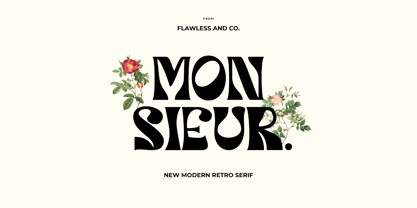 Orphic is a display retro font with a fun and bold style that perfect for your boho-themed projects such as poster design, branding materials, t-shirt, business cards, logo, photography, quotes, and more. Try out some alternate characters for another visual result! This font support for some multilingual. Also contains uppercase A-Z and lowercase a-z, alternate character, numbers 0-9, and some punctuation. If you need help, just write me! Thanks so much for checking out my shop!
 - Jelly Cloud by Supfonts,
$10.00 JellyCloud / Font with Swashes JellyCloud is a chic script with exquisite accents. It is perfect for branding, wedding invitations and invitation cards and much more. Font includes a full set of gorgeous uppercase and lowercase letters, numbers, a large selection of punctuation marks, ligatures Test it out below to see how it could look for your next project! Includes: Regular Script Latin languages support Uppercase and lowercase Numbers and punctuation Ligatures Check out my blog: https://www.instagram.com/zloillev pinterest.com/dmitriychirkov7 Enjoy
 - Farmhouse by Victory Type,
$20.00Farmhouse is a rustic serif typeface that was inspired by the woodcarved store signs on Main Street in a quaint little village nearby. Farmhouse is based upon the shapes of Baskerville but has a unique rustic character all its own. - Kigelio by Ivan Rosenberg,
$15.00 KIGELIA is a stylish display serif font inspired by fashion magazines and romance. It is great for short headlines and titles, but it looks great in advertising, vintage mood board, branding, logotypes, packaging, titles, editorial design and modern and vintage design.
 - Dyane by Wiescher Design,
$39.50 Dyane is based on monolinear scripts from the Bauhaus time. But it is very special for ist counterstrokes in the lowercase letters a, h, m and n that gives the script a very distinct rhythm. Your rhythmic type-designer Gert Wiescher
 - Creepy Face by Forberas Club,
$16.00 This font was created with horror genre inspiration but packed with cute shapes. Also suitable for children's horror story books or cartoons. Or maybe you have something interesting that you are interested in using this font? Hope you like it.
 - Hola Delight by Jafar07,
$15.00 Hola Delight serif font was a very unique retro style-obsessed in the past, but now we are giving this font a unique touch by providing 100+ alternative characters, which can be combined at your command for your best designs.
 - Amoeba by SparkyType,
$19.00If you look into the past to see what was expected of us in the future, Amoeba is where we wanted to be by now. Amoeba is a constrained but quirky future font, designed on a computer by a human. - Printers Choice JNL by Jeff Levine,
$29.00 Banners, arrows with numbers, cartoon cuts, decorative elements and ad helpers make up the assortment of classic images found in Printers Choice JNL. Each were carefully re-drawn from vintage sources to offer a wide variety of topics and uses.
 - Dubidam Arabic by NamelaType,
$29.00 Dubidam Arabic is new version of Dubidam with the addition of Arabic glyphs (Arabic, Urdu, Kurdish, Pegon and Farsi. Dubidam Arabic is A Cheerful semi-slab Typeface. Has a playful but firm style in each stem approach to harmony with Latin.
 - Dortmunder Ecke by Hanoded,
$15.00 Dortmunder Ecke ("Dortmund Corner") is a clean, all caps font inspired by Cubism. It really has nothing to do with the city in Germany, but the name stuck and I kept it that way. Comes with a square amount of diacritics.


