10,000 search results
(0.014 seconds)
- Bola - Unknown license
- ideoma MIAGUIII - Personal use only
- Candy Store BV - Unknown license
- Crystalline - Unknown license
- Exedore - Personal use only
- Sci Fied - 100% free
- Funkygraphy - Personal use only
- VlaanderenRound - 100% free
- DBXLNightfever - Unknown license
- Rubberneck - Unknown license
- Groovy Fast - Personal use only
- Tokyo Honey Chan - Unknown license
- REDRING 1969 - Unknown license
- Violette01 - Unknown license
- Nipple - Unknown license
- Langó - Unknown license
- WHOA SAUCE PERSONAL USE - Personal use only
- LT Bread Medium - 100% free
- Scott Room - Personal use only
- Bubble Shine - Personal use only
- LT Wave - 100% free
- Flipahaus - Personal use only
- Fear Robot - Personal use only
- Cronus - Personal use only
- Qbicle 2 BRK - Unknown license
- Coop Blackletter by Alex Jacque,
$30.00 - PyeMan by The Northern Block,
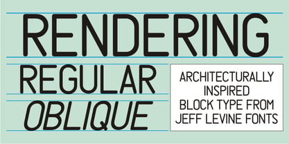
$16.70 - Rendering JNL by Jeff Levine,
$29.00 - Environ by MADType,
$- - Brilliante by Gerald Gallo,
$20.00 - Bandwidth Bandless BRK - Unknown license
- Squareroque - Unknown license
- UNITED BRK - Unknown license
- Binary X BRK - Unknown license
- Anglaise by Ladyfingers,
$39.00 - Bou College - Personal use only
- Creampuff - 100% free
- Lemondrop - Personal use only
- Tellural - Personal use only
- Syntha - Personal use only


