10,000 search results
(0.172 seconds)
- Conithing by Sulthan Studio,
$14.00 Conithing a very classy and light style handwritten font, with lots of characters in it, also complete with connectable hearts to make it more beautiful. Conithing font is modern, simple, but still authentic. You will get full set of lowercase and uppercase letters, numerals and punctuation, multilingual symbols, lowercase beginning and ending swashes, ligatures and extra swashes.
 - Ex Libris by Fenotype,
$25.00 Ex Libris is a high contrasted Flared Serif font family in two weights. Ex Libris is a display type and it’s at its best in headlines, branding, packaging or as a logotype. Try adding some extra flair with Swash, Stylistic or Titling Alternates or wield any of Ex Libris’s 33 Discretionary Ligatures when typing in caps.
 - Roadster Script by Fontop,
$9.00 Welcome my new vintage style ROADSTER font family. With so many extras the font gives additional opportunities for logo creation, branding designs, blogs. Also looks cool when used in headers in signs, layouts, ad materials. OpenType features include swashes and dividers. To use swashes and dividers you need to press dot (.) followed by a number from 1-9 range.
 - Hachitos by Maulana Creative,
$11.00 Hachitos is a modern casual signature font. Hachitos included opentype features Ligatures and extra swash. Hachitos support multilingual more than 100+ language. This font is good for logo design, Movie Titles, Books Titles, a short text even a long text letter and any awesome project you create. Make a stunning work with Hachitos signature font. Cheers, MaulanaCreative
 - P22 Pop Art by P22 Type Foundry,
$24.95 This font set was developed for the Albright-Knox Art Gallery and is inspired by their collection of Pop Art. Artists such as Warhol, Lichtenstein, and Rauchenberg sought to blur the lines between high and low art as well as the boundaries between art and everyday life. The alphabets and extras in this set reflect that spirit.
 - Afferiants by Uncurve,
$25.00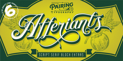 Afferiants is pairing authentic font collection. Thats already match up and to be use together. Afferiant support ligatures and alternates character to make everything awesome design. This Collection best use for vintage or modern design, logo, poster, advertising, branding, invitation, postcard, and more. The extras include badge, catchword and ribbon. Its make you more easier to combine.
 - Nigel Roos by madeDeduk,
$14.00 Really excited to introduce Nigel Roos is a realistic signature to give a incredible impression for all your project design. Nigel roos come with two alternative with extra swashes and more than 140 ligatures in each font to make everything look realistic handmade signature. Included: Uppercase Lowercase Number & Symbol International Glyphs Multilingual Support Ligature Hope you enjoy it.
 - Muscleman by Big Typephoon,
$20.00A strong, heavy font that really packs a punch. Muscleman is there when your design needs a little extra lift. Originally created for a poster project, the font juiced up and grew quickly into the large fat size it is today. It works well for logos, posters, and t-shirt designs and has a slight deco look. - Lyps by hgo,
$15.00 Lyps is a contemporary headline family designed by Heiko Hoos. There are 4 font styles: Lyps Regular, Lyps Small, Lyps Extra Small and Lyps Wide. Each font file has OpenType features for ligatures, caps and some alternative Type variations. The Lyps family is suitable for high impact situations like posters, headlines, titles, magazines, packaging and many others.
 - Hostania by Attract Studio,
$17.00 Hostania is a beautiful and nostalgic serif typeface that looks amazing in both large and small settings as both display and body text. Best used as a showcase for titles and logos, sharp curves and a decorative alternative that give any project an extra touch of class. Includes: Alternative Styles Multiple Languages Supported PUA Encoded Characters.
 - Lisa Fiore by Wiescher Design,
$39.50 Lisa is an elegant script family in the tradition of early Italian type designers like Bodoni. I added counter strokes and floral embellishments to the font. Lisa comes in three variations: the beautiful Lisa Bella, the flowery Lisa Fiore and the extra swinging Lisa Piu (which means more in Italian). Enjoy! Your elegant script designer Gert Wiescher
 - P22 Da Vinci by P22 Type Foundry,
$24.95 The great Italian artist, inventor, and visionary Leonardo da Vinci created an extraordinary variety of work which continues to amaze those who study it. This set faithfully captures Leonardo's remarkable imagination and includes an exclusive Da Vinci Backwards font (reflecting the artist's own unique style of handwriting). The 72 extras included are drawn from Leonardo's sketchbooks and journals.
 - Arnika by Typejockeys,
$50.00 This charming type family comes in four widths: Regular, Semi Condensed, Condensed and Extra Condensed – bringing flexibility and diversity to your drawing table. Crisp details convey confidence without losing fineness. Arnika is your ally for all things classy. Although it is a match made in heaven for beauty products and fashion magazines, we leave its usage to your imagination.
 - UT Sugar Cane by Uniontype,
$15.00 Sugar Cane by Uniontype is a fresh and light multilingual script inspired by vintage monoline fonts. It provides advanced typographical support with contextual alternates, ligatures and swashes. That way, you’ll have automatic access to the dozens of extra glyphs in each of the fonts. This font is good for menu, signs, packaging, posters, letterings and logos.
 - Lisa Piu by Wiescher Design,
$39.50 Lisa is an elegant script family in the tradition of early Italian type designers like Bodoni. I added counter strokes and floral embellishments to the font. Lisa comes in three variations: the beautiful Lisa Bella, the flowery Lisa Fiore and the extra swinging Lisa Piu (which means more in Italian). Enjoy! Your elegant script designer Gert Wiescher
 - Delighter Script by Uncurve,
$20.00 Delighter Script is simply perfect blended fonts with 3 style. Including 10 font and extras. Delighter is inspired from many lettering, poster, quotes, logos and brands. It's perfect for advertising, magazines, editorial, poster, branding, logo type, header, titles, packaging, display etc. A good combination for helping your design, just mix and match and you'll be very authentic.
 - Brush King by Subectype,
$17.00 Brush King is a supercharged, street-wise brush font bursting with energy, with extra attention to quick strokes and sharp details. This font is perfect for challenging jobs, titles, t-shirts, websites, hoodies, and various print and digital media with energy. Brush King is ideal for logos, apparel, quotes, product packaging, or anything which needs a typographic turbo-boost.
 - Bromley Hatch by Attract Studio,
$12.00 Bromley Hatch & Extras is a modern scripts with handwriting, decorative characters, and basic dance lines! designed to perfectly combine informal, sassy, romantic, sweet scripts, and hand-drawn design elements allow you to create many beautiful typographic designs in an instant, just in time for branding, logos, web design and editorial, branding, prints , invitations, crafts, quotes, and more.
 - Dubuffet by SAMUEL DESIGN,
$19.00 The name of this font is Dubuffet, named after a famous artist. The font style is distinct and unforgettable at the same time, showing a simple temperament. The extra thick strokes bring readers a warmer visual experience. The overall shape is artistic and literary. The serif uses a sharp shape that adds a youthful, modern vibe.
 - MTF Goodness Gracious by Miss Tiina Fonts,
$12.00 Goodness Gracious, it’s another font by Miss Tiina! This font is extra special with its cute handwritten characters and ligatures. It's perfect for adding a personal touch to your designs, it has a bouncy, playful feel that’s sure to bring a smile to your audience. Have fun mixing & matching upper and lowercase letters for a unique design.
 - Walkingblue by LetterStock,
$25.00 Walkingblue This pair was inspired by old motorcycle poster design that i saw on some gellery, It was crafted by hand specially to add natural handmade feeling in its brand identity than i make it clean with pentool. We add some rough to make it retro feel, this font is bold so it can look strong if you use it for branding or even title for your retro poster design. Opentype features Walkingblue font has 204 character set included Walkingblue Font is very good looking in retro rough logotype, labels, t-shirt prints, product packaging, invitations, advertising and others. This fonts works with folowing languages: Afrikaans, Albanian, Asu, Basque, Bemba, Bena, Chiga, Cornish, Danish, English, Estonian, Filipino, Finnish, French, Friulian, Galician, German, Gusii, Indonesian, Irish, Italian, Kabuverdianu, Kalenjin, Kinyarwanda, Low German, Luo, Luxembourgish, Luyia, Machame, Makhuwa-Meetto, Makonde, Malagasy, Malay, Manx, Morisyen, North Ndebele, Norwegian Bokmål, Norwegian Nynorsk, Nyankole, Oromo, Portuguese, Romansh, Rombo, Rundi, Rwa, Samburu, Sango, Sangu, Scottish Gaelic, Sena, Shambala, Shona, Soga, Somali, Spanish, Swahili, Swedish, Swiss German, Taita, Teso, Vunjo, Zulu Thank you for using this font. LS
 - Adriane Text by Typefolio,
$49.00 Adriane Text was designed between 2006 and 2007 with additional production completed by Silas Dilworth for this 2008 release [v1.002]. Focusing on text composition and unique typographic characteristics, details within the characters provide both personality and excellent legibility at small sizes. With a medium contrast, a predominantly vertical axis, and a generous x-height, it can be classified as a transitional typeface. This package of advanced OpenType fonts consists of the style-linked quartet of Regular and Bold weights accompanied by corresponding Italics, each of which include small caps and full support for Extended Latin character sets - now including Central European diacritics. Old style and lining figures are provided in both proportional and tabular spacing, and an extensive set of ligatures, ornaments, dingbats, and alternate ampersands are available across the family. The Italics possess a fluidity that contrasts with the staid posture of the Roman styles. The degree of inclination for the uppercase and lowercase characters are slightly different, offering an enhanced visual rhythm in the text settings.
 - Croftler by LetterStock,
$23.00 Croftler This pair was inspired by old motorcycle poster design that i saw on some gellery, It was crafted by hand specially to add natural handmade feeling in its brand identity than i make it clean with pentool. We add some rough to make it retro feel, this font is bold so it can look strong if you use it for branding or even title for your retro poster design. Opentype features Croftler font has 201 character set included Walkingblue Font is very good looking in retro rough logotype, labels, t-shirt prints, product packaging, invitations, advertising and others. This fonts works with folowing languages: Afrikaans, Albanian, Asu, Basque, Bemba, Bena, Chiga, Cornish, Danish, English, Estonian, Filipino, Finnish, French, Friulian, Galician, German, Gusii, Indonesian, Irish, Italian, Kabuverdianu, Kalenjin, Kinyarwanda, Low German, Luo, Luxembourgish, Luyia, Machame, Makhuwa-Meetto, Makonde, Malagasy, Malay, Manx, Morisyen, North Ndebele, Norwegian Bokmål, Norwegian Nynorsk, Nyankole, Oromo, Portuguese, Romansh, Rombo, Rundi, Rwa, Samburu, Sango, Sangu, Scottish Gaelic, Sena, Shambala, Shona, Soga, Somali, Spanish, Swahili, Swedish, Swiss German, Taita, Teso, Vunjo, Zulu Thank you for using this font. LS
 - Narevik by ParaType,
$30.00 Narevik consists of 7 styles -- 4 uprights (including black) and 3 italics. It’s a type of dynamic low contrast design with slightly rounded triangle serifs and drops which conveys to it a certain peculiarity. The vertical strokes have gentle intasis that brings additional softness to the shapes. The family was created by Armenian designer Manvel Shmavonyan and got its name after his daughters Nare and Arevik. It can be used in text composition as well as in display matters. Released by ParaType in 2011.
 - Modern Sans by Larin Type Co,
$16.00 Modern Sans this is a font family that includes 9 weights from thin to black and two styles basic and oblique. In this font you will find a classic and universal grotesque that will perfectly cope with a variety of tasks and will always look stylish and modern, as well as many alternates for Upper and Lowercase, with which you can play and find the most incredible and stunning option. This universal font covers a huge range of possibilities for the design and creation of your project.
 - Fixga by Formatype Foundry,
$24.00 Behance Fixiga is a Modern rounded geometric sans with experiment forms to make powerful visual, a combining with the rounded and some sharp cutting edges. Fixga family comes with 8 weights, from ExtraLight to Black upright Italic, In addition Fixga also support OpenType alternate characters, Alternate SS.01 is offer with typewriter look and SS.02 is offer with neutral look with single storey "a" and "g" Fixga also support several OpenType features include: ligatures, tabular figures, fractions, and language support for extended Latin Icons and symbols.
 - Canciller by Corradine Fonts,
$29.95 Canciller is an elegant typeface designed by Manuel Corradine and Sergio RamÌrez that will give your projects a very exclusive and fresh appearance. Its style is a mix between the grace of calligraphy and the legibility of typography so Canciller can be used in a wide range of purposes. It’s available in six weights that go from light and delicate to black and powerful to give the designer the possibility of creating hierarchies and great contrasts. Its character set supports Western and Central European languages.
 - Malevich by BBDO Studio,
$19.00 Hi! I am Black Square! Probably the most famous square in the world. Thanks to my godfather Kazimir Malevich, who created me in 1915, this year I am celebrating 100th anniversary. Let me tell you what a great gift I just got! It`s a family of almost 300 letters and symbols suprematic as suprematic can be - shapes, form attacks, booms and even hashtags! All under the name of Malevich Font. Isn`t it a great present for my anniversary? Thank You BBDO Ukraine
 - Anselm Sans by Storm Type Foundry,
$63.00One of the good practices of today’s type foundries is that they release their type families as systems including both serif and sans serif type. Usually, the sources of inspiration need to be well tried with time and practice, since production of a type family is such a laborious and complex process. From the beginning, it needs to be clear that the result will be suited for universal use. Such systems, complete with the broad, multi-lingual variations permitted by the OpenType format, have become the elementary, default instrument of visual communication. Non-Latin scripts are useful for a wide scope of academic publications, for packaging and corporate systems alike. And what about outdoor advertisement designated for markets in developing countries? Cyrillics and Greek have become an integral part of our OpenType font systems. Maybe you noticed that the sans serif cuts have richer variety of the light – black scale. This is due to the fact that sans serif families tend to be less susceptible to deformities in form, and thus they are able to retain their original character throughout the full range of weights. On the other hand, the nature of serifed, contrasted cuts does not permit such extremes without sacrificing their characteristic features. Both weights were drawn by hand, only the Medium cut has been interpolated. Anselm Ten is a unique family of four cuts, slightly strengthened and adjusted for the setting in sizes around 10 pt and smaller, as its name indicates. The ancestry of Anselm goes back to Jannon, a slightly modified Old Style Roman. I drew Serapion back in 1997, so its spirit is youthful, a bit frisky, and it is charmed by romantic, playful details. Anselm succeeds it after ten years of evolution, it is a sober, reliable laborer, immune to all eccentricities. The most significant difference between Sebastian/Serapion and Anselm is the raised x-height of lowercase, which makes it ideal for applications in extensive texts. Our goal was to create an all-round type family, equally suitable for poetry, magazines, books, posters, and information systems. - Anselm Serif by Storm Type Foundry,
$63.00 One of the good practices of today’s type foundries is that they release their type families as systems including both serif and sans serif type. Usually, the sources of inspiration need to be well tried with time and practice, since production of a type family is such a laborious and complex process. From the beginning, it needs to be clear that the result will be suited for universal use. Such systems, complete with the broad, multi-lingual variations permitted by the OpenType format, have become the elementary, default instrument of visual communication. Non-Latin scripts are useful for a wide scope of academic publications, for packaging and corporate systems alike. And what about outdoor advertisement designated for markets in developing countries? Cyrillics and Greek have become an integral part of our OpenType font systems. Maybe you noticed that the sans serif cuts have richer variety of the light – black scale. This is due to the fact that sans serif families tend to be less susceptible to deformities in form, and thus they are able to retain their original character throughout the full range of weights. On the other hand, the nature of serifed, contrasted cuts does not permit such extremes without sacrificing their characteristic features. Both weights were drawn by hand, only the Medium cut has been interpolated. Anselm Ten is a unique family of four cuts, slightly strengthened and adjusted for the setting in sizes around 10 pt and smaller, as its name indicates. The ancestry of Anselm goes back to Jannon , a slightly modified Old Style Roman. I drew Serapion back in 1997, so its spirit is youthful, a bit frisky, and it is charmed by romantic, playful details. Anselm succeeds it after ten years of evolution, it is a sober, reliable laborer, immune to all eccentricities. The most significant difference between Sebastian/Serapion and Anselm is the raised x-height of lowercase, which makes it ideal for applications in extensive texts. Our goal was to create an all-round type family, equally suitable for poetry, magazines, books, posters, and information systems.
 - Aguadija by Christian Gamba Pardo,
$12.90 This font contains plant icons from the taxonomic category Orchidaceae, inspired by the multiple specimens that can be found in Colombia that has the largest number of orchids in the world, more specifically in the specimens that have been exposed on the José Celestino Mutis botanical garden. These icons are characterized by having an organic outline; representing flowers, roots, leaves, bulbs and different supports or pots. The vast majority of icons have perfect bilateral symmetry because this is one of the differential characteristics of orchids (compared to other flowers), if they are divided by a central-vertical axis, their right and left sides are practically identical. “Aguadija” can be used in projects related to nature or similar topics, some icons (specifically the digits) are intended to form decorative ribbons or borders.
 - Sketchson by Uncurve,
$30.00 Sketchson is an aesthetic vintage typography font, contains of script, serif and wide serif . Inspired from the past, elegant signage, gold leaf art , sign painting , lettering , tattoo , logo and old label product. Sketchson Script comes with tons of alternates characters and special alternate (i) lowercase is a ending swash thats to make more eye cacthy and the Sketchson Serif is a pairing font to combine in your design . finally BOOM..!! you get a great design for your project. Sketchson It's suitable for authentic logos, headings, sign painting, tattoo, posters, letterhead, branding, magazines, album covers, book covers, movies, apparel design, flyers, greeting cards, product packaging, and more.
 - Maged by Linotype,
$187.99Maged, a traditional-style Arabic text face, enjoyed widespread popularity as a dry-transfer typeface prior to being licensed by Letera Arabica to Linotype-Hell for font production. In consultation with the Linotype Design Studio (U.K.), the artwork was redrawn by Adrian Williams to render the typeface into a complete, unitized Arabic font with a full complement of traditional-style ligatures suitable for digitization. Maged, which has two weights, first appeared as a 202 font in 1987 before its eventual conversion to OpenType in 2005. Thus Linotype’s Maged font can be described as a trend-setting modern Naskh design that retains a sense of the fluidity of Naskh calligraphy: the letters, when composed, appear as freshly-written text characterized by rich, inky horizontals, tapering swash strokes and contrasting delicate ascenders. The Bold exploits these features of the Regular without excess, tempered by the need for clarity at smaller sizes. Maged Regular and Bold are eminently suited to text and titling in broader column work (brochures, magazines, advertising, coffee-table books etc.) and are thus able to extend the range of the Linotype Arabic library in areas of work where the more compact text and titling fonts would create a too concentrated effect. Both of the Maged fonts include Latin glyphs (from Palatino Medium and Palatino Black) inside the font files, allowing a single font to set text in both most Western European and Arabic languages. Maged incorporates the Basic Latin character set and the Arabic character set, which supports Arabic, Persian, and Urdu. They include tabular and proportional Arabic, Persian, and Urdu numerals, as well as a set of tabular European (Latin) numerals. - Pantera by Lián Types,
$39.00 ROARRR! THE STYLES -Pantera Pro is the most complete style, and although its default look is mono-rhythmic it gets really playful and crazy like the examples of the posters by just activating the Decorative Ligatures button in the Open-type Panel of Adobe Illustrator. However, I recommend using also the Glyphs Panel because there you'll find much more variants per letter. Pantera Pro is in fact, coded in a way the combination of thicknesses will always look fantastic. -Pantera Black Left, and Pantera Black Right are actually “lite” versions of Pantera Pro: They have very little Open-Type code, so what you see here is what you get. Pantera Black Left has its left strokes thick, while Pantera Black Right has its right strokes thick. -Pantera White is a lovely member in this family that looks lighter and airy, hence its name. With the feature Standard Ligatures activated (liga) the font gets very playful. -Pantera Caps is based on sign painters lettering and since it follows the same pointed brush rules as the other styles, it matches perfectly. -Pantera Claws like its name suggests, is a set of icons that were done by our dear panther. THE STORY It is said that typography can never be as expressive as calligraphy, but sometimes it can get close enough. I tend to think that calligraphic trials, in order to work well as potential fonts, need first to go through very strict filters before going digital: While calligraphy is synonym of freedom (once its rules are mastered), type-design, in the other hand, has its battlefield a little tighter and tougher. When I practice pointed brush lettering, there are so many things happening on the paper. And most of them are delicious. The ones who know my work may see that although many of my fonts are very expressive, my handmade brush trials are much more lively than them. With that in mind, this time I tried to go further and rescue more of those things that are lost in the process of thinking type when first sketches are calligraphic. I wondered if I could create something wild, hence its name Panther, by understanding the randomness that sometimes calligraphy conveys and turning it to something systemic: With Pantera, I created an ordered disorder. Like it happens a lot in many kinds of lettering styles, in order to enrich the written word the scribe mixes the thickness of the strokes and the width of the letters. Like one of my favorite mentors say (1), they make thoughtful gestures Some lively strokes go down with a thick, while some do that with a thin. Some letters are very narrow, meaning some of them will need to be very wide to compensate. Why not?. The calligrapher is always thinking on the following letters, and he/she designs in his head the combination of thicks and thins before he/she executes them. He/she knows the playful rhythm the words will have before writing them. It takes time and skill to master this and achieve graceful results. Going back to the font, in Pantera, this combination of varying thicknesses and widths of letters were Open-Type coded so the user will see satisfactory results by just enabling or disabling some buttons on the glyphs panel. I'm very pleased with the result since it’s not very easy to find fonts which play with the words' rhythm like Pantera does, following of course, a strong calligraphic base. I believe that if you were on the prowl for innovative fonts, this is your chance to go wild and get Pantera! NOTES (1) Phrase by Yves Leterme. In fact, it’s the title of a book by him. EPILOGUE Esta fuente está dedicada a mi panterita
 - Hells Kittchen Devil God by TypoGraphicDesign,
$19.00 CHARACTERISTICS The font name is a pun on the German word "Kittchen" (English prison/jail) and the English "Hell’s Kitchen". The character of the font looks as though the scum here — the guilty and innocent prisoners carved/scratched their signs and messages at the prison walls of their jail cell. The cold, creepy and scratchy character of the handwritten typeface is a very unique gloomy atmosphere. APPLICATION AREA The scary, dark, horror, trash, handwritten script font "Hells Kittchen Devil God" with many symbols/dingbats would look creepy good at rusty display size for headlines. Magazines or websites, movie posters, music covers or webbanner. TECHNICAL SPECIFICATIONS Headline Font / Display Font / Trash Script "Hells Kittchen Devil God" OpenType Font with 375 glyphs — many symbols/dingbats, alternative letters and ligatures (with accents &€) & 2 style (regular, bold)
 - Masifa Rounded by Hurufatfont,
$19.00 Masifa Rounded has compact, simple, functional and neutral body structure. It has 5 widths from Normal to Ultra Condensed. Each width includes 9 weights from Hairline to Black and their matching italics. Also, every weight includes rich OpenType Features like Small Caps and custom number styles. Due to its large family, it is ideal for a wide range of usage from large-scale designs to small product labels. Masifa Rounded updated on September 25, 2021.
 - Parsek by ParaType,
$25.00Designed at ParaType in 1990 by Elvira Slysh. Based on Brush Script of American Type Founders, 1972, by Robert E. Smith. À popular and widely used script face. Designed to give the impression of letters written with a brush with coherent lowercase, giving a fairly black overall color. Ideal for display work and wherever an informal, handwritten style is required. For use in posters, newspapers and magazines, advertisements, signs and many other informal applications. - Gathell by Alit Design,
$12.00 Introducing Gathell Typeface GATHELL font family consists of 13 families, from Thin to Black style. The elegant modern font creates a unique design and is sure to steal the eye of the design target audience. Besides being unique, the GATHELL font also has a luxury simple character that makes the design charming and luxurious. These a fonts are perfect for designs with the concept of elegant, luxury, romance, fashion and so on.
 - Elita by Wiescher Design,
$14.00 »Elita« is a 100% geometric font designed on a 3 by 16 grid that makes it very slim. There are no optical tricks employed, it is purely geometric. The extreme narrow font design gives it high black and white contrast. The font is not made to write long copy, but it is perfect if you want to employ that magic between pure geometric and almost impossible to read. Just look at the samples and enjoy!
 - Senza by Blackmoon Foundry,
$40.00 Senza is a contemporary, neutral, all-purpose sans serif family designed by Elena Albertoni. It was specially designed for the use on screen. With open shapes and large x-heights Senza guarantees high legibility for body text in small sizes. Senza ’s character-set covers all European languages written in Latin alphabet including real small caps, ligatures, proportional and tabular figures. Senza comes in four weights from Light to Black with matching italics.