10,000 search results
(0.027 seconds)
- Apadana by Naghi Naghachian,
$100.00 Apadana is a new creation of Naghi Naghashian. Apadana design fulfills the following needs: A. Explicitly crafted for use in electronic media fulfills the demands of electronic communication. Apadana is not based on any pre-digital typefaces. It is not a revival. Rather, its forms were created with today's technology in mind. B. Suitability for multiple applications. Gives the widest potential acceptability. C. Extreme legibility not only in small sizes, but also when the type is filtered or skewed, e.g., in Photoshop or Illustrator. Apadana's simplified forms may be artificial obliqued in InDesign or Illustrator, without any loss in quality for the effected text. D. An attractive typographic image. Apadana was developed for multiple languages and writing conventions. Apadana supports Arabic, Persian, and Urdu. It also includes proportional and tabular numerals for the supported languages. E. The highest degree of geometric clarity and the necessary amount of calligraphic references. This typeface offers a fine balance between calligraphic tradition and the contemporary sans serif aesthetic now common in Latin typography.
 - Diad by Andinistas,
$29.95 Diad was born on 2000 in order to design posters about second World War. The original idea was obtained by breaking, burning and getting wet a bunch of written copies with an old writing machine. Today, Diad is a small typographic system useful for bringing relevance to any content with a grunge look. Each and every detail passed through a strict experimentation process. Its outrageous and unconventional spirit travels from high leveled corrosion, up to a delicate visual neglect. Diad 2 and 3 work for designing words. Diad 1 is ideal for long phrases and titles. Diad dingbats includes 26 illustrations about motocross. In total, adding Diad 1,2 and 3, it has around 260 glyphs. Diad will make your design shine providing different graphic atmospheres, optimizing time and work to its users. Diad is perfect for graphic design on contexts such as death metal, drum and bass, films, war and horror video games. It could work also for logos, words, titles and short texts in covers, tags, clothes, wraps, cards, stickers, toys, bicycles, surf boards, etc.
 - Core Sans CR by S-Core,
$20.00 Core Sans CR family is a rounded version of Core Sans C; a part of the Core Sans Series, such as Core Sans N, Core Sans M, Core Sans E, Core Sans A, Core Sans D, Core Sans G, Core Sans R and Core Sans B. Core Sans CR is inspired by classic geometric sans (Futura, Avenir, Avant Garde etc.). It is based on geometric shapes, like near-perfect circle and square. It has a much higher x-height (height of lowercase letters), an effect which promotes readability especially at small print sizes. The Core Sans C Family consists of 9 weights (Thin, Extra Light, Light, Regular, Medium, Bold, Extra Bold, Heavy, Black) and Italics for each format. Core Sans C supports complete Basic Latin, Cyrillic, Central European, Turkish, Baltic character sets. Each font includes proportional figures, tabular figures, oldstyle figures, numerators, denominators, superscript, scientific inferiors, subscript, fractions and case features. Core Sans C is an ideal font family for use in magazines, web pages, screens, displays, and so on.
 - Damavand by Naghi Naghachian,
$114.00 Damavand is designed by Naghi Naghashian. It is a Font family, in 5 weights, Light, Regular, DemiBold, Bold and Heavy. This font is a contribution to modernisation of Arabic typography, gives the font design of Arabic letters real typographic arrangement und provides more typographic flexibility. Damavand supports Arabic, Persian and Urdu. It also includes proportional and tabular numerals for the supported languages. Damavand design fulfills the following needs: A. Explicitly crafted for use in electronic media fulfills the demands of electronic communication. B. Suitability for multiple applications. Gives the widest potential acceptability. C. Extreme legibility not only in small sizes, but also when the type is filtered or skewed, e.g., in Photoshop or Illustrator. Nima’s simplified forms may be artificial obliqued in InDesign or Illustrator, without any loss in quality for the effected text. D. An attractive typographic image. Damavand was developed for multiple languages and writing conventions. Damavand supports Arabic, Persian and Urdu. It also includes proportional and tabular numerals for the supported languages. E. The highest degree of calligraphic grace and the clarity of geometric typography.
 - English Garden SG by Spiece Graphics,
$39.00 Here is a wonderfully charming typeface similar in style to the folklore lettering created by Walter Crane, the prolific children’s book illustrator. This English artist created many beautiful, flower-decorated works during the Arts and Crafts movement that flourished between 1860 and 1910. English Garden SG Regular contains many of Crane’s original whimsical and quirky characters. Note the inclusion of a spurred capital G, a squat lowercase g, a bending floral lowercase d, and the quaint old style figures. All of which are a delight to use when casting a medieval storybook tone to your project. You might also take advantage of the enchanting small capitals when setting logos, headlines, and decks. English Garden SG Regular is now available in the OpenType format. Some new characters have been added to this OpenType version including stylistic alternates, discretionary ligatures, historical forms, and petite figures. Advanced features currently work in Adobe Creative Suite InDesign, Creative Suite Illustrator, and Quark XPress 8. Check for OpenType advanced feature support in other applications as it gradually becomes available with upgrades.
 - Ekbatana by Naghi Naghachian,
$75.00 Ekbatana is a new creation of Naghi Naghashian. Ekbatan design fulfills the following needs: A. Explicitly crafted for use in electronic media fulfills the demands of electronic communication. Ekbatana is not based on any pre-digital typefaces. It is not a revival. Rather, its forms were created with today's technology in mind. B. Suitability for multiple applications. Gives the widest potential acceptability. C. Extreme legibility not only in small sizes, but also when the type is filtered or skewed, e.g., in Photoshop or Illustrator. Ekbatana's simplified forms may be artificial obliqued in InDesign or Illustrator, without any loss in quality for the effected text. D. An attractive typographic image. Ekbatana was developed for multiple languages and writing conventions. Ekbatana supports Arabic, Persian, and Urdu. It also includes proportional and tabular numerals for the supported languages. E. The highest degree of geometric clarity and the necessary amount of calligraphic references. This typeface offers a fine balance between calligraphic tradition and the contemporary sans serif aesthetic now common in Latin typography.
 - Pasargad by Naghi Naghachian,
$108.00 Pasargad is a new font family, designed by Naghi Naghashian. It is a Font family in 3 weights, Light, Regular and Bold. This font is a contribution to modernisation of Arabic typography, gives the font design of Arabic letters real typographic arrangement und provides more typographic flexibility. Pasargad supports Arabic, Persian and Urdu. It also includes proportional and tabular numerals for the supported languages. Pasargad design fulfills the following needs: A Explicitly crafted for use in electronic media fulfills the demands of electronic communication. B Suitability for multiple applications. Gives the widest potential acceptability. C Extreme legibility not only in small sizes, but also when the type is filtered or skewed, e.g., in Photoshop or Illustrator. Pasargad’s simplified forms may be artificial obliqued in InDesign or Illustrator, without any loss in quality for the effected text. D An attractive typographic image. Pasargad was developed for multiple languages and writing conventions. Pasargad supports Arabic, Persian and Urdu. It also includes proportional and tabular numerals for the supported languages. E The highest degree of calligraphic grace and the clarity of geometric typography.
 - Langston by Type Innovations,
$39.00 Langston is an original design by Alex Kaczun. It’s part of a series of lettering experiments, manipulating body proportions, characteristic elements and spacing to achieve some dramatic visual effects. It is hard to characterize if Langston is an outline or inline font. The outline has the same thickness and proportions as the stems. And the inter-letter spacing is also visually similar. This creates a dynamic and interesting visual harmony throughout. Furthermore, certain design elements like the accents and punctuation symbols, break with the outline treatment, and morph into an interesting play between inline and outline. The overall effect is stunning and mesmerizing. Langston is a display font not intended for text use. It was designed specifically for display headlines, logotype, branding and similar applications.This attractive display comes in roman with lower case and lining figures.The font is also available with true small capitals and old style figures. A special version was created with decorative initial capitals to further enhance the possibilities. The large Pro font character set supports most Central European and many Eastern European languages.
 - VTC Bloke by Vintage Type Company,
$19.00 VTC Bloke is a revival of Miller & Richard’s classic metal typeface, ‘Egyptian Expanded’, including the three-dimensional, ‘Open’ style that was later introduced to the family. The roots of this typeface stem from the UK, where William Miller and his son-in-law Richard had their initial foundry in Edinburgh, Scotland. In addition to the beautiful and timeless type designs, the foundry gained a reputation for offering super small type sizes, designed for Bibles, dictionaries, documents, etc. Slab Serifs (or Egyptian Serifs) started to gain popularity in the early 19th century. It’s around this time, due to emerging industrial technologies, and an ever-expanding advertising industry, that type designers started to really experiment with letterforms that could help their clients distinguish themselves from the competitor, and catch people's eyes. The size of posters and advertising space was getting bigger, and bigger, and so was the type. All original letterforms have been re-drawn and cleaned up, with some more modern glyphs and characters added in. VTC Bloke supports Adobe Latin 1 Language Support.
 - Ostad Arabic by Naghi Naghachian,
$64.00 Oustad Arabic is designed by Naghi Naghashian. It is a Bold headline font, in 1 weight. This font is a contribution to modernisation of Arabic typography, gives the font design of Arabic letters real typographic arrangement und provides more typographic flexibility. Oustad Arabic supports Arabic, Persian and Urdu. It also includes proportional and tabular numerals for the supported languages. OstadArabic design fulfills the following needs: A Explicitly crafted for use in electronic media fulfills the demands of electronic communication. B Suitability for multiple applications. Gives the widest potential acceptability. C Extreme legibility not only in small sizes, but also when the type is filtered or skewed, e.g., in Photoshop or Illustrator. Nima’s simplified forms may be artificial obliqued in InDesign or Illustrator, without any loss in quality for the effected text. D An attractive typographic image. Kasha was developed for multiple languages and writing conventions. Nima supports Arabic, Persian and Urdu. It also includes proportional and tabular numerals for the supported languages. E The highest degree of calligraphic grace and the clarity of geometric typography.
 - Glorisa by Black Studio,
$18.00 Glorisa is a new elegant serif font that will add a touch of luxury and style to your projects. This is a very versatile font that works well in large and small sizes. Perfect for editorial projects, magazine headers, Logo designs, Clothing Branding, product packaging, and showcasing masculine and feminine qualities. Glorisa is equipped with uppercase, lowercase, numbers and full punctuation + Multi language support and PUA-encode. To activate the OpenType Stylistic alternative, you need a program that supports OpenType features such as Adobe Illustrator CS, Adobe Indesign & CorelDraw X6-X7, Microsoft Word 2010 or a later version. Features: 3 Font weight Uppercase & lowercase letters Alternative & Ligature Styles Numbers & Punctuation Characters with accents Supports Multiple Languages This type of family has become a work of true love, making it as easy and enjoyable as possible. I really hope you enjoy it! I can't wait to see what you do with Glorisa! Feel free to use #Black Studio tags and #Glorisa Serif fonts to show what you've been up to.
 - Pepone by Storm Type Foundry,
$43.00 This typeface is primarily optimized for the setting of belles-lettres. The regular styles are balanced to suit small text sizes and enable the reading of long portions of text. The development of the typeface was guided by the goal of creating a contemporary, discreet book serif, with modern expression and numerous functions. Letters feature reduced contrast, the lighter styles may evoke wired letters, while the heavier ones bear distinct slab serif references. The extremes thus work in harmony and fulfil the demanding requirements of advertising and magazine layout. The typeface is suitable for bottle labels, invitations, exhibition catalogs and posters, for printed and online presentations alike. The name Pepone was chosen as an homage to Josef Kroutvor. Of course, the typeface isn’t solely reserved for the setting of the works of Josef K. On the contrary – we’d like to present a universal typeface suited for literature, catalogs and magazines. It wouldn’t be the first and the last example of a typeface created with a specific purpose in mind, which later became used universally.
 - Arable by Heyfonts,
$18.00 Arable Font Is "Unique Display Font" refers to a specific type of typography that is characterized by its distinctive, one-of-a-kind design, and it is typically used for eye-catching and decorative purposes. Here's a detailed explanation of what a unique display font is: -Distinctive Design: Unique display fonts stand out because of their distinct and unconventional design. They often deviate from traditional letterforms and can take on a wide range of creative and artistic shapes. Unlike standard, legible fonts used for body text, display fonts prioritize aesthetics over readability. -Specialized Use: Display fonts are not intended for extended reading. Instead, they are used in small quantities for headlines, titles, logos, posters, banners, invitations, and other design elements where visual impact is essential. Their unique and attention-grabbing design makes them ideal for drawing attention to specific text. -Creative Freedom: Designers have creative freedom when creating unique display fonts. This allows for a wide array of styles, from whimsical and ornate to futuristic and abstract. Some display fonts may be inspired by art movements, cultures, historical periods, or nature, leading to highly original and thematic designs. -Limited Character Set: Display fonts often have a limited character set compared to standard fonts. They typically include uppercase letters, numbers, and basic punctuation marks, but may lack lowercase letters or extended characters. This limitation is due to their specialized use and focus on visual impact. -Customization: Some unique display fonts are custom-designed for specific projects or brands. Designers work closely with clients to create a font that aligns with the brand's identity or the project's theme, ensuring a truly unique and tailored result. -Combination with Other Fonts: In many design projects, unique display fonts are paired with more standard, legible fonts to achieve a balance between visual impact and readability. This combination allows for a harmonious and effective overall design.
 - Jantar Flow by CAST,
$45.00 Jantar Flow is a humanist sanserif type family tailored for continuous reading for both printing and screen. With its large x-height and low contrast it also performs very well in captions, side notes, and short paragraphs set in small sizes. Jantar Flow Italic is distinct and readable. Following a proper italic construction, it shows the fun side of the family yet keeps the features of the upright. Jantar Flow – as well as its teammate Jantar Sharp – comes in seven weights from ExtraLight to Heavy, each with accompanying italics. It has a tabular and proportional set of figures in both old style and lining options, and also a special set of hybrid figures sitting between x-height and capitals. Superscripts and subscripts are provided together with a vast collection of diacritics covering all European languages as well as a set of case-sensitive characters. Jantar, the pairing superfamily. ‘Jantar’ is an old Polish name for ‘amber’, a fossilised resin – a substance that is robust and organic at the same time. These qualities somehow reflect the feeling behind the Jantar families, ‘Flow’ and ‘Sharp’. Jantar Flow was designed along with Jantar Sharp. As part of the Jantar superfamily these two faces are perfectly paired: though not based on the same skeleton, they share the same design parameters and the same character set, but each one works independently with its peculiar features. Designed for publishing for print and web, as well as for branding, the Jantar superfamily was inspired by common font pairings of the digital age like Helvetica/Times or Verdana/Georgia. Jantar Flow and Jantar Sharp communicate with individual yet complementing voices, just like two trained acrobats can perform alone but also know well how to perform together.
 - Dream Orphanage by Typodermic,
$11.95 Welcome to Dream Orphanage, a typeface that will bring warmth and personality to your design projects! With its tidy and friendly sans-serif style, Dream Orphanage is a high-quality reconstruction of the beloved 1990s typeface, Dream Orphans. But we didn’t stop there. We’ve included an alternative style of “g” in OpenType-capable apps, giving you even more creative freedom to make your designs stand out. And with seven weights and italics to choose from, you’ll have no shortage of options to craft the perfect look for your project. Whether you’re designing a greeting card for a loved one, a website for a small business, or anything in between, Dream Orphanage will bring a touch of charm and friendliness that will capture the hearts of your audience. So don’t wait—start creating today with Dream Orphanage! Most Latin-based European writing systems are supported, including the following languages. Afaan Oromo, Afar, Afrikaans, Albanian, Alsatian, Aromanian, Aymara, Bashkir (Latin), Basque, Belarusian (Latin), Bemba, Bikol, Bosnian, Breton, Cape Verdean, Creole, Catalan, Cebuano, Chamorro, Chavacano, Chichewa, Crimean Tatar (Latin), Croatian, Czech, Danish, Dawan, Dholuo, Dutch, English, Estonian, Faroese, Fijian, Filipino, Finnish, French, Frisian, Friulian, Gagauz (Latin), Galician, Ganda, Genoese, German, Greenlandic, Guadeloupean Creole, Haitian Creole, Hawaiian, Hiligaynon, Hungarian, Icelandic, Ilocano, Indonesian, Irish, Italian, Jamaican, Kaqchikel, Karakalpak (Latin), Kashubian, Kikongo, Kinyarwanda, Kirundi, Kurdish (Latin), Latvian, Lithuanian, Lombard, Low Saxon, Luxembourgish, Maasai, Makhuwa, Malay, Maltese, Māori, Moldovan, Montenegrin, Ndebele, Neapolitan, Norwegian, Novial, Occitan, Ossetian (Latin), Papiamento, Piedmontese, Polish, Portuguese, Quechua, Rarotongan, Romanian, Romansh, Sami, Sango, Saramaccan, Sardinian, Scottish Gaelic, Serbian (Latin), Shona, Sicilian, Silesian, Slovak, Slovenian, Somali, Sorbian, Sotho, Spanish, Swahili, Swazi, Swedish, Tagalog, Tahitian, Tetum, Tongan, Tshiluba, Tsonga, Tswana, Tumbuka, Turkish, Turkmen (Latin), Tuvaluan, Uzbek (Latin), Venetian, Vepsian, Võro, Walloon, Waray-Waray, Wayuu, Welsh, Wolof, Xhosa, Yapese, Zapotec Zulu and Zuni.
 - El Fonte Angelia by Gilar Studio,
$16.00 Hello Everyone.. Introducing a new Font " El Fonte Angelia " Beautiful Serif Type Family is inspired by the serif typefaces used in editorial media in the 70s and 80s.such as the soft and gentle shapes found in Cooper or the fluid, angled strokes in Windsor— mixed into one single design that features familiar, fresh, modern flavors. Designed to reflect nature, it creates a sense of natural softness and expressiveness. We pushed the concept into a usability focused direction, to work as a bold tool and beautiful communicator. El Fonte Angelia variable allows fluid design across 5 weights The font broadens its use by supplying weights all the way from Light to Bold. The natural curves, swells and sloping trunks, grow in character as the font gains weight. Whilst the thinner weights have lowered contrast and optical corrections to create a warm and gentle appearance. El Fonte Angelia character set incorporates additional symbols, stylistic alternates, unique ligatures and case sensitive punctuation - producing a stable workhorse family ready to tackle projects of any size.The type family melds organic curves and gentle repetition into powerful and harmonious type. At large point sizes you can appreciate the letter shapes, whilst the same restraint and focus creates an even texture for small point sizes and long reading. Its variety of weights provide a range of choices that will help you find the best typographic color for your project. Lighter weights are well-suited for body text while heavier ones are ideal for high impact headlines. The available stylistic alternates offer a number of different characters that give your logo or business card a unique look. Check my other Font here : https://gilarstudio.com/ Thank you Regards, Gilar Studio
 - Magola by Andinistas,
$39.95 Magola is a creamy flavor font family whose purpose is to season with emotions the reading of words and phrases formed by puffy glyphs coated with a caramel of empty spaces external and internal. Independently or in groups, members of the family serve to decorate and organize packaging or advertising material in letters apparently crafted for food or entertainment contexts. Its starting point was to draw letters like a ballon fish evolved into a black version with empty areas and microscopic contrasted with colorful inflated and filled areas. Then the challenge was based on the sum transferred between full and empty into a lighter caliber. In that vein, its overall design adapted skeletons of italics and Roman calligraphy. Therefore, its regular, bold and black files have great height "x" with upwards and downwards extremely short and large internal counterblocks to facilitate reading. In this regard, to strengthen its objective and capture the reader's attention, its kind of contrast and simulated auctions flat tip brush strokes, and amount of contrast between thick and thin in the black version is slightly inverted. Its sizes, smooth strokes and irregular lines reinforce its traditional spirit, so it is favorable to shine the information on posters or large-format media. In short, its optical conformation based on a non-literal way, in metrics similar in all family members to be easily exchanged without changing the ìxî height. It is therefore a striking and versatile tool, that besides being useful in large sizes, can be used in small sizes as well. And more importantly, its general concept is more profitable when its members are mixed to nest headings, subheadings and short paragraphs, designed according to size, position, color and location in logos, covers, posters, ads and flyers.
 - TT Cometus by TypeType,
$19.00 Dynamic, attractive and catchy - the new TypeType display font! Please note! If you need OTF versions of the fonts, just email us at commercial@typetype.org TT Cometus is an expressive typeface that captivates from the first time you read a text set in it. Despite its massiveness, the typeface is malleable and dynamic, like a comet piercing the space in order to achieve the only goal - to capture the attention of the viewer. TT Cometus is a slab serif whose strong serifs are serifed at the junctions with the vertical stroke to give the typeface a dynamic and modern character. Thanks to this solution, some elements of the font evoke associations with calligraphic works, while display elements remain stable thanks to massive serifs. The pointed endings of the letters c, y, e, t and noticeable inflows of arches and semi-ovals make the character of TT Cometus dynamic. The contrast between the thicknesses of the horizontal and vertical elements is small, but in the serifs, inflows, and letter endings, the contrast is pronounced. The nature of the font is balanced, and its friendliness is supported by the smoothness of shapes. Oriented towards the viewer, flowing yet massive and dynamic, TT Cometus is suitable for use in eye-catching projects. This is a display font that shows its character better in a large body size and can be used in printed materials or on the web. The font looks flawless in headlines and logos, and is suitable for use in branding. TT Cometus consists of 5 faces: 4 upright and one variable font. Each face has 568 glyphs. The font contains 18 OpenType features, including a large number of ligatures, sets of alternative characters for the ampersand and the letter g.
 - Mifelin by Nathatype,
$29.00 Mifelin is a well-defined serif font. Serifs are small ornaments that appear at the ends of the lines of letters, giving them a neater, more structured appearance. The well-defined serifs in this font create an elegant and professional impression. This serif font has a balanced and harmonious proportion of height and width. The proportions ensure that each letter looks proportional and easy to read. The line of letters in this font has a smoothness and clarity that distinguishes each character. Sharp, clear lines give off a professional and organized impression. This clarity also helps strengthen the legibility of the font in a variety of design settings. This serif font with an elegant look has a classic style that remains relevant in modern designs. Despite having strong roots in traditional typographic design, this font is able to adapt to more contemporary design contexts and give it a touch of elegance and class. Even though it has a touch of elegance, this serif font still prioritizes good readability. Each letter is carefully designed to ensure that the text remains easy to read and understand for the reader. Prominent readability is the hallmark of this font. Enjoy the various features available in this font. Features: Stylistic Sets Ligatures Multilingual Supports PUA Encoded Numerals and Punctuations Mifelin is suitable for any designs that require a formal and official impression. This font is can be used in the design of books, magazines, reports, formal invitations, brand identities, and other design projects that require elegance and professionalism. Find out more ways to use this font by taking a look at the font preview. Thanks for purchasing our fonts. Hopefully, you have a great time using our font. Feel free to contact us anytime for further information or when you have trouble with the font. Thanks a lot and happy designing.
 - Comic Tantrum by David Engelby Foundry,
$25.00 Comic Tantrum is a versatile font – you can use it for headline posters, for infographics, for web pages or other media, when you need an expressive comic font. And you can skew it and squeeze it. It also has many special designed alternates, swash versions and ligatures. Have fun!
 - Beary by Balevgraph Studio,
$15.00 Beary is a stylish and modern sans serif font. You can use this font in a variety of projects to create a unique and distinctive look. The Beary font can be used anywhere without the need for opentype support. Beary fonts are available in regular, alternate, and oblique.
 - New Moon by Melissa Lapadula,
$14.95This font has been derived from different transformations of the moon transcending into different moods which affect the world. A full moon can cause human beings to be aggressive. While a new moon is a good time for new beginnings. This font can function as headings and subheadings. - Qilla by Herlan Nawwi,
$10.00 Qilla is a simple and elegant font for your projects. Can be used for various purposes such as headings, logos, wedding invitation, t-shirt, letterhead, signage, labels, posters, badges etc. Qilla comes with two styles, upright and slanted version can be an alternative choice to suit your needs.
 - Aryaka by Letterafandi Studio,
$14.00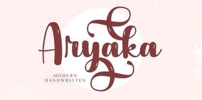 Aryaka is a modern handwritten font. It can be used for various purposes such as logos, wedding invitations, headings, t-shirts, letterhead, signage, labels, news, posters, badges and so much more. Aryaka is PUA encoded which means you can access all of the glyphs and swashes with ease!
 - Comfort by Jehansyah,
$9.00 short and bold font, cute and looks professional and a nuanced logo font that you can customize with the elegant look you want there are several alternatives that you can use and combine, and there are italics to make it easier for you to work on your design project
 - MOORA LIGHT by Top Type,
$9.00 Moora Light feels playfully nostalgic and delivers an incredible vintage aesthetic. Use this serif font to add that special retro stylish touch to any design idea you can think of! This font is PUA encoded which means you can access all of the amazing glyphs and ligatures with ease!
 - Bogitha by Letterafandi Studio,
$14.00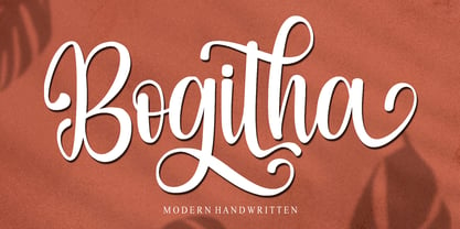 Bogitha is a modern handwritten font. It can be used for various purposes such as logos, wedding invitations, headings, t-shirts, letterhead, signage, labels, news, posters, badges and so much more. Bogitha is PUA encoded which means you can access all of the glyphs and swashes with ease!
 - Wulf Utility by Device,
$29.00 Wulf Utility is a heavily degraded font that evokes information in a utilitarian manner without any pretence to elegance, fuss or refinement. Gruff and direct, it is about as basic as a font can be. The Dirty version can be layered over the Rough version for two-tone effects.
 - Jassime by Nian Keun Studio,
$12.00 Jassime is an elegant serif font with beautifully crafted characters following the trend so you can use them very well. You can use Jassime in graphic designs, magazines, logos, identity branding, fashion brands, clothes, and many others. Thank you for coming to my shop and enjoying other fonts.
 - Radhistone by ZetDesign,
$14.00 Radhistone is a decorated serif font with a natural theme. This font is equipped with OpenType features and there are many choices of shapes and swashes (up to 6 shapes) that can be accessed so that users can make choices according to their creativity to produce amazing works.
 - Shinigami by Hoperative Design,
$19.00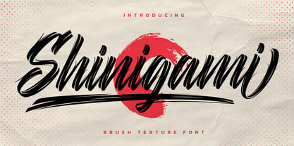 Shinigami is modern brush script font. It has a classy, elegant and modern look that can be used for T-Shirt, branding, invitations, Poster, wedding designs, social media posts, and much more! Shinigami Features : Ligature Stylistic Alternates Swash PUA encoded which means you can access all glyphs Multilingual Support
 - Rilderta Hellgest by Letterena Studios,
$10.00 Rilderta Hellges feels playfully nostalgic and delivers an incredible vintage aesthetic. Use this serif font to add that special retro touch to any design idea you can think of! This font is PUA encoded which means you can access all of the amazing glyphs and ligatures with ease!
 - Lavana by Nirmalagraphics,
$12.00 Lavana is made with a style brush. If you like natural fonts in a bold and handwriting style, you must have it. You can use Lavana for any needs, can be for logos, flyers, magazines, clothes, business card brochures and others. Lavana is also equipped with multi-lingual support.
 - Catshape by RodrigoTypo,
$45.00 Catshape is a font of dingbats, which in combinations with uppercase and lowercase you can generate multiple characters with different textures. In addition to a set of ornaments and a font called Alquitran Stencil, it was designed for different graphics. I hope you can have fun with this font!
 - Kaminari-Kun by Julmeme,
$25.00 Kaminari-Kun is a typeface that has a very strong and unique impact. With its iconic saw-toothed design, characters can fit into each other and can be associated to create an modern and electric design. Applicable for any type of graphic design, especially for posters and logotypes.
 - Zaptron by Patria Ari,
$15.00 Zaptron is a modern sci-fi fonts with different shapes on uppercase and lowercase. With this difference, you can explore different combinations, also with more than 100 discretionary ligatures you can access by hit capslock/uppercase. This logo perfect for logotype especially on technology, construction, automotive, and more.
 - Thunder Ragnarok by Letterara,
$14.00 Thunder Ragnarok is a stylish modern brush script. It has an unique, striking look which can be used to make any design stand out. It’s perfect for logos, fashion designs,stationary, quotes, and much more!. This font is PUA encoded which means you can access all of the glyphs.
 - Adoria by Sarid Ezra,
$17.00 Adoria is a minimalist logo font with unique edge that will make your logo and design looks more simple and modern. With the unique characteristic lowercase, this font can make your logo even more stunning. You can use this font for any purpose, especially to make logotype. You can mix and match the uppercase and lowercase to make your logo more advanced. Adoria also comes with alternates that's why it's called deluxe logo font. This font also comes with number, symbol, and multilingual support!
 - Klopers by Sarid Ezra,
$15.00 Klopers is a lovely and minimalist logo font with unique shape that will make your logo and design looks more minimal yet modern. With the unique characteristic lowercase, this font can make your logo even more stunning. You can use this font for any purpose, especially to make logotype. You can mix and match the uppercase and lowercase to make your logo more advanced. Klopers also comes with love shape that replace the "o". This font also comes with number, symbol, and multilingual support!
 - XRoomingHouse by Ingrimayne Type,
$9.95 XRoomingHouse is a typeface of pictures that I did many years ago. Most of the pictures are border elements, and within a set they can be combined to make borders or frames. There is no real style consistency in the font—it is an eclectic collection of elements. (Minor corrections and additions were made in 2018 to improve sets that can form frames. For a more ambitious attempt at a font that can form frames, see Framealot). As for the name, boarders stay in a rooming house.