10,000 search results
(0.023 seconds)
- Weekend Warrior - 100% free

- Reading Frequency by Vladvertising,
$10.00 Ever wonder what language looks like? This type decided to dive into this idea... how audible and visual forms play with each other. The forms you see also have been waterjet-cut out of stainless steel sheets. With these physical forms, one day in a recording studio and a mallet in hand later... we get this. Link to Audio Files: http://vladrudakov.com/files/Reading%20Frequency%20Audio.zip (If you use for samples– have fun, just shoot me an email w/ final product) vlad (at) vladvertising.com
 - Bronx by ITC,
$29.99Bronx is a contemporary, highly stylized script typeface that captures the effect of quickly rendered brush lettering. The capitals are intended only for initialing purposes but may be joined with the lowercase letters, which can be linked together to reproduce the look of handwriting. This design has great potential for use in work associated with the fashion industry. British designer David Quay originally produced Bronx for Letraset in 1986, and it is just one of the many styles of type developed by this talented and renowned designer. - AM Godina by Errea Type,
$10.00 Godina was born from the interest in learning and deepening in the basic forms and how they are combined to compose a typographic system. The name, a tribute to the town of La Almunia de Doña Godina, the town for which the author of the typography connects. La Almunia is a crossroads in the typography designer's travels, a link between his family and friends. It combines the scent of a straight and modular typeface with sinuous and curved shapes, which make it a fun and playful typeface.
 - YAKSOM by Twinletter,
$17.00 Yaksom is a classic serif font that exudes timeless beauty and a captivating modern style. The perfect solution for projects that require an elegant classic modernism theme. With a proportional and elegant serif design, Yaksom conveys timeless elegance in every letter. Every detail is exquisitely detailed, creating a look that embodies the refinement and elegance of an irreplaceable classic era. Yaksom is also equipped with stunning features. Beautiful ligatures add a creative touch and enrich the look of a font, while alternative variations provide unique styling options. Extensive multilingual support also ensures that Yaksom can be used fluently in multiple languages. Are you looking for a font that combines classic elegance with a dazzling modern twist? Yaksom is a perfect choice. With a stunning classic serif style, creative features such as alternate ligatures and variations, and the ability to support multiple languages, this font will quickly grab the attention of your prospects and create a stunning aesthetic impression in the blink of an eye. What’s Included : File font All glyphs Iso Latin 1 Alternate, Ligature Simple installations We highly recommend using a program that supports OpenType features and Glyphs panels like many Adobe apps and Corel Draw so that you can see and access all Glyph variations. PUA Encoded Characters – Fully accessible without additional design software. Fonts include Multilingual support
 - Mimeograph Lettering JNL by Jeff Levine,
$29.00 Mimeograph Lettering JNL is based on one of the numerous plastic lettering templates once manufactured by the A.B. Dick Company of Chicago and is available in both regular and oblique versions. The mimeograph utilized a porous drum which inked the backside of a waxed stencil sheet. Unlike traditional stencils which have cut out areas that are directly inked or painted, a mimeo stencil has the area to be printed scratched away by removing the wax coating with a stylus. The resulting image allows the ink from the drum to seep through the sheet and transfer to the blank paper. As with a companion font (Mimeograph Template JNL), the character shapes follow the routed letters of the template, complete with rounded terminals. A previous font release [designed with flat terminals and some alternate characters] is available as Interoffice Memo JNL.
 - Pre Code Movies JNL by Jeff Levine,
$29.00 The hand lettered credits from the 1931 melodrama “Safe in Hell” inspired the typeface Pre Code Movies JNL, which is available in both regular and oblique versions. The design is strongly influenced by the popular Art Deco style of thick-and-thin characters and also features rounded corners. The font’s name comes from the early era of talking pictures and the short period before the establishment of the Hays Office in 1934 when Hollywood did not self-censor itself. Many then-taboo topics were exploited on film until Will Hays cracked down on such productions. To read more about Pre-Code Hollywood, visit the Wikipedia link: https://en.wikipedia.org/wiki/Pre-Code_Hollywood
 - Smegh Mouth by LetterStock,
$15.00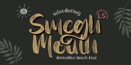 **Smegh mouth Font** This pair was inspired by the retro poster design that i saw on some coffee shop, It was crafted by hand specially to add natural handmade feeling in its brand identity than i make it clean with pentool. **Opentype features** Smegh mouth font has 184 character set included Smegh mouth Font is very good looking in logo, labels, t-shirt prints, product packaging, invitations, advertising and others. This fonts works with folowing languages: Afrikaans, Albanian, Asu, Basque, Bemba, Bena, Chiga, Cornish, Danish, English, Estonian, Filipino, Finnish, French, Friulian, Galician, German, Gusii, Indonesian, Irish, Italian, Kabuverdianu, Kalenjin, Kinyarwanda, Low German, Luo, Luxembourgish, Luyia, Machame, Makhuwa-Meetto, Makonde, Malagasy, Malay, Manx, Morisyen, North Ndebele, Norwegian Bokmål, Norwegian Nynorsk, Nyankole, Oromo, Portuguese, Romansh, Rombo, Rundi, Rwa, Samburu, Sango, Sangu, Scottish Gaelic, Sena, Shambala, Shona, Soga, Somali, Spanish, Swahili, Swedish, Swiss German, Taita, Teso, Vunjo, Zulu. Thank you for using this font. LS
 - Armthadore by LetterStock,
$15.00 Armthedore Script Font This pair was inspired by the retro poster design that i saw on some coffee shop, It was crafted by hand specially to add natural handmade feeling in its brand identity than i make it clean with pentool. **Opentype features** Armthedore Script font has 172 character set included Armthedore Script Font is very good looking in logo, labels, t-shirt prints, product packaging, invitations, advertising and others. What includes * Multilingual support (Western European characters). This fonts works with folowing languages: Afrikaans, Albanian, Asu, Basque, Bemba, Bena, Chiga, Cornish, Danish, English, Estonian, Filipino, Finnish, French, Friulian, Galician, Gusii, Indonesian, Irish, Italian, Kabuverdianu, Kalenjin, Kinyarwanda, Low German, Luo, Luxembourgish, Luyia, Machame, Makhuwa-Meetto, Makonde, Malagasy, Malay, Manx, Morisyen, North Ndebele, Norwegian Bokmål, Norwegian Nynorsk, Nyankole, Oromo, Portuguese, Romansh, Rombo, Rundi, Rwa, Samburu, Sango, Sangu, Scottish Gaelic, Sena, Shambala, Shona, Soga, Somali, Spanish, Swahili, Swedish, Swiss German, Taita, Teso, Vunjo, Zulu. Thank you for using this font. LS
 - Roadline by John Moore Type Foundry,
$45.00 Roadline is a professional display font collection of Streamline style for lettering, a style of lettering that was much in vogue from the 30 to the 60. Roadline aligns all your characters on a horizontal baseline and allows headlines or logos into three wide variables. Besides its connectors allow you to create variations ranging from elegant classics to radicals or creative situations, adapting to all target tones of voice message, it brings Roadline a series of pre-programmed parts in Opentype links for easy use and enable very creative and unexpected combinations. For its decorative character this typeface is very useful for headlines and logo creation. Relive the golden years of the brands with Roadline.
 - Angilena by Mantype Studio,
$14.00 Angilena is an elegant, unique font that uses ligatures to smoothly link letters. Perfect for adding a unique twist to word-mark logos, monograms or pull quotes. Angilena has 51 ligatures as well as numbers and punctuation making it super versatile. Ligatures are able to be turned off if needed for body copy. To make it look more unique, here we prepared some ligatures:ca cb ch ck cm cn cp cr ea eb eh ek em en ep er ib id ih ik il iga ig ga gi mg ng ob oh ok om on op or oo tb th tk tm tn tp tt ti tu ro vo wo yo vi wi yi
 - Wola by Monotype,
$50.99 Wola™, by Franciszek Otto, is not for the typographically timid. It creates vibrant digital headings, banners and navigational links, in addition to commanding print headlines and subheads – but it is not shy, reserved or demure. The design blends the stroke weight stress of Bodoni with the urgency of handwritten letterforms, conveying the energy and immediacy of a design that’s bigger than life – and outside the fence. OpenType® Pro fonts of Wola provide for the automatic insertion of ligatures and alternate characters. These are in addition to a character set supporting most Central European and many Eastern European languages, including Cyrillic and Greek. All this makes Wola a comfortable – if boisterous – world traveler.
 - Speedway SG by Spiece Graphics,
$39.00 Motoring at top speed calls for your own high-performance machine and a special racetrack font to run it on. Speedway was built with blacktop smooth caps to ease you through those short and dangerous curves. And its sleek, aerodynamic lowercase linking makes getting your speedy cruiser to the checkered flag a breeze. Developed in typeface alley for discriminating designers. And for the more adventurous, Speedway SG is now available in the OpenType Std format. Some new characters have been added to this OpenType version. Advanced features currently work in Adobe Creative Suite InDesign, Creative Suite Illustrator, and Quark XPress 7. Check for OpenType advanced feature support in other applications as it gradually becomes available with upgrades.
 - Godwit by yasireknc,
$19.00 Godwit is an experimental high-contrast serif font. The piece screams creative freedom and exploration, as the color literally breaks through the boundaries of the original type. The final piece is really fluid as each letter links smoothly into the next and you can feel the real natural ink paths. This is a benefit of Godwit and the most powerful-distinguishable feature, as most standard fonts wouldn’t allow for this fluidity, especially a serif font. The Aphorism: The main idea comes from being fluent and smooth-spoken natural ink shapes. As we go into the details, the organic shape of the body makes the font a unique piece. The collection lends itself to the design, packaging, and advertising of everything with a romantic feel like liquid love potion; weddings, greetings, cosmetics, lingerie, book covers, and too many more to mention! This font is a great place to begin getting that tone.
 - Scarab - Unknown license

- Marian Churchland by Comicraft,
$39.00 Tall, thin and elegant, Marian Churchland’s fonts are very much like her.. and now available from those awfully nice chaps at Comicraft to allow you to pretend that you are too! Marian Churchland was born in Canada in 1982, and was raised on a strict diet of fine literature and epic fantasy video games. She has a BA in Interdisciplinary Studies (English Literature and Visual Arts) from the University of British Columbia, and has been doing professional illustration work, including book covers and magazine articles, since she was 17. Last year, she became the first woman to solo-illustrate a CONAN story, and this year she’s illustrating three issues of ELEPHANTMEN for Image Comics. See the families related to Marian Churchland: Marian Churchland Journal.
 - Vary by Monotype,
$50.99 Vary by Olli Meier is a geometric sans serif typeface inspired by Bulgarian Cyrillic. Vary is fun and adaptable and was built with three feelings (variations): classic, modern, and loopy, offering an opportunity for designers to be playful in their creations. The inspiration in Bulgarian Cyrillic is seen mostly in the character “g,” which was inspired by a very uncommon handwritten “?” spotted by the designer in a shop window in Sofia, Bulgaria. When he flipped this design in 180°, the Latin character ‘g’ was born for Vary Another example is the “R” in the modern stylistic set, which was inspired by the handwritten Cyrillic character “?”. Vary is available as a variable font and also comes with 10 preset instances from Hairline to ExtraBlack.
 - CLIMAXED - Personal use only

- Shelf Tags JNL by Jeff Levine,
$29.00 Before the mid-to-late 1970s, when retailers started to embrace UPC (universal price code) technology on a grand scale, pricing merchandise took on many forms. One method especially popular with variety stores (such as Woolworth's, McCrory's, Kress, etc.) were pre-printed price tags that came in small pads and were inserted into metal holders. Shelf Tags JNL recreates a vintage price tag based on examples seen online, and allows the user different ways to create their own vintage-style price tags. You can either utilize the round pen nib style numbers and price marks to place on any size or type tag, or type out prices using the reversed characters (white on black) along with the two end caps provided to form a complete tag unit. For the more adventurous, a complete blank tag is also provided in case the desire is to print a solid color tag background and [using the regular numbers] crate prices in custom colors. Two sets of smaller number (for "floating" cents prices) are also provided in regular numbers and reverse panels. As an extra bonus, there is a set of 1 through zero, dollar sign, cents sign and decimal point individual black-on-white outlined panels for making individual pricing numbers. The keyboard layout for the various characters is as follows: asterisk key - regular cents sign (no panel) dollar sign key - regular dollar sign (no panel) period key - regular decimal point (no panel) left and right parenthesis keys - panel end caps (to form price tags) colon key - reverse decimal point on black panel 1 thru 0 keys - regular numbers (no panels) A through J keys - small regular numbers (no panels) K and L keys - truncated [shorter width] end caps M through Y keys - individual price numbers (black on white with black border a through j keys - reverse numbers on black panels k key - reverse dollar sign on black panel l key - reverse cents sign on black panel m through v keys - reverse small numbers on black panels w through z keys - blank rectangular panels of varying widths equal sign key - full black panel price tag hyphen key - blank rectangular black panel based on the width of most number panels
 - Bodoni Ornamental by FontMesa,
$30.00 New for 2020 Bodoni Ornamental now has two italics to choose from, one basic italic and a second which is more of a true italic with a few uppercase letters that have been stylized. Only one italic can be style linked to the regular upright version so in the second italic we've added Avanti to the name which means forward in Italian. When purchasing the regular upright and Avanti italic together they will install as two separate families. Bodoni Ornamental is a revival of a very old typeface based on the Poster Bodoni letter shape. Giambattista Bodoni passed away in 1813, this decorative version was created in the 1820’s or 1830’s which was the time period when many of these ultra bold decorated type faces began to appear, the original artist is currently unknown. The original version of this ornate classic was only available as a set of uppercase letters, today over one hundred eighty years later this font is now complete with a new lowercase, numbers and accented characters for Eastern, Central and Western European countries. Due to the ornate detail in Bodoni Ornamental when printing itís recommended to use a laser printer 600dpi or greater, a 1200dpi printer will give you the best results rendering the most detail at the smallest possible point size for this font. Small home user Ink Jet printers are not recommended for Bodoni Ornamental unless you set the font to a very large point size. With Ink Jet printers much of the detail in the letters will bleed together as the ink hits the page, commercial Ink Jet printers such as GiclÈe printers may give good results. When using Bodoni Ornamental for digital images including web site graphics it may help to add a one pixel stroke fill around the letters setting color to white or grey, this may help the web site images display better on some computer's. You will need a photo editing application such as Adobe Photoshop to create your image adding the stroke fill and save as a jpg , png or gif file. I hope you enjoy this old font as much as I did making it. Note: When previewing the Bodoni Ornamental font in the Windows font preview you may notice some letters appearing lighter and some darker, this is a problem with the preview window and some ornate fonts, Bodoni Ornamental will print normal and not with mixed light and dark letters.
 - 1805 Jaeck Map by GLC,
$42.00 This font is mainly inspired from the engraved characters of a German Map depicting Germany's roads and parts of surrounding lands, edited in Berlin probably in the end of 1700's. The engraver was Carl Jaeck or Jaek (1763-1808). The Map was bought by the French napoleonic general Louis Pierre Delosme (1768-1828) probably during the Napolenic campaign against Germany, circa 1805 or at least 1806, his sole staying in Germany. The font (with two styles, Normal and Italic)is containing standard ligatures and a few alternative characters. It is a "small eye" or "Small x-eight" font, as the Maps' characters are most often very small (some Italic lower cases of the map are 1mm hight, upper cases 2mm) The standard English characters set is completed with accented or specific characters for Western (Including Celtic) and Central European, Baltic, Eastern Europe and Turkish languages.
 - Restaglick by Mokatype Studio,
$22.00Hello Introducing, Restaglick - Ligatures Connected Serif is an elegant and unique font that uses ligatures to link letters smoothly. Perfect for adding a unique twist to word-mark logos, monograms, or pull quotes. Restaglick has 28 ligatures as well making it super fantastic. Ligature can be turned off if required for standard writing needs. Any question? Just ask! Language Support: Danish, English, Finnish, French, German, Italian, Luxembourgish, Norwegian Portuguese, Spanish, Swedish, Swiss, German and More + Standard glyphs + Web Font + International Accent + Works on PC and Mac + Simple installations accessible in Adobe Illustrator, Adobe Photoshop, Adobe InDesign, and even works on Microsoft Word. PUA Encoded Characters: Fully accessible without additional design software. Fonts include multilingual support. + Image used: All photographs/pictures/vectors used in the preview are not included, they are intended for illustration only. Thank you - Dubrove by Dima Pole,
$36.00 Dubrove is a wedge serif typeface inspired by Moravian (Czech) type designs of the 1930-50s. The character font is expressive: free, daring and graceful, delicious and attractive. Here are more than 1100 glyphs, all 102 European languages, all Ancient Slavic Alphabet (49 characters), Latin and Slavic small capitals and OpenType features with many solutions. Dubrove has several stylistic sets, historical forms, localized forms of several languages, interest contextual ligatures and many other delicacies. In the Dubrove typeface several stylistic sets of Slavonic lowercase letters are made. In addition to font basic style (in fact it is close to the natural lowercase character) is a traditional [ss02] set (postpreliminary, the Soviet Union, when most copy lowercase letters are uppercase) and lowercase the natural character [ss03], the style of which, in particular, is often used in the Bulgarian script.
 - F6 Grand Prix by Ortho,
$19.99 It's here! Designed with the future in mind, while paying tribute to a rose-tinted past we all deeply cherish. As usual for Ortho's fonts, F6 Grand Prix is a display type meant to engender a feeling of freedom and potential in any designer's hands. Although it comes ready for any occasion, it's also incredibly malleable and quickly-transformed for even the most specific projects. Inspired by the classic Y2K styles seen in series such as Wipeout and SSX, nothing will quench the need for speed quite like F6 Grand Prix! This stylish font sports a comprehensive Western Latin glyph set of 192 glyphs (per typeface!) as well as meticulously-tuned kerning pairs. Whether it be for titles, body copy, or logotype design, F6 Grand Prix is sure to be a powerful tool in any modern-day designer's belt!
 - FF Kaytek Rounded by FontFont,
$50.99 Kaytek™ Rounded completes the Kaytek typeface family with seven carefully rounded weights. Every style of the typeface takes up exactly the same amount of space, thanks to the careful creation by Radek Łukasiewicz. This means designers can switch between styles without the text being reflowed, making it particularly useful in magazines, where space might be limited, and also on the internet, where hover links appear in a different style. Kaytek Rounded comes in seven weights, from Thin to Black. It pairs also with Kaytek Sans, Kaytek Slab, and Kaytek Headline.
 - Nipon by URW Type Foundry,
$39.99 Nipon has an affiliation with the Far East. The first character I designed for this alphabet was the capital P. The stepped thin lines are linking to the Japanese characters and the circle shape is a classic Japanese element which means literally: the origin of the Sun, Nippon. So this is where the name comes from, I skipped one P in the name, so my Nipon gets his own identity. Next to this oriental look it also carries a light resemblance with a juwel box. Precious and elegant shapes for the gentle touch in writing.
 - Fiducia by Typogama,
$19.00 Inspired by the first Swiss banknotes, Fiducia is a four weight display typeface. Linked through a common theme, this family is a collection of four styles of typography, Serif, Modern, Slab and Sans. Connected through common vertical proportions, the styles can be combined and mixed to create diverse layouts. These four styles include a range of Opentype features, they all share a range of numerals and each weight equally features its own additional option, for example adding a titling style in the Serif weight or Small capitals in the Sans.
 - Voltury by Angin Studio,
$10.00 Voltury is a vintage script created carefully to create a great flow and great character. It is inspired by American vintage signage and packaging. Voltury comes with 2 styles: clean and rough. It also comes with OpenType features such as ligatures and stylistic alternates, so you have more flexibility to mix and match the letters and make your design stand out from the crowd. It also contains characters for multi-lingual support. Check this link to see all glyph inside this product : https://bit.ly/2Oa3DVo Email : ahmadaswin99@gmail.com Thank you happy creating
 - Retro Nouveau JNL by Jeff Levine,
$29.00 Because of the large influx of Irish immigrants during the late 1800s and early 1900s, it was not unusual for songwriters of the day to craft songs around Irish themes, offering a nostalgic link to their homeland. One such 1917 piece entitled "You Brought Ireland Right Over to Me" had the title hand lettered on the sheet music cover in a sans serif design reflecting the popular Art Nouveau movement of the day. This design is now available digitally as Retro Nouveau JNL, in both regular and oblique versions.
 - Architype Schwitters by The Foundry,
$99.00 Architype Konstrukt is a collection of avant-garde typefaces deriving mainly from the work of artists/designers of the inter-war years, whose ideals have helped to shape the design philosophies of the modernist movement in Europe. Due to their experimental nature character sets may be limited. Architype Schwitters was developed from the phonetic experiments made by Kurt Schwitters with his 1927 universal alphabet, where he attempted to link sound and shape. He ‘played with’ using heavier, wider, rounded forms to convey the vowels, creating a unique visual speech texture.
 - Skope by Type-Ø-Tones,
$62.00 Skope is an experiment in horizontal stress and also a recreation of the extreme lettering style of comic masters such as Josep Coll or Manuel Urda from his cartoons in the pages of the classic TBO (Barcelona, Spain, 1917-1998) or our contemporary favorites Francesc Capdevila -Max- and Joost Swarte. The proportions and some of the fundamental features of Skope are drawn from the features of the masthead of the magazine Triunfo (Valencia, Spain, 1946-1982). The inspiration for the numbers comes from a kitchen clock from the 70’s photographed in the distance in a second-hand shop.
 - Maggot by Malgorzata Bartosik,
$10.00 Maggot is crazy geometric display typeface. First 36 characters were designed during #36daysoftype 2021. Each letter of the typeface fits into a square composed of 49 modules. Maggot contains 112 letters - Basic Latin, Western, Central and South Eastern European diacritics. Each character that contains a mark has two versions: regular, where the mark is above or below the height of the character and alternate, where character with mark is the same height as characters without marks. Maggot is a display typeface, it works best as short inscriptions, for example on vinyl and book covers, posters, T-shirts, packaging.
 - Sign Paintoh by Letterhend,
$19.00 The Sign Paintoh is a retro bold script which will bring you back to 60s feel. The swashes makes this font looks great for retro lettering which you can create in a sec! This font perfectly made to be applied especially in logo, and the other various formal forms such as invitations, labels, logos, magazines, books, greeting / wedding cards, packaging, fashion, make up, stationery, novels, labels or any type of advertising purpose. Features : uppercase & lowercase numbers and punctuation multilingual ligatures alternates swashes PUA encoded We highly recommend using a program that supports OpenType features and Glyphs panels like many of Adobe apps and Corel Draw, so you can see and access all Glyph variations. For accessing opentype feature, kindly check this link letterhend.com/tutorials/using-opentype-feature-in-any-software/
 - Turmus MF by Masterfont,
$59.00 This type family is a revival of the old and famous Frank Rühl from 1924. With less contrast the 2 weights make it more readable and pleasant to the eye too. OpenType Pro Excellent support for Niqqud (Vowels). All marks are programmed to fit each glyph's shape and width. OpenType Pro includes new advanced features like Dagesh Hazak, ShevaNa, Qamatz Katan, Holam Haser and wide letters. Best used with Adobe InDesign CC that support complex Hebrew text. Please check these advanced features in this link: https://tinyurl.com/ybgdsxme Font files were re-generated to get better online screen display, as well as refined OpenType features as kerning glyph substitution. Please be aware of minor changes that might impact page layouts done with older fonts' versions. So be careful.
 - Urbanchrome by Vintage Voyage Design Supply,
$15.00 • Introduce you the first SVG font in Vintage Voyage collection. • Trendy all-caps cinematic sans in four styles. Inspired by 80s multimedia era typographic like your old VHS cassette package design in your mama's house attic. Perfect choice for your movie titles, party flyers, exhibition identity or action style advertisement. • Four styles: Clean, Roughen, Outline and SVG textured. SVG was made with Hand Made grunge texture. • Multilingual. • If you don't know how to use SVG fonts Jeremy from The Hustle Supply has a useful video about it here: https://youtu.be/Qed4f2UAChU Please, Pay Attention: Myfonts.com doesn’t support the heavy svg files. After purchase this family just send me your order number to contact@vintagevoyagedesign.com and i’ll send you the link to download the OTF SVG file within 24 hours.
 - Karme by PeachCreme,
$18.00 Say hello to our new classy font duo "Karme"- a combination of all-caps serif and stylish handwritten script! Karme Serif - Due to its extraordinary and eccentric characters, the serif can be more suitable for displays, headers, and short logos rather than body or long texts. Not all but some of the letters have alternatives in stunning lowercase forms. You can play with 92 different fascinating ligatures with the Karma Serif. While using the serif, we would recommend turning off the automatic ligatures and accessing them manually through the Glyphs panel (or copy/paste) so that from several options you can choose the one that fits your text best. Karme Script - a modern and realistic handwritten font with a natural flow. Featuring 112 playful and groovy ligatures, the font can be well paired with serif, sans serif, and display fonts. Works great for stationery, websites, packaging, and many other handwritten style designs.
 - Flinch by LetterStock,
$15.00 This pair was inspired by kids poster design that i saw on some coffee shop, It was crafted by hand specially to add natural handmade feeling in its brand identity than i make it clean with pentool. Opentype features Flinch font has 172 character set included Flinch Font is very good looking in logo, labels, t-shirt prints, product packaging, invitations, advertising and others. What includes Multilingual support (Western European characters). This fonts works with folowing languages: Afrikaans, Albanian, Asu, Basque, Bemba, Bena, Chiga, Cornish, Danish, English, Estonian, Filipino, Finnish, French, Friulian, Galician, Gusii, Indonesian, Irish, Italian, Kabuverdianu, Kalenjin, Kinyarwanda, Low German, Luo, Luxembourgish, Luyia, Machame, Makhuwa-Meetto, Makonde, Malagasy, Malay, Manx, Morisyen, North Ndebele, Norwegian Bokmål, Norwegian Nynorsk, Nyankole, Oromo, Portuguese, Romansh, Rombo, Rundi, Rwa, Samburu, Sango, Sangu, Scottish Gaelic, Sena, Shambala, Shona, Soga, Somali, Spanish, Swahili, Swedish, Swiss German, Taita, Teso, Vunjo, Zulu. Thank you for using this font. LS
 - Prague Metronome by 38-lineart,
$16.00 We are happy to introduce Prague Metronome, inspired by the city of Prague and the metronome in the heart of this city. Prague Metronome, a font made manually by hand that we set in such a way that everything is connected in a neat rhythm, just like metronome used by musicians to set the tempo. This font has alternate stylistic for Uppercase and Lowercase, we also complement lowercase with alternate swash and titling. No half-hearted, we added 142 ligature to get the impression of natural handwriting. Comes with two thicknesses namely hairline and monoline as well as a unique shape appearance that will attract interest when used as your brand identity. This font can be used for brands, quotes, headers, websites, and other broader graphic designs. Prague with its metronome is a symbol for everything, beauty, history and personal impression that cannot be described. If European cities were a necklace, Prague would be a diamond among the pearls. Enjoy our font. thanks.
 - Perva by Eller Type,
$30.00 Perva is a suite of three eye-catching fonts inspired by display types from the 19th century. This unconventional family has three different font styles that can be used individually or combined to build a playfulness multi-typeface design system. It is suitable for titling, posters headlines, book covers, packaging, social media, and branding. Perva brings together a Slab serif font, a.k.a Antique or Egyptian; a Reverse-contrast or Italian; and an Old English Blackletter. The design is inspired by the display types listed as “Typographic monstrosities” in Thomas C. Hansard’s book Typographia (1825). What he found absurd was understood here as interesting and enjoyable to introduce a contemporary approach of the types widely sold by foundries such as Bruce’s New York Type-Foundry and Caslon Foundry. Each of the three fonts holds around 400 glyphs, covering the languages of Northern, Western, Central, and Southern Europe. Opentype features include case-sensitive forms and a couple of alternates for the Blackletter style.
 - NorB Architect CF by NorFonts,
$32.00 NorB Architect Condensed fonts are the condensed and the extra-condensed version of my NorB Architect font. It comes with 12 weights from Light to Condensed to Extra Condensed along with their Bold and Felt version. These Architectural fonts will add a beautiful architectural hand-lettering style to all your CAD project drawings. Architects have always wanted their CAD drawings to look more like they were drawn by hand, rather than by a CAD program. These AutoCAD fonts are the first step in bringing back that “artistic hand-drawn” feel to your CAD drawings or any graphic design project that can use true type fonts. They also can be used with any word processing program for text and display use, print and web projects, apps and ePub, Comics, graphic identities, branding, editorial, advertising, scrapbooking, cards and invitations … or even just for fun! NOTE: For more variations of 'NorB Architect CF' font please visit click on this link.


