8,449 search results
(0.012 seconds)
- Akko by Linotype,
$40.99 The Akko typeface family is the first new design from Akira Kobayashi in a very long time - and it is well worth the wait. Picture an industrial strength typeface like the Isonorm™ design. Now blend this with an organic design like the Cooper Black™ typeface. It was the idea of the fusion of these two design concepts that inspired Kobayashi to draw Akko. „My initial idea was to create a sanserif type with a ‚soft-focus‘ effect,“ says Kobayashi. „From here, the design evolved into two families, the robust and structured sanserif Akko and soft and friendly Akko Rounded.“ Akko has a wide range of weights, with options including complementary italics and a new Condensed range. The Akko typeface family is available as a suite of OpenType™ Pro fonts, allowing for the automatic insertion of small caps, ligatures and alternate characters. Pro fonts also offer an extended character set supporting most Central European and many Eastern European languages. And new Paneuropean versions introduce support for Cyrillic and Greek.
 - Gueton by Twinletter,
$17.00 Introducing Gueton, the retro condensed font that adds a classic touch to your designs. This font features a timeless and stylish retro look and comes with 20 alternate characters and 25 ligatures that beautifully complement its unique design. Whether you’re working on a vintage-inspired project or just want to add some nostalgic charm to your work, Gueton is a perfect choice. Not only does Gueton offer stunning design features, but it also supports multiple languages, making it a versatile font for a wide range of projects. Whether you’re designing a logo, poster, or website, Gueton’s classic and modern blend will give your work a standout and professional look. Check out our collection now and elevate your designs with this elegant and sophisticated font. What’s Included : - File font - All glyphs Iso Latin 1 - Alternate, Ligature - Simple installations - We highly recommend using a program that supports OpenType features and Glyphs panels like many Adobe apps and Corel Draw so that you can see and access all Glyph variations. - PUA Encoded Characters – Fully accessible without additional design software. - Fonts include Multilingual support
 - Innamoramento - Unknown license

- DekoBrett - Unknown license

- Tikitype - Unknown license

- Bispo by Custom Types,
$- Bispo is a script typeface family made based on italic chancery calligraphy. After one year of it first launch, Bispo family now has another variant, a Bispo Pro version. The Pro version now contains more than 450 glyphs and new OpenType features, enjoy!
 - Bum Steer JNL by Jeff Levine,
$29.00 In older American slang, a "bum steer" is a bad tip, some bad advice or being sent in the wrong direction (to name a few examples). Bum Steer JNL was modeled from some playful hand lettering found on a piece of early 20th Century sheet music entitled "When Uncle Joe Plays a Rag on His Old Banjo". It's very possible that "Hobo" (a popular type design of the time) was a strong influence on the sheet music's style of title lettering. It seems that songwriters in those bygone days were prone to cramming as many words from a line of their song into the title itself. Another such example of a wordy song title which coincidently is in keeping with the theme of a "bum steer" (pun intended) is a novelty number from 1915: "Cows May Come and Cows May Go but the Bull Goes on Forever" (words by Vincent Bryan, music by Harry Von Tilzer). [It's kind of self-descriptive, don't you think?]
 - Violitta by Arendxstudio,
$15.00 Violitta is an elegant minimalist signature handwritten font package with a personal charm. With a style that I feel is the first time being blended with a different brush so it has a natural hand. Violitta Regular contains upper and lower case letters, numbers and various complete signs. Violitta Minimalis includes alternative characters, with capital letters and small that is completely new.
 - ND Laterne by NeueDeutsche,
$20.00 Introducing ND Laterne: a font that masterfully blends the timeless essence of tradition with the sleek aesthetics of modernity. At a first glance, its uppercase letters exude a comforting familiarity, yet upon closer inspection, its lowercase characters unveil a captivating and singular personality. Delicately embracing curves and meticulously sculpted forms, ND Laterne beckons for attention, instilling a profound sense of assurance and empowerment.
 - Dekal by The Northern Block,
$29.00 A modern display typeface with ultra sharp detailing. The unique line style takes influence from earlier fonts produced in the 1970’s by Letraset. These lines are then blended with a stronger letterform creating a more visually dynamic font suitable for today’s market. Details include: three unique styles, all caps character set with alternatives, manually edited kerning and Euro symbol.
 - Morphica by Shinntype,
$39.00 This critique of the utilitarian is a perverse and disjunctive mash-up of thematic devices: sans mixed with serif, stroke contrast applied to techno armature, body parts displaced and elided. We are asked to admire the virtuosity that conjures the sweet spot where everything blends together into some semblance of legibility, but contemplation is disturbed by the transgressive nature of the proposition.
 - Magic Seven by ahweproject,
$11.00 Magic Seven is a stunning display script font that seamlessly blends classic and modern design elements to create a unique and stylish typeface. This font perfectly made to be applied especially in logo, and the other various formal forms such as invitations, labels, logos, magazines, books, greeting / wedding cards, packaging, fashion, make up, stationery, novels, labels or any type of advertising purpose.
 - Calserif by Great Studio,
$19.00 Calserif is a serif font combined with a calligraphy serif font. With its blend of classic elements and contemporary designs, this serif family has two versions, a choice of regular serif styles and italic calligraphy styles. These fonts are perfect for your design needs such as making nostalgic but still clean and elegant designs such as headlines, magazines, logo designs, packaging, editorials, invitations.
 - Quagera by Digitype Studio,
$17.00 Quagera is a beautiful serif font, a blend of modern and old styles and equipped with unique ligatures, discretionary ligatures, and alternates. The Quagera font is very suitable to be applied to various other formal forms such as fashion, logos, invitations, greeting/wedding cards, labels, magazines, books, packaging, makeup, stationery, novels, labels, or all kinds of advertising purposes. Thank You and Happy Creating
 - Nouveau Display JNL by Jeff Levine,
$29.00 Vintage sheet music for the 1920s song "Where Did Robinson Crusoe Go with Friday on Saturday Night?" yielded the hand lettered Art Nouveau alphabet for Nouveau Display JNL. Because the Art Nouveau movement was so influential in the graphic designs of the 1960s "Love Generation" counter culture, this typeface blends itself well with projects crossing many decades and varying styles.
 - Actalle by Andfonts,
$27.00 Meet Actalle, a calligraphy font that effortlessly blends the grace of traditional script with a modern touch. It's a perfect choice for various design projects. Actalle's delicate strokes and fluid lines capture the timeless charm of classic calligraphy, adding a touch of sophistication to your work. Add a touch of calligraphic sophistication with Actalle. Transform your text into a work of art.
 - Maryland Bawlmer by Cititype,
$17.00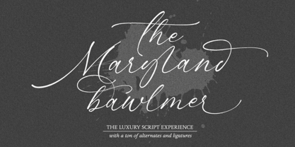 Maryland Bawlmer is a modern and luxurious calligraphy with a natural look. perfect for wedding invitations, calligraphy logos for branding, elegant websites, personalized gifts, social media posts, photography and more! Featuring 81 ligatures, 7 Alternate Set Styles (SS01-SS07) and Supports Western European, Central/Eastern European, Baltic, Turkish, Romanian Language Elegant, modern, luxurious, stylish and a natural touch blended in Maryland Bawlmer
 - Mr Mixter by Letterhead Studio-YG,
$34.00 Mr. Mixter designed to blend everything with everything. Mix Latin letters with Cyrillic letters, add numbers as letters — just have fun with the mixing process. As a result, you might get a funny and cute Christmas card. Attention! Work only by hand, using the Glyphs menu in Illustrator or InDesign. Look carefully and you will find a lot of fun.
 - Hosperity by Letterhanna Studio,
$19.00 Introducing "Hosperity" – a captivating handwritten script font that blends artistic elegance with modern flair. Crafted by a talented font maker from Indonesia, this font is a testament to creativity and precision. With its flowing strokes and unique character, "Hosperity" adds a touch of personal charm to your designs. Whether you're designing invitations, branding materials, or any creative project, "Hosperity" is your ideal choice.
 - JabcedHy by Ingrimayne Type,
$5.95 JabcedHy is a serifed, legible typeface in four weights with each weight having both an upright and an italic style. The original four fonts (plain, italic, bold, and bolditalic) were constructed by blending two other typefaces, and because the result seemed better than either parent, the parents were retired. Semibold and extra bold weights were added in a 2019 revision.
 - Brownwood NF by Nick's Fonts,
$10.00The inspiration for this typeface was discovered on a 1906 travel poster, promoting the Hotel Braunwald, located in the Swiss Alps. Its odd blend of Art-Nouveau-meets-the-Old-West makes for fetching heads and subheads. Both versions include the complete Unicode Latin 1252, Central European 1250 and Turkish 1254 character sets, as well as localization for Lithuanian, Moldovan and Romanian. - ABTS milk by Albatross,
$19.00 ABTS milk is fresh and fun script typeface with a unique blend of masculine, feminine, slab, serif, and sans-serif characteristics. The combination creates endless possibilities for different applications and breathes more personality into the typeface itself. With 384 glyphs, ABTS milk covers a wide range of languages and dialects, and also includes symbols, as seen in the gallery images.
 - High Performance by Sabrcreative,
$25.00 Unleash the power of creativity with the High Performance Font, a captivating display hand brush typeface designed to elevate your designs. Whether you're crafting attention-grabbing headlines, posters, or branding materials, this font adds a dynamic and expressive flair to your work. Its seamless blend of uppercase and lowercase characters provides versatility, ensuring your typography stands out with a personalized touch.
 - Resvina by Yohanes Oktav,
$15.00 Resvina is a Serif Display Typeface that seamlessly blends classic elegance with a modern touch. With its sophisticated serifs and high contrast, it commands attention for headlines and titles. What sets Resvina apart is its extensive alternates and ligature options, providing designers with creative freedom and versatility. Ideal for projects that demand refined typography, Resvina adds a timeless charm to any design
 - Cardin by Flavortype,
$19.00 We're introducing Cardin, A Big, Bold, Juicy script paired with bold serif. A captivating duo that effortlessly combines the bold playfulness of script with the timeless elegance of serif. With two distinct styles, this font set offers the perfect blend of contemporary trends and a touch of vintage allure, resulting in a harmonious balance that is both visually striking and versatile.
 - Kaldi by Hemphill Type,
$18.99 Kaldi is a tall condensed typeface that has gone through a natural process of handcraft and refinement to produce a speciality blend. On consumption expect light and dense notes with an earthy undertone. This font family was inspired by the legend of Kaldi – the goat herder who discovered the coffee plant after his goats started dancing after eating the coffee cherries.
 - Cosmic Miles by Four Lines Std,
$15.00 Introducing Cosmic Miles: A Captivating Handwritten Font for Inspiring Quotes. Elevate your designs to new celestial heights with Cosmic Miles, a stunning handwritten font designed specifically to breathe life into your favorite quotes. With its unique blend of thick and rounded strokes, this font encapsulates a sense of warmth and charm, adding a touch of cosmic magic to any project.
 - Ethereal Havena by RagamKata,
$16.00 Ethereal Havena, a typeface exuding femininity and beauty, combines the delicate strokes of serif typography with the elegant touch of ligatures. Perfect for diverse applications seeking a graceful and sophisticated aesthetic, it graces luxury branding, fashion editorials, and lifestyle magazines with its refined allure. Crafted with expertise, Swagume harmoniously blends modernity with timeless beauty, presenting a distinctive style that encapsulates grace and poise.
 - ITC Esprit by ITC,
$29.99ITC Esprit is the work of designer Jovica Veljović and blends the classic proportions of a serif typeface with the grace and charm of calligraphy. Highly legible even in small point sizes, the font can also be used as an impressive display face for use with sans serif text. In 2010 Veljovic revised this family and released this as ITC New Esprit. - CalliSans Variable by 38-lineart,
$140.00 Hello. this is the variable version of CalliSans : a revolution in typography. 14 fonts, 7 regular and 7 italic, seamlessly blend calligraphy's grace with sans-serif simplicity. Perfect for projects demanding elegance, from books to digital screens. Make a bold statement with its distinctive style. Timeless yet contemporary, it transcends trends. Your creative secret weapon. CalliSans Pro: where art meets design.
 - Untitled-1 - Unknown license

- Scriptonah Pro by Jonahfonts,
$45.00 Scriptonah-Pro now with Central European Diacritics and Improved kerning.
 - Modulus Pro by Arkitype,
$16.00 Modulus Pro, the extensive update to Modulus. This update was built around the original Modulus Font. This rounded sans-serif has a larger glyph set which covers many languages. Modulus Pro now comes in 8 weights from Extra-Light to Black. This updated version was designed with the designer in mind, you have many stylistic alternates to get creative with and make some really cool customised typography. A large range of examples have been designed to show just how versatile and creative you can get with this font family. It's fun but has a cool, edginess to it at the same time. Modulus Pro is not just another rounded sans-serif, you are going to want this in your font list.
 - Cassandra Plus by Wiescher Design,
$49.50 Cassandra Plus is my revised version of Cassandra, it can now be used all over Europe except Greece and Russia. I changed the weights a bit to make them more distinct. The Font has two widths of letters, wide Capitals on the (shift) uppercase-keys and narrow ones on the (no shift) lowercase-keys. You can match them as you like, but you should avoid having the same letter in one word in two different widths. But if yoyu are really daring you can use one narrow S and a wide one, it might still look good. It will almost always look good! Cassandra is my “bow” to Adolphe Mouron Cassandre. Yours sincerely mixing things up for you again Gert Wiescher
 - Alderney by Fontelan,
$18.99 Alderney is a friendly font family in three weights, Light, Regular and Bold, designed by Stephen E Rowe for the foundry Fontelan. It is a gentle script crafted for more relaxed display needs, but, being oblique in character, it gives an air of excitement to many projects, especially in all caps situations. Unlike many scripts, the capitals can be successfully used as a great display option. All glyphs have a smooth curve and a broad, flowing, low aspect. The light version lends itself to airy design possibilities, again, especially when the caps are used for display purposes. The regular version is a well balanced script that remains spacey and elegant, and the bold version is excellent for a display that suggests excitement.
 - Honesty Sans by Océane Moutot,
$32.90 Honesty was the first font published by the Studio in 2020. It was a typeface with flared stems. 2 years later, we are now publishing Honesty Sans. It is inspired by the original design but is revisited as a sans serif this time. Honesty Sans keeps the inspiration from the incise genre and font such as Albertus or the Trajan but with softness, thanks to its low contrast and smooth curves. Honesty Sans is highly lisible, which offers a variety for use, from titles, edition of texts, branding, magazines and so on. Its large variety of glyphs, including accents, old-style numbers and ligatures will give uniqueness to your designs. Honesty Sans is available in 16 styles, from thin to heavy in roman and italic.
 - Mestika Arabic by Boharat Cairo,
$20.00 Mestika is a resinous spice, in Arabic means gum, the name is Mestika cause the mestika has a mixture of sharp edges and cursive connections, that mixture gives the typeface an edge to stand out, a low contrast sharp design with 9 weights making it works well with text and headlines. The design is a collaboration with the Iranian designer Kamyab Jafari, The typeface is a modern design, and has a wide range of ligatures and features for better justifications. The typeface comes with 9 weights, and works in variable axes, the typeface now supports only Arabic-based languages, but in the near future, it would support Latin-based languages, the Typeface is based on Naskh calligraphy, something in between the Iranian and the Arabic styles.
 - Kestrel Script by Alan Meeks,
$45.00 Originally designed in 1985 and released by Letraset for dry transfer Lettering, Kestrel has, until now, never been digitized. The face now has been completely re-drawn and digitized for all formats. It is a heavy formal script similar in form to Commercial Script.
 - OilBats - Unknown license

- RobustA - Unknown license


