5,184 search results (0.013 seconds)
  1. LA Heat by TypeSETit, $24.95
    It's fun and funky.
  2. La Quinta by Jonahfonts, $42.00
    La Quinta is a display font for some small text and logo applications as well as branding, invitations, stationery, packaging, fliers, gaming texts and book jackets. Plus many other applications at the discretion of the designer.
  3. La Flama y La Espina - Personal use only
  4. La Flama y La Espina - Personal use only
  5. Ananda Black Personal Use - Personal use only
  6. Black Jack Personal Use - Personal use only
  7. Black Shirt Slime Trail - Unknown license
  8. SF Archery Black Shaded - Unknown license
  9. SF Archery Black Outline - Unknown license
  10. Mute Fruit Black Krash - Unknown license
  11. SF Archery Black Outline - Unknown license
  12. 11S01 Black Tuesday Italic - Unknown license
  13. SF Archery Black SC - Unknown license
  14. Black boys on mopeds - Unknown license
  15. Loud noise Black Skew - Unknown license
  16. 11S01 Black Tuesday Offset - Personal use only
  17. SF Archery Black Shaded - Unknown license
  18. SF Archery Black SC - Unknown license
  19. Quality Capcay Black Light by Sulthan Studio, $6.00
    Quality Capcay Black is a handwritten that comes with three fonts. This font is fresh and cute and it will be fun for you when use it. File include - Quality Capcay Black(line). otf/ttf - Quality Capcay Black(light). otf/ttf - Quality Capcay Black. otf/ttf
  20. H74 The Black Bureau by Hydro74, $9.99
    The Black Bureau is a slab structure. Uppercase only.
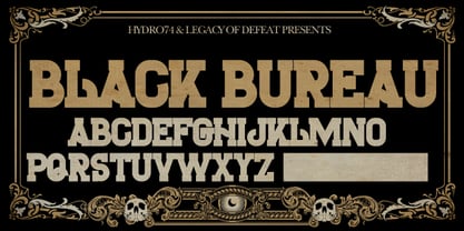
  21. Archive Black Title Text by Archive Type, $19.95
    Blackletter typeface.
  22. Morse Black Metal Font by Tebaltipis Studio, $59.00
    Morse Font is a cool alternative for you to easily create a logo for your Underground band or whatever. Using alternate front and ending letters brings the font to life, It comes with a basic character set and a small group of symbols and signs often used in the extreme music sector.
  23. Dezter Black Metal Font by Tebaltipis Studio, $35.00
    Morse Font is a cool alternative for you to easily create a logo for your Underground band or whatever. Using alternate front and ending letters brings the font to life, It comes with a basic character set and a small group of symbols and signs often used in the extreme music sector.
  24. Futura Black Art Deco by URW Type Foundry, $39.99
  25. H74 Black Label Whiskey by Hydro74, $25.00
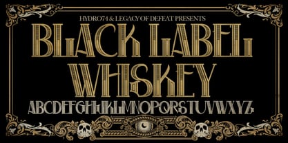
  26. Well Said Black NF by Nick's Fonts, $10.00
    This commanding typeface is based on Welling Black, a Fotostar offering from the 1970s. Equally well suited for headlines and subheads. Both versions support the Latin 1252, Central European 1250, Turkish 1254 and Baltic 1257 codepages.
  27. Display Black Serif Rough by Gerald Gallo, $20.00
    Display Black Serif Rough is a rough version of my font Display Black Serif . It is a display font not intended for text use. It was designed specifically for display, headline, logotype, branding, and similar applications. Display Black Serif Rough has an uppercase alphabet located under the character + shift keys and a complete set of alternate uppercase characters located under the character set keys. It also has numbers and punctuation.
  28. P22 Pooper Black Pro by IHOF, $39.95
    Pooper Black Pro is based on a brush ethic and has an extreme axis that lends a certain amount of speed to the font while the lack of connectors slows it down. The pro version expands on the original and popular Pooper Black with the addition of full Central and Eastern European character sets and plenty of alternate characters for those who have applications that support Opentype features. Almost all of the lower case characters now include an in stroke and out stroke version for greater design flexibility. A wonderful face for packaging, titling, and short bursts of text.
  29. XXII BLACK-BLOCK-SERIFA by Doubletwo Studios, $22.22
  30. LHF Black Rose Script by Letterhead Fonts, $59.00
    Nearly 2 years in the making, LHF Black Rose Script is the perfect blend of hand-lettering and modern technology. This beautiful script is loaded with features, such as automatic ligatures, discretionary ligatures, bonus ending characters, swashes, and several alternates (302 glyphs to be exact). You receive 3 versatile fonts to match different moods: Regular, Block Shadow (placed under Regular), and an expertly-crafted Inked version which has been distressed to look like freshly inked lettering. One look at your designs and your clients will fall in love with Black Rose Script. And with so many carefully designed alternates to use, they'll probably think you hand-lettered it yourself!
  31. BIG Slant Black UltExp - Personal use only
  32. View Slant Black ExtExp - Personal use only
  33. Lost at sea GM - Unknown license
  34. FF DIN Slab Variable by FontFont, $419.99
    FF DIN: the famous, faithful and first revival of DIN 1451. FF DIN originates in the lettering models from the German standard DIN 1451, and is considered the perfect standard typeface due to methodical and engineered design. FF DIN Slab is a robust compliment to the FF DIN family. Designed by Antonia Cornelius and Albert-Jan Pool, it offer designers tools to create greater rhythm and design depth. FF DIN Slab’s proportions have been meticulously aligned with its Sans origins, offering the perfect balance between positive and negative space. The serifs are assertive, sturdy and balanced, they are engineered to emphasis a strong horizontal flow through text, a grounded utility and assurance in headlines. The result of this attention to detail is a typeface that harmonizes beautifully with other FF DIN styles. Pushing font technology to its limits, FF DIN Slab is also available as a Variable font. Allowing creatives to design hyper specific variations which thrive in any design space, and even seamlessly animate movement from one state to the next. FF DIN Slab distinctively carries on its parent’s DNA, speaks the same native language — but with a strong peculiar dialect. It expands the DIN family worthily — independent but integrated — and opens totally new possibilities of uses with the whole DIN family.
  35. Sea of Japan JNL by Jeff Levine, $29.00
    A 1922 piece of sheet music entitled “Japanese Sailor” had its title hand lettered in a Far Eastern motif. This design is now available as Sea of Japan JNL, in both regular and oblique versions.
  36. PF Bague Slab Pro by Parachute, $79.00
    PF Bague Slab Pro draws its inspiration from early 20th century slabs and was designed as a companion to Bague Sans, a versatile monoline typeface with a distinct and eye-catching personality. Following its predecessor’s design guidelines, it overcomes the monotonous and mechanical rigidity of early geometrics by introducing subtle variations in stroke width and semi-wedge serifs rather than square slabs. These striking serifs, along with a mixture of attractive letterforms, exude a strong, modern and energetic personality at display sizes. On the other hand, at small sizes these distinct characteristics become subtle and the simplistic geometric personality of the typeface comes in place to offer a highly readable text. Bague Slab Pro is a very clean and legible typeface with a warm and well-balanced texture which is ideal for editorial design, branding and corporate identity. This superfamily includes 18 weights from Hairline to Ultra Black with a consistent and well-refined structure. The italics are slightly narrower than the romans with cursive characteristics. Each style consists of 718 glyphs with 13 opentype features and an extended set of characters which supports simultaneously Latin, Cyrillic and Greek. PDF Specimen Bague Slab Pro on Behance
  37. PF Centro Slab Press by Parachute, $75.00
    Centro Slab Press: Specimen Manual PDF Ever since its first release, Centro Slab has been particularly popular with corporate applications, branding and print media. The new Centro Slab Press version was redesigned with narrower proportions which are better suited for publications such as magazines and newspapers as well as web applications. Centro Slab Press is a very clean and legible typeface even at heavier weights, a characteristic which is not often seen among slab typefaces. This is part due to the fact that Centro Slab Press is not overpowered by clumsy serifs. Instead it incorporates semi-slabs which provide comfortable reading without compromising its modern profile. The italics are narrower than the romans and incorporate beautiful cursive characteristics. Each style consists of 659 glyphs with several opentype features and an extended set of characters which support more that 100 languages such as those based on the Latin, Greek and Cyrillic alphabet. The family is composed of 16 styles from ExtraThin to UltraBlack along with their italics. All weights were meticulously hinted for excellent display performance on the web.
  38. French Slab Serif JNL by Jeff Levine, $29.00
    Another example of 1930s French Art Deco lettering from the 1934 publication L'Art du Tracé Rationnel de la Lettre (which roughly translates to “The Rational Path Art of the Letter”) resulted in the digital typeface French Slab Serif JNL. This bold and slightly eccentric slab serif design is available in both regular and oblique versions.
  39. FF Signa Slab Stencil by FontFont, $72.99
  40. AW Conqueror Std Slab by Typofonderie, $59.00
    Slab serif with a 70’s aesthetic A version of AW Conqueror Sans, AW Conqueror Slab draws inspiration from geometrical slab serifs of the 1930s, of which Rockwell is a perfect example. Lubalin Graph, a reworking of the genre, came out in the wake of the Avant Garde wave of the early 70s. In recent years, ‘slabs’ have made a comeback in the graphic design world. AW Conqueror Slab advances the cause quite happily. AW Conqueror superfamily AW Conqueror Didot is part of a larger family, who include 4 others subfamilies with great potential: They’re but based on same structure, with some connection between them (width for example), to offer a great & easy titling toolbox to any designers, from skillful to beginner. Each of the members try their best to be different from the others because of their features. They should work harmoniously in contrast. Club des directeurs artistiques Prix 2010 European Design Awards 2011
Looking for more fonts? Check out our New, Sans, Script, Handwriting fonts or Categories
abstract fontscontact usprivacy policyweb font generator
Processing