2,969 search results
(0.009 seconds)
- Mod Blaq by Throndsen,
$10.00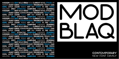
- Allumi Std by Typofonderie,
$59.00 Technology in mind in 12 fonts Allumi is a different font. Different from anything Jean François Porchez has designed in the past. Allumi is a sleek typeface designed with technology in mind. It’s a perfect font family for any communication concerning design, robotics, or functionality. Pushed to its extreme limits, the Allumi shapes are neither perfectly round or geometrically square. It’s a human design with a high tech touch. Allumi can be described as the Eurostyle (designed by Aldo Novarese in 1964) of the new century, mixed with Frutiger. Allumi is a serious typeface because of the unique design and sturdy form. The pure shapes can create a global presence today with an eye on the world of tomorrow. Two widths The Allumi family has been built around two series of widths, standard and extended. Italics have been carefully designed as slanted roman with all necessary optical and human corrections to create a perfect and neat italic. I Love Typography 2009
 - MTC Agrinaya by Martype co,
$22.00 Agrinaya is a condensed display font with high contrast and feels like a serif style to make it more stylish and modern, this font is made for logotypes, branding, editorial designs, and more. Thank You & Happy Designing!
 - Mariné STD by TipoType,
$19.90Mariné STD is a geometric sans but with the softness of humanistic strokes. It’s mild contrast and multiple different styles allow Mariné to work well as both a text and display font. Mariné STD is a selected version of Mariné Family. - Ideal for print and identity works. - Works well for text or display uses. - Designed for web and apps. - Look serious or look casual. - Mencken Std by Typofonderie,
$59.00 An American Scotch remixed in 27 fonts Mencken has twenty seven styles, divided into three widths, three optical sizes, romans and italics. Generally, optical size typeface families belong to a same common construction. It falls into the same category of type classification, while presenting different x-heights or contrasts. Mencken is unique because it is designed according to different axis and optical sizes. Firstly, Mencken Text is a low-contrast transitional typeface, designed on an oblique axis, asserting horizontal with featuring open counters. Its capitals follow Didots to better harmonize the rest of the family. On the other side of the spectrum, Mencken Head (and narrow variations) is designed on a vertical axis, high contrast, in a contemporary Didot style. The Mencken is therefore a typeface answering to different sorts of uses, whose design is different according to its uses: from oblique axis in small size to vertical axis in large sizes. Vertical proportions (x-height, capitals height, etc.) were calibrated to be compatible with many Typofonderie typeface families. Lucie Lacava and I followed the idea launched by Matthew Carter few years ago for some of his typefaces intended for publications. From Baltimore Sun’s project to Typofonderie’s Mencken It is a bespoke typeface for American newspaper The Baltimore Sun started at the end of 2004 which marks the beginning of this project. The story started with a simple email exchange with Lucie Lacava then in charge of redesigning the American East Coast newspaper. As usual, she was looking for new typeface options in order to distinguish the redesign that she had started. At the time of its implementation, a survey of the newspaper’s readers has revealed that its previous typeface, drawn in the mid-1990s, was unsatisfactory. The Mencken was well received, some reader responses was particularly enjoyable: “It’s easier to read with the new type even though the type is designed by a French.” Why it is called Mencken? The name Mencken is a tribute to H. L. Mencken’s journalistic contributions to The Sun. According to the London Daily Mail, Mencken ventured beyond the typewriter into the world of typography. Because he felt Americans did not recognize irony when they read it, he proposed the creation of a special typeface to be called Ironics, with the text slanting in the opposite direction from italic types, to indicate the author’s humour. Affirming his irreverence, the Mencken typeface does not offer these typographic gadgets. Henry Louis Mencken (1880 — 1956) was an American journalist, satirist, cultural critic and scholar of American English. Known as the “Sage of Baltimore”, he is regarded as one of the most influential American writers and prose stylists of the first half of the twentieth century. He commented widely on the social scene, literature, music, prominent politicians and contemporary movements. Creative Review Type Annual 2006 Tokyo TDC 2018
 - Retiro Std by Typofonderie,
$59.00 Full of life Hispanic Didot in 2 optical sizes Retiro is a daring interpretation of Spanish typography. Severe, austere and yet, full of life, Retiro is a vernacular version of Castilian and Andalusian in a typical Didot. Named after a lovely park in Madrid, Retiro started life as a a bespoke typeface designed to give a unique voice to the magazine Madriz. In 2006, the founder of Madriz was looking for a Didot for his new magazine. The Didot is the archetypal typeface used in high-end magazines. Retiro is a synthesis of these high contrast styles mixed with an Hispanic mind. Result is then, after 2-3 years of work, a typeface with countless variations to establish typographic shades adapted to different sections and pages of the Madriz. In 2014, it was necessary to further revise the typeface before its launch at Typofonderie. In order to keep its originality, the unique weight was retained, but complemented with optical size variants to set highly contrasted headlines into various sizes, visually balanced. How to use Retiro optical sizes? Each font provided in Retiro family is named according to the scale of body size: 24 pt and 64 pt. Of course, these names are referring to the body sizes used in typographic design. In the “glorious old days,” the letterpress period, it was customary to cut punches directly to the size at which typefaces would be used. The punchcutter had to visually adapt his design to the engraving size. The aim was to optimize the best contrast and general weight, but also to respect both design’s and reader’s needs. In Retiro’s case, intended for large titling sizes, it’s an adaptation of this ancient practice for our contemporary uses. Although each font is named by a typographic point size, do not feel obliged to use this font at this precise size, but why not, in larger or smaller. It’s rather the concept of gradients that must be preserved in layouts, rather than strictly size numbers. It’s up to the designer to select the right font size for his own designs. Granshan Awards 2012 Creative Review Type Annual 2011 Designpreis 2011 Club des directeurs artistiques, 41e palmarès Type Directors Club 2010 Certificate of Type design Excellence
 - Shearman Std by UFF,
$25.00 Shearman STD has a simple design, based on industrial fonts, in particular at the typewriters fonts. It's a geometric font with curves elimination, noting in particular the O and Q letters. It has smooth angles and clean forms which combine in a font with modern appearance. It include five weights with two italics and an extended European character set.
 - Robox Std by Elemental Type,
$19.99 A unique sans serif typeface created from geometric shapes like perfect circles and straight stems with half-rounded endcaps. Simple, yet complex, this typeface is akin to other classics, like Avant Garde and Bauhaus, in that it can be used in modern, friendly or futurist designs. Whether your intent is serious or playful, the versatility of Robox has you covered.
 - Uncut Madness by Mirco Zett,
$15.00 Uncut Madness is a another horror genre font, inspired by vintage movie posters, books and vinyl covers. Including some bloody extras... ;) Made for logos, headlines, apparel design etc.
 - Anisette Std by Typofonderie,
$59.00 A geometric Art Déco multi-widths type family Anisette has sprouted as a way to test some ideas of designs. It has started with a simple line construction (not outlines as usual) that can be easily expanded and condensed in its width in Illustrator. Subsequently, this principle of multiple widths and extreme weights permitted to Jean François Porchez to have a better understanding with the limitations associated with the use of MultipleMaster to create intermediate font weights. Anisette is built around the idea of two widths capitals can be described as a geometric sanserif typeface influenced by the 30s and the Art Deco movement. Its design relies on multiple sources, from Banjo through Cassandre posters, but especially lettering of Paul Iribe. In France, at that time, the Art Déco spirit is mainly capitals. Gérard Blanchard has pointed to Jean François that Art Nouveau typefaces designed by Bellery-Desfontaines was featured before the Banjo with this principle of two widths capitals. A simple sentence will be as diverse in its representations, as the number of Anisette variables available to the user. With Anisette, typography becomes a game, as to design any title page as flamboyant as if it has been specially drawn for it. Two typefaces, many possibilities The complementarity between the two typefaces are these wide capitals mixed with narrow capitals for the Anisette while the Anisette Petite – in its latest version proposes capitals on a square proportions, intermediate between the two others sets. Anisette Petite proposes capitals in a square proportion, intermediate between the two other sets, all of which are interchangeable. In addition, Anisette Petite also includes a set of lowercase letters. Its style references shop signs present in our cities throughout the twentieth century. Anisette, an Art Déco typeface Anisette: Reveal your typographic expertise Club des directeurs artistiques, 46e palmarès Bukva:raz 2001 Slanted: Contemporary Typefaces #24
 - MTT Roma by MTT Type Firm,
$39.99 MTT Roma is designed to re-create the atmosphere of the city of Rome of the 21st century. The studio for the letterform evolved from the Trajan Column alphabet. Suitable for both display and body-text usage, stylistically MTT Roma aims to distance itself from the proliferation of geometric sans-serif families of its time. The result is a sharp, subtly humanist typeface inspired by modern day Rome, the city of contrasts and eternal beauty. Featuring an extended character set to support Central and Eastern European as well as Western European languages, the typeface comes with six weights – from thin to black — with matching italics.
 - Mislab Std by Typofonderie,
$59.00 A brighter slab n’ sans in 18 styles Referred to as Egyptian’s in the early years of the nineteenth century, today slab serifs are primarily used in display sizes but seldom used in body text. With Mislab, Xavier Dupré has designed a brighter and more legible slab serif than most. Mislab aptly combines the strength of a slab serif with the lightness of a sans serif. Bold and thick serifs make for strong impact in display uses while performing extremely well under the most stressful body text conditions. A slight cursive feel adds spice to the text while its delicate rounded rectangular structure is naturally adapted to screen displays. The capitals have fully assumed serifs while the lowercases have more discreet versions. Notable features include sanserif endings on the lowercase a, c, e & s, inducing fluidity and enhanced readability. This highly versatile typeface brings clarity to headlines. Mislab will provide foolproof stability to your layouts. Mislab, a new design by Xavier Dupré Type Directors Club 2014 Tokyo TDC 2014 Communication Arts Typography Awards 2014 Club des directeurs artistiques, 45e palmarès Slanted: Contemporary Typefaces #25
 - Madness Attitude by IKIIKOWRK,
$19.00 Proudly present Madness Attitude - Street Brush Type, created by ikiiko. Inspired by the brush strokes on the street, where the raw, rough lines show a strong character of freedom expression. The font has a sloppy & dirty stroked texture, so it fits perfectly for making a poster, magazine layout, youth stuff, sleeve cover, party flyer, quotes, or simply as a stylish text overlay to any background image. What's Included? Uppercase & Lowercase Numbers & Punctuation Multilingual Support Works on PC & Mac Enjoy our font and if you have any questions, you can contact us by email : ikiikowrk@gmail.com
 - Chevin Std by G-Type,
$60.00 Chevin is a contemporary rounded type family in 6 weights which was designed with functionality and legibility in mind. With its open counters and slightly condensed style Chevin can be used for text and is particularly suited to signage. Erik Spiekermann is a fan, noting that Chevin “is charming without being cute, and very legible even in small sizes because of its restrained shapes and simple construction.” Chevin is named after a hill on the outskirts of Otley in West Yorkshire. Since 2007 the type family has been highly prominent in the UK as Royal Mail’s corporate font and the typeface that adorns every Post Office in the country. The Chevin Pro set includes additional Greek and Cyrillic layouts.
 - Giom Mod by Ardyanatypes,
$15.00 Giom Mod is a unique and elegant display font with a distinctive serif style. This font offers nine different thickness options, ranging from Thin to Black, providing a wide range of choices for various applications. Each thickness of Giom Mod has its own unique characteristics, allowing you to select the one that best suits your design aesthetics. For example, Thin may be suitable for light and elegant designs, while Black can be used for more dramatic and bold appearances. Furthermore, Giom Mod comes equipped with various OpenType features. These include features such as ligatures, which allow specific characters to combine beautifully, and alternative letterforms that provide more design options. With these features, you can create more engaging and unique text elements in your designs. Additionally, Giom Mod is designed to support multiple languages, making it suitable for use in many countries. This makes it highly versatile and appropriate for a wide range of multilingual design projects. So, if you are looking for a font that combines the beauty of serif with various thickness options, useful OpenType features, and multilingual support, Giom Mod is the perfect choice to meet your design needs.
 - Ambroise Std by Typofonderie,
$59.00 An exquisite Didot font in 18 series Ambroise is a contemporary interpretation of various typefaces belonging to Didot’s late style, conceived circa 1830, including the original forms of g, y, &; and to a lesser extent, k. These unique glyphs are found in Gras Vibert, cut by Michel Vibert. Vibert was the appointed punchcutter of the Didot family during this period. It is the Heavy, whom sources were surest that Jean François Porchez has been used as the basis for the design of the typeface family. In the second half of the 19th century, it was usual to find fat Didots in several widths in the catalogs of French type foundries. These same typefaces continued to be offered until the demise of the big French foundries in the 1960s. Ambroise attempts to reproduce more of what we see printed on paper in the 19th century; a more accurate representation of Didot punches. So, the unbracketed serifs are not truly square straight-line forms but use tiny transitional curves instead. The result on the page appears softer and less straight, particularly in larger sizes. The illustrious Didot family of type founders and printers Every variation of the typeface carries a name in homage to a member of the illustrious Didot family of type founders and printers. The condensed variant is called Ambroise Firmin. The extra-condensed is called Ambroise François. Ambroise Pro brought back to life: fifteen years in the making! Club des directeurs artistiques, 48e palmarès Bukva:raz 2001
 - Airco Std by Typofonderie,
$59.00 Designed between italic and script styles Airco is a typeface designed between italic and script styles. The letterform finish is rounded. Designed ultra slanted (27°), the shapes evoke a fast and assertive movement. The result is a human typeface, dynamic, that will visually work well in technology and sport, without ever being dry, rigid or dehumanized. The structure of the letters is influenced by Renaissance italics, at the difference that in the case of Airco, the lowercases and capitals are visually homogeneous thanks to the giants lowercases. In fact, the default numerals can be used in capital as well lowercases settings.
 - Diversa Std by DSType,
$10.00 DSType proudly presents Diversa Std, the same system as Diversa, but with separate styles: Serif, Serif Stencil, Inline, Soft Serif, Sans, Sans Stencil, Slab, Slab Stencil and Baroque. Diversa Std: Because uniformity still sucks!
 - MTC Maglita by Martype co,
$59.00 MTC Maglita is a semi-slab serif font that comes with seven styles for display purposes to make it satisfying, also suitable for minimalist, chic, branding, packaging, and logotype design to boost your design exploration. Additional Information Comes with many iconic symbols and arrows (which can be accessed from glyphs in your Adobe software) Multilingual Support supports many different languages 20+ Seven styles to make it more versatile typefaces Thanks & Happy Designing! Umar
 - Scissor Madness by Hanoded,
$15.00 Back in 2017, I was working on a cutout font that I originally wanted to call Scissor Madness. In the end, I named it Cut Along and it was quite a popular font for a while. This week I decided to clean up my fonts folder a bit (as I usually have tons of unfinished fonts lurking in there) and I found a file named Scissor Madness. It was the original try-out for Cut Along. It contained a couple of nice glyphs that I never used, so I started playing around with them and after a day, I had a whole new font! So, in short, Scissor Madness was partly cut out by hand, partly computer made, but it is 100% fun to use! Scissor Madness comes with a bunch of very cute discretionary ligatures.
 - Hippie Mods by Jolicia Type,
$19.00 Hippie Mods is a font that takes you back to the psychedelic era of the 1960s and 70s. This fun and retro typeface is a true embodiment of the free-spirited movement, peace and love, capturing the essence of the countercultural revolution in its design. It is the perfect choice for projects that demand a touch of nostalgia and strong individuality. The font's flowing curves, hand-drawn feel, and vintage details evoke the spirit of a bygone era. With a natural color palette and versatile design, Hippie Mods are the perfect choice for adding a touch of nostalgia and whimsy to your creative projects. This typeface will also make your projects radiate the strong spirit of the Hippie era, whether you are creating art, posters, or branding.
 - Black Madness by Mirco Zett,
$12.00 Black Madness is a font inspired by blackletter typography, but instead of clean and accurate lines I gave it an more abstract and intuitive look. Like most of my fonts, Black Madness is made for logos, headlines and other typography related work.
 - Lovely Madness by Mirco Zett,
$18.00 Lovely Madness“ is a modern calligraphy font, which is a hybrid out of various types of calligraphy - based fonts. Lovely Madness“ is elegant and at the same time playful, as well as rough and maybe a little bit creepy. That is why there is a wide application possibility for this font and "Lovely Madness“ allows you to give your calligraphy – based creations a new touch.
 - Audace Std by Typofonderie,
$59.00 Between geometry & shapes inspired by nature, in 4 fonts Audace was born as a response to a simple brief: how to visually express human interaction and technology with abstract forms? The starting point is a humanistic sanserif, to which are added external references: design pieces, furniture, buildings. Architects shape our world with the intention to reconnect nature, human and address a perfect functionality. Not so far to typeface design which combines a personal vision and ensures good legibility in a certain context. Audace — like the works of those artists, designers, architects — is clearly influenced by the tension of the line, the play with negative space, the dynamics, the surprise, the nature that will influence the shapes of the letters. So if a v is asymmetrical, and the y based on similar asymmetry but in reverse, these two shapes help to distinguish from one to the other. This is a consequence of the influence of forms from design and art in the design of the Audace. And this small example illustrates the confrontations of the designer’s influences: the search for the most unique shapes, but without compromising on function: to be read, to be legible, even at very small size in the worst conditions. Audace, between geometry and shapes inspired by nature
 - Mad Props by Graffiti Fonts,
$19.99Classic & clean tag style lettering that's easy to read & flexible. Mad Props includes 2 full alphabets, full numbers, punctuation & other symbols. This style works well with outlines & effects. - Ardoise Std by Typofonderie,
$59.00 A straightforward sanserif in 20 fonts, 4 widths Ardoise met the needs of publications. By extension, it met the needs of a newpapers typeface featuring a low contrast, straightforward forms, as Franklin Gothic. The verticals metrics and proportions of Ardoise are calibrated to match perfectly others Typofonderie families. Four widths to answer all situations Ardoise, inspired by the needs of today’s fine newspapers offers simple and tense shapes designed to renew and revitalize. Ardoise could be considered as an homage to Antique Olive, but quite indirectly and as an organic result of the designer’s longstanding admiration of the work of Roger Excoffon. Ardoise shares a purity and dynamics with Excoffon’s designs giving it a unique elegance and excellent readability. Its sturdiness means it is virtually immune it to distortion. In addition, a few alternates glyphs (a, c, g) can be used to alter the overall tone of a text setting.
 - MTC Quinnie by Martype co,
$15.00 MTC Quinnie a condensed serif typeface with many alternates and ligature features good choice for designers and editorials. The use of many alternates and ligatures in these fonts adds visual interest and variety, allowing designers to create unique and customized typography. One notable aspect of these fonts is the smoothness of their serifs. The serifs, or small decorative flourishes at the ends of letter strokes, are an essential part of serif typefaces.
 - Teimer Std by Suitcase Type Foundry,
$75.00Typographer and graphic designer Pavel Teimer (1935-1970) designed a modern serif roman with italics in 1967. For the drawing of Teimer he found inspiration in the types of Walbaum and Didot, rather than Bodoni. He re-evaluated these archetypes in an individual way, adjusting both height and width proportions and modifying details in the strokes, thus effectively breaking away from the historical models he used as a starting point. Teimer's antiqua has less contrast; the overall construction of the characters is softer and more lively. The proportions of the italics are rather wide, making them stand out by their calm and measured rhythm. This was defined by the purpose of the typeface, as it was to be utilised for two-character matrices. The long serifs are a typical feature noticeable throughout the complete family of fonts. In 1967, a full set of basic glyphs, numerals and diacritics of Teimer's antiqua was submitted to the Czechoslovak Grafotechna type foundry. However, the face was never cast. At the beginning of 2005 we decided to rehabilitate this hidden gem of Czech typography. We used the booklet "Teimer's antiqua - a design of modern type roman and italics", written by Jan Solpera and Kl‡ra Kv’zov‡ in 1992, as a template for digitisation. The specimen contains an elementary set of roman and italics, including numerals and ampersands. After studying the specimen, we decided to make certain adjustments to the construction of the character shapes. We slightly corrected the proportions of the typeface, cut and broadened the serifs, and slightly strengthened the hair strokes. In the upper case we made some significant changes in the end serifs of round strokes in C, G and S, and the J was redrawn from the scratch. The top diagonal arm of the K was made to connect with the vertical stem, while the tail of Q has received a more expressive tail. The stronger hairlines are yet more apparent in the lower case, which is why we needed to further intervene in the construction of the actual character shapes. The drawing of the f is new, with more tension at the top of the character, and the overall shape of the g is better balanced. We also added an ear to the j, and curves in the r have become more fluent. To emphasise the compact character of the family, the lining numerals were thoroughly redrawn, with the finials being replaced by vertical serifs. The original character of the numerals was preserved in the new set of old-style figures. To make the uppercase italics as compact as possible, they were based on the roman cut rather than on the original design. The slope of lowercase italics needed to be harmonised. The actual letter forms are still broader than the characters in the original design, and the changes in construction are more noticeable. The lower case b gained a bottom serif, the f has a more traditional shape as it is no longer constricted by the demands of two-matrice casting, the g was redrawn and is a single storey design now. The serifs on one side of the descenders of the p and q were removed, the r is broader and more open. The construction of s, v, w, x, y, and z is now more compact and better balanced. Because Teimer was designed to make optimal use of the OpenType format, it was deemed necessary to add a significant amount of new glyphs. The present character set of one font comprisess over 780 glyphs, including accented characters for typesetting of common Latin script languages, small caps and a set of ligatures, tabular, proportional, old style and lining, superscript and fraction numerals. It also contains a number of special characters, such as arrows, circles, squares, boxed numerals, and ornaments. Because of its fine and light construction, the original digitised design remained the lightest of the family. Several heavier weights were added, with the family now comprising Light, Light Italic, Medium, Medium Italic, Semibold, Semibold Italic, Bold, and Bold Italic. - Mixink Std by MIX.Jpg,
$14.00 Mixink Std is a serif font features amazing swashes. It has a vintage feel and look that makes it perfect for any retro and nostalgic project.
 - Alpine Mtn by Wooden Type Fonts,
$15.00 Sans serif, bold, display font, useful for brochures and display advertising.
 - Kropotkin Std by sugargliderz,
$30.00 This typeface design was influenced by the British Rail corporate type introduced in an old lettering instruction book published in Japan. Of course, the only clue to this typeface is the lettering instruction book at hand. Therefore, this typeface is based on the British Rail corporate type introduced in an old lettering instruction book published in Japan, and I have expanded the design variations. I started with the Bold design first. Then I designed Light, Regular, and Black in that order. Light and Regular are intended to be used as the text type, while Bold and Black are intended to be used as the base for logotypes, headlines, and other eye-catchers.
 - Black Mud by Stripes Studio,
$20.00 Black Mud a new font that is brushed is very attractive with a natural, detailed and perfect texture, also has an additional Black Mud Underlines. Perfect for brand projects, logos, product packaging, posters, invitations, greeting cards, news, blogs, everything including personal charm etc.
 - Autobahn Std by AVP,
$18.00 Autobahn is a robust masculine sans of near monoline thickness and angular characteristics. Autobahn Std has a full Latin 1 character set but no CE, Cyrillic or Opentype features. For the extended character set and Opentype features, see Autobahn Pro.
 - Zosimo Std by Delicious Type,
$39.00 Zosimo is a neo-grotesque typeface created by designer Ron Gilad (Delicious Type) in cooperation with renowned typographer Oded Ezer based on his ubiquitous Alchemist typeface. Carefully drawn curves, robust shapes and a range of OpenType features make Zosimo a great choice for designing logotypes, signage, titling, texts and more. Zosimo now comes in three families: Standard (full Latin support), Cyrillic (basic Latin and Cyrillic) and Pro (all included). Totalling in 9 weights, roman and italic, Zosimo can accommodate all your type-related design needs in one big happy family.
 - MTF Noted by Miss Tiina Fonts,
$10.00 Noted is that perfect quirky font you'll use again and again! Mix and match upper and lowercase letters to create your own unique hand-jotted look!
 - Bulldog Std by Club Type,
$37.00
- Phoenica Std by preussTYPE,
$29.00 PHOENICA is a contemporary humanistic typeface family suitable for traditional high-resolution print purposes, office application and multi-media use. Of the creation formed the basis an idea which was developed for the first time by Lucian Bernhard approx in 1930 with the Berhard Gotic and was taken up in the last time by different written creators repeatedly: the repeated elimination anyway (in comparison to a Antiqua, e.g. Garamond) already very much diminished form Grotesque (as for example Helvetica) by systematic leaving out of the serifs. The horizontal direction of the writing is thereby stressed remarkably by which so-called »Rail effect« originates. The eyes can grasp the line to be read very well what is ordinarily left to a Serif-stressed font. By this desired effect is suited PHOENICA also for big text amounts. In numerous test runs Stems and tracking was compared to experienced fonts and was adapted. The experienced was taken over without renouncing, nevertheless, the modern and independent character PHOENICA. PHOENICA offers to you as a welcome alternative to the contemporary humanistic Sansserif. It is a very adaptable family for text and Corporate design uses. Several companies have discovered PHOENICA meanwhile as a Corporate font for themselves and use them very successfully. She provides a respectable typeface combined with refinement and elegance. Every PHOENICA family has at least six weights in each case in regular and italic. In addition more than three fine Haarline weights (Hairline 15, 25, 35). These are a total of 27 possibilities. Phoenica as well as Phoenica Condensed are excellently readable fonts, because they were optimised especially for amount sentence. Both basic styles (Regular and Condensed) are tuned on each other and follow the same form principle. The family is neither exclusively geometrical nor is constructed humanistically, the forms were sketched on quick and light Recognition effect of every single letter. The PHOENICA family design and logo is suited for all only conceivable uses like newspapers and magazines, for the book typography and Corporate Design.
 - Basco Std by Typofonderie,
$59.00 A mix of Renaissance & tropical atmosphere Basco is an exploration of the Renaissance style, a period in which letterforms were informed primarily by hand writing. It is clearly a contemporary interpretation of calligraphic shapes forms. The serifs are subtly asymmetrical. Slightly curved arches on the n, m and u are noticeable, creating an interesting tension in the text. Bruno Mello’s distinctive style is most obvious in his mastery of super fluid curves. It is a result of his extensive exploration of calligraphic forms, their tensions and dynamics, mixing angularities with curves. The roman weights include alternate swashes, as well as initial and terminal glyphs. The italics, based on chancellery script, feature simple stroke endings, most visible on the s and c. ➼ Basco minisite
 - Oksana Std by AndrijType,
$25.00 Oksana Std has only the Western Latin characters from multilingual Oksana. It has six weights with real italics, and Alt faces with Old Style figures, alternative characters -a-g-k-y- and ampersand. German großes Eszett is also included.
 - Rufina STD by TipoType,
$13.00 Rufina was as tall and thin as a reed. Elegant but with that distance that well-defined forms seem to impose. Her voice, however, was sweeter, closer, and when she spoke her name, like a slow whisper, one felt like what she had come to say could be read in her image. Rufina's story can only be told through a detour because her origin does not coincide with her birth. Rufina was born on a Sunday afternoon while her father was drawing black letters on a white background, and her mother was trying to join those same letters to form words that could tell a story. But her origin goes much further back, and that is why she is pierced by a story that precedes her, even though it is not her own. Maybe her origin can be traced back to that autumn night in which that tall man with that distant demeanor ran into that woman with that sweet smile and elegant aspect. He looked at her in such a way that he was trapped by that gaze, even though they found no words to say to each other, and they stayed in silence. Somehow, some words leaked into that gaze because since that moment they were never apart again. Later, after they started talking, projects started coming up and then coexistence and arguments, routines and mismatches. But in that chaos of crossed words in their life together, something was stable through the silence of the gazes. In those gazes, the silent words sustained that indescribable love that they didn't even try to understand. And in one of those silences, Rufina appeared, when that man told that woman that he needed a text to try out his new font, and she saw him look at her with that same fascination of the first time, and she started to write something with those forms that he was giving her as a gift. Rufina was as tall and thin as a reed, wrote her mother when Rufina was born.