10,000 search results
(0.035 seconds)
- [D]ONLINE by Don Citarella,
$20.00 [D]ONLINE is the first font family designed by Don Citarella for his blog, [D]ONLINE, and was created to provide a signature feel for its namesake. It combines a strong, medium stroke with arching end caps to embue the typeface with a futuristic curvilinear feel. This display font is best used for headlines, identities, wordmarks and other instances involving minimal copy and maximal whitespace The typeface includes 300 characters, including 45 accented glyphs and 30 ligatures.
 - Oilvare by Adam Ladd,
$25.00 Oilvare is a hand-drawn, layered typeface inspired by vintage painted signs and oil cans. While sturdy, it also has a softer side—wide proportions, oval-inspired forms, curled angle strokes, and a medium contrast all help give it a little bit of distinction from the typical sans serif. Mix, match, and layer the styles to your liking. Carefully drawn, when you enlarge the typefaces, the subtle irregularities become more apparent and harken to hand lettering of the past.
 - Quietism Variable by Michael Rafailyk,
$150.00 A smooth contemplative Antiqua with aspiring to the sky ascenders, inspired by the Quietism philosophy. Clarity of the mind is achieved by bringing the body into a state of calm and contemplation, and this is reflected in the design – the quiet horizontal serifs (body) are opposed to the peaky soaring ascenders (mind). The design also features four optical size subfamilies with different x-height and contrast, oldstyle diagonal stress, oldstyle figures by default, smooth details and slightly dark texture. Variable axes: Weight, Contrast, X-Height. Scripts: Latin, Greek, Cyrillic. Languages: 480+. The complete list of supported languages: michaelrafailyk.com/quietism Kerning: 4553 class-to-class pairs. Hinting: Not applied. Format: TTF – OpenType with TrueType outlines. Variable Font: Quietism Variable provides more options than static versions, and has three axes: Weight (Thin–Black), Contrast (Low-High), and X-Height (Low-High). Variable fonts includes thousands of styles that you can access using a sliders on graphic editor or via CSS on web browser. Mixing different axes gives you extra styles not represented by static fonts. Optical Size: The typeface is represented by four subfamilies: Text (low contrast, high x-height – for paragraph 10-20 pt), Deck (medium contrast, medium x-height – for subheading 20+ pt), Display (high contrast, medium x-height – for heading 72+ pt), Poster (high contrast, low x-height – for big size 120+ pt). Small Caps: Lowercase letters and Oldstyle Figures are replaced with Small Capitals forms. Capitals to Small Caps: Uppercase letters, all figures, and some punctuation are replaced with Small Capitals forms. Case Sensitive Forms: ()[]{}‹›«»-–—•·#%‰@ and Arrows are centered on capitals. Oldstyle figures are replaced with Lining figures. Oldstyle Figures: 0123456789 #%‰. Designed to work with lowercase letters. Used by default. Lining Figures: 0123456789 #%‰. Figures are the same height as uppercase letters (cap height). Proportional Figures: Lining, Oldstyle, Small Caps, Capitals to Small Caps. Tabular Figures: Lining, Oldstyle, Small Caps, Capitals to Small Caps. Ordinals: adehnorst. Superscript, Subscript, Numerator, Denominator: 0123456789. Fractions: ¼½¾⅐⅑⅒⅓⅔⅕⅖⅗⅘⅙⅚⅛⅜⅝⅞⅟ (precomposed). Any other fractions (even those typed through a slash) will also be displayed correctly, with the automatic replacement to Numerator + fraction + Denominator. Slashed Zero: All 0 figures. Contextual Alternates: Number sign character (#) before uppercase letters is replaced by its version centered on capitals. Hyphen character (-) between two uppercase letters is replaced by its version centered on capitals. First of two TT letters is replaced by its alternate form. Letters vwy before the letters fijmnprtuvwxy are replaced with an alternate shorter versions that fits better in the context. Contextual Alternates (Greek): ΆΈΉΊΌΎΏ. Greek uppercase accented characters lose their tonos accent and retain only dieresis in All Caps and Small Caps modes. Turned on by default. If you need tonos accents in All Caps then turn off Contextual Alternates (calt) feature. Stylistic Alternates: FTГТИЦЩцщ and their versions with diacritical marks. Stylistic Set 01 “Arrows”: Left <- Right -> Up Left Right <-> Up Down North West South East \> South West Stylistic Set 02 “Round-Square Cyrillic”: ДИЙЍЛФвгджзийѝклнптцчшщьъю characters are replaced with its Bulgarian or Russian forms. Stylistic Set 03 “Cyrillic Tse Shcha short tails”: ЦЩцщ characters are replaced with its alternate form with short tail. Stylistic Set 04 “Cyrillic I full serifs”: ИЙЍӢ characters are replaced with its alternate form with inner serifs. Stylistic Set 05 “FT bent inward serif”: FTГ characters and their versions with diacritical marks are replaced with its alternate form with right head serif that bent inside. Stylistic Set 06 “Small Caps centered on Capitals”: Small Caps are vertically centered on uppercase letters. Standard Ligatures: fi fl fb ff fh fj fk ffb ffh ffi ffj ffk ffl. Discretionary Ligatures: Th ct st. Localized Forms: 52 character substitutions for Azeri, Bulgarian, Catalan, Dutch, German, Kazakh, Macedonian, Moldavian, Polish, Romanian, Serbian, Tatar, Turkish. Glyph Composition/Decomposition (Diacritics): Full Latin and based Vietnamese set of diacritics (571 characters). Precomposed.
 - Cottorway Pro by FoxType,
$25.00 Cottorway Display Pro is a Brand New Elegant Typeface From a powerful font family of cottorway with 54 Varients. It has a dependable and uncompromising style, with controlled letterforms and modern touches. It looks amazing in logos, magazines, and movies. Cottorway Font would be perfect for branding, headlines, Captions, paragraphs, and posters. The various weights allow you to experiment with a wide range of applications. It's created to make an impression without sacrificing its beauty and readability. It's shown a clean, minimalist, warmth, quirky, yet still purposed to be versatile The Typeface includes Nine Weights -Thin, ExtraLight, Light, Regular, Medium, SemiBold, Bold, ExtraBold and Black. Numerals and extended punctuation (200+ Glyphs). Updated and reworked Glyphs Expert kerning and quality crafting. Normal, Italic, Condensed and Outline Varients are Included. Thank you for taking the time to look into the font.
 - Acuta by Anatoletype,
$27.00 Acuta is a new all-purpose text serif with a good readability and a contemporary, robust look thanks to its low-medium contrast. The differences between thicks and thins are less strongly marked than in oldstyle text faces; yet the diagonal stress needed to facilitate reading is partly provided by the letter shape itself: sharp angles and italic construction give the right dynamism to the text. Acuta becomes very distinctive as a headline, while its big x-height makes it suitable for texts at rather small sizes too. The family consists of seven weights & correspondent italics, with a large character set. The Book and Medium weights, relatively close to each other, can both be used as “plain” weight depending on the size of the text, background color or backlighting. Small caps, oldstyle and tabular figure alternates, superiors and inferiors and ligatures are available in all styles through OpenType features. The real italics include unobtrusive swash alternates to emphasise the written feeling. Please find a specimen of Acuta (PDF) in the Gallery section.
 - Cocomat Pro by Zetafonts,
$39.00 Cocomat has been designed by Francesco Canovaro and Debora Manetti as a development of the Coco Gothic typeface system created by Cosimo Lorenzo Pancini. It shares with all the other subfamilies in the Coco Gothic system a geometric skeleton with open, more humanistic proportions, a sans serif design with slightly rounded corners and low contrast proportions, without optical compensation on the horizontal lines, resulting in a quasi-inverted contrast look in the boldest weights. What differentiates Cocomat from the other subfamilies in Coco Gothic are some slight design touches in the uppercase letters, with a vertical unbalancing reminiscent of art deco design, notably evident in uppercase "E", "A","F","P" and "R" - while lowercase letters have been given some optical compensation on the stems, like in "n","m", "p" and "q". These design choices, evoking the second and third decade of the last century (Cocomat is also referred as Coco 1920 in the Coco Gothic Family) all give Cocomat a slight vintage feeling, making it a perfect choice every time you need to add a period vibe or an historical flair to your design, like in food or luxury branding. The typeface, first published in 2014, has been completely redesigned by the original authors in 2019 as Cocomat PRO to include eight extra weights (thin, medium, black and heavy in both roman and italic form), extra open type features (including alternate forms, positional numerals), and extra glyphs making Cocomat cover over two hundred languages using latin, cyrillic and greek alphabets.
 - Olivine by URW Type Foundry,
$35.00 In an era of typographic neutrality, Pria Ravichandran adds spirit and flavour to the humanist sans, a genre that is known for legibility. Introducing Olivine. Olivine is a versatile type family that performs admirably across sizes. It is designed with maximum care ensuring legibility across various sizes, angles and distances. The sturdy shapes and the exaggerated ink traps fade to produce an even typographic colour and a lively texture in smaller text sizes. In larger display settings, the details become self-conscious and highlight the spectacular quality of the design. Olivine is neither experimental nor minimal, striking a balance between formality and friendliness. Olivine is clean as well as organic at the same time. Consisting of seven weights in roman and italics, the type-family address typographic hierarchy for texts of all kinds and sizes. Distinctive, yet neutral letterforms add personality to the type family. The counter-forms are large and open giving the design plenty of internal space which is balanced against the generous spacing of the characters. These features of Olivine make the reading process enjoyable in digital as well as the print medium. No squinting to read this type-family! If you are looking to add some flavour into your design, try Olivine. It is a trend-setting typeface that we predict is going that extra mile. Try before you buy, Olivine Medium and Medium Italic are available free for unlimited commercial usage.
 - Planetype by CozyFonts,
$20.00 The Planetype Font Family is Modern. It has 6 Font Styles: X-Light, Light, Medium, Inline, Bold, & X-Bold. Each style has a consistent weight with a square serif of equal weight to its vertical and horizontal strokes. Planetype™ for short or Planet-Type font styles all have extremely clean edges and are sharply defined. There is a standard kerning applied, however evenly letter-spacing these family members give a distinct personality and continues to command the negative space just as in tight kerned examples. The compatible relationship of these font family members, weight to weight, and X-Light to X-Bold is seamless and the overall design coloring of words and sentences is well balanced and extremely legible. The Planetype Family fonts are matching members glyph to glyph. This family works in modern, contemporary and vintage settings. The Planetype Medium matches the outer weight of Planetype Inline. Their are several unique Glyphs that set the character of this family, such as: Caps B, M, Q, R, X and Lower Case a, e, k, r, z to begin with. The numerals and dingbats also have several unique glyphs that flow with the family Style in every matching weight. These characteristics lend well in designing logos, brands, and even monograms. Starting with Planetype X-Light the designer has a command of the clean lines yet expressing Modernism and a touch of Architectural structure. Planetype Medium & Planetype Inline are a dynamic duo giving a positive/negative readability.
 - Arnel by Craft Supply Co,
$20.00 Arnel Vintage Font is a striking sans-serif typeface that effortlessly embodies the rustic charm of vintage stamps, capturing a raw and hand-drawn aesthetic. This font is tailor-made for all your vintage display needs, exuding an authentic and weathered appearance that harks back to yesteryears. With Arnel, you can effortlessly transport your audience to an era of nostalgia and authenticity. Its rough edges and irregularities in letterforms evoke the tactile feel of aged ink stamps, giving your designs a genuine vintage appeal. Whether you’re creating posters, labels, or any project that calls for a touch of vintage character, Arnel Vintage Font adds a unique and nostalgic flair. It’s like unearthing a hidden treasure in the world of typography, making it the perfect choice for projects that aim to evoke a bygone era’s timeless charm and authenticity.
 - Flicket by IbraCreative,
$17.00 Flicket is a contemporary display serif font that seamlessly blends sophistication with a touch of whimsy, making it an ideal choice for modern design projects. With its clean lines and subtle flourishes, Flicket exudes a timeless elegance that captures attention while maintaining readability. The typeface strikes a harmonious balance between classic serif elements and a contemporary aesthetic, making it versatile for a range of applications, from editorial design to branding. Flicket’s distinctive letterforms showcase a refined yet approachable style, allowing it to convey both professionalism and creativity in a single glance. This modern display serif font, with its unique personality, adds a distinctive flair to any project, making it a standout choice for those seeking a perfect blend of tradition and innovation in typography.
 - Okezone Chamoon by Alit Design,
$22.00 Get ready to groove with the Okezone Chamoon Groovy Display Serif Font! This font is the perfect blend of retro 80s style, funky cartoon vibes, and a dash of modern flair. With its wavy lines, extensive ligature options, and a whopping 758 characters, Okezone Chamoon is the ultimate choice for designers looking to infuse a playful and nostalgic touch into their projects. Key Features: Groovy 80s Aesthetics: Okezone Chamoon takes you on a trip back to the 1980s with its groovy and wavy design. It's like stepping into a time machine and bringing the funky, vibrant spirit of the 80s into your designs.Funky Cartoon Vibe: This font exudes a playful and fun-loving attitude that's perfect for creating eye-catching headlines, posters, and logos with a whimsical twist. Versatile Ligatures: Okezone Chamoon offers an extensive range of ligatures that seamlessly connect characters, enhancing the flow and style of your text. Experiment with ligatures to create custom and captivating typography. 758 Characters: With a whopping 758 characters at your disposal, you have a wide variety of options to make your text truly unique. Add special characters, symbols, and emojis to express your creativity. Multilingual Support: Don't let language barriers hold you back. Okezone Chamoon supports multiple languages, making it a font that can connect with audiences worldwide. Digital and Print-Ready: Whether you're designing for the web or print, Okezone Chamoon is optimized for both mediums. Your designs will look stunning on screens and in physical publications. Unique Branding: If you want your brand to stand out and be remembered, Okezone Chamoon is the font to make it happen. Its distinct style is sure to leave a lasting impression. Endless Possibilities: Whether you're working on advertising campaigns, retro-themed projects, or simply want to add a touch of nostalgia to your designs, Okezone Chamoon empowers you with endless creative possibilities. With Okezone Chamoon Groovy Display Serif Font, your designs will turn heads, evoke nostalgia, and radiate a playful spirit. Embrace the funky 80s vibe and let your creativity run wild!
 - Sequel 100 Black by OGJ Type Design,
$35.00 Sequel 100 Black is a neogrotesque font family for forceful headlines, confident titles, and striking posters. An extension of Sequel Sans and primarily designed for display use, it has wider proportions than the original typeface. It also sports a larger x-height that allows for maximum impact on the page. And Sequel 100 Black ain’t no lightweight: it’s the boldest member of the Sequel superfamily, with weights starting at 45 (a sturdy medium style) and going all the way up to an ultra-black 115. Use Sequel 100 Black whenever you want to combine a touch of cool mid-century modernism with the scintillating tension of maximum ink use and minimal whitespace.
 - Milanello by Mevstory Studio,
$25.00 Milanello is a strong sans serif font with medium contrast. Inspired by the High Octane Rock genre and modern-classic fashion. Carefully designed with a short ascender to give a solid look, also the sharp serif makes the letters look more strong. Milanello is a display-type which perfect for a headline, sub-headline, and short body text for magazine, books, fashion, quotes, hipster t-shirt, signboards, logo, and etc. A great choice for a brave concept!
 - SF Khaled by Sultan Fonts,
$19.99 About this font family: Khaled Typeface for different titles and manchites. Khaled is An Arabic typeface for desktop applications, for websites. Khaled font family is Modern style and contains 3 weights: Regular, Medium and Bold. The font includes support for Arabic, Persian, and Urdu. It also includes proportional and tabular numerals for the supported languages. Khaled typeface comes with many opentype features. Designer: Sultan Maqtari Design date: 2019 Publisher: Sultan Fonts
 - Bubblegum Sans Pro by Sudtipos,
$19.00 Bubblegum Sans Pro is upbeat, flavor-loaded, brushalicious letters for the sunny side of the street. It bounces with joy and tells a great story. Designed by Angel Koziupa and produced by Ale Paul, this typeface is a loud 21st century shoutout to the kind of the 1930s lettering that sold everything to everyone through every medium. Bubblegum Sans Pro version covers all Latin-based languages and includes some alternates.
 - Livemono by Letterhend,
$17.00 Livemono is a new monospaced sans serif. It looks clean and and very suitable for coding style. The typeface is versatile to blend in your design- with 6 weight, ranging from bold, light, medium, regular, semibold, and thin. Perfect anywhere you need a right finas touches for branding, publishing, titles, book, magazine , and use on UI/UX design. Features: Variable Font uppercase & lowercase numbers and punctuation multilingual 6 weight PUA encoded
 - Fields by Adam Ladd,
$25.00 Fields is a versatile, soft serif family blending casual, retro tones with modern vibes. Details like rounded serifs, teardrop terminals, and subtle tails make this typeface friendly and approachable. Drawing inspiration from familiar classics such as Cooper and Souvenir, Fields is a contemporary expression of this style. Fields exudes pleasant, plumper characters with its medium contrast, while the high contrast in the Fields Display family presents something more fashionable and sophisticated.
 - Eden CT by CastleType,
$39.00 Eden Light, originally designed by the American type designer Robert H. Middleton in 1934, was commissioned by Publish magazine for a redesign in 1990. When I found a specimen of Eden Bold a couple years later, I decided to digitize it also. Subsequently, I created a Medium weight. Very squared and compact with thin slab serifs, Eden includes support of all European languages that use the Latin alphabet.
 - Cubest by Mans Greback,
$59.00 Cubest is a geometric sans-serif typeface. Created by Mans Greback in 2021, this futuristic font has a square, monolined appearance with a retro-digital style. The family consists of eight styles: In addition to Light, Medium and Bold, it is also provided as Cubest Monospace and Cubest Variable, plus each weight as Italic. The font supports all European Latin-based languages and contains all symbols, characters, punctuation and numbers.
 - K-Block by HiH,
$10.00 K-Block was inspired by a hand-lettered sign by a young lady by the name of Kristina Lee. It captures a light-hearted, youthful feeling and is not intended to be taken too seriously. It was drawn for fun and is fun to use. Its very inconsistency insists on being casual and relaxed. Probably better for a birthday party announcement than a bank letterhead. Can you imagine a Just-For-Fun National Bank? K-Block Solid compliments K-Block and provides a stronger presence when required. For two-color work, K-Block can be layered on top of K-Block Solid to provide a different color outline for a very effective presentation. Full Western European character set plus alternate g and y, as well as a Th ligature. If you have a drawing program like Corel Draw, you can easily convert the alternate g and y to curves and stretch out the tails to underline an entire word. The zip package of each font includes two versions. There is an OTF version which is in Open PS (Post Script Type 1) format and a TTF version which is in Open TT (True Type)format. Use whichever works best for your applications. K-Block and K-Block Solid are sold separately.
 - Green Peas by Four Lines Std,
$15.00 Crafted with meticulous attention to detail, Green Peas Font offers a harmonious balance between beauty and elegance of nature. Green Peas Font combines legibility adnd Readibility with a touch of whimsy, making it perfect for both digital and print mediums. Its versatility allows you to seamlessly incorporate it into various projects, from website headers, quotes, inspirational messages, posters, stickers, social media graphics, or personal journals, to book covers, ensuring a consistent and visually striking presence. Unlock the extraordinary power of Green Peas Font and witness the transformative effect it has on your designs.
 - MTT Milano by MTT Type Firm,
$39.99 MTT Milano is a font inspired by the Milanese typographic heritage and the Futurist movement that developed it. Drawn from scratch, it features ascendants and descendants slightly taller than what can usually be found in similar typefaces, in order to improve its elegance. Whilst maintaining a good readability in body-text, this family meets its peak when displayed in medium-big sizes. There are five weights — from regular to black — each with their matching italic, ligatures and extended language support resulting in a full, flexible, ten fonts family.
 - HS Almaha by Hiba Studio,
$50.00 HS Almaha is a modern OpenType Arabic Typeface. It combines the features of linear Naskh and modern Kufi. Segments of its letters are curvy and sharp. They are refinement more readable and present in extended texts in magazines, newspapers, books and other publications. This typeface supports Arabic, Persian, Urdu and Kurdish languages and it contains four weights; light, regular, medium and bold which can add to the library of Arabic fonts contemporary models that meet with the purposes of various designs for all tastes.
 - Hupaisa by Melvastype,
$22.00 Hupaisa is a geometric sans serif with a casual hand-drawn feeling. It has six weights: thin, light, regular, medium, bold and black. Although Hupaisa is a display font, it is very legible also in small sizes. That makes Hupaisa very useful in design projects. You can use it on titles and body texts. Create interesting typography with a proper hierarchy. Hupaisa also includes many alternate characters, ligatures and swashes to give you options to play with. Use them to create interesting titles, wordmarks, quotes or logos.
 - Jumping Jess by The Mafia Rabbit Foundry,
$9.99 Jumping Jess is a high quality decorative typeface making use of Stick Figures in various playful jumping poses to depict the letters A-Z. Numbers, symbols and punctuation are composed of elements from the Stick Figure design to visually complement the letters of the alphabet. With a comprehensive set of Ligatures and hundreds of Hand-kerned pairs, Jumping Jess was developed to look great with any string of letters. This font is suitable for greeting cards, sports posters, logos, signage, menus, wedding invitations, product packaging, craft, children's writing, t-shirts, quotes, social media page covers, large format event banners, book covers, magazine title pages and so much more. We highly recommend using an application that supports Open Type features. Ligatures will better display double consonants like "TT" and "LL" and other character combinations like "SH" and "ZY". Ligatures are enabled by default on some applications like Notepad and Photoshop but disabled by default on others like Word and Paintshop. FEATURES Uppercase alphabet 50+ Ligatures, 400+ Kerning Pairs Full range of numbers, symbols & punctuation Comprehensive language support* * ISO-8859-1, ISO/IEC 8859-15, Windows-1252 (e.g. French, German, Polish, Spanish, Italian, Portuguese, Finnish, Norwegian, Swedish, ...)
 - Arrevederci JNL by Jeff Levine,
$29.00 The 1954 sheet music for the song "Arrevederci Roma (Goodbye to Rome)" [from the MGM film "The Seven Hills of Rome"] was hand lettered in a medium-wide sans serif. This design is now available digitally as Arrevederci JNL in both regular and oblique versions.
 - Ellisea by cm5dzyne,
$10.00Ellisea (pronounced L-S-E) blends traditional letter shapes with straight lines to project a strong, unique image perfect for display purposes or medium-length text blocks. Ellisea is best used in printed material but is attractive in small sizes on screen as well. - Trio CT by CastleType,
$39.00 I was commissioned by Publish magazine to digitize Trio in 1990. Originally designed in a Light weight only, Trio is now available in Medium and Bold weights as well. Uppercase only, but each weight includes two alphabets, one more "deco," the other more "modern."
 - Hercule by Kate Brankin,
$32.00 Hercule is a decorative typeface family in two weights: Light and Medium. The inspiration for Hercule was the fanciful moustache of the great fictional detective Hercule Poirot. The typeface was created by hand. Hercule is ideally suited for headlines, logotypes, decorative and display use.
 - Corrida by ParaType,
$25.00Designed for ParaType (ParaGraph) in 1989 by Elvira Slysh. Based on Slogan of Ludwig & Mayer type foundry, 1959, by Helmut Matheis. An informal flowing script simulating pointed brush calligraphy. A style of medium weight and coherent lowercase. For use in advertising and display typography. - Whiplash by 38-lineart,
$16.00 Whiplash is a natural handwritten font with firm strokes as the main character. All-caps and mixed-match are the main concepts of this font, where the uppercase and lowercase can be pair according to your taste. This font has a very strong and very prominent character that will distract the eyes. This is a great choice when used as a title on banners, posters, book titles and even magazine covers. Modern lifestyle brands such as fashion, cosmetics, and outdoor sports are also a trend to use this font style. You who like travelling can also try to write a caption or quote, people are increasingly curious about the mystery of your adventure and short notes. Besides being equipped with multi-language, we also equip ligature such as ee, ll, gg, oo, ss, tt, pp, rr. Enjoy our fonts, and make sure your brand will stand out and invite people to take a closer look.
 - Blimone by Degarism Studio,
$40.00 Blimone Inspired from beautiful Art Nouveau styled and pop culture, Blimone approach with geometric shapes and dynamic humanist blends several calligraphic concepts to create a modernist style but with a strong and unique look. The subfamily Blimone ink-traps and the italic characters to appear monumentally "Sharp" in large sizes and jaggedly imperfect in small sizes. The Bilmone font family includes 24 fonts, Support for the variable version of the font, you can choose the individual thickness and the slopes. Support has many fancy ligatures, common standard ligatures are found in some fonts include fi, ff, ffi, fy, ti, tt, ty, tti, ttl , ffk, ft and the discretionary ligatures are gi, ggi, gt, gk, gj, gl, ggl, gh, gti,ct, cti, cty, et, eti, ety, st, and more. all intended to create a natural look that imitates the flow and spontaneous joins of handwriting.OpenType also supports tabular lining numbers, fractions, Numerator and Denominator.
 - Black Stanky by Artisan Studio,
$18.00 Black Stanky a work that is purely a result of handwriting, has a natural characteristic. this is perfect for invitations, signatures, blogs, social media, business cards, product brands. Black Stanky has Stylistic standard, Stylistic Initial, Stylistic Teminal and ligatures. and includes uppercase and lowercase letters, numbers and punctuation marks. Accessed by using : OpenType smart programs such as Adobe Photo Shop, Adobe Illustrator, Adobe Indesign, Corel Draw and Microsoft Office. A Total of 362 Glyphs: Multilingual Support : ŠŒŸÐÀÁÂÃÄÅÆÇÈÉÊËÌÍÎÏÑÒÓÔÕÖØÙÚÛÜÝ àñáâåäãçæìíîïòóôõöøùúûüýÿèéê뢚ߞ Ligature accesed :St dd th gg pp ff wh mm of ck on we are all wr en ex ee ve oo ox ax ss so rr ot al tt ch ll rl ct ol rt at cl az 4 alternative setst accesed : a b c d e f g h i j k l m n o p q r s t u v w x y z special greetings for all, all of us all smoothly in running the routinen
 - Runista by Struvictory.art,
$14.00 We would like to introduce our new Thin Line Geometric Font Runista. Runista is a linear font in folk style, lowercase is decorated with geometric elements. The typeface includes a Decorative and a Symbol version. Letters and symbols are perfectly combined with each other. The font is easy to use in various design programs or without any program. Runista Typeface is suitable for lettering posters, music albums, tattoos and photo overlays in hipster style. The font works great for both printing clothes and craft products branding and packaging. Also use individual letters and symbols to create logos and monograms. Runista Decorative contains stylistic alternates for letters O, Q, C, D, G and the most popular ligatures: bb, cc, dd, ee, ff, gg, ll, mm, nn, oo, pp, rr, ss, tt, zz, ty, ly, ct, sp, st, in, ch, ck, sh, ou, qu, th, ph, ge, ng, gn, gh, au QU. The font has extensive language support.
 - Melango by IbraCreative,
$27.00 Melango is a captivating and artistic brush signature font that exudes a sense of flair and personality. With its handcrafted and expressive strokes, Melango captures the essence of a genuine signature, as if written with a brush. Each letter carries a unique and fluid charm, adding an element of authenticity to any design. The brush-like texture and varying thicknesses create a natural and dynamic appearance, making Melango an ideal choice for logos, branding, and creative projects seeking a touch of artistic elegance. Whether used for invitations, greeting cards, or social media graphics, Melango effortlessly infuses designs with a sense of warmth and creativity, making it a standout brush signature font.
 - Fd Massive by Fortunes Co,
$19.00 Massive moon is headline font with a retro feel transports readers to a bygone era, invoking nostalgia and charm. Its bold strokes and quirky serifs harken back to the golden age of design, reminiscent of vintage posters and classic advertisements. The typeface exudes a timeless appeal, seamlessly merging the flair of yesteryear with modern readability. Each character carries a sense of character, mirroring the craftsmanship of mid-century typography. The warm color palette and slightly distressed texture further amplify the retro vibe, adding a touch of authenticity. This font doesn't just convey information; it tells a story, bridging the gap between the past and present.
 - Cynthia June JF by Jukebox Collection,
$32.99 Cynthia June is an elegant and formal copperplate style script font from Jukebox. Perfect for weddings, dinners, holidays or any design that needs classic elegance, flair and femininity, this typeface will fit the bill! It includes an alternate set of swash caps and several alternate lowercase letters to expand its use. The font is named for a dear friend of the designer. Jukebox fonts are available in OpenType format and downloadable packages contain both .otf and .ttf versions of the font. They are compatible on both Mac and Windows. All fonts contain basic OpenType features as well as support for Latin-based and most Eastern European languages.
 - Askey by Craft Supply Co,
$20.00 Askey - The Funky Serif Font is a bold and expressive typeface that channels the spirit of funk and creativity. With its unique and unconventional serifs, Askey exudes a sense of artistic flair and individuality. This font is perfect for projects that seek to make a statement and stand out from the crowd. Whether you're working on posters, album covers, or any design that demands a touch of funkiness, Askey adds a distinctive and charismatic charm. Askey is like a burst of creativity in the world of typography, making it an ideal choice for projects that want to embrace a bold and unconventional style, exuding confidence and originality.
 - Bolton Commercial by Greater Albion Typefounders,
$14.00 Bolton Commercial revives and updates one of Greater Albion's designer's earliest typeface families, Bolton, which was recently used on the credits of a popular UK television series. The family consists of five faces- Regular and Obliqued, Blocked, Embossed and Engraved. All have a late Victorian/Edwardian feel and are ideal for posters, signage, Book covers...and of course television credits! Bolton Commercial combines the virtues of flair, fun and legibility.
 - Arta Machine by Wacaksara co,
$12.00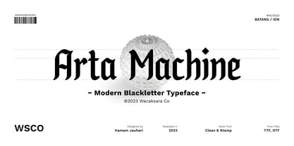 Introducing "Arta Machine" font, a modern blackletter typeface that skillfully combines classic elegance with contemporary flair. This versatile font family offers two unique styles: 'clean' for a sleek and refined appearance, and 'stamp' for a bold and rugged aesthetic. This font is perfect for use as poster designs, branding, logos, apparel, cards, packaging, quote, web, headline, tattoo, or other design needs. Features : Multilanguage Alternates PUA Encoded Ligatures Thank you.