10,000 search results
(0.074 seconds)
- Heart & Salsa by Fikryal,
$15.00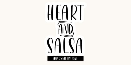 Heart & Salsa is a fancy font perfect for crafting, branding, invitation, stationery, wedding designs, social media posts, advertisements, product packaging, product designs, label, photography, watermark, special events, or anything. Heart & Salsa with a full set of uppercase letters, multilingual symbols, numerals, and punctuation.
 - Mandalykha by TSA Creative,
$12.00 Mandalykha is a very unique script font, inspired by a tourist spot located in Central Lombok Regency. Mandalykha a stylish script which is guaranteed to add an eye-catching appeal to your logo designs, brand imagery, quotes, product packaging, merchandise & social media posts
 - Creamy Sunset by Balpirick,
$15.00 Creamy Sunset is perfect for product packaging, branding project, megazine, social media, wedding, or just used to express words above the background. Creamy Sunset also multilingual support. Enjoy the font, feel free to comment or feedback, send me PM or email. Thank you!
 - Ailee Sofia by Tlatous Type,
$19.00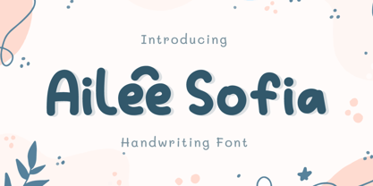 Introducing Ailee Sofia Font by Tlatoustype Ailee Sofia is a Playful Thick Display Font. Ailee Sofia is perfect for book cover, product packaging, branding project, megazine, social media, wedding, or just used to express words above the background.This font also multilingual support.
 - The Quincy by Essentials Studio,
$16.00 Quincy Is a Modern Script Font The Quincy is perfect for product packaging, branding project, magazine, social media, wedding, or just used to express words above the background. Enjoy the font, feel free to comment or feedback, send me PM or email
 - Elmimore by Qwrtype Foundry,
$14.00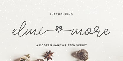 Introducing by Qwrtype Proudly Present, Elmimore Elmimore is a Monoline Script with Swash Elmimore is perfect for product packaging, branding project, megazine, social media, wedding, or just used to express words above the background. Elmimore also come with Multi-Lingual Support. Thank you!
 - Lickos by Fitrah Type,
$12.00 Lickos is the newest typeface with a tagging graffiti style. The entire typography has been designed to work on large sizes. This font ideal for designing merchandise, social media, marketing posts, product packaging & branding projects. Lickos supports uppercase, lowercase, numerals and punctuation.
 - Spearmint by Qwrtype Foundry,
$14.00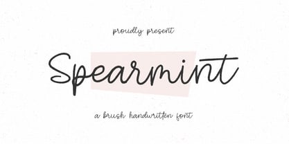 Introducing by Qwrtype Foundry Proudly Present, Spearmint Spearmint is a Brush Handwritten Font Spearmint is perfect for product packaging, branding project, megazine, social media, wedding, or just used to express words above the background. Spearmint also come with multilingual support. Thank you!
 - Bruzh by Garisman Studio,
$20.00 BRUZH combines attractive and natural hand-brushed letters with swinging curves and fresh urban edges; delivering a stylish brush which is guaranteed to add an eye-catching appeal to your logo designs, brand imagery, handwritten quotes, product packaging, merchandise & social media posts.
 - Yournotes by Garisman Studio,
$18.00 Yournotes typeface born from original and natural handwritten in the paper with boldpoint and pen; delivering a stylish typeface which is guaranteed to add naturality styles and taste appeal to your logo designs, brand imagery, quotes, product packaging, merchandise & social media posts.
 - DJ Parade by ParaType,
$25.00 An original display typeface was designed in 2000 by Vladlen Erium for the series of international musical events. A wide Sans of distinctive letterforms with rounded corners is well used in advertising of teenage goods and modern technologies. Licensed by ParaType in 2003.
 - Techno Board by Putracetol,
$28.00 Technoboard - A Scifi Futuristic Display Font. This font is inspired by techno circuit boards, combined with the scifi font type. Technoboard is great for any kind of display purpose from logos, Tshirt, apparel, product packaging, tittle header, poster, merchandise, social media, labels, branding.
 - Monstera Garden by Timurtype,
$14.00 Introducing by Timur type Monstera Garden A Handwritten Font Monstera Garden is perfect for product packaging, branding projects, magazines, social media, wedding, or just used to express words above the background. Monstera Garden offers also multilingual support. Enjoy the font. Thank you!
 - Dontheus by Lemonthe,
$12.00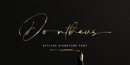 Dontheus is a Stylish Signature font, with a natural & stylish flow. Dontheus Font is perfect for many different project such as logos & branding, invitation, stationery, wedding designs, social media posts, advertisements, product packaging, product designs, label, photography, watermark, special events or anything.
 - Restrick by ZetDesign,
$15.00 Restrick is a strong display font. uses curved corners for flexible use on a variety of media displays. This font is very suitable for use as a headline in a newspaper, poster, or magazine. This font is available in regular and italic format.
 - Historina by MJB Letters,
$17.00 Say hi to Historina elegant classy handwritten font which have a unique shape of each character and has ligature options. this font is perfect for wedding design, logo design, signature, packaging, posters, social media posts, business card design, quotes, branding and others.
 - Bleached Magenta by Lunas Type,
$19.00 Bleached Magenta is an elegant font. Bleached Magenta will add charm and impression for your design. Bleached Magenta is perfect for many design needs such as merch, T-shirts, signature logo, wedding, book covers, social media posts, websites, events, and many more.
 - Ali SRF by Stella Roberts Fonts,
$25.00 Ali SRF is named for Stella's son, and was designed for Stella Roberts by Ray Larabie of Typodermic Fonts. The net profits from my font sales help defer medical expenses for my siblings, who both suffer with Cystic Fibrosis and diabetes. Thank you.
 - Butter Spoky by Prioritype,
$15.00 Butter Spoky font very suitable for your creative project. Can be applied to print or digital media such as crafts, clothing, food product packaging, logos and many more. See the preview to see some images. Features: -Uppercase -Lowercase -Numeral -Punctuation -Multilingual Thanks.
 - Kinderly by FallenGraphic,
$19.00 Kinderly is perfect for many different projects such as logos & branding, invitation, stationery, wedding designs, social media posts, advertisements, product packaging, product designs, label, photography, watermark, special events, or anything. what’s inside : Accents (Multilingual Characters) PUA encoded Numerals and Punctuations (OpenType Standard) ligature
 - HV Constantine by Harmonais Visual,
$10.00 Constantine - an exquisite display modern serif, inspired by classic roman arts and vintage cars aesthetics. Specially designed for luxury, clean, high-end projects, perfectly suitable for creating elegant, classy design such as magazine, social media, and more. The font features standard ligatures.
 - Flanela Monicha by Essentials Studio,
$16.00 Flanela Monicha Is a Modern Script Font Flanela Monicha is perfect for product packaging, branding project, megazine, social media, wedding, or just used to express words above the background. Enjoy the font, feel free to comment or feedback, send me PM or email
 - Launsela by Prioritype,
$15.00 This elegant, minimalist and beautiful handwritten font can be applied in various print or digital media such as creative posts, business cards, wedding invitations, crafts, photographer watermarks, logos and much more. For reference, see preview. Features: -Uppercase -Lowercase -Numeral -Punctuation -Multilingual Thanks.
 - Mourning by FallenGraphic,
$19.00 Mourning is perfect for many different projects such as logos & branding, invitation, stationery, wedding designs, social media posts, advertisements, product packaging, product designs, label, photography, watermark, special events, or anything. what’s inside : Accents (Multilingual Characters) PUA encoded Numerals and Punctuations (OpenType Standard) ligature
 - Grasted Rosta by Ergibi Studio,
$20.00 Grasted Rosta is a modern and elegant handcrafted signature font perfect for branding, photography, invitations, quotes, watermarks, advertisements, product designs, social media posts, stationery, labels, and more! Grasted Rosta includes Multilingual Options to make your branding globally acceptable. Thank you by Ergibi Studio
 - Enjoyable by Invasi Studio,
$16.00 Enjoyable born from hand-lettered style combines fun and playful glyph with all-caps font; delivering a fancy hand draw that is guaranteed to add an eye-catching suitable for your quotes, logo designs, brand imagery, product packaging, merchandise & social media posts.
 - Monck by Putracetol,
$28.00 Introducing Monck, a modern display font that combines the best of modern typography and classic serif styles. With its sleek design and unique lettering options, Monck is perfect for a wide range of design projects. Whether you're creating logos, posters, quotes, or social media graphics, Monck offers a plethora of alternates and end swashes through its OpenType features. Monck comes with three different file formats - otf, ttf, and woff - making it compatible with various design software programs such as Adobe Illustrator CS, Adobe Photoshop CC, Adobe InDesign, and Corel Draw. This means you can easily access and utilize the alternate glyphs in Monck to create eye-catching lettering compositions. The OpenType features in Monck allow you to access uppercase and lowercase letters, as well as alternates and ligatures, giving you endless possibilities for creative combinations. Additionally, Monck supports multiple languages, making it a versatile choice for designers around the world. In your zip package, you'll find the Monck font files in otf, ttf, and woff formats, providing flexibility for different design projects. The font includes uppercase and lowercase letters, numerals, punctuation, and symbols, ensuring that you have all the tools you need to create stunning designs. Monck is a versatile font that can be used for various design purposes, such as logotypes, headings, covers, posters, product packaging, headers, merchandise, social media graphics, greeting cards, and more. Its modern and classic fusion style adds a unique and contemporary touch to your designs, making them stand out in any context. In summary, Monck is a modern display font that offers a wide range of alternates and ligatures through its OpenType features, making it a powerful tool for creative lettering compositions. With its multilingual support and compatibility with popular design software, Monck is a must-have font for any designer looking to add a touch of modernity and versatility to their projects. So why wait? Get Monck now and start creating stunning designs with ease!
 - Think Big by Seemly Fonts,
$14.00 Think Big is a unique display font. Whether you’re using it for crafting, digital designing, presentations, or greeting card making, it’s perfect! Fall in love with its incredibly versatile style and use it to create spectacular designs!
 - Kandel 205 by Talbot Type,
$19.50 Kandel 205 is a geometric, tri-line, display and headline font available in a family of three weights. Its bold, graphic styling gives it great stand-out qualities and a highly individual look. It’s particularly well suited to bringing energy to designs, or for designs with a sporting theme. It’s also available with character variations as Kandel 105 .
 - Canterbury by Studio K,
$45.00 Canterbury is named after the English cathedral city in the county of Kent, chiefly because its sculptural qualities are reminiscent of ecclesiastical architecture. It's a monumental font in the sense that it is well suited to plaques, certificates and other formal inscriptions. It's also suitable for any application that strives for a sense of elegance and dignity.
 - Buttermilk by Jessica Hische,
$49.00 Buttermilk is the first font from illustrator/designer/typographer Jessica Hische. It’s a wonderful display script that is feminine but bold. It’s equipped with decorative caps (which would make great drop-caps), fancy numerals, and a far too extensive array of ligatures (automatic in most programs thanks to OpenType) to make it easier for you to set it beautifully.
 - Fathing by Multype Studio,
$17.00 Introducing, Fathing Script. This is a modern script font. It maintains its classy calligraphic influences while feeling contemporary and fresh. Fathing is perfect to use in logotype / wordmark, badge, sign board, poster, headline text, apparel, wedding invitation, etc. This font has many opentype features like ligature, stylistic alternate, contextual alternate, swash, etc and support multi language
 - Abracadabra PW by Patty Whack Fonts,
$29.00This font is made of many unrestrained strokes of the pen and it is perfect for a freestyle look. It would be great to use for projects that you would want to look handwritten, lively and even calligraphic. It's very playful and mysterious. It's so much fun to use and can be used in a variety of ways! - Kumbaya by Rachel Kick,
$6.00 Kumbaya is a purely hand-drawn, all-caps sans. It's the perfect combo of handmade quirks and clear, legible print. Kumbaya has the ability to hold it's own as a single word headline, or in a paragraph form. It also works well with script compliments. With four different styles, it is the perfect addition to any project!
 - Kandel 105 by Talbot Type,
$19.50 Kandel 105 is a geometric, tri-line, display and headline font available in a family of three weights. Its bold, graphic styling gives it great stand-out qualities and a highly individual look. It’s particularly well suited to bringing energy to designs, or for designs with a sporting theme. It’s also available with character variations as Kandel 205 .
 - MTF Goodness Gracious by Miss Tiina Fonts,
$12.00 Goodness Gracious, it’s another font by Miss Tiina! This font is extra special with its cute handwritten characters and ligatures. It's perfect for adding a personal touch to your designs, it has a bouncy, playful feel that’s sure to bring a smile to your audience. Have fun mixing & matching upper and lowercase letters for a unique design.
 - URLOP by Mikołaj Grabowski,
$9.00 Colour is more fun than black, but multicolour is even better. Let me introduce URLOP, a wide type family suitable for your fancy posters, headlines, covers, illustrations, websites, initials, blackmails, chronicles, signboards, poems and many others. Twelve basic styles, which make the overall construction, give a wide range of opportunities. All of them, being able to mix with each other, vary from a thin INSIDE, through a medium FILL, to a double-stem PLUS styles. And then comes a range of colour fonts, so you don’t have to waste any of your precious time for experiments, because I’ve already done it for you! URLOP is an all-caps display collection consisting of three sub-families of fonts, divided by the usage they are designed for. First of all, there is a wide range of alphabets made in the new OpenType-SVG colour fonts format. This is quite a novelty and a very promising technology at the same time. It allows designers to store colour information inside the font. Due to my experience with layered colour thinking that I explored in my first family - Epilepsja , I decided to make several preset layer combinations in this auspicious format. This sub-group is tagged RGB. Make sure that your field of usage and software support OT-SVG format. However, if you feel a need to experiment in the old-fashioned way, you may buy separate layers under the DIY tag. The last group is very similar to the DIY, but it was optimized to look better when standing without other layers. It’s called PRO*. All styles cover Latin alphabets of Europe, basic Cyrillic and Greek sets. Have fun! Before using the font, read the instructions and specimen attached to font files in the purchased package or download them from the Gallery tab on this site. This will help you avoid making unexpected mistakes when combining layers. *PRO subfamily release planned in 2019.
 - Barkpipe by Australian Type Foundry,
$25.00This face has a stiff machine-like quality which derives from it's ambiguous position between semi-serif, slab-serif and display. Barkpipe can't quite make up it's mind what category it wants to reside in. - Cavalier by Erik Bertell,
$19.95 Cavalier is a bold and extravagant headline typeface. Drawing inspiration from the iconic Lubalin classic, ITC Serif, Cavalier maintains in its design an approach more geometric and slightly cleaner. Equipped with plenty over 100 discretionary ligatures, Cavalier makes for a striking headline font, yet capable of legibility even in longer texts.
 - Lovebright by Set Sail Studios,
$16.00 Lovebright is an expressive, untamed handwritten font, with exaggerated descenders and loops. It’s an engaging and charming choice for signature style logos, personable branding, display text, handwritten quotes & letters, and blog/social media posts. Lovebright includes a full alternate set of upper & lowercase characters, included as it’s own separate fonts. Use the alternate characters for a different text layout, or mix with the regular version to avoid repeating letters and recreate naturally inconsistent handwriting. Lovebright also includes 22 ligatures, these double letter combinations will help letters connect and flow more naturally. The ligatures will automatically generate when using the Lovebright fonts with most software. Please get in touch if you need any help with these. The Lovebright fonts contain language support for; English, French, Italian, Spanish, Portuguese, German, Swedish, Norwegian, Danish, Dutch, Finnish, Indonesian, Malay, Hungarian, Polish, Croatian, Turkish, Romanian, Czech, Latvian, Lithuanian, Slovak, Slovenian.