10,000 search results
(0.038 seconds)
- Sunny by Zaki Creative,
$12.00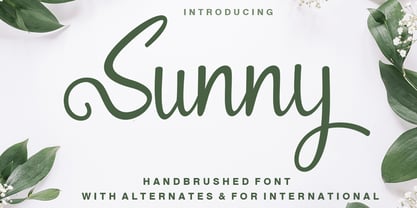 Sunny brush is a new modern script brush font with an irregular baseline. Trendy and feminine style. Sunny looks lovely on wedding invitations, thank you cards, quotes, greeting cards, logos, business cards and more. Perfect for using in ink or watercolour. Including initial and terminal letters, alternates and multiple language support. To enable the OpenType Stylistic alternates, you need a program that supports OpenType features such as Adobe Illustrator CS, Adobe Indesign & CorelDraw X6-X7, Microsoft Word 2010 or later versions. There are additional ways to access alternates/swashes, using Character Map (Windows), Nexus Font (Windows), Font Book (Mac) or a software program such as PopChar (for Windows and Mac). Thanks so much for looking and please let me know if you have any questions.
 - Salistya by Kartiny Type,
$12.00 Salistya is an Elegant script font that comes with very beautiful character changes, a classic copper decorative script type with a modern touch, designed with high detail to present an elegant style. Salistya file Salistya script is interesting because the typeface is pleasing to the eye, clean, feminine, sensual, glamorous, simple and very easy to read, because of the many luxurious letter connections. I also offer a number of decent stylistic alternatives for some of the letters. Classic style is very suitable to be applied in various formal forms such as invitations, labels, restaurant menus, logos, fashion, make up, stationery, novels, magazines, books, greeting cards/weddings, packaging, labels or all kinds of advertisements. If you need help or have questions, let me know. I'm happy to help.
 - Nebula Swirl by Hipfonts,
$17.00 Introducing Nebula Swirl, a modern and elegant font that mesmerizes with its captivating wavy shapes and smooth edges. This typeface is a true embodiment of expressiveness and boasts a strong personality that demands attention. Nebula Swirl's unique design merges fluidity with precision, resulting in a font that effortlessly balances grace and strength. Its dynamic and swirling curves create a sense of movement, as if the letters are gracefully dancing across the page. Perfect for creative and eye-catching designs, Nebula Swirl adds a touch of intrigue and sophistication to any project. Whether used in headlines, logos, or editorial layouts, this font commands a presence that is both bold and alluring. Let Nebula Swirl unleash its magnetic charm and elevate your designs to new celestial heights.
 - Samithan by Kartiny Type,
$12.00 Samithan Script is an Elegant script font that comes with very beautiful character changes, a classic copper decorative script type with a modern touch, designed with high detail to present an elegant style. Samithan file Samithan is interesting because the typeface is pleasing to the eye, clean, feminine, sensual, glamorous, simple and very easy to read, because of the many luxurious letter connections. I also offer a number of decent stylistic alternatives for some of the letters. Classic style is very suitable to be applied in various formal forms such as invitations, labels, restaurant menus, logos, fashion, make up, stationery, novels, magazines, books, greeting cards/weddings, packaging, labels or all kinds of advertisements. If you need help or have questions, let me know. I'm happy to help.
 - Bainbrydge Script by Shape Studio,
$12.00 Bainbrydge Script is a new and modern font with an irregular baseline. Bainbrydge Script looks lovely on wedding invitations, thank you cards, quotes, greeting cards, logos, business cards and more. It's perfect for using in ink or watercolour. It includes initial and terminal letters, alternates, ligatures and multiple language support. To enable the OpenType Stylistic alternates, you need a program that supports OpenType features such as Adobe Illustrator CS, Adobe Indesign & CorelDraw X6-X7, Microsoft Word 2010 or later versions. There are additional ways to access alternates/swashes, using Character Map (Windows), Nexus Font (Windows), Font Book (Mac) or a software program such as PopChar (for Windows and Mac).Thanks so much for looking and please let me know if you have any questions.
 - Gemulir by Twinletter,
$18.00 Gemulir is the embodiment of the beauty of classic serif fonts. With smooth lines and elegant character shapes, this font brings a timeless and classy look to any project. Gemulir gives you the ability to create luxurious and memorable documents, promotional materials or web designs. Gemulir's key features include its ability to customize various types of projects. From use in formal documents to use in branding designs, this font always provides a consistent and professional appearance. Gemulir is the perfect choice for those who appreciate classic beauty in design. With the ability to convey messages elegantly and powerfully, this font will take your projects to the next level. So, don't hesitate to choose Gemulir and let your designs shine with classic elegance.
 - Foom by Comicraft,
$19.00 DOCTOR OCTOPUS! BOOM! DOCTOR DOOM! 'SHROOM! DOCTOR EVIL! BA-THROOM! DOCTOR FRANKENSTEIN! KRA-KOOM! Never let it be said that Comicraft does not possess a Varied Vocabulary of Vile Villainy or a Tremendous Thesaurus of Terrible Tinkerers! It's our belief that every Medley of Madmen, every Rogue's Gallery of Ragged Rascals and every Sinister Selection of Scoundrels, Scalliwags and Sick Scientists --even they deserve a Nefariously Notorious Name-Finagling Font to announce their Apocalyptic Arrival. That font is here, towering murderously above the city blocks of Manhattan even as we speak... It's a Despicable Doctor of Dastardly Deeds, it's a Master of Evil Scheming, an Infamous Infidel, your Arch Enemy, your NEMESIS... IT'S THE END OF THE WORLD AS WE KNOW IT! FING... FAN... FOOM!
 - Foundland by Mans Greback,
$69.00 Foundland is a flowing typeface in a classic style. Let this soft serif font give its beautiful tone to your next project. Use it for a feminine logotype or headline to give your work that endearing look. User underscore _ to make a swash. Example: Super_stars The Foundland family consists of the fonts Regular and Italic. The font is built with advanced OpenType functionality and has a guaranteed top-notch quality, containing stylistic and contextual alternates, ligatures and more features; all to give you full control and customizability. It has extensive lingual support, covering all Latin-based languages, from Northern Europe to South Africa, from America to South-East Asia. It contains all characters and symbols you'll ever need, including all punctuation and numbers.
 - Salera Script by Afkari Studio,
$19.00 Introducing Barona Script - Handwritten Signature Font Barona Script exudes timeless elegance with its graceful handwritten brush strokes. This font embodies a contemporary calligraphy style that seamlessly blends sophistication and playfulness, making it the ultimate choice for elevating your branding and digital designs. Barona Script offers a treasure trove of alternative glyphs and ligatures for endless creative possibilities. Whether you're crafting quotes, logos, social media content, websites, blogs, or invitation cards, this font is your artistic companion. Barona Script's Features: - Uppercase, Lowercase, Number, and Punctuation - Standart and Special Ligatures - Works on PC & Mac - Simple installations - Accessible in Adobe Illustrator, Adobe Photoshop, Adobe InDesign, and even work on Microsoft Word - Fully accessible without additional design software. - Mültîlíñgúãl Sùppört; Embrace Barona Script, and let your creativity flourish. Happy designing!
 - Graphite Club by Comicraft,
$19.00 The eight rules of Graphite Club: You do not talk about Graphite Club… You do NOT talk about Graphite Club. If someone types "Stop" taps out “Limp,” the Graphite is over. Only two -- Waitasecond! EVERYBODY wants to talk about Graphite Club! It's the font for rough and tough typesetting that looks as etchy and sketchy, sleek and sexy as Brad Pitt on an off day. It's Light as a featherweight, it's as Regular as wetwork and as Bold as Brass Knuckles. And don't let anyone tell you this font is not special. It's as beautiful and unique as a snowflake. And so are you. Features six weights with alternate uppercase alphabets, language support for Western & Central Europe, Automatic alternates, Stylistic Alternates & Crossbar I Technology™
 - Raw potato by Agnieszka Ewa Olszewska,
$25.00 Introducing "Raw Potato" - a font that beautifully balances the raw and the captivating. Its bold, middle, and very thin weights within each letter create an intriguing, almost unfinished aesthetic that's still undeniably cool and eye-catching. "Raw Potato" is the perfect choice for products aimed at kids, as it brings a sense of playfulness and curiosity to any design. Its unconventional charm adds a touch of whimsy while maintaining a modern and edgy appeal. So, if you're in the market for a font that's raw yet fascinating, "Raw Potato" is your ticket to making designs that resonate with creativity and youthful energy. Let your imagination run wild with "Raw Potato" and watch your projects come alive! it contains Europenian diarcritics.
 - Thasyalina Script by Shape Studio,
$10.00 Thasyalina is a new modern script calligraphy font with an irregular baseline. Trendy and feminine style. Thasyalina Script looks lovely on wedding invitations, thank you cards, quotes, greeting cards, logos, business cards and more. Perfect for using in ink or watercolour. Including initial and terminal letters, alternates, ligatures and multiple language support.Files included: To enable the OpenType Stylistic alternates, you need a program that supports OpenType features such as Adobe Illustrator CS, Adobe Indesign & CorelDraw X6-X7, Microsoft Word 2010 or later versions. There are additional ways to access alternates/swashes, using Character Map (Windows), Nexus Font (Windows), Font Book (Mac) or a software program such as PopChar (for Windows and Mac).Thanks so much for looking and please let me know if you have any questions
 - Summerlane by Rillatype,
$19.00 Introducing "Summerlane," a captivating bubble retro display font that transports you to the carefree vibes of summer. This font is a playful blend of nostalgia and modernity, reminiscent of vintage signage with a contemporary twist. Each character in Summerlane is carefully crafted to evoke the essence of retro summers, where the air is filled with joy and the sunsets are endless. The bubbly, rounded design adds a touch of friendliness to your creative projects, making it perfect for posters, logos, and any design that craves a bit of retro flair. With its versatility, Summerlane offers a delightful journey into the past while staying relevant for your present-day designs. Elevate your projects with the whimsical charm of SummerLane and let the good vibes flow.
 - Desirable Brust Texture by Alcode,
$20.00 Desirable Brush Texture is a brush version of desirable solid released in 2019. With a classic style and an elegant touch, inspired by Italian women's handwriting and ancient manuscripts. These two fonts are carefully designed to work together in harmony making them perfect for wedding media, book covers, greeting cards, logos, branding, business cards and certificates, even for any design work that requires classic, formal or extravagant. Try Desirable Brush Texture, enjoy the richness of the features and let her fun and elegant excitement make you happy and enhance your creativity! You can use this font very easily. Multilingual Support And Special Ligatures If you are interested in the solid version, visit the link - https://www.myfonts.com/fonts/alcode/desirable-calligraphy/
 - Bahagia Script by Shape Studio,
$10.00 Bahagia is a new modern script calligraphy font with an irregular baseline. Trendy and feminine style.Bahagia Script looks lovely on wedding invitations, thank you cards, quotes, greeting cards, logos, business cards and more. Perfect for using in ink or watercolour. Including initial and terminal letters, alternates, ligatures and multiple language support. To enable the OpenType Stylistic alternates, you need a program that supports OpenType features such as Adobe Illustrator CS, Adobe Indesign & CorelDraw X6-X7, Microsoft Word 2010 or later versions. There are additional ways to access alternates/swashes, using Character Map (Windows), Nexus Font (Windows), Font Book (Mac) or a software program such as PopChar (for Windows and Mac).Thanks so much for looking and please let me know if you have any questions
 - Rangen by Letterfreshstudio,
$12.00 Rangen was inspired by Retro style in combination with hand lettering. Rangen has many alternative swashes and ligatures characters and has OpenType features such as alternative styles, ties and swashes so you can mix and match as you wish. Rangen is perfect for logos, posters, badges, book covers, t-shirt designs, handwritten quotes, product packaging, headers, posters, merchandise, social media & greeting cards. Rangen is coded with Unicode PUA, which allows full access to all additional characters without having special design software. Mac users can use the Font Book, and Windows users can use the Character Map to view and copy any of the additional characters to paste into your favorite text editor / application. Let me know if you have any questions.
 - Noble Serenity by Hipfonts,
$9.00 Introducing Noble Serenity, where timeless beauty meets serene elegance. This exquisite serif font is a harmonious blend of sophistication and tranquility, designed to elevate your designs with a touch of refined grace. With its clean lines, delicate curves, and perfectly balanced proportions, Noble Serenity exudes an aura of understated charm and sophistication. Each letter is meticulously crafted, reflecting the meticulous attention to detail and craftsmanship of a bygone era. Whether you're designing wedding invitations, luxury branding, or editorial layouts, Noble Serenity brings an air of refined beauty to your projects. Discover the captivating allure of Noble Serenity and let your designs embrace the essence of timeless elegance. Elevate your typography to new heights with this font that whispers of tranquility and commands attention with its noble presence.
 - Wisdom Teeth by DM Founts,
$20.00 Wisdom Teeth is the fifth typeface released by DM Founts. It's a modern and personal take on the original Baby Teeth font by Milton Glaser, and inspired by the lettering used for the Pac-Man series of games (and its clones). This typeface was around 25 years in the making, and was made in response to the large number of hideously bad clones of Baby Teeth circulating around the Internet. Version 1.0 Included in Version 1.0 are a number of accent characters, and alternate characters for A and Y, along with the usual ASCII characters. For the time being this is an all caps typeface. Please let me know your thoughts and suggestions, and I may add some more characters in the near future.
 - Alisya Script by Shape Studio,
$16.00 Alisya is a new modern script calligraphy font with an irregular baseline. Alisya looks lovely on wedding invitations, thank you cards, quotes, greeting cards, logos, business cards and more. Perfect for using in ink or watercolour. Including initial and terminal letters, alternates, ligatures and multiple language support. To enable the OpenType Stylistic alternates, you need a program that supports OpenType features such as Adobe Illustrator CS, Adobe Indesign & CorelDraw X6-X7, Microsoft Word 2010 or later versions. There are additional ways to access alternates/swashes, using Character Map (Windows), Nexus Font (Windows), Font Book (Mac) or a software program such as PopChar (for Windows and Mac).Thanks so much for looking and please let me know if you have any questions
 - As of my last update in April 2023, "Divlit" is not a widely recognized or documented font in the realms of typography commonly discussed or published in well-known typographic resources, databases, ...
- Areplos by Storm Type Foundry,
$53.00To design a text typeface "at the top with, at the bottom without" serifs was an idea which crossed my mind at the end of the sixties. I started from the fact that what one reads in the Latin alphabet is mainly the upper half of the letters, where good distinguishableness of the individual signs, and therefore, also good legibility, is aided by serifs. The first tests of the design, by which I checked up whether the basic principle could be used also for the then current technology of setting - for double-sign matrices -, were carried out in 1970. During the first half of the seventies I created first the basic design, then also the slanted Roman and the medium types. These drawings were not very successful. My greatest concern during this initial phase was the upper case A. I had to design it in such a way that the basic principle should be adhered to and the new alphabet, at the same time, should not look too complicated. The necessary prerequisite for a design of a new alphabet for double-sign matrices, i.e. to draw each letter of all the three fonts to the same width, did not agree with this typeface. What came to the greatest harm were the two styles used for emphasis: the italics even more than the medium type. That is why I fundamentally remodelled the basic design in 1980. In the course of this work I tried to forget about the previous technological limitations and to respect only the requirements then placed on typefaces intended for photosetting. As a matter of fact, this was not very difficult; this typeface was from the very beginning conceived in such a way as to have a large x-height of lower-case letters and upper serifs that could be joined without any problems in condensed setting. I gave much more thought to the proportional relations of the individual letters, the continuity of their outer and inner silhouettes, than to the requirements of their production. The greatest number of problems arose in the colour balancing of the individual signs, as it was necessary to achieve that the upper half of each letter should have a visual counterbalance in its lower, simpler half. Specifically, this meant to find the correct shape and degree of thickening of the lower parts of the letters. These had to counterbalance the upper parts of the letters emphasized by serifs, yet they should not look too romantic or decorative, for otherwise the typeface might lose its sober character. Also the shape, length and thickness of the upper serifs had to be resolved differently than in the previous design. In the seventies and at the beginning of the eighties a typeface conceived in this way, let alone one intended for setting of common texts in magazines and books, was to all intents and purposes an experiment with an uncertain end. At this time, before typographic postmodernism, it was not the custom to abandon in such typefaces the clear-cut formal categories, let alone to attempt to combine the serif and sans serif principles in a single design. I had already designed the basic, starting, alphabets of lower case and upper case letters with the intention to derive further styles from them, differing in colour and proportions. These fonts were not to serve merely for emphasis in the context of the basic design, but were to function, especially the bold versions, also as independent display alphabets. At this stage of my work it was, for a change, the upper case L that presented the greatest problem. Its lower left part had to counterbalance the symmetrical two-sided serif in the upper half of the letter. The ITC Company submitted this design to text tests, which, in their view, were successful. The director of this company Aaron Burns then invited me to add further styles, in order to create an entire, extensive typeface family. At that time, without the possibility to use a computer and given my other considerable workload, this was a task I could not manage. I tried to come back to this, by then already very large project, several times, but every time some other, at the moment very urgent, work diverted me from it. At the beginning of the nineties several alphabets appeared which were based on the same principle. It seemed to me that to continue working on my semi-finished designs was pointless. They were, therefore, abandoned until the spring of 2005, when František Štorm digitalized the basic design. František gave the typeface the working title Areplos and this name stuck. Then he made me add small capitals and the entire bold type, inducing me at the same time to consider what to do with the italics in order that they might be at least a little italic in character, and not merely slanted Roman alphabets, as was my original intention. In the course of the subsequent summer holidays, when the weather was bad, we met in his little cottage in South Bohemia, between two ponds, and resuscitated this more than twenty-five-years-old typeface. It was like this: We were drinking good tea, František worked on the computer, added accents and some remaining signs, inclined and interpolated, while I was looking over his shoulder. There is hardly any typeface that originated in a more harmonious setting. Solpera, summer 2005 I first encountered this typeface at the exhibition of Contemporary Czech Type Design in 1982. It was there, in the Portheim Summer Palace in Prague, that I, at the age of sixteen, decided to become a typographer. Having no knowledge about the technologies, the rules of construction of an alphabet or about cultural connections, I perceived Jan Solpera's typeface as the acme of excellence. Now, many years after, replete with experience of revitalization of typefaces of both living and deceased Czech type designers, I am able to compare their differing approaches. Jan Solpera put up a fight against the digital technology and exerted creative pressure to counteract my rather loose approach. Jan prepared dozens of fresh pencil drawings on thin sketching paper in which he elaborated in detail all the style-creating elements of the alphabet. I can say with full responsibility that I have never worked on anything as meticulous as the design of the Areplos typeface. I did not invent this name; it is the name of Jan Solpera's miniature publishing house, in which he issued for example an enchanting series of memoirs of a certain shopkeeper of Jindrichuv Hradec. The idea that the publishing house and the typeface might have the same name crossed my mind instinctively as a symbol of the original designation of Areplos - to serve for text setting. What you can see here originated in Trebon and in a cottage outside the village of Domanín - I even wanted to rename my firm to The Trebon Type Foundry. When mists enfold the pond and gloom pervades one's soul, the so-called typographic weather sets in - the time to sit, peer at the monitor and click the mouse, as also our students who were present would attest. Areplos is reminiscent of the essential inspirational period of a whole generation of Czech type designers - of the seventies and eighties, which were, however, at the same time the incubation period of my generation. I believe that this typeface will be received favourably, for it represents the better aspect of the eighties. Today, at the time when the infection by ITC typefaces has not been quite cured yet, it does absolutely no harm to remind ourselves of the high quality and timeless typefaces designed then in this country.In technical terms, this family consists of two times four OpenType designs, with five types of figures, ligatures and small capitals as well as an extensive assortment of both eastern and western diacritics. I can see as a basic text typeface of smaller periodicals and informative job-prints, a typeface usable for posters and programmes of various events, but also for corporate identity. Štorm, summer 2005 - Helveticrap - 100% free

- CartoGothic Std - 100% free

- Bergamo Std - 100% free

- Advertisers Gothic by HiH,
$12.00 Advertisers Gothic is bold and brash, like the city it comes from, Chicago. It was designed by the accomplished German-American matrix engraver, Robert Wiebking, for the Western Type Foundry in 1917. As its name suggests, it was designed for commercial headliner work, much as Publicity Gothic by Sidney Gaunt for BB&S the year before. See our Publicity Headline. Alternate letters ‘A’ & ‘S’ are provided. The most popular ad words “Free!”, “New!” and “Sale” (with both esses) are provided at an angle for dramatic tension. Advertisers Gothic became quite popular because it was effective. It can work equally well for a flyer advertising a non-profit event as for a magazine product ad. This font refuses to be a wimp. Use it boldly. Advertisers Gothic ML represents a major extension of the original release, with the following changes: 1. A total of 335 glyphs (compare) with added glyphs for the 1250 Central Europe, the 1252 Turkish and the 1257 Baltic Code Pages. 2. Added OpenType GSUB layout features: pnum, ornm, liga, hist & salt ˜ with total 13 lookups. 3. Added 209 kerning pairs. 4. Revised vertical metrics for improved cross-platform line spacing. 5. The most popular ad words “Free!”, “New!” and “Sale” (with both esses) are provided at an angle for dramatic tension The zip package includes two versions of the font at no extra charge. There is an OTF version which is in Open PS (Post Script Type 1) format and a TTF version which is in Open TT (True Type)format. Use whichever works best for your applications.
 - TT Severs by TypeType,
$29.00 TT Severs useful links: Specimen | Graphic presentation | Customization options TT Severs is a geometric grotesque with emphasized elements of internal brackets. A distinctive feature of TT Severs is the unusual form of internal ovals, which refers us to the style of traditional Arabic writing. TT Severs has a strong character and is great for use in high tech (IT), the web, in robotics, computer games, and sports. TT Severs is a 2-in-1 font family. In a large body size, it works great as a display font, creating a distinctive character for logos and headings. At the same time, when TT Severs is used in a small body size or in large text arrays, the font’s peculiarities of bracket construction fade, and it perfectly functions as a text font, thanks to both the low contrast between vertical and horizontal strokes and the detailed logic of interaction of black and white letter elements. The font family TT Severs includes 18 fonts, each of which consists of 558 glyphs. The family has standard and discrete ligatures, which include experimental ligatures for the Cyrillic alphabet. In addition, TT Severs can be made a little more humanist—it is enough to turn on stylistic alternates, and due to them the font takes the form of a humanist grotesque, which refers us to traditional broad nib writing. As part of the font family, you will also find old-style figures and a large number of OT features such as case, ordn, sups, sinf, dnom, numr, onum, tnum, pnum, liga, dlig, salt (ss01), frac.
 - TT Livret by TypeType,
$39.00 If you still think that an antiqua is a typeface with a strong historical character that difficult to apply in modern realities, meet the new typeface from TypeType! TT Livret is an elegant, modern and functional antiqua featuring a calm text and an expressive display subfamily. TT Livret useful links: Specimen | Graphic presentation | Customization options This font looks harmonious in books and other periodicals, on posters or on magazine covers. The scope is not limited to the printing industry, because TT Livret looks aesthetically pleasing wherever text is used. The text subfamily has uniwidth proportions and a calm spirit, oval round characters, free spacing and more open apertures. The glossy display subfamily is proportional and has round signs that are as close to a circle as possible, the apertures are closed, and the spacing is dense. The font has an intermediate subfamily - Subhead, which can look more relaxed when used as text font, or be contrasting and used as a display font. In TT Livret, we have embodied the idea of an antiqua that will be comfortable to use in modern realities. This is a functional font, where the text face does not distract from reading, and the display face, on the contrary, attracts attention. The TT Livret font family consists of 32 faces: 15 upright, 15 oblique, and 2 variable fonts. Each face has 1031 glyphs. The font contains 26 OpenType features, as well as a large number of ligatures. There are many alternative characters in italics, which are especially diverse in Cyrillic.
 - Masked Hero by Linecreative,
$18.00 Introducing "Masked Hero," a dynamic and commanding font that stands tall as a bold, oblique, all-cap typeface. This font is not just a collection of letters; it's a visual narrative of strength, speed, and superhero prowess. "Masked Hero" takes typography to new heights by incorporating uppercase letters adorned with intricate wing patterns, elevating your design into a powerful champions. The uppercase characters in "Masked Hero" aren't just letters; they're symbols of superheroic identity, each adorned with wing-like patterns that evoke a sense of flight and strength. These letters become the emblem of your design, embodying the essence of masked heroes ready to leap into action. To provide designers with unparalleled flexibility, "Masked Hero" is equipped with alternates for both uppercase and lowercase letters. This feature allows you to customize the appearance of your text, giving you the creative freedom to push the boundaries of typographic design. The alternates enhance the visual impact of your message, ensuring that every word becomes a statement. With a sharp and bold aesthetic, "Masked Hero" is tailor-made for projects that demand speed, strength, and a touch of superhero flair. Whether you're designing a logo for a masked vigilante, creating dynamic sports-themed graphics, or crafting the name of a superhero, this font is your ally in making a bold statement. Masked Hero offers you: 1. 4 options of letters, All Caps (All options of the characters are included in one font) 2. Numbers and Punctuation 3. Multilingual Support (Latin Western Europe)
 - Speedwriter - Personal use only

- CANDY INC. - Personal use only

- Jon - Unknown license

- Cityscape™ - Unknown license

- Abaddon™ - Unknown license

- Apollyon™ - Unknown license

- Easter Parade - Unknown license

- Allembert™ - Unknown license

- Cadeaulx™ - Unknown license

- Art Lesson JNL by Jeff Levine,
$29.00The hand-lettered title of a vintage Walter Foster "how to draw" book inspired the Deco-influenced alphabet of Art Lesson JNL. Bold and retro in nature, this typeface gets the message across in a straightforward way, yet still has a bit of a casual feel to it. - Thingamajig by Comicraft,
$19.00 Okay, ya finally wangled yer widget out from between the framistat and the whatchamacallit, ya assembled yer Avengers and ya hooked up yer hoojamajigger to the doohickey. But ya still ain't gonna get yer contraption to work until ya plug the widget into the thingamajig! Sheesh! Wotta Revoltin' development!
 - Burt by Renegade Fonts,
$35.00 Burt is extended grotesk with condensed uppercase. Its combines modern bauhaus features with old grotesk details. And the X, what a banger! Well it actually is. That what gave the font name - buřt = sausage. Full Latin extended A support, many features, stylistic sets and alternates. All together 9 styles.


