10,000 search results
(0.034 seconds)
- Pana Summer by Attype Studio,
$12.00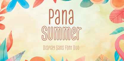 Pana Summer is a Display summer font duo, make an amazing combination between outline and regular style. Pana Summer is perfect for summer event, summer party, branding, logo, invitation, quotes, apparel design, product packaging, merchandise, game titles, cute style design, Book/Cover Title and more. What's Included : - Multilingual Support - Font Duo --- Hope you enjoy with our font! Attype Studio
 - Parkson by Rook Supply,
$18.00 Inspired by the grotesque fonts of the 19th century, Parkson is a tall sans serif typeface of 7 weights along with italic and several outline versions. The contemporary typeface aims to be one of the world's best condensed collection of fonts. Designed for optimum legibility, its clean, geometric look is perfect for logotypes, headers, titles and brochures.
 - Keith by Talbot Type,
$19.50 Keith is a striking and playful display font. Mix and match the different shadow styles, to create a variety of different looks and effects. There are four different shadow effects, along with a fill and an outline variation. Keith features a full upper and lower case character set and an extended set of accented characters for Central European languages.
 - Rookie Heat by Bogstav,
$17.00 Based upon classic typefaces such as Bodoni, you might find Rookie Heat familiar. However, the rough outline and handmade look and feel makes it perfect for your craft products. All in all, Rookie Heat is reflecting the beauty of decorative objects. Play around with the swashes for upper- and lowercase to make your designs stand more out.
 - Spectacular Americanos by Youngtype,
$17.00 Spectacular Americanos & Spectacular Americanos Outline is a hand brush font made with brushes and ink. This typeface is ideal for use in thick watercolor designs or handwriting styles, such as blog titles, posters, wedding elements, t-shirts, clothing, book covers, business cards, greeting cards, branding, merchandise etc. Contains full set : Uppercase Lowercase Ligatures Punctuation number multilingual support. Thank you!
 - Oxo by Typedepot,
$24.00 Oxo is an expressive typeface from typedepot. Designed to be used as a decorative, headline font which quickly evolved into great new font usable for large amounts of text as well. Available in 4 weights - thin,light, regular and bold with their matching italics plus three extra weights: Outline, College and Deco which are great addition to the family.
 - Alderwood by Hustle Supply Co,
$20.00 Alderwood | A Condensed Hand Drawn Typeface: Alderwood is a hand drawn condensed typeface that comes in multiple styles / weights. Get it in regular, stamp, outlined with oblique versions of each. The subtle imperfection of hand drawn type adds character to projects that require a more grassroots vintage aesthetic. What's Included? → 6 Fonts Files → Western European Characters Included → Web Fonts
 - Eccles by Greater Albion Typefounders,
$14.50 Eccles is another of our 'Early Victorian' typefaces, a series we started with the Wolverhampton family a little while ago. It might be described as 'extreme-Tuscan' in style but has a delicacy that many other Tuscan faces seem to lack. It's ideal for giving design projects a clear period feel, particularly in design and advertising work. We also see it having considerable application in preparing invitations to a certain type of happy event. At the other extreme, some of our younger associates have described it as 'your latest Steampunk font'. So perhaps we'll just have to settle on it having a split personality...
 - Carolus - Unknown license

- Mushrooms by Okaycat,
$29.50 Okaycat JAPAN newly launches "Mushrooms"! Mushrooms is a picture font containing exceptional illustrations of mushrooms. The mushrooms appear in outline form, and also as solid graphics.
 - Barkants - Personal use only

- Luft by Sebastian Cabaj,
$20.00 Luft is blackletter typeface with a modern feel. Inspired by old writing letters and preparation for using in modern design.
 - Dealers by Gumpita Rahayu,
$20.00 Back to the past when the old building and the beauty of a old store decorated by distinctive signage. With a clear feels of authentic historical value and the today's needs must be balanced in order to create the nostalgic feels. Introducing an authentic touch based on old fashioned signage developed into the wood type feels, and it's called Dealers. Dealers is a development of the classic taste wood type to form a solid blocked shapes, modern serifs, and with all caps based characters and slightly condensed. With specific characteristics, dealers font is intended for coffee shops, stores, restaurant menu that you want to create the impression of a classic and harmonious. With the addition of catchwords in the OpenType features, allowing you to be more creative to meet the requirements on the design you create.
 - Piano Keybuild by Type Minds,
$5.00 Piano Keybuild is a small font designed for creating piano keyboard layouts. It was inspired by my Yamaha CLP-840, a wonderful digital piano. The face consists entirely of keyboard keys that can be combined to form realistic keyboards. These keys come in four styles: basic outlined keys, filler keys (for adding a second color inside the outlines), keys with note names, and pre-made sets of keys. Keys of a given kind will kern with one another, but only in the order that they would naturally occur on a keyboard. (This makes it easier to spot incorrect key sequences.) It also includes digits 0 through 9 inspired by numerals used in traditional music notation. The user guide (PDF under Gallery tab) demonstrates the locations of all the glyphs as well as how to use them together effectively.
 - Feltro by Ndiscover,
$24.99 Feltro is a Handmade Brush Script full of personality. Because of its fast brush strokes the design looks really fresh and full of identity. It has a total of 9 variants that will give you a lot of customisation options. Outline, Shadow, 4 Textures, and also Textured Outline and Shadow. You can combine the 9 styles in different manners and create colourful typographic expressions. Feltro is loaded with features, like terminal forms, ligatures and contextual alternates, so that you have even more stylistic options. It has a large latin language support across all the 9 styles so you can use it with confidence in all styles. You can use Feltro in advertising, branding, merchandise, web headlines, and more. Make sure you buy the full family and benefit of a massive discount. You can see feltro in action on this short video.
 - Dash To School by Comicraft,
$15.00 One of the more popular pupils in the Comicraft Academy of Lettering Arts, Dash Decent, has been working on his penmanship, thanks to a grant from those lovely learning specialists at Brainzy and Education.com. Developing learning games for Pre K, K and 1st grade, Brainzy requested a font that was fun and clean to help children learn to print. Dash to School is an all new revision and expansion of the Dash Decent family and features fun bold/heavy/outline and drop shadow weights for display, guidelines and dashed lines to assist learning and understanding and a healthy dose of decency! Dash Decent has graduated 1st Grade and with Dash to School’s help, so can you! See the families related to Dash To School: Dash Decent Features: Nine fonts (Regular, Bold, Heavy, Outline, Shadow, Guides, GuidesDashed & GuidesSolid) with upper and lowercase alphabets.
 - Doriss Girls by Open Window,
$- Dorriss girls were the dancing troop at the Moulin Rouge. I had the idea for this font while trying to come up with an alternative to beveling. I thought it would be interesting to create this sort of stepped effect as I've never really seen this treatment on a font before. Then my need to create chaos shows up again with Doriss Girls informal. A hand drawn take on the forms. This seemed like it would appear on an old art nouveau poster by the great Toulouse Lautrec, so there you have the genesis of this font. I've been somewhat compelled by the letterforms so I may expand and create a more normal version of this font someday with a range of weights. That would be the bees knees.
 - Roughcast by Hanoded,
$10.00 Roughcast is a kind of outside plaster, composed of cement and pebbles. It’s not the best looking plaster and it is estimated that in the UK, a roughcast outer reduces the value of a house by 5%. I am in the middle of renovating our old farm, but I won’t cover it in roughcast! Roughcast font is actually quite an attractive brush font. I made it with a brush I found hiding underneath my stove (where it had been for a while). I cleaned it and used it to make a couple of fonts, including Roughcast. Roughcast is best used for packaging, book covers and posters.
 - Plasto by Eko Bimantara,
$19.00 Plasto is a complete grotesk sans serif family. The quirky letterforms and its slight width variation characterized the typeface as fun and playful as "plastic" in a graphic layout, fit for various design spaces, fit for both informal or functional purposes, fit for large display and also small text. Plasto complete family contains 54 styles with two axes; Weight and Width. The weight consists of 18 styles from Thin to Black, and the width consists of 3 styles, condensed, normal and expanded.
 - Bizarre - Unknown license

- Shodo Gothic by Mirco Zett,
$25.00 Shodo Gothic is a mixture of western black letter typography and asian calligraphy.
 - Sofa Bird by Bogstav,
$18.00 Sofa Bird is my name for a laid back and relaxed comic font, with a twist of handcraft mixed with adventurous penmanship!
 - Celtic Garamond Pro by CheapProFonts,
$10.00 A classical proportioned text font - with a Celtic twist! Perfect for that oldstyle look, but still very readable. I have cleaned up the outlines, improved the spacing and kerning, modified a few letterforms - and then expanded the character set by 440%! A bolder weight has now also been created, and a rough version for a more antique look. ALL fonts from CheapProFonts have very extensive language support: They contain some unusual diacritic letters (some of which are contained in the Latin Extended-B Unicode block) supporting: Cornish, Filipino (Tagalog), Guarani, Luxembourgian, Malagasy, Romanian, Ulithian and Welsh. They also contain all glyphs in the Latin Extended-A Unicode block (which among others cover the Central European and Baltic areas) supporting: Afrikaans, Belarusian (Lacinka), Bosnian, Catalan, Chichewa, Croatian, Czech, Dutch, Esperanto, Greenlandic, Hungarian, Kashubian, Kurdish (Kurmanji), Latvian, Lithuanian, Maltese, Maori, Polish, Saami (Inari), Saami (North), Serbian (latin), Slovak(ian), Slovene, Sorbian (Lower), Sorbian (Upper), Turkish and Turkmen. And they of course contain all the usual "western" glyphs supporting: Albanian, Basque, Breton, Chamorro, Danish, Estonian, Faroese, Finnish, French, Frisian, Galican, German, Icelandic, Indonesian, Irish (Gaelic), Italian, Northern Sotho, Norwegian, Occitan, Portuguese, Rhaeto-Romance, Sami (Lule), Sami (South), Scots (Gaelic), Spanish, Swedish, Tswana, Walloon and Yapese.
 - Signature Creation by Arterfak Project,
$17.00 Introducing "Signature Creation," a nostalgic display font inspired by vintage sign painting. Representing craftsmanship, creativity, and movement. Immerse yourself in a wave of nostalgia with this font set, available in 5 distinct styles that harmoniously interact as layers: Regular, Inline, Shadow, Outline, and Extrude. Signature Creation boasts a contemporary aesthetic and seamless design. Complete with swashes and special characters, Signature Creation infuses a playful feel into your design
 - We Love Nature Stems Two by kapitza,
$85.00 We Love Nature Stems Two is a picture font consisting of 52 all new high quality, hand drawn illustrations with clean outlines and a minimum of vector points. Due to the overwhelming success of our flower font We Love Nature Stems, we have created this brand new set of original illustrations. We loved creating these beautiful new flowers and hope that you will love designing with them. Enjoy!
 - Casual Crew by Learning Kiddos,
$18.99 A fresh friendly font with upper and lower cases inspired by the Casual Style of Sign Painters. It features well-designed curves, four versatile styles (including Regular, Bold, Halftones and Outlines), latin language support and sexy built-in signs and catchwords. Suitable for titles, Branding, package design & more. If you are looking for a fine Hand-drawn font Family with great curves, Casual Crew is what you want.
 - 1906 Fantasio Auriol by GLC,
$38.00 We have created this family inspired from the set of well known Auriol fonts used by the French popular "cheerful" satirical magazine Fantasio (1906-1948). The present version contains Normal, Italic, Bold and Bold Italic styles, in use for texts, plus narrow titlings and normal outlined with upper and lower case, both in use for titles. This family may be used together with 1906 French News, 1906 Titrage and 1890 Notice.
 - Bernound by 38-lineart,
$8.00 The Bernound is an amazing typeface which comes in three weights. The clean weight comes with rounded corners and a slim shape that presents a minimalist impression. The outlined weight has a fancy feel when displayed on its own, and the rough weight has a vintage, rustic, and grunge look. All weights can be combined perfectly which gives you the opportunity to create endless unique designs with just this one download.
 - Hillray by Sarid Ezra,
$15.00 A NEW STYLISH BOLD FONTS WITH LIGATURE & ALTERNATES, Hillray! Hillray is a stylish bold sans that contains ligatures and alternates each characters! You can make a unique branding with this fonts. This stylish bold fonts also included extrude and outline style that will compliments the regular style! This fonts suitable to use for poster, branding, merchandise, and any street art style! Also support multilingual and already PUA Encoded! Thank You!
 - Ytoxina by FSdesign-Salmina,
$39.00 Ytoxina. Acid new Pixelfont. Do you look for an unconventional aggressive headlinefont? Ytoxina might be exactly what you are looking for. Ytoxina is a new member oft the Atoxina family with experimental character. The form of the letters suggests the effect of an aggressive acid having devoured their outlines. Like the other member of the family it is based on a pixelfont. Avoid nicely typography, experiment with Ytoxina!
 - Noa by Linotype,
$29.99The Danish designer Nina Lee Storm designed Noa for use on television and computer screens during the late 1990s. She began her six-member type family with the creation of bitmap fonts, developing their print outlines only secondarily. Noa’s letters exhibit a tall x-height, coupled with very short ascenders and descenders. Storm is proud to report that her typeface also looks very “Danish.” Why don't you give it a try? - Helena Handbasket NF by Nick's Fonts,
$10.00The 1888 edtion of James Conner's Sons United States Type Foundry specimen book listed this little gem simply as "Antique Light". Its original, rather anemic outlines have been beefed up and its serifs have been rounded, with the result that this face will get noticed wherever it goes. Both versions of this font include the complete Latin 1252 and CE 1250 character sets, with localization for Romanian and Moldovan. - ArTarumianBehrensInitialen by Tarumian,
$100.00 Behrens Initialen is based on the type graphics of the German architect and type designer Peter Behrens (1868-1940). The drawing of the original typeface is in tune with the Art Nouveau (Jugendstil) style in which Behrens worked. This is a light, delicate, somewhat theatrical typeface, the forms of which bear at the same time a certain shade of Gothic and modernity, and can be used, in particular, when there is a need to make a reference to medieval graphics while maintaining the modern style of composition. In the proposed version, the original initial graphics are used not only for uppercase letters, but also for Arabic figures, while for lowercase letters and for the base of other characters are used the letters themselves - without decorative framing. This feature can be useful for obtaining various effects when using both lower and upper cases in parallel, including when they are overlaid. The font includes the Latin, Cyrillic and Armenian ranges. Created by Ruben Tarumian in 2020.
 - Mairy by Typesketchbook,
$39.00 Mairy font family is a modern sans serif font family. Featuring 9 separate weights each followed by own true italics Mairy is positioned somewhere between rounded sans with humanist touch. In fact the humanist presence in Mairy is a little bit more than the usual doze adding more calligraphic elements mostly noticeable in italic weights but also very important in regulars. This symbiosis of Grotesk geometry with handwriting is well balanced regarding contrast and legibility so that at the end we have a highly usable font family. Light weights are very tender and elegant while the old and blacks are soft, friendly and full of vitality. The mid weights are just perfect with their medium contrast and excellent legibility. Mairy is very fresh font family and is surprisingly flexible when it comes to screen or print use – it is optimized for both even if the conditions are poor. Use it with OpenType compatible software and explore its true potential by accessing additional set of ligatures, alternates and multilingual support.
 - Mr Palker by Letterhead Studio-YG,
$35.00 A slab serif Mr Palker and grotesque Mr Palkerson build one superfamily together. These are blank types. In a way even the display ones. Typefaces for newspapers, announcements, cheap advertising and police posters. Mr Palker and Mr Palkerson will turn every language into a fence. And due to six types of faces one can choose what material should the fence be made from — from Thin steel rods to the Black stone blocks. In their simplest appearance Mrs P&P are intended for the solid blank composition in victorian or industrial style. They are quite decent, a bit old-fashioned slab serif and grotesque with closed aperture. All my types have layers. Walker and Palkerson also do. Besides the standard set of symbols, they have 4 add-ons. 1. Alternate glyphs, including unicase ones. 2. Ligatures with A letter. 3. Extra tall small caps. 4. Two-storey ligatures. All this options are intended for the complex composition. The additional letters are rather eccentric as their main function here is to imitate the victorian oddities. Imitate, parody, just not repeat. There are lower-case As and Es in the set in height of small caps and uppercases. They can turn every writing into the unicase. The lower-case A (as well as uppercase and small caps version of it) has deliberately by my taste grown a ludicrous tail. To compensate it I’ve built all the possible ligatures - ад, ал, ая. There are 35 of this ligatures all together. Take a closer look at the Russian letters D, L, K, Ya from the main set as well as their alternates. The additional glyphs are one more comic than the other — on purpose to imitate (not to repeat!) the victorian set. This sets have lowercase numbers. And small caps numbers as well. What a modern typeface without them. They also have an У-letter with a generously curvy tail. As if before the WWI. The Latin of course has alternates as well. It has letters to make the perfect French sound more like the russian provincial version of it. The tails of Js and Ts can be made a little bit more open — or a little bit closed. My favorite feature here, an invention of a kind - extra tall small caps. It allows to compose logos with the small caped uppercases directly from the keyboard. The small caps of this typefaces are usually much taller than the customary ones. This is the kind of small caps that Palker and Palkerson have. More to that, the strokes’ weight and the letters width are corresponded to the uppercases. Just a ready set for making a logo a la 1913 style. With a unicase, one has to mind! One more trick with the tall small caps is a possibility to make them work like lower uppercases. Their height is just in between of lower- and uppercases. Isn’t it great to have an additional set of uppercase working ponies in stock for the case of emergency. And finally — the trademark of Palkers family, two-storey ligatures. They are made in the height of uppercases and turn every writing into an ornament or a puzzle of a kind, while at the same time making them much shorter. Each face has 90 of them. Mainly those are twins: CC, BB, DD and so on. ll this things are for the unhasty compositing, even for lettering. Which means that for the things which are not there you always should have Command+Option+O and some patience. Also — among the two storey ligatures one also can find some belvedere villas. All my types are glasses from the one kaleidoscope. The P&Ps family was preliminary part of the victorian set, which already has 1 Cents and Clarendorf - optionally one can add Costro, Gordoni, Handy, Guardy, Surplus, Red Ring, Red Square, Babaev to the list. And also Sklad, Odessa, Dreamland, Romb, Platinum - here, at Letterhead’s, every second one is victorian. All together our typefaces can allow one to set advertisement of any kind, even the trickiest one, and compose everything, from the coffee place’s menu to the antiquarian magazine.
 - Mr Palkerson by Letterhead Studio-YG,
$35.00 A grotesque Mr Palkerson and slab serif Mr Palker build one superfamily together. These are blank types. In a way even the display ones. Typefaces for newspapers, announcements, cheap advertising and police posters. Mr Palker and Mr Palkerson will turn every language into a fence. And due to six types of faces one can choose what material should the fence be made from — from Thin steel rods to the Black stone blocks. In their simplest appearance Mrs P&P are intended for the solid blank composition in victorian or industrial style. They are quite decent, a bit old-fashioned slab serif and grotesque with closed aperture. All my types have layers. Walker and Palkerson also do. Besides the standard set of symbols, they have 4 add-ons. 1. Alternate glyphs, including unicase ones. 2. Ligatures with A letter. 3. Extra tall small caps. 4. Two-storey ligatures. All this options are intended for the complex composition. The additional letters are rather eccentric as their main function here is to imitate the victorian oddities. Imitate, parody, just not repeat. There are lower-case As and Es in the set in height of small caps and uppercases. They can turn every writing into the unicase. The lower-case A (as well as uppercase and small caps version of it) has deliberately by my taste grown a ludicrous tail. To compensate it I’ve built all the possible ligatures - ад, ал, ая. There are 35 of this ligatures all together. Take a closer look at the Russian letters D, L, K, Ya from the main set as well as their alternates. The additional glyphs are one more comic than the other — on purpose to imitate (not to repeat!) the victorian set. This sets have lowercase numbers. And small caps numbers as well. What a modern typeface without them. They also have an У-letter with a generously curvy tail. As if before the WWI. The Latin of course has alternates as well. It has letters to make the perfect French sound more like the russian provincial version of it. The tails of Js and Ts can be made a little bit more open — or a little bit closed. My favorite feature here, an invention of a kind - extra tall small caps. It allows to compose logos with the small caped uppercases directly from the keyboard. The small caps of this typefaces are usually much taller than the customary ones. This is the kind of small caps that Palker and Palkerson have. More to that, the strokes’ weight and the letters width are corresponded to the uppercases. Just a ready set for making a logo a la 1913 style. With a unicase, one has to mind! One more trick with the tall small caps is a possibility to make them work like lower uppercases. Their height is just in between of lower- and uppercases. Isn’t it great to have an additional set of uppercase working ponies in stock for the case of emergency. And finally — the trademark of Palkerson family, two-storey ligatures. They are made in the height of uppercases and turn every writing into an ornament or a puzzle of a kind, while at the same time making them much shorter. Each face has 90 of them. Mainly those are twins: CC, BB, DD and so on. ll this things are for the unhasty compositing, even for lettering. Which means that for the things which are not there you always should have Command+Option+O and some patience. Also — among the two storey ligatures one also can find some belvedere villas. All my types are glasses from the one kaleidoscope. The P&Ps family was preliminary part of the victorian set, which already has 21 Cents and Clarendorf - optionally one can add Costro, Gordoni, Handy, Guardy, Surplus, Red Ring, Red Square, Babaev to the list. And also Sklad, Odessa, Dreamland, Romb, Platinum - here, at Letterhead’s, every second one is victorian. All together our typefaces can allow one to set advertisement of any kind, even the trickiest one, and compose everything, from the coffee place’s menu to the antiquarian magazine.
 - Cocogoose Pro by Zetafonts,
$39.00 Discover Cocogoose Pro Narrow Weights! Designed by Cosimo Lorenzo Pancini in 2013, Cocogoose was first expanded in 2015 with the help of Francesco Canovaro who co-designed the decorative display weights and Andrea Tartarelli who developed the condensed widths. In 2020 a full redesign of the typeface has been published: Cocogoose Pro now includes new widths, weights, open type features and characters, thanks to the help of Mario De Libero. Influenced by vernacular sign-painting and modernist ideals, Cocogoose is drawn on a classic geometric sans skeleton, softened by rounded corners and slight visual corrections. Its very low contrast, dark color and tall x-height make it a solid choice for all designers looking for a powerful display typeface for logos, headings and vintage-inspired branding. The tall x-height makes texts set in Cocogoose very readable even at small sizes, while the bold regular weight allows for maximum impact when used as a branding, signage or decorative typeface. Cocogoose Pro was designed as a highly reliable tool for design problem solving, and given all the features a graphic designer needs, starting from its wide range of widths and weights. Its 2000+ latin, cyrillic and greek characters make sure it covers over 200 languages worldwide, while its comprehensive set of open type features allows faultless typesetting thanks to small capitals, positional numbers & case sensitive forms. A wide range of alternate letterforms, developed along nine different stylistic sets, gives you an extra level of design fine-tuning. The layerable and color-ready display variants include inline, outline, shadow and a letterpress version that can simulate the effect of old print, also thanks to programmed randomization of its letters. Cocogoose Pro has been completely re-engineered in 2020 to include extra features and technologies. A variable font version allows you to fine tune precisely the appearance of the text while minimizing download size on the web. A darkmode weight range has been added to the whole family, to keep consistency of effect when the typeface is used in reverse on the web and in dark mode interfaces. Also, a new text subfamily has been developed for body text usage, to keep the look and feel of Cocogoose while maximizing readability on screen and on the printed page.
 - Moon Type by Thomas Käding,
$1.00 This font of Moon Type is modelled after Dr. Moon's original poster. He developed this embossed writing system to help those who have lost their sight later in life, and so are familiar with the shapes of English letters. Moon writing is still used, and you can find books written with it. This font only contains the letters and punctuation that are in the Moon Type system.
 - MC Inversa by Maulana Creative,
$14.00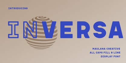 Inversa is a Display sans font with two style. Regular Fill and Outline stroke, fun character with a bit of ligatures and alternates. To give you an extra creative work. Inversa font support multilingual more than 100+ language. This font is good for logo design, Social media, Movie Titles, Books Titles, a short text even a long text letter and good for your secondary text font with script or serif. Make a stunning work with Inversa font. Cheers, Maulana Creative
 - Genius by Artegra,
$19.00 Genius is a clean, geometric typeface with great legibility and modern look, which makes it a perfect typeface for any kind of use. It's especially suitable for branding, advertising, magazines, web design and so on. Created by Ceyhun Birinci, the Genius family consists of 9 weights from thin to black along with their italics.


