10,000 search results
(0.041 seconds)
- Extra Crunchy by Bogstav,
$18.00 Extra Crunchy is my handwriting when I am eating cookies while drawing! No, it's true! I did eat a whole box of cookies while drawing this font! :) The letters are a bit jumpy, and have no steady x-height, however, your text may look a bit off, but it is clear and legible. Fits perfect for a children's book, a postcard/poster design or something else that needs that extra crunch :)
 - Yellabelly by Chank,
$99.00Being a lefty makes it challenging to write in cursive. Unlike righthanders who pull the pencil across the page, lefties must push the pencil as they write. As a result, the letterforms created by pushing instead of pulling the implement are different from each other. The lefty’s cursive script is seen here in Yellabelly, the fontified version of Chank Diesel’s left-handed handwriting. This one’s named after a cowardly cowboy. - Castile by Eyad Al-Samman,
$3.00 Castile is a central region of Spain that formed the core of the Kingdom of Castile, under which Spain was united in the 15th and 16th centuries. "Castile" is a Kufic modern Arabic typeface. It is suitable for books' covers, advertisement light boards, and titles in magazines and newspapers. It is very distinctive when used in black and white printout. It decorates colored pages and makes artworks more attractive. This font comes in three different weights. I adore Spain and the historical achievements of the Islamic civilization existed there in the past. By designing "Castile" Typeface, I wanted to refer to the Islamic civilization that Muslims had in Spain and especially in Andalusia. Today the name of Castile survives in two autonomous regions of Spain: Castile-La Mancha (capital city is Toledo) and Castile-Leon (capital city is Valladolid). The main characteristic of "Castile" Typeface is in its modern open-end style for some of its Arabic characters such as "Sad", "Dad", "Seen", "Sheen", "Qaf", "Faa", "Yaa" and others. The shape of the characters' "dot", "dots", and "point" is innovative; a triangle with a semi-circle shape. "Castile" Typeface is suitable for books' covers, advertisement light boards, and titles in magazines and newspapers. Its charactersí modern Kufic styles give the typeface more distinction when it is used also in posters, greeting cards, covers, exhibitionsí signboards and external or internal walls of malls or metroís exits and entrances. It can also be used in titles for Arabic news and advertisements appeared in different Arabic and foreign satellite channels.
 - Orelia Display by Orenari,
$20.00 Introducing our latest retro font design: Orelia Display font, a modern take on classic mid-century typography. Our simple retro font is designed to be humble yet eye-catching, with clean lines and simple shapes that evoke a sense of nostalgia while remaining relevant and contemporary. This font is perfect for projects that require a touch of retro charm without overwhelming the design. Its understated appearance makes it ideal for minimalist designs, logos, and branding, while the bold letterforms ensure that it still catches the eye. Crafted with care and attention to detail, our simple retro font is available in a variety of weights and styles, allowing you to customize your design and make it truly unique. Whether you're creating a retro-themed website, designing a product with a vintage twist, or simply want to add a touch of nostalgia to your work, our simple retro font is the perfect choice. With its timeless appeal and modern design, our simple retro font is sure to become a go-to choice for designers and creatives who appreciate the beauty of simplicity. Purchase now and add a touch of retro charm to your next project!
 - Callisto by Groteskly Yours,
$8.00 Callisto is a classic serif stencil fonts that is a stencil font like no others. Elegant curves are paired with great legibility and wide range of available glyphs. While stencil fonts are generally thought of as too masculine and rough, Callisto is very feminine and soft, which makes it perfect as a logo font for those who seek to further emphasise their brand's identity. Despite being a display font, Callisto looks great at smaller sizes, so short headlines and headers will look natural and email legible even in smaller sizes. Callisto comes in two styles —Regular and Half —which can easily be combined within the same body of text. Regular is a more minimal style, with wider and more open apertures, while Half is a hybrid between a serif and stencil font that still has longer strokes and stems. Each style consists of 415 glyphs, ranging from fractions to diacritics. There are a number of glyphs with cool stylistic alternatives (which is awesome for branding), lots of punctuation and OpenType features. Callisto is a great font for designers and artists who need a feminine font with a really strong character.
 - Prestige 12 Pitch by Bitstream,
$29.99Limited to a single width for all characters and a rough image transferred through a ribbon to the paper, in 1953 Clayton Smith at IBM, Lexington, adapted the classical serifed letterform to this difficult medium to obtain a typewriter face of good readability and interesting texture. - Malaga by Emigre,
$59.00 Why do we need another typeface? This is a prickly question often asked of typeface designers. Depending on who you ask, the answer in simplified form is usually one of two: 1. As the basis of written communication, type design carries social responsibility, so we must continue to improve legibility. 2. Type design is a form of artistic expression. Without art, life is not worth living. The best work, of course, accomplishes both. Xavier Dupré, the designer of the Malaga typeface family, has at least one leg securely planted in the latter notion. He believes, like others, that within typeface design most legibility needs have been worked out and that today we are satisfying aesthetic desires. We design typefaces to differentiate our communications. Type design is primarily a formal exercise reflecting our personal quirks, technological obsessions, and cultural heritage. In case of Dupré’s work, issues of cultural heritage and personal quirks are of particular consequence. An incessant traveler, he visited the following countries during the development of the Malaga type family: Thailand, Malaysia, Indonesia, Myanmar, Cambodia, Vietnam, France, Belgium, and finally, Spain, where his choice for the name Malaga originates (Malaga is a port city in southern Spain). Dupré’s home is where his laptop is. He travels with a 12- or 15 inch PowerBook, without a printer, and with sporadic access to his reference books and other historical documents. All he needs is a table and chair. He even learned to design without a mouse since hotel and cafe tables are often too small to also fit a mousepad. Dupré is the new global designer who can take disparate influences and fluidly process the information into a coherent whole. Malaga is a case in point. It is inspired by ideas ranging from blackletter to Latin fonts, and from the Quattrocento’s first Venetian antiquas to brush stroke types. This makes Malaga a richly animated font saturated with unorthodox detail. Its black and bold weights are particularly suited for headlines and short texts, while the subtle modulation and moderate contrast in the regular and medium weights makes it perfectly readable in extended text settings. While Malaga doesn’t claim to resolve any particular legibility issues, it is nonetheless perfectly readable and will impart any design with a healthy dose of visual character.
 - Dream Cake by Typadelic,
$14.95 While I was developing this font, my mother kept feeding me something she calls "Dream Cake". This indescribably delicious confection fueled my inspiration (there's nothing like a constant sugar-high to keep you going!) and the result is this cute little font. Dream Cake is casual in nature and as with all of my fonts, you'll find some quirky little twists to make your type projects interesting.
 - Soda Jerk NF by Nick's Fonts,
$10.00Lettering by an uncredited designer on a French travel poster from 1929 provided the inspiration for this ultrabold headline typeface, a curious blend of symmetry and asymmetry. The font’s small descender height allows tight line spacing while maintaining legibility, even in relatively small sizes. Both versions of this font include the complete Latin 1252 and CE 1250 character sets, with localization for Romanian and Moldovan. - Suidae by vve.type,
$49.99 Suidae is a fat font family, combined from 3 different style. It's fresh, friendly, fun and full of surprises waiting for you to be discover!. It is also a great mix of boldness and cuteness, so it definitely captures attention while keeping the minimal form of letters. Plus, Suidae is an effective font family for creating amazing headlines, logos & posters with a custom-made feeling.
 - Bookbag by Letradora,
$15.00 Bookbag is a font for teaching kids to read and write. It comes in 4 weights, from light to extrabold, and has dotted and lined versions for students to practice. Many glyphs have alternate versions, that can be accessed either through OpenType stylistic alternates, or using the Alt versions of the font. Bookbag has a very wide language support, with most latin languages supported.
 - HU Noodle KR by Heummdesign,
$25.00 HU NoodleKR is a stencil-type font designed for drawing with one brush and writing in stroke order. It is composed of large grapheme for good visibility, and fine curves are added to the shape based on straight lines to create a soft feel. In particular, it is a full-bodied square font where personality is felt in double consonants. HU NoodleKR includes Korean.
 - Ballpoint Rush by Motokiwo,
$17.00 Ballpoint Rush is an organic and classy handwritten script font that crafted from pen strokes. The font very simple as a real quick writing with a pen. It's great for chic and elegant projects such as fashion branding, casual notes text, signature, song lyric, and many more. Features & Files: OTF Uppercase letters Lowercase letters Numbers & Punctuation Ligatures Standard Latin Multilingual Support Easy to use in any software
 - Estravaganza by Scholtz Fonts,
$19.95 Estravaganza is an elegant, finely crafted script, with an uneven, drizzled paint line. It has the delicacy of gossamer while boasting the extravagance of bold swashes and loops. Think "ballet-like femininity offset by the distressed paint drizzle of a jackson Pollock canvas." Use Estravaganza to brand perfume, clothing, jewelry, and to enhance wedding invitations, greeting cards and book covers. Language support includes all European character sets.
 - Neubau Grotesque by TipografiaRamis,
$29.00 Neubau Grotesque is an upright italics variation of Neubau Sans and is built in three weights. The main difference of this typeface is that it presents a softer and more human look (less techno), while retaining the condensed geometric structure of its counterpart. Neubau Grotesque is recommended for use as a display font, and has been generated in a single OpenType format with Western CP1252 character set..
 - Emona by Linotype,
$29.99I began my work on Emona while still struggling with Birka. I took the superellyptic form as the basic shape, and that gives the typeface some of its characteristics. It is strictly vertical. It is easy to classify it in the same section as Bodoni & Company. Emona is what Ljubljana, the capital of Slovenia, was called in the Roman days. Emona was released in 1992. - Calm Gray by WR Foundry,
$20.00 The Calm Gray typeface is a book font with good readability. It is relatively bright, has a gentle rhythm and neutral expression. Calm Gray is a lightweight font, and thanks to its small caps and oldstyle figures, it allows to create a pleasant, unaccented text grayness. The Thin and ExtraBold weights are suitable for headlines and highlights in text while maintaining the uniform character of the design.
 - Diogenes by Ludwig Type,
$45.00 Diogenes is an elegant and crisp text typeface. While the skeletons of the individual characters are distinct and strong, the serifs are fine and sharp. This is especially true for the capitals with their comparatively strong horizontal strokes. The graceful appearance of Diogenes makes it an ideal choice for books, newspapers, and magazines, both at small text sizes and display sizes. See also this minisite.
 - Hopeless Romantic Society by PeachCreme,
$23.00 An imperfectly charming handwritten font, "Hopeless Romantic Society", is here to liven up your design works. This carefree ligature-filled handwritten typeface was influenced by writings that were sloppily produced by hand. With these 55 ligatures, your designs will have that extra layer of authenticity. Whether you're looking to create a playful logo or send a handwritten letter, this typeface is the way to go.
 - Fairfield by Linotype,
$41.99 Rudolph Ruzicka designed his font Fairfield as a legible text font. His philosophy: The reader expects optical assistance with reading. He does not want to be distracted while interpreting and understanding the ideas of a text." Fairfield font is based on the forms of Venecian Old Face fonts as well as on the designs and details of Art Deco, giving the font a distinctive appearance"
 - Chop Crap by Flawlessandco,
$9.00 Introducing "Chop Crap" - a lively and humorous handwritten font that combines boldness with a playful twist. There's some connected letters and some alternates that suitable for any graphic designs. This font support for some multilingual. Also contains uppercase A-Z and lowercase a-z, alternate character, numbers 0-9, and some punctuation. If you need help, just write me! Thanks so much for checking out my shop!
 - Rounded Elegance by Douglas Charles,
$12.00 In the "Rounded Elegance" font family you will find modern, clean and elegant fonts. The family is thought and designed to provide smooth and modern logo creation as well as writing subtitles and brand slogans for end customers. The "Rounded Elegance" family is a unique sans serif type, with smooth, rounded contours. The package contains the new version (2.0) of the well-known Rounded Elegance font.
 - Sprouts by Wundes,
$18.00Sprouts is probably best described as "Bonsai-Nouveau". It's designed to look 100% organic up close, while maintaining good readability even at a distance. The looped letters terminate in playful swirls perfect for use on the cover of a menu or cookbook, yet would be equally at home in corporate logo art or as initials. Play with it, because creativity is an organic process. - Comet Hotspur by Putracetol,
$28.00 Comet Hotspur - Display Typeface Font is a bold and distinctive font that seamlessly blends modern and retro aesthetics. With its unique character shapes, bold strokes, and alternative letterforms, this font offers a captivating typographic solution. The font exudes a retro bold and vintage vibe while maintaining a fresh and contemporary edge. Whether you're creating logos, branding materials, titles, posters, film graphics, cards, quotes, or landing page titles.
 - Mersh by Sign Studio,
$12.00 Mersh is a type system that provides a wide range of options for any design project. The typeface comes with 9 weight in both regular and italic styles. Mersh is the result of exploring minimalist design trends and classic typography. Have the ability to be a display font and writing text well. Mers sans serif family is a very versatile font suitable for headlines, posters, logotypes, etc.
 - Sudsier AT by madeDeduk,
$12.00 Sudsier is a note hand drawn font contains 50+ ligatures and comes with two alternative font. Sudsier is great for branding, posters, logos, invitation, writing and headings. Feature Uppercase & Lowercase Number & Symbol International Glyphs Multilingual support Alternative Ligature Thanks so much for checking out my shop and feel free to drop us a message any time and follow my shop for upcoming updates Hope you enjoy it.
 - Swung Note by PintassilgoPrints,
$35.00 Swung Note is a groovy and dynamic font, packed with more than three hundred smart interlocking pairs that do their magic powered by OpenType programming. Since the letters assume different shapes in the many different ligatures, the compositions look truly handcrafted. Swung Note is definitely a great – and quite playful – tool for creating amazing custom-lettered looking designs, while keeping the groove going. Swing-along!
 - Safetread by Hatftype,
$15.00 Safetread is a magical handwritten font carefully created with a touch of elegance. This is a beautiful combination of timeless elegance and authentic calligraphy. It features an incredibly classic style, while still keeping a friendly feel. Safetread is the perfect font for making original and outstanding designs. Features: 01.A-Z Character Set 02.Numerals & Punctuations (OpenType Standard) 03.Stylistic Alternates 04.Multilingual 05.Ligatures
 - Fort Collins by Letterhend,
$13.00 Fort Collins is a pair of fonts that bring the classy yet casual feel in the same time. The condensed sans combined with the natural hand writing script are the perfect match for you who needs a typeface for headline, logotype, apparel, invitation, branding, packaging, advertising etc. This typeface is comes in uppercase, lowercase, punctuation, symbols & numerals, stylistic set alternate, ligatures, etc also support multilingual.
 - Gopher by Adam Ladd,
$25.00 Gopher is a reverse contrast, geometric sans serif typeface in 3 optical sizes ranging — Text, Normal, and Display. With the most subtle contrast,Text works best in smaller type settings while Display is the most dramatic as the contrast has been pushed more to the extreme for an immediate visual impact. Gopher works great in a variety of settings for branding, advertising, posters, magazines, packaging, and more.
 - M Felt Pen PRC by Monotype HK,
$523.99 To blend a handwritten style with a graphical aesthetic, Monotype designers paid attention to the balance between the two, hence harmoniously combine their qualities like a mix of tradition and modern. M Felt Pen references the unified stroke thickness and rounded terminals of rounded Heiti typefaces, imitating the fluidity of marker writing. The linked strokes are vivid and suggest the presence of the human hand.
 - Cherry Bell by Good Java Studio,
$20.00 Cherry Bell is the perfect font for all your fun designs. The main font file is equipped with ordinary characters, as well as more than 350 glyphs to support most Latin-based languages. It is suitable for you to use in making t-shirt designs, quotes, labels, packaging, logo types, or long writing because we have compiled kerning and matrices that are tailored to your needs.
 - M Felt Pen HK by Monotype HK,
$523.99 To blend a handwritten style with a graphical aesthetic, Monotype designers paid attention to the balance between the two, hence harmoniously combine their qualities like a mix of tradition and modern. M Felt Pen references the unified stroke thickness and rounded terminals of rounded Heiti typefaces, imitating the fluidity of marker writing. The linked strokes are vivid and suggest the presence of the human hand.
 - Kamesky History by Youngtype,
$14.00 Kamesky History is a hand brush font made with brushes and ink. This typeface is ideal for use in thick watercolor designs or in those needing a hand writing touch such as blog titles, posters, comic books, t-shirts, clothing, book covers, business cards, greeting cards, branding, merchandising and more. Kamesky History contains a full set of: Uppercase Lowercase Punctuation numbers multi-lingual support Thank you!
 - Blinks High by Reyrey Blue Std,
$12.00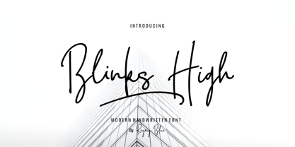 Blink High Signature Script is a beautiful handwriting font based on authentic hand writing with natural signature style. Blink High Signature Script is perfect for branding projects, logo, wedding designs, social media posts, advertisements, product packaging, product designs, label, photography, watermark, invitation, stationery and any projects that need handwriting taste. Features : · All Uppercase and Lowercase · Number & Symbol · Supported Languages · Alternates and Ligatures · PUA Encoded
 - Cinta Adhesiva by Wordshape,
$20.00 Cinta Adhesiva began as a typeface designed for the masthead of a graffiti fanzine called Free Copy. The monumental letters painted by L.A.-based graffiti writers Crae and Hael greatly influenced the feel of the typeface. The availability and ease-of-use of tape as a medium to write with is apparent on a multitude of surfaces, and this approach led to the creation of Cinta Adhesiva.
 - Boyscout by Canada Type,
$24.95Digitized from the handwriting of Simone Wilkie's son, Boyscout is a font that demonstrates a mix between the power of learning and individual creative development of a seven year old child. The struggle to conform with observation appears in most letters, while the creative streak shows clearly in letters like the swashed N, the single-stroke Q, the high T, and the charmingly odd, calligraphic z. - Quickpen by Trial by Cupcakes,
$29.00 Quickpen is casual and carefree, designed to recreate the look of confident, quickly jotted script with a felt tip pen or brush. In OpenType, ligatures and contextual alternates for lowercase letters add a natural hand-written look, while swashes lend a bit more finesse. The perfect script for any design that doesn’t take itself too seriously. For a fuller brush texture, check out Quickpen’s cousin, Quickbrush.
 - Soup and Salad JNL by Jeff Levine,
$29.00 Within the 1893 edition of the Barnhart Bros. & Spindler type specimen book is “Bisque”, a text and headline type face with a charmingly eccentric look. Some upper case characters take on more of a squarer look than others, while the lower case has a higher ‘x’ height. This type revival is now available as Soup and Salad JNL in both regular and oblique versions.
 - Tropic Fresh by Sign Studio,
$15.00 Tropic Fresh is a serif font that adapts to today's design styles. Equipped with alternative characters and also ligature. High detail in every part of the body. Uppercase and lowercase have the ideal height so this font is still good for writing formal text. Tropic Fresh is a versatile font to support a wide variety of today's designs. All PUA Encoded characters, so they are easily accessible.