7,095 search results
(0.014 seconds)
- Hebrew Frank Tanach by Samtype,
$189.00 This is The Classic font of XX century. Based in a typeface created by
 - Roma Initial Caps JNL by Jeff Levine,
$29.00Roma Initial Caps JNL is a set of alphabet caps drawn from elegant lettering found in an old sign painter's manual. The upper case keys have the letters in white on black backgrounds, while the lower case has the letters in black on a white background with a black border. - Dead Mans by Comicraft,
$19.00 Shiver me Timbers and Splice me Mainbrace! There's strange goings on in Smugglers' Cove... A gathering of thieves, brigands, piratefolk and back-stabbing blackguards the likes of which have not been seen since the days of Redbeard! Someone'll be swinging from the yardarm or walking the plank if the map identifying the location of the fonts created for Grim Todd McFarlane's SPAWN: THE DARK AGES doesn't turn up soon!
 - Lonestar by FontMesa,
$25.00 Lonestar is a revival of the old classic slab serif font named Hellenic which was very popular in the middle to late 1800s.
 - Keyden Drop Caps JNL by Jeff Levine,
$29.00 A set of slab serif framed capitals is displayed in the 1906 edition of the Keystone Type Foundry specimen book as “John Alden Initials”. Digitally redrawn as Keyden Drop Caps JNL, regular and reverse versions are available in one font file. Upper case keys contain the regular version, lower case keys have the reverse version. Blanks frames for each are on the parenthesis keys. The font’s name is a hybrid of both ‘Keystone’ and ‘Alden’. These vintage letters can easily be used as drop caps, monogram initials or for short novelty titles or headlines. Choose from either regular or oblique for your next print project.
 - Gallatin Light by Wooden Type Fonts,
$15.00 A light weight slab serif font, useful for posters and large ads, based as it is on wooden fonts designed in the 19th century.
 - Schein by Almarkha Type,
$29.00 Schein – Sans & Slab inspired by the famous minimalist logo and perfect for the purposes of designing templates, brochures, videos, advertising branding, logos and more.
 - Case Closed JNL by Jeff Levine,
$29.00 Case Closed JNL is a bold, slab serif stencil font inspired by a set of brass stencils spotted for sale in an internet auction.
 - Display Roman JNL by Jeff Levine,
$29.00 Display Roman JNL is derived from examples of some vintage sign letters, and features a condensed style with somewhat square letterforms and slab serifs.
 - Grecian Bold Expanded by Wooden Type Fonts,
$15.00 A revival of one of the popular wooden type fonts of the 19th century, suitable for display, geometric slab serifs unbracketed, short descenders,condensed.
 - Redgar by Graphite,
$12.00 Redgar is a weathered display family. It comes in four styles – regular, slab, stencil, clean and has a matching set of banners and shapes.
 - Capstan by Studio K,
$45.00 Bold yet distinctive, Capstan is a stand out slab serif ideal for signage, headlines, branding and other applications intended to convey strength and character
 - Egyptian Wide by Wooden Type Fonts,
$15.00 A revival of one of the popular wooden type fonts of the 19th century, suitable for display, short ascenders and descenders, pronounced slab serifs.
 - Jot by Typadelic,
$19.00A playful slab-serif font. This typeface is versatile enough to be used in any type of design work, be it serious or fun. - Pinatas Marks by Piñata,
$12.00 Original Foundry: TypeType Original name: TT Marks The typeface Pinatas Marks is made in the style of the traditional American sign painting, which is the traditional art of painting on buildings, billboards and signage for the purpose of announcing or advertising of products, services, and activities. Font family Pinatas Marks consists of 32 fonts and has 8 different weights: Thin, ExtraLight, Light, Regular, Medium, Bold, ExtraBold, Black. Pinatas Marks is looking great on all the modern information media, ranging from small labels to entire text blocks.
 - Neuron by Corradine Fonts,
$29.95 Neuron puts a chemist's twist on standard block-style print to create a fresher version of the elemental alphabet. Widely spaced letters and a slightly tall x-height have a clean effect for great readability. Squarish shapes are stylized to retain curved tails, achieving a neutral appearance that makes it very versatile. A thick width in ExtraBold, Black and Heavy give stand-out strength for headlines and branding, without affecting legibility. This modern sans-serif family includes 16 variants, and covers Latin, Central European and Cyrillic characters.
 - CloisterBlack BT - Unknown license

- Burned Rubber - Unknown license

- Marclane by Ironbird Creative,
$10.00 Marclane is a hand drawn slab serif typeface. This item consist of 4 fonts in various styles which you can play around with it and also come with MARCLANE DINGBAT to make better design. This typefaces is perfect for people looking for vintage aesthetic and organic feel or design needs with a touch of classic western. What Will You Get : Marclane Slab Serif Marclane Dingbat If you have any questions, please contact (ironbirdcreative@gmail.com)
 - Northunder Rough by Alphabet Agency,
$23.00 Northunder (Nor/Thunder) Rough is a vintage style font with a powerful presence. It can be used as an excellent display font as it possesses a unique serif style combination of slab serif and serif that create sharp points that really give the font its character. The slab serif elements help give the characters a strong look and balance across the font. The font includes uppercase, lowercase, number, international Latin letters and punctuation.
 - Amecane by designdefontes,
$24.00 Amecane is a mecane. (Mecanes are slab Fonts) inspired by old style typography introduced in the early nineteenth century. Amecane is a slab serif font - designed by Loïc Choquet. The Amecane font family consists of 16 fonts, 2 widths and 8 weights, with italics. Well-suited for editorial projects, logotypes, posters, packaging, etc. The font contains 348 glyphs with a wide range of flexibility for Latin language support for every typographical needs.
 - Northunder by Alphabet Agency,
$23.00 Northunder (Nor/Thunder) is a vintage style font with a powerful presence. It can be used as an excellent display font as it possesses a unique serif style combination of slab serif and serif that create sharp points that really give the font its character. The slab serif elements help give the characters a strong look and balance across the font. The font includes uppercase, lowercase, number, international (basic Latin) letters and punctuation.
 - Bobik by Lewis McGuffie Type,
$35.00 Bobik is a display type family with three faces – sans, serif and slab. The family was drawn initially on basic principles described in Jean Alessandrini’s Codex 80 and then further developed, including adding a lowercase and ligatures. With a clean sans, robust slab and dramatic serif, Bobik has a contemporary European feel and is ideal for headlines, editorial and short copy. Each face contains upper and lowercase plus West, Central and East European language support.
 - Aloha Beach by HansCo,
$15.00 Aloha beach is a slab type font with rounded characters on each side. You will also get some alternative swashes in it. Use this display slab font to add that special retro vintage touch to any design idea you can think of! Very suitable for logotype, Stickers, Packaging design, Cricut Project, headlines, brand identity, t shirt or apparel industry, posters, magazines, books, YouTube, Instagram, websites, or any of your creative design projects. Enjoy!
 - Small Heath by Putracetol,
$22.00 Small Heath - Slab Serif Font. Small Heath is a slab serif inspired by vintage american poster but made flexible enough for everyday use. Small Heath is unique font because the difference "slab" of each character. This serif is very beauty, so it makes Small Heath look amazing great. Small Heath best uses for title, invitation, heading, cover, poster, logos, quotes, product packaging, merchandise, social media & greeting cards and many more The alternative characters were divided into several Open Type features such as Swash, Stylistic Sets, Stylistic Alternates, Contextual Alternates, and Ligature. The Open Type features can be accessed by using Open Type savvy programs such as Adobe Illustrator, Adobe InDesign, Adobe Photoshop Corel Draw X version, And Microsoft Word. This font is also support multi language.
 - Chaparral by Adobe,
$35.00Chaparral is the work of type designer Carol Twombly and combines the legibility of slab serif designs popularized in the 19th century with the grace of 16th century roman book lettering. The result is a versatile, hybrid slab-serif design. Unlike ""geometric"" slab serif designs, Chaparral has varying letter proportions that give it an accessible and friendly appearance in all weights from light to bold. And because it is a multiple master typeface with an optical axis (ranging from 7 to 72 points), Chaparral is clear and legible in smaller text settings while remaining subtle and lively at display sizes. Chaparral�s highly functional design is surprisingly beautiful, the perfect choice for correspondence, as well as book, poster and newsletter design. - Regime by Barnbrook Fonts,
$75.00 Historical influences coalesce with a contemporary twist to form the striking slab serif typeface Regime. In the early 19th century, as the Industrial Revolution began to transform Britain, the slab serif was born. The impact of new technology created a demand for a visual language that was compatible with mass-production and that could capture the attention of a newly-literate consumer. The design of the first slab serif typeface is credited to British punchcutter and typefounder Vincent Figgins and was released under the name Antique in 1815. In the same year, Napoleon was defeated at Waterloo. The name Regime alludes to this moment in history, when Britain emerged as the principal naval and imperial power of the 19th century.
 - Hexore by Almarkha Type,
$29.00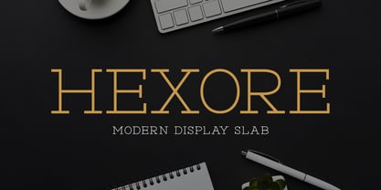 ntroducing Hexore – Modern Display Slab inspired by the famous minimalist logo, perfect for the purposes of designing templates, brochures, videos, advertising branding, logos and more.
 - Tailor by Suomi,
$25.00 Tailor was a study of slab serif style with round and comfortable feel. I wanted to merge round shapes with exaggerated ink traps for legibility.
 - Aldogizio by TeGeType,
$29.00 The ALDOGIZIO family is a new slab-serifs typefaces family inspired by Aldo Novarese' Egizio. It can be use for text as for titling applications.
 - Crystal by AVP,
$25.00Crystal is a clean and highly legible slab-serif design. The four roman weights provide strong color accents making it perfect for reports and newsletters. - Grecian by Wooden Type Fonts,
$15.00 A revival of one of the popular wooden type fonts of the 19th century, suitable for display, geometric slab serifs unbracketed, short descenders, very condensed.
 - Matcha by Los Andes,
$59.00 We decided to explore the concept of fitness, but from a more natural perspective. With so many people drinking detox drinks and eating raw food, we were inspired to create a font that mixes the ‘strength’ of sports and the organic nature of natural products. The result is ‘Matcha’: a strong and energetic typeface that also flows at the same time. Matcha consists of a stable, very friendly Slab face and a calligraphy Script with a handmade style: spontaneous and fickle with some reverse-contrast alternative characters. Can you guess who is the designer behind each style? The duo contains OpenType features and is perfect for labeling natural products, cookbooks, magazine photography, fashion & beauty magazines covers, health & fitness publications, and more. For both print and digital communication. Matcha: the new black coffee!
 - Rothwood by Type-Ø-Tones,
$60.00 In 2011, while tutoring an exercise on Slab Serifs, Josema discovered Robert Thorne’s work for Thorowgood. Specifically, he was fascinated by the extraordinary density of the 6-line Egyptian Pica from 1820-21. As a simple exercise, he wanted to test the limits of readability within the context of a contemporary alphabet. Rothwood Ultra is the result of this experiment. As a way of developing the series, he found it interesting to go to the opposite end of the spectrum and discover how to evolve the extra-black Ultra’s DNA into a super lightweight model. The Hairline and Thin styles are her slim sisters. The third challenge has been the creation of the text version. Light, Book, DemiBold and Bold, including italics and Small Caps close the Rothwood cycle for editorial use.
 - Zin Serif by CarnokyType,
$46.00 Zin Serif is a contemporary typeface designed for various situations of typographic usage. Characteristic feature is a large x-height and balance between neutral construction of letters (strictly vertical axis) and dynamic open forms (opened terminals). Another typical feature is a visually narrower connection between stems and strokes. The complete font family consist of three width proportions (Normal, Condensed and Extended). Every sub-family has 5 weights, ranging from Light to Black with matching Italics. Zin Serif can be effectively used for both text and display typesetting. It can be used especialy in magazine layouts and editorial design, as well in advertising typography, orientation systems, corporate identities and many other situations. Zin Serif is a member of the Zin super family, which also includes Zin Sans, Zin Slab and Zin Display fonts.
 - Rockwell by Monotype,
$40.99 Whether you call them slab serif, square serif, or Egyptian, you know them when you see them – sturdy, nearly monoweight designs with blunt, straight-edged serifs and a no-nonsense attitude. The Rockwell® Nova family is a fine example of this appealing and eminently usable type style. This is a design that is both robust and adaptable. Marked by the flat top-serifs on the cap A, unusual Q tail and high-legibility two-storied lowercase a, Rockwell has a bit of handmade charm that distinguishes it from the cool, more modern interpretations of the slab serif style. The family is excellent for branding, headlines and other display uses. The simple shapes and hearty serifs also make it a good choice for short blocks of textual content in both print and on-screen environments. The light and bold weights are perfect for setting blocks of text copy, while the extra bold and condensed designs bring authority to display copy. Throw in a little color, and you amp up Rockwell’s messaging power. The regular and italic designs perform handsomely, in the most modest of screen resolutions. With four weights of normal proportions, each with a complementary italic, and three condensed designs, two with italics, the family is a commanding and versatile graphic communicator. Rockwell’s large x-height, simple character shapes and open counters, make for an exceptionally legible design. It should not, however, be set so tight that its serifs touch, as this will erode legibility and impair readability. A benefit to Rockwell’s slab serifs, however, is that the design combines beautifully with both sans serif typefaces and a variety of serif designs. Rockwell OpenType® Pro fonts have an extended character set supporting Greek, Cyrillic, most Central European and many Eastern European languages, in addition to providing for the automatic insertion of ligatures and fractions. Looking for its perfect pairing? Look no further than ITC Berkeley Old Style, Between™, ITC Franklin Gothic®, Harmonia Sans™, Metro® Nova or Frutiger® Serif.
 - Hakan by Typefactory,
$14.00 Hakan is an modern display font with an Arabian look. This font particularly for those not native to Arabic languages. Hakan try to bring back the Baghdad and Alladin memories to your design or typography. The font suits creative titling on both web and print, perfect for scroll text. Well balanced letters make for readable blocks of copy or headings.
 - Antique Six by Wooden Type Fonts,
$15.00 A revival of one of the popular English Antique styles of the 19th century. The slab serif style was also used by American wood type manufacturers.
 - Rancher JNL by Jeff Levine,
$29.00 Rancher JNL was inspired by classic wood type. This wide, slab serif typeface is reminiscent of wanted posters, broadsides and other printed matter from the 1800s.
 - Fordham JNL by Jeff Levine,
$29.00 Fordham JNL is a slab serif typeface in regular and oblique versions that has a casual, informal look reminiscent of 50s and 60s-era ad headlines.

