7,054 search results
(0.024 seconds)
- Earmark NF by Nick's Fonts,
$10.00This extra stout slab serif derives its inspiration from two Vincent Pacella designs: Pacella Barrel and Pacella Colossus. Essentially it’s an all-caps font, but there are biform variants of a, e, m, n and u, so you can mix things up to create more interesting headlines. This font contains the complete Latin language character set (Unicode 1252) plus support for Central European (Unicode 1250) languages as well. - Urban Cowboy by Miguel Ibarra Design,
$20.00 Urban Cowboy is a western styled typeface created by Miguel Ibarra. It was designed specifically for display and headline purposes. Urban Cowboy is a fun and bold typeface, that has a combination of western slab serifs with a modern "Tuscan" form. Perfect for that western look, or for a bold logotype. A single set of stylistic alternates can also be applied under ss01 for applications that support them.
 - TEMPER Wide by OGJ Type Design,
$35.00 Temper Wide is an extended neogrotesque slab with unbracketed serifs and square dots. Its hard-working letterforms and industrial heritage make for a no-nonsense look, well suited to editorial design and advertising. It provides an energetic backdrop for fashion and accessories, whether on-product, in campaigns, or branding. Horizon’s the limit! This sturdy font family will be by your side. A neutral, unembellished typeface, ready to make an impact.
 - Barnum by Victory Type,
$9.00 Victory Type is proud to present the release of another classic American typeface. Originally a wood-type, Barnum evokes circus wagons and wanted posters from the wild west. Rugged, rustic, old-fashioned and full of character, Barnum is a charming blast from the past and great for headlines and signage. This chunky slab-serif alphabet was digitized and expanded to include full punctuation and European characters by Noah Rothschild.
 - Lastari by Mantra Naga Studio,
$20.00 Lastari – a Bold Slab Serif Display Typeface. This typeface has many alternatives with swashes that can make your lettering/logotype more attractive. This font is suitable for logos and various other formal forms, such as invitations, labels, logos, magazines, books, greeting/wedding cards, packaging, fashion, makeup, stationery, novels, labels, or advertising. This font is PUA encoded, which means you can access all of the glyphs and swashes with ease!
 - Indus by Linotype,
$29.99Linotype Indus is part of the Take Type Library, which features winners of Linotype’s International Digital Type Design Contest from 1994 to 1997. Designed by P.H. Hashin from India, Indus finds its historical roots in inscriptions found on ancient Indian graves. Thus Indus has a unique look and is versatile in point sizes from middle to headline. The font combines well with sans serif and slab serif typefaces. - Stropha by Tour De Force,
$25.00 Stropha is compact slab serif font family that comes with matching Italics. With distinctive differences between letter stems and with five weights only, Stropha is imagined as small, but "all you really need" family. It's original, with characteristic serifs, with deep ink traps, curvy top diagonal endings and gentle curvy touches in details. Contains Extended Latin character set. Fully applicable in any situation, from branding and editorial design to webfont usage.
 - Aachen by ITC,
$39.00 Note: Neue Aachen is an updated and expanded version of Aachen featuring 18 fonts! The Aachen™ typeface design is a thick slab serif created by Alan Meeks at Letraset, type directed by Colin Brignall. Aachen only comes in two weights: medium and bold. This strong typeface features sharp outlines, stubby serifs and heavy strokes for use in headlines, posters, signage, apparel and other display uses (24 point size and above).
 - Organic Respect by Bogstav,
$17.00 Organic Respect is my monospaced and organic slab serif font. Although the font is monospaced - which may not lead your mind to something organic - I did my best to make the letters appear vibrant and lively in an organic way. I've added 6 slightly different letters for you to choose from, and they automatically cycle as you type, or you can manually select them from the glyph menu.
 - Uchrony by deFharo,
$14.00 Uchrony is a condensed proportion slab serif typeface. The font family is made up of 3 styles, Roman, Small Caps & Italics, with 6 weights each. The lowercase letter "o" has guided the basic proportions and curves, in an exercise in minimalist construction, providing morphological coherence and maximum legibility, for this multi-purpose typeface family. The typography includes alternative letters, several sets of numbers, and advanced OpenType features. • View specimen in PDF
 - Good Reporting JNL by Jeff Levine,
$29.00 A September 29, 1920 edition of The San Diego Union ran the headline “Cicotte Confesses Baseball Fraud; Eight White Sox Players Indicted”. The White Sox baseball scandal was the first to reveal illegal gambling on the game. However, the headline itself was set in a bold slab serif type style [likely ATF Foster] which served as the model for Good Reporting JNL; which is available in both regular and oblique versions.
 - Colon Mono by TipografiaRamis,
$30.00 Colón Mono is a monospaced slab serif type family of eight styles. The typeface design was influenced by the nostalgia for the aesthetic of a typewriter. Colón Mono is a counterpart to Colón sub-family and consists of two weights of roman and alternative styles and matching italics respectably. Colón Mono is released in OpenType format with extended support for most Latin languages, and includes some opentype features.
 - MC Byrdens by Maulana Creative,
$23.00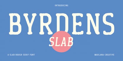 Byrdens is a retro slab serif font. With regular rounded stroke, fun character. To give you an extra creative work. Byrdens font support multilingual more than 100+ language. This font is good for logo design, Social media, Movie Titles, Books Titles, a short text even a long text letter and good for your secondary text font with script typeface. Make a stunning work with Byrdens font. Cheers, Maulana Creative
 - Eden CT by CastleType,
$39.00 Eden Light, originally designed by the American type designer Robert H. Middleton in 1934, was commissioned by Publish magazine for a redesign in 1990. When I found a specimen of Eden Bold a couple years later, I decided to digitize it also. Subsequently, I created a Medium weight. Very squared and compact with thin slab serifs, Eden includes support of all European languages that use the Latin alphabet.
 - Regan Alt by The Northern Block,
$32.00 An informal sans serif typeface carefully cut from the template of Regan and Regan Slab. Smooth curves are combined with simple angles to form a modern, legible font with a charming personality. Regan Alt is ideally suited to wide range of applications including advertising, fashion, retail and the web. Details include 10 weights with italics, 540 characters, 5 variations of numerals, small caps, stylistic alternatives, manually edited kerning and Opentype features.
 - Klick by Grontype,
$10.00 Klick is a Slab Serif Font family. The style are light, outline and Blurred. This font is elegant and it based on the combining a variety of styles. Suitable for Logo, greeting cards, quotes, posters, branding, name card, stationary, design title, blog header, art quote, typography Features : Uppercase and lowercase Numeral and Punctuation Please contact us if you have any questions. Enjoy the font and thanks for supporting us. Regards, Grontype.
 - Pacific Atoll JNL by Jeff Levine,
$29.00 Pacific Atoll JNL is a stylized slab serif type design based on the movie title lettering for the 1942 wartime film “Pacific Rendezvous”, and is available in both regular and oblique versions. According to Wikipedia, “…an atoll (sometimes known as a coral atoll), is a ring-shaped coral reef, including a coral rim that encircles a lagoon partially or completely. There may be coral islands or cays on the rim.”
 - Kenwyn by Talbot Type,
$19.50 Kenwyn is a bold, geometric, Egyptian style slab-serif display font. It comes in two variations — Single Dot and Double Dot — each with an accompanying Stencil variation. Essentially a blend of circles and squares, Single Dot features a circular counter at the centre of each character, while Double Dot uses a lower and upper circle. Although the two variations are similar in principle, the results are visually quite different.
 - Bursa MF by Masterfont,
$59.00 Geometric shapes are the building blocks the construct these 2 fonts.
 - Amebo & Oboni by Volcano Type,
$19.00 Oboni, how are you. I am fine, thank you! This little song is what you will hear in Ghana and Togo. The white people are called Oboni and the black people are the Amebo. We'll bring both cultures together!
 - Basalt by Volcano Type,
$19.00 Basalt is a hard, black volcanic rock with less than about 52 weight percent silica. Because of basalt's low silica content, it has a low viscosity (resistance to flow). Basalt is erupted at temperatures between 1100 to 1250° C.
 - The College Block II font is a Display Slab-Serif typeface that is inherently associated with collegiate and sports themes, making it perfect for university sweaters or ...
- Lady Ice - Unknown license

- Aberration - Unknown license

- Quropa - Unknown license

- Poxy by Something and Nothing,
$10.00 Poxy is a black weight display font with 3 styles available. Built with particles, including circles, hexagons and stars. An Alternate Stylistic Set offers the option to make letters, numbers and symbols float away at the the top of each glyph.
 - Frontiersman JNL by Jeff Levine,
$29.00 The pages of the Speedball® Lettering Textbook have yielded a number of classic typefaces for digital designers. Frontiersman JNL and Frontiersman Black JNL have the wonderful hand-lettered look that adds just the right touch of nostalgia to any layout.
 - Kane by Device,
$29.00 Based on the Batman logo, this font (and a medium weight which is unreleased) were designed especially for Rian Hughes' "Batman: Black and White" comic book. It retains the signature reversed-stress weight distribution, seen to best effect on the A.
 - MAISY by Cultivated Mind,
$29.00 A chic and simple geometric hand font. Maisy comes with a set of icons and is perfect for fashion, marketing, books, websites, magazines, film and television. Maisy comes in two font styles (basic/wide) and four weights (light/regular/bold/black).
 - Anantason Reno by Jipatype,
$17.00 Anantason Reno is a versatile sans-serif typeface that offers a range of 162 styles, spanning from thin to black in weight and ultra-condensed to ultra-expanded in width. Its adaptability makes it well-suited for a variety of purposes.
 - Retrade by Muksal Creatives,
$14.00 Retrade is a unique and modern family of Sans serif fonts. Simply Conception has 9 families Regular font, starting from the small thin to the largest Black. This typeface is versatile and can be used successfully in magazines, posters, branding, websites.
 - Magefin by Muksal Creatives,
$10.00 Magefin is a unique and modern family of serif fonts. Simply Conception has 9 families Regular font, starting from the small thin to the largest Black. This typeface is versatile and can be used successfully in magazines, posters, branding, websites.
 - Indoxine by PizzaDude.dk,
$20.00Indoxine is a scribbled font, simulating hasty written letters with occasional inkblobs. Comes with ligatures for both double upper/lower letters and numbers, in regular and black versions! You will need to use OpenType supporting applications to use the autoligatures. - Nutnik by Hanoded,
$20.00 Nutnik was made using cut out cardboard letters, black paint and some brushes. The result is a highly legible, yet grungy font. It comes with all the diacritics you could possibly wish for and stylistic alternates for the lower case letters.
 - Colibre Bristole Pro by Jolicia Type,
$20.00 Colibre Bristole Pro is a serif font family that crafted with precision, Colibre Bristole consist of 9 styles from thin to black. has 49 ligatures to make writing more interactive Features : · Multilanguange · Alternates · PUA Encoded · Font Family totals 9 fonts
 - LT Cushion Light - 100% free

- Segment A Type by Kobuzan,
$35.00 Segment A is a powerful display type family with 18 styles inspired by condensed European grotesques of 19th-century, but with clear geometric proportions. In Black weights, the letterforms are inspired by the aggressive industrial graphic design of the 1960s and 70s. Both have 3 axes and are adjustable in weight, width and 10˚ italic. It is a typeface with narrow proportions, distinctive character, high-quality outline and lots of details. Characters have oblique cuts, sharp tails and highly visible ink traps. All this makes the font more aggressive and edgy. The huge x-height with short ascenders and descenders allows this typeface to be used in blocks with minimal line spacing. Features: – Total glyph set: 631 glyphs; – 18 styles (3 weights x 3 widths + italic); – Support 210+ languages; – Latin Extended; – Cyrillic Basic + Bulgarian letters; OpenType features: – Proportional numerals, tabular numerals, superiors, fractions; – Punctuations and symbols; – Arrows; – Stylistic alternates (ss01-ss05); – Ligatures; – Case-sensitive forms.
 - Cohort by insigne,
$22.00 Cohort is a strong and crisp geometric sans serif. Cohort uses a rounded rectangle as its central motif. Although the geometric design is minimalistic, Cohort has a variety of unique letterforms that keep the design from being too predictable and maintains a bit of beautiful nuance with plenty of legibility. Cohort's six different weights give it a great deal of versatility, from its sharp and potent black weight to the fresh and razor sharp thin. Cohort can be used for logotypes, headlines or short blocks of text. Cohort includes many useful OpenType features, including a set of upright italic swash alternates, ligatures, small caps, fractions and old style figures, sharper and more unique counterforms and simplified characters for titling. OpenType-capable applications such as the Adobe suite or Quark can take full advantage of automatically replacing ligatures and alternates. This family also includes the glyphs to support a wide range of latin based languages.
 - VLNL Cleaver by VetteLetters,
$29.99 Chop chop! VLNL Cleaver is an important tool in the Vette Letters’ kitchen. It’s a butcher knife of a font. Razor sharp, ultra heavy and with pointy slanted serifs. At first glance it seems straight-lined, but a closer look revails that all straight lines are curved inward slightly, which enhances the sharp image even more. Cleaver was originally designed by DBXL for cutting meat - hell, it even hacks right through bone. It can easily splice a chicken in one slash or seperate ribs, just like that. You can also very well use it to chop up hard vegetables like pumpkin or squash on the chopping block. It gets better, the opposite blunt side can be deployed to crush ingredients like garlic, nuts or spices like black pepper. You could use a grinder, but with Cleaver it’s more fun, isn’t it? VLNL Cleaver is suitable to give a sharp edge to flyers, posters, logos (Heavy metal bands and other) or magazine headlines.
 - AuX DotBitC Xtra Bold - Unknown license


