10,000 search results
(0.034 seconds)
- De Sandey by Rochart,
$10.00 De Sandey is a hand brushed font, with natural authentic brush, and also provided some alternate, ligatures and Swashes Extra. Brand new stylish textured fonts and Make it easy for made logotype Handlettering Style. It will be great for Logotypes, Posters, Digital Lettering Arts, Clean Design, Branding Design, Sign, Merchandise and Social Media Posts. This font contain of Uppercase, Lowercase, Number, Symbol, Punctuation, also support multilingual and already PUA encoded.
 - Arabetics Latte by Arabetics,
$59.00 Arabetics Latte is a Latin Serif typeface with a comprehensive support for the Arabetic scripts, including Quranic texts. While its seemingly-idiosyncratic Latin design eliminates the excessive usage of serifs and offsets the visual effects of several geometrically-intense glyphs, its Times Romanesque proportions gives a full nod to the beginnings of Latin types and produces an overall stable look-and-feel of a classical Serif style, making it suitable for both text and display applications. Liberal spacing is maintained throughout to match that of the Arabic text and is further supplemented by a careful implementation of a typical Latin kerning. The overall design of this font, including metrics and dimensions, was intended to make its Latin harmonize well with most other Arabetics foundry fonts. Arabetics Latte fully supports MS 1252 Western and 1256 Arabic code pages, in addition to all the transliteration characters required by the ALA-LC Romanization tables. Users can either select an accented character directly or form it by keying the desired combining diacritic mark following an unaccented character. For Arabic, it fully supports Unicode 6.1, and the latest Arabic Supplement and Extended-A Unicode blocks. The Arabic design of this font family follows the Mutamathil Taqlidi design style with connected glyphs, emphasizing vertical strokes to bring added harmony, and utilizing slightly varying x-heights to match that found in Latin. The Mutamathil Taqlidi type style uses one glyph for every basic Arabic Unicode character or letter, as defined by the Unicode Standards, and one additional final form glyph, for each freely-connecting letter of the Arabic cursive text. Arabetics Latte includes the required Lam-Alif ligatures in addition to all vowel diacritic ligatures. Soft-vowel diacritic marks (harakat) are selectively positioned with most of them appearing on similar high and low levels—top left corner—, to clearly distinguish them from the letters. Tatweel is a zero-width glyph. Keying the tatweel key (shft-j) before Alif-Lam-Lam-Ha will display the Allah ligature. Arabetics Latte includes both Arabic and Arabic-Indic numerals, in addition to generous number of punctuation and mathematical symbols. Available in both OpenType and TrueType formats, it includes two weights, regular and bold, each has normal, Italic, and left-slanted styles.
 - Roijer by PeGGO Fonts,
$39.00 “Röijer” was born from a branding exercise done with “high care”, graphically developed thanks to the valuable help of designers Marcela Aguilera & Pedro Gonzalez, each letterform and every type design process was worked as a typographic jewel, as a strong bond between classical and fresh concepts (with a Lombardic and Art Nouveau touch). Röijer puts a dual capital model in your hands; a classic Roman and a fresh contemporary alternative, on each letter: the first located in a lowercase box looks formal and sober, while the uppercase box shows a glamorous and more daring look, ideal to being use at specific moments only. Röijer combine elegance and audacity in a very magistral way. It has 2 variants with 541 glyphs each one; a normal and a volumetric one, all with an ornaments set and a decorative objects set. Ideas that be useful not only for branding design but also for titling, headline composition, label design, fashion and luxury stuff.
 - Brush Maker by UICreative,
$23.00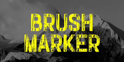 Introducing our new product the name Brush Marker Hand Painted Font. Modern Display font that is beautiful classy, elegant, and modern. This font is perfectly suited for a wide variety of projects, such as signature, stationery, logo, wedding, typography quotes, magazine or book covers, website headers, clothing, branding, packaging design, and more. Also for fashion-related branding or editorial design and displays both masculine and feminine qualities.
 - View is designed to stand out, make an impact , and dominate any visual space with elegance. Its exaggeratedly wide proportions and black weight don't ask for permission: each letter is a statemen...
- Biotrip Sans — a typeface that breathes. I've brought to life a friendly typeface family that is, above all, a journey. A journey (Trip) from the purity of geometry to the warmth of the organic (Bi...
- Brainoise by Ronny Studio,
$19.00 Punk-looking fonts usually embody the rebellious and edgy spirit of the punk subculture. It is characterized by its bold, jagged, and distorted letterforms, which often feature exaggerated or irregular shapes. This font is perfect for your design needs such as: for posters, magazines, covers, brands, logotypes, band logos, etc
 - Chilopod by Typodermic,
$11.95 Are you looking for a font that will transport you back to the golden age of video games? Look no further than Chilopod—the worm script typeface inspired by the classic arcade game, Centipede. With its bold, connected letters, Chilopod will bring a touch of retro gaming nostalgia to any project. But it’s not just a pretty face—this font also features OpenType ligatures, which allow common letter combinations to flow seamlessly into continuous lines. It’s the perfect blend of form and function. So whether you’re designing a poster for your next gaming tournament or just want to add some playful flair to your branding, Chilopod is the font for you. Try it out today and get ready to level up your design game! Most Latin-based European writing systems are supported, including the following languages. Afaan Oromo, Afar, Afrikaans, Albanian, Alsatian, Aromanian, Aymara, Bashkir (Latin), Basque, Belarusian (Latin), Bemba, Bikol, Bosnian, Breton, Cape Verdean, Creole, Catalan, Cebuano, Chamorro, Chavacano, Chichewa, Crimean Tatar (Latin), Croatian, Czech, Danish, Dawan, Dholuo, Dutch, English, Estonian, Faroese, Fijian, Filipino, Finnish, French, Frisian, Friulian, Gagauz (Latin), Galician, Ganda, Genoese, German, Greenlandic, Guadeloupean Creole, Haitian Creole, Hawaiian, Hiligaynon, Hungarian, Icelandic, Ilocano, Indonesian, Irish, Italian, Jamaican, Kaqchikel, Karakalpak (Latin), Kashubian, Kikongo, Kinyarwanda, Kirundi, Kurdish (Latin), Latvian, Lithuanian, Lombard, Low Saxon, Luxembourgish, Maasai, Makhuwa, Malay, Maltese, Māori, Moldovan, Montenegrin, Ndebele, Neapolitan, Norwegian, Novial, Occitan, Ossetian (Latin), Papiamento, Piedmontese, Polish, Portuguese, Quechua, Rarotongan, Romanian, Romansh, Sami, Sango, Saramaccan, Sardinian, Scottish Gaelic, Serbian (Latin), Shona, Sicilian, Silesian, Slovak, Slovenian, Somali, Sorbian, Sotho, Spanish, Swahili, Swazi, Swedish, Tagalog, Tahitian, Tetum, Tongan, Tshiluba, Tsonga, Tswana, Tumbuka, Turkish, Turkmen (Latin), Tuvaluan, Uzbek (Latin), Venetian, Vepsian, Võro, Walloon, Waray-Waray, Wayuu, Welsh, Wolof, Xhosa, Yapese, Zapotec Zulu and Zuni.
 - The "Scratch my back" font by PizzaDude is an intriguing and playful typeface that immediately captures your attention with its unique charm and personality. Designed to evoke a sense of casual creat...
- Fashion Mode by Nirmana Visual,
$24.00 Inspired by Fashion magazine adverts from the 70'sand 80's. modern and minimal look, Fashion Mode Font brings a luxurious and clean style to websites, modern logos, branding identity, social media quotes, wedding stationery, and whatever your heart dreams up!
 - Dolsáb by Kent Barns,
$20.00 Dolsáb was designed from scratch with uniqueness in mind. The subtle movement from thick to thin and the variants of sharp to rounded make this cutting edge san serif a must have. The inspiration for Dolsab was a simple pairing of a rhombus and calligraphy. While neither of those two elements can be seen in their entirety in any instance, the influence of both is strong. The rhombus can be notice on most ascenders like on the lowercase t & l, for example. And the calligraphy inspiration is most easily captured on the descenders such as the lowercase y & g. The most beautiful characteristics of Dolsab is definitely the calligraphy-influenced movement. These features really stand out on the lowercase a & e. It's almost amusing to let your eye follow the contours of those two letter forms as they travel from thick to thin, sharp to rounded and back again. Users are welcomed to try all font styles of Dolsab in any applique of their choosing. However, it will be quickly noticeable that only Dolsab Air & Demi (the thiner of the styles) will be best suited for body copy. Personally I like to see these letterforms as large as they can be to really showcase the subtle movement, especially in Dolsab Heavy where these movements become much more dramatic. You'll never know what really works best unless you experiment. Dolsab surely isn't the answer to all projects, but it's certainly worth trying. No other typeface moves quite like Dolsáb.
 - Floral Decay by Mircea Boboc,
$22.00 This is Floral Decay, your seasonal autumn font with jaded, weathered, and earthy contours of rustic lettering. As they blend into words, the characters evoke floral arrangements of a decaying beauty. It is versatile, playful, and perfect for Graphic Design decorations! This font is unique because, in order to create it, I had to answer some tricky questions: What makes autumn… autumn? Capturing the essence of the other seasons into your letters comes easier. For instance, in order to suggest summer, you only need to draw a few flowers. How about autumn? You could garnish your letters with a few grapes, you might think, but it would only result in a grape-themed font. The notion that is more directly associated with autumn is the image of falling and withering leaves, which brought me to the second question. How exactly are you going to create something beautiful out of a somewhat morbid premise, like wilted leaves? Well, I soon realized that by creating a handwritten font and preserving the right imperfections, you can actually portray collateral beauty. In this context, asymmetry is important because it suggests decay. Further on, the design concept required the letters to come very close together, so that every typed word can be regarded as a floral arrangement. How close together, though? As much as possible without confusing one with the other, risking a lack of legibility. Therefore, in contrast with the demo version of this font, this actual version provides the ideal kerning.
 - Saint Abigail by Fromletterel,
$12.00 Saint Abigail is a handmade font with clean and modern signature style, perfect for creating authentic hand- lettered, branding, logos, card, gift design, wedding related stuffs, web design and social media post. Happy design.
 - Spheris is born from a delightful contradiction: a geometric sans serif with rounded corners that seem to breathe. Spheris is a rounded, geometric sans serif family . Its curves are not a deco...
- Avenir Next by Linotype,
$97.99 Avenir Next Pro is a new take on a classic face—it’s the result of a project whose goal was to take a beautifully designed sans and update it so that its technical standards surpass the status quo, leaving us with a truly superior sans family. This family is not only an update though, in fact it is the expansion of the original concept that takes the Avenir Next design to the next level. In addition to the standard styles ranging from UltraLight to Heavy, this 32-font collection offers condensed faces that rival any other sans on the market in on and off—screen readability at any size alongside heavy weights that would make excellent display faces in their own right and have the ability to pair well with so many contemporary serif body types. Overall, the family’s design is clean, straightforward and works brilliantly for blocks of copy and headlines alike. Akira Kobayashi worked alongside Avenir’s esteemed creator Adrian Frutiger to bring Avenir Next Pro to life. It was Akira’s ability to bring his own finesse and ideas for expansion into the project while remaining true to Frutiger’s original intent, that makes this not just a modern typeface, but one ahead of its time. Complete your designs with these perfect pairings: Dante™, Joanna® Nova, Kairos™, Menhart™, Soho® and ITC New Veljovic®. Avenir Next Variables are font files which are featuring two axis, weight and width. They have a preset instance from UltraLight to Heavy and Condensed to Roman width. The preset instances are: Condensed UltraLight, Condensed UltraLight Italic, Condensed Thin, Condensed Thin Italic, Condensed Light, Condensed Light Italic, Condensed, Condensed Italic, Condensed Demi, Condensed Demi Italic, Condensed Medium, Condensed Medium Italic, Condensed Bold, Condensed Bold Italic, Condensed Heavy, Condensed Heavy Italic, UltraLight, UltraLight Italic, Thin, Thin Italic, Light, Light Italic, Regular, Italic, Demi, Demi Italic, Medium, Medium Italic, Bold, Bold Italic, Heavy, Heavy Italic. Featured in: Best Fonts for PowerPoints
 - Antihistory by Typodermic,
$11.95 Step back in time with Antihistory, the ultimate vintage typeface. Unlike other aged fonts that mimic designs from the early 1900s, Antihistory is inspired by typography from the late twentieth century and beyond. With its distressed look and feel, this typeface is perfect for adding an authentic, retro touch to your designs. Whether you’re working on a vintage-inspired logo, poster, or website, Antihistory will transport your audience to a future bygone era. Available in Regular and Italic styles, Antihistory is incredibly versatile. Use the Regular style for bold headlines and eye-catching titles, while the Italic style adds a touch of elegance and sophistication to your designs. Plus, with its unique look and feel, Antihistory is sure to make your work stand out from the crowd. So, why settle for boring, modern fonts when you can add a touch of alternate universe history to your designs with Antihistory? Get your hands on this one-of-a-kind typeface today and start creating stunning gonzo-vintage designs that will leave a lasting impression. Most Latin-based European, Greek, and some Cyrillic-based writing systems are supported, including the following languages. Afaan Oromo, Afar, Afrikaans, Albanian, Alsatian, Aromanian, Aymara, Bashkir (Latin), Basque, Belarusian (Latin), Bemba, Bikol, Bosnian, Breton, Bulgarian, Cape Verdean, Creole, Catalan, Cebuano, Chamorro, Chavacano, Chichewa, Crimean Tatar (Latin), Croatian, Czech, Danish, Dawan, Dholuo, Dutch, English, Estonian, Faroese, Fijian, Filipino, Finnish, French, Frisian, Friulian, Gagauz (Latin), Galician, Ganda, Genoese, German, Greek, Greenlandic, Guadeloupean Creole, Haitian Creole, Hawaiian, Hiligaynon, Hungarian, Icelandic, Ilocano, Indonesian, Irish, Italian, Jamaican, Kaqchikel, Karakalpak (Latin), Kashubian, Kikongo, Kinyarwanda, Kirundi, Komi-Permyak, Kurdish (Latin), Latvian, Lithuanian, Lombard, Low Saxon, Luxembourgish, Maasai, Macedonian, Makhuwa, Malay, Maltese, Māori, Moldovan, Montenegrin, Ndebele, Neapolitan, Norwegian, Novial, Occitan, Ossetian, Ossetian (Latin), Papiamento, Piedmontese, Polish, Portuguese, Quechua, Rarotongan, Romanian, Romansh, Russian, Sami, Sango, Saramaccan, Sardinian, Scottish Gaelic, Serbian, Serbian (Latin), Shona, Sicilian, Silesian, Slovak, Slovenian, Somali, Sorbian, Sotho, Spanish, Swahili, Swazi, Swedish, Tagalog, Tahitian, Tetum, Tongan, Tshiluba, Tsonga, Tswana, Tumbuka, Turkish, Turkmen (Latin), Tuvaluan, Uzbek (Latin), Ukrainian, Venetian, Vepsian, Võro, Walloon, Waray-Waray, Wayuu, Welsh, Wolof, Xhosa, Yapese, Zapotec Zulu and Zuni.
 - Darkheart by Typodermic,
$11.95 Introducing the spookiest typeface on the block—Darkheart! With its condensed horror style, this font will send shivers down your spine. The interlocking letterforms are reminiscent of the monstrous creatures that roamed the silver screen in the 1960s. Darkheart’s eerie letters will give your message a mournful and terrifying voice, perfect for any horror-themed project. Use this font to create movie posters, book covers, or even Halloween party invitations. And, for your convenience, Darkheart is designed with ligatures that automatically create interlinked combinations. No need to fiddle around with separate letters, let the font work its magic and create the perfect spine-tingling message. Don’t miss out on this creepy typeface—get Darkheart today and let the monsters lurch to life! Most Latin-based European writing systems are supported, including the following languages. Afaan Oromo, Afar, Afrikaans, Albanian, Alsatian, Aromanian, Aymara, Bashkir (Latin), Basque, Belarusian (Latin), Bemba, Bikol, Bosnian, Breton, Cape Verdean, Creole, Catalan, Cebuano, Chamorro, Chavacano, Chichewa, Crimean Tatar (Latin), Croatian, Czech, Danish, Dawan, Dholuo, Dutch, English, Estonian, Faroese, Fijian, Filipino, Finnish, French, Frisian, Friulian, Gagauz (Latin), Galician, Ganda, Genoese, German, Greenlandic, Guadeloupean Creole, Haitian Creole, Hawaiian, Hiligaynon, Hungarian, Icelandic, Ilocano, Indonesian, Irish, Italian, Jamaican, Kaqchikel, Karakalpak (Latin), Kashubian, Kikongo, Kinyarwanda, Kirundi, Kurdish (Latin), Latvian, Lithuanian, Lombard, Low Saxon, Luxembourgish, Maasai, Makhuwa, Malay, Maltese, Māori, Moldovan, Montenegrin, Ndebele, Neapolitan, Norwegian, Novial, Occitan, Ossetian (Latin), Papiamento, Piedmontese, Polish, Portuguese, Quechua, Rarotongan, Romanian, Romansh, Sami, Sango, Saramaccan, Sardinian, Scottish Gaelic, Serbian (Latin), Shona, Sicilian, Silesian, Slovak, Slovenian, Somali, Sorbian, Sotho, Spanish, Swahili, Swazi, Swedish, Tagalog, Tahitian, Tetum, Tongan, Tshiluba, Tsonga, Tswana, Tumbuka, Turkish, Turkmen (Latin), Tuvaluan, Uzbek (Latin), Venetian, Vepsian, Võro, Walloon, Waray-Waray, Wayuu, Welsh, Wolof, Xhosa, Yapese, Zapotec Zulu and Zuni.
 - Posterama by Monotype,
$40.99 The Posterama™ typeface family contains 63 fonts and is a true journey through space and time. Designed by Jim Ford, each Posterama family contains 7 weights from Thin to Ultra Black, in 9 distinct families. What makes Posterama so unique and versatile are the eight alternative display families. By making use of a collection of alternative glyphs, Posterama sets an evocative flavor to visualize an entire century of futuristic reference points from art, architecture, poster design and science fiction into one family. Posterama Text is the base family. It has the most robust character set including upper and lowercase glyphs and pan-European language support (including Greek and Cyrillic). Note: all the other Posterama variants described below do not have lowercase letters or Greek and Cyrillic support. Posterama 1901 recalls the decoratively geometric style of Art Nouveau from the turn of the 20th century. Letterforms such as the slender, snaking ‘S’, the high-waisted ‘E’ and the underlined ‘O’ revive the spirit of Charles Rennie Mackintosh and the designers of the Viennese Secession. Posterama 1913 pays homage to the Armory Show, or 1913 Exhibition of Modern Art, which brought the revolutionary work of European artists such as Picasso, Duchamp and Kandinsky to the US for the first time to the shock and astonishment of press and public. Near-abstract, angular characters such as the ‘A’, ‘E’ and ‘N’ hint at cubism’s jagged and clashing planes. Posterama 1919 uses a small, but important, variation to set a tone when the Bauhaus was founded, and the surge in radical European typography that followed. The straight-sided, roundheaded ‘A’ adds a flavor of 1919 – this style of ‘A’ can still be seen in the Braun logo, designed in 1934. Posterama 1927 captures the year of Metropolis, The Jazz Singer and Paul Renner’s pioneering, geometric Futura typeface from 1927, which had a profound influence on design in the US and Europe. Posterama 1933 – With its low-waisted, sinuous designs, the Posterama 1933 typeface family echoes lettering of the Art Deco period, which in turn had its roots in Art Nouveau, the key influence on Posterama 1901. The two fonts make a great team and can be used interchangeably. Posterama 1945 features a few Cyrillic characters to conjure up an era when Russian art and political posters made their mark in cold war propaganda, espionage and also giant aliens and monsters. Posterama 1984 takes its typographic influences from George Orwell’s classic novel, publicity for the dystopian action and sci-fi movies (Blade Runner, Videodrome and Terminator) and games like Space Invaders and Pac-Man that made an impact at that time. Posterama 2001 was inspired by Stanley Kubrick’s science fiction masterpiece, which made extensive use of the Futura typeface. Posterama 2001 finds its cosmic orbit with its nosecone-style ‘A’ from NASA’s much-missed ‘worm’ logotype. There’s an echo, too, in Bauhaus designs from as early as 1920, whose minimalist, geometric lettering also featured a crossbar-less ‘A’.
 - Decor by Haniefart,
$17.00 Decor is a classic style font made by hand, modified with various ornaments so that it looks attractive, modern and elegant, can be used for company brands, logos, film titles, drink bottles and so on.
 - Bananas by Canada Type,
$30.00 In the history of 20th century graphic arts, the evolution of the informal sans serif has been a uniquely American phenomenon. The ongoing saga of this (still as popular as ever) sub-genre dates back to the maturity of the Industrial Age and early Hollywood film titling, runs through the prosperous times of interwar print publications, sees mass flourishing during the various media propagations of the film type era, and solidifies itself as arguably the most common design element in the latter years of the century. Fun, bouncy, playful, and highly exciting, the casual sans serif is now all over game packaging, film and animation titles, book covers, food boxes, concert posters, and pretty much everywhere design aims to induce excitement about a product or an event. The casual sans is the natural high pill of typesetting. We figured it was high time for the casual sans to adapt to 21st century technology, gain more versatility, and become as much fun to use as the emotions it triggers. So we’re quite excited to issue Bananas, a fun sans serif family in 6 weights and 3 widths that can be used anywhere your designer’s imagination can take you. Rather than being based on a single design, Bananas was sourced from multiple American film era faces, all from 1950s and 1960s, when the casual sans genre was at its popular peak. Headliners’ Catalina and its very similar cousin, Letter Graphics’ Carmel, served as initial study points. Then a few Dave West designs informed the design development and weighting process, before narrow and wide takes were sketched out and included in the family. The entire development process happened in a highly precise interpolative environment. All Bananas fonts come with a full glyph complement supporting the majority of Latin languages, as well as five sets of figures, automatic fractions, quite a few ligatures, biform/unicase shapes and other stylistic alternates.
 - Hurson by Garisman Studio,
$20.00 HURSON is born from original and hand-drawn style font. This font gives a feel of vintage, classic, old, handmade looked like. Already PUA Encoded and I think this font is perfect for people looking for vintage aesthetic or hand-drawn logo. Suitable for any graphic designs such as branding materials, t-shirts, prints, business cards, logos, posters, photography, quotes, and more.
 - Brewery No 2 Paneuropean by Linotype,
$103.99An entry in the Second Linotype Design Contest, Linotype Brewery, designed by Gustavs Andrejs Grinbergs, became part of the TakeType Collection in 1997. Brewery No 2 represents a significantly improved version of its precursor, and the typeface has been both extended and enhanced. When asked about prototypes, Grinbergs cites German typefaces of the early 20th century. It is thus not surprising that the characters of Brewery™ No 2 are based on geometrical forms. However, this is no mere synthetic Grotesque-derived typeface. It has significant contrasts in line thickness and triangular line terminals that are not unlike serifs, placing it in the middle ground somewhere between a Grotesque and serif font. The contrast between the features of a synthetic Grotesque and an Antiqua gives the characters of Brewery No 2 their distinctive charm and is the distinguishing attribute of this contemporary typeface. Additional vibrancy is provided by bevelled line endings (as in the case of the 'E' and the 'F'), the circular punctuation marks and the slight curve of the descending bar of the 'k'. Thanks to a generous x-height and its open counters, Brewery No 2 is also highly legible in small point sizes. Only in its bolder versions is another aspect of Brewery No 2 apparent; Grinbergs has here made the linking elements more rectangular and has emphasized the counters, so that the Bold variants of Brewery No 2 exhibit elements typical of a broken typeface. Brewery No 2 is available in seven finely graduated weights, ranging from Light to Black. Every variant has a corresponding, slightly narrower Italic version. In addition, the lowercase 'a' is given a closed form, the 'e' is more rounded and the 'f' has a descender. The character sets of Brewery No 2 leave nothing to be desired. In addition to small caps and ligatures, there are various numeral sets with old style and lining figures for setting proportional text and table columns. In its most extensive form (the Pan-European variant), Brewery No 2 can be used to set texts in many languages that employ the Latin alphabet and also texts in international languages that use Cyrillic or monotonic Greek orthography. Although some of the features of Brewery No 2, such as the tiny serifs, are only evident in the larger point sizes, this typeface is not just at home when used to set headlines. Brewery No 2 also cuts a good figure in short or medium length texts. This contemporary typeface with its formally elegant quality looks good, for example, on posters, in newspapers and promotional material. It can also be used for websites as it is also available as a web font. - Brewery No 2 by Linotype,
$40.99 An entry in the Second Linotype Design Contest, Linotype Brewery, designed by Gustavs Andrejs Grinbergs, became part of the TakeType Collection in 1997. Brewery No 2 represents a significantly improved version of its precursor, and the typeface has been both extended and enhanced. When asked about prototypes, Grinbergs cites German typefaces of the early 20th century. It is thus not surprising that the characters of Brewery™ No 2 are based on geometrical forms. However, this is no mere synthetic Grotesque-derived typeface. It has significant contrasts in line thickness and triangular line terminals that are not unlike serifs, placing it in the middle ground somewhere between a Grotesque and serif font. The contrast between the features of a synthetic Grotesque and an Antiqua gives the characters of Brewery No 2 their distinctive charm and is the distinguishing attribute of this contemporary typeface. Additional vibrancy is provided by bevelled line endings (as in the case of the 'E' and the 'F'), the circular punctuation marks and the slight curve of the descending bar of the 'k'. Thanks to a generous x-height and its open counters, Brewery No 2 is also highly legible in small point sizes. Only in its bolder versions is another aspect of Brewery No 2 apparent; Grinbergs has here made the linking elements more rectangular and has emphasized the counters, so that the Bold variants of Brewery No 2 exhibit elements typical of a broken typeface. Brewery No 2 is available in seven finely graduated weights, ranging from Light to Black. Every variant has a corresponding, slightly narrower Italic version. In addition, the lowercase 'a' is given a closed form, the 'e' is more rounded and the 'f' has a descender. The character sets of Brewery No 2 leave nothing to be desired. In addition to small caps and ligatures, there are various numeral sets with old style and lining figures for setting proportional text and table columns. In its most extensive form (the Pan-European variant), Brewery No 2 can be used to set texts in many languages that employ the Latin alphabet and also texts in international languages that use Cyrillic or monotonic Greek orthography. Although some of the features of Brewery No 2, such as the tiny serifs, are only evident in the larger point sizes, this typeface is not just at home when used to set headlines. Brewery No 2 also cuts a good figure in short or medium length texts. This contemporary typeface with its formally elegant quality looks good, for example, on posters, in newspapers and promotional material. It can also be used for websites as it is also available as a web font.
 - Albireo by Cory Maylett Design,
$25.00 Albireo is a typeface for those times when you have more to say than space to say it. It also looks fantastic spread out across the page as though space doesn’t matter. Expertly crafted with a high level of attention to detail, Albireo is an immensely practical and flexible typeface that’s neutral enough to be used almost anywhere a highly condensed, sans-serif face is needed. Despite its down-to-earth functionality, this is a typeface that definitely isn’t lacking in style. It really shines when used for headlines or subheadings in magazines, brochures, posters, newspapers, flyers or on the web. With 42 weights, widths and italics, there’s enough flexibility to make every word fit perfectly. You may buy one font at a time or save money by purchasing packages consisting of the 14 fonts in each width (Extra Condensed, Condensed or Semi Condensed). Save even more by purchasing the entire collection and, in addition to the 42 separate fonts, you'll receive two variable fonts (upright and italic) that cover all the weights, widths and everything in between. So where does the name come from? Well, look upwards at night. Albireo is a binary star in the constellation Cygnus. Through a backyard telescope, Albireo (the star) resolves into two brilliant component stars — one orange and one blue. The beginnings of the typeface were the result of me needing a newspaper feature headline about space exploration. I couldn’t find the right typeface, so I drew my own letters and eventually expanded it out into an entire mega-family. Given its origins, naming it after my favorite star seemed totally appropriate. Check it out. I think you’ll love it. Albireo deserves its place as a shining star in everyone’s font collection. It’s that good — really.
 - Transmute by Typodermic,
$11.95 With Transmute, you’ll be transported back to a time when science and machines were the focus of the world. Our display typeface is inspired by vintage technical lettering, with squarish letterforms and quirky angles that give your designs an unmistakable edge. Transmute’s harsh, precise letterforms are the perfect choice for anyone who wants to evoke thoughts of unusual electromechanical, scientific apparatus from a bygone era. Whether you’re designing a cutting-edge website, an eye-catching poster, or an attention-grabbing ad campaign, Transmute has everything you need to make your designs stand out from the crowd. And with three weights to choose from—light, regular, and bold—you’ll have complete control over the look and feel of your designs. So why settle for boring, traditional typefaces when you can add a touch of techno to your designs with Transmute? Try it out today and see the difference for yourself! Most Latin-based European writing systems are supported, including the following languages. Afaan Oromo, Afar, Afrikaans, Albanian, Alsatian, Aromanian, Aymara, Bashkir (Latin), Basque, Belarusian (Latin), Bemba, Bikol, Bosnian, Breton, Cape Verdean, Creole, Catalan, Cebuano, Chamorro, Chavacano, Chichewa, Crimean Tatar (Latin), Croatian, Czech, Danish, Dawan, Dholuo, Dutch, English, Estonian, Faroese, Fijian, Filipino, Finnish, French, Frisian, Friulian, Gagauz (Latin), Galician, Ganda, Genoese, German, Greenlandic, Guadeloupean Creole, Haitian Creole, Hawaiian, Hiligaynon, Hungarian, Icelandic, Ilocano, Indonesian, Irish, Italian, Jamaican, Kaqchikel, Karakalpak (Latin), Kashubian, Kikongo, Kinyarwanda, Kirundi, Kurdish (Latin), Latvian, Lithuanian, Lombard, Low Saxon, Luxembourgish, Maasai, Makhuwa, Malay, Maltese, Māori, Moldovan, Montenegrin, Ndebele, Neapolitan, Norwegian, Novial, Occitan, Ossetian (Latin), Papiamento, Piedmontese, Polish, Portuguese, Quechua, Rarotongan, Romanian, Romansh, Sami, Sango, Saramaccan, Sardinian, Scottish Gaelic, Serbian (Latin), Shona, Sicilian, Silesian, Slovak, Slovenian, Somali, Sorbian, Sotho, Spanish, Swahili, Swazi, Swedish, Tagalog, Tahitian, Tetum, Tongan, Tshiluba, Tsonga, Tswana, Tumbuka, Turkish, Turkmen (Latin), Tuvaluan, Uzbek (Latin), Venetian, Vepsian, Võro, Walloon, Waray-Waray, Wayuu, Welsh, Wolof, Xhosa, Yapese, Zapotec Zulu and Zuni.
 - Adelyne by Good Java Studio,
$20.00 Adelyne is a modern hand-lettering font make from handwriting ideas in font design. This font includes full Alphabetical glyphs, Numerals, and punctuation. Adelyne is perfect for invitations, monograms, wedding, fashion, branding, labels, hand-lettering or logotype.
 - Shiny Ink Display by Lloyd David Designs,
$14.99 Hi there, thanks for looking at my first typeface. It began as one of my original sketches back in 2019 as a freelance graphic designer trying to create unique letterforms that I could use for posters or websites with other possible use cases in mind for commercial use. The sketches were then passed on to and worked on with Vladimir Tsagolov who has more experience in creating professional typefaces, the experience for me was invaluable, and I have many more typefaces I'm now working on. Shiny Ink Display is a collection of hand drawn fonts based on the flow of reflective viscous ink with 7 styles, some styles can be interchangeable and used on top of each other. For example, Shiny Ink Display Plain, can be used with Shiny Ink Display Plain Lined to create shadows underneath it, at angles not available with the Shadow styles you'll see in the font collection. Shiny Ink Display has various use cases, maybe even infinite, but more specifically for posters or websites with large text, though it bodes quite well at smaller sizes, and is visually appealing to its viewers as long as it's at a legible font size. When it comes to font pairing, Shiny Ink Display works especially well with Monospace and sans-serif fonts. You can check the poster examples on this page to help you imagine what you could do with the font styles. I also had in mind manufactured products, but I could leave that to you to create your ideas with the available font styles. In regards to languages or typing on a keyboard, most of the English/European latin or cyrillic language keys are supported, so you'll have lots of glyph characters to play with for a number of ideas you may have. All the best with your projects using my fonts, if there are any issues, don't hesitate to contact me for support: lloyddaviddesigns.co.uk - Lloyd David
 - Chorettan by OCSstudio,
$12.00 Chorettan is a hand-written script. This is perfect for branding, wedding invitations, cards, social media, or maybe for your logo products, and also websites.
 - Playvictim by Gassstype,
$22.00 Here comes a New font,Introducing Playvictim is Bad Brush Font ,This Authentic Style and classy style, Cute Cartoon Font,Bold Display , Inspired from Modern logos of brands that have very strong characteristics, this font is great for your creative projects such as watermark on photography, and perfect for logos & branding, invitation,advertisements,product designs, stationery, wedding designs,label ,product packaging, special events or anything that need handwritting taste. Playvictim a natural Hand Drawn feel. This handmade font will make your design has a beautiful natural touch for each details. It is perfect for any design project as Invitation,logo, book cover, craft or any design purposes,photos, photography overlays, signs, window art, scrapbooking, tags and so much more!
 - Every Cloud by HOHOHtype,
$25.00 ‘Every Cloud’ is a cute hand-drawn type family. The family has 4 different weights and a matching inline style. It has a tall x-height, and the edges are rounded and soft. It was designed with applications such as advertising and packaging, editorial and publishing, logo, branding and creative industries, poster and social media, and marketing in mind.
 - Luciana by Liartgraphic,
$14.00 Our newest script font, Luciana, is funny but straightforward, both used as a letter logo, branding, packaging design, landing pages, tag lines and more. Our fonts also include multilingual support as well as alternates and ligatures.
 - Beard Canye by Fype Co,
$16.00 Beard Canye is perfect for delivering any message with confidence and style. This hand-lettered script is inspired by baseball. Beard Canye works well for logos, stationery, social media, branding, packaging, header, and so much more.
 - Dreamelly by Good Java Studio,
$20.00 Dreamelly was born from hand writing style fonts. It is versatile and useful for design posters, logos, branding, labels, quotes, headline profiles, banners, t-shirt design, packaging, magazines, brochures, and much more in your amazing work.
 - Astenia by Fateh.Lab,
$15.00 Astenia is a modern script that is designed in detail, made with original hand pulls, the perfect font to meet needs such as photography, signatures, branding, logos, and more. Very beautiful and classy, simple but strong.
 - Jesus Saves by Breauhare,
$13.94 Jesus Saves is a font based on the familiar old logo that has “JESUS” hidden within a maze-like set of multi-branched vertical bars. The characters appear to be an alien, cryptic language at first sight, perhaps even a Japanese, Chinese, or Korean language, thanks to the unusual figures created by the combinations of various letters. It is a teaser for the eyes, as well as a visual feast of De Stijl-type art. It is an attention-getting font that is cool to look at, an eye puzzle that is enticing to decipher. It’s a great font to use for striking logos (see Gallery Images) by the judicious use of ligatures, where in word settings ligatures may be used at the beginnings of words, the middle or the endings of words. Jesus Heals is the missing spaces from the Jesus Saves font, sort of like a doughnut hole font! If you use this font to fill in the spaces in the Jesus Saves font, it becomes whole, or healed, thus the name. Jesus Lives is a raised block/3D or three dimensional version of Jesus Heals. For color combinations in apps that support layering, Jesus Lives synchs and has perfect kerning register with Jesus Heals, as Jesus Heals has with Jesus Saves. The digitization was done by fontmeister John Bomparte.
 - Artistic Sigature by HKL Studio,
$19.00 Artistic Signature is a modern, handwritten font with a magical emphasis. This font is perfect for creating signature logos and watermarks for photography studios or wedding invitations, best for signatures or initial logo branding. Artistic Signature includes a full set of beautiful handwritten upper and lower case letters, numbers, various punctuation and binding. All lowercase letters including initial and final strokes, have 54 bindings that give a realistic handwriting style.
 - Suttena Script by Letterfreshstudio,
$15.00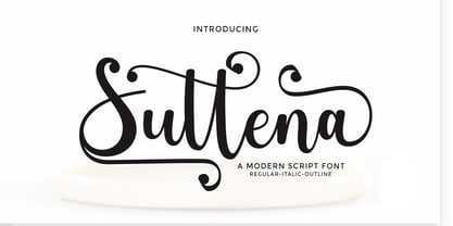 Introduce ! Suttena Script script is a modern script with hand lettering, decorative characters and dancing baselines! very suitable for use Such as blog headers, branding, t-shirts, weddings, social media, product design, stationery, advertising, clothing, book covers, business cards, greeting cards, branding, merchandise, invitations and handmade quotes and many more. Features : Ligatures Stylistic sets Basic Latin A-Z and a-z Numbers International Symbols included Punctuation Ligature Thank You.
 - Marvellous Script by Lone Army,
$10.00 Marvellous Script - A Perfectly Magical bouncy Script hand lettered Creative and Casual, together or apart, make tons of gorgeous typographic designs, just in time for all your Christmas labels, cards, and branding too! Perfect for DIY projects, greeting cards, labels, quotes, posters, invitations, wall art, branding, packaging, websites, photos, photo & photography overlays, signs, window art, tags and so much more! Marvelous has an alternate beginning and ending set as well
 - Sophima by insigne,
$10.00 What's Included : • Ligatures • Works for PC and Mac • Simple installation • 7 styles: 1 undistressed, 6 distressed • 500+ glyphs in each type • More than 75 languages are supported, including extended Latin. • Each style includes 12 OpenType features, including stylistic alternatives, ligatures, old-fashioned figures, and other helpful elements. • Two different swash ending varieties. • Non connected forms • All connected forms, including caps • Randomly selected character forms for organic looking textures. Sophima exudes languorous luxury. The writing glides around, changing elevation above and below the standard x-height, giving it a lively and raucous vibe. Sophima is designed for 3D printing. I required a contemporary script with technical elements that could be printed using a 3D printer. This necessitates the use of quite thick linking characters. Another result of this technology was the need that all letters, including caps, be linked. Such letters are included in optional Opentype style sets. The unusual technological limitation gave the design a new and distinct vibe. Sophima may be used for a variety of purposes, including headlines, weddings, social media, logos, posters, packaging, T-shirts, coffee shops, restaurants, magazine headers, signage, gift/post cards, cafés, and weddings. Designers have a plethora of alternatives from which to pick, giving them greater variety, power, and creative flexibility. Automatic ligatures for best character connections are supplied, as are alternate ending characters that appear at the end of words that lack connectors or have lengthy swash endings. Sophima is made up of five fonts: one standard and five texture variants that change the tone of the typeface. Each design has 500 characters and is available in more than 75 languages. The typeface has 15 OpenType features, such as stylistic alternates that change the look of characters, ligatures, and more. Constraints and a desire to solve challenges breed the finest creativity. And there's no question that Sophima came up with a solution to the situation. Now use Sophima to create your own designs.
 - Ahoy Amigo by Konstantine Studio,
$10.00 Say hello to Ahoy Amigo! A couple of all caps and script brush hand lettering font. Fully stroked by human hand with the authentic traditional handmade vibes to catch up your vintage crafted branding feels. Absolute perfectly imperfect.