10,000 search results
(0.135 seconds)
- Centennial Script by Canada Type,
$24.95 Centennial Script was designed and cut by Hermann Ihlenburg in 1876 (the centennial of American independence, hence the typeface's name) for the MacKellar, Smiths & Jordan foundry in Philadelphia. Ihlenburg was then only 33 years old, and these beautiful forms put him on his way to become the most prolific and innovative deco, ornamental and script typeface designer and punch cutter of the nineteenth century. In trying to be a true homage to the history of the new world, Centennial Script transcends its then-contemporary deco fashion to embrace script elements historically similar to lettering found on maps or political documents of the 18th century. Letters like the p and s extend themselves high and mighty to accentuate words and lines of text in a fancy hand-drawn manner. The dots on the i and j are those of a careful scribe who acknowledges the importance of the document being lettered. The lowercase letters connect with two slight angular motions of the hand, also very carefully and elegantly. Even the ligatures and ending swashes Ihlenburg made for this face were reminiscent of a mapmaker's patient hand, though Ihlenburg's elegant touch in them cannot be mistaken. Although Centennial Script was one of the few Ihlenburg faces to make it to film type technology, the transition was neither credited nor faultless. The film type version was a bit sloppy in the way the connectors were made, so the lowercase needed a lot of manual work to typeset properly. To alleviate such waste of time for the user of this digital version, the connectors were redrawn according to the original metal ones made by Ihlenburg himself, and tested thoroughly in print to ensure the quality of the typeface's flowing cursive nature. This wasn't an easy task, and very time-consuming, since the changing angles on both ends of the connection made it impossible to escape from having to build every lowercase letter with both left and right connectors that would fit with the rest of the letters. This is one typeface that couldn't be revived in any other manner than the way it was originally made, regardless of more than 130 years of technological advances since the face was designed. Centennial Script comes in all popular font formats, and supports most Latin-based languages. Also included is an Alts fonts that contains alternates, ligatures, snap-on swash endings, some ornaments, as well as a complete set of the lowercase without left side connectors, for a more natural combination when following a majuscule, or just in case the user finds it fit to set the copy in a non-connecting script instead of the face's original connected flow. Centennial Script Pro, the OpenType version, combines the main font with the Alts font in a feature-packed single font. Use the ligature feature to set wordmarks like Mr, Ms, Mrs, Dr, and &Co, the stylistic alternates feature to replace some letters with their alternative forms, the contextual alternates feature for better uppercase-lowercase sequences, and the titling feature to set your text in a disconnected script. Centennial Script is the only script we currently know of that can be set connected or disconnected simultaneously, either using the titling feature in the OpenType Pro version, or manually in the other formats.
 - Fuse by W Type Foundry,
$25.00 This font is inspired by two typographic styles, incorporating (both) geometry and humanism. It combines the rhythm of such typefaces as Meta Pro and The Sans, as well as terminations and structures from fonts like Din and Futura. This results in a font that plays with condensation and a parallel rhythm, simple and functional. Fuse is perfectly equipped with Opentype, it contains alternative glyphs, fractions, modern and old numbers, superscripts and subscripts, ligatures and Small Caps. We always kept the idea of having Fuse be humanistic, rational and universal, which makes it ideal for graphic design, printed publications, web design, motion graphics, interaction design and branding. Learn about upcoming releases, work in progress and get to know us better! On Instagram W Type Foundry On facebook W Type Foundry wtypefoundry.com
 - Volut by jpFonts,
$19.95 Volut is a very charming display font designed by Christoph Ulherr. The family comes with four design variations as Base, Blocks, Outline and Outline Blocks. It’s touching and kissing characters create an outstanding sex appeal. Volut invites you to play and have fun, just try it. It should only be used in large point sizes beyond 24pt. All fonts include stylistic alternates and special ligatures to guarantee the best typographic quality.
 - Andron 1 Alchemical by SIAS,
$99.00 Andron 1 Alchemical offers about 170 alchemical and astrological characters in a sophisticated and mature typographical style. It contains all relevant Zodiac, constellation and planet symbols of the 26xx Unicode block as well as the complete new 1F700-block of special alchemical characters. – All glyphs are drawn in the classical Andron style and blend perfectly with all other Andron fonts. – This font is a valuable addition to your Andron library.
 - Linotype Scrap by Linotype,
$29.00Linotype Scrap is part of the Take Type Library, chosen from the entries of the Linotype-sponsored International Digital Type Design Contests of 1994 and 1997. The font is available in two weights and was designed by German artist Ingo Preuss. It is as though the forms of the basic weight were cut with scissors out of pieces of paper. There are no inner contours, only the outer silhouettes. The capital letters which make up Scrap Bonus are set on black rectangular backgrounds and are white and framed with a white contour. This weight includes a number of different pictograms which were also not spared the scissors. The decorative Linotype Scrap embodies the comic style of the 1990s and is meant exclusively for headlines of points sizes 18 and larger. - Putrey by Alit Design,
$11.00 Introducing PUTREY Typeface PUTREY font is designed with a modern concept that is simple and dynamic. The sans serif style adopted by the PUTRAY font is a 2022 style font, has a unique swash alternative, has a large selection of ligatures. In addition. Sans Serif typefaces such as “PUTREY typeface” are very easy to apply to any design, especially those with an elegant and smooth concept, besides that this font is very easy to use both in design and non-design programs because everything changes and glyphs are supported by Unicode (PUA). The PUTREY typeface contains 837 glyphs with many unique and interesting alternative options. Plus, there's a cool sans serif font family for header and description text from light to black. In the poster preview all the letters are in the PUTREY typeface.
 - SK Paragrapher by Shriftovik,
$10.00 SK Paragrapher™ is a monumental geometric typeface whose structure was inspired by the paragraph glyph. The entire typeface is built on a rhythmic composition and a black-to-white balance. Each character corresponds to a grid, and all its characters are monospaced, so the typeface looks harmonious and complete, despite the complexity of perception of its appearance. This typeface has both uppercase and lowercase letters, as well as a capital! The typeface supports a multilingual layout that includes: extended Latin and Cyrillic characters, additional characters, and Hebrew. This typeface also includes more than 10 currency symbols, as well as 4 fonts: Solid, Outline, Rounded, Sharp! As a result, SK Paragrapher is a multilingual, monospaced geometric monumental typeface that contains almost 1000 glyphs for your any design work, be it a poster or a website!
 - Penitentiary Gothic by E-phemera,
$30.00Penitentiary Gothic is a digital recreation of the letters used on California state license plates, designed in order to make props for movies and television shows. The regular style is meant to be used on its own, but the other four styles are meant to be used one on top of another in different colors to create an embossed 3D effect. For best results, use the fill style in a dark color on top of a light colored background. Put the lolite style directly on top of the fill style in 10 - 30% of the background color. Put the hilite style directly on top of that in 10 - 30% of your fill color. Put the shadow style directly on top of that using your background color plus 50 - 80% black. - Eris Pro by DBSV,
$120.00 Rolling gemstones… The name "Eris" is again borrowed from Greek mythology, is related to the myth "the apples of Hesperides" which were gold and one of them got the Erida!!! More about this myth can be found on the web... And in this font (as in one section in the "Cyceon" font) I have mixed in the lower case with the capitals in many letters.I tried here to give a different illustration in lowercase letters, simply because of whims or because the monotony is tiring me!!! One can also mix here with two levels to get a third color depiction using the “ErisPro-Black” with “ErisPro-Strap” or “ErisPro-BlackIt” with “ErisPro-StrapIt” This series is composed and includes twenty-four fonts with 658 glyphs each, with true italics and supports Latin, Greek and Cyrillic.
 - Lucida Handwriting by Monotype,
$40.99 Lucida Handwriting is a casual, connected script designed for smooth and fun reading on screens and in print. Its relaxed personality and vigorous energy sends a distinctive message. Lucida Handwriting was originally released in one weight. It is now available in five weights, from Thin to Black. Lucida Handwriting was designed by Kris Holmes and Charles Bigelow based on historic blackletter style cursives. As with other joining script typefaces, all capital letters usage is not recommended: it is best to use upper and lowercase for optimal legibility. Lucida Handwriting is part of the Lucida superfamily of fonts from Bigelow & Holmes. Lucida is highly regarded for legibility and its extensive range of type styles. The Lucida Handwriting typeface family has a Standard character set with 255 glyphs supporting the basic range of Latin languages.
 - Cavas Nera by Authentype,
$13.00 Cavas Nera modern & elegant font with discretionary ligatures that give each word a different shape. Also contains a swash with an elegant, contrasting, and clean, perfect for logo designs, posters, and various types of promotional media. Including 8 Font weight Thin, ExtraLight, Light, Medium, SemiBold, Bold, ExtraBold, Black. – Standard glyphs uppercase and lowercase letters – Numerals, a large range of punctuation and ligatures. – Swashes. – Multilingual – Works on PC & Mac. Simple installations, accessible in Adobe Illustrator, Adobe Photoshop, Adobe InDesign, even work on Microsoft Word. PUA Encoded Characters – Fully accessible without additional design software. Fonts include multilingual support for; ä ö ü Ä Ö Ü ß ¿¡ _________________________________________________________________________________________ Image used: All photographs/pictures/logo/vectors used in the preview are not included, they are intended for illustration purposes only. Thank you for your purchase! Hope you enjoy our font!
 - Ador by Fontador,
$24.99 Ador is a humanist sans serif especially designed for contemporary typography and comes up with 8 weights from ultralight to black plus true italics and 343 ligatures. A large x-height not only creates space in the letters for extra-bold styles, but also lends Ador an open and generous character in the more narrow and semi-bold versions. The nice balance between sharp ink trapped and soft, dynamic shapes helps to work in small sizes. Diagonal stress, angled finials and the 4 degree true italic styles give Ador a dynamic look. The font contains 981 glyphs including small caps, tabular, old style, fractions … and a wide range of flexibility for Latin language support for every typographical needs. Ador is a contemporary sans serif typeface, special for logotypes, brands, magazines and editorial.
 - CA Negroni by Cape Arcona Type Foundry,
$29.00 A dinner is not complete without a fine appetizer. Whatever you dinner will be, CA Negroni is the perfect introduction. Delivered in three flavors, Normal (Light + Black + Fill), Inline and Round. Versatility is proved by the extensive language support, covering whole Central Europe. CA Negroni is the well aged and improved version of a typographic classic: in the beginning of the 20th century, type in advertising was mostly drawn by hand. A master of this art and pioneer in logo-design was Wilhelm Deffke (1187–1950). CA Negroni is inspired by his kind of bold and solid letterings, picking up some of the charming details while leaving away other that might have a disturbing effect on the general look. Two stylistic sets let you choose between a more serious or a more playful look.
 - Ravensara Serif by NaumType,
$19.00 Ravensara Serif - elegant high contrast classic serif. Style of the typeface originates in a classic Didone but took a step to simplify some letter forms and make Didone feel more contemporary. Ravensara Serif is a part of the Ravensara superfamily, united by the same anatomy, which currently also includes Ravensara Sans and Ravensara Stencil. Ravensara Serif, despite its ancient roots and due to simplified and smoothed forms, can be used in a variety of different styles. It’s a perfect choice for bold headlines, oversize typography, fashion logos, branding, identity, website design, album art, covers, posters, advertising, etc. It is available in 7 weights, including Thin, Light, Regular, Medium, SemiBold, Bold and Black. Ravensara Serif extends multilingual support to Basic Latin, Western European, Euro, Catalan, Baltic, Turkish, Central European, Pan African Latin and Afrikaans.
 - Zin Serif by CarnokyType,
$46.00 Zin Serif is a contemporary typeface designed for various situations of typographic usage. Characteristic feature is a large x-height and balance between neutral construction of letters (strictly vertical axis) and dynamic open forms (opened terminals). Another typical feature is a visually narrower connection between stems and strokes. The complete font family consist of three width proportions (Normal, Condensed and Extended). Every sub-family has 5 weights, ranging from Light to Black with matching Italics. Zin Serif can be effectively used for both text and display typesetting. It can be used especialy in magazine layouts and editorial design, as well in advertising typography, orientation systems, corporate identities and many other situations. Zin Serif is a member of the Zin super family, which also includes Zin Sans, Zin Slab and Zin Display fonts.
 - Hando Soft by Eko Bimantara,
$24.00 Hando Soft is a variant of Hando neo grotesk sans family. Each letter on Hando Soft has curve strokes end, which gives a soft and more ease-looking letterforms. Hando offers a wide range of usage possibilities. It's low x-height and variety of light size options make it a good choice for reading, it's tenuous white spaces in the counter letterforms make it legible enough to be recognized remotely. It's curved tensions on the circular letterforms gave a futuristic impression. It's sleek and simple strokes make it perfect for a broad range design purposes. Hando consists of 10 styles from Hairline to Black with each matching oblique. Contains more than 440 glyphs that support a broad latin language. Also some Opentype features e.g. stylistic alternates, variation of figures, e.t.c
 - Colagent by Great Studio,
$25.00 Colagent is a high-contrast typography inspired by transitional and contemporary typography. The font expands its usability by providing weights ranging from Light to black. Natural curves, swelling and slanting stems grow in characters as the font gets heavier. While the thinner weights have reduced contrast and optical corrections to create a warm and soft appearance. Featuring charming italic letters, exceptional bold weights, and full character support for over 200 Latin-based languages. Colagent excels in display settings such as editorial design, titles, branding projects, logo design, packaging, magazine headings, advertising, short or long text. Colagent also comes with four Variable font versions: Regular, Italic, Condensed, and Condensed Italic to make it easier for designers to explore and perfect beautiful designs, uncovering many visual tones and hidden secrets.
 - Ransite Medieval by Mans Greback,
$69.00 Ransite Medieval is a bold blackletter typeface. Put together and refined by Mans Greback in 2022, this Old-English style lettering is drawn based on studies of multiple historical documents and typographic resources. With black calligraphy strokes, this heavy middle ages typeface is decorative but clean and clear. Ransite Medieval is provided in four styles: Regular, Bold, Italic and Bold Italic Use it for a logotype or in a medieval context where you want a genuine, yet legible, typography. The font is built with OpenType functionality and has a guaranteed top-notch quality. It has extensive lingual support, covering all Latin-based languages, from North Europa to South Africa, from America to South-East Asia. It contains all characters and symbols you'll ever need, including all punctuation and numbers.
 - DIN Next Slab by Monotype,
$56.99 Now even more design possibilities with the popular DIN Next. With its technical and neutral character, DIN Next has earned a permanent place in contemporary typography. Now, DIN Next Slab expands the font family further, offering new design potential. Now comes the next step, DIN Next Slab, also produced under the direction of Akira Kobayashi. On a team with Sandra Winter and Tom Grace, Kobayashi is creating the new font variant based on the optimized shapes of DIN Next. The expansion will make the popular font all the more flexible and versatile. Apart from that, the geometric slab serifs underline the technical and formal nature of the font and emphasize a central design element of DIN Next. However, the team did have some challenges to overcome. While it is relatively easy to imagine DIN Next Light with slab serifs, the amount of available space quickly disappears when it comes to the Black styles. Winter explains that many tests and trials were necessary to find a compromise between space, letters and the serif shapes. Experiments with modified contrast in the weight or only one-sided serifs were quickly abandoned. The central, technical and powerful character of the font changed too much. Nevertheless, it was necessary to simplify slightly the shape of some letters, such as the ‘k’ or ‘x’, for example. These changes, first developed in the Black styles, were applied to all weights in order to lend the font a consistent appearance. Like DIN Next, DIN Next Slab also has seven weights, which cover the range from Ultralight to Black, each with matching italic. There are various character sets in all of the styles and the four middle weights have small capitals available. DIN Next Slab harmonizes perfectly with the styles of DIN Next: the basic letterforms and weights are identical. Both versions of the font can work together perfectly, not just in headlines and body text, but also within a text; they complement each other very well as design variations. With the new DIN Next Slab, Monotype expands the DIN Next super family consistently. With DIN Next Slab, you can underscore the technical and formal nature of the understated font not only in headlines, but in texts, as well. In this way, you have new and diverse potential for application, thanks to the way the different styles of DIN Next combine perfectly.
 - Scripps College Old Style by Monotype,
$49.00The story of Scripps College Old Style is a heart-warming and inspiring chronicle about a young librarian, a handful of students, a wealthy grandmother, a dedicated educator -- and two eminent American type designers. The story begins in 1938, when Dorothy Drake, the newly hired librarian at Scripps College, a small women's college in southern California, became an impromptu dinner companion of the American type designer Fred Goudy. By the 1990s, the original fonts that Goudy had created for Scripps College in the 1940s had become prized -- but they were seldom-used antiques. Scripps needed digital versions of the metal fonts. This goal posed two immediate challenges: finding a designer familiar with letterpress printing who was skilled at creating digital fonts, and locating the money to commission the designer's services. The first challenge was the easiest to conquer. Sumner Stone was my first and only choice," recalls Kitty Maryatt, the current curator of the Scripps College Press. "I knew he had letterpress experience, was an accomplished calligrapher, and that his typeface designs were simply exquisite. The choice was easy."The second challenge was more difficult. It took the dedication, hard work and tenacity of Maryatt to bring the beautiful Goudy designs into the twenty-first century. While Stone was eager to begin work on the project, the college had no more money for new typeface designs in the 1990s than it did in the1930s. Years of lobbying, cajoling and letter writing were necessary to obtain the college's approval for the design project. Once she had the necessary funding, the design brief posed yet a third challenge. Goudy had provided two sizes of type to the Press: 14 point and 16 point. Which would serve as the foundation for Stone's work? In addition, the Goudy fonts were quite worn. Should Stone use printed samples as his design master, or base his work on the original Goudy renderings? The 14-point master drawings were the ultimate choice, with the stipulation that the finished fonts would provide both a seamless transition from the worn metal versions and a faithful representation of the original Goudy designs. Once the budget and design brief were established, the process of converting the original Goudy drawings into digital fonts took just a little over two months. Stone delivered finished products to Scripps in the fall of 1997. The first official use of the fonts was to set an announcement for a lecture by Stone at Scripps in February of 1998. But the story is not quite finished. Maryatt was so pleased with the new digital fonts, she wanted to share them with the graphic design community. At Stone's suggestion, she contacted Monotype Imaging with the hope that the company would add the new designs to its library. An easy decision! Now Monotype Imaging is part of the story. We are proud to announce the release of Scripps College Old Style as a Monotype Classic font. The once exclusive font of metal type is now available in digital form for designers around the world. " - Ribbons by Positype,
$20.00 Ribbon type. Holy grail of complex-lettering-turned typeface or an elusive Loch Ness monster that is often teased, possibly seen in the wild, but never confirmed? From the amazing lettering artist and author Martina Flor and masterful type designer Neil Summerour, comes the aptly named Ribbons. Ribbons is a sincere and well-conceived approach to providing a reliable solution to ribbon and ribbon-styled type for creative professionals when a lettering artist just isn’t available. Ribbons provides both flat and ‘folded’ options with the Regular and Fold styles, but then raises the bar with separate layer styles that will allow you to easily create the elegant back and forth movements produced with ribbon-style lettering we have all come to appreciate. These layer options are provided in both ‘smooth’ and ‘pleated’ connected styles. Flor and Summerour didn’t stop there. Each typeface was expanded with a number of stylistic alternates, additional swashed and flourished letters, ligatures, and even more in order to provide as many decorative options as possible to the creative. To round out the nine fonts available in the typeface and to ‘put a bow on it’, they’ve added a separate Shadow style and two different color fonts (available exclusively with family purchases).
 - Once upon a time, in a galaxy not-so-far away, nestled within the boundless universe of typography, there emerged a font that was unlike any other. It was a font so whimsical and so eccentric that it...
- Are You Shaw NF by Nick's Fonts,
$10.00This decorative delight is based on a typeface discovered within the pages of "Schriftatlas: Alphabete von A bis Z," and originally named Pygmalion. The swash caps and plain caps in the lowercase positions allow for wide-ranging creativity in the composition of dramatic headlines. Both versions include the complete Latin 1252, Central European 1250 and Turkish 1254 character sets, as well as localization for Moldovan and Romanian. - Trocadero Pro by RMU,
$35.00 In 1927 Albert Auspurg cut Trocadero for the Trennert foundry in Hamburg. This new version is not a mere digitalization, but many letterforms were altered and updated, and missing links in the complete alphabet had been drawn afresh. Out came a beautiful cursive font with a certain charm of its own which covers beside the West European languages also those of Central Europe and Turkish.
 - Making Cookies by Timurtype,
$14.00 Introducing by Timur type Proudly Present, Making Cookies Making Cookies A Handwritten Font Making Cookies is perfect for product packaging, branding project, megazine, social media, wedding, or just used to express words above the background. This White Buttert font includes: -Full Set of standard alphabet and punctuation & symbol -Extra set Alternate ending lowercase -multilingual support. Embelish your designs with our original fonts.Enjoy the font, Thank you!
 - ITC Stenberg by ITC,
$29.99ITC Stenberg was designed by Tagir Safeyev based on the forms characteristic of the Constructivism in the early days of the USSR. The brothers Vladimir and Georgii Stenberg were two of the creative artists of this movement who were turning older forms to revolutionary use. ITC Stenberg has a caps and small caps alphabet and is available in a bold and an inline version. - Benyamin Signature by Timurtype,
$14.00 Introducing by Timur type Proudly Present, Benyamin Signature Benyamin Signature A Handwritten Font Benyamin Signature is perfect for product packaging, branding project, megazine, social media, wedding, or just used to express words above the background. This Benyamin Signature font includes: -Full Set of standard alphabet and punctuation & symbol -Extra set Alternate ending lowercase -multilingual support. Embelish your designs with our original fonts.Enjoy the font,Thank you!
 - Pulp Fiction by Comicraft,
$19.00 The name's Heironymous Flask. Some of my acquaintances call me 'Hip.' Those that know me really well don't call me at all. In my game, you don't make friends. You make excuses. Like it says on the door, I'm a private hippopotamus. This is my story. This is my font. Features: Six weights (Regular, Italic, Bold, Bold Italic, Heavy & Heavy Italic) with upper and lowercase alphabets.
 - Micro Manager NF by Nick's Fonts,
$10.00This font features a complete uppercase alphabet, including accented characters, as well as numbers and standard punctation. Lowercase characters are an assortment of useful dings and things. To create very low-load GIFs, compose your type in Photoshop (or equivalent) at 8 point (or multiples thereof), with anti-aliasing turned off. Both versions of the font include 1252 Latin, 1250 CE (with localization for Romanian and Moldovan). - Nightcap JNL by Jeff Levine,
$29.00 It's not a new idea - combining two typefaces into one design, but when it works, it makes for an interesting novelty font. Nightcap JNL is a fun typeface that can be used by itself, or along with the two original fonts that comprise it (Parkitecture JNL and Typesetter Oblique JNL) to create some wonderful retro headlines. Nightcap JNL contains only the alphabet, numbers and basic punctuation.
 - Vulgary by Etewut,
$24.00 Vulgary is a script family that includes 4 fonts. They match each other but can be used separately as well. It supports all euro languages based on Latin alphabet. To use swashes you have to open glyphs panel in menu Window. The font is compatible on both Windows and Mac. You can use it in all popular apps like Adobe, Corel Draw, Microsoft, Final Cut etc.
 - Amadeus by Classic Font Company,
$14.95Amadeus was inspired by an alphabet reputed to be used in the Papal Chancery in the 16th century. It has highly decorated capitals and to be used at its best requires a large point size. The lower-case characters have been deliberately made simple to contrast with the ornate capitals. Included within the font are many extra characters plus a complete set of framed numerals. - Katzenjammer by Hanoded,
$15.00 Katzenjammer is a German word meaning 'Cat's Wail' - it is used to describe a hangover. Katzenjammer font is a slightly eroded, squarish typeface, which would be ideal for headlines, packaging, posters and websites. This all caps font comes with different upper and lower case glyphs and a non-eroded set of alternates for the lower case - for those who like their alphabet nice and neat.
 - Smiley Hamster by Timurtype,
$14.00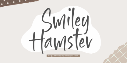 Introducing by Timur type Proudly Present, Smiley Hamster Smiley Hamster A Handwritten Font Smiley Hamster is perfect for product packaging, branding project, megazine, social media, wedding, or just used to express words above the background. This Smiley Hamster font includes: -Full Set of standard alphabet and punctuation & symbol -Extra set Alternate ending lowercase -multilingual support. Embelish your designs with our original fonts.Enjoy the font, Thank you!
 - Poodle Pusher NF by Nick's Fonts,
$10.00In his book, Brushstroke and Freestyle Alphabets, Dan X. Solo called this fabulous fifties face Maidstone Script. Somewhat less willowy than the original, this version is still righteously retro, and takes its name from a collision between a poodle skirt and pedalpushers, two fifties fashion statements. The Opentype version of this font supports Unicode 1250 (Central European) languages, as well as Unicode 1252 (Latin) languages. - Bread Forest by Timurtype,
$14.00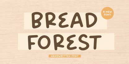 Introducing by Timur type Proudly Present, Bread Forest Bread Forest A Handwritten Script Font Bread Forest is perfect for product packaging, branding project, megazine, social media, wedding, or just used to express words above the background. This Bread Forest font includes: -Full Set of standard alphabet and punctuation & symbol -Extra set Alternate ending lowercase -multilingual support. Embelish your designs with our original fonts.Enjoy the font,Thank you!
 - Romsey Duo by Supfonts,
$16.00 Romsey is a modern and minimalistic serif font combined with a sloppy handwritten font. This combination creates a clean and luxurious style in your designs Thanks so much for checking out my shop, and please get in touch if you have any questions! Romsey Font Features: - Full Set of standard alphabet and punctuation - Handwritten ligatures - PUA Encoded - no special software needed to access extra characters - Multilingual Characters
 - Batavia Retro by Alpha Bento,
$15.00 Introducing a new handwritten font, Batavia Retro, a modern and minimal typeface packed with handwritten ligatures. Batavia Retro adds chic elegance to websites, wedding stationery, modern logos and branding, social media quotes and more. Great for signature logos and more. Batavia Retro Features Full Set of standard alphabet and punctuation Extra set of Alternate lowercase Extra stylistic alternates and ligatures PUA Encoded Multilingual Characters
 - Eurostile by URW Type Foundry,
$89.99 Eurostile Display Caps The Eurostile font family was designed (by Novarese and Butti in 1952) to complement the titling font, Microgramma, by offering a lowercase alphabet. Issued by the Nebiolo foundry, the rather square sans serif Eurostile became popular for display and advertising use. The linear nature of Eurostile suggests modern architecture, and its attraction is technical and functional. Eurostile is commonly misspelled Eurostyle.
 - Rumble Seat NF by Nick's Fonts,
$10.00British poster artist Cecil Wade provided the lowercase for this typeface, and his compatriot T. G. Birtles provided the uppercase. The result is a rollicking, frolicking, bouncy romp through the alphabet, not unlike a ride in the compartment for which it is named. Both versions of this font include the complete Latin 1252 and CE 1250 character sets, with localization for Romanian and Moldovan.