10,000 search results
(0.068 seconds)
- Gadeg by Twinletter,
$10.00 Introducing the Gadeg sanserif font. special font with a unique and special shape adopts a modern minimalist style with a simple and elegant impression. We designed this san serif family font by paying attention to the combination of each letter to create a beautiful impression and appearance, making it easier to answer your needs, both formal and non-formal needs. This font is perfect for a wide variety of design projects, sporting events, branding, banners, posters, movie titles, food and beverage, technology, quotes, clothing, logotypes, and more. Of course, by using this font your various design projects will be perfect and amazing, because this font comes with a family of fonts, both for titles and subtitles and sentence text, start using our fonts for your amazing projects.
 - Cottorway by FoxType,
$10.00 Cotterway Display is a Brand New Elegant Typeface with a powerful font family. It has a dependable and uncompromising style, with controlled letterforms and modern touches. It looks amazing in logos, magazines, and movies. Cotterway Font would be perfect for branding, headlines, Captions, paragraphs, and posters. The various weights allow you to experiment with a wide range of applications. It's created to make an impression without sacrificing its beauty and readability. It's shown a clean, minimalist, warmth, quirky, yet still purposed to be versatile The Typeface includes Six Weights - Light, Regular, Medium, SemiBold, Bold and ExtraBold. Numerals and extended punctuation (200+ Glyphs). Expert kerning and quality crafting. TTF, OTF and WebFonts Included. Thank you for taking the time to look into the font.
 - Tilaa by Brenners Template,
$19.00If you want to design a classic yet strong touch, try these typography combinations. Tilaa Sans Logo Fonts The Tilaa Sans Logo Fonts were designed by combining Ligatures and Alternates for modern and interactive imaginations. You can enjoy the joy of design through these Opentype Features. Tilaa Serif Display Fonts Tilaa Serif is a beautiful typeface with extensive coverage ranging from editorial design to web design. Manually adjusted italic inclination and 124 Ligatures are innovative solutions for classic and defiant styles. And it is excellent for creating modern and luxurious logos and titles by incorporating rebellious ligatures while maintaining classic skeletons. And, they each contain exquisitely designed Ligatures, and in the case of Tilaa Sans, the best typography solution for 3D effects. - Oldburg Display by FoxType,
$12.00 Oldburg Display is a Brand New Elegant Typeface with a powerful font family. It has a dependable and uncompromising style, with controlled letterforms and modern touches. It looks amazing in logos, magazines, and movies. Oldburg Font would be perfect for branding, headlines, Captions, paragraphs, and posters. The various weights allow you to experiment with a wide range of applications. It's created to make an impression without sacrificing its beauty and readability. It's shown a clean, minimalist, warmth, quirky, yet still purposed to be versatile The Typeface includes Five Weights - Light, Regular, Medium, SemiBold and Bold. Numerals and extended punctuation (200+ Glyphs). Expert kerning and quality crafting. TTF, OTF and WebFonts Included. Thank you for taking the time to look into the font.
 - Synthica by Volcano Type,
$35.00 Synthica is the advanced version of a geometrically constructed typeface – designed for a thesis project in summer 2010 in Pforzheim. In the context of electronic music and the profound analysis of its parameters, this typeface is primarly based on a strict modular grid. Additionally, the ascender, descender and the x height had slightly been increased in order to even out a visual difference in size between the glyphs. The name „Synthica“ dervives from a basic principle in electronic sound synthesis. Sinus, triangle and square are some of the basic waveforms in the synthesizers’ oscillator section and were thus used as geometric modules for the grid. The modularity and geometry also derive from different structures of electronic music. The strong emphasis on diagonal lines creates a rhythmic typeface that connotates electronic music patterns with highly recognisable glyphs. The contrast between digital and analog is another basic idea of this typeface: while Synthica Outline has a more synthetic and fragile character, the filled version Synthica Black serves as the analog counterpart.
 - Absentia Display by DR Fonts,
$19.00 This modern display typeface expands the Absentia collection with an impactful option for headlines, titles and logos. Graced with the geometric DNA of its distinctive lineage, the new addition emerges as a refreshing alternative for large size typesetting. Absentia Display borrows design attributes from the Sans and Slab families, in the form of slanted finials (‘a’, ‘e’, ‘C’) and one-sided serifs (‘b’, ‘F’, ‘H’). But in contrast to its relatives' measured restraint, it distinguishes itself with uninhibited boldness. Featuring stencil face breaks, basic glyph components are either abridged or completely omitted, as the shoulder of lowercase ‘m’ or the diagonal stroke of capital ‘W’. Modular letterforms set this typeface apart with a stylish appearance; round diacritic dots (‘i’, ‘Ü’) and curved transitions (‘E’, ‘L’) breathe a lighthearted attitude. Designers can scale up and go loud with Absentia Display, available in ten weights with matching italics and two variable fonts. From the refined Hairline to the robust Black, this versatile family serves a wide range of needs and styles.
 - Mr Gabe by Leksen Design,
$- Check out Mr Gabe in motion! Mr Gabe is a typeface designed to dance. Not that it’s a flamboyant display face, but that it has a liveliness, especially in its heavier weights, that dances across the page. And the letters include a selection of exuberant flourishes that can be used to kick up a ruckus or make a sweeping gesture. Mr Gabe is a high-contrast serif typeface with vertical stress, a “modern” face in traditional type terms. Even in the regular weight, the contrast between thick and thin strokes is very obvious. Designer Andrea Leksen has given many of the lowercase letters ball terminals, teardrop shapes that make Mr Gabe seem decorated even when most of its letter forms are conservative. If you need more bells and whistles, or perhaps revolving mirror balls and dancing shoes, you can explore the font’s collection of ornaments and decorative borders. Mr Gabe comes in four weights, from Regular to Black, with italics for each. Each font includes over 57 ligatures, 31 illustrations and borders, small caps and proportional oldstyle numerals.
 - Mermaid Monogram by MonogramBros,
$12.00 Mermaid Monogram Font is a perfect shaped monogram font consisting of 52 letters. With just a single font file you will be able to create beautiful monograms in just a matter of minutes after the purchase! Mermaid Monogram Font comes with font file in OTF format.
 - Blushmine by Adante Creative,
$23.00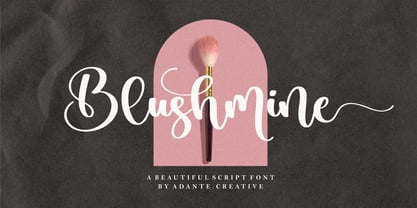 Introducing by Adante.Creative Proudly Present, Blushmine Blushmine A Beautiful Script Font Blushmine is perfect for product packaging, branding project, magazine, social media, wedding, or just used to express words above the background. Enjoy the font, feel free to comment or feedback, send me PM or email.
 - Bageline by Bosstypestudio,
$12.00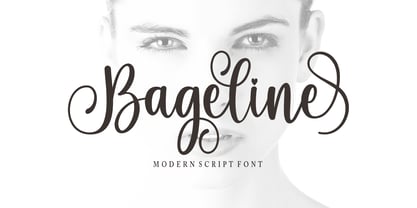 Bageline in a beautiful handwritten style. Equipped with 300 glyphs. Bageline is perfect for branding projects, home appliance design, product packaging, use in business cards, invitation cards, etc. Simply as a stylish text overlay onto a background image or anything that requires a touch of elegance.
 - Initial Monogram by MonogramBros,
$12.00 Initial Monogram Font is a perfect shaped monogram font consisting of 26 letters. With just a single font file you will be able to create beautiful monograms in just a matter of minutes after the purchase! Initial Monogram Font comes with font file in OTF format.
 - Halland by Struggle Studio,
$16.00 Halland is an Lettering Script Font whose work is long enough, The design of the letters is quite beautiful, suitable for those of you who like the Classic & Elegant style, matching classic copper scripts with a modern touch, designed with high detail to open stylish elegance.
 - Montgrove by Surplus Type Co,
$9.00 Montgrove is a beautiful serif font that includes an extensive set of ligatures that's too long to list! Montgrove features large extended serifs that help make it a memorable display font. This font works really well for branding projects, editorial layouts, stationery & so many other projects.
 - Brithany by Josstype,
$12.00 Brithany Script is Hand Lettered Calligraphy Font with beautiful waves and natural flow. has a unique letter style, with natural handdrawn, and has a softer and smoother character subtly connect all the characters. They have a simple elegant swashes in separate letters, you can use graphic design software to access the alternate letter. Brithany Script 427+ glyphs . including initial and terminal letters, alternates, swashes, ligatures and multiple language support. o enable the OpenType Stylistic alternates, you need a program that supports OpenType features such as Adobe Illustrator CS, Adobe Indesign & CorelDraw X6-X7, Microsoft Word 2010 or later versions. There are additional ways to access alternates/swashes, using Character Map (Windows), Nexus Font (Windows), Font Book (Mac) or a software program such as PopChar (for Windows and Mac). How to access all alternative characters: http://youtu.be/iptSFA7feQ0nn http://cuttingforbusiness.com/2016/01/28/how-to-use-opentype-fonts-in-silhouette-studio-or-cricut- design-space/ https://www.youtube.com/watch?v=Go9vacoYmBw Thank you for your purchase! and please let me know if you have any questions. via email: joelpopon@gmail.com
 - Colamine by Gatype,
$12.00 Introducing Colamine, a modern, free-flowing, hand-drawn font. Colamine has THREE COMPLETE CHARACTER SETS including uppercase and lowercase letters with full initial and final swash sets, binders, and a Stylistic Set. Characters were hand-drawn and then carefully digitized to create this modern script. Use character sets as they are, or mix them up and use additional options to create authentic-looking handwritten masterpieces. There's one amazing set of capitals that's perfect for monograms and another set of capitals that looks more like block letters. Check out the preview to see what you can do. This script is perfect for wedding suites, social media, blogs, titles, magazine layouts, monograms, businesses and anywhere else you need a script that looks modern and free flowing. To access alternative glyphs, you'll need a program that supports OpenType features such as Adobe Illustrator CS, Adobe Photoshop CC, Adobe Indesign, and Corel Draw. Thank you Gatype Adobe Photoshop : https://helpx.adobe.com/photoshop/using/glyph-panel.html Adobe Illustrator : https://helpx.adobe.com/illustrator/using/special-characters.html
 - Galiano by DearType,
$49.00 Galiano is an elegant combination of a script and a narrow modern serif. It is slender, feminine and classy, while still maintaining a friendly feel. Galiano is versatile and will work perfectly for fashion, e-commerce brands, trend blogs, wedding boutiques or any business that wants to appear upscale and chic. With its 1500+ glyphs the Galiano Script is perfect for creating original and functional designs. It has extensive language support and tons of ligatures, alternates, stylistic sets and swashes that add visual interest to every letter. The Galiano Font Family in a nutshell: - Galiano - a dancing baseline script with signature loops for ascenders and descenders - Galiano Inline - similar feel to Galiano, notably featuring a standartized x-height - Galiano Text - a simpler version of the script with no fancy loops for ascenders and descenders and no swashes and alts. - Galiano Serif + Italics - perfect for headlines - Galiano Ornaments - a set of 80 beautiful ornaments to embellish your typography. You can use the Galiano Family for high-end logotypes and magazine headlines, but let’s not forget greeting cards, invitations, posters, book covers, ads and the various web and screen usages. The overall feel of the font is elegant, sophisticated with a touch of informal and it is ideal if you want to convey a sense of class and style.
 - El Fonte Angelia by Gilar Studio,
$16.00 Hello Everyone.. Introducing a new Font " El Fonte Angelia " Beautiful Serif Type Family is inspired by the serif typefaces used in editorial media in the 70s and 80s.such as the soft and gentle shapes found in Cooper or the fluid, angled strokes in Windsor— mixed into one single design that features familiar, fresh, modern flavors. Designed to reflect nature, it creates a sense of natural softness and expressiveness. We pushed the concept into a usability focused direction, to work as a bold tool and beautiful communicator. El Fonte Angelia variable allows fluid design across 5 weights The font broadens its use by supplying weights all the way from Light to Bold. The natural curves, swells and sloping trunks, grow in character as the font gains weight. Whilst the thinner weights have lowered contrast and optical corrections to create a warm and gentle appearance. El Fonte Angelia character set incorporates additional symbols, stylistic alternates, unique ligatures and case sensitive punctuation - producing a stable workhorse family ready to tackle projects of any size.The type family melds organic curves and gentle repetition into powerful and harmonious type. At large point sizes you can appreciate the letter shapes, whilst the same restraint and focus creates an even texture for small point sizes and long reading. Its variety of weights provide a range of choices that will help you find the best typographic color for your project. Lighter weights are well-suited for body text while heavier ones are ideal for high impact headlines. The available stylistic alternates offer a number of different characters that give your logo or business card a unique look. Check my other Font here : https://gilarstudio.com/ Thank you Regards, Gilar Studio
 - Red Border Labels JNL by Jeff Levine,
$29.00 In the pre-computer, pre self-adhesive label era of office supplies a number of companies (including Dennison, Maco and Denny-Reyburn) manufactured a wide variety of gummed labels for just about any use or purpose. Blank labels, specialty labels and decorative holiday seals were just a part of this line. One popular style was that of labels with parallel thick-and-thin borders of red lines and corners chamfered, rounded or straight cut. Occasionally, one could find similar labels with blue, green or gold borders but red was the mainstay, hence naming this typeface Red Border Labels JNL. Presented in this font is a collection of twenty-six standard and specialty shape label borders on the capital (A-Z keys) and twenty-six solid panel versions on the lower case (a-z) keys which can be used as backfills for the borders or as stand-alone labels.
 - Plinc Tuggle by House Industries,
$33.00 While we can’t comment of the suggested definitions for ‘tuggle’ that you might encounter online, we are happy to expound on Tuggle’s quirky and endearing characters. The gravity of its bellbottom slab-serif structure is mitigated by soft rounded corners, while surging swashes and globular stroke endings further attenuate Tuggle’s otherwise would-be uptight tenor. The ideal typographic solution for children’s blocks, candy packaging, vape shop signage, and hospital way finding. Pair Tuggle with an equally juicy script like Dave West’s Superstar. Designed by the Photo-Lettering staff, and digitized by Susana Carvalho. TUGGLE CREDITS: Typeface Design: Photo-Lettering Staff Typeface Digitization: Susana Carvalho Typeface Production: Bas Smidt Typeface Direction: Erik van Blokland, Ben Kiel Like all good subversives, House Industries hides in plain sight while amplifying the look, feel and style of the world’s most interesting brands, products and people. Based in Delaware, visually influencing the world.
 - Benguiat Caslon by House Industries,
$33.00 Designed to be set in big, large and huge sizes in classic TNT (tight-not-touching) style, Benguiat Caslon is dynamite for a wide range of display demands. We also included outline and drop-shadow versions as well as numerous swash caps, ligatures, contextual alternates and automatically-shifting punctuation. Ed Benguiat originally designed this alphabet for the Photo-Lettering library during his tenure as the legendary type house’s art director. When we purchased Photo-Lettering in 2003, one of the first things we did was start picking some of our favorite films to digitize as fonts. Photo-Lettering partner Christian Schwartz chose this expressive serif specimen for its high contrast strokes that stand up to the most vigorous display typography demands without withering against pesky design limitations like screen resolution, ink spread and dot gain. FEATURES: Alternate characters, ligatures and contextual substitutions add an unexpected flair to words and phrases. We also provided a drop shadow to add depth and dimension. Shifting punctuation marks take care of those optical tricks so you don't have to. A delicately expressive outline version adds color even in black and white. BENGUIAT CASLON CREDITS: Typeface Design: Ed Benguiat Typeface Digitization: Christian Schwartz, Bas Smidt Typeface Production: Ben Kiel, Jason Campbell Like all good subversives, House Industries hides in plain sight while amplifying the look, feel and style of the world’s most interesting brands, products and people. Based in Delaware, visually influencing the world.
 - Billiboldy by Gie Studio,
$10.00 Are you planning to do an amazing piece of work to make lots of people smile happily while taking your hat off every time? If so, this is the right time to give your work a little touch with a sincere and elegant writing. Introducing Billiboldy- A New Bold Script Font Billiboldy is a cursive and thick lettered handwritten bold script font, crafted to give your headlines and logotype projects a stylish touch. This font reads as strong, dynamic and can add tons of nostalgic character to your designs. This font includes Multilingual Options to make your branding globally acceptable. Features: - Ligatures - Stylistic Sets - Multilingual Support - PUA Encoded - Numerals and Punctuation - Special underscore character 7 style - Special doodles for front and back of letters or sentences Thank you for your visit and downloading premium fonts from Gie Studio
 - Hello Blushberry Script by Great Studio,
$14.00 Allow me to introduce Hello Blushberry - Font Duo is a playful script containing many choices of alternative characters to choose from as well as ligatures that look natural to add to the authenticity of letters. A collection of strange and initial swash tips is also included to add finishing touches or fill the design space in your type design. Hello Blushberry a modern handwriting fonts, loaded with awesome opentype features, and full alternative upper and lower case character sets. make custom letters a dream thanks to all the extra decorative choices you can enter for beautiful and unique customizations - swash, endings, alternative letters and ligatures all make it the prettiest little thing since tutus and tiara. Designed to work harmoniously, this duo font consists of super fine and casual signature scripts and a complete and clean set of all sans serif letters. Sans Serif fonts consist of two outline fonts of different weights, and a regular version. Layer them with different colors and turbidity to get a million different views. This font is perfect for branding, logos, web and editorial design, branding, prints, invitations, crafts, quotes, and more. Includes Files: • Hello Blushberry Script • Hello Blushberry Script Capitals Need help? If you need help or advice, please contact me by e-mail at Greatstudio92@gmail.com.
 - HeyPumpkin by Ingrimayne Type,
$14.95 HeyPumkin is a letterbat font designed for use in the late autumn, when the leaves are falling and the harvest is underway. October 31 is an especially good time to use it. The upper- and lower-case letters are almost identical. If you want a version of this face without the pumpkins, try Ingone. Buried in the font is another set of letters on pumpkins. They are on unicode characters in the 2400 block, circled digits and letters. These characters can also be accessed using the OpenType stylistic sets feature. (The alternative characters are further developed in a separate typeface, part of the InsideLetters family.)
 - Frostbite by Comicraft,
$19.00 If you're feeling a chill in your bones and the grass is a little crunchy under your feet after looking at this font, you might like to put your feet in warm water when you get home if to stave off a little Frostbite. This remastered font family is a chip off the old block, and will help you thaw out before your skin starts to freeze and flake. We recommend you melt Frostbite cubes in the warm water too to ensure you don't stick to the ice. We also recommend you don't lick the letterforms, as we know our customers are wont to do.
 - Risbeg by Craft Supply Co,
$20.00 Risbeg – Elegant Serif Font: A Font for Impactful Titles Timeless Elegance Meets Modern Design Risbeg Elegant Serif Font blends classic serif features with a modern twist, creating a stylish and engaging visual experience. Its well-crafted curves and distinct serifs make it perfect for titles that demand attention. Each character in Risbeg is designed with precision, ensuring a harmonious balance in your designs. Versatile and Readable Risbeg stands out for its versatility, adapting seamlessly to various design needs. Whether it’s for branding, editorial layouts, or digital media, this font maintains readability across different mediums. Its clear, crisp lines make reading effortless, even in dense text blocks.
 - Beni by Nois,
$18.00 Beni is a bold & strong sans serif font family beautifully crafted to perform in short headlines in posters or contemporary interface design. Each character has been optically adjusted for maximum effect in the space between; as such, this is a strong contender for movie posters, titling, album artwork, and any design project that needs a clean sans serif that makes an impact wherever it is applied. This type family is available in four unique weights that stand well apart from one another in visual style. Beni Light is the runway model of the family, standing with a narrow posture and towering height. It’s a fantastic choice for conveying a message in a limited horizontal space. Beni Regular and Beni Bold are shorter in stature but both pack a punch, carrying bold strokes that speak with confidence and offer great legibility. The heaviest of the heavy, Beni Black is the super-bold, go-to type design for projects that need an impossibly strong type design at the helm. Beni extends multilingual support to Basic Latin, Western European, Euro, Catalan, Baltic, Turkish, Central European, Pan African Latin, Igbo Onwu, and Basic Greek for design projects intended for an international audience.
 - Blackberry by Los Andes,
$25.00 Blackberry is a display typographical family inspired on the design of vintage packaging, old fashion ads and show business marketing campaigns. This font brings back Woodtype characteristics such as angular serifs, and light and diagonal curves, which make it a fresh and current proposal for contemporary design needs. Blackberry has a dynamic system of layers that include 3D extrusions, shadows, outline and inline graphics, as well as a series of dingbats and flags. The system is supported for over 200 Latin-based languages. In total, the 10 Blackberry fonts provide a wide array of combinations and possibilities for high impact graphics, such as labels, packaging, posters, branding, record and movie covers, among others.
 - VAG Rounded Next by Monotype,
$57.99 VAG Rounded Next brings a classic 1970s typeface up to date, keeping all of its easy going, approachable personality but adding some much-needed versatility and language support. Originally commissioned by Volkswagen, VAG Rounded remained in use by the company until the early 90s and has also been used by Apple, Skype and Myspace. Its enduring appeal lies in its appealingly rounded terminals, and its immediate, informal tone of voice. “When you look at the Volkswagen Beetle it has these curves that are timeless and legendary,” says Steve Matteson, who led the creation of VAG Rounded Next. “I think that's what stands out in this design – that friendly aesthetic, and the simple line and circle.” This new version offers 700 glyphs with pan European language support (including Greek and Cyrllic), as well as 10 weights of upright and italic styles. New display weights Shine and Rough – which create “chocolate popsicle” and “rust” effects – are begging to be used in branding, packaging and editorial projects, while the lighter weights are well suited for text. VAG Rounded Next Variables are font files which are featuring one axis and have a preset instance from Thin to Black.
 - Bernyck by Eurotypo,
$24.00 Bernyck is a vintage fonts inspired by bold advertisers hand lettering styles, popular in the late 1940s through the early 1950s. It has the same charm as his brother “Cinefile”, but, this time, connected and with more alternates. The Bernyck family is integrated by Bernyck and Bernyck Extrude to interact together. To this we add a beautiful set of 131 ornaments, Bernyck Ornaments and of course, Bernyck Ornaments Extrude. The Open Type features include a full international character compliment, standard and contextual alternates, swatches, stylistic sets, initial forms, standard and discretionary ligatures. All this makes the text lively and bouncy, without the monotony of obviously repeated letterforms. A total of 634 glyphs to offer you many more options for your designs! Bernyck, like all our fonts, was carefully designed, controlled and tested in both aspects: readability and technical aspects. We take care of the kerning pairs, hinting and the precise programming of the Open Type functions; as well as the final touch of each glyph. Bernyck adapts well to titles, packages, invitations, greeting cards, magazines and book covers, children's material, fashion, logos and, posters and wherever you need a fun and sympathetic display font.
 - Geometry Script Pro by CheapProFonts,
$10.00 The Geometry Pro family has been designed to be the final word in purely geometric fonts, and this rounded Script sub-family is a nod to the 50s style of connected logomarks. Words set with both the Regular and the Alternate (with its more flourished capitals and alternate stem connections) can be extended by using the underscore character between letters. You can freely mix and match glyphs from both fonts to create a little bit of variety, and finding that perfect combination. For a matching set of capitals (and disconnected lowercase letters): check out the Regular weights of the Geometry Soft Pro family. All the Geometry Pro fonts are strictly geometric (as drawn with a compass and a ruler fixed to 90 and 45 degree angles) but they are not slavishly modular. ALL fonts from CheapProFonts have very extensive language support: They contain some unusual diacritic letters (some of which are contained in the Latin Extended-B Unicode block) supporting: Cornish, Filipino (Tagalog), Guarani, Luxembourgian, Malagasy, Romanian, Ulithian and Welsh. They also contain all glyphs in the Latin Extended-A Unicode block (which among others cover the Central European and Baltic areas) supporting: Afrikaans, Belarusian (Lacinka), Bosnian, Catalan, Chichewa, Croatian, Czech, Dutch, Esperanto, Greenlandic, Hungarian, Kashubian, Kurdish (Kurmanji), Latvian, Lithuanian, Maltese, Maori, Polish, Saami (Inari), Saami (North), Serbian (latin), Slovak(ian), Slovene, Sorbian (Lower), Sorbian (Upper), Turkish and Turkmen. And they of course contain all the usual "western" glyphs supporting: Albanian, Basque, Breton, Chamorro, Danish, Estonian, Faroese, Finnish, French, Frisian, Galican, German, Icelandic, Indonesian, Irish (Gaelic), Italian, Northern Sotho, Norwegian, Occitan, Portuguese, Rhaeto-Romance, Sami (Lule), Sami (South), Scots (Gaelic), Spanish, Swedish, Tswana, Walloon and Yapese.
 - PF Bague Sans Std by Parachute,
$39.00 Bague Sans is an award-winning monoline typeface with a distinct and eye-catching personality. Despite its inspiration from early 20th century geometrics, it diverts from the mechanical rigidity of those typefaces by incorporating humanist characteristics, such as subtle variations in stroke width and open counter shapes with vertical endings. This is a very clean and legible typeface with a warm and well-balanced texture which is ideal for intense editorial use in magazines and newspapers. The most remarkable feature of Bague Sans is its vast array of uppercase alternates and ligatures which truly shine when set at display sizes. This typeface is automatically transformed into a flexible, charming and stylish typeface with strong modern aesthetics. Explore its dual personality, switch from Humanist to Geometric and vice versa by using alternate characters such as the single-storey a and single-storey g. From classic to modern, from excessive to neutral, Bague Sans is a multipurpose typeface which offers enormous possibilities and variations for editorial design, branding and corporate identity while it performs amazingly well on web. This superfamily includes 18 weights from Hairline to Ultra Black with a consistent and well-refined structure. It supports extended Latin such as Central European, Baltic, Turkish, Romanian and includes numerous alternates and ligatures for unlimited text variations. You may also want to check out Bague Sans Pro which supports Cyrillic and Greek as well.
 - ALS Direct by Art. Lebedev Studio,
$63.00 ALS Direct is an open and dynamic typeface with clear-cut letterforms that make it instantly readable. It lends text a neutral, yet agreeable and modern feel. Direct has nine font styles convenient for the purposes of navigation signage. Regular-style letterforms are rather wide, because direction signs are likely to appear before readers at an angle, so the type needs to withstand perspective distortions. And as signs and boards may vary in size, Direct was developed to include several width variations. Condensed fonts can be used where horizontal space is limited, allowing you to keep proper height and readability of the characters. A signage typeface must be easily readable from some distance away and have simple letterfoms with clear-cut features to quickly identify characters. Designing a type for a potentially wide range of purposes calls for a universal approach. If not destined to be used for navigation in a particular building, it shouldn’t incorporate any peculiar elements to agree with certain design or architecture. All of the above determined our choice of a sans serif with large apertures and definite features allowing readers to instantly recognize letters. Descenders are made compact not to interfere with the line below. And the low contrast between thick and thin strokes renders all elements equally perceptible. The x-height is significant, close to the cap height, which inhances readability of the lowercase type. There are two reasons why directions must not be set in all caps. Firstly, lowercase letters are more diverse and include ascenders and descenders identifying some of the letters in the line. And secondly, having learned to read, people recognize word shapes rather than individual letters, which makes lowercase text more readable. With Direct being a signage typeface, first to be developed were its width variations, and different weight styles and italics were added later. Another thing to be kept in mind was that signs often use dark background colors, and black type on a white background appears smaller than white type on a black background. Direct is the first Cyrillic typeface created for navigation purposes. Before that, designers could use the Cyrillic version of Frutiger (Freeset) developed by Adrian Frutiger for the Paris Charles de Gaulle International Airport, and a number of other, mostly body copy, neutral sans serif types. However, signs and boards were dominated by Arial, which Direct would be glad to replace offering elegance and lucidity of form instead of type bluntess. Direct was designed as a signage typeface, but its neutral style and clear-cut letterforms suggest various other ways of application.
 - Technique BRK Pro by CheapProFonts,
$10.00 I noticed this font for its versatile techno look - it makes wonderful logotype word images. Every letter combination is perfectly kerned so that the letters fit together nicely... Also includes some alternate letterforms, but only in their basic forms (not made in combinations with diacritics). These alternates are available via your programs' glyph palette or using the OpenType functions "Stylistic Alternates"/"ss02" and "Swash"/"ss01". Technique BRK Pro is the perfect companion for Technique Outline BRK Pro (it exactly fills the "holes") but also a nice techno font in its own right. ALL fonts from CheapProFonts have very extensive language support: They contain some unusual diacritic letters (some of which are contained in the Latin Extended-B Unicode block) supporting: Cornish, Filipino (Tagalog), Guarani, Luxembourgian, Malagasy, Romanian, Ulithian and Welsh. They also contain all glyphs in the Latin Extended-A Unicode block (which among others cover the Central European and Baltic areas) supporting: Afrikaans, Belarusian (Lacinka), Bosnian, Catalan, Chichewa, Croatian, Czech, Dutch, Esperanto, Greenlandic, Hungarian, Kashubian, Kurdish (Kurmanji), Latvian, Lithuanian, Maltese, Maori, Polish, Saami (Inari), Saami (North), Serbian (latin), Slovak(ian), Slovene, Sorbian (Lower), Sorbian (Upper), Turkish and Turkmen. And they of course contain all the usual "western" glyphs supporting: Albanian, Basque, Breton, Chamorro, Danish, Estonian, Faroese, Finnish, French, Frisian, Galican, German, Icelandic, Indonesian, Irish (Gaelic), Italian, Northern Sotho, Norwegian, Occitan, Portuguese, Rhaeto-Romance, Sami (Lule), Sami (South), Scots (Gaelic), Spanish, Swedish, Tswana, Walloon and Yapese.
 - Good Selection by Mega Type,
$10.00 Good Selection Font Duo and Extras is a modern scripts with handwriting, decorative characters, designed to perfectly combine informal, sassy, romantic, sweet scripts. Hand-drawn design elements allow you to create many beautiful typographic designs in an instant like branding, logos, web design and editorial, prints, invitations, crafts, quotes, and more. Good Selection Font Duo and Extras features OpenType stylistic alternates, ligatures and International support for most Western Languages. To enable the OpenType Stylistic alternates, you need a program that supports OpenType features such as Adobe Illustrator CS, Adobe Indesign & CorelDraw X6-X7, Microsoft Word 2010 or later versions. How to access all alternative characters using Adobe Illustrator: https://www.youtube.com/watch?v=XzwjMkbB-wQ Good Selection is coded with PUA Unicode, which allows full access to all the extra characters without having special designing software. Mac users can use Font Book , and Windows users can use Character Map to view and copy any of the extra characters to paste into your favorite text editor/app. How to access all alternative characters, using Windows Character Map with Photoshop: https://www.youtube.com/watch?v=Go9vacoYmBw If you have any question, don't hesitate to contact me by email : megatype04@gmail.com
 - Kemanala by IbraCreative,
$17.00 Kemanala – An Enchanting Script Typeface Kemanala, an enchanting script typeface, dances gracefully across the page, intertwining elegance with whimsy. Its flowing and organic strokes exude a wonderful sense of fluidity, capturing the essence of handwritten beauty. Each letter in Kemanala is meticulously crafted, featuring delicate curves and stylish flourishes that add a touch of sophistication to any design. Whether adorning invitations, branding materials, or artistic projects, Kemanala effortlessly bridges the gap between timeless charm and contemporary style. With its versatility and charm, this script typeface invites users to weave a narrative of their own, making every written expression a journey into the realms of enchantment and creativity. Kemanala stands as a testament to the artistry of script typography, offering a harmonious balance between classic appeal and a touch of delightful modernity. Kemanala is perfect for branding projects, logo, wedding designs, social media posts, advertisements, product packaging, product designs, label, photography, watermark, invitation, stationery, game, fashion and any projects. Fonts include multilingual support for; Afrikaans, Albanian, Czech, Danish, Dutch, English, Estonian, Finnish, French, German, Hungarian, Italian, Latvian, Lithuanian, Norwegian, Polish, Portuguese, Slovak, Slovenian, Spanish, Swedish.
 - Intermediate JNL by Jeff Levine,
$29.00 The letters and numbers of a home movie titling kit from circa the 1950s or 1960s called the Magna Tech Titler Number 312 were die-cut from cardboard with a magnetic backing and were styled after Futura Bold. The user of this set composed the desired title or phrase onto a metalized board and the result was photographed with their 8 or 16mm camera. Because the dies of the characters were handmade, very slight variations in the shape and stroke width of the lettering would occasionally occur. These variations were incorporated into the design of the digital type face. Intermediate JNL is available in both regular and oblique versions.
 - Cochin by URW Type Foundry,
$35.99 The Cochin font is based on the work of eighteenth-century punchcutter, Cochin. Charles Peignot commissioned the revival of this strong typeface in 1912. The capitals are squarish. The lowercase has long ascenders and sharp serifs, giving Cochin an unusual elegance. The curved ascender in the italic lowercase d is a major characteristic and the p and q lack foot serifs. Cochins overall vivacity derives from the engravings on copper, produced in France in the eighteenth century. Cochin is a trademark of Linotype Corp. registered in the U.S. Patent and Trademark Office and may be registered in certain other jurisdictions in the name of Linotype Corp. or its licensee Linotype GmbH.
 - Lisboa Sans by Vanarchiv,
$35.00 This humanist sans-serif typeface was exhaustively designed, full-featured typeface family that reveals its character and distinctiveness in complex settings. It features a large complement of ligatures, lining and old-style figures, expert characters, dingbats (arrows, brackets, and symbols for both Regular weights). Lisboa Sans lacks the hook-head terminals, but its structure and proportions are the same. The simplicity of the sans weight created very strong readability at small sizes. After ten years from the first version publication, this new version (0.2) is available with Latin (Western, Central Europe) and Cyrillic alphabets. It was selected by Our Favorite Fonts of 2005 (Typographica).
 - Fd Massive by Fortunes Co,
$19.00 Massive moon is headline font with a retro feel transports readers to a bygone era, invoking nostalgia and charm. Its bold strokes and quirky serifs harken back to the golden age of design, reminiscent of vintage posters and classic advertisements. The typeface exudes a timeless appeal, seamlessly merging the flair of yesteryear with modern readability. Each character carries a sense of character, mirroring the craftsmanship of mid-century typography. The warm color palette and slightly distressed texture further amplify the retro vibe, adding a touch of authenticity. This font doesn't just convey information; it tells a story, bridging the gap between the past and present.
 - PF Hellenica Pro by Parachute,
$69.00 The Golden Age of the Greek Civilization. The world’s history carved on stone. Hellenica Pro was created based on numerous photos from archaeological sites and several other historical references dating back to 1100 B.C. In order to capture the essence of this writing, there are a few alternate forms used at lowercase, uppercase and/or accented positions. These alternates come from different regions in Greece. For instance, uppercase Theta was used by the Cretans and the Korinthians, whereas uppercase Delta by the Ionians. PF Hellenica Pro comes in 3 versions: Light, regular and bold. The new ‘Pro’ version has been expanded to include 3 major scripts: Latin, Greek and Cyrillic.