10,000 search results
(0.051 seconds)
- Starlive Script by Cooldesignlab,
$13.00 Starlive Script is a beautiful and interesting calligraphy handwriting font. You can see from scratches that give a realistic and modern style. This font looks sweet and is full of the best characters. You can use this font in your design product range like invitation, mockup, embossed, branding card and others. Starlive Script includes a full set of large and attractive international letters, numbers, punctuation and ligatures. All lowercase letters include the beginning and end of the swashes. Also, Starlive includes multilingual symbols. The script is encoded with PUA Unicode, which allows full access to all additional characters without special design software. Mac users can use Font Books, and Windows users can use Map Characters to view and copy additional characters to be included in your favorite text editor / app.
 - HS Alnasma by Hiba Studio,
$69.00 Hs Alnasma is an Arabic display typeface, under “titles” category. It is useful for book titles, creative designs and modern logos. Also, it is used when a contemporary and simple look is desired that can fit with the characteristics of Latin fonts where horizontal parts are thinner than vertical ones for use in technical and engineering company. The font is based on some modern lines of Kufi calligraphy along with some derived ideas of Latin fonts, maintaining the beauty of the Arabic font and its fixed rates. This font supports Arabic, Persian, Urdu, Kurdish and Pashto and also includes Basic Latin and consisting of two weights (regular and bold) which can add to the library of Arabic and Latin fonts contemporary models that meet with the purposes of various designs for all tastes.
 - TE Almona Dewany by Tharwat Emara,
$95.00 The DEWANY (ALMONA DEWANY ) font is a font of original Arabic fonts and is specialized in writing in the offices of the Sultan and Arab’s Kings. It is also one of the most beautiful Arabic fonts as it has the flexibility to write official graduation certificates, certificates of appreciation, scientific progress and decorations. It is also commonly used in writing posters and sequences for serials, films, medals and decorations on clothes. The ALMONA DEWANY font has its aesthetics derived from its round and interlocking letters. In this version of Dewany font ( Almona Dewany ) you will find many of Arabian names, Ayat of Holley Quran and Good names of Allah (Asmaa Allah Al-Hosnna) and all of this is ready to written quickly by one click and choose glyphs you want to add.
 - Nereida by Latinotype,
$39.00 Nereida is a delicate, luminous and dainty typeface endowed with an expressive and versatile personality. Its high-contrast design positions it as the preferred choice for elegant and creative typographic compositions. Nereida stands out for a generous x-height structure, thus ensuring an exceptional readability in paragraphs of moderate length. It distinguishes itself with delicately crafted terminals and a set of attractive ligatures and initial letters that expand their ranges of use. Nereida is a distinctive typographic experience for magazines, headlines, logos, packaging and beauty products. It offers the unique possibility of transmitting messages with subtlety in short words and with force in longer text compositions. Each stroke and curve of Nereida contributes to creating a unique visual experience, adding a touch of elegance and creativity to any project.
 - P22 Civilite by P22 Type Foundry,
$24.95 P22 Civilite is a historic font revival. The font is a non-connecting upright handwriting script based on 16th century sources with a lineage going back to Robert Granjon in France and from early Dutch type specimens from the Enschede and Sons Foundry. The P22 Civilite suite of fonts includes the 6 basic Dutch versions of Civilite in both "historical" and "modern" styles in basic OpenType format and Pro versions that combine the historical, modern & sorts into one OpenType font with alternates, expanded language coverage and pro features.
 - Stately GG by Baseline Fonts,
$39.00 TWO LAYERED FONT: Be sure to get both the FRONT and the BACK! Maintaining simultaneous shades of whimsy and versatility is no simple feat, but the meticulously constructed Stately Gothic accomplishes just that, elegantly. Stately Gothic is a redrawn version of Grit Gothic. The strong vertical character of this stacking/layered typeface make it an ideal solution for use where legibility matters most: posters, logos, book and album covers, and so on. It is part of Grit History Series B along with Heirloom Artcraft, Worn Gothic, Grit Sans, and Grit Gothic.
 - Pleasure Point by Comicraft,
$39.00 Slocals! Check out the action of our radical new font, PLEASURE POINT! It's Bananas, Totally Tubular, Stoked and ready to ride some waves. Back in his grom days, Comicraftsman John JG Roshell could be found down at Pleasure Point, waiting for The Big One, and this is IT! Don't be a criddler, paddle hard and rip this font to your motherboard to keep it real every time you gun, rail or tail. And if you get rag dolled, dude, don't blow out your squeaker. Pleasure Point will hang loose and chillax you to the max.
 - Retrouvailles by Hanoded,
$15.00 Retrouvailles is a French word, which means ‘the feeling one gets after reuniting after a long time’. This script font was based on a couple of handwritten letters and postcards and my own imagination. I used a drawing tablet for the ligatures and the connecting strokes. Retrouvailles comes in 3 distinct styles: the slightly slanted regular style, an Italic style and a back slanted style. Retrouvailles has an abundance of goodies under the hood: it comes with a lot of ligatures and all the diacritics you could poke a stick at.
 - Brosse by Greater Albion Typefounders,
$12.95 Brosse is a family of slabserif faces which emphasise clarity and geometric cleanliness of line, in a 'Brave New World' sprit that harks back to the 1930s and possibly also to postwar rebuilding in the 1950s. Its clear legibility makes it ideal for poster work and titles, as well as for signage of any kind. Eight faces are offered, regular and italic, bold and bold italic, as well as a condensed face and a bold weight thereof. There are also two decorative forms- outline and embossed faces. All faces include a large character set and extensive Opentype features. A Demonstrater version of the regular face is also offered free of charge-this is fully licensed but has a signnificantly reduced character set.
 - Palm Honey by PeachCreme,
$19.00 We were quite often asked to create heart font with modern letters, stepping back a little from a calligraphic look (Hi, Sophia Ronald!) Palm Honey beautifully works for modern wedding stationery projects. Palm Honey has beginning lowercase, ending lowercase, connecting heart lowercase alternates. You can test your custom text in the box above!
 - Nondescript JNL by Jeff Levine,
$29.00 One good pun is worth a simple description… Nondescript JNL… 'Non' - not. 'de' - of, in Spanish. script - a cursive (handwritten) letter form. So… while nondescript generally means lacking any defining description, in this case it also means "not of a script"… which is precisely what a typeface such as this one is!
 - Modulus Pro by Arkitype,
$16.00 Modulus Pro, the extensive update to Modulus. This update was built around the original Modulus Font. This rounded sans-serif has a larger glyph set which covers many languages. Modulus Pro now comes in 8 weights from Extra-Light to Black. This updated version was designed with the designer in mind, you have many stylistic alternates to get creative with and make some really cool customised typography. A large range of examples have been designed to show just how versatile and creative you can get with this font family. It's fun but has a cool, edginess to it at the same time. Modulus Pro is not just another rounded sans-serif, you are going to want this in your font list.
 - 1913 Typewriter by GLC,
$38.00 This font was patterned after a few characters on a genuine old 1913 small portable typewriter. It looks like those early typescripts, rough, irregular and eroded, suggestive of mythical famous authors, such as Hemingway, as well as “serie noire” movies or anonymous state employee working in a gloomy Kafkaesque office. It is a complete alphabetic full font. It can be used as web-site titles, poster design, or book editing. It may be preferable, if possible, when printing, to choose a pale color a little rather than condensed - dark grey instead of heavy black, for example - to give the best appearance and to benefit from the full details. The old typewriter character size is 11 to 12 points, but this font easily supports enlargement.
 - Retroxoid by PizzaDude.dk,
$20.00 You may recognize the looks of Retroxoid - if not, then let me help you out: Retroxoid is actually a font I made back in 2007. I ran prints of the font, through a very bad copymachine, used a wet cloth to make the print look worn, scanned the prints and voila! Retrozoid, my very first Open Type font, was born! Now in 2010, Retroxoid has risen from the past, and is ready to burst your designs with clean, round and futuristic shapes!
 - Neon Goo by Hanoded,
$16.00 I’m a bit of a sucker for neon lights, especially in big cities. My favourite city is Tokyo, with its brightly coloured billboards and its back alleys full of neon-lit eateries. At first sight, Neon Goo is a slightly warped font, with some funny looking glyphs and a generous spacing. When you start using it, you’ll find out that the glyphs do complement each other! Neon Goo comes with all diacritics and a set of alternates for the lower case letters.
 - Reksano by Just Font You,
$19.00 Reksano was inspired by retro vintage arcades, toys, and games back in the 90s era. Embracing the retro-futurism trend with the mindset from the past, predicting how the future will look from the human eye's perspective. The bold, and tall form of construction makes the Reksano a no-doubt game-changer for your graphic design visual journey. Perfectly fit for logo, branding, gaming, esport design, poster, music video, album artwork, cover, book, packaging, merchandise, apparel, fashion, and many more.
 - Decima Mono Pro by TipografiaRamis,
$39.00 Decima Mono Pro is an upgrade of the well received Decima Mono typeface, released back in 2009 and quite successful ever since. This is a modern monospaced condensed sans serif family with classic geometric design, built in three weights and six styles. The letterforms in roman style are techno (engineered) in appearance, while italics remind one of elegant handwriting balanced with Roman geometry.\ The typeface is released in OpenType format with extended support for most Latin languages, as well as Greek and Cyrillic.
 - Cardila by Letterhend,
$17.00 The Cardila is a retro bold script which will bring you back to 60s feel. This typeface has the extrude version so you can create your retro effect font in ease. This font perfectly made to be applied especially in logo, and the other various formal forms such as invitations, labels, logos, magazines, books, greeting / wedding cards, packaging, fashion, make up, stationery, novels, labels or any type of advertising purpose. Features : uppercase & lowercase numbers and punctuation multilingual ligatures alternates swashes PUA encoded We highly recommend using a program that supports OpenType features and Glyphs panels like many of Adobe apps and Corel Draw, so you can see and access all Glyph variations.
 - Fizgiger by insigne,
$11.95Fizgiger is a chance to kick back and take break from designing some of insigne's more serious typefaces, like the sans serif Aberlyth. It is an extension of the ideas of Blue Goblet, but includes more frills and a more pronounced vertical stress. The name Fizgiger is derived from the English word Fizgig, which is defined as a flirty girl. Fizgiger is a fun and uplifting script that works for whenever you need a playful and exciting script. As always, Fizgiger comes with a wide range of OpenType features, including small caps, a full complement of artistic alternates (it's like getting another font free!) and old style figures to add a touch of class. - Zebrawood by Adobe,
$29.00Zebrawood font is a joint work of the typeface designers K.B. Chansler, C. Crossgrove and C. Twombly, who also designed Rosewood, Ponderose and Pepperwood together. Like its relatives, Zebrawood also displays a kind of Wild West character. Its style can be traced back to the Toscanienne typefaces which appeared in advertisements and on signs at the end of the 19th century. Typical of this capital alphabet are the split serifs and robust base forms, which emphasize the typeface's decorative character. Zebrawood is, like Rosewood and Schwennel, meant as a bicolor font, meaning that the weight Zebrawood fill complements the inner spaces of Zebrawood regular. When used carefully in headlines, Zebrawood font will be sure to attract attention. - Mezalia by Arrière-garde,
$9.00 Mezalia is a one of a kind typeface. Its shapes were strongly influenced by bastarda scripts of high medieval times. Unlike most fonts sharing similar origin, Mezalia is not just another blackletter but a fully functional text typeface, blending medieval poise and character with modern sensibilities. Stroke widths, imitating a broad nibbed pen of a scribe, fluctuate constantly giving paragraphs a characteristic vibrating texture. Despite it's strong character Mezalia is very legible and will be an excellent choice for a book or an elegant magazine. Mezalia has two distinct styles: straight and cursive (true italic if you will, although the word is not really correct here), which come in seven weights, from thin to black. Each weight contains a set of old-style figures, lining figures, small caps and ligatures. A separate style containing drop-cap initials is also available.
 - Ongunkan Wakanda Runic by Runic World Tamgacı,
$50.00 Wakandan is an alphabet designed by Hannah Beachler, and used in the 2018 film Black Panther. It is based on Nsibidi symbols. In the film it is used to transliterate English text in the credits and other on-screen text. Another script used in the film was developed by Oluwaseun Osewa and inspired by Nsibidi, a system of symbols used in southeastern Nigeria between about 400 and 1400 AD. In addition, the symbols of several different ancient languages were also used for the alphabet. Like Old North Arabia, Old Tifinagh. I did not draw for this font, except for a few letters. I transferred the sound values from the ancient writing languages fonts that I had made before to the Wakanda font, so I did not take much time, I finished it in 4-5 hours.
 - Kolage by Runsell Type,
$20.00 Kolage was created from a sans humanist design with a modern twist. Characterized by the large x-height, inktrap and open appertures as the hallmarks of the Kolage a letterform. Kolage was inspired by the strong character of the letter without leaving the aesthetic of the letterforms. Each family member of Kolage also equipped with useful OpenType features such as Ordinals, Superscripts, Subscripts, Stylistic Alternates, Stylistic Sets, Oldstyle Figure, Proportional Lining, Standard Ligatures, Fractions, also Numerators & Denominators. Each font has 530+ glyphs which covers Western & Eastern Europe, and other Latin based languages – over 200 languages supported! Comes with 9 weights from Thin to Black with each matching Italic. Contain several OpenType features: Stylistic Alternates, Figures Variation (fraction, tabular lining, numerator, denominator), and also covered broad latin languages. Provided also variable fonts in two styles; Upright and Italic
 - Realtime by Juri Zaech,
$30.00 Information displays have an aesthetic of their own. Functional design where transmission of information is key — and best in real time. The Realtime typeface is not meant to recreate the appearance of those applications, instead it takes inspiration from them. The result is a technical yet friendly design with details that serve function and visual impact alike. As a monospaced typeface it lends itself to tabular designs, sturdy columns and tidy layouts. Nevertheless Realtime comes with a feature for setting continuous text — a proportional design employable through OpenType — it further comes in five weights, from light to black, and with a character set that covers over 200 latin languages. Please see the Realtime Type Specimen PDF in the gallery. A soft version of Realtime is available separately: Realtime Rounded. Its soft edges apply warmth to the otherwise rather technical appearance. Thanks for visiting!
 - Francker Paneuropean by Linotype,
$103.99Francker is a sans-serif typeface family based on clean and simple principles of design. The letterforms' curves are inspired by the "super ellipse," a mathematical shape that is about halfway between an ellipse and a rectangle. Francker's lowercase letters appear somewhat reduced, as the a, b, n and u have no spurs. The family is available in nine weights, from Extra Light to Extra Black. Excellent areas of use for Francker signage, posters, magazines, advertisements, or logos; wherever a timeless, modern look is needed. Francker's fonts have a large character set that includes all glyphs in Linotype's W1G specification (World Glyph Set 1). Proportional figures are available as alternatives to the tabular defaults, via an OpenType feature. The Francker type was developed designed by Anders Francker (b. 1972), an engineer and designer living in Denmark. - Breakable by Gassstype,
$23.00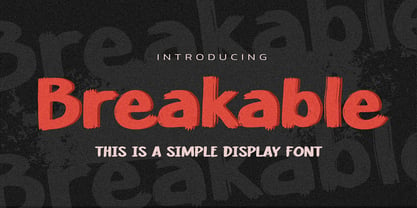 Hello Everyone, introduce our new product Breakable This Is a Simple Display Font with a natural feel. This handmade font will make your design has a beautiful natural touch for each details. It is perfect for any design project as Invitation,logo, book cover, craft or any design purposes. This font is PUA encoded which means you can access all of the magical glyphs with ease!
 - Transcribed JNL by Jeff Levine,
$29.00 The term "transcribed" takes on many definitions. In sheet music (the source of this type face design) it means to set down onto paper. In the formative days of radio, and until the advent of the tape recorder, radio stations depended on 16 inch wide recordable discs known as transcriptions. These discs were generally aluminum base with a soft lacquer coating that was cut with a heated stylus. This was the only way a program could be recorded and preserved for later broadcast or copied for syndication. Transcribed JNL is a hand lettered sans in the chamfer style of block lettering, based on vintage sheet music displaying the name and address for Zenith Music Publications.
 - Urbanregent by Kenn Munk,
$26.00The font is largely undesigned, but is bound together by a thick connected band which forms the word-blocks. At the same time, parts of Urbanregent are very designed, glyphs have been re-designed to reflect changes in the way we speak and write. The exclamation mark is louder and more manic, because people tend to write two or three exclamation marks after each other anyway. The full stop is more stopping and the hyphen kicks you on to the next word. Kenn Munk's fonts are generally hard to use - Urbanregent is no exception, but a tip would be to start each word with a capital letter. Because Every Word Is Important. - Dear Gray by Redy Studio,
$17.00 Dear Gray – Modern Wedding Fonts Dear Gray is a beautiful, feminine, and modern calligraphy script for your wedding designs. Dear Gray includes a full set of uppercase and lowercase letters, numerals, punctuation, and common ligatures for a more harmonious look. With Opentype features and stylistic alternatives, Dear Gray gives you a lot of possibilities to make your design even more special. Following the trend of modern hand-drawn typography, Dear Gray is a friendly choice to convey your loving words. Dear Gray features: A full set of upper & lowercase characters Numbers & punctuation Ligatures Lowercase beginning swashes Lowercase ending swashes A ton of stylistic alternatives PUA Encoded Characters – Fully accessible without additional design software. Feel free to give me a message if you have a problem or question. Thank you so much for taking the time to look at one of our products.
 - Promenade by Jen Wagner Co.,
$17.00 Introducing Promenade – a calligraphic serif that started on paper with a flat nib pen (see the 6th image), and blossomed into a full serif with italics. At its core, this font is just... beautiful. It's elegant, it's crisp, it's delicate, but can still hold its own. As I was creating the graphics, I just couldn't get over the flow of the letters – especially the italic. It's got class, but also isn't afraid to rock a pair of Doc Marten's. Funny enough, Jen from Tonic (they make beautiful websites) saw a preview of this font and said, "I'd take that font to prom." Which of course spurred a conversation about how this font would take a Mercedes G-Series instead of a limo, and wear Doc Marten's instead of heels, but still wear the most gorgeous dress, and that is 100% Promenade (and inspo for the name – thanks, Jen!). I've also been loving combining the regular and italic, especially for logos (see the "Friendfolk" logo) One thing to note about Promenade is the letter spacing. It was spaced for clean reading and intentional balance, so I recommend setting the spacing a little tighter if you want to create the display look found in many of the logo mockups(around -20 to -40 should do!).
 - Neela by Bykineks,
$10.00 Neela is an Art Nouveau serif typeface designed for a variety of design needs. With 27 font families consisting of thin, extralight, light, regular, medium, semibold, bold, extrabold, and black, as well as condensed and expanded types, Neela can be used for various sizes and design needs. Neela is characterized by sleek and elegant letters, with typical Art Nouveau elements, such as subtle and elegant decorative flourishes. This font is suitable for various design needs, such as: Book covers, wine labels, wedding invitations, exhibitions, packaging, merchandise, event billboards, posters and many others. Neela also supports 65 Latin alphabet languages, so it can be used for various design needs throughout the world. Characteristics The letters are sleek and elegant Distinctive Art Nouveau elements Suitable for a variety of design needs Neela is the perfect typeface for designers looking for an elegant and versatile Art Nouveau serif typeface. This font can be used for various design needs, from book design, labels, invitations, to graphic design.
 - Sicret Mono by Mans Greback,
$29.00 Sicret Mono is a monospaced and geometric typeface family. It was drawn by Måns Grebäck in 2020, and was created by following a strict mathematical pattern consisting of only two basic shapes, in four different combinations, set on a 2 by 3 grid. The resulting product is a font with a serious and solid character, with an official look while yet going towards sci-fi because of its digital nature. The family consists of nine weights: Thin, Extra Light, Light, Regular, Medium, Semi Bold, Bold, Extra Bold and Black. The range of weights makes it very adaptable, and all the weights works very well together to give a sentence or graphic tone and emphasization. As Sicret Mono is a font with over 850 glyphs, it is guaranteed to contain all characters you'll ever need, including all punctuation and numbers. It has a very extensive lingual support, covering Greek, Cyrillic, Hebrew as well as European and American languages.
 - Kuenstler 480 by ParaType,
$30.00 The Bitstream version of Trump Mediaeval of Linotype, 1954-60, by Georg Trump, a prolific German type designer. It seems to be his best typeface. It has a vigorous and assumed oldstyle roman and italic that is the sloped roman, except for the letters a, e, f. With its crisp angularity and wedge-shapes serifs, Trump Mediaeval appears carved in stone. It is a strong text typeface that is highly legible and especially useful for low-resolution output. It is useful in display work too. Cyrillic version developed for ParaType by Vladimir Yefimov and Isabella Chaeva and released in 2010. Cyrillic italics maintain the main feature of Trump Mediaeval to be the sloped roman, except for the letters г, д, и, й, n, т. There are old style figures, additional ligatures and fractions available at all styles and small caps at the Roman 55. Black style was added in 2011 by Vladimir Yefimov.
 - Varese Gradient by Tarallo Design,
$18.99 Varese Gradient is a color font for display, headlines, or large body text. Use it for bold graphic statements or a vintage mood. Its geometric style is inspired by Art Deco and early 1900s European travel posters. This typeface will set a friendly and light tone while giving messages a unique and memorable feeling. The gradients transition vertically and come in these sets; color with white, color with black, two colors, chromatic grays, grayscales, and concepts like summer or cappuccino. The font name will indicate its color. The full family includes one regular font. Here is a list of all the fonts in color. The lowercase letterforms are similar to the uppercase, but the lowercase have counterforms. It comes with OpenType features such as alternate glyphs, half-height letters, standard ligatures, and stylistic sets. The fonts are OpenType SVG format and fully scalable. Contact Tarallo Design if you need custom colors. Varese Gradient has siblings, Varese Soft (rounded) and Varese Outlined (color/shadow/outline).
 - Gelica by Eclectotype,
$30.00 When work started on the design of Gelica, there wasn't the same glut of retro-ish soft serifs there is today, and if I'd managed to complete it quicker, it might have been more trendsetter than bandwagon jumper, but that's the way it goes sometimes! I still think it's useful and unique enough to be a worthwhile addition to your typographic arsenal. Although obviously influenced by Cooper, it actually owes more to the lesser known Goudy Heavyface and Ludlow Black, particularly in the concave serifs. I wanted the family to be friendly and approachable, but not overly cutesy, and usability was always the prime concern. A nice weight range with matching italics was a must, along with useful OpenType features, and various figure styles. This is a display family first and foremost, but is also comfortable at smaller sizes for longer copy, and so works well in a supporting role to a more exuberant titling font.
 - XXII CoolScript by Doubletwo Studios,
$25.99 XXII CoolScript - The vibrant typeface with a ton of alternates MAJOR UPDATE This is a big update of XXII CoolScript. First of all, from now it’s a whole family with 7 new weights from ExtraThin to Black. It comes with more than hundred additional glyphs, some more alternates, ligatures, numerals and fitting opentype features for fractions and two extra ampersands. This lovely script font by Lecter Johnson is another, more soft and round one in the series of Doubletwo Studios’ script fonts (XXII YeahScript, XXII AwesomeScript). Its wonderfully designed letters, ligatures and alternates may bring a charming and individual handwritten look to your creation. This fonts are designed to easily create logos, headlines and text phrases within a blink of an eye. Just open your glyphs-palette* and simply chose, from up to 27 different alternates and variations per glyph, the one that fits best for your needs. *For further information visit the Behance Project.
 - Cy Grotesk by Kobuzan,
$25.00 Cy Grotesk is the result of combining the clear forms of mid 20th-century European neo-grotesks and the expressiveness of the 19th-century grotesques. It is display typeface with an eccentric character and a special rhythm. Symbols have sharp long angled spurs and large wedge incision between the bowl and the stem, diluting it with smooth curves and the tight aperture. Built like a multifunctional workhorse that has a wide range of font uses. This type family consists of 27 styles that are adjustable in weight and width. Or one variable font with 2 axes. From pure thin to radically black. From roomy key to catchy grand. All styles include an extended set of Latin characters and a basic Cyrillic. Features: – Total glyph set: 676 glyphs; – 27 styles (3 widths x 9 weights) + variable; – Support 210+ languages; – Latin Extended; – Cyrillic Basic. OpenType features: – Uppercase, lowercase; – Proportional, circled, tabular numerals, superiors, inferiors, fractions; – Punctuations and symbols; – Arrows; – Stylistic sets (ss01-ss10); – Ligatures; – Case-sensitive forms.
 - Song Merchant JNL by Jeff Levine,
$29.00 Although the early 1900s through the 1920s seemed to be the "Golden Age" of ridiculously long novelty song titles, it appears that even the decade of the 1940s had its fair share as well. Song Merchant JNL was modeled from the hand lettered [but exhausting] title of the sheet music for "Princess Poo-Poo-Ly Has Plenty Pa-Pa-Ya (and she Loves to Give it Away)". Despite the obvious double-entendre inferences of the title, the square block letters with rounded corners make for a useful headline font (even if the source material it was drawn from is quite forgettable). Available in regular and oblique versions.
 - Corsa Grotesk by Typedepot,
$39.00 Corsa Grotesk is our very own tribute to two typographic giants: the Futura and Avenir typefaces. It is Designed with geometric simplicity in mind with well balanced strokes and modern touch. Generous proportions and x-height with more contemporary details - the single story ‘a’ and the horizontally barred ‘k’ being just two of many examples makes it shine in every jobs it takes. Corsa Grotesk blends the classic geometric aesthetics into a well-balanced font with generous proportions and minimal contrast. It features 10 weights ranging from Hairline to Black plus matching italics, as well as Cyrillic support for Bulgarian and Russian localizations. Filled with all the essential OpenType features like tabular figures, fractions, ligatures etc, it is a great choice for branding, advertising, user interfaces or any text that needs a bit of polish and a slick, present-day look that still feels familiar. With its 2.0 version we managed to polish the font even more. We revisited every path and fixed all the inaccuracies throughout. Corsa Grotesk now comes with way better and consistent spacing and kerning, just the right amount of contrast and balance. Live Tester | Download Demo Fonts | Subscribe
 - Koondim by Twinletter,
$17.00 Introducing Koondim, a retro condensed font with a classic retro-inspired design. This font is perfect for various special projects, such as branding, packaging, logos, and more. With its OpenType feature, Koondim comes with 54 alternate styles and 38 ligatures that add a stylish and unique touch to your design. Koondim font is a versatile choice for any designer looking for a retro, condensed style with a touch of modern sophistication. The beautiful alternates and ligatures make it easy to create a customized look and elevate your designs. Plus, its multilingual support ensures that your message can be communicated clearly to a global audience. What’s Included : - File font - All glyphs Iso Latin 1 - Alternate, Ligature - Simple installations - We highly recommend using a program that supports OpenType features and Glyphs panels like many Adobe apps and Corel Draw so that you can see and access all Glyph variations. - PUA Encoded Characters – Fully accessible without additional design software. - Fonts include Multilingual support