3,524 search results
(0.022 seconds)
- URLOP by Mikołaj Grabowski,
$9.00 Colour is more fun than black, but multicolour is even better. Let me introduce URLOP, a wide type family suitable for your fancy posters, headlines, covers, illustrations, websites, initials, blackmails, chronicles, signboards, poems and many others. Twelve basic styles, which make the overall construction, give a wide range of opportunities. All of them, being able to mix with each other, vary from a thin INSIDE, through a medium FILL, to a double-stem PLUS styles. And then comes a range of colour fonts, so you don’t have to waste any of your precious time for experiments, because I’ve already done it for you! URLOP is an all-caps display collection consisting of three sub-families of fonts, divided by the usage they are designed for. First of all, there is a wide range of alphabets made in the new OpenType-SVG colour fonts format. This is quite a novelty and a very promising technology at the same time. It allows designers to store colour information inside the font. Due to my experience with layered colour thinking that I explored in my first family - Epilepsja , I decided to make several preset layer combinations in this auspicious format. This sub-group is tagged RGB. Make sure that your field of usage and software support OT-SVG format. However, if you feel a need to experiment in the old-fashioned way, you may buy separate layers under the DIY tag. The last group is very similar to the DIY, but it was optimized to look better when standing without other layers. It’s called PRO*. All styles cover Latin alphabets of Europe, basic Cyrillic and Greek sets. Have fun! Before using the font, read the instructions and specimen attached to font files in the purchased package or download them from the Gallery tab on this site. This will help you avoid making unexpected mistakes when combining layers. *PRO subfamily release planned in 2019.
 - Hempa Sans by Yukita Creative,
$9.00 Hempa Sans is a modern sans serif font family with a geometric touch. Consists of 16 Styles 8 upright and 8 inclined to match. Thin Weight - Black Designed with strong open-type features in mind. This font has alternate characters in Letters (G, M, R, g, k, r, t, u, y). Each weight includes extended language support for numbers, arrows, binders, and more. Great for graphic design and any display use. It can easily work for Web, Print, and more. This typeface comes with a standard 445 character set that supports more than 80 Latin-based languages.
 - Zzzap by Comicraft,
$19.00 Run your hand under the tap and then thrust your fingers in the electrical outlet nearest to you* and you'll get the same effect that our latest release, ZZZAP will have on comic book readers everywhere when Electro, The Shocker, Black Lightning, Storm and Darth Sidious turn the dark side of the force on them. *The management accepts no responsibility for any adverse effects experienced by comic book font users who stick moistened digits into the power supply after installing this font for the purposes of comparison (it's probably best to just take our word for it). Batteries not included, void where prohibited.
 - Dezen Pro by DizajnDesign,
$- Dezen is a contemporary, mechanical grotesque typeface. Its letters were first constructed from individual modules and then optically refined to enhance its rhythm. Its tight letter spacing and narrow proportions make the typeface particularly well suited for display sizes and headlines. When you add spacing, font can be used for shorter amount of text, bigger than 12 points. The Dezen type family consists of a wide variety of styles – solid and stencil. The Dezen Pro subfamily combines all 4 styles (Solid, Stencil 01, Stencil 02, Stencil 03) in a specific sequence, which originates a “pattern” for the alphabet (or dezen, in Slovak).
 - Kristas by Dora Typefoundry,
$19.00 Krista's is an elegant classy serif display font with a uniquely styled ligature character set that connects letters smoothly. It also has 100+ binders, 115+ alternatives for uppercase and lowercase letters and multilingual support. This font is perfect for your creative projects like Logotypes, printed quotes, invitations, cards, product packaging, headers, Letterheads, Clothing, Web design, Magazines, Books, etc. FEATURE: Number of Glyphs : 457 Uppercase Lowercase Punctuation and Marks Symbol Alternate Ligatures & Characters This type of family has become the work of true love, making it as easy and fun as possible.I really hope you enjoy it! Thank you and good job.
 - Dezen Solid by DizajnDesign,
$39.00 Dezen is a contemporary, mechanical grotesque typeface. Its letters were first constructed from individual modules and then optically refined to enhance its rhythm. Its tight letter spacing and narrow proportions make the typeface particularly well suited for display sizes and headlines. When you add spacing, font can be used for shorter amount of text, bigger than 12 points. Dezen type family consists of a wide variety of styles – solid and stencils. Dezen Pro subfamily combines all 4 styles (Solid, Stencil 01, Stencil 02, Stencil 03) in a specific sequence, which originates a “pattern” for the alphabet (or dezen, in Slovak).
 - Angkora Volk by Skinny Type,
$18.00 Angkora Volk - a stylish OpenType rich serif with letters that seem to dance and swirl in harmony - to form a unique & elegant typographic design. A large selection of interwoven Opentype binders and replacements, meaning lots of choice and variety in your final look. To access these OpenType features, you need Opentype-enabled software such as: Word, Textedit, Photoshop, Sketch, Pages, Keynote, Numbers, iBooks Author, QuarkXPress, Indesign and Illustrator. A wide variety of useful glyphs are included - see preview images of all glyphs. Angkora Volk also includes the full set: -uppercase and lowercase letters -multilingual symbols -number -punctuation -alternative style -fastener
 - Missing Stone by Pesic,
$29.00 Missing Stone features grunge rough, lapidary, antique look inspired by letters carved in stone plates. Capital glyphs are, although damaged, satisfactorily legible, whereas instead of lowercase letters, capital glyphs are placed, also featuring nearly abstract, hardly legible look, cross cut with rough horizontal lines and dots. The overall visual experience is rough, reminiscent of erosion of stone and disintegration. Capitals are legible and of small size, whereas the second group can be used only in bigger size, whereby rendering an interesting text texture in the course of alternate use. The font contains all the Latin accented characters used in European languages.
 - Fluffenhaus by astroluxtype,
$20.00 Fluffenhaus is a vintage bold retro-font, the glyphs are soft serve ice cream, sorta Cooper Black after to much party. A fun playful look that suggests the 1960's and 1970s rock posters and cereal box art as well. Fluffenhaus is a fat bold font, apply to projects that need an attention grabbing headline that expresses the fun of the information being convened. Tightly spaced in the metric, suggested uses would be for it to be used BIG and then bigger. Fluffenhaus is a groovy beautiful and tuned into the psycho-fab of the now!
 - Garrison by Latinotype,
$39.00 Garrison is a contemporary sans serif that offers a straightforward interpretation of the English humanist sans, gently blending rigid tones over a warm structure. It’s available in 7 weights and it comes with a duo-italic set; on the one hand the Oblique complements your text as the slanted version of the Regular, and the smooth, flowing italic will make your written piece stand out brightly. This simple and carefully crafted typeface, with traits flirting with geometry, becomes a powerful workhorse. Its versatility makes it ideal for both paragraphs and bigger typesettings, a great choice for branding, signage, editorial, and more.
 - Maculature by Pesic,
$29.00 Maculature features grunge, uneven look inspired by letters from old posters and advertisements. Capital glyphs are, although damaged, satisfactorily legible, whereas instead of lowercase letters, capital glyphs are placed, also featuring nearly abstract, hard to read dirty looks damaged spots and stains. The overall visual experience is rough. Capitals are legible and of small size, whereas the second group can be used only in bigger size, whereby rendering an interesting text texture in the course of alternate use. The font contains all the Latin accented characters used in European languages, Cyrillic and various ancillary graphemes, ornaments and rough lines.
 - Dezen Stencil 02 by DizajnDesign,
$39.00 Dezen is a contemporary, mechanical grotesque typeface. Its letters were first constructed from individual modules and then optically refined to enhance its rhythm. Its tight letter spacing and narrow proportions make the typeface particularly well suited for display sizes and headlines. When you add spacing, font can be used for shorter amount of text, bigger than 12 points. Dezen type family consists of a wide variety of styles – solid and stencils. Dezen Pro subfamily combines all 4 styles (Solid, Stencil 01, Stencil 02, Stencil 03) in a specific sequence, which originates a “pattern” for the alphabet (or dezen, in Slovak).
 - Dezen Stencil 03 by DizajnDesign,
$39.00 Dezen is a contemporary, mechanical grotesque typeface. Its letters were first constructed from individual modules and then optically refined to enhance its rhythm. Its tight letter spacing and narrow proportions make the typeface particularly well suited for display sizes and headlines. When you add spacing, font can be used for shorter amount of text, bigger than 12 points. Dezen type family consists of a wide variety of styles – solid and stencils. Dezen Pro subfamily combines all 4 styles (Solid, Stencil 01, Stencil 02, Stencil 03) in a specific sequence, which originates a “pattern” for the alphabet (or dezen, in Slovak).
 - Gamby by Nathatype,
$29.00 Gamby is an attractive, vintage, playful display font for your customers. Its main character is the round, thick letters in thin outlines. Gamby provides two versions, regular and italic to use for bigger-sized texts to be legible. Features: Ligatures Multilingual Supports PUA Encoded Numerals and Punctuations Gamby fits for any design projects, such as posters, logos, book covers, headings, printed products, merchandise, social media, etc. Find out more ways to use this font by taking a look at the font preview. Feel free to contact us for further product information or trouble complaints. Thank you and happy designing.
 - You Blockhead by Comicraft,
$29.00 Why you little Numbskull! Nitwit! Visigoth! Dimwitted Jackass! Interplanetary Goat! Highwayman! Sea-gherkin! Jellyfish! KnowNothing! Filibuster! Cachinnating cockatoo! Artichoke! Two-timing Troglodyte! Bald-headed budgerigar! Odd-toed Ungulate! Autocrat! Carpetseller! Duck-billed platypus! Dunderheaded coconut! Ectoplasm! Steamroller! Iconoclast! Kleptomaniac! Raggle taggle ruminant! Orangutang! Rapscallion! Ten thousand thundering typhoons! Whippersnapper! Billions of billious barbecued blue blistering barnacles -- you-you... YOU BLOCKHEAD! With its sturdy stance and over 100 friendly interlocking letter pairs, this font was made famous in the logo and branding for the video game CLASH OF CLANS, and infamous in the logo and branding for the Image comic THE BEEF.
 - Blingston Brush Font by madjack.font,
$18.00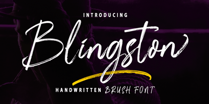 Blingston Brush. is a textured brush font, a contemporary approach to design, with handcrafted and natural underlines and also has alternatives & binders that make your designs more attractive. Suitable for use in title design. Such as clothes, invitations, book titles, stationery designs, quotes, branding, logos, greeting cards, t-shirts, packaging designs, posters, and others. Blingston Brush. equipped with Standard Characters upper and lower case, Punctuation, Numbers. And some glyph variations of OpenType features like Standard Ligatures and Stylistic Sets. Includes multiple multilingual support If you have any questions, feel free to message me :) Thank you so much for watching and enjoying it!
 - Ardiland by Dora Typefoundry,
$17.00 Introducing, Ardiland - a stylish serif with beautiful binders and substitutes! Ardiland is a modern serif font to apply to many graphic or editorial design projects. A classy, unique high contrast, and light binding style for your upcoming projects. for feminine logo signs, fashion & editorial design heads, branding projects, Apparel Branding, packaging, magazine titles, advertisements, T-shirts, postcards and other special occasions. Here's what's included: Alternatives & Ligatures Numbers & punctuation Character with accent Support Multiple Languages PUA encoded This type of family has become the work of true love, making it as easy and fun as possible. I really hope you enjoy it! Thank you
 - Mailart Rubberstamp by K-Type,
$20.00 The Mailart Rubberstamp font was inspired by rubberstamped envelopes and artworks by Mailartists Jonathan Stangroom, H. R. Fricker and Flea Art, and the typeface Clarendon Condensed. Mailart Rubberstamp now has an additional Bold weight and complimentary Obliques. The typeface has also been updated with subtle outline improvements, a bigger repertoire of European accented characters, and more consistent, slightly tighter spacing; increase the tracking to recreate the more relaxed, rustic appearance of the earlier version. The fonts are derived from the individually rubber-stamped letters on printed and collaged envelopes received from mailartists, and the typeface Clarendon Condensed.
 - Dezen Stencil 01 by DizajnDesign,
$39.00 Dezen is a contemporary, mechanical grotesque typeface. Its letters were first constructed from individual modules and then optically refined to enhance its rhythm. Its tight letter spacing and narrow proportions make the typeface particularly well suited for display sizes and headlines. When you add spacing, font can be used for shorter amount of text, bigger than 12 points. Dezen type family consists of a wide variety of styles – solid and stencils. Dezen Pro subfamily combines all 4 styles (Solid, Stencil 01, Stencil 02, Stencil 03) in a specific sequence, which originates a “pattern” for the alphabet (or dezen, in Slovak).
 - PGF Dinos by PeGGO Fonts,
$29.00 “PGF Dinos” is a low contrast round typeface that resembles handmade American ‘Sign Painting’ in such the upper portion of the characters is bigger than the lower one, what gives the font a more playful and friendly personality. Another remarkable feature is its hooked terminals in characters such as C, G or S, heightening the differences between similar characters. “PGF Dinos” Family is composed of 10 different weights ranging from Hairline to Extra Black plus Italics and a full set of Dingbats. Early version was originallly called as “Globa” and was developed under the supervision of the Latinotype Team. Designer: Pedro González.
 - Garinstae Script by Pista Mova,
$19.00 Garinstae Script Pro, is modern and classic handwritten calligraphy, so soft, perfect for your next designs, such as logos, printed quotes, invitations, cards, product packaging, headers and anything else from your imagination. Garinstae Script Pro allows you to create custom dynamic text. You can access by turning on; Alternative Styles, Swashes and binders in Photoshop, Adobe Illustrator, Adobe InDesign or via the glyph panel like Adobe Illustrator, Photoshop CC, Let's go from regular characters to alternate characters to get the text with the layout of your dreams. Garinstae Script Pro also includes glyphs, punctuation, numbers and multilingual. Thank you for your visit
 - Gibbons Gazette by Comicraft,
$39.00HOLD THE FRONT PAGE! STOP THE PRESSES! We have a new Headline for our Cover Story! DAVE GIBBONS is all over the tabloids, the trades AND the quality papers today. Yes, it's the opening of the WATCHMEN movie, but we have a much BIGGER story; the REAL scoop -- and we're announcing it in 72 point type... yes, there's a new addition to the Dave Gibbons family, and our editorial staff have the baby's name and our paparazzi have the pictures! Dave's new little sprog is called... GAZETTE. Man, that kid is gonna get teased at school, Dave. - Baritta Script by madjack.font,
$18.00 Baritta is a modern script font made with brushes and ink, thick and irregular lines. It contains the complete set of lowercase, uppercase, alternative, binder, punctuation, numbers, and multilingual support. Get inspiration from the preview above. Baritta is perfect for use in watercolor designs or bold handwriting styles, such as blog headings, branding, t-shirts, weddings, social media, product design, stationery, advertisements, clothing, cover books, business cards, greeting cards, branding, merchandise, invitations and handmade quotes and more. Baritta features alternative OpenType styles, binders and international support for most Western Languages included. To enable the OpenType Stylistic alternative, you need a program that supports OpenType features such as Adobe Illustrator CS, Adobe Indesign & CorelDraw X6-X7, Microsoft Word 2010 or newer versions. How to access all alternative characters using Adobe Illustrator: https://www.youtube.com/watch?v=XzwjMkbB-wQ Baritta is coded with Unicode PUA, which allows full access to all additional characters without having special design software. Mac users can use the Font Book, and Windows users can use the Character Map to view and copy one of the additional characters to paste into your favorite text editor / application. How to access all alternative characters, using Windows Character Map with Photoshop: https://www.youtube.com/watch?v=Go9vacoYmBw If you need help or have questions, please let me know. I am happy to help :) Thank you & Happy Designing!
 - Trade Gothic Next by Linotype,
$97.99In 1948, Mergenthaler Linotype released the first weights of Trade Gothic, designed by Jackson Burke. Over the next 12 years Burke, who was the company’s Director of Typographic Development from 1948 through 1963, continued to expand the family. Trade Gothic Next is the 2008 revision of Jackson Burke’s design. Developed over a prolonged period of time, the original Trade Gothic showed many inconsistencies. Under the direction of Linotype’s Type Director Akira Kobayashi, American type designer Tom Grace, a graduate of the MA Typeface Design in Reading, redesigned, revised and expand the Trade Gothic family. Many details were improved, such as the terminals and stroke endings, symbols, and the spacing and kerning. Moreover, there are newly added compressed widths and heavy weights perfect for setting even more powerful headlines. Trade Gothic Next brings more features and better quality for today’s demanding typographers. Trade Gothic Next® font field guide including best practices, font pairings and alternatives. - Neutraface Display by House Industries,
$33.00 Although better known for his residential buildings, Richard Neutra’s commercial projects nevertheless resonate the same holistic ecology—unity with the surrounding landscape and uncompromising functionalism. His attention to detail even extended to the selection of signage for his buildings. It is no wonder that Neutra specified lettering that was open and unobtrusive, the same characteristics which typified his progressive architecture. House Industries brings the same linear geometry to Neutraface without sacrificing an unmistakably warm and human feel. FEATURES LIGATURES: This feature is on by default. It will substitute a long list of “f” and “t” ligatures. For example, open InDesign or Photoshop and type “ff” or “tt”. NEUTRAFACE DISPLAY ALTERNATES: Neutraface Display contains several stylistic alternate characters useful when a purely geometric setting is desired. Like all good subversives, House Industries hides in plain sight while amplifying the look, feel and style of the world’s most interesting brands, products and people. Based in Delaware, visually influencing the world.
 - Glomersa by Pixesia Studio,
$23.00 Introducing Glomersa - Modern Luxury Serif Font Glomersa is a modern aesthetic serif font inspired with an elegant and bold design. It brings more chances and possibilities to craft a design with an elegant, strong, and sophisticated vibe. Glomersa suits perfectly in the use of any fashion brand. Glomersa is better used for fashion product packaging, clothing labels, any masculine related brand, or any projects seeking for a touch of elegant, luxury, classic, bold and any sophisticated vibe. FEATURES - Stylistic Alternates - Ligatures - Uppercase and Lowercase letters - Numbering and Punctuations - Works on PC or Mac - Simple Installation - PUA Encoded Characters – Easily accessible without additional design software. - Support Adobe Illustrator, Adobe Photoshop, Adobe InDesign, also works on Microsoft Word - Multilingual Support for 68 languages including Afrikaans, Albanian, Basque, Catalan, Danish, Dutch, English, Estonian, Faroese, Filipino, Finnish, French, Galician, German, Icelandic, Indonesian, Irish, Italian, Malay, Norwegian Bokmål, Portuguese, Spanish, Swahili, Swedish, and Zulu Hope you Like it. Thank you for your purchase!
 - Newberth by Pixesia Studio,
$29.00 Introducing Newberth - Modern Blackletter Font Newberth is a modern blackletter font inspired by modern aesthetics which immersed with a fierce and elegant touch. It provides more possibilities and chances to craft a design with a strong, bold, and aesthetic vibe. Newberth suits perfectly in the use of any masculine or elegant occasion. Newberth is better used for fashion product packaging, clothing labels , or any projects seeking for a touch of fierce, bold and strong masculine font. FEATURES – Stylistic Alternates – Ligatures – Uppercase and Lowercase letters – Numbering and Punctuations – Works on PC or Mac – Simple Installation – PUA Encoded Characters – Easily accessible without additional design software. – Support Adobe Illustrator, Adobe Photoshop, Adobe InDesign, also works on Microsoft Word – Multilingual Support for 68 languages including Afrikaans, Albanian, Basque, Catalan, Danish, Dutch, English, Estonian, Faroese, Filipino, Finnish, French, Galician, German, Icelandic, Indonesian, Irish, Italian, Malay, Norwegian Bokmål, Portuguese, Spanish, Swahili, Swedish, and Zulu Hope you Like it. Thank you for your purchase!
 - Sreet Pieces by Tomatstudio,
$12.00 Now everyone can create simple pieces of graffiti in an easy way. With all our experiences in the real graffiti scene combined with our skill in creating fonts, we create these "Street Pieces." This is a simple version of a wildstyle graffiti piece; you can clearly read the font; unlike heavy wildstyle, which not everyone can read clearly, your message is still clear with this font. It's very easy to use, but for a better result, you should adjust the kerning and lead manually because the real graffiti is like that, and use your own graffiti style because there are no rules in graffiti. In this package, you’ll get two fonts. "Street Pieces Line" for the line, and "Street Pieces Fill" for the fill. Don’t forget to combine with "alternate" fonts; see the preview fonts for the sample; and also add a drop shadow or extrude effect to make it more realistic.
 - Richard Starkings by Comicraft,
$39.00 A NEW HOPE! You begged with us..! You pleaded with us..! But we decided to release the official Richard Starkings font anyway! Huh? WHAT? You heard that line before? Where? Hmm... on this very site...? Well, yes, the Hedge Backwards font is all fine and dandy and does resemble the lettering legerdemain of comic book lettering robot, Richard Starkings... but has it been tweaked over the years to better suit the writing stylings of ELEPHANTMEN creator and writer, Richard Starkings? Has it been refurbished and digitally remastered by ELEPHANTMEN designer and Comicraft Secret Weapon, John JG Roshell? Hmm? No? Well then... here it is, retooled, reimagined and reStarkingsed...ah, what the hell, we started from scratch! This ain't no Greedo Shoots First -- you won't have to keep your pasty '70s VHS recordings of previous Richard Starkings Fonts inside a concrete bunker. Because any other font that claimed to be the official Richard Starkings font would have been called The Official Richard Starkings Font, would it not?
 - Alabaster Antique FJ by Frncojonastype,
$39.00 fj Alabaster Antique™ is a hybrid typefamily with a 10 styles inspired of the develop and exploration of “serif” since the first half in XIX century, envolves a special influence of the slab humanist typefaces, —with a calligraphy flavor in his Italic— with the goal to generate a contrast in to texts sheets. Has a three display versions based in the universe of “woodtypes” to deliver a “unity” in all typeset, like his versions fj Alabaster Antique™ Display, Engraved & Shaded. Include Small Caps, Swashes, Modern and OldStyles figures to decimal notation that envolve to fj Alabaster Antique™ in a ideal typeface for first and second lecture in the most of the visual communication pieces. • To exclusive licenses and to follow the develop of this project please visit frncojonas.com Learn about upcoming releases, work in progress and get to know us better! WB: frncojonas.com BE: beh.net/frncojonas TW: @frncojonas ING: @frnco.jonas
 - Only You Sexy by LeType,
$49.90 Is the real romanticism over? This is not the intention achieved on a creation of the new version of Only You Pro. Develop a font that reflects the perfect union of sensuality and romanticism: Only You Sexy. It has a soft trait and delicated curves that evokes contemporary and musicality while has erotic and sensual references. The icons are a piece of show. They make reference to hipsters concept a recurring nostalgia and a recovery of an almost forgotten romanticism. Bring all that romance back. Bring the sensuality in your work and graphic texts. This font brings back everything that the true romanticism deserves: a font that allows you to write using beauty, sensuality and the sounds from the hearts. Only You Sexy is handmade, stylish, modern and multilingual. With more than 800 glyphs it is possible to get an infinity of combinations at your disposal. The font doesn't have PDF and works better in softwares that support the complete OpenType function.
 - Blacker Mono by Zetafonts,
$39.00 Blacker mono was developed out of a brief by Isabella Ahmadzadeh, by Cosimo Lorenzo Pancini and Francesco Canovaro for the editorial project "A beautiful mistake" by OFFF Tlv in 2022. It is a monospaced version of our typeface Blacker, bringing its "evil serif" aesthetics in the realm of typewriter and coding typefaces. In designing these, usually the letterforms are deformed to better fill the space, but in Blacker Mono only the serifs are modified to balance letters, while letter skeletons are kept consistent with the ones of the original Blacker family. This gives the typeface an uneven, unexpected rhythm, underlined by the unusual choice of providing three optical sizes and some extreme display weights - both uncommon choices in monospaced fonts. The resulting typefamily is thought for use in editorial situations where readability must be married by a strong personality, and is complemented by all the wide array of Open Type features that are present in all Blacker variants, from positional numerals to small case letters and alternates.
 - CAL Bodoni Palazzo by California Type Foundry,
$47.00 The Greatest Caps Of The Greatest Font Designer Bodoni's Most Beautiful Display Caps, Finally Available in Digital This font is the largest display caps that Bodoni ever made, painstakingly handcarved and now digitized to wow in any situation. It is one of the most beautiful fonts for whenever you need a stunning all caps display. The obvious and easy choice over tired standards like Trajan, Palazzo will be a highlight in your font collection. Bodoni Palazzo was updated in 2021 to include Small Caps and other new features. Previously only included the "old style" figures (top); Now with lining figures to better match all caps, and small caps numbers to match the small caps. CAL Bodoni Palazzo is a member of our Origin Series. Origin Fonts are designed to be true to the original designer's intentions and fonts. Our Bodoni origin fonts ARE Bodoni fonts, not imitations or interpretations. They were drawn by Bodoni, our team just expanded it for modern use.
 - Kaeswaii by insigne,
$29.99 Introducing Kaeswaii, a font that is ideal for anyone wishing to infuse their creations with a dash of inspiration and delight. It's ideal for producing fresh designs that will stand out thanks to its unique contrast and rounded serifs. It has a joyful feel because of its high x-height, and its playful serifs give it a funky touch. Kaeswaii has enough variety to help your project look better than the rest with forty-eight different styles. Select from nine weights and italics for the standard, condensed, and extended styles. It has rounded corners and a luscious texture and a squishy, gloopy vibe. Atarimae, the hint is to use Kaeswaii when you want to infuse your products with a dash of inspiration and delight. It has a happy feel with its high x-height and rounded serifs. It's ideal for producing fresh designs. Put a playful spin on your work with the unique personality of Kaeswaii's rounded terminals. Let Kaeswaii bring life to your ideas!
 - Bodoni by Linotype,
$29.99 Giambattista Bodoni (1740–1813) was called the King of Printers and the Bodoni font owes its creation in 1767 to his masterful cutting techniques. Predecessors in a similar style were the typefaces of Pierre Simon Fournier (1712–1768) and the Didot family (1689-1836). The Bodoni font distinguishes itself through the strength of its characters and embodies the rational thinking of the Enlightenment. The new typefaces displaced the Old Face and Transitional styles and was the most popular typeface until the mid-19th century. Bodoni’s influence on typography was dominant until the end of the 19th century and, even today, inspires new creations. Working with this font requires care, as the strong emphasis of the vertical strokes and the marked contrast between the fine and thick lines lessens Bodoni’s legibility, and the font is therefore better in larger print with generous spacing. The Bodoni of Morris F. Benton appeared in 1911 with American Type Founders.
 - Naste by Tipo Pèpel,
$22.00 Tipo Pèpel strikes again with a lush splurge on pure basic geometrical shapes and sizes, those that inspired Paul Renner’s typographic milestone “Futura”. A new look to classic shapes, bringing them back plenty of delightfullly details as the lowercase cursive forms’ long tiles that break the supposed linearity expected from a purely geometrical font. Rhythm given by hidden details in each character of each weight, push “Naste” out of German geometric sobriety, will help us to easily create typographic hierarchies upon the many weights available and the many and accurate details. Excellent results with minimal effort. Wide ‘x’ height, restrained ascending and descending stems; thick but elegant, easy to read and in need of generous white space around, where it feels comfortable. More is better than less. As usual in Type Pépel, full sets of Opentype alternatives and Unicode support for 104 languages plus Cyrillic. 16 weights of typographic beauty in all its glory.
 - M Lady PRC by Monotype HK,
$523.99 M Lady is a design inspired by Agfa Waddy’s rather elegant design comes with narrow proportion. M Lady is a rare condensed design in world of Chinese typefaces. Entry and finial points of strokes are squarish, with a sharp but small symmetric serif. It has a medium contrast to improve character recognition. Its thin stems (豎) make it suitable for fine print with minimal conglutination. Dots (點) are straight, reversely curved or round. Downstrokes (撇、捺), ticks (剔) and hooks (勾) are highly regular and consistent. Dots (點), downstrokes (撇、捺) and ticks (剔) are long, smooth, monolinear and curved with small symmetric serif and sometimes angled entry and finial points of strokes to create subtle sharpness in the midst of its softness and elegance, which is better for larger text print. Its features and construction create subtle sharpness in the midst of softness and slim elegance. It is best suited for casual subheading or display, set upright (non-slanted), non-condensed (naturally condensed).
 - Baltimore Geometric by HiH,
$10.00 Baltimore Type Foundry released its Antique Geometric series by 1883, including it that year on advance sheets for their 1886 Specimen Book, shortly after the firm was taken over by Charles J. Cary. We have chosen to call our version of the face “Baltimore Geometric” because we like the name better. The Central Type Foundry-Boston Type Foundry combine followed with a similar typeface in 1884, using an engraving machine to cut directly into matrices (Gray page 124). It was called simply “Geometric”. As noted in the write-up for HiH font Teutonia, a number of similar typeface designs have appeared over the years. The simplicity of concept is inviting and certainly fits nicely with some of the intellectual theories that developed in the early twentieth century, like the De Stijl and Constructivist movements. This font is useful in conveying an image that is logical and mechanical, implying a high degree of functionality.
 - Simplified by Redy Studio,
$19.00 Simplified – Casual Chic Font Simplified is a casual and natural font, with a spirit of clean-cut modern and classic. This typeface has been specially designed to give a feeling of casual luxury. This is not easy typography! We have done a lot of effort to build this font. In the past, we have experimented with a ton of fonts that are similar to Simplified, and Simplified is better in every aspect that I have found, including some OpenType features and ligatures, lowercase beginning & ending swashes that you can use to make your own style. In short, it’s a typeface that you must have! Simplified features: A full set of upper & lowercase characters Numbers & punctuation 63 Gorgeous ligatures Lowercase beginning swashes Lowercase ending swashes Multilingual symbols PUA Encoded Characters – Fully accessible without additional design software. Feel free to give me a message if you have a problem or question. Thank you so much for taking the time to look at one of our products.
 - M Lady HK by Monotype HK,
$523.99 M Lady is a design inspired by Agfa Waddy’s rather elegant design comes with narrow proportion. M Lady is a rare condensed design in world of Chinese typefaces. Entry and finial points of strokes are squarish, with a sharp but small symmetric serif. It has a medium contrast to improve character recognition. Its thin stems (豎) make it suitable for fine print with minimal conglutination. Dots (點) are straight, reversely curved or round. Downstrokes (撇、捺), ticks (剔) and hooks (勾) are highly regular and consistent. Dots (點), downstrokes (撇、捺) and ticks (剔) are long, smooth, monolinear and curved with small symmetric serif and sometimes angled entry and finial points of strokes to create subtle sharpness in the midst of its softness and elegance, which is better for larger text print. Its features and construction create subtle sharpness in the midst of softness and slim elegance. It is best suited for casual subheading or display, set upright (non-slanted), non-condensed (naturally condensed).