3,524 search results
(0.015 seconds)
- Reklame Script by HVD Fonts,
$30.00 Reklame Script is a brush typefamily consisting of four weights. It was designed by Hannes von Döhren in 2010. This family is influenced by the handlettering of printed advertisements of the 1940s and 1950s. You can combine the four weights to gain a better emphasis – perfect for headlines, posters, and other display uses. Reklame Script is equipped for professional typography. The OpenType fonts have an extended character set to support Central and Eastern European as well as Western European languages. The fonts also contain double-letter ligatures to prevent repetition.
 - Nimbusant Bresslo by DePlictis Types,
$31.00 Nimbussant Bresslo is a contemporary sans and attipic unicase were lowercase alternates with smallcaps creating an unusual look that can be used in posters, logo design and headings or small bold plain texts. This grotesque typeface supports most of the latin based languages and also kyrillic and greek alphabets. For a plus of a modern and young appeal, some of the letters have a very sharp, straight and minimalist body design but you may find also their stylistic alternates to better emulate the look you find more appropiate for your design.
 - Verge by Type Fleet,
$9.00 Verge exploratory information transmitter Verge type family operates at the very edge of art and technology in the typographic constellation. Its fairing is designed with a new technique that adds better stability to the curvature. It is prepared for all environments and communicates with minimized latency. The letters of this contemporary slab serif are compact, clear and rather simple. It is suitable for branding, longer texts, information graphics and signalization. The typeface’s x-height is a little above 70% of its capitals. The italics are designed at a 7° angle.
 - Staehle Graphia by Linotype,
$29.00Staehle Graphia Script was designed by Professor Walter Stähle in the 1960s. It is a very vertical font in the style of the printing on private correspondence in the 19th century. The elegant and sweeping capitals of Linotype Staehle Graphia Script are particularly well-suited to the beginning of passages or lines while the capitals of Linotype Staehle Graphia are better for longer texts. Both should be used with a relatively small line width. The lyricism and liveliness displayed by the font makes it the perfect choice for artistic texts such as poems. - Franklin Gothic by URW Type Foundry,
$39.99 By 1915, all the major foundries offered families of sans serifs, sometimes called Gothic in the USA. Franklin was a response suitable for countries in the vanguard of the machine age. Designed by Morris Benton in 1903-1912, Franklin has preserved its own personality ever since. The ITC Franklin Gothic font family is a redrawing by ITC that keeps the original strength intact, meeting the demand for a strong typeface. ITC Franklin Gothic is better read in display sizes and considered a standard in the newspaper and advertising fields.
 - Faringa by Sensatype Studio,
$15.00 Faringa is a New Bold Vintage Font with Retro style inside. An extraordinary style with vintage and retro in serif font, to make your design more standout. As our focus that analyze any typeface that helps to leverage any logo design to look more modern and unique. We prepared this font with any vintage characters to help you create creative style. Faringa Bold Retro Vintage Font ready with: Better style of characters with creative style Preview as a inspirations that you can do with Faringa font All Uppercase characters Wish you enjoy our font. :)
 - ITC Cushing by ITC,
$29.99ITC Cushing has a long history. The typeface was originally designed by J. Stearns Cushing, a Boston-based book printer, and famous American type designer Frederic Goudy expanded it to include an italic weight. Under a special license from the American Type Founders, Vincent Pacella modified the design for ITC and added some additional weights. ITC Cushing is slightly condensed with large, bracketed serifs. Pacella changed the capital letters to better complement the lower case and replaced the sloping serifs of the italics to linear type serifs to produce ITC Cushing. - Paneuropa Inline by ROHH,
$19.00 Paneuropa Inline is a retro display typeface inspired by a classic modernist design from Poland. It has a retro mood, but is reworked from the original to achieve a better consistency in letterforms and spacing. The set includes 3 versions of the font, each one featuring different worn/grunge effects to fit various sizes and design scenarios. Paneuropa Inline is designed for all kinds of retro, vintage, grunge, eco, bio, organic projects in mind and nicely fits to industries and purposes such as food & beverage, gardening, travel & hospitality, vintage-styled apparel, restaurants and pubs.
 - Trained Monkey by Hanoded,
$15.00 Trained Monkey is a happy serif cartoon font. Use it for your book cover designs, posters, product packaging (may I suggest peanut butter?) and whatever else you may fancy. This monkey was made by hand, so the glyph edges are a bit rough and uneven - giving it ‘ye olde handmade look’. The name? Well, I was watching a movie (can’t remember which one) in which two guys were having a discussion. One of them said to the other: ‘a trained monkey could have done this job!’ That’s all folks.
 - Vow by Thinkdust,
$15.00 Vow is an incredibly stylised font, strutting its stuff on the typography catwalk. Vow does everything to excess, even when cutting down: where it’s curvy, it’s very curvy, but where it’s thin, it’s thin. Vow’s regular weight has a certain boldness at text size, but its ultra-thin alternative is much better used at larger sizes, managing to take up very little space even when scaled up. Using a mix of the two creates a subtle emphasis, especially when coloured, which helps to create stunning messages in elegant ways.
 - Spark Sans by Primitive Spark,
$5.00 Spark a revolution for a better future with Spark Sans. Super clean and geometric, this display typeface is ideal for tech, transportation, electronic music, revolutionary products or other disruptive ideas that move us beyond the present. Spark Sans has a relatively high x-height and squared off curves that give it a distinctive look while still maintaining a minimalist aesthetic. The design originated with custom lettering for the Primitive Spark identity, which became the foundation for the bold style. With 260 glyphs, Spark Sans is a great choice for many languages with Latin characters.
 - Sunshine Formula by PizzaDude.dk,
$17.00 Imagine having a formula for sunshine. I mean, in a way to make the sun shine when you want it, or really need it. That could be for a day at the beach, or for the plants in your garden - or even better: make someone happy with a little bit of sunshine! I made this font on the first day of summer in Denmark 2020 - the rounded corners and the soft and easy look of Sunshine Formula, really got me into the "this-is-going-to-be-a-great-summer" mode! :)
 - Artificial Flavour by Kitchen Table Type Foundry,
$15.00 I do groceries a couple of times a week. When I am shopping for food, I always read the ingredients list; I don’t want too much sugar, nor palm oil, trans fats or a lot of E numbers. It used to be quite hard finding products that didn’t contain artificial flavours or colouring, but it is getting better. Artificial Flavour is an anti-ode to the time we couldn’t get enough of the stuff - it is a handmade, all caps font which comes with extensive language support and a sweet set of alternates.
 - 1634 René Descartes by GLC,
$38.00 This font was inspired by the well-known philosopher René Descartes' hand writing. In 1634, from Amsterdam, he wrote a famous letter to his friend Mersenne, a great scientist monk, in which he spoke about Gallileus works. The greatest part of our glyphs is based on this document. We have added some letters Descartes himself didn't use, like modern s and j (he used exclusively s long and i instead of j). A lot of ligatures and alternates are enriching the font, giving a better appearance of real handwriting.
 - Rice by Font Kitchen,
$9.99 Everything is better with Rice! Stylized inktraps, square-ish curves, and a strong, savory flavor make this superfamily an easy-to-use treat in your kitchen. Versatile enough for whatever you'll be cooking up next, Rice is available in a whopping 130 styles, each locally grown and harvested. Raised with stylistic alternates, fractions, tabular and lining figures, hand-kerned pairs, ligatures, and arrow figures that are great for signage, Rice is a strong, welcome addition to your typographic menu that will bring structure and body to anything it's served with.
 - Santis by Latinotype,
$45.00 Santis is a multiface type, special for logos, brands, magazines and editorial world. Especially for setting trends in fashion and design. The particularity of this font is that you can easily read it, even when applying swash type letters. It is a Didot based font. Santis versatility can harmoniously display a word or phrase. Santis has 1017 glyphs with alternate characters, numbers and ligatures ornaments specially created for a better design. For best results use with Open Type. Designed by Enrique Hernandez with technical support of Daniel Hernández.
 - Filson Pro by Mostardesign,
$26.00 Designed by Olivier Gourvat in 2014, Filson Pro is a new geometric sans serif family with versatility in mind. With its 575 glyphs and its round aspect, this typeface covers all kind of graphic and web design projects. This font family contains 16 fonts from Thin to Black with a professional range of Opentype functions such as pro kerning,lining and oldstyle figures, stylistic alternates, case sensitive forms, localized forms and f-ligatures. For better typographic control, Filson Pro also includes Opentype class kerning with thousands of kerning pairs.
 - Soul Skull by Otto Maurer,
$19.00 Soul Skull ist a special Version of my Font „Soul“ (soul ultra black). For a long Time i want to make a Font like this. Before FL6 that was impossible. I know it is a big File Size for a Font with all the Graphics but i need a Font like this for a Halloween Projekt. And so i did it myself. I hope you like it as i do! At this time i will say Thank you for FontLab 6 It is so much better than V5. I love this App :)
 - 2 Prong Tree - Unknown license

- Magical Vintage by Gloow Studio,
$19.00 Magical Vintage Font - Retro 70's Script Style. It comes with open type features like style alternatives, style sets, contextual alternatives & binders. This Retro styled font will help you create amazing designs. It offers beautiful typographic harmony for a wide variety of design projects, including logos & branding, social media posts, advertising & product designs.
 - Calling Card JNL by Jeff Levine,
$29.00In today's day and age, the term "calling card" refers to a prepaid means of making long distance phone calls. In a more gentler time, the calling card (similar to a business card) was what a gentleman presented to a housekeeper or butler when visiting (calling) on a friend or business contact. - Umbrellia by Matra Creative,
$14.00 Umbrellia Script is a calligraphy script font that comes with beautiful alternative characters. mixture of handleting copper calligraphy. Designed to bring elegance to style. Umbrellia comes with uppercase letters, lowercase letters, numbers, punctuation, and so many variations on each character including OpenType alternatives, and general binders to allow you to adjust the design. Classic styles are very suitable to be applied in various formal forms such as invitations, labels, menu, logo, fashion, make up, stationery, letterpress, romantic novels, magazines, books, greeting / wedding cards, packaging, labels. Umbrellia Script has 582 glyphs. including various language support. With the OpenType feature with alternative styles, binders and characters, it allows you to mix and match pairs of letters that match your design, as well as a touch of ornament to make this font look elegant.
 - CompassOne by Ingrimayne Type,
$9.00 CompassOne was a design I began in 1990 or so, but did not bother to finish until five years later. Its name comes from the fact that all the letters could have been drawn with a compass (which draws circles) and a straight edge. The typeface Demotte was a further development of this design idea.
 - Dream Script by Lián Types,
$49.00 One of my dreams as a type-designer was making a good looking chancery cursive. Full of life, like some of the best calligraphers around the world do on their artworks. With Julian Waters, John Stevens and Denis Brown (just to name a few of them) (1) chancery, or italic script, was transformed into a new, exciting and very fresh style of calligraphy mainly at the end of 20th Century. Dream Script may be that dream named above made true. I have been practicing chancery in the way I learnt from those calligraphers for many years now. Making a font out of my ink-sketches was a tough work, since they were closer of -being art- than of -being type-. However, this font rescues many aspects of handmade calligraphy: You have to look at it really close to notice it is actually a font, and that was one of my goals. The secret of a good looking chancery is on its subtle details: pen angle is constantly changing, even on the strokes which seem straight. Capitals and swashes have to be done a little faster than lowercase letters. The rhythm has to be even, in spite of its playful look. The fact that makes Dream look alive is that it has many alternates per glyph. This makes each word look unique like it happens in calligraphy: you will find alternates for the beginning/ending of a word/phrase, some for the middle of it, some interchangeable. Also, to accompany the script, you will find Dream Caps, which was inspired in the eternally beautiful trajan capitals. Place them like I did on the posters and you will have great results for sure. The font works great in small, middle and big sizes and can be a great selection for magazines, wedding invitations, perfumes, and posters. Close your eyes, and Dream with me... TECHNICAL Dream Script Pro is the most complete style, it contains all the alternates and ligatures (OT programmed, better if you use Adobe applications) If you plan to use the font for text, be sure to activate the less decorative capitals, which are placed in the “salt” group of alternates. Dream Script Standard has less glyphs than the Pro one, it contains just some ligatures for a better legibility. (OT programmed, better if you use Adobe applications) NOTES (1) Not only are they great artists, but also good people, who are always willing to share with their students all what they know. I would also like to thank Ricardo Rousselot, whose work inspired me this time to make “The Dream Script” exlibris; and to Alisara Tareekes, a very talented friend which international calligraphy conferences gave me: She kindly helped me with some tips to make this font better.
 - Kinera by Zamjump,
$17.00 Kinera is a display elegant serif . It seduces your eyes with its curves yet still looks serene and classy. Perfect for any kind of creativity you are about to start :). with a binder in it will add a very memorable impression to the writing you want. Note : Ligature can be active in CAPSLOCK File Included : - All Caps - Ligature
 - Fernburner NF by Nick's Fonts,
$10.00This stunning display face is based on Hans Bohn’s 1929 opus for Gebr. Klingspor, originally named Orplid. One of the treasures discovered in the legendary green vinyl binder that launched Nick’s love of type, it’s a real crowd pleaser. Both versions of this font include the complete Latin 1252, Central European 1250 and Turkish 1254 character sets. - Neue George Rounded by Kaligra.co,
$29.00 Neue George Rounded is new geometric contemporary sans serif font family of 8 fonts with Soft edges. Designed with clean and stylized modern European geometry with harmonious appearance for both texts and headlines. Perfect companion for branding, editorial and signage, also works great for bigger applications. This typeface covers all kind of graphic and web design projects.
 - Kithen Mellogia by IM Studio,
$19.00 Kithen Mellogia is a natural handwritten font produced by IM Studio. You'll get a full set of lowercase and uppercase letters, numbers and punctuation, multilingual symbols, alternative lowercase letters, and a binder pack. This font is suitable for branding, signatures, wedding invitations, promotions, product packaging and other needs. This font is natural, simple, yet authentic and very stylish.
 - Regonia by Narrow Type,
$35.00 Regonia is a high-contrast display serif typeface inspired by neoclassical Didot style typography. Thin hairlines and many unique details make Regonia an elegant and contemporary typeface. Regonia has a large x-height and works perfectly in headlines or bigger sizes. It is also equipped with many ligatures and alternative glyphs, which will make your projects more unique.
 - Pedell by profonts,
$41.99 Pedell ist eine neue Schreibschrift, die das Schreiben mit Kreide simuliert. Ein Font mit eben diesem ‚Kreidecharakter’ fehlte bisher noch in der profonts Library. Also wurde der Schriftdesigner Ralph M. Unger beauftragt, eine Kreideschrift zu schreiben und zu digitalisieren. Pedell ist eine gut lesbare, lebendige und nicht kindische Handschrift, die nicht nur für schulische Zwecke hervorragend einsetzbar ist.
 - Bologna Script by Hrz Studio,
$16.00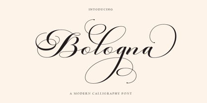 Welcome to the Bologna Script font is a modern, casual, and beautiful calligraphic typeface with a swash. It can be used for many purposes. such as titles, signatures, logos, wedding invitations, letterheads, nameplates, labels, newsletters, posters, badges, etc. Bologna Script Features Open type, including initial and terminal letters, alternatives, binders, and International support for most Western languages included.
 - Scriptissimo Forte by Wiescher Design,
$39.50 Scriptissimo-Forte is the bold version of Scriptissimo. When using the normal cut of Scriptissimo I sometimes had the feeling that I could well use a bolder cut to make a bigger impression, so I simply made that cut for myself. I think you can use it too; try it out. Yours very bold scriptissimo, Gert Wiescher
 - Bellas Artes by Sudtipos,
$59.00 Bellas Artes is what happens when the brush of Angel Koziupa and the technical expertise of Alejandro Paul go face to face with the Art Deco aesthetic. The recognizable Koziupa curves become players of a game of halves, where there is no such thing as a better half, but both sides complete each other like in that perfect romance you will never forget. Bellas Artes is an excellent choice not only for packaging design, but also for book and music covers meant for the feminine demographic, collateral of classical taste, and of course pre-WWII visuals.
 - FF Danubia by FontFont,
$41.99 Austrian type designer Viktor Solt-Bittner created this serif FontFont in 2002. The family has 5 weights, ranging from Regular to Extra Bold (including italics) and is ideally suited for advertising and packaging, festive occasions, film and tv as well as logo, branding and creative industries. FF Danubia provides advanced typographical support with features such as ligatures, alternate characters, and case-sensitive forms. It comes with a complete range of figure set options – oldstyle and lining figures, each in tabular and proportional widths. This FontFont is a member of the FF Danubia super family, which also includes FF Danubia Script.
 - SK Fillout by Shriftovik,
$32.00 SK Fillout is a display typeface inspired by the problem of information noise. Noise is embedded in the basis of characters structure, which gives it a unique form. The typeface is built on combining several thicknesses into a single symbol form with an offset at different distances. For better expressiveness, each letter has two variations of the character it included into the uppercase and lowercase sets. This typeface supports many languages included in the Extended Latin and Cyrillic type sets. The SK Fillout font is perfect for bold design, for working with printed and web products.
 - Vikive by Eurotypo,
$23.00 Vikive is a family of Sans Serif fonts, better known in its origins as "Gothic" in America or "Grotesque" in Europe. Some authors divide them into three categories: Grotesque, Geometric and Humanistic. Probably, it can be defined that Vikive has some characteristics of the first two: Grotesque and Geometric, high x-height, slight squareness of the curves, wide set, open tail, simple construction. The family concept provides several weights and widths for one face and its matching italics, therefore this family of types is more suitable for text settings, enriched with strong contrast fonts (condensed thin or expanded black) for headlines.
 - HGB Bacco by HGB fonts,
$23.00 Since 2005, I have repeatedly attempted to create a neutral-looking grotesque with a humanistic character. I wanted a pleasant, soft typeface. The typeface should appear similar to Helvetica or Univers, but with more open shapes and therefore better readability. The features are deliberately reserved with 4 gradations plus italics. The onum feature for Old Style Figures contains additional alternative letters such as a looped g. The italics have a swash feature with some decorative shapes. As a sans serif, HGB Bacco does not appear to be technically constructed, but has a friendly, open character and is also suitable for longer texts.
 - Mantequilla JNL by Jeff Levine,
$29.00 Some unusual hand lettering was found on the cover of the 1924 edition of a Spanish language novel by Joaquin Belda entitled “La Hora del Abandono” ("The Time of Abandonment"). The title was created as all lower case characters in a semi-serif style reflecting the dawn of the Art Deco movement. A new set of capital letters was created for this digital revival, along with the numbers, punctuation and other necessary glyphs. Mantequilla JNL is available in both regular and oblique versions. For those unfamiliar with the Spanish language, Mantequilla (pronounced mon-tay-key-yuh) means butter.
 - Corsair PE by Rosetta,
$70.00 Corsair is a rugged font with a handcrafted touch. Familiar and easy to work with, it has a worn-in feel that slots right into your typographic toolkit like you’ve known it all along. Originally commissioned by Best Made Co., its functional beauty was shaped to mimic the idiosyncrasies of handwriting. Naturally randomised letterforms lend it authenticity, while weathered edges and subtle variations add a hospitable charm. The effect is an honest, approachable, and organic look that’s careful, but that doesn’t overthink it. Goes well with packaging, branding, and product lookbooks alike. Like a writer’s favorite pen, it gets even better with age.
 - Dambera by Tour De Force,
$25.00 Dambera is a made up word I used as planet name in my first comic published in a kids magazine when I was 6 years old. Dambera font has pretty similar reference - it's a simple script font I initially designed for wedding invitations and restaurant menus, but it can have wide appliance in every design field, from posters, book covers, outdoor signes to labels and packages. It contains a set of stylistic ligatures and swash alternates, as well as a small set of floral dingbats. Also contains a set of characters with specific endings (in OpenType terminology, better known under FINA term).
