3,894 search results
(0.026 seconds)
- Fields by Adam Ladd,
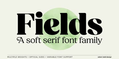
$25.00Fields is a versatile, soft serif family blending casual, retro tones with modern vibes. Details like rounded serifs, teardrop terminals, and subtle tails make this typeface friendly and approachable. Drawing inspiration from familiar classics such as Cooper and Souvenir, Fields is a contemporary expression of this style. Fields exudes pleasant, plumper characters with its medium contrast, while the high contrast in the Fields Display family presents something more fashionable and sophisticated. - Krazy Kracks NF by Nick's Fonts,
$10.00This playful offering, suggestive of Cooper Black on some serious drugs, is based on the so-called “California” style of lettering used extensively in travel posters of the 30s to the 50s. This version is based on its interpretation by Carl Holmes in a Walter T. Foster artbook entitled ABC of Lettering. Both versions of this font include the complete Unicode Latin 1252 and Central European 1250 character sets. - Lehmann Egyptian by ParaType,
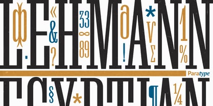
$30.00Lehmann Egyptian is a font of three styles, based on the pre-revolutionary hand set fonts by Berthold and Lehmann type foundries in St. Petersburg. Designed mainly for display typography, the font works well in small texts too. There's also a quite useful bonus — a stylistic set of historical forms. Lehmann Egyptian was designed by Albert Kapitonov in cooperation with Dmitry Kirsanov and released by ParaType in 2018. - Novelin by Designova,
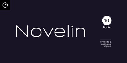
$25.00Novelin is a modern typeface with a unique design and a perfect choice for creating logotypes, branding, headlines, corporate identities, and marketing materials for web, digital & print alike. The typeface will be great for branding, logo/logotype design projects, marketing graphics, banners, posters, signage, corporate identities, and editorial design. - Kids - Unknown license
- Green Mountain 3 - Unknown license
- Frankenstein - Unknown license
- MC Hobbes - Unknown license
- Privacy - Unknown license
- QTSApril by QafType,
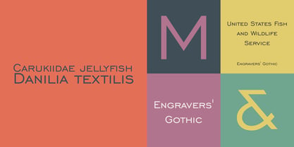
$30.00 - Engravers' Gothic BT by Bitstream,
$29.99 - WBP Emperio by Studio Jasper Nijssen,
$20.00A classic serif font with a twist. WBP Emperio has an interesting shape. She has rounded corners and a slightly 'curvy' look. The little indent makes her stand out above the rest. A sensation in the making. Emperio has two styles. The Regular: Great for designing friendly corporate identities. And there's the Hand Drawn style: Great for design posters of prints with a handmade feel. Combine the two and you can go infinite. WBP Emperio was a sketch I designed when I started my company. So you can say it's been five years in the making XD. When I was invited to add two pages to the Typodarium 2022, I speeded up the process and added the hand-drawn style. The end result is awesome. A classic serif font, with a crazy extra style. - Canapé by FDI,
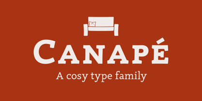
$25.00Canapé is based on the idea of letters with a subtly curved and slightly modulated line. Through this, the typeface has a warm and friendly, almost haptical appearance which brings some kind of cosiness to your communication with type. Designed and crafted with great attention to detail, the type family is usable for copy texts as well as corporate design or display purposes. Canapé (Serif) with its 4 fonts and more than 4,200 characters contains a large amount of features like small capitals, swashes, 10 different figure sets, automated fractions, ordinals, standard and discretionary ligatures, language support for Central and Western Europe and a small sofa building kit. All features are conveniently accessible through OpenType features. Check out the type specimen PDF for more details and a closer look. - Shrub by Chank,
$59.00The new OpenType font Shrub feels like a printed, textural typestyle, influenced by the great slab-serif fonts of the 20th century and organic, messy effects of old Xerox copiers. You might call this one a “multi-messter font” because it not only comes grainy and coarse, but also features a special stylistic alphabet set to add extra schmutz as you see fit. Users of Adobe’s Creative Suite applications can access this feature as either “Stylistic Set #1” in InDesign or “Stylistic Alternates” in Illustrator. The extra blotches can be turned on or off as you see fit. Put a little organic texture mixed with old-school legibility to make you flyers and other designs look like they were really printed! Shrub speaks with a compelling, grounded personality in a voice that’s easy to read. - Cortex by Cubo Fonts,
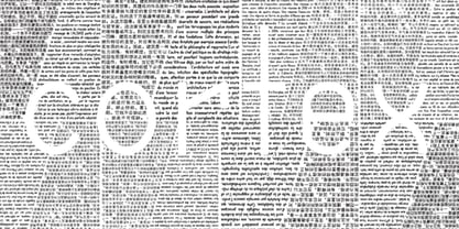
$29.00Cortex was designed for Shanghai Word Expo 2010 / A.A.D.I Pavilion corporate identity: signage, corporate communication, graphic design (a 120 pages monography), promotional items, etc. It was inspired by the pavilion "slanted" architectural concept, and had to fit the famous chinese "YOUYUAN" typeface as well. This is a both very clear and dynamic typeface. - Curtain Up JNL by Jeff Levine,
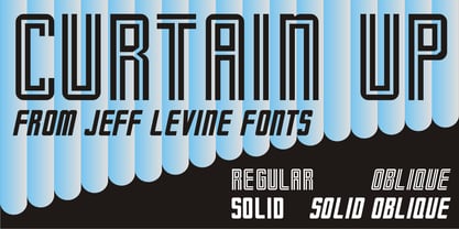
$29.00The 1937 sheet music for the tune "Sweet Stranger" has the title hand lettered in a round cornered Art Deco sans with an inline featuring square corners. Now available as Curtain Up JNL, it is available in regular, oblique, solid and solid oblique versions (for those who prefer a version without the inline). - Klone by Linecreative,
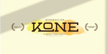
$12.00Klone is a slab-serif font that gives the impression of being clean and very elegant. This font supports Latin and Western European languages. It is also equipped with ligatures, so you can design without limits. The Regular style has traditional square edges and corners, the Stamp style features rounded edges and corners. - VTC-SumiSlasherOne - Personal use only
- Moranga by Latinotype,
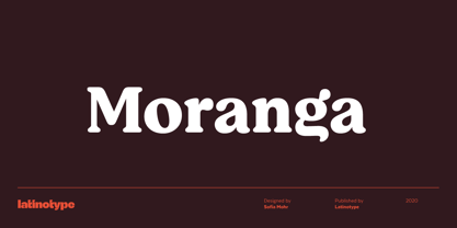
$29.00Moranga is a contemporary, serif, retro-style typeface with a strong personality. Its design is a mixture between Café Brasil's flowing, organic shapes and elements from 70's popular fonts such as Cooper and Souvenir. Moranga, in 5 weights and matching italics, is the perfect choice for headlines, display use and high-impact or friendly designs. Moranga contains a set of more than 400 characters and supports over 200 Latin-based languages. - Convey by Wannatype,
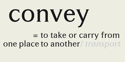
$30.00The convey typefont family merges essential features of classical serifs and sans-serifs and creates a character with a contemporary, open appearance. The elements of an antiqua typeface are formally reduced to a minimum, still supporting the eye in keeping lines and maintaining outstanding reading properties. The font was created as a cooperation project with media theorists and was designed and perfected through analyses, reading tests and the application of media psychological and sociological findings. - Hamburger Font BF by Bomparte's Fonts,
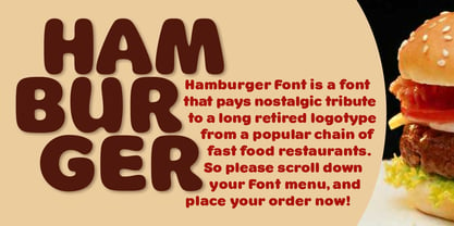
$40.00Hamburger Font BF is an endearing tribute to the lettering style of a logo, long retired, from a certain chain of fast food restaurants. It joins that fraternity of heavy, fat, round, and pleasingly-plump faces such as Cooper Black and Frankfurter; and it serves as a delightful alternative to such. It's suitable for a wide variety of uses from children’s media projects, to headlines where a cool, informal appearance is desired. - Bill Display by OGJ Type Design,
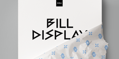
$29.00Bill Display is a post-Max Bill font, developed in close cooperation with the Max Bill Georges Vantongerloo foundation. MAX BILL Last universal scholar, most important design teacher of the 20th century: There are superlatives, always very enthusiastic, when the importance of Max Bill is discussed. The trained silversmith studied at the Bauhaus, with personalities such as Josef Albers, Paul Klee and Oskar Schlemmer. He worked as an architect, later as sculptor and designer. - Enforcer by Tour De Force,
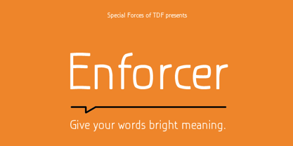
$25.00Modern simple typeface expressing sharp and bright words without need for writing something really smart. Made by Dusan Jelesijevic one day when he left without anything smart to say or write, so he just grabbed a pencil and forced the paper to be cooperative. Someone said that this typeface looks like the ancient Greeks went in present future and used contemporary equipment for writing those letters. It is ideal for branding and avantgarde identities. - Scythe - Unknown license
- Fanzine - Unknown license
- Ajile - Unknown license
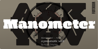
- Manometer by Fontador,
$18.99 - Gibarish by PizzaDude.dk,
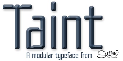
$20.00Gibarish is my comic inspired headline font. A closer look reveals grafitti-inspired curves as well! - Taint by Suomi,
$25.00 - VTC-RoughedUp - Personal use only
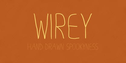
- Wirey by Joshua Conley,
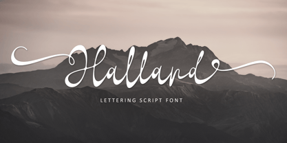
$22.00 - Halland by Struggle Studio,
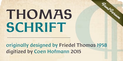
$16.00 - ThomasSchrift by URW Type Foundry,
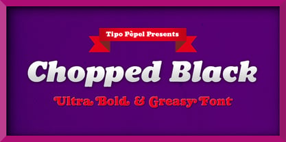
$39.99 - Chopped Black by Tipo Pèpel,
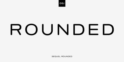
$24.00This typeface was inspired by the font Pabst Heavy, designed by Chauncey Hawley Griffith in 1928 for Linotype. Because of its formal characteristics, recalls the popular Cooper Black and probably was the reaction of Linotype to counter the popularity of this font distributed by the "American Type Founders" was acquired. It's a heavy typeface, ideal for headlines or for use in creating logos, rounded shapes and gestures evoke dynamism and make it perfect to highlight specific words or phrases. - Sequel Rounded by OGJ Type Design,
$35.00Sequel Rounded is a post-Max Bill font, developed in close cooperation with the Max Bill Georges Vantongerloo foundation in Switzerland. MAX BILL Last universal scholar, most important design teacher of the 20th century: There are superlatives, always very enthusiastic, when the importance of Max Bill is discussed. The trained silversmith studied at the Bauhaus, with personalities such as Josef Albers, Paul Klee and Oskar Schlemmer. He worked as an architect, later as sculptor and designer. - ITC Woodland by ITC,
$29.99ITC Woodland is the work of Japanese designer Akira Kobayashi. It is based on Kobayashi's hand lettering with a flat brush or square-edged pen. I wanted to design each weight to act its own part," says the designer. "The light version tends to look almost fading in small sizes, but the heavy weight is as black as Cooper Black." The cheerful ITC Woodland is ideal for graphics, greeting cards, correspondence, and other applications requiring a light touch. - Blackstripe by Mirror Types,
$15.00This font was inspired by the bricks of my wall, I stared at them all the time thinking, wouldnt be great if fonts live in cooperation with bricks, and then, it came to my mind…A font family that shows naked bricks, like it is RIGHT on the middle of design process. The main features are the informal and wired look that make it worthwhile for bands and informal invitations, flyers, for concerts or infantile designs. - Polate by Typesketchbook,
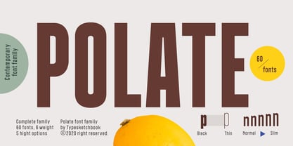
$55.00Polate font is an extra large super family of 60 fonts! Polate has such a big abundance of contrast, styles, weights, X-Hight. Typesketchbook consists of a very usable, clean and modern sans typeface . The complete Polate type family includes 6 weights with italic and 5 X-Hights versions for each of them all in all 60 fonts for a multifunctional usage, especially for cooperative work, such as website, magazine, editorial, publishing , as well as packaging. - CAC Champagne - Unknown license
- CAC Pinafore - Unknown license
