10,000 search results
(0.044 seconds)
- Dekros by FontHaus,
$14.00 Dekros has the look and feel of an Art Nouveau font when a key feature in much of the design of the 1890s was characterized by intricate linear and flowing curves that were based on natural and organic forms.
 - Music To My Eyes by Comicraft,
$19.00 This singsong font is Chock Full o’Notes to help semibreviate your lettering with melodic minims, quarter notes and quavers! NOTE, however that we cannot take responsibility for any arrangement that my seem out of tune to the trained eye.
 - Circuit by Holland Fonts,
$30.00A decorative tech typeface, designed for use in broadcast station identities and animations (Wired TV), with a slight reference to Rand's Westinghouse logo, of which a huge sign was used as a dinner table in the corporate guest quarters. - Coins Coupes NF by Nick's Fonts,
$10.00 Chamfer, released by Barhart Brothers & Spindler in the late nineteenth century, provided the pattern for this simple, elegant headline face. Both flavors of this font feature the 1252 Latin, 1250 Central European, 1254 Turkish and 1257 Baltic character sets.
 - Raleigh by Bitstream,
$29.99Following the death of Carl Dair, David Anderson redrew Dair’s design, Cartier, for Typsettra, where it was renamed Raleigh. Adrian Williams at Fonts added three weights as a display series for Conways, while Robert Norton drew the text series. - Bucintoro by Three Islands Press,
$24.00Bucintoro is a modern version of the rotunda blackletter, the Gothic book hand of Italy and Spain in the 14th, 15th, and 16th centuries. As the name implies, it's more "rotund" than the tall, angular Textur blackletter used in Germany that Gutenberg imitated. While the use of blackletter continued far into the 20th century in Germany and Scandinavia, the rotunda gave way to roman (and later also italic) letterforms in Italy, France, and Spain. It's less well known these days. Bucintoro has upper- and lowercase alphabets, numerals, punctuation, diacritics but lacks such modern characters as currency symbols. Has light, medium, and black weights. - Figgins Sans by Shinntype,
$79.00 The first sans serif types were made in London in the early 19th century. They were severely modern, all caps and bold. The Figgins foundry, inventor of the term sans serif, showed a ?ne example in its specimen of 1836. The extra bold weight of Figgins Sans is a close revival of the original, with the addition of a lower case which retains its partly geometric, partly grotesque quality. The family is rounded out with other weights and an italic, and extended into Cyrillic and Greek, all executed in what is assumed to be as authentic a manner as possible, given the hypothetical nature of the exercise. Together with Scotch Modern, comprises The Modern Suite of matched fonts.
 - ITC Garamond by ITC,
$34.99 Drawn by Tony Stan, ITC Garamond was first released in 1975 in Book and Ultra weights only. These were intended as display faces to complement existing text designs from other foundries. (In fact, many of ITC’s interpretations of traditional typefaces began as display counterparts for existing text designs.) These first weights of ITC Garamond became so popular, however, that ITC released the Light and Bold weights and a suite of condensed faces in 1977. Now, the complete ITC Garamond family features sixteen members: four weights of roman and italic in normal width and four weights of roman and italic in companion condensed versions. The family resemblance is there, but ITC Garamond’s unique provenance gives it an unmistakable, one-of-a-kind appeal.
 - Libertad by TipoType,
$24.00 Design can do without images, but not without typefaces. Libertad is a sans-serif typeface that mixes humanist and grotesk models. It’s most interesting feature is the combination of balanced regulars with dynamic italics, which makes it a very versatile font for different uses. This typeface follows the Luc(as) de Groot’s Interpolation Theory, that’s why it has seven specially-calculated weights plus their matching italics, from thin to extra-bold. This allows it to be useful in big headlines and also small texts. It has more than 800 characters per weight and support for more than 70 languages. WARNING: This does not work with most Office suites; you only have access to R/I/B/BI. Credits: Photos by Lu-Lee.com - Web template by EleganThemes.com
 - RF Rostin by Russian Fonts,
$26.00Rostin is a modern monospaced typeface with half-open forms of characters. Contains 8 fonts. 4 regular and 4 true italic. Weights from ultralight to bold. Including modern and futuristic stylistic alternates. The typeface was designed to read well in small sizes (from 15px) and be bright in large sizes. With these characteristics and a wide palette of weights Rostin has a huge potential area for usage. Ideally suited for musical covers, posters, logos, street wear, movie titles, packaging, editorial, web and applications - here he will always be gorgeous. With a wide variety of alternate characters you can make your design bright, memorable and modern. Opentype features: old-style figures, fractions, stylistic alternates, superscript and subscript.Multilingual support: Latin, latin extended, cyrillic and cyrillic extended (more than 75+ languages) - Athens by EllenLuff,
$38.00 Athens is an elegant typeface of contrast. Designed for branding, headlines and titles. The family offers class and clarity at larger and smaller sizes. Its a modern take of the old didone genre, confidently playing with extremes of thick strokes and whisper-thin curves, but removing the serifs, planting it firmly in modern day design. Its a careful collaboration between beauty and function. FEATURES 10 Fonts (4 weights + inline + matching italics) Supports ALL Latin based languages. (657 Glyphs per font) 2 options of numbers (Basic and stylistic) Athens features upper and lower cases, USE Each font offers something different and are all crafted to work harmoniously together. Athens Light, Regular, Bold and inline is designed specifically for headlines, titles and branding. Athens Book is optically designed for use in smaller sizes, making great body copy.
 - LC Gianluca by Compañía Tipográfica de Chile,
$29.00 Gianluca is a typeface of glyphic serif, or “flare” inspired by Aldo Novarese’s fonts from the 70s, with a fresh and modern touch. It is a type family that can be elegant in its normal version, or very playful, to compose from extensive texts to flashy headlines in books, magazines, labels, posters, branding and more. It has many discretionary ligatures in capital letters (with its diacritics) to play with the text, 5 stylistic sets: among them medieval style or references to Herb Lubalin, and some special letters. Gianluca consists of 5-weight fonts, from Thin to Extra Bold. All of them with matching italics. It has a nice set of small capitals, modern and old style numbers, and capital-sensitive punctuation, among other striking glyphs. Play with Gianluca!
 - Forjada by Latinotype,
$26.00 Forjada—designed by Raúl Israel—is a monolinear, rounded and condensed typeface, belonging to the slab serif classification, inspired by wrought iron window and door grills on facades of historic buildings in America and Europe. Forjada is a rigid yet softly curved font with exquisite ornaments and optimized for great legibility. Forjada Family comes in 3 weights—Light, Regular and Bold—with matching italics and includes alternate swash caps and ligatures plus Ornaments and Catchwords sets that provide a wide range of choices for creating the most beautiful designs. The font character set supports 212 languages. Forjada is well-suited for branding, packaging, food & drinks menus, wedding invitations, party invitations, guidebooks to old cities or any glamorous design you want to add a fresh and modern touch to!
 - Outright by Sohel Studio,
$16.00 Outright slab serif inspired by sporty design, vintage style with a touch of classic style. There are 4 different styles that you can apply in your design projects. This font is built with solid foundations, strong visuals, old-school movement, and a modern minimalist style. Outright is perfect for , Jersey , athletic, poster, branding projects, Logo design, Clothing Branding, product packaging, for magazine titles. for something with the theme of sports, album title, etc Outright Features: · 4 Weights font (Regular,Italic,Bold,Outline) · Numerals & Punctuation · Accented characters · Multilingual Support · PUA Encoded While using this product, if you encounter any problem or spot something we may have missed, please don't hesitate to drop us a message. We'd love to hear your feedbacks in order to further fine-tune our products. Thanks and have a wonderful day
 - Jiho Soft by cretype,
$20.00 Jiho Soft Family is a modern & soft sans-serif typeface that is clean, simple and highly readable. It is the rounded version of Jiho Family. Letters in this type family are designed with minimal & modern shapes without any decorative distractions. The spaces between individual letter forms are precisely adjusted to create the perfect typesetting. Jiho Soft is versatile type family of 18 fonts. Jiho Soft family consists of 9 weights (Thin, ExtraLight, Light, Regular, Medium, Bold, ExtraBold, Heavy & Black) with their corresponding italics. The Open Type fonts contain complete Latin 1252, Cyrillic, Central European 1250, Turkish 1254 character sets. Each font includes proportional figures, tabular figures, numerators, denominators, superscript, scientific inferiors, subscript, fractions, old style-figures and case features. We highly recommend it for use in signage, books, web pages, screen displays, and so on.
 - Winterfell by Alan Meeks,
$45.00 It is difficult to define the classification of Winterfell. The caps are definitely Roman however the lowercase is italic and slightly calligraphic. Because of its old style look I decided to describe it as modern medieval. This design reminded me of Game of Thrones hence the name Winterfell.
 - Stereohead by Stationjack,
$13.00 Stereohead is a retro sans serif display typeface inspired by old eighties video cassette cover designs. This font would work perfectly in magazine headlines, t-shirt design, posters, packaging, advertising purposes. Uppercase and lowercase characters, numbers, punctuation and extended latin characters included. 2 font styles available, regular and italic.
 - Labours by Akufadhl,
$15.00 Labours is a bold strong handcrafted typeface, inspired by an old and rustic signs on the street. Designed for any vintage purpose. suitable for Posters, Logotype, T-Shirt design, and many other vintageous design!
 - Melancholia by Barnbrook Fonts,
$75.00 Melancholia is a subtle and beautiful sans-serif inspired by calligraphic letterforms. The name describes a feeling of deep sadness, an intense sensitivity to the world. The design of Melancholia is an attempt to introduce some of that wistfulness into the sans-serif form, a typographic classification that is often characterised by an austere functionality. Melancholia includes a set of true italics influenced by old-style serif italics, such as those found in Claude Garamond’s eponymous typeface, as well as a set of stylistic alternates and calligraphic-style swash characters.
 - Kyiv by Apostrof,
$40.00 The font Kyiv is an attempt to unite old-style antiqua with the Ukrainian tradition and modern requirements. Besides having usual italics the Renaissance tradition of "semi-italics" renewed, compact weights are also provided. Special charm is added by decorative motives of chestnut leaves and flowers. The weights are included in a way to promote the solution of various tasks both text, and an accidental set in various combinations. The font Kyiv was awarded the 2nd prize in category of text fonts in the first Ukrainian typeface competition Ruthenia in 2010.
 - SantaCruz by Wilton Foundry,
$29.00I wanted to capture a sense of California with this font - generous, warm, open, bold and sunny - all this imagery is captured in Santa Cruz. It is the quintessential California beach town like the world-famous Boardwalk with everything from the Giant Dipper roller coaster to cotton candy, corn dogs on a stick and chocolate-coated bananas. In fact, the Santa Cruz Boardwalk is the West Coast's last remaining seaside amusement park. It has miles of sandy beaches, giant redwood forests and great wineries. I know you will find many great applications to use SantaCruz, the font, whenever you have a need to extress a warm, sunny and generous spirit! SantaCruz is available in Opentype, PostScript and Truetype formats for both Mac and Windows. - Bark Type by Putracetol,
$22.00 Introducing “Bark Type - Quirky Dog Font,” a playful and bold typeface inspired by man’s best friend. This font is characterized by its fun, thick letters, making it a perfect choice for various applications. Each of the nine variations is meticulously crafted to resonate with the theme of dogs, animals, and playfulness. Whether used alone or combined, Bark Type promises versatility and visual appeal. Ideal for children’s themes, crafting, invitation cards, packaging, posters, business branding, greeting cards, stickers, children’s books and magazines. Its distinct design ensures that it stands out in any context related to animals or specifically dogs. Every letter is infused with elements that echo the playful and loving nature of puppies – a delightful addition to your creative projects.
 - Garota Sans SC - Personal use only

- Bunken Tech Sans Wide by Buntype,
$49.00 The Bunken Tech Sans superfamily: A reminiscence of constructed fonts of the modern age designed with considerably cleaner forms. •See other members of the Superfamily: Bunken Tech Sans •For further details, view the Specimen PDF. Bunken Tech Sans Wide follows in the best tradition of the straight-lined and somewhat angular structures of its predecessors while offering a much more open and mild design. The shapes of the letters are therefore reduced to the most essential elements: The spurs on a, b, n and other lower case letters occur just as little as decorative or style details, the lightly rounded inside edges are more pleasing to the eye than certain historic role models and make for a harmonic, flowing style. Use In particular Bunken Tech Sans Wide stands out as an easy, distinctive headline font with its straight-lined, technical design. Open counters and large x-height make it equally suited for use in shorter texts. It is also perfectly complemented by Bunken Sans or Bunken Slab in longer texts (available soon). Features Available in 16 styles with widths ranging from Light to Heavy with associated Italics. All of the styles are very extensive: Support for at least 58 languages, Small Capitals, 9 number sets (e.g. Lining, Oldstyle, Tabular and Small Cap Figures), ligatures, alternate characters, numerous Opentype functions, and lots of other small features that make it more pleasant to work with the font on a daily basis as well as fulfilling typographic desires. Each style contains more than 870 characters! Each style is available in a professional (Pro) standard (Std) and Small Caps (SC) edition with a different range of functions. (Language support, OpenType features and number of glyphs). Details can be found on the respective pages. Bunken Tech Sans Wide is part of the Bunken Tech superfamily and is available in Condensed, Normal and Wide. Also of interest: The slab serif variation Bunken Tech Slab Features in Detail: 16 Weights: -Light -Book -Medium -SemiBold -Bold -ExtraBold -UltraBold -Heavy and corresponding Italics 3 Widths: -Condensed -Normal -Wide Alternate Characters: A, E, F, L, S, e, f, t, s, y, etc. Small Capitals 5 Sets of Figures: -Lining Figures -Old Style Figures -Tabfigures -Old Style Tabfigures -Small Cap Figures Automatic Ordinals Automatic Fractions Extended Language Support and more...
 - Quars by Letterjuice,
$66.00 Quars is a text and display typeface family designed to work on magazines. However, it is also suitable for books and other editorial material. It has a strong personality with elegant, sharp and contemporary features. This typeface comes from several subtle influences, from the contrast of the Scotch Romans to the sharpness of contemporary Dutch designers. Quars is a crystal clear and neat typeface full of small details, its structure is bursting with curves and accurate features which gives it its firm personality. Its italic experiments with the boundaries of italics themselves; with just 1 degree of slant Quars Italic accomplishes its purpose of highlighting pieces of text within its Roman. This carefully thought out inclination protects the uppercase from the usual distortion which Italic caps suffer. It offers a generous glyph set with many ligatures specially crafted for titling and ornaments based on anonymous metal types found in the drawers of an old printing workshop in a coast town near Barcelona.
 - Faust Text by Solotype,
$19.95Barnhart Bros. and Spindler called this Faust Text when they introduced it in 1898. A quarter of a century later, they brought back a number of obsolete faces and renamed them. This one became Missal Text in their 1923 catalog. - Pitch by Device,
$39.00 A heavy block sans in chrome and solid variants. The high lower-case x-height and short ascenders and descenders permit tight line spacing for an impactful, punchy effect. The chrome variant works well at larger sizes and in shorter settings.
 - Vektra by Device,
$39.00 Vektra takes advantage of the high-resolution afforded by the Glyphs font design program. Stripes of different density overlap to create a cross-hatched tonal effect. Best used at larger sizes and in shorter settings where the details can be seen.
 - Sunlight JNL by Jeff Levine,
$29.00Sunlight JNL takes the classic wood type from Jeff Levine's Twelve Oaks JNL and shatters it with bursts of light for a novelty effect. Limited to a very basic character set, it's best used for short words and phrases in headlines. - Moyenage Sans by Storm Type Foundry,
$55.00Moyenage is a modern replica of blackletter. Whereas the calligraphic typeface family can be used in shorter texts and posters, the sans-serif variation is rather experimental project which may find its use on music cover design, occasional lettering and invitations. - Summer Magic by Nirmana Visual,
$25.00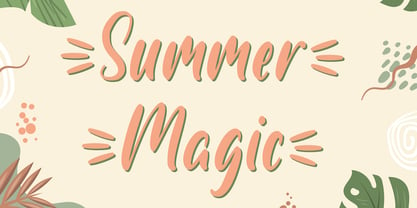 Introducing Summer Magic, Perfect for everything from branding to crafting. This versatile font is great for merchandise, products, quotes, editorial, posters or whatever design you have in mind. This is a great font for crafters. Thank you and Happy Crafting!
 - Shopping Basket JNL by Jeff Levine,
$29.00 The cover of the vintage sheet music for "This Little Piggie Went to Market" (from the 1934 film "Eight Girls in a Boat") features a hand-lettered sans serif with intermittent chamfered angles. This became the model for Shopping Basket JNL.
 - Digital Clock by Beast Designer,
$15.99 Digital Clock Font is a typeface designed specifically for use in digital alarm clocks and other timekeeping devices. It is characterized by clear, legible numerals and symbols, and a modern, minimalistic design that is easy to read at a quick glance.
 - Husky by Trim Studio,
$12.00 Husky is a sweet and playful handwritten font, clean and a little bit quirky, this font is the perfect fit for crafter and graphic artist to complete their design such as invitation, advertisement, poster, logo, birthday, product sign, and many more!
 - Umidus Font by Softulka,
$10.00 Umidus font - Trippy wavy liquid decorative font, which works perfectly for bold titles, Festival posters, as a graphic element for bright T-shit or hoodies, or even backgrounds! This weird and ugly font likes an experiment with spacing and different deformation. Please, don't hold back on your bold modern ideas! ------------------- You will receive: - 3 OTF files (3 font styles: plane black, transparent outline, black with highlights) - ATTENTION! font comes WITHOUT any photos, textures, or effects.
 - Archapolago by HIRO.std,
$16.00 Archapelago is semi casual bold script This font describes about boldy, stylist, fun and elegant, catchy, dynamic, sporty, readable, easy to use FEATURES - Support Opentype Features - Stylistic alternates - Swash alternates - Numbering and Punctuations - PUA Encoded Characters - Multilingual Support - Works on PC or Mac USE Archapelago works great in any logotype, magazines, apparel, poster, advertisements, product packaging, product designs, label, and any projects that need semi casual and bold style. Enjoy using! Thanks. HIRO.std
 - Beantown Bounce NF by Nick's Fonts,
$10.00This quirky charmer is based on a typeface originally called Century, which appeared in the Boston Type Foundry's 1898 specimen book. This version includes many of the ornaments and accents included with the original font, as well as alternate versions of lowercase e and o. The PC PostScript, TrueType and OpenType versions contain the complete Latin language character set (Unicode 1252) plus support for Central European (Unicode 1250) languages as well. - Qualitype by Bülent Yüksel,
$19.00 QUALITYPE + VARIABLE FONT FAMILY "QualiTYPE" font extends its use by providing weights from "Thin" to "Black". Natural curves, ridges, and curved bodies grow in character as the font gains weight. "Qualitype" is an exciting serif font with contemporary twists. It has a distinctive sound that preserves the simplicity and elegance of classic "serif" fonts with a fresh, stylish rework. Her personality is bold and fills the space without shouting, she looks elegant and confident. The low X-height provides a great amount of visibility at all weights and is optically corrected for better readability. In the process of working on "Qualitype" we wanted to expand the functionality of the typeface a bit more, so after a few tries two different fonts were born: "Old", "Neo" and "italics" versions. "Qualitype" is perfect for use in magazines, in the fashion industry, in the branding of premium goods and services. "Qualitype" is quite versatile and suitable for use both in headings and in text arrays. In addition, we have done manual hinting in the typeface, and now it can be used with a clear conscience in the web and applications. “Quality” typeface consists of 56 styles: 2 style, 2 Shining, 7 weights and italics. Each typeface style consists of 860+ glyphs (except for the decoratives). “Qualitype” supports over 80+ languages. A variant version of the basic styles has been prepared for the most demanding users. Using the variability slider, you can adjust and select the individual thickness regardless of the current weight distribution. An important clarification - not all programs support variable technologies yet, you can check the support status here: https://v-fonts.com/support/. OPENTYPE FEATURES aalt, dnom, onum, pnum, tnum, lnum, numr, frac, zero, sing, sups, subs, case, c2sc, smack, salt, hist, titl, holing, dig, liga, ss01, ss02, ss03, ss04, ss05, ss06, ss07, ss08, ss09, ss10, kern FEATURE SUMMARY: - 4 Axes: 2 Style: Old and Neo. 7 weights: Thin, Light, Book, Regular, Medium, Bold and Black. 2 Shining: Dark and Lamp. Matching italics (12º) for all weights and style . - Matching small caps for all weights and widths. - Lining and old style figures (proportional and tabular). - Alternate characters (a, d, g, m, n, p, q, r, u, y). - Unlimeted fractions. - 24 Dingbats. - Extended language support. - Extended currency support. You can contact me at buyuksel@hotmail.com, pre-purchase and post-purchase with questions and for technical support. You can enjoy using it.
 - Miss Mable by Cory Maylett Design,
$25.00 Miss Mable is a high-quality, well-proportioned contemporary typeface with variations in thick and thin strokes that contains a hint of previous decades. I wanted to create enough weights and widths to make the typeface suitable for a wide range of uses where a soft, stylish, and friendly look is appropriate. The Miss Mable type family consists of 44 fonts. The family encompasses seven weights across three widths in Roman and italics plus variable versions. Each font contains a complete set of characters for Western and Central European languages. In addition, OpenType features include dynamic fractions, alternate glyphs, ligatures, plus proportional, tabular, and old-style numerals. These high-quality fonts are fully compatible with Windows, Macintosh, and Linux. Also for sale are two Miss Mable variable fonts that include all Roman and italic glyphs of every width and weight plus everything in between. For example, if you need something slightly bolder than bold and a little wider than semi-condensed, the variable fonts make that possible without distortion. Variable technology is new, however. All modern web browsers support variable fonts, but support for most desktop software is still spotty.
 - TT Norms Pro Serif by TypeType,
$39.00 Introducing TT Norms® Pro Serif, version 1.100! The updated font now has new OpenType features and localization for the Serbian and Bulgarian languages. TT Norms® Pro Serif is a functional serif based on our studio's main bestseller—the versatile sans serif TT Norms® Pro. Together, they form an ideal font pair. Although these typefaces are made for each other, they can easily be used independently and paired with other fonts. So, TT Norms® Pro Serif is a self-sufficient and elegant serif, neutral at the same time. It is easy to recognize due to its gentle proportion dynamics, open aperture, slanted oval axis, and low stroke contrast. Another distinctive feature of this font is brutal serifs that adjust in length according to the weight of the font. As well as TT Norms Pro, there are Italic font styles in TT Norms® Pro Serif. However, for this serif, we have designed true italics instead of simple slanted font styles. Their key feature is the ability of the lowercase letterforms to change in reference to the roman font styles. They become more rounded, moving towards handwritten shapes. The nature of the italics turned out sharper than that of the roman font styles. It can be used to place accents that would attract attention without interfering with the process of reading. TT Norms® Pro Serif is capable of solving multiple design tasks. It is highly readable, which makes it convenient for small point sizes. This serif's application range is broad and diverse: it can be used for websites, printed materials, and packaging design. The font is well-suited for projects in the domains of culture, art, history, or literature and can be implemented into the designs of signs, posters, or premium products and services. TT Norms® Pro Serif, version 1.100, consists of: 24 font styles: 11 roman, 11 italic, and 2 variable fonts (one for the roman font styles and another—for italics); 1380 glyphs in each font style; 31 OpenType features, including options for localization.
