10,000 search results
(0.047 seconds)
- Misspiece by Yahya Type,
$22.00 Meet Misspiece, a luxury ligature serif font with italic. Misspiece combines a vintage look with a modern flair to add more elegance to your project. This font can be used in high-end branding, logo designs, magazines, product packaging & invitations, wedding designs, social media posts, advertisements, labels, photography, and watermark... WHAT’S INCLUDED? Misspiece Regular (uppercase & lowercase) Misspiece Italic (uppercase & lowercase) Misspiece Condensed (uppercase & lowercase) Misspiece Condensed Italic (uppercase & lowercase) Numbers & punctuation Ligature & Huge Stylistic alternate Multilingual support. Still have a question? Send me a message and I’ll be happy to answer! qura.yahya@gmail.
 - Alibata - Unknown license

- Alt Sku by ALT,
$15.00 Sku typeface is a elegant display font and comes in 2 styles: Regular & Italic.
 - Assegai by Scholtz Fonts,
$19.00 Named for the Zulu traditional spear, Assegai evokes the long, slim outline of the weapon, and the strength of the Zulu warrior. The font combines the irregular shapes of tribal African art with the simple, clean elegance of contemporary design. It is especially useful for headings, subheading, for shorter passages and also works as a body font since it has both upper and lower case and is striking and readable.
 - Craw Modern by GroupType,
$19.00 Craw Modern was designed by Freeman Craw in 1958 and first released by The American Typefounders Company, (ATF). In typography, 'Modern' is a style of typeface (classification) developed in the late 18th century that continued through much of the 19th century. Characterized by high contrast between thick and thin strokes and flat serifs. Bodoni is among the most popular of the Moderns. Moderns are also known as Didone and New Antiqua.
 - Aeda Rift by ZP Fonts,
$20.00 Aeda Rift is a high-contrast display typeface characterized by its sharp serifs and graceful contours, mirroring the elegance and hostility of the desert landscape. Consisting of nearly 400 glyphs, this font includes a full upper and lower case Latin-based alphabet, punctuation, symbols, diacritics, and ligatures—all together supporting over 82 languages. Perfect for headlines, pull quotes, and intro decks, Aeda Rift is carefully kerned and primed for creativity.
 - HU Suryeo by Heummdesign,
$15.00 HU Suryeo is a new typeface of Heumm's calligraphy that takes the motif from carefully written calligraphy. It follows the calligraphic shape of Korean classics and can be used for titles and body text without distinction. The stroke thickness, strength, and degree of bending were set differently for each style. The thinner it is, the sharper it is, and the thicker it is, the blunt and round it is.
 - Louise by Hanoded,
$15.00 Louise font was based on the art of Louise Marie (lou) Loeber, a Dutch painter. She was born in Amsterdam in 1894 and flirted with several styles like De Stijl, Cubism and Bauhaus. Her artworks are characterized by a sober use of geometric shapes; lines, rectangles and triangles. Louise font consists of Caps, but the lower and upper case glyphs are quite different. Louise comes with extensive language support.
 - Nadia by Type Innovations,
$39.00 Nadia is an original design by Alex Kaczun. It is a modern stencil interpretation of Granjon Oldstyle, highlighted by large elongated serifs, generous proportions and a large x-height. It is an elegant display for headlines as well as text. Named after his daughter, Nadia has a distinctively vibrant and baroque quality which some would even call sensuous. It’s a truly unique stencil treatment characterized by crisp, clean, rounded shapes.
 - Paddy Wagon NF by Nick's Fonts,
$10.00The typeface which inspired this offering was originally called "Chaucer", not because it is typical of lettering of Chaucer’s time (which it is not) but, more likely, because it’s pretty funny, even if the humor is low. Another purveyor of low humor, Mack Sennett and his Keystone Kops, suggested this version’s name. Both versions of this font include the complete Unicode Latin 1252 and Central European 1250 character sets. - Love Diery by Black Studio,
$15.00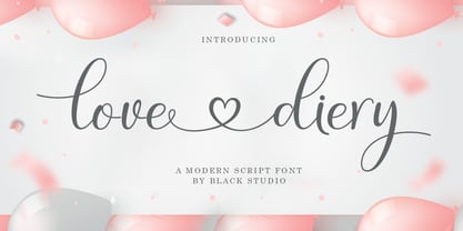 Love Diery Script is a beautiful script font with many alternative styles, this font looks natural, elegant and perfect for extraordinary projects. The Love Diery script is suitable for various products such as invitations, product packaging, offers, product designs, crafters, labels, photography, watermarks, logos & branding. Everything can be accessed using software that supports Opentype, such as Adobe Indesign, Adobe CS Illustrator, Adobe Photoshop CC, and Corel Draw. Thank you
 - School Activities JNL by Jeff Levine,
$29.00 An image spotted in an online auction online of a 1940 Milton Bradley child's activity set consisting of wooden letters formed the basis for School Activities JNL, which is available in both regular and oblique versions. Although the basic characters feature chamfered corners, the nature of bending the steel rule dies to form the letters to be cut from the wood provided rounded edges as well, creating their unique look.
 - ITC Regallia by ITC,
$29.99The calligraphic ITC Regallia is, like ITC Samual, a work of Phill Grimshaw. Generous capitals contrast beautifully with reserved lower case letters whose flowing ascenders and descenders create the flow which characterizes this font. ITC Regallia is graceful and almost poetic, its capitals also suited for use as initials. ITC Regallia includes several ligatures and is best used for short and middle length texts in point sizes of 12 and larger. - Staylive by Rotterlab Studio,
$12.00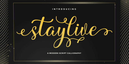 Staylive is a beautiful calligraphy font with many alternative styles & leaf swashes, it looks natural, elegant and perfect for any extraordinary project. Staylive is suitable for a wide range of products such as invitations, product packaging, quotes, product design, crafters, labels, photography, watermarks, logos & branding. Everything can be accessed using software that supports Opentype, such as Adobe Indesign, Adobe CS Illustrator, Adobe Photoshop CC, and Corel Draw. Thank you & happy design :)
 - 64-SRC by ILOTT-TYPE,
$49.00 64-SRC is a condensed monospace font inspired by 1960s IBM Selectric type seen on HAL’s telemetric displays in 2001: A Space Odyssey. It is characterized by unique "double-space" alternates for the widest characters such as “w” and “m”. These alternates maximize legibility, improve the rhythm of readability and keep typographic color even. As a result 64-SRC is as well suited for extensive copy as it is display type.
 - Hampers by Trim Studio,
$12.00 Hampers is cute double line typeface with handwritten style and kawaii touch, to match the design type of cuteness and kids,, especially in precious moment like baby shower, birthday, christmas, easter and many more,, Its perfectly suited for crafter and graphic artist to complete their design such as invitation, advertisement, poster, logo, birthday, product sign, and many more! Hampers also Lightweight, even so contains All Standard glyphs and punctuations
 - ITC Riptide by ITC,
$29.99ITC Riptide is a work of British designer Timothy Donaldson. Abrupt changes in stroke, pointed stroke ends and changing slant direction characterize this very experimental alphabet. The temperamental figures are irrepressible and aggressive, the forms seem to have been chosen randomly, and these traits lend the font its informality and spontaneity. ITC Riptide is legible in point sizes of 14 and its fresh character is perfect for comics and cartoons. - Marat Sans by Ludwig Type,
$45.00 Marat Sans is a clean and lively sans serif typeface designed by Ludwig Übele. It is characterized by excellent legibility and suits a wide range of typography. The entire family contains 27 styles & weights and includes many OpenType features: various numerals, alternate glyphs, fractions, superiors and inferiors, language features, arrows, case sensitive forms and many more. Marat Sans is the perfect companion for Marat, a soft and elegant serif typeface.
 - Swifted by Sarid Ezra,
$15.00 Swifted is a modern and stylish typeface with unique details. This font works best in bigger sizes, useful for headlines, titles, or shorter texts. You can see the beautiful details in any characters that will make the font more fashionable. This font contains a bunch of essential ligatures that will make your presentation or logo even more stunning and stand out! Swifted also support Multi Language and already PUA Encoded!
 - Cirulis Display by Asketic Design Studio,
$40.00 Cirulis is a display sans family of two weights. Inspired by the lettering of Ansis Cīrulus (1883-1942) one of the first Eastern European designers. The artist’s heritage is characterized by letters with asymmetric widths, sliced cuts and various intrinsic features. By carefully studying forms and origins of the letters Asketic designed a new typeface that in a contemporary fashion relives early 20th century national romanticism of Eastern Europe.
 - Fancyou by Asenbayu,
$15.00 Fancyou is a classy vintage-inspired serif typeface with modern proportions consisting of 8 styles. Fancyou fonts are characterized by sharp serifs that bring a fashionable feel. You can use these fonts in modern vintage designs. These fonts are perfect for many projects such as logos, branding identity, magazines, business cards, posters, websites and many more. Fancyou fonts feature: Kerning, Ligature Style, Alternative Style, Numeral, Symbol and Multiple Languages Supported
 - Quote Notes by Trim Studio,
$12.00 Quote Notes is cute whimsical font with fun style to let you explore more about craft and cuteness, especially in precious moment like holiday, baby shower, birthday, christmas, easter and many more,, Its perfectly suited for crafter and graphic artist to complete their design such as invitation, advertisement, poster, logo, birthday, product sign, and many more! Quote Notes also Lightweight, even so contains All Standard glyphs and punctuations
 - Linotype Rory by Linotype,
$29.99Linotype Rory oblique is part of the Take Type Library, selected from contestants of Linotype’s International Digital Type Design Contests of 1994 and 1997. The font was designed by Canadian Tad Biernot with strictly constructed forms. The similarly formed figures seem mechanically created and their light slant gives the impression of strenght and dynamism. Linotype Rory oblique should only be used in the shorter texts of headlines in larger point sizes. - Farmhouse Children by Abo Daniel,
$13.00 introducing FARMHOUSE CHILDREN - a playful handwritten font - This font is designed for crafters. It is great for branding, packaging, quotes, t-shirt design, card, banners, and anything of craft project that needs kid's style. The combination of uppercase and lowercase is great, unique, and very fun. Let's play with this awesome font! Features: - Uppercase - Lowercase - Numeral - Multilingual - PUA encoded I hope you love it. regards, Abo Daniel Studio
 - Chumba Wamba by Putracetol,
$24.00 Chumba Wamba - Display Rough Font is a captivating display typeface characterized by its intentionally messy and rough outlines, featuring textured details within each letterform. This font possesses a subtle classic flair, yet its thick and disheveled appearance imparts a touch of playfulness. Perfectly suited for logo design, posters, headlines, titles, printing designs, stickers, greeting cards, and business branding, Chumba Wamba adds a unique and eye-catching dimension to your creative projects.
 - Fun Write by FunFont,
$19.00 Fun Write is a font characterized by a playful and enjoyable nature, much like letters inscribed with full-hearted merriment, as implied by its name. With its simple and naive font structure, rounded edges, and an absence of sharp angles, it eschews the pointed facets typical of expressive marker strokes. This font is exceptionally well-suited for your design projects requiring a whimsical and delightful character reminiscent of a child's world
 - FF Sanuk Big by FontFont,
$57.99FF Sanuk Big is a clean and crisply drawn headline typeface intended for high legibility with a distinct character. Compared to the regular version, FF Sanuk Big has an extensively high x-height—with shorter ascenders and descenders. The tight spacing makes it perfect for big and powerful headlines. The family consists of 16 styles in total, including a wide range of weights and up-to-date OpenType features. - Written By Hand by Trim Studio,
$14.00 Written By Hand, a handmade font that is taken from the real hand style of writting, its so realistic to used for many branding and personal identity style, especially for its messy stlye of writting Its perfectly suited for crafter and graphic artist to complete their design such as invitation, advertisement, poster, logo, birthday, product sign, and many more! Buttier also Lightweight, even so contains All Standard glyphs and punctuations
 - Brignell Slab by IB TYPE Inc.,
$40.00 BRIGNELL SLAB is an eight font family designed by Ian Brignell. Curvaceous and dynamic, this unique slab exudes honesty and personality. A slab serif characterized by a soft treatment where normally you would see vertical serifs. This feature allows for a smoother, less toothy, reading effect. Brignell Slab was born in 2008 and was inspired by the logo and custom font Ian designed for Naturalizer. Extended Latin set.
 - HU Specialmovie KR by Heummdesign,
$25.00 HU SpecialmovieKR is a retro, wide square typeface, characterized by streamlined, narrow stroke ends such as 'ㄴ,ㅅ,ㅈ'. The first consonants are designed to be large with full modules to improve readability. The grapheme 'ㅇ', which is the face of the font, is in the form of a square in harmony with straight lines and curves, expressing a solid and simple feeling overall. HU SpecialmovieKR includes Korean.
 - Cervina by QUADRAAT,
$125.00 Currently the only serif font from the Quadraat foundry. Cervina is characterized by a sharp lettering like the edge of the Hörnli or knife blades as well as closed forms in lowercases plus a stylistic set of square numerals. Cervina is a typeface specifically designed for big volumes of text but also for titles of books, newspapers, magazines, posters. Variable format available on request. Supports all latin languages
 - Monster Movies JNL by Jeff Levine,
$29.00 A 1967 ad for Aurora “Monster Scenes Custom Builder Kits” featured the drippy, gooey hand lettering long associated with science fiction and horror movies. The letters in the ad were auto-scanned and additional characters were completed with the end result being a horror-themed font with sharper angles and lines instead of drips. This is now available as Monster Movies JNL, which is available in both regular and oblique versions.
 - Quiche Sans by Adam Ladd,
$25.00 Quiche Sans is a high-contrast, sans serif with monoline stroke endings, angled stems, and geometric proportions. A sibling to the Quiche family, with the ball terminal endings removed. The design is influenced by the serif didone genre, characterized by its elegance and extreme thick/thins, but it removes the serifs for a unique and modern expression and tapers out the stroke endings for a sophisticated monoline appearance.
 - Crafty Beach by Abo Daniel,
$13.00 CRAFTY BEACH -craft font with summer clipart- it is a simple, natural, and fun handwritten font. This font is designed for crafters. It is great for branding, packaging, quotes, t-shirt design, card, banner, cutting, silhouette, and anything of craft project. I create the summer clipart to complete this font. The clipart is very easy to use. Features: - Uppercase - Lowercase - Number & punctuations - Multilingual - Summer Clipart - PUA encoded regards, Abo Daniel Studio
 - Ziletti Pop by RM&WD,
$20.00 ZILETTI POP is a font used by Girolamo Ziletti in Venice in mid/late 1500. A typographic caracter characterized by a Venetian style cage with slight geometrical imperfections but with a great perceptual level. This is a multilayered variant with a wide range of possibility in variations in terms of end results. With the use of the color your artworks will have news optical effects. Ideal for Covers, Posters, Logos…
 - BaselBook - Unknown license

- BodinSmall - Unknown license

- SF Foxboro Script Extended - Unknown license

- Bikly - Unknown license

- 3x3 dots - 100% free


