10,000 search results
(0.05 seconds)
- Amica Pro by Eclectotype,
$40.00 Welcome Amica Pro, a workhorse sans designed to give your branding a friendly, approachable look. What is it that makes a typeface friendly? Eclectotype undertook extensive research* in this and the results are in! To cut a long story short, friendliness in sans serif fonts can be summed up in two words – short and fat. Basically, think Danny DeVito in letter form. The shortness in Amica Pro is achieved (somewhat counterintuitively) by pushing up the x-height. This, coupled with short ascenders and descenders, gives the text a squat appearance. For the fatness, that's easy in the bolder weights, but how to carry this through to the lights? Here, the fatness equates to roundness, so the letterforms, even if the stroke weight is light, have a rotund appearance from the wideness and roundness of the circular glyphs. When thinking about friendliness, we think about inclusiveness. To this end, Amica Pro supports a super wide range of latin-based languages, as it uses Underware's Latin Plus character set, as well as extra support for Vietnamese. Amica Pro is best used for branding, logos, infographics etc. It will give your UI a friendlier feel, but that doesn't mean it's not serious. There are many useful typographic features, including alternates, numerous figure styles, automatic fractions and case-sensitive forms. The italics are carefully optically corrected "sloped romans" and as such they are the same width as their upright equivalent, so changing your copy to italics will not mess around with the spacing. *I looked at a few fonts and drew some lazy conclusions.
 - Tenez by Plau,
$30.00 Big News! Tenez has been selected for the Tipos Latinos Biennial 2016 and Typographica’s Favorite Typefaces of 2015! Tenez is a Grand Slam display didone typeface from Plau. We designed it for a branding project, further developing the resulting logotype into a typeface we felt could solve many designers’ needs. Its origins are rooted in pointed nib calligraphy which can be seen in contemporary Didot and Bodoni inspired typefaces. But Tenez’s shapes are organic (these modern typefaces were originally cut by hand after all) – in fact that was the challenge we set from the start: to make a typeface as organic in construction as possible. This echoes some of late 19th century typefaces and advertising, yet we thought of it for contemporary uses. One of the several unique features of Tenez is its unusual Thin weight, in which the contrast between thin strokes and the black area left by the serifs makes for a typewriter-like personality. The italics provide a perfect counterpoint to the roman weights. Tenez was unapologetically conceived as a display typeface meant to be used large as in magazine openings, drop caps or everywhere there’s a need for elegant impact. The family includes support for almost all Latin languages available, figure sets for almost every conceivable occasion (tables, text, you name it), alternates for the quirky beautiful R (sometimes simpler is better, but not always!) and Q (with a nice big tail for that article opener). Tenez pairs really well with our no-frills sans-serif Motiva Sans and our cute vertical connected script Primot.
 - Sirius B by Hanoded,
$15.00 Sirius B is a very lively display font. It can be used for book covers or posters, but would look rather dandy on T-shirts, mugs and other merchandise as well! Sirius B comes with alternates for all upper- and lowercase letters, has extensive language support and - lo and behold - all glyphs are interchangeable.
 - C Elle F by TeGeType,
$19.00 The "C Elle F" is a typographic family, as a stencil letter, originally intended for cutting and engraving to carry out marking and signaling work. But of course, the very characteristic shape of these letters evokes much more. This typographic family can therefore be used for communication in various fields, commercial, import-export, military, etc.
 - Berryspickers by Abbasy Studio,
$17.00 Berryspickers is allcaps font with handwritten style very suitable when combined with watercolor and it can makes your work more stylish. this font features with Stylistic Alternates that allows you to mix and match pairs of letters to fit your design. Perfect for branding projects, Logo design, Clothing Branding, product packaging, magazine headers, etc.
 - Gluy by Ndiscover,
$29.00 Gluy is geometric humanist hybrid. It blends the two categories into one design. Mixing geometric rational shapes with a touch of organic calligraphic forms. Comprises a total of 20 styles and supports most Latin languages and Cyrillic. Ideal for branding but very versatile. It can be used in many contexts from print to web.
 - Truens by Seventh Imperium,
$15.00 Truens is a vintage display typeface. It's an all uppercase serif font collection with a Script font that was inspired by the look and feel of old serifs. Truens features include badges, ornaments, catchwords, and Multiple Language Support. This fonts is very versatile, all the styles work well together and can look authentically vintage.
 - Signorina by Talavera,
$20.00 Signorina is a funny font (a "funnty"?) not to be taken so seriously. It reminds me of slab serif designs, but jelly-stuffed instead of having wood. This font also works very well on small sizes because of it's tall x height. You can use this kind of font on both text and titles.
 - Invention by Create Big Supply,
$15.00 Invention Font is a unique, This will add a very unique and powerful touch to your design. This font is PUA encoded which means you can access all the glyphs and sweeps easily! Features: Uppercase & lowercase Numbers and punctuation Multilingual PUA Encoding Full Character Set !"#$%&()*+,-./0123456789:;=?@ABCDEFGHIJKLMNOPQRSTUVWXYZ[\]^_abcdefghijklmnopqrstuvwxyz{|}~ ¡¢£¤¥§©ª«®°±²³·¹º»¿ÀÁÂÃÄÅÆÇÈÉÊËÌÍÎÏÑÒÓÔÕÖ×ØÙÚÛÜÝÞßàáâãäåæçèéêëìíîïñòóôõö÷øùúûüýþÿıŒœŠšŸž–—‘’‚“”„†•‹›€−
 - Signate Grotesk by Sign Studio,
$18.00 Signate Grotesk comes in 9 weights. The dimensions are synchronous from Thin to Black and are also equipped with an Italic style of 12 degrees. Equipped with Cyrillic characters will provide good language support. Can stand alone or as a support for other typography. Very versatile for writing official documents, logotypes, product branding, website design.
 - Granny Tales by OKSHUtypeCO,
$12.00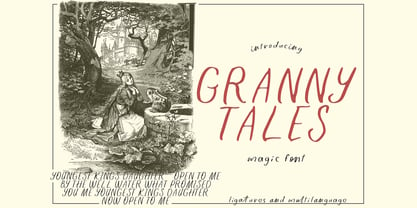 Granny Tales - a new fresh handmade calligraphy font. Very suitable for greeting cards, branding materials, business cards, quotes, posters, and more!This font are perfect for wedding postcard. Or you can create perfect and unique design of your logo, blog, stationery, marketing, magazines and more :) Features : Ligatures UpperCase & Lowercase Numerals & Punctuations Multilingualcharacters(AÀÁÂÃÄÅCÇDÐEÈÉÊËIÌÍÎÏNÑOØÒÓÔÕÖUÙÜÚÛWYÝŸŸ ÆŒßÞàáâãäåæçèéêëìíîïðñòóôõöøùúûüýÿ)
 - Baby Story by Sulthan Studio,
$12.00 Baby Story The script font with a handwritten style inspired by a very cute baby story fits well with this beautiful handwriting with a heart that can be connected or a heart on each end of the letter or also a middle letter that rises up or down. Baby Story comes with 567 glyphs.
 - Mama Bear by Hanoded,
$15.00 Mama Bear is a playful, neat, children's book typeface. It is cute and happy, very legible and comes with extensive language support, including the 'schwa' glyph found in a handful of languages. Mama Bear was inspired by my 16 month old son, who loves his fluffy bear and likes to play hide and seek.
 - Bestaline by Typebae,
$15.00 Introducing Bestaline Font Pack Bestaline is a versatile font pack. It has 5 styles of fonts and ornaments, can be used and combined for various projects. To use the beginning and ending swashes, you don't need to use software that supports opentype, because we have made it separately so it's very easy to use.
 - Manda Rawles by Ws Studio,
$15.00 Manda Rawles is a dazzling script font. This font is neatly crafted and very detailed. Whatever the topic, this font will be a great asset to your font library, as it has the potential to enhance any creation. This font is PUA encoded which means you can access all the glyphs and sweeps easily!
 - Bupkis by Hanoded,
$15.00 Bupkis literally means ‘goat’s dropping’ in Yiddish, but it is used to say ‘nothing, zero, zilch’. Bupkis is a very nice handmade font. A little formal, a little uneven, a little unusual. Use for it whatever you like, but product packaging, cards and book covers do come to mind. Comes with a lot of diacritics.
 - Suspiria Vampira by Konstantine Studio,
$10.00 Halloween is coming. Get prepared earlier with our Suspiria Vampira. A bold and bouncy fonts with 2 styles, Clean and rough. Very good for a halloween concept, but the versatility level are high in this font. It can be placed into any fun and cheerful branding or event concept. So many possibilities coming up!
 - After Brush Graffiti by Sipanji21,
$16.00 Hello, this is After Brush - Realistic Awesome Monoline Display Font! This font designed so that users can use it more easily and make Monoline designs easier. After Brush is very suitable for use in various media such as; packaging, logos, labels, posters, shirt designs, bulletins, typography, and many other media, especially with Monoline look.
 - Dark Sider by Sipanji21,
$18.00 Hello, this is Dark Sider- Natural Handwritten Graffiti Tag Font! This font designed so that users can use it more easily and make graffiti designs easier. Dark Sider is very suitable for use in various media such as; packaging, logos, labels, posters, shirt designs, bulletins, typography, and many other media, especially with graffiti look.
 - Blacklisted by Motokiwo,
$18.00 Blacklisted is a vintage script font with clean brush strokes. It’s very recommended for logo, branding, clothing, poster, and many more. You can customize every word with alternates characters and swashes. Blacklisted also support special characters for multilingual. Files & Features: Uppercase & Lowercase Numeral & Punctuation Stylistic Alternates Stylistic Sets (SS01 & SS02) Special Characters PUA Encoded
 - Kunstler Grotesk by HiH,
$12.00 Künstler Grotesk ML is one of a number of typeface designs that attempts to reconcile Germany’s blackletter tradition with the international familiarity of roman letterforms in a simple, robust design suitable for meeting the demands of a modern industrial economy, while rejecting the extraneous ornamentation of the departing Victorian era. It is an all-cap design with a number of playful ligatures. It has an appealing boldness that reverses well. Künstler means ‘artist’ in German. I had always assumed it was a person’s name until I came across the translation. Lesson: conjecture is not fact. Grotesk refers to a sans serif letterform tradition. Kunstler Grotesk was originally released by Bauer'sche Giesserei of Frankfurt am Main circa 1900. Künstler Grotesk ML represents a major extension of the original release, with the following changes: 1. Added glyphs for the 1250 Central Europe, the 1252 Turkish and the 1257 Baltic Code Pages. Added glyphs to complete standard 1252 Western Europe Code Page. Special glyphs relocated and assigned Unicode codepoints, some in Private Use area. Total of 350 glyphs, 260 kerning pairs. 2. Added OpenType GSUB layout features: pnum, salt, dlig (19) and hist. 3. Revised vertical metrics for improved cross-platform line spacing. 4. Redesigned mathematical operators. 5. Included tabular (std) & proportional (opt) numbers. 6. Refined various glyph outlines. 7. Made CcNnOoSsZz-kreska available (salt). 8. Incorporated alternate glyphs in lower case.
 - Unione GX by TOMO Fonts,
$32.00 UnioneGX by TOMO FONTS is the variable version of Unione. A clean and modern sans-serif type family with a geometric touch. It has a single axes (Weight / Wgth) that you can control with a slider on Desktop apps or you can use it for the web, dramatically reducing file size for your web project. It's like magic! but no. If you want to learn more about variable fonts, please click here or if your are interested in web context read here. Geometric and modern Sans-Serif VARIABLE FONT! This means, you control the weight! 1000+ glyphs per font. Latin Plus support, Extended Latin Cyrillic support, Basic & Extended Fractions Circled Numerals & Letters Lots of Stylistic Alternates Interested in Unione 'static' family? Check it here
 - Affair by Sudtipos,
$99.00 Type designers are crazy people. Not crazy in the sense that they think we are Napoleon, but in the sense that the sky can be falling, wars tearing the world apart, disasters splitting the very ground we walk on, plagues circling continents to pick victims randomly, yet we will still perform our ever optimistic task of making some little spot of the world more appealing to the human eye. We ought to be proud of ourselves, I believe. Optimism is hard to come by these days. Regardless of our own personal reasons for doing what we do, the very thing we do is in itself an act of optimism and belief in the inherent beauty that exists within humanity. As recently as ten years ago, I wouldn't have been able to choose the amazing obscure profession I now have, wouldn't have been able to be humbled by the history that falls into my hands and slides in front of my eyes every day, wouldn't have been able to live and work across previously impenetrable cultural lines as I do now, and wouldn't have been able to raise my glass of Malbeck wine to toast every type designer who was before me, is with me, and will be after me. As recently as ten years ago, I wouldn't have been able to mean these words as I wrote them: It’s a small world. Yes, it is a small world, and a wonderfully complex one too. With so much information drowning our senses by the minute, it has become difficult to find clear meaning in almost anything. Something throughout the day is bound to make us feel even smaller in this small world. Most of us find comfort in a routine. Some of us find extended families. But in the end we are all Eleanor Rigbys, lonely on the inside and waiting for a miracle to come. If a miracle can make the world small, another one can perhaps give us meaning. And sometimes a miracle happens for a split second, then gets buried until a crazy type designer finds it. I was on my honeymoon in New York City when I first stumbled upon the letters that eventually started this Affair. A simple, content tourist walking down the streets formerly unknown to me except through pop music and film references. Browsing the shops of the city that made Bob Dylan, Lou Reed, and a thousand other artists. Trying to chase away the tourist mentality, wondering what it would be like to actually live in the city of a billion tiny lights. Tourists don't go to libraries in foreign cities. So I walked into one. Two hours later I wasn't in New York anymore. I wasn't anywhere substantial. I was the crazy type designer at the apex of insanity. La La Land, alphabet heaven, curves and twirls and loops and swashes, ribbons and bows and naked letters. I'm probably not the very first person on this planet to be seduced into starting an Affair while on his honeymoon, but it is something to tease my better half about once in a while. To this day I can't decide if I actually found the worn book, or if the book itself called for me. Its spine was nothing special, sitting on a shelf, tightly flanked by similar spines on either side. Yet it was the only one I picked off that shelf. And I looked at only one page in it before walking to the photocopier and cheating it with an Argentine coin, since I didn't have the American quarter it wanted. That was the beginning. I am now writing this after the Affair is over. And it was an Affair to remember, to pull a phrase. Right now, long after I have drawn and digitized and tested this alphabet, and long after I saw what some of this generation’s type designers saw in it, I have the luxury to speculate on what Affair really is, what made me begin and finish it, what cultural expressions it has, and so on. But in all honesty it wasn't like that. Much like in my Ministry Script experience, I was a driven man, a lover walking the ledge, an infatuated student following the instructions of his teacher while seeing her as a perfect angel. I am not exaggerating when I say that the letters themselves told me how to extend them. I was exploited by an alphabet, and it felt great. Unlike my experience with Ministry Script, where the objective was to push the technology to its limits, this Affair felt like the most natural and casual sequence of processions in the world – my hand following the grid, the grid following what my hand had already done – a circle of creation contained in one square computer cell, then doing it all over again. By contrast, it was the lousiest feeling in the world when I finally reached the conclusion that the Affair was done. What would I do now? Would any commitment I make from now on constitute a betrayal of these past precious months? I'm largely over all that now, of course. I like to think I'm a better man now because of the experience. Affair is an enormous, intricately calligraphic OpenType font based on a 9x9 photocopy of a page from a 1950s lettering book. In any calligraphic font, the global parameters for developing the characters are usually quite volatile and hard to pin down, but in this case it was particularly difficult because the photocopy was too gray and the letters were of different sizes, very intertwined and scan-impossible. So finishing the first few characters in order to establish the global rhythm was quite a long process, after which the work became a unique soothing, numbing routine by which I will always remember this Affair. The result of all the work, at least to the eyes of this crazy designer, is 1950s American lettering with a very Argentine wrapper. My Affair is infused with the spirit of filete, dulce de leche, yerba mate, and Carlos Gardel. Upon finishing the font I was fortunate enough that a few of my colleagues, great type designers and probably much saner than I am, agreed to show me how they envision my Affair in action. The beauty they showed me makes me feel small and yearn for the world to be even smaller now – at least small enough so that my international colleagues and I can meet and exchange stories over a good parrilla. These people, whose kindness is very deserving of my gratitude, and whose beautiful art is very deserving of your appreciation, are in no particular order: Corey Holms, Mariano Lopez Hiriart, Xavier Dupré, Alejandro Ros, Rebecca Alaccari, Laura Meseguer, Neil Summerour, Eduardo Manso, and the Doma group. You can see how they envisioned using Affair in the section of this booklet entitled A Foreign Affair. The rest of this booklet contains all the obligatory technical details that should come with a font this massive. I hope this Affair can bring you as much peace and satisfaction as it brought me, and I hope it can help your imagination soar like mine did when I was doing my duty for beauty.
 - Mastro by Ndiscover,
$49.00 Mastro is a contemporary design comprising 72 styles. With 9 weights and 4 optical sizes: Caption, Text, Sub-head and Display. A super versatile font family ideal for editorial, graphic design, branding and web. Filled with iconic unusual shapes, yet with a super rigorous professional look this design will stand out and work efficiently. Caption styles are meant for very small text like footnotes; Text styles are meant for long strings of text; Subhead styles are meant for sub-headlines; Display styles are meant for large size type setting. Mastro has many OpenType features such as Small Caps, Standard and Discretionary Ligatures, Superscript Letters, Case Sensitive Forms, Lining Figures, Old Style Figures, Tabular and Proportional Numbers, and more. If you want to enlarge this font family make sure you get its sans counterpart: Mastro Sans.
 - Aestetico by Latinotype,
$29.00 This beautiful font explores 3 very individual styles of one typeface. Each style pays homage to classic sans serif typefaces while adding contemporary flair to its characteristics. With both formal and informal styles, Aestetico explores how the shapes and curves of letters change their perception and focus. The informal letters are rounder and more quirky while the formal style utilizes more traditional sans serif letterforms. The whole set (54 styles) consists of 3 sister families, each in 9 weights with matching italics. The 3 variants ensure every design project is covered by Aestetico; its versatile nature is perfect for a huge variety of applications from editorial design to branding, advertising, publications and digital. As you would expect from Latinotype, this font comes with a standard character set (395 glyphs) and supports over 200 languages.
 - Tusker Grotesk by Lewis McGuffie Type,
$35.00 Tusker Grotesk is a headline typeface designed for robust and high-impact use. The initial inspiration for Tusker came from postwar typefaces like Haettenschweiler, Impact and Helvetica Inserat which use very high x-heights. Other influences in the condensed end of the Tusker family are old grotesques like Folio Extra Condensed and Stephenson Blake Elongated Sans No.1 with their flat terminals and closed-up apertures. Then as the widths in Tusker grow, the lettering takes some more inspiration from gothic style sans such as Inland Type's Title Gothic No.8, while maintaining the optical weight established in the narrow end of the family. Each width set is duplexed, stackable and is ideal for headlines, logos and bold attention-grabbing editorial design. Tusker has extended latin coverage ideal for western, central and eastern European languages.
 - Mowaq by Ixipcalli,
$27.00 Mowaq es una tipografía limpia, abstracta, moderna, minimalista y de trazos sencillos pero elegantes. Sus cuatro pesos hacen un juego visual de degradados muy marcados. La tipografía Mowaq fue inspirada a partir de los estilos mayúsculas sans-serif, como uso de encabezados y subtítulos en dos libros donde se necesitaba mostrar un aspecto limpio, moderno y minimalista. Los tipos minúsculas fueron adaptados posteriormente a la familia Mowaq. Mowaq is a clean, abstract, modern, minimalist typeface with simple but elegant lines. Its four weights make a visual game of very marked gradients. The Mowaq typeface was inspired by sans-serif uppercase styles, used for headings and subheadings in two books where a clean, modern and minimalist look was needed. The lowercase types were later adapted to the Mowaq family.
 - Moron by Barnbrook Fonts,
$30.00 Moron is a distinctive and idiosyncratic display typeface: a winsome-but-nasty, old-and-yet-new drawing of Victorian sans-serif letterforms (with some 1970s sausage fonts thrown in). Moron started life as a sans-serif redrawing of Nylon but developed into a unique typeface with a character all its own. It is based, very loosely, upon Victorian Tuscan and Grotesque type found in the churches and cemeteries of the city of Glasgow. These letterforms originated before the dawn of modernism and at a time when the Arts and Crafts Movement was flourishing. In this age of early mass production and mechanisation, the Victorian ability to balance functionality with ornamentation had fascinating results. The typography of that period displays a unique combination of industrial heft and romantic decoration.
 - TG Neuramatica by Tegami Type,
$25.00 Neuramatica is a low contrast sans serif font. Simple letter form makes that this font has a high level of legibility. Thus making Neuramatica look very modern. Neuramatica has five different weights, ranging from Light, Regular, SemiBold, Bold and Black. This font is highly recommended for use as a bodytext or headline, because it has good legibility. Design with a swiss style is perfect to use this font because it gives the impression of a modern and simple but still able to read well.
 - Trend by Latinotype,
$20.00 Trend , Trend Hand Made & Trend Rough is a font made of layers, taking as a basis a sans and a slab font. It is the result of observation, search and study of the last global trends. Trend tries to capture the aesthetics of fashion or even fashion itself, integrating elements of a very popular and current trend. It is a typeface designed to be used without need to add anything external to it, because it has all components required for this. Trend is trending.
 - Quta Rounded by Fo Da,
$15.00 Quta Rounded "derivative typeface from Quta" is a sans serif typeface produced by FoDa foundry, that meets all the needs of professionals who search a family of clean rounded geometric font, very well suited for headlines, newspaper and many purposes. With a basic character set in Five weights with their italics. Quta Rounded covers many features like: -Five main weights (Light, Regular, Medium, Bold and Extra Bold) -Matching italics for all weights. -language support for many Latin-based scripts -Ligatures and many other OpenType features.
 - Trend Rough by Latinotype,
$20.00 Trend , Trend Hand Made & Trend Rough is a font made of layers, taking as a basis a sans and a slab font. It is the result of observation, search and study of the last global trends. Trend tries to capture the aesthetics of fashion or even fashion itself, integrating elements of a very popular and current trend. It is a typeface designed to be used without need to add anything external to it, because it has all components required for this. Trend is trending.
 - Neuron by Corradine Fonts,
$29.95 Neuron puts a chemist's twist on standard block-style print to create a fresher version of the elemental alphabet. Widely spaced letters and a slightly tall x-height have a clean effect for great readability. Squarish shapes are stylized to retain curved tails, achieving a neutral appearance that makes it very versatile. A thick width in ExtraBold, Black and Heavy give stand-out strength for headlines and branding, without affecting legibility. This modern sans-serif family includes 16 variants, and covers Latin, Central European and Cyrillic characters.
 - Bentalista by Zamjump,
$17.00 Introducing Bentalista a modern sans typeface with lots of alternative characters, multilingual support, and unique ligatures. Bentalista is a very versatile font, easy to work with and perfect for creating minimalist style logos, labels, package designs, text for t-shirts, hoodies and much more. Features: Uppercase + Lowercase letters Numbers + Punctuation Swash feature OpenType Features Multilingual support OpenType features (ligatures and alternatives) help make your writing more interesting. There are also alternating swashes Software for using this font: Adobe Illustrator, Adobe Photoshop, Adobe Indesign, Word, Corel draw, inkscape).
 - Maroon And Black by Areatype,
$15.00 Maroon And Black a display sans serif is a very versatile font, clean, and visual elegance. Also available Maroon And Black Outline to help you mix and match it to fit your creative work in harmony. perfect for magazine images, to wedding invitations, to branding, poster design, and more. Files included: Numerals & Punctuation Stylistic Alternates & Ligatures PUA Encoded Characters Thanks so much for looking, I really hope you enjoy it and please don't hesitate to drop me a message if you have any issues or queries :)
 - Nevolasty by Glukfonts,
$10.00 Nevolasty is a geometric sans serif (uppercase) family. It comes in 9 weights - from Thin to Black. Perfect for graphic design, branding, packaging design but very versatile. With over 1000 alternate glyphs, this font has extensive Latin language support for Western, Central, and Eastern European and gives text a unique, elegant and modern feel. Try magical Stylistic Set01 with more extreme automatic contextual alternates. Technical info: To be able to use Nevolasty fonts you need to have installed program with Opentype features (Contextual Alternates) support.
 - Compacta by ITC,
$39.00 Compacta is the work of Fred Lambert and is reminiscent of the extremely narrow, sans serif stencilled fonts of the 1920s, then intended as titles or headlines for magazines and posters. The characters of all cuts are narrow and the space between letters is very small. The white spaces between strokes are perceived almost as only small white stripes and dots which stand out from the black bands of the lines of text. Compacta is not meant for longer texts but is impressive in titles and headlines.
 - Compacta MT by Monotype,
$29.00 Compacta is the work of Fred Lambert and is reminiscent of the extremely narrow, sans serif stencilled fonts of the 1920s, then intended as titles or headlines for magazines and posters. The characters of all cuts are narrow and the space between letters is very small. The white spaces between strokes are perceived almost as only small white stripes and dots which stand out from the black bands of the lines of text. Compacta is not meant for longer texts but is impressive in titles and headlines.
 - Kelly by Kaligra.co,
$29.00 Kelly is Sans serif Version of Mikela Typeface. It is a Bold Minimalist Elegant Modern vintage font with beautiful ligatures, tons of special alternative glyphs, ornament and multilingual support. It's a very versatile font that works great in large and small sizes. Perfect for branding projects, Logo design, Clothing Branding, product packaging, magazine headers, or simply as a stylish text overlay to any background image. HOW TO ACCESS ALTERNATE CHARACTERS Open glyphs panel: In Adobe Photoshop go to Window - glyphs In Adobe Illustrator go to Type - glyphs
 - Whitehaven by Greater Albion Typefounders,
$8.95 Whitehaven is the spirit of the Art Deco movement made into a very solid and blocky Sans Serif font. The name owes its inspiration to Whitehaven Mansions, a block of flats where that greatest of 1930s detectives, Hercule Poirot lived. Use this to make bold statements, to give posters and designs a taste of thee 30s, and wherever you want to be clear and definitive. Whitehaven is offered in two widths and a range of embossed and engraved styles for flexibility in design work.