10,000 search results
(0.385 seconds)
- String Hopper by Letterhend,
$17.00 String Hopper is a unique serif typeface font with bold and vintage feel. This font has unique shape, very suitable for horror, thriller and spooky yet fun theme design. This font also perfectly made to be applied especially in logo, and the other various formal forms such as invitations, labels, logos, magazines, books, novels, labels or any type of advertising purpose. Features : altermate and ligatures numbers and punctuation multilingual PUA encoded We highly recommend using a program that supports OpenType features and Glyphs panels like many of Adobe apps and Corel Draw, so you can see and access all Glyph variations.
 - Kanote by Letterhend,
$15.00 Introducing, Kanote. A Whimsical display font. This typeface is have a playful and casual look, very suitable to use for headline, title, logo or anything especially related with fun themed design project. Features : uppercase & lowercase (alternates) numbers and punctuation multilingual PUA encoded We highly recommend using a program that supports OpenType features and Glyphs panels like many of Adobe apps and Corel Draw, so you can see and access all Glyph variations. How to activate opentype feature : https://letterhend.com/tutorials/using-opentype-feature-in-any-software/ Email us to letterhend@gmail.com if you need something! Happy Designing!
 - MN Revolta by Mantra Naga Studio,
$15.00 MN Revolta is an organic hand drawn typeface which has 5 styles, regular, stamp, oblique, oblique stamp and outline. Inspired by the uneven shape of stamp spots, this font is made in a grunge style to make it look more authentic so it looks like it was done manually by hand. There are also extra bonus illustrations to make your design even better. This font is very suitable for people who like vintage aesthetics because it gives a classic, old, vintage feel, and looks like it is handmade. Supporting multilingual as many as 89 languages, this font can be used for all designs.
 - Rogmans by Letterhend,
$19.00 Rogmans is a display font which looks great for modern theme but still has classy feel. Very suitable for for headline, logotype, apparel, invitation, branding, packaging, advertising etc with old school / vintage as well as modern theme. It comes in uppercase, lowercase, punctuations, symbols & numerals, stylistic set alternate, ligatures, etc also support multilingual and already PUA encoded. Features : - uppercase and lowercase - numbers and punctuation - multilingual - alternates and ligatures - PUA encoded We highly recommend using a program that supports OpenType features and Glyphs panels like many of Adobe apps and Corel Draw, so you can see and access all Glyph variations.
 - Rolling by Gatype,
$14.00 Introducing Rolling - a typeface inspired by classic style script. This font has many alternative styles, and ligatures, so you can play around with it using the OpenType feature and create letters with a natural touch. This type of font is perfectly made to be applied especially to logos, and various other formal forms such as invitations, labels, logos, magazines, books, greeting/wedding cards, packaging, fashion, make-up, stationery, novels, labels, or whatever. type of advertising objective. The script includes a set of uppercase characters, numbers, Alternates, etc. Thank you very much for viewing and Enjoying it.
 - Sadio by Abo Daniel,
$21.00 introducing SADIO - the extended signature - This font is created specifically for logotypes. Yes, this font is only suitable for making logos or headline text. This font is not suitable for use in subtitles or main content. It is great for branding, business card, signature, and more. I also created the lowercase swash to completed this product. You can combine the standard character and the swash. It is perfect. Very easy to access the lowercase swash, you only need to add underscore twice after the lowercase characters. For example a_ _ it will be a with swash. Features: Uppercase Lowercase Number & Punctuations Swash PUA encoded
 - Whisper Night by Letterhend,
$17.00 Introducing, Whisper Night - A display typeface font with bold and unusual form. This font has unique shape, very suitable for horror, thriller and spooky theme design. This font also perfectly made to be applied especially in logo, and the other various formal forms such as invitations, labels, logos, magazines, books, novels, labels or any type of advertising purpose. Features : uppercase and lowercase numbers and punctuation multilingual PUA encoded We highly recommend using a program that supports OpenType features and Glyphs panels like many of Adobe apps and Corel Draw, so you can see and access all Glyph variations.
 - Mildistance by Letterhend,
$17.00 Introducing, Mildistance Script - an old and classic style script font. The look of the font will give you nostalgic feel, very suitable for old school theme design and the other various formal forms such as invitations, labels, logos, magazines, books, greeting / wedding cards, packaging, fashion, make up, stationery, novels, labels or any type of advertising purpose. Features : uppercase & lowercase numbers and punctuation multilingual alternates and ligatures swashes PUA encoded We highly recommend using a program that supports OpenType features and Glyphs panels like many of Adobe apps and Corel Draw, so you can see and access all Glyph variations.
 - Merlovaz by Ilhamtaro,
$14.00 MERLOVAZ is a bold, vintage-style font that has beautiful curves. This font is basically a classic serif font that is thick and has a slightly beautiful feature because the strokes have beautiful bends so that even though it is sturdy it still has a beauty side, it is very suitable for vintage designs such as a brand logo badge, liquor label, but also can for more modern designs like magazine headlines. To enable the OpenType Stylistic alternates, you need a program that supports OpenType features such as Adobe Illustrator CS, Adobe Indesign & CorelDraw X6-X7. Cheers!
 - Gate Keeper AOE by Astigmatic,
$19.95 The GateKeeper typeface was inspired by old horror movies, and the various poster typography that went with some of them. A loose and pointy typestyle, GateKeeper embodies the dark side of typography and life, with a creepy and on edge feeling. With large and small capitals, it is easy to exchange cases in events of double characters, which can lend for a very interesting offbeat quality. Usable for any ocassion, but most suitable for dark matter. Learn about the GateKeeper, study his methods, and pass his test. Get the GateKeeper typeface today, and you are on your way!
 - Rainfall by Arkalandara,
$130.00 Nightmare font is a simple attempt to convey the essence of a handwritten font with strong lines. In a real handwritten font, you would find more variation in line thickness, curves, and other design elements that contribute to the overall style. Creating a visual representation of a handwritten font using lines can be a bit challenging in plain text, but I'll provide a simple ASCII representation that may give you an idea of a strong handwritten style. Keep in mind that this is a very basic representation, and actual fonts would have much more detail and nuances.
 - Garten House by Letterhend,
$19.00 Garten House is a sophisticated high contrast display serif typeface. The ligature character makes this typeface unique and stands out rather than the regular serif font. Very suitable for logo, headline, tittle, and the other various formal forms such as invitations, labels, logos, magazines, books, greeting / wedding cards, packaging, fashion, make up, stationery, novels, labels or any type of advertising purpose. Features : Numbers and punctuation Multilingual Ligatures Alternates PUA encoded We highly recommend using a program that supports OpenType features and Glyphs panels like many of Adobe apps and Corel Draw, so you can see and access all Glyph variations.
 - Herlianty by MJB Letters,
$15.00 Say hi to our newest product called ‘Herlianty‘ which is a natural handwritten font, with an original handwritten look, highlighting the uniqueness of each character and having several ligatures that will add an elegant impression to the design. This font is very perfect for wedding designs, wedding invitations, stationery, logotype, branding, display, fashion design, poster and more. Herlianty includes full set of uppercase and lowercase letters, numeral, punctuations and ligatures. Included in this set: Works on PC & Mac Simple installations Accessible in Adobe Illustrator, Adobe Photoshop, Adobe InDesign, even work on Microsoft Word. PUA Encoded Characters – Fully accessible without additional design software
 - Arameza by Creative17studio,
$9.00 Introducing Arameza, a stunning serif font. Arameza comes with a thin, luxurious and elegant font style. This font is very versatile for a variety of design purposes. don't forget the luxurious impression that is in each character, it gives added value in every design project, such as poster design, invitation cards, web writing, banner design, packaging, branding, business cards and many other design projects that can be supported by this font.This font also supports multilingual. features: - complete basic characters (uppercase/lowercase) - Numeral & punctuation marks - Multilingual support - multiple ligatures - some alternative characters Any question? just ask. Thank you
 - PF Mellon by Parachute,
$35.00 PF Mellon is a modernist variable grotesque with mixed roots. Its unconventional aesthetic is the product of an exploration into the art of emphasizing titles, headlines and text in captivating and unpredictable ways. Contrary to conventional practices of highlighting text with heavier weights, PF Mellon proposes an intriguing new scheme based on striking and attention-grabbing compositions of narrow and extended letterforms- even when set in lowercase. Part geometric and part grotesque, PF Mellon’s expressionist alphabet and extravagant style challenge conventions of visual culture in an Art Deco-like manner. PF Mellon’s rebellious idiosyncrasy takes its cues from the eccentric personality of our popular PF Venue, an earlier geometric sans serif characterized by its daring combinations of non-uniform structures. PF Mellon’s basic design skeleton was influenced by nineteenth and early twentieth century condensed sans serif typefaces such as Stephenson Blake's Grotesque No.77 and ATF’s Alternate Gothic, adding an extra contrast to the thickness of strokes. PF Mellon is also available as a variable font format which you may request it free of charge from Parachute® once you purchase the whole type family.
 - Garbata by Zetafonts,
$39.00 Garbata was designed in 2020 by Francesco Canovaro, looking for an approach to sans serif design that ignored the over-exploited grotesque and modernist models. It takes its skeleton from old style typefaces like Windsor or Cooper, keeping the quirky sloped shapes of some letters and adding to the historical smooth shapes a flat brush calligraphic sensibility. The result of these different historical influences is a humble yet distinctive sans serif typeface, developed in a wide range of weights, with finely-tuned differences between the medium, text-oriented cuts (with wider tracking and more regular design) and the more extreme, display-oriented weights. This play on subtlety allows Garbata to be surprising in all uses: humble and readable when set in body text, it shows all its elegant, whimsical qualities in logo design and display use. Equipped with all advanced OpenType features you expect from a production typeface, Garbata comes with an extended character set covering over two hundred languages with latin and Cyrillic glyphs. Designed with an Italian sensibility mixing craftsmanship and artistry, Garbata is ready to help you make your designs timeless, elegant and unusual.
 - CA Superpilot by Cape Arcona Type Foundry,
$29.00 Introducing the CA Superpilot Sans & Script family pairing - the ultimate package designed specifically for creatives and designers. The CA Superpilot Sans font family, with its contemporary take on Futura, is the perfect choice for those seeking a sleek and modern typeface. With five weights and italics, this font is flexible enough to be used in any project. In addition, it includes an extensive Central European character set and alternate characters, ensuring that your designs will stand out in any language. On the other hand, the CA Superpilot Script font family is a monoline script font that takes inspiration from vintage camera equipment logos and type designations from the 1950s. The result is a unique and retro-inspired typeface that adds personality and charm to any project. With regular and italic styles, you have plenty of options to work with. Despite being a script typeface, its bold strokes and clean lines make it ideal for captivating and impactful headlines in uppercase. Using these two fonts together gives you unmatched flexibility for any project, whether it's branding, website design, or print design. Don't miss out on this essential font pairing - get it today!
 - Axia by Kontour Type,
$50.00 Axia is a robust sans serif of concise letter forms. It comes in ten weights from Light to Black with extended language support, a host of OpenType features including Small Caps, multiple figure styles, and more. Each, the roman and italic weights harmonize perfectly in line width. Text set in Light or Black results in the same fit. Stencil display weights with a unique aesthetic and perfect for captivating type sizes add further distinctive options to the typographic palette. The stencil display weights consist of abstract floating parts that seduce the eye and form nicely proportioned type when united. Originally designed for the Rice University School of Architecture in 2011, this contemporary sans found some inspiration in the TwinCities™ typeface family created by Sibylle Hagmann for the University of Minnesota in 2003. Orchestrated from scratch, the inner arched strokes off the stem on the lowercases 'n' or 'd', for example, progressively open the letter forms and express conceptual clarity throughout the system. A feature doing double duty that contributes to great legibility in the heavier weights and attributes to the versatility of individual weights.
 - PF Benchmark Pro by Parachute,
$79.00 Benchmark Pro is a carefully structured geometric typeface which works amazingly well in body text due to its simplistic nature and large x-height. The design of Benchmark Pro started out as an attempt to convert the minimalistic structure of a technical and purely geometric design into a readable modern and friendly sans serif. This was achieved by selectively changing and turning the straight lines of the initial drawings into curves and applying legibility techniques to the transformed letterforms. These letterforms have a distinct personality which is bolstered by its angular curves and open counter terminals. The result is a contemporary text typeface that looks quite fashionable. Benchmark Pro gets away from the ultra modern and mechanical structure but keeps its display nature, it gets away from the classical but still remains legible. This robust san serif type family offers an extended character set which supports simultaneously Latin, Cyrillic and Greek. All Benchmark Pro font variants have a companion italic, rounding the total family members at 14 fonts. Each font includes more than 750 glyphs and is powered with 17 opentype features. PDF Specimen Benchmark on Behance
 - TT Octosquares by TypeType,
$35.00 TT Octosquares useful links: Specimen | Graphic presentation | Customization options TT Octosquares is a fresh, revised, expanded, and significantly improved version of our first commercial typeface TT Squares and its narrow version TT Squares Condensed. With all our love for the original font family, it felt there was a lack of functionality, character composition, features, and design freshness, which prompted us to the idea of a complete restart. Now TT Octosquares can be safely called a superfamily consisting of 4 widths (Compressed, Condensed, Standard, Expanded), 72 faces (18 in each width), and 1 incredible variable font in which variability works jointly on three axes. In addition to working on the contours themselves and their design, we completely revised the composition of the typeface. First, we added two completely new widths: Compressed and Expanded. Secondly, we increased the number of weights in each of the subfamilies—while in the old versions there were 5 weights, now in each of the subfamilies there are 9 weights. At the stage of working with the contours of characters, we revised the roundings, changed the forms of shoulder and stem crossings, added noticeable shelves at the letters, removed the sharpness from the triangular characters and cut off all sharp endings. From the very beginning of work on TT Octosquares, we planned to make a variable 3-axis version of it sewn into 1 font file. This means that by installing just one variable font file, you get access to three axial adjustment of the font: by thickness, width and inclination. Thanks to this flexibility in settings, you can always choose a custom combination of thickness, width or inclination that best suits your tasks. Due to the increased language support and the appearance of a bunch of useful OpenType features, the number of glyphs in the typeface has increased from 480 to 825 in each style. Now you can use stylistic alternates, standard and discretionary ligatures, or use old-style figures, numbers in circles and even slashed zeros in your design. Full list of features: aalt, mark, mkmk, ccmp, subs, sinf, sups, numr, dnom, frac, ordn, lnum, pnum, tnum, onum, case, zero, dlig, liga, salt, ss01, ss02, ss03, ss04, ss05, ss06, ss07, ss08, ss09, ss10, ss11, ss12, calt, locl. To use the variable font with three variable axes on Mac you will need MacOS 10.14 or higher. For other software and browsers, you can check the support status here: v-fonts.com/support/.
 - Manchego by Fenotype,
$25.00 What do you get when you mix iconic Cooper Black from 1922 with an even older font, equally iconic Windsor from 1905? Well of course, you get Manchego! Manchego combines the best of both: the plump features and serifs from Cooper with seriously bold forms, such as the oversized bowl of R, peg-legged N, pinched U and leaning a, h, m & n giving it an adorable retro-appeal. With these distinguishable features Manchego works extremely well with illustrations or can actually be used as an illustration per se. Despite its vintage charm, Manchego is fully equipped with modern OpenType features. Standard ligatures help with certain difficult character combinations. In addition Manchego sports Swash, Titling & Stylistic Alternates that can be deployed for more original look. Try Manchego with a bit tighter kerning for more 70s feel.
 - 1925 My Toy Print Deluxe Pro by GLC,
$42.00 This family was created inspired from two French (one so common and a very rare large one) "toy print" boxes, named Le petit imprimeur, with rubber stamp characters from the 1920's. The big difference from our 1920 My Toy print is that this font is complete, with upper and lower cases, accented, complete punctuation and some symbols. The doubly of each usual character in each style (A-Z/a-z and numerals) allow to give a rich and variously uneven appearance, looking like the results of the real use of those old rubber stamps, with bad kernings and alignement. The font is containing West (including Celtic), Central, East European, Turkish and Cyrillic characters. The bold style may be used as a reinforcement, mixed with normal style without disadvantage, allowing finally four choices for each usual letter... The original size is 6mm (about 17 pts).
 - HGB Unik by HGB fonts,
$23.00 For many years I had repeatedly written names on certificates or designed texts for certificates of honor with a pen. I later digitized a font written with a broad pen from 1988 to make it easier to use. After the technical possibilities for this had developed, I made a PostScript font out of this document font. The "HGB-Unik" is a humanistic antiqua that arose from this written type. In 2009 Unik was chosen as the text font for a book. However, the book designers wanted to have an italic and a bold style as well. The cursive was developed from written texts that I also wrote for various occasions in the 1980s. The resulting font family was thoroughly revised several times until a usable text font with four weights was created. Although the Unik looks very idiosyncratic in display size, it shows a surprisingly balanced, pleasant typeface in read size.
 - Prince And Princess Charming by Harald Geisler,
$68.34 Prince and Princess Charming are very extravagant and extroverted about their feelings. Prince Charming puts a heart on everything. If you're convinced that you love you've got to go with Prince Charming. Compared to the Prince, Princess Charming puts more hearts on every letter. Convince that you have to be loved: follow Princess Charming. As you would expect from Aristocrats the family members are fluent in many languages and have a surprising extensive character set that even covers Cyrillic. Prince and Princess Charming are a part of the Light Hearted Font Collection that is inspired by a recording of Jean Baudrillard with the title, "Die Macht der Verführung" (The Power of Seduction) from 2006. Further inspiration came from the article, "The shape of the heart: I'm all yours". The heart represents sacred and secular love: a bloodless sacrifice. by British writer Louisa Young printed in EYE magazine (#43) London, 2002.
 - ITC Scram Gravy by ITC,
$29.99The 1928 logotype for Sertal Toiletries consisted of a stylized woman's head, a very snaky S, and five fine, fat deco caps spelling out the rest of the brand name. From these five clues, designer Nick Curtis divined the rules" of the typeface and drew a complete alphabet, including a lower case. The result: ITC Scram Gravy. The finished product could be described as Bodoni on steroids. Tight curls in characters like the 'm,' 'r' and 'y' soften the lower case and give the design a light-hearted flavor. ITC Scram Gravy takes its name from one of many running gags in the screwball comic strip "Smokey Stover," which had folks alternately splitting their sides and scratching their heads from 1935 to 1973. Those familiar with Bill Holman's strip will recall Smokey's car, the Foomobile, and one of his famous nonsense declarations: "No foo-ling, that scram gravy ain't wavy."" - Luminari by Canada Type,
$29.95 Philip Bouwsma returns with yet another great manifestation of historical calligraphy. Luminari is an amalgam of High Middle Ages writing, a blend that combines the ornate Church hands with the simple Carolingian from the ninth to the fifteenth centuries. Its majuscules are particularly influenced by the versals found in the famous Monmouth psalters, as well as those done by the Ramsey Abbey abbots in the twelfth century. The minuscules also exhibit some influence from the book hand of prolific humanist Poggio Bracciolini from the early fifteenth century. Italian and essentially romanesque in style, Luminari exercises a slight tension between the round forms and the angular “gothic” styling. Luminari was updated with plenty of alternates and expanded language support in 2012. It now supports a very wide range of codepages, including Cyrillic, Greek, Central and Eastern European, Turkish, Baltic, Vietnamese, and of course Celtic/Welsh.
 - Marian Churchland by Comicraft,
$39.00 Tall, thin and elegant, Marian Churchland’s fonts are very much like her.. and now available from those awfully nice chaps at Comicraft to allow you to pretend that you are too! Marian Churchland was born in Canada in 1982, and was raised on a strict diet of fine literature and epic fantasy video games. She has a BA in Interdisciplinary Studies (English Literature and Visual Arts) from the University of British Columbia, and has been doing professional illustration work, including book covers and magazine articles, since she was 17. Last year, she became the first woman to solo-illustrate a CONAN story, and this year she’s illustrating three issues of ELEPHANTMEN for Image Comics. See the families related to Marian Churchland: Marian Churchland Journal.
 - Eleckatrical Banana JNL by Jeff Levine,
$29.00 From the same page of a vintage German lettering textbook entitled “50 Alphabete fur Technikur und Fachschulen” (loosely translated to “50 Alphabets for Technicians and Specialized Schools”) that inspired Trippy Hippy JNL comes Eleckatrical Banana JNL. It’s another novelty, free form Art Nouveau hand lettered alphabet that works well in recreating 1920s period pieces or for designing a retro-inspired rock and roll concert poster reminiscent of the 1960s. The name of the typeface is from a line in the 1966 pop hit “Mellow Yellow by Donovan (Leitch), and his extended pronunciation of ‘electrical’: “…E-lec-a-tric-cal’ banana is going to be the very next craze…” Caps only Fonts. Eleckatrical Banana JNL is available in both regular and oblique versions.
 - 1495 Bastarde Lyon by GLC,
$38.00 Font designed from this who was used by an unknown printer in Lyon (France) to print the “Conte de Griseldis ” (Griseldis' tale), from Petrarque, inspired by Boccace, in 1495. The original font has a relatively small number of special characters and ligature, for the time. This font includes “long s”, naturally, as typicaly medieval but numerous letters - as accented ones - were added for this version. A render sheet, enclosed with the file, helps to identify them on keyboard. It is used variously in web-site titles, posters and fliers design, editing ancient texts or greeting cards as a very decorative and fine font... This font works at a small size like 9, remaining clear and easy to read on screen, but always better when printed.
 - Coral by Scholtz Fonts,
$17.00Coral had its origins in the font Leah. I had requests from users that I create a cursive version of Leah. (In a cursive font the letters are joined together as in handwriting). In the process of development it changed sufficiently that I decided to release it under its own name. Hence "Coral". Coral is relaxed but very readable. It is, perhaps, a tad more formal and regular than Leah but not sufficiently so as to detract from its relaxed quality. The font is fully professional: carefully letterspaced and kerned. It contains over 235 characters - (upper and lower case characters, punctuation, numerals, symbols and accented characters are present). (It has all the accented characters used in the major European languages). - Libertine by Canada Type,
$24.95 Taking its cue from the lettering of 1930s Dutch commercial artist Martin Meijer, Libertine is a script where expert calligraphy and total wrist control are on display. With strokes stopping and starting at very steep angles and extreme contrasts, every character is a high riff jolting from within a stunning epic that brands the message home. This is the rebel yell, the adrenaline of scripts. Libertine comes in three interchangeable fonts, each of which containing extended language support. The complete set comes with a fourth font that includes tons of alternates and ligatures and, more importantly, Libertine Pro, the 1160+ character behemoth that combines all four fonts for advanced typography environments, where automatic ligatures, stylistic alternates, and position-sensitive forms are seamlessly put to good use.
 - Kitetsu Faux by Twinletter,
$15.00 Kitetsu is a spoof Japanese typeface that we created especially for those of you who need writing for a Japanese-themed design. Of course, this typeface is also very attractive when used for other graphic display purposes. If you choose this typeface, your project will leave an impression on your audience because of its unique, abstract, and different shape, which will set it apart from the rest. Logotypes, food banners, branding, brochure, posters, movie titles, book titles, quotes, and more may all benefit from this font. Of course, using this font in your various design projects will make them excellent and outstanding; many viewers are drawn to the striking and unusual graphic display. Start utilizing this typeface in your projects to make them stand out.
 - Mariam by Linotype,
$187.99Mariam is a traditional-style Arabic headline face designed by the famous Arabic type designer Ismet Chanbour, who also designed Al Harf Al Jadid - another highly successful typeface from Linotype. Mariam is characterised by certain design features which contribute to its stylistically lively, yet graceful appearance: downward-pointing tails combining with the swinging finial strokes of certain characters, and the various cut-away" effects. This headline face successfully offers a wide range of applications, from very large, bold poster-size work to use at 18 point for emphasis in text work. Available as in the OpenType format, Miriam incorporates the Arabic codepage (CP 1256), and supports Arabic and Persian. It also includes both tabular Arabic and Persian numerals, as well as Latin figures and complete punctuation." - Railroad Gothic by Linotype,
$29.99Railroad Gothic was originally designed in 1906 for ATF (American Type Founders). This uppercase-only typeface is very condensed and also heavy, giving it a distinct 19th American wood type feeling. Like those 19th Century classics, Railroad Gothic is best used when set really big. Originally designed for use in railroad signage, Railroad Gothic has since been adapted for use in many American tabloid journals, which employ it in screaming headlines. When you need to set something large and loud for the whole world to see, this old ATF classic may be right for you. Railroad Gothic is an all caps font, and is available in digital format exclusively from Linotype. The typeface is included in the Take Type 4 collection from Linotype GmbH." - Store Clerk JNL by Jeff Levine,
$29.00 The cover of the 1929 sheet music from the First National/Vitaphone picture “The Girl from Woolworth’s” had its title (“Someone”) hand lettered. This single word title was the model for Store Clerk JNL, which is available in both regular and oblique versions as well as solid and solid oblique versions (without an inline). A bold, casual sans serif with rounded ends and an inline, Store Clerk JNL is perfectly suited for projects where a strong, yet playful title is necessary to grab the reader’s attention. For those old enough to remember, Woolworth’s was a leading “Five and Dime” store chain, especially in the days when a nickel or a dime actually could purchase something.
 - Grauna by Typeóca,
$40.00 Graúna is Typeóca’s first ‘serious typeface’. The idea was to produce a revival of Block Heavy, removing the ‘rough’ texture from its outline. Though other revivals existed, most of them approached the Block family as a whole, leaving aside the idiosyncrasies that make the Heavy weight so unique. In the early stages of its development, however, we realized that a lot of its quirkiness is only possible precisely because of the ‘rough’ texture we were trying to remove. That way, we started going further and further away from the original model, and thinking about the typeface in its own terms, resulting in an impactful yet friendly sans serif, ideal for logos and short titles.
 - Goodwater by Fenotype,
$19.00 Goodwater is an original collection of a Brush, three weights of a monoline Script and four weights of condensed Sans typeface. Goodwater also has a “Print” version with rugged outline and worn-out texture of each font. Goodwater is a great pack for any display use from online to logo and from headline to packaging. All the styles are designed using the same proportions and soft corners so that they’ll place nice together. All Print versions have the same texture style and size too so that they’ll fit smooth together. Goodwater Script and Brush fonts are equipped with automatic Standard Ligatures and Contextual Alternates to keep the flow smooth and it’s best to keep those features on.
 - MFC Pantomime Monogram by Monogram Fonts Co.,
$19.95 The inspiration source for Pantomime Monogram is an unusual Art Deco design from a vintage embroidery publication which combines both sans-serif and flare serif styles to create a diamond monogram format. This monogram, which evokes visions of it etched into bakelite, was originally intended to adorn handkerchiefs and towels, but it has so many other possibilities. It is one of many monogram designs from the early 1900’s which fall into a two letter format that is either adorned or interwoven with framing styles. Pantomime Monogram is only capable to two letter monograms due to its unique design. Download and view the MFC Pantomime Monogram Guidebook if you would like to learn a little more.
 - Kapra Neue by Typoforge Studio,
$29.00 Kapra Neue was the #1 bestselling Grotesque Sans released in 2017 on MyFonts. Kapra Neue is a younger brother of Kapra. This new family has refreshed proportions, rounded corners, and a new shape of glyphs. It is characterised by a wide range of instances – 24 new weights, from Thin Condensed to Black Expanded, allowing use of the family in complex ways, depending on the user’s needs. Every instance comes with its italic version. The font has a glyph set for latin script and old-style figures. Kapra Neue is inspired by a “You And Me Monthly” magazine, published by National Magazines Publisher RSW "Prasa” in Poland, from May 1960 till December 1973.
 - JP Alva Expanded by jpFonts,
$19.95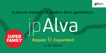 jpAlva is a technical and functional sans-serif that consists of 40 typefaces, divided in 2 font families jpAlva and jpAlva Extended. A universal family of typefaces that fits pretty much any purpose. It illustrates a precise balance of modern geometrics, with a functional yet sparing style that effectively communicates without distraction. A straightforward, unadorned appearance with efficient construction. Simple, clean with a technical note and a wide range of styles it is perfectly suitable for a wide range of applications, from identity systems to editorial design, from signage systems to software applications. Designed with powerful OpenType features (e.g. figure sets, fractions, ligatures, case sensitive forms) and extended language support, it is easy and enjoyable to use.