10,000 search results
(0.134 seconds)
- Wulkie by Fargun Studio,
$12.00 Wulkie Font is handwritten stylish fonts, combines from copperplate to contemporary typeface with a dancing baseline, classic and elegant touch. Can be used for various purposes. such as headings, signature, logos, wedding invitation, t-shirt, letterhead, signage, lable, news, posters, badges etc.
 - FM Kaantaa by FontMeister,
$19.95 Kaantaa is a bold typeface that draws inspiration from stencil and technical typfaces. It has been thought as a display typeface. You can use it to create posters, greeting cards, scrapbooks, CD labels, T-shirts, coffee mugs, digital videos websites and banners.
 - Montesla Diamond by Letterena Studios,
$9.00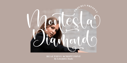 Montesla Diamond is an enchanting handwritten font. This versatile script font has a wide spectrum of applications ranging from greeting cards to headlines. Montesla Diamond is PUA encoded which means you can access all of the amazing glyphs and ligatures with ease!
 - Hebrew Amanda Std by Samtype,
$59.00 This is a modern, wonderful, and beautiful font. This font is super readable and can be used from Posters to books. The readability of this font is amazing. This font has the modern Hebrew punctuation: Shevana, Kamatz Katan, Dagesh Hazak, and Cholam Chaser.
 - Dolmen by ITC,
$29.99Dolmen font from Max Salzmann revives the look of the 1920s and suggests all the glamour and culture of the jazz age. Dolmen can be used in all capital or upper and lower case settings and gives any work an Art Deco look. - Conners Corners NF by Nick's Fonts,
$10.00 Here's another collection of ornate border elements gleaned from the 1888 specimen books of James Conner's Sons United States Type Foundry in New York City. Refer to the PDF guide for detailed, yet simple, instructions for constructing nine delightfully different border patterns.
 - PR Swirlies 07 by PR Fonts,
$10.70 This font is a collection of simple calligraphic ornaments suitable for invitations, gift tags, and anything that can benifit from a "spoonful of sugar" visually. Influenced by Celtic knotwork and tattoo designs, interlacing bands are broken to emphasize the "over and under" movement.
 - Carlgine by Muksal Creatives,
$10.00 Carlgine is a unique and modern family of serif fonts. Carlgine has 18 families Regular and italic font, starting from the small thin to the largest black. This typeface is versatile and can be used successfully in magazines, posters, branding, websites, etc.*
 - Ali SRF by Stella Roberts Fonts,
$25.00 Ali SRF is named for Stella's son, and was designed for Stella Roberts by Ray Larabie of Typodermic Fonts. The net profits from my font sales help defer medical expenses for my siblings, who both suffer with Cystic Fibrosis and diabetes. Thank you.
 - Looney by Bhubbiberry Studio,
$16.00 Looney, a handmade font! This bold, free-flowing and casual font is designed to be easily customisable. Looney is a font which you can use and enjoy, for anything from promotional material and handwritten quotes, to product packaging, merchandise and branding projects.
 - Helios Antique by W Type Foundry,
$25.00 Helios Antique & Helios Stencil Check our PDF specimen for more details Helios type family is the result of a mixture between the early sans serif and the modern trends of our era. Its rational structure is subtly wider than the majority of the first sans, generating a higher impact in its uses. All the typeface terminals are more open in order to balance better the whites and blacks of Helios, and where the strokes meet it has a deeper contrast giving more legibility to the reader. Furthermore, in some letters it is possible to see some prominent features such as the leg of the "R" and the tail of the "Q", which are particular gestures that identify this type family. Helios Stencil is the tough version of this type family. All the stencil gaps were measured rigorously, thus in small sizes it conveys a neutral aesthetic whereas in big sizes a display logic appears. Helios Antique is composed by 36 styles, 782 glyphs and small caps. Besides, it has powerful OpenType features for each style, including alternates characters, ligatures, fractions, special numbers, arrows, extended language support and many more.
 - Bibliophile Script by Sudtipos,
$79.00 A friend once jokingly told me that what I really do is mine extinct arts for parts to use in modern things, like going to the scrapyard to pick up bumpers, quarter-panels and dashboards off of Datsuns and Ponies to build a shiny new Ferrari. I still kind of grin at that, but I certainly do spend a lot of time looking at old things and imagining ways they would work today. This shiny new Ferrari here is called Bibliophile, and it contains scrap heap parts from various pages by Louis Prang, the Prussian-American printer and publisher who inspired my Prangs fonts. This is my second engagement with the late 19th century man, and it’s quite a bit more intricate than just an italic Didone with a connected lowercase. Bibliophile marries Round Hand calligraphy with Italian capitals, two styles not often relayed in the same alphabet, but work together beautifully when combined well. When you combine them well with a few long-practised tricks of the trade, then mix in a few trusted features from my previous work over the years, you get my usual crazy exuberance, like 17 different shapes for the d, 21 different forms for the y, endings, beginnings, swashes, ornaments, and so on. It’s no secret that I can get carried away when I’m so consumed by an idea. — Bibliophile comes in 2 weights, each of them with over 900 glyphs covering all the latin languages. Bibliophile also comes with a bold weight, something I’m always reluctant to do with something as adventurous and complex as the structure of this historical mashup. But I couldn’t chase away the idea of increasing the contrast while maintaining the hairlines in a lowercase this narrow. Part of it was the curiosity about the outcome, and part was the sheer challenge of it. I think it turned out OK. Words set in either weight will show delicateness and elegance, and the more time you spend inside the font and micro-manage the setting, the more ways you will find to magnify either. Bibliophile can be as muted or luxurious as you want it to be. This is the kind of alphabet that fits well in fashion marketing and high-end packaging, from the very subdued to the super-exquisite. Enjoy the gleaming new vehicle made with freshly polished old parts.
 - Darah Erc - Unknown license

- Paralucent Slab by Device,
$39.00 Paralucent Slab is an addition to the ever-popular Paralucent family. Paralucent is versatile all-purpose modern sans and slab serif design. Available in seven weights, from Thin to Heavy, with corresponding italics, it avoids some of the more eccentric calligraphic quirks of Akzidenz or Helvetica or the cool precision of Univers for an elegant, functional, yet warm design. Several core ideas inform Paralucent’s design. Prime attention has given to the negative space between characters, giving a more even “colour”, especially in text. For example, the J, L and T have shorter arms than comparable sans typefaces, while the M and W are wider. The A has a lower bar, opening up the interior counter. An unusually high lower-case x-height again helps to give a more even colour and improve legibility. Care has been taken to rationalise repeated elements like the tails on lower-case letters, or the Q and the “ear” of the g. Typographic design solutions that are consistent across all these features add more stylistic cohesion. ‘Ink traps’ are exaggerated incisions used to open up a letter's narrower internal angles, which can become clogged with ink, especially in small point sizes. Now largely redundant due to the high quality of modern print, they are still sometimes used as a stylistic quirk or design feature. Now that digital fonts are often reversed or outlined, or enlarged to enormous sizes, these can also lead to unexpected or obtrusive results. Paralucent takes these inevitable digital manipulations into account, and adds optical corrections without resort to ink traps. The family has been picked up by many UK and US publishers, featuring heavily in magazines like Loaded, Heat and TV Quick, as well as high-end coffee-table photography books and gallery websites. The addition of the Slab family adds even more options for running text and headline.
 - Axalp Grotesk by ROHH,
$39.00 Axalp Grotesk™ is a post-Swiss-Style modernist sans serif type family characterized by the play between elegant rounded shapes and sharp angular details. It is minimal, legible, well balanced and charismatic. Its heavy weights deliver powerful yet friendly impact. Thin ones emanate elegance, fine lines and precision. The family has very versatile proportions and generous x-height allowing a successful use for user interfaces, all sorts of display and branding scenarios, as well as a paragraph text typeface. Contemporary minimalistic approach makes Axalp Grotesk an outstanding design tool for creating modern visual identities and user interfaces. A truly universal sans serif family where beautiful forms and proportion work together with careful spacing, kerning and hand-hinting. Axalp Grotesk is an attractive contemporary alternative to the classics of Swiss Design School such as Akzidenz-Grotesk, Univers and Helvetica. It is bright, crisp, modern and friendly in character, and features an alternative stylistic set for more minimalistic and neutral look, simplifying such characters as “Q”, “J”, “a” and “y”. The family has extended latin language support, as well as broad number of OpenType features, such as stylistic alternates, case sensitive forms, ligatures, contextual alternates, lining, oldstyle, tabular and circled figures, slashed zero, fractions, superscript and subscript, ordinals, currencies and symbols.
 - TALL TWIN - Unknown license

- Aviano Future by insigne,
$24.99 The Aviano series returns with a vigorous and futuristic sans serif. Aviano Future’s powerful squared forms lend intensity and authority to your designs. Aviano Future’s extended forms give the face strength and muscle. Aviano Future is a versatile new addition to the Aviano titling series. Aviano Future comes in six different weights with “fast” Fasts and is packed with OpenType features. Want to use more traditional rounded forms? Need swash forms? Art Deco alternates? Aviano Future includes 390 alternate characters. Eleven style sets are available, two sets of art deco inspired alternates, small forms, tough swash, constructivist titling and traditional stylistic alternates. Aviano Future also includes 40 discretionary ligatures for artistic typographic compositions. Please see the informative .pdf brochure to see these features in action. OpenType capable applications such as Quark or the Adobe suite can take full advantage of the automatically replacing ligatures and alternates. This family also includes the glyphs to support a wide range of languages. Aviano Future is a great choice for a professional designer that wants to achieve a technological, futuristic or epic look. Be sure to check out the rest of the Aviano series which can be used as complementary faces, including Aviano, Aviano Serif, Aviano Sans, Aviano Didone, Aviano Flare and Aviano Slab.
 - Sebino Soft by Nine Font,
$25.00 Sebino Soft family is a rounded version of Sebino. It is a neutral sans-serif type family with 9 weights, from thin to black, with corresponding italics. Sebino Soft has a large x-height with open apertures which make texts more legible at small sizes. Each font includes OpenType Features such as Proportional Figures, Tabular Figures, Numerator, Superscript, Subscript, Case-Sensitive, Denominators, Scientific Inferiors, Ordinals, Ligatures and Fractions. Sebino Soft will make your artworks better with its clean & clear shapes.
 - Linotype Venezia by Linotype,
$29.99Linotype Venezia Initiale is part of the Take Type Library, selected from the contestants of Linotype’s International Digital Type Design Contests of 1994 and 1997. Designed by German artist Robert Kolben, the font is based on the classic forms of Roman writing in the 1st and 2nd centuries found chiseled on countless buildings and monuments. Linotype Venezia Initiale is a timeless, elegant font particularly well-suited to headlines or as initials in combination with other fonts, working especiall well with sans serif alphabets. - Letunical by Ingrimayne Type,
$9.95 Letuncial is a sans-serif typeface in which the shapes of the letters are derived from uncial, a writing style in the early medieval period. Like uncial, it has no true upper-case letters. Rather it has two sets of letters that are interchangeable. Fonts Letunical Inline Overlay-Middle and Letunical Inline Overlay Inside are designed to be layered with Letunical Inline to produce bicolored or tricolored letters and Letunical Shadow Inside is designed to layered with Letunical Shadow to produce bicolored letters.
 - Album Cover JNL by Jeff Levine,
$29.00An older typeface belonging to a family of sans serif fonts known as Grotesque (or Grotesk in the classic spelling) has been re-drawn by Jeff Levine and released as Album Cover JNL. The font's name is derived from the fact that this typeface was found on many long-playing record jackets during the 1950s and 1960s. To add a look closer to that of hand-set type, there are minute variants in some of the heights of the characters. - Magdelin by Adam Ladd,
$24.00 Magdelin is a minimal yet warm gothic sans with normal and alternate families. At its core, the design has simple forms and low contrast, yet it takes some qualities from the humanist class with its calligraphy or cursive-inspired details found in the italics and the bowl shapes of characters like b and d. The small x-height, longer ascenders and descenders, and semi-condensed proportions give it a bit of a vintage or classic feel while still appearing contemporary and modern.
 - Perfect Redemption by Din Studio,
$22.00 Introducing Perfect Redemption- Font Duo. Perfect Redemption is a brush font and combines with sans font. Made with naturally brush. The texture from the brush font will make your design more beautiful and powerful. This font is suitable for any design like branding, quotes, t-shirt printing and etc. Accents (Multilingual Characters) 64 Alternates 50 Extra Swashes PUA encoded Numerals and Punctuations (OpenType Standard) I hope you enjoy it !! Thanks for visiting and purchasing my font! Best Regards Donis M
 - The Stranger by Din Studio,
$22.00 The Stranger is a brush font and combines with sans font. Made with naturally brush. The texture from the brush font will make your design more beautiful and powerful. This font is suitable for any design like branding, quotes, t-shirt printing and etc. Features: Accents (Multilingual characters) 12 Alternates 14 Ligatures 52 Extra Swashes 26 Splatters PUA encoded Numerals and Punctuations (OpenType Standard) Customer support I hope you enjoy it !! Thanks for visiting and purchasing my font! Best Regards DIN STUDIO
 - LTC Globe Gothic by Lanston Type Co.,
$24.95 This series of faces was designed initially by Morris Fuller Benton, circa 1900. The design is a refinement of Taylor Gothic from 1897. It features a sans serif thick and thin design with angular stems. Pre-dating art deco, this design feels quaint, yet it still has a touch of modernism. Frederic Goudy designed a bold version of Globe Gothic in 1905 for ATF. The Bold and Bold Italic digital versions have been added to the LTC library in early 2007.
 - Rikon by JCFonts,
$30.00 Rikon is a modern Sans Serif Family designed by Joël Carrouché and available in six weights, from Thin to Black. With its simple yet original letter shapes, this family displays a strong personality and will really shine in branding or titling applications, while being legible enough to endure longer texts and smaller sizes. The fonts are available in OpenType format, and include diacritics for most European languages and a selection of OpenType features (two stylistic sets, case sensitive forms, tabular figures...).
 - Funny Papers JNL by Jeff Levine,
$29.00 Sheet music for the 1910 composition "Good-By Betty Brown" has its title hand lettered in a thick and thin, condensed sans serif design reminiscent of lettering found in later comic strips and books of the 1930s and 1940s. Transcending both the Art Nouveau and Art Deco styles, Funny Papers JNL gets its name from the slang reference Americans of the early 20th Century gave the Sunday comics pages in their local newspapers, and is available in both regular and oblique versions.
 - FF Super Grotesk by FontFont,
$68.99 German type designer Svend Smital created this sans FontFont in 1999. The family has 6 weights, ranging from Regular to Bold in Condensed and Normal and is ideally suited for film and tv and editorial and publishing. FF Super Grotesk provides advanced typographical support with features such as ligatures, alternate characters, case-sensitive forms, fractions, super- and subscript characters, and stylistic alternates. It comes with a complete range of figure set options – oldstyle and lining figures, each in tabular and proportional widths.
 - Straightler by Dikas Studio,
$15.00 Hello friend, let me introduce my product Straightler - Oldpress Font! Straightler is a display sans serif typeface inspired from letterpress in old signane, they have a verry rough and rust character. Straightler come with four fonts styles regular, press, oblique and oblique press. Straightler basicly is allcaps font but they have some alternate character, ligature and catchword to make your design more stunning. Suitable and applicable to create typography design, branding, logos, product packaging, invitation, qoutes, t-shirt, label badge poster etc.
 - Saffran by CAST,
$45.00 Saffran is a project of Erasmo Ciufo and Alessio D’Ellena. Saffran is a clear sans-serif with big x-height, short ascenders and descenders, that works well both for headlines and main bodies of text. The objective of the design is to improve readability of small size texts, by clearing the junctions and enlightening the structure of each letter as a consequence. The broken junctions, inspired from the hebrew alphabet, turn into spiky endings that connect to the flat sides only under 7pt.
 - Mohn by Ryan Keightley,
$19.00 Mohn is a sans serif font that draws inspiration from the Bauhaus movement, characterized by its geometric shapes and neo-grotesque elements. With its clear and legible forms, Mohn works as a body copy font, or blow it up larger for headlines to really see its gently rounded corner details which bring a personal and contemporary touch to any design project. Available in 7 weights with italics for each, a variety of accented glyphs, ligatures, and extra stylistic alts on select letters.
 - Meredia by IbraCreative,
$17.00 Meredia is a striking modern space sans serif typeface that embodies contemporary design principles with its clean lines and geometric shapes. This versatile font exudes a sense of sophistication and minimalism, making it an ideal choice for a wide range of applications, from digital interfaces to printed materials. With its well-balanced letterforms, Meredia exudes a sense of professionalism and readability while embracing a futuristic aesthetic, making it a standout choice for designers seeking a sleek and timeless typeface for their projects.
 - Modny by Tour De Force,
$25.00 Modny is a simple and elegant sans serif family with high contrast strokes. By its characteristics, Modny is gentle, smooth and geometric at the same time, neutral to blend into every project. Comes in five weights with tall x-height, file stylistic sets, bunch of ligatures, initials and terminal forms, containing more than 600 glyphs for all Latin languages support. Special addition is an Inline version made out from Bold weight, to increase the effect of decorative elements in each letter.
 - Handil Pro by Alifinart Studio,
$- Handil Pro is a geometric sans-serif font that serves as the perfect complement to the Mustica Pro font family. This font boasts geometric shapes with optical adjustments and enhanced gestures. The name "Handil" is derived from a place where two rare and nearly extinct species reside, the Proboscis Monkey and the Muller's Bornean Gibbon. Hearing the word "Handil" reminds us that amidst the bustling world, there are endangered creatures in the remote forests that we must preserve. Get it now.
 - Aago by Positype,
$22.00 Aago is year-long project to create sans inspired by Positype's popular Aaux Next typeface, but not beholden to its previous conventions. 54 fonts spread across 3 widths, 9 weights, and each with matching italics. Drawn from the ground up to “just work well” across print and screen uses, Aago provides a comfortable, not too wide footprint with hopes of becoming a go-to utilitarian typeface perfect for packaging, branding and identity systems, poster and billboards, small and HD screens alike.
 - Bronkoh by Brink,
$30.00 Bronkoh: A Subtly Softened Sans. Bronkoh aims to give a friendly face and soft touch to type both on screen and in print. Humanist forms and generous apertures make this a sturdy and legible face while its softened curves and terminals give it an approachable and welcoming spirit. The large character set and extensive latin language support make Bronkoh a highly functional font; This in conjunction with eight weights from thin to heavy, and matching italics add to its versatility.
 - Plasto by Eko Bimantara,
$19.00 Plasto is a complete grotesk sans serif family. The quirky letterforms and its slight width variation characterized the typeface as fun and playful as "plastic" in a graphic layout, fit for various design spaces, fit for both informal or functional purposes, fit for large display and also small text. Plasto complete family contains 54 styles with two axes; Weight and Width. The weight consists of 18 styles from Thin to Black, and the width consists of 3 styles, condensed, normal and expanded.
 - Two Cents Plain JNL by Jeff Levine,
$29.00 Two Cents Plain JNL is a simple sans design for titling, sign work, display ads and so forth. The name is derived from the way folks in the Northeast used to ask for a glass of seltzer water at restaurants and soda fountains decades ago: "Give me a two cents plain." It was always cheaper to order plain seltzer than to have flavored syrup added, and this was especially true in the years during the Great Depression when every penny made a difference.
 - SG Sunblum by Studio Gulden,
$20.00 Introducing the "SG-SUNBLUM" font, a modern sans-serif typeface that stands out from the crowd with its extraordinary design elements. This font features sleek, elongated lines and bold, asymmetrical letterforms that give it a dynamic and eye-catching appearance. It also includes an extensive range of special characters and multilingual support for added versatility. Whether you're looking for a font for a headline, logo, or any other design project, SG-SUNBLUM is sure to make a bold statement and capture attention.
 - Visby Round CF by Connary Fagen,
$35.00 Visby Round takes the charismatic forms of its sibling Visby and softens them, creating a friendly, approachable look. Perfect anywhere you need a little smooth sans-serif goodness. Includes Latin and Cyrillic scripts. Visby Round CF pairs well with contrasting, shap typefaces, particularly text-friendly serifs like Artifex CF and Addington CF. All typefaces from Connary Fagen include free updates, including new features, and free technical support.Check out Artifex Hand CF which is a great pair for Visby Round CF.

