10,000 search results
(0.35 seconds)
- The Craprio by Muksal Creatives,
$12.00 The Craprio is a unique, simple, clean and well appointed display serif. It is perfect for gorgeous logos, titles, web layouts, fashion magazine and branding. It looks very nice and classy in an all-caps with a wide-set spacing, and also very beautiful on its own in capital and lowercase letters.
 - Madison 01 by Fateh.Lab,
$10.00 Madison 01 is a bold, powerful and sporty font, perfect for sports logos, branding, posters, clothing designs with a bold and confident look. and also suitable for editorial / web titles. by adding some very detailed illustrations, of course this is very helpful to add elements to the design that you will make.
 - Dindalove by Rezastudio,
$9.00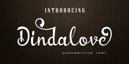 Dindalove is a modern calligraphy typeface. This font is made in a modern style with a very beautiful beginning and ending, elegantly, very casual and suitable for your various design needs Perfect for logo, branding, tittle, social media posts, advertisements, product packaging, product designs, label, photography, watermark, special event, magazine, web design, etc.
 - Le Monde Journal Std by Typofonderie,
$59.00 A highly legible typeface in 4 series Le Monde Journal by definition is intended for newspaper use & at small sizes. It’s an economical and workshorse typeface adapted to any extrem condition of uses. Even though it has the same colour as Times, it appears more open. The reading flow has been made more fluent & less abrupt. The glyphs counters are bigger, as if they were “alluminating the interior.” The form, characterized by its serifs, remains embedded in our visual memory. Intermediate weights like Book can be considered as a grade supplement of the Regular. Italics accompany Le Monde Journal. With a more delicate design & a distinctive rhythm, they remain noticeable when used with the romans. Its companion, Le Monde Sans can extend your typographic palette. For beautiful page layout, use it in conjunction with Le Monde Livre for titling sizes. The verticals metrics and proportions of Le Monde Journal are calibrated to match perfectly others Typofonderie families. This family was designed in 1994 as bespoke typeface family for the French newspaper Le Monde. The family is not used any more by this newspaper from November 2005. Bukva:raz 2001 Type Directors Club .44 1998 European Design Awards 1998
 - Mirenath by Arterfak Project,
$13.00 Introducing Merinath Typeface a rounded vintage monoline. Merinath is clean modern-vintage display font which inspired from old school letterpress and rounded sans serif shapes. This font was created and explored become 3 styles with over 500 glyphs on each font. Also with many features that give you many options in your design project. You can access the open type features by accessing Font Book (Mac) and Character Map (Win) or you can get it in design software like Photoshop, Illustrator, CorelDraw, InDesign etc. Here's what you'll get : - Merinath Normal : Looks good for a headline, editorial, body text, and other formal styles. - Merinath Rounded : With the inky effect, this style is awesome for old school, hipster, vintage, typographic, sign board, logo design and letterpress effect. - Merinath Bold : Suitable for food, kids, logotype and other joyful designs. TTF & OTF format features : - Uppercase - Lowercase - Numbers - Symbols - Ligatures - Stylistic alternates - Contextual alternates - Swashes - Stylistic set 01 - Stylistic set 02 - Multilingual characters : Afrikaans, Albanian, Catalan, Croatian, Czech, Danish, Dutch, English, Estonian, Finnish,French, German, Hungarian, Icelandic, Italian, Lithuanian, Maltese, Norwegian, Polish, Portugese, Slovak, Slovenian, Spanisch, Swedish, Turkish, Zulu Thank you for visits and enjoy!
 - Boilermaker by Stiggy & Sands,
$29.00 A Stylish Condensed Sans Boilermaker began as a digitization of a film typeface from LetterGraphics dubbed Flair G100. From this origin, it has evolved to a much more robust character set than its original. From the inclusion of original unicase and lowercase alternates to the addition of a Russian language expansion, Boilermaker really shines. See the 4th graphic for a comprehensive character map preview. Boilermaker is loaded with features to give you plenty of customisation options: - Stylistic Alternates feature for Unicase & Lowercase alternates. - Russian language coverage. - A Full set of Inferiors and Superiors for Limitless Fractions - Tabular and Proportional figure sets Approx. 602 Character Glyph Set: Boilermaker comes with a glyphset that includes standard & punctuation, international language support, unicase & lowercase alternates, alternate numeral styles, subscript and superscript.
 - Duvall by John Moore Type Foundry,
$19.95 Duvall is an idealization created from the Edward J. Duvall lettering. Mr. Duvall was a teacher in lettering, who was well known for his book “Modern Sign Painting” in the late 40s and early 50s. Duvall cursive script is presented in five weights, Duvall 1, as a light version, to Duvall 5 as a bold version, and Duvall Style a decorative typeface with Inline, ideal for set in color layers combined with Duvall 5. Duvall is a Script font with low contrast, not intended to be used as a type of reading, but is however well adapted to small sizes because its simple form is easy to read. It is advisable to use this font for large to medium sizes. Duvall is ideal for composition, ordinal, superior and inferior numbers, and thanks to the OpenType features you can compose with alternate characters, old style numbers and with a complete set of glyphs for Eastern and Western European languages. The Duvall set comes with a font called Duvall Ribbons, a dingbats font with which you can create interesting headlines with the taste of the advertising of the 50s. Duvall FunWords is a dingbats playing with funny words in English, French and Spanish phrases. Duvall is ideal for packaging, signs, banners, branding and graphic design in general and can be combined harmonically with your favorite sans fonts.
 - Garino Variable by Julien Fincker,
$185.00 About Garino: Garino is a modern sans-serif typeface family. It gains its expressive character from a dynamic sweep in the curves and high-contrast transitions. The thinner and thicker weights are particularly suitable for strong headlines, while the middle weights can be used for typographic challenges and body text. As a result, it can be used in a reserved as well as an expressive way. Thanks to an extensive character collection, it becomes a real workhorse. A versatile allrounder that is up to all challenges – for Corporate Identity, Editorial, Branding, Orientation and Guidance systems and much more. Variable Font The Variable font contains 2 axes: weight and oblique – all in just one file. Features: With over 1165 characters, it covers over 200 Latin-based languages. It has an extended set of currency symbols and a whole range of Open Type Features. There are alternative characters as stylistic sets, small caps, automatic fractions – just to name a few. Arrows and numbers: In particular, the extensive range of arrows and numbers should be highlighted, which are perfectly suited for use in orientation and guidance systems. Thanks to Open Type Features and an easy system, the various designs of arrows and numbers can also be simply "written" without first having to select them in a glyph palette. Get the static version of the Garino family here: https://www.myfonts.com/fonts/julien-fincker/garino/
 - Miso - 100% free

- La chata - 100% free

- M+ 1m - Unknown license

- Social Gothic by Canada Type,
$29.95When Social Gothic first launched in 2007 as a basic single font, it became an instant branding and advertising favourite. It was used widely by a few major fashion outlets and department stores, then soared to new heights of exposure when it became the billboard-cause standard face for a few charity outfits and political organizations throughout Canada’s major urban centres. Social Gothic is a unicase font that combines standard sans serif elements with some distinct “wooden” shapes and oval lowercase components, to make for a totality that achieves a handmade look while maintaining a clean, legible, understated and easy message delivery. It is a gothic with quite a few humanist leanings, something seldom found in the sans serif genre. This retail Social Gothic family is the re-conceptualized, refined and optimized redux of the many bespoke versions that were commissioned and customized for various proprietary brands and projects over the years. The remastered set consists of four multi-script weights, rough and soft variations, and a very unique stencil treatment. Each of the Social Gothic fonts contains over 550 glyphs and support for Latin, Greek and Cyrillic languages. - Littler Serifada by Intellecta Design,
$21.90a bold sans serif family with many variants - Soyombo by Letterhead Studio-VG,
$50.00 Geometric Sans for any use. Strong, modern, new.
 - LCT Picon by LCT,
$35.00 Big modern sans-serif family, for multiple use.
 - Flexy by AKTF,
$25.00 This is a sans serif version of Flexy.
 - Grotesca Defragmentation by Intellecta Design,
$16.90a round sans serif with optical art effects - Leo Arrow - 100% free

- Display Dots Three Serif by Gerald Gallo,
$20.00 Display Dots Three Sans and Serif are display fonts not intended for text use. They were designed specifically for display, headline, logotype, branding, and similar applications. Display Dots Three Sans and Serif include an uppercase alphabet, numbers, and punctuation.
 - Display Dots Four Serif by Gerald Gallo,
$20.00 Display Dots Four Sans and Serif are display fonts not intended for text use. They were designed specifically for display, headline, logotype, branding, and similar applications. Display Dots Four Sans and Serif include an uppercase alphabet, numbers, and punctuation.
 - Hypatia by Adobe,
$35.00Hypatia Sans is a geometric sans serif with humanist undertones. Its rich features and wide range of weights make this family both versatile and expressive at larger sizes yet still clear and readable at text sizes in short paragraphs. - Mantika Book by Linotype,
$50.99 Mantika Book was originally conceived and drawn parallel to the first Agilita drawings. *[images: pencil drawings] It took several years before having a chance looking at these designs again. But then, my first impulse was to turn this alphabet into a new sanserif, which was to become Mantika Sans. This was the starting point to conceive a super family consisting of different design styles and corresponding weights. The initial drawings of Mantika Book were refined and an Italic was developed to go with it. The aim was to create a modern serif typeface which is reminiscent of humanistic Renaissance typefaces, yet without following a particular historic model. Its large x-height for one is far away from original Renaissance models. Mantika Book was designed as a companion serif typeface to Mantika Sans that can be set for lengthy texts as in books, hence its name. It shares the same x-height with Mantika Sans but has longer ascenders and descenders, making for better word shapes in long, continuous reading. The approach of an ›old-style‹ looking typeface with large minuscules makes Mantika Book also a choice for magazine text settings where one often needs smaller point sizes to fit in a multiple columns layout. The unique details of Mantika Book are the asymetric bracketed serifs in the upright font and its higher stroke contrast than usual in a Renaissance style. The stems are slightly curved inwards. Also, the Italics have a low degree of inclination, which makes longer passages of text set in Italic rather pleasing to read. Another feature Mantika Book shares with Mantika Sans is that all four weights take up the same line length. It covers all European languages plus Cyrillic and Greek, is equipped with lots of useful scientific symbols [double square brackets, angle brackets, empty set, arrows] and the regular weight has small caps. There is a kind of an old-style feeling to Mantika Book, yet these citations were turned into a contemporary serif typeface with a soft but sturdy character.
 - Amelia Amanda by Sinfa,
$14.00 Amelia Amanda calligraphy script that comes with a very charming fancy character, in the form of results but looks modern, made with inspiration to get a beautiful style and match between one and the other letters. Amelia Amanda belongs to a unique font type, feminine , sensual, clean, glamorous, simple and very charming to look at, due to the unique form of letters and alternative styles that are appropriate for many letters. Classic style is very suitable to be applied in various formal forms such as invitations, labels, restaurant menus, logos, fashion, makeup, stationery, novels, magazines, books, pride greeting cards as well as weddings, packaging, labels and also suitable for all forms of advertising . The Amelia Amanda script is very feasible because it is supported by some charming alternative letters.
 - KR Jigsaw Joey - Unknown license

- Jambo by Hanoded,
$15.00 Jambo ('hello' in Swahili) is a cute and bouncy typeface. I guess you can say that it is didone-ish in nature, but comic would also be an apt description. Jambo has generous curves, swirls and curls and comes with a jumbo amount of diacritics.
 - Marcgravia by ErlosDesign,
$24.00 Say hello to our new display bold serif font "Marcgravia". Marcgravia is an elegant and luxurious serif font. Trendy and stylish, this font will elevate each of your creations. Marcgravia is PUA encoded which means you can access all the glyphs and swashes with ease.
 - Bonkey by PizzaDude.dk,
$14.00 Drawn with a loose hand and keeping the eye off what's considered right (regarding typefaces) Bonkey saw the light of day on a napkin during dinner, and was scanned, cleaned up (just a bit) It's an unpredictable font that just wants to have some fun!
 - Salden by Canada Type,
$40.00 The Salden fonts are our tribute to the man who was dubbed the face of the Dutch book, and whose work is considered essential in 20th century Dutch design history. Helmut Salden’s exquisite book cover designs were the gold standard in the Netherlands for more than four decades. His influence over Dutch lettering artists and book designers ranges far and wide, and his work continues to be used commercially and exhibited to this very day. At the root of Salden’s design work was a unique eye for counter space and incredible lettering skills that never failed to awe, regardless of category or genre. This made our attention to his lettering all the more focused within our appreciation to his overall aesthetic. Though Salden never designed alphabets to be turned into typefaces (he drew sets of letters which he sometimes recycled and modified to fit various projects), we thought there was enough there to deduce what a few different typefaces by Salden would have looked like. The man was prolific, so there were certainly enough forms to guide us, and enough variation in style to push our excitement even further. And so we contacted the right people, obtained access to the relevant material, and had a lot of fun from there. This set covers the gamut of Salden’s lettering talents. Included are his famous caps, his untamed, chunky flare sans serif in two widths, his unique Roman letters and an italic companion and, most recognizable of all, his one-of-a-kind scripty upright italic lowercase shapes, which he used alongside Roman caps drawn specifically for that kind of combination titling. All the fonts in this set include Pan-European glyph sets. They’re also loaded with extras. Salden Roman (908 glyphs) and Salden Italic (976 glyphs) each come with built-in small caps (and caps-to-small-caps), quite a few ligatures, and two different sets of alternates. Salden Black and Salden Black Condensed (636 glyphs each) come with a set of alternates, and both lining and oldstyle figures. Salden Caps (597 glyphs) comes with a set of alternates, and Salden Titling (886 glyphs) comes with a quite a lot of swashed forms and alternates (including as many six variants for some forms), a few discretionary ligatures, and two sets of figures. There are also some form alternates for the Cyrillic and Greek sets included in all six fonts. These alphabets were enjoyably studied and meticulously developed over the past ten years or so. We consider ourselves very fortunate to be the ones bringing them to the world as our contribution to maintaining the legacy of a legendary talent and a great designer. The majority of the work was based on Salden’s original drawings, access to which was graciously provided by Museum Meermanno in The Hague. The Salden fonts were done in agreement with Stichting 1940-1945, and their sale will in part benefit Museum Meermanno.
 - Piel Script by Sudtipos,
$89.00 Over the past couple of years I received quite a number of unusual and surprising requests to modify my type designs to suit projects of personal nature, but none top the ones that asked me to typeset and modify tattoos using Burgues Script or Adios. At first the whole idea was amusing to me, kind of like an inside joke. I had worked in corporate branding for a few years before becoming a type designer, and suddenly I was being asked to get involved in personal branding, as literally “personal” and “branding” as the expression can get. After a few such requests I began pondering the whole thing from a professional perspective. It was typography, after all, no matter how unusual the method or medium. A very personal kind of typography, too. The messages being typeset were commemorating friends, family, births, deaths, loves, principles, and things that influenced people in a deep and direct way, so much so that they chose to etch that influence on their bodies and wear it forever. And when you decide to wear something forever, style is of the essence. After digging into the tattooing scene, I have a whole new respect for tattoo artists. Wielding that machine is not easy, and driving pigment into people’s skin is an enormous responsibility. Not to mention that they're some of the very few who still use a crafty, hands-on process that is all but obsolete in other ornamentation methods. Some artists go the extra mile and take the time to develop their own lettering for tattooing purposes, and some are inventive enough to create letters based on the tattoo’s concept. But they are not the norm. Generally speaking, most tattoo artists use generic type designs to typeset words. Even the popular blackletter designs have become quite generic over the past few decades. I still cringe when I see something like Bank Script embedded into people’s skin, turning them into breathing, walking shareholder invitations or government bonds. There’s been quite a few attempts at making fonts out of whatever original tattoo designer typefaces can be found out there - wavy pseudo-comical letters, or rough thick brush scripts, but as far as I could tell a stylish skin script was never attempted in the digital age. And that’s why I decided to design Piel Script. Piel is Spanish for skin. In a way, Piel Script is a removed cousin of Burgues Script. Although the initial sketches were infused with some 1930s showcard lettering ideas (particularly those of B. Boley, whose amazing work was shown in Sign of the Times magazine), most of the important decisions about letter shapes and connectivity were reached by observing whatever strengths and weaknesses can be seen in tattoos using Burgues. Tattoos using Adios also provided some minor input. In retrospect, I suppose Affair exercised some influence as well, albeit in a minor way. I guess what I'm trying to say is there is as much of me in Piel Script as there is in any of the other major scripts I designed, even though the driving vision for it is entirely different from anything else I have ever done. I hope you like Piel Script. If you decide it to use it on your skin, I'll be very flattered. If you decide to use it on your skateboard or book cover, I'll be just as happy. Scripts can't get any more personal than this. Piel Script received the Letter2 award, where they selected the best 53 typefaces of the last decade, organised by ATypI.
 - Belinda New by Melvastype,
$29.00 Belinda New is an updated version of the original Belinda which I designed in 2011. Belinda New is a smooth and lining brush script font with a vintage and retro feel. It has two sets of uppercase and many alternates for lowercase letters. It is a good choice to use in logos, headlines and packages. You can also match it with a serif or sans serif fonts and use it as a secondary font in web design, magazines and branding.
 - Justin Brown Monoline by Gatype,
$5.00 Justin Brown is a Sans serif display font with a modern, classy, fun, unique and versatile style. It looks amazing on any screen size and is easy to read in any text size. This font also has tons of unique alternatives and binders that will make for stunning design projects. This will add a fun and friendly touch to any of your projects. This font is PUA encoded which means you can access all the glyphs and sweeps easily and more.
 - Spoon by Dharma Type,
$19.99 Spoon is a fresh and contemporary sans-serif that can be used in wide range of project. Its skeleton of letterform is geometrically-based and minimal but the body was designed with a touch of humanistic outlines as though they were handwritten. This not only make the font clean, legible and functional, but also make it possible to give natural, friendly and soft impressions. Spoon comes in seven weights with matching italics and includes diacritics for most European in each weight.
 - Chamelton by Alex Khoroshok,
$9.99 Chamelton, a vast layered font family, provides a creative spectrum through layers, colors, and weights, including 109 Sans Serifs, 3 script weights, + 198 extras. You can use the family as a complete design kit or a component of your work. Most styles are stand-alone fonts, but some layers work only in combination. Creating a multi-colored layered font is simple and compatible with any layer-supporting graphic software, including Adobe Suite, Sketch, Figma, etc. See Specimen PDF for more details.
 - Spy Stencil JNL by Jeff Levine,
$29.00 Dean Martin starred in four movies as Matt Helm, the titular character in a series of spy novels by Donald Hamilton. Martin’s version of the government counter-agent followed his TV persona – a fun-loving ladies man who (in this case) just happened to be a spy. The movie poster for 1966’s “The Silencers” has its title hand lettered in an extra bold sans serif stencil style. This is now available as Spy Stencil JNL in both regular and oblique versions.
 - Andreash by Rometheme,
$25.00 Andreash – Sans Serif Font. It has a elegant, classy look and beauty. It’s a great font for fashion, apparel projects, signature, album cover, logo, branding, magazine, social media, & advertisements, but also works great for other projects. Highlight: - Easy instalation - Work on PC or Mac - PUA Encoded Support - Basic Latin A-Z and a-z - Numbers - Symbols - No special software is required, The fonts can be opened and used in Adobe Illustrator, Adobe Photoshop, Adobe InDesign, even work on Microsoft Word.
 - Aglaia by Wildstripe,
$19.00 Aglaia is an elegant geometric sans serif typeface that comes in three weights. Designed in part inspired by Art Deco, but with a modern minimalist approach that makes it a versatile and excellent contemporary display font for titles, editorials and short texts. Font features: Uppercase & Lowercase Numerals, Punctuation & Symbols Alternates & Ligatures Multiple Languages Support (Latin characters + Diacritics) How to access Alternate Characters: The alternate characters can be accessed via the glyphs panel in your favorite software. Or with OpenType features turned on.
 - Zuume Rough by Adam Ladd,
$25.00 Zuume Rough is a textured, bold, condensed sans display family. A sister to Zuume, this version features a rough printed texture for a more natural and raw look. The fonts can be tightly spaced and stacked for a visual punch or loosened for a little more breath. A distinct characteristic is the notched and extended ink traps meant for both function and aesthetic interest. The strong and sturdy design makes it ideal for eye-catching headlines, branding, packaging, sports, logos, and more.
 - Rawkner by Trustha,
$18.00 Rawkner is a sans serif font. Inspired by ink trap. The first concept is the letter "W" and "K", then the other letters refer to both. Come with four styles, regular, oblique, round, and round oblique. Rawkner is perfect for the headline, and subheadline. There are alternative glyphs that you can choose according to your project. Also, the ligature of the uppercase and lowercase will make it more perfect. Rawkner is an option that you should try for your creative project.
 - Zuume Soft by Adam Ladd,
$24.00 Zuume Soft is a high-impact, condensed sans serif family with a soft touch. A sister to Zuume, this version features round corners for a friendlier appearance. The lighter weights give a sharp, technical feel while the bold, blacker weights can be tightly spaced and stacked for a strong visual punch. The notched and extended ink traps add both function and aesthetic interest. The strong and sturdy design makes it ideal for eye-catching headlines, branding, packaging, sports, logos, and more.
 - Ekela by AukimVisuel,
$9.00 Ekela family has 216 styles in 5 versions: Normal, Round, Circle, Punch and Round Punch. Ekela family is a neat, unique sans serif simple font with minimal and round letters. It can easily be combined with an incredibly large set of projects, so add it to your creative ideas and notice how it sets them apart! Suitable for a wide variety of designs thanks to its neat styling, Ekela family has the potential to become your favorite font, whatever the occasion!


