10,000 search results
(0.048 seconds)
- Monton by Larin Type Co,
$12.00 Monton is a wonderful font family that includes from thin to black style as well as in oblique style, a total of 18 fonts. This is a condensed block sans-serif font that is perfect for titles, logos, branding, posters, flyers, website design, advertising, labels, packaging, web titles, text descriptions and much more. It is well readable and irreplaceable in modern design and can be used as a main or additional one.
 - Design System by Dharma Type,
$14.99 Design System is a great type system consisted of 5X7X2=70 font styles from 70s-style simple square sans to the widest style of all time that are best for titles, logo and text. Their simple form does not limit the target of design and can be used for any creative work. Additionally they all have been designed not to provide a feeling of strangeness when they are used in mixture each others.
 - Sabu by Larin Type Co,
$16.00 Sabu is multitasking, modern sans-serif font family, and a great solution for anyone your project. It includes upright and Italic style, each of them has weight weights from thin to extra bold. This is a multi-purpose one that is perfect for big and small text, it is constructed modern and easy to read. With it, you can create logos, banners, use in advertising, packaging, books covers and magazines, headings, descriptions and much more.
 - Jassime by Nian Keun Studio,
$12.00 Jassime is an elegant serif font with beautifully crafted characters following the trend so you can use them very well. You can use Jassime in graphic designs, magazines, logos, identity branding, fashion brands, clothes, and many others. Thank you for coming to my shop and enjoying other fonts.
 - Babysitter by Hanoded,
$15.00 Babysitter is a nice, feminine font. It can be used for a variety of purposes. Very unobtrusive in nature, yet with a big impact! Comes with all the accents, bells and whistles.
 - Olazy by PizzaDude.dk,
$20.00 Slightly curly and very romantic! Olazy can be used for anything that needs a twist of elegance or romance - or would fit perfectly for children's toys! Contains both fi and fl ligature!
 - Zimple by Ingrimayne Type,
$9.95 Zimple is a very simple blackletter face with few if any curves. The Zimple Extrude Overlay font is spaced so that it can be layered with Zimple Shadow to produce bicolored lettering.
 - Theo Ballmer by URW Type Foundry,
$39.99 The Theo Ballmer font family is based on Theo’s design ideas which were completed by his son Theo Ballmer (Thierry’s father), and digitized by Thierry, with the help of URW++ and their Ikarus technology. Theo Ballmer is available in 3 x 5 variants: condensed, regular, expanded each in 5 weights. Theo Ballmer is a masterpiece, which fills a historical gap and provides a real font family from the Bauhaus era.
 - Etched Stencil JNL by Jeff Levine,
$29.00 The American Sign Museum in Cincinnati houses an amazing collection of vintage signage from all kinds of sources and covering many eras of retail advertising. Someone visiting the museum posted online an image of one particular piece of glass with hand lettering saying “gold leaf” in a bold Art Deco stencil style. Etched Stencil JNL was inspired by that image and is available in both regular and oblique versions.
 - Broiter by Abbasy Studio,
$15.00 Introducing Broiter, 2 font mono weight family with plenty of alternative long stemmed characters. These 2 fonts make it effortless to create hand made lettering, and perfectly suitable for made to be applied in logo, and the other various formal forms such as invitations, labels, logos, magazines, books, greeting / wedding cards, packaging, fashion, make up, stationery, novels, labels or any type of advertising purpose.
 - Mesclo by DSType,
$40.00 Mesclo is our personal take on the geometric typefaces genre. With mono-linear appearance, humanistic elements and subtle hints of Art Deco, Mesclo is a timeless typeface with dramatic oblique terminals and a welcoming, friendly roundness. The outstanding dynamic rhythm and legibility of the text contrasts with the inflexible geometry of the unusual complementary caps-only typefaces, specially developed to fulfil and enrich this type family.
 - Amherst by Linotype,
$29.99Amherst is a family of blackletter-inspired typefaces. This family, created by British designer Richard Yeend in 2002, is unique in that it mains the feel of blackletter/medieval type without relying directly on historical forms. Amherst is split into two different sub-families, Amherst and Amherst Gothic. Amherst is very geometric interpretation of Fraktur. Fraktur was a style of German type very popular in central Europe from 1517 until the early 20th Century. Its letters appear "broken" at certain angles and joints. Still, we recommend using it primarily for display purposes. Amherst is available in three weights: Regular, Bold, and Heavy. Amherst Gothic is very loosely inspired by late medieval letterforms, often called Texturas or Gothics. However, the letterforms of Amherst Gothic seem just as inspired by the Art Deco movements of the 1920s and by contemporary sans serif type design as anything else. Nevertheless, certain letters in this typeface do appear more "gothic" than others, especially A, D, M, Y, d, r, and x. Amherst Gothic is made up of three fonts, Amherst Gothic Split, Amherst Gothic Split Alternate, and Amherst Gothic Italic. Amherst Gothic Split has in-lined characters, and appears very ornamented. The alternate characters in Amherst Gothic Split Alternate are quite medieval in their appearance. Amherst Gothic Italic is the least medieval-looking of the set; its characters are very round, and more geometric. All six styles of the Amherst Family are OpenType format fonts, and include old style figures. - ITC Japanese Garden Ornaments by ITC,
$29.99ITC Japanese Garden Ornaments is a symbol font designed by Akira Kobayashi (before Kobayashi became Linotype's Type Director in 2001, he worked as an independent typeface designer in Tokyo). The images in Japanese Garden are, as the name suggests, mostly floral or herbaceous, derived from designs used in Japanese indigo stencil dyeing. In Japanese Garden," Kobayashi says, "I tried to create a set of type fleurons that are very familiar to a Japanese eye, but not too exotic to people in other countries." Several of the designs fit together seamlessly in repeating patterns; others work either together or as isolated ornaments, a flexibility that also characterizes traditional Western type fleurons. "The original illustrations," notes Kobayashi, "were mostly cut from white paper squares, about two by two inches in size, and were simply scanned and traced. That is why there are few smooth curves and perfectly straight lines in the illustrations. I simply liked the ragged textures of them."" - Caravela by Mans Greback,
$59.00 Caravela is a decorative formal typeface. It was designed, drawn and realized by Mans Greback in 2020. Inspired by 17th century typographic works, this work lifts some of the absolute best elements from the golden age of calligraphic lettering, bringing it to life in a new, modern setting. The fusion results in a typeface that works perfectly for a present day headline, logotype or invitation, while keeping the traditions and formality inherited from history. It contains several alternate alphabets, a great set of ligatures and hundreds of contextual functions, which combined make the writing appear as a true handpainted piece of art. Swashes can be accessed by writing swash1, swash2, swash3 etc. Also included is the Caravela Swash style, a font that contains more than 50 decorative elements to be used with the lettering for an even greater visual effect. It has a very extensive lingual support, covering all European Latin scripts. The font contains all characters you'll ever need, including all punctuation and numbers.
 - FS Jack by Fontsmith,
$80.00 a, g, k and y It was a forensic examination by Jason Smith of his existing designs that laid the groundwork for FS Jack. Jason made a list of unique characteristics that would give the sans serif font its typographic thumbprint, which included an unusually large x-height and slightly off-the-wall letters like the lower-case “a”, “g”, “k” and “y”. “I wanted to make something that was slightly uncomfortable,” says Jason, “and in doing so simplify the quirkiness down to a few letters.” Fernando Mello did “the rest of the cooking”, filling the design out and making the additional weights. Tipos Latinos Upon its release in 2010, FS Jack was submitted by Fernando, who is Brazilian, for the esteemed type design biennial, Tipos Latinos, where it was selected as a winner in the Families category. It went on to be selected for type exhibitions throughout Latin America and around the world. “FS Jack is a workhorse,” says Fernando, “but also very ownable and distinctive, and available in a good range of weights, crafted by Jason and I.” Corporate “FS Jack took a couple of years to get noticed and is still fairly underused,” says Jason, “which is good in a way, for our Brandfont clients that have adopted it.” FS Jack was chosen as the signature font for The Shard in London, from its signage down to business cards. Fontsmith also worked with Lloyds Bank to customise FS Jack into a bespoke font for the bank’s updated brand identity – part of Fontsmith’s Brandfont service, which you can read about here. Fat Jack Included in the FS Jack family – just – is FS Jack Poster, the super-heavy weight of the range. “That was a last minute addition,” says Fernando, “after Jason and I started talking about how much we liked Gill KO, a typeface that is almost comically fat.”
 - Mosquito by Monotype,
$29.99Éric de Berranger likes to multitask, and often works on two typeface families at once. Such was the case with Mosquito, a jaunty sans that was developed at the same time he was creating the more traditional Maxime. Mosquito represented a sort of recreation," says de Berranger. "When I grew tired of working on one design I could work on the other and then come back to the first, full of courage and desire!" Mosquito is built from simple, straightforward shapes, but its distinctive stroke terminals and slight oblique weight stress distinguish the design from more conventional sans serif faces. The relatively large x-height and open counters add to the legibility of the design. The capitals are straightforward (with just a hint of Peignot), while the lowercase has a softer, more inviting demeanor. "I drew Mosquito with the hope that it would be pleasant to look at and to read," says de Berranger. "I think the end result is almost feminine." Mosquito comes in three weights, with complementary italic designs and a suite of small caps, old style figures and alternate characters." - Rockyeah by Majestype,
$19.00 Rockyeah is 3 style fonts: brush, serif and sans serif who have strong personalities and work very well in many design projects. - Rockyeah Brush made with fine brush pen with the fastest stroke movement. Comes with over 300 glyphs that will give you a vast possibility to play with each character. - Rockyeah Serif is an interpretation of Rockyeah brush. A serif font that focuses on legible, elegant and unique. With light and bold stroke combination this serif will give a modern-classic vibes on your design project. - Rockyeah Sans a geometric sans serif that focuses on legible, clean and useful for any project. This sans is an interpretation of Rockyeah Serif with the same caps height and bold stroke. This font is suitable for poster, tattoo, tees graphic, headline and etc :) Just play and rock it!
 - Hazelnut Milk Tea by Fikryal,
$18.00 Introducing this very simple sans serif font that is Hazelnut Milk Tea font. I created this font with the inspiration of simplicity and it is very friendly to look at, with four versions, namely regular, italic, bold, bold italic. Very suitable to be applied in various aspects of design, Also it’s perfect for logo, branding, title, social media posts, advertisements, product packaging, product designs, label, photography, watermark, special event, magazine, web designs, etc. Features : Hazelnut Milk Tea Regular ( Uppercase, Lowercase ) Hazelnut Milk Tea Regular Italic ( Uppercase, Lowercase ) Hazelnut Milk Tea Bold ( Uppercase, Lowercase ) Hazelnut Milk Tea Bold Italic ( Uppercase, Lowercase ) Symbols multilingual support If you have any questions please don’t hesitate to contact me follow my Instagram: @fkryall Thank you
 - Ringo by typoland,
$9.00 Whassup y’all! Me and my bros got this li’l gang together: we is Ringo, and we got da bling, yo! We is da typeface family for ya all! We got some real sweet stuff for ya, some nice characters. We got all ’em OpenType features like fractions and proportional figgers, we even got da cubic root, man! And check out da question mark, man, is real sweet. And the ampersand, yeah! I luv ’em ampersands. Now my brothers over here got some light action for ya, and they got some real bold action for ya. We got some nice foxy curves goin’ on, some nice tension, and some nice relaxation. My bro Light over here is kind of like the subtle guy, ya know. He’s in for the female fans, ya know. Heh! Hell, yeah! And man, we speak like 84 languages: we speak the German, and the French, and the Spanish, and we speak the Polish, and the Czech, and the Hungarian, and we even speak Shambala and Swahili and Rundi, and we got some Esperanto thing as well for ya. And check out my bro Black right over here, he’s like the action superhero, man! He’s got impact, man! Yeah yeah, but you know, my bros Regular and Bold are the real deal. Them is like da word of da street, man! Like da word of you, and you. And we got a message for y’all: life is hard, life is real, but you should work your mojo, be smooth, be nice, chill. We got all them kerning pairs, and all them weights, and we got ’em alternate letters. So check us out, yo!
 - Kokomo Breeze by Nicky Laatz,
$35.00 Say hello to Kokomo Breeze - A deliciously bold and nonchalant casual marker font. Kokomo Breeze was designed to keep a naturally handwritten marker-style look , while still maintaining some subtle inky marker imperfections on its edges , to keep in line with a more realistic, yet very legible look. Great for headlines, bold branding, classy packaging, eye-catching callouts and stand-out advertising, Kokomo Breeze is designed to be your jack of many trades. Be sure to turn on your OpenType features when type with Kokomo Breeze - it’s packed with natural-looking ligatures and alternate characters for both upper and lower case - all of these opentype extras make your type design look mush less mechanical, and much more like naturally formed words as you type. Pair it with a bold tall sans serif font, or a classy serif to add another whole new dimension to this very versatile marker font. Great as large and small sizes, Kokomo Breeze is perfect for any size design.
 - Martine Script by Cooldesignlab,
$13.00 We are proud to present Martine Script. This script is very cool to use in your everyday design. You can see from the scratches that give a realistic and modern style. The font looks sweet and full of the best characters. You can use this font in your various design products such as invitations, mockups, embosses, branding cards and more. Martine includes a complete set of large international letters, numbers, punctuation marks and ligatures. All lowercase letters include the beginning and end of raids. Also, follow multilingual symbols. Scripts are coded with PUA Unicode, which allows full access to all additional characters without special design software. Mac users can use the Font Book, and Windows users can use Character Maps to view and copy additional characters to be included in your favorite text editor / application.
 - Devil Scream by Yoga Letter,
$15.00 "Devil Scream" is a very unique horror font, as it is equipped with ghost decorations and a witch's hat on each letter. This font is very easy to use because the letters and decorations will automatically appear when typing letters. "Devil Scream" is a display font with a horror theme that will add a horror atmosphere to your Halloween party celebration. In addition, this font can also help your work. This font can be used as logos, branding, banners, posters, prints, stickers, horror movie titles, book titles, comics, or others.
 - Chubby Elephant by Putracetol,
$25.00 Chubby Elephant - Bold Playful Display Font. This font is very bold and playful. With a childish style, it will be very suitable for your project, which is related to children. Such as story books, illustrations, comic books, t-shirts, posters, greeting cards, logos, branding, stickers, svg, crafting. This font can be installed on MAC OS and Windows OS, it can also be installed in the procreate and cricut applications. Come with lot of ligatures character, its help you to make great lettering. This font is also support multi language.
 - Frank Flowers by Wiescher Design,
$15.00 Frank Flowers are fonts with flowery embellishments. They are useful for all kinds of celebrations, but they also have lots of impact. There are only uppercase letters even on the lowercase keys. Uppercase and lowercase look different, so you can mix them. You can even mix the two sets, it'll look great. I had a lot of fun doing these fonts and I want you to have some fun as well. That's why I sell them very, very cheap, even cheaper if you buy the pair! -Your typedesigner for unusual solutions Gert Wiescher
 - Respondent by Mans Greback,
$49.00 Respondent is a flowing and handwritten font. Drawn, created and published by Mans Greback in 2021, this script family has a genuine and empathic personality, while being wild and vivid. Respondent can be used in a product or company logo, or in any digital design where you want the appearance of true, released handwriting. Originally inspired by the lettering on the cover of GTA Vice City, over the design process is has evolved to a very diverse typeface that can be used in a wide variety of contexts, much more than a Grand Theft Auto font. The Respondent Family is provided in five weights: Thin, Light, Medium, Bold and Black The different styles supplies a flexibility in both character and size. The font is built with advanced OpenType functionality and has a guaranteed top-notch quality, containing stylistic and contextual alternates, ligatures and more features; all to give you full control and customizability. It has extensive lingual support, covering all Latin-based languages, from North Europe to South Africa, from America to South-East Asia. It contains all characters and symbols you'll ever need, including all punctuation and numbers.
 - Borned by Almarkha Type,
$29.00 Hello Everyone, Introduce our new collection, Borned - Futuristic Display, Inspired from famous logos of Futuristic Style and brands that have very strong characteristics, Borned font with strong and challenging nuances. very suitable for the title, typography, Poster, magazines, brochures, packaging,Websites and much more for your design needs, making your designs more modern and professional
 - FF Attribute Text by FontFont,
$72.99 FF Attribute™ Text is a proportional design with a faux monospace appearance. It has an industrial strength, minimalist vibe, making it perfect for attention getting, theme-based headlines, posters, banners and navigational links. And, because it is such a robust family, FF Attribute can also be used for branding of blogs, games, web sites and tech products. FF Attribute comes in two families; Mono and Text. The Mono is a fixed width (monospace) design, while the Text is a proportional design. FF Attribute was, in fact, initially designed for the use in code editor software. Its seven roman and italic monospaced weights and extended character set supporting a many languages, also make it a powerful communications tool. But this is only the tip of the iceberg. In addition to the monospaced version, where all characters share a fixed width, there is also a proportional, “faux monospaced” version: FF Attribute Text. The Text family keeps the visual character of a monospaced typeface, but wide letters are given more space while narrow characters have been drawn with correct proportions and spacing. FF Attribute Text looks monospaced – but it’s not. Drawn by Viktor Nübel, FF Attribute Text’s 14 designs, huge character set, including box-drawing characters and user interface-icons, make it the Swiss Army Knife® of monospaced fonts.
 - Trango by Juraj Chrastina,
$29.00 A funny childish handwritten font, with a spirit. This typeface can tell fairy tales. Trango is a sans serif that goes well with the slab serif Besley Hand.
 - Besley Hand by Juraj Chrastina,
$29.00 A funny childish handwritten font, with a spirit. This typeface can tell fairy tales. Besley Hand is a slab serif that goes well with the sans serif Trango.
 - Inovasi by XdCreative,
$29.00 Inovasi Sans "Inovasi Sans is the youngest brother of Clinto Geometric sans font family by Faldykudo, released a few months ago. Inovasi is constructed based on geometric principles, emphasizing simplicity and modernity. The font comes with comprehensive multilingual support, offering more than 300 languages. Notably, Inovasi Sans features a distinctive characteristic in its lowercase 'a', offering 8 alternate characters. Additionally, each lowercase letter from 'a' to 'z' has stylistic alternates, providing a unique look and feel for a modern and futuristic impression."
 - Novela by Jonahfonts,
$42.00 Novela is a chisel flat pen style written with overtones of Uncial, from century old scribes. Very suitable for greeting cards, headlines, packaging and many other applications.
 - Christine by Typadelic,
$19.00This attractive handwriting typeface from Typadelic exudes casualness and informality. Very readable at small and large text sizes...perfect for scrapbooking, greeting cards and casual letter-writing. - Syntax Next Paneuropean by Linotype,
$103.99Syntax was designed by Swiss typographer Hans Eduard Meier, and issued in 1968 by the D. Stempel AG type foundry as their last hot metal type family. Meier used an unusual rationale in the design of this sans serif typeface; it has the shapes of humanist letters or oldstyle types (such as Sabon), but with a modified monoline treatment. The original drawings were done in 1954; first by writing the letters with a brush, then redrawing their essential linear forms, and finally adding balanced amounts of weight to the skeletons to produce optically monoline letterforms. Meier wanted to subtly express the rhythmical dynamism of written letters and at the same time produce a legible sans serif typeface. This theme was supported by using a very slight slope in the roman, tall ascenders, terminals at right angles to stroke direction, caps with classical proportions, and the humanist style a and g. The original foundry metal type was digitized in 1989 to make this family of four romans and one italic. Meier completely reworked Syntax in 2000, completing an expanded and improved font family that is available exclusively from Linotype GmbH as Linotype Syntax. In 2009 the typeface family was renamed into a more logical naming of "Syntax Next" to fit better in the Platinum Collection naming." - Neo Latina by deFharo,
$12.00 Neo Latina is a classic sans serif typography in small caps of square proportions and rectilinear character with the ends of the rounded horns and a semi-stencil design that gives a futuristic aspect and of science fiction. Neo Latina is the right heiress of geometric fonts from the early 20th century inspired by the Bauhaus school and is specially designed for use in any size for both screen and print. Neo Latina is a very versatile typography for graphic design, you can use it in advertising posters, video games, film titles, logos, editorial design, etc. The Commercial version includes: - Two fonts: Regular & Bold - 460 glyphs. Latin Extended-A • OTF & TTF - Neo Latina fonts can be used unlimited for both Commercial and Personal projects. - The download file includes a PDF with the specimen sheet of typography. - OpenType features compatible with: Photoshop, Illustrator, QuarkXpress, Indesign. - OpenType Features: Subscript, Additional languages, Alternate Annotation Forms, Capital Spacing, Denominators, All Alternates, Oldstyle Figures, Superscript, Superiors, Superior letters, Standard Ligatures, Kerning, Extended Fractions, Small Capitals, Historical Forms, Inferiors, Fractions, Localized Forms, Numerators, Ordinals, Discretionary Ligatures, Scientific Inferiors, Slashed Zero. - Bitcoin & Chaos symbol: b# - a#(ligatures)
 - Al Stagen by Aluyeah Studio,
$120.00 Stagen is a cloth with a length ranging from 5-10 meters and a width of about 15 cm which is usually used by traditional Javanese women as part of the traditional kebaya dress. The stagen is wrapped around the stomach to help maintain posture and "lock" the jarik cloth on the kebaya. Stagen existed before World War II in Indonesia and became an elegance in the harsh world at that time. Inspired by the rich culture, Stagen is a modern sans serif typeface that has an upright and sturdy impression, with unique curves in it. A simple, yet distinctive, elegant font that can be applied to many areas of design. Coming with 130+ stunning and super easy to use alternates and ligatures. Very suitable for magazine, headline, website, ads, product package and all type of design project you have. Features: OpenType support Multilingual support (15 languages) PUA Encoded Super Easy to Use alternates - It's OpenType support but you can easly call alternates character using special combination like A.2 R.3 L.A L.a etc so you don't need special software. To get results like the preview just type Sta.gen.
 - Dienilla by Abo Daniel,
$16.00 Dienilla is a luxury handwritten font that comes in 3 weights: Thin, Regular and Bold. Dienilla is great for branding, logos, wedding invitations, cards, quotes, T-shirt design, and many other projects that need a simple but elegant feel. Dienilla has multi-lingual support and is PUA encoded. I created 2 styles of ending swashes to make this product so perfect and very easy to use. To access the first style you can add underscore twice after the lowercase character: for example : a _ _ and to access another one you can add underscore twice and put a 1 after the lowercase character: for example : a _ _1 Dienilla is really beauty, and very very user friendly. Hope you love it, and let's grab it...
 - VLNL Sardines by VetteLetters,
$35.00 Sardines is a project by Jacques Le Bailly aka Baron von Fonthausen. This original version is the one that saw the light as a monospaced font student project and which would eventually grow into Vette Letters’ largest font family (see VLNL Neue Sardines). Sardines is an eclectic mash of classic curves and mathematical measurements, leaving a very distinct typographic flavor. While most of our type is market-fresh, this one comes out of the can, but it’s delicious nonetheless. And it’s great for adventurous BBQ-ing!
 - CAL Bodoni Ferrara by California Type Foundry,
$47.00 Bodoni Ferrara™ Fashionable, Luxury Heritage: The Original Bodoni Ferrara Sculpted from hi-res photos and scans of Bodoni's original Ferrara Font—his 1818 Manuale Tipografico and 1768 specimens. It has never before been available. This cut of Bodoni specially selected by Dave Lawrence from rare book specimens. Part of the California Type Foundry Origin Series. 3 Display Fonts in One!! And 6+ style mixes. Bodoni's 1st Draft - Transitional Serif Bodoni was often inspired by French type designs. His first draft of Ferrara was inspired by Pierre Simon Fournier. But Bodoni added his own Italian sensibilities. Bododni’s first, transitional style can pair with humanist sans, and transitional fonts. Bodoni's Rework - Modern Serif Later, Bodoni reworked Ferrara to match the later neo-classic style or modern serif of Firmin Didot¹. Bodoni’s modern style can pair with geometric sans, grotesque sans, neo-grotesque sans, gothic sans, copperplate script, . Informal On™ - Informal Mode by CAL Type Foundry This can pair with “infant” fonts. Geometric sans, and other sans or serifs with one-storied a’s. + Bodoni’s Tivoli a for another option! Works great with Fournier¹ fonts and grotesques, since the terminals will match. Font Pairing Guide This font includes a 78 page Ferrara Pairing Guide. This book shows you 131 pairings with text fonts. 47 pairings with subheader fonts! We want to help you get more out of your font collection. Design Features • Subtle forward angle (0.5-1.5°) makes Ferrara more lively and engaging than most Bodoni or Didot fonts. • Round curves make this font feel letter-pressed. • Bodoni's original tall x-height and slightly condensed proportions: great for headlines, where space is at a premium. • Better uppercase. Uppercase punctuation for design apps. • Proportional oldstyle and lining figures, both modern style and transitional numbers. Every pair of numbers is kerned for display sizes: no unsightly gaps! • Multiple special symbols for whenever you need a design to pop, including 3 of Bodoni’s amazing ampersands. Language Features Latin standard for western European and other languages. +Advanced support for: German, French, Spanish, Portuguese, Italian, and French. Special, uppercase umlauts for titles! Compare to metal Bauer¹ Bodoni! Special context kerning for French, Spanish, Portuguese, Italian, and French, to allow better better words like L'Angelique & “¿Nosotros?”. This kerning gets rid of unsightly gaps between “¿ and other combinations. Can’t Find the Pairing Guide? Can't find the pairing guide? Google “California Type Foundry” and grab the pairing guide. Get another free pro font while you’re there! Ferrara: many sizes, styles, moods and situations. It's a classic, fashionable font for display, headlines, and titles. Grab Ferrara today! ----------- ¹Trademarks of their respective owners. Ferrara™ is a trademark of the California Type Foundry.
 - Little Birds Script by Senzana,
$13.00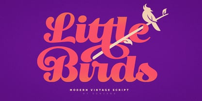 Little Birds is a script that can be used with vintage, simple and modern styles. It is very suitable for logos, posters, t shirts and more. Features Uppercase Lowercase Numerals Ligatures Stylistic Alternates
 - LD Hot Betty by Illustration Ink,
$3.00Hot Betty combines clean, modern lines with the fun of mixing it up a bit. Who says you can't substitute an uppercase for a lowercase? or vice versa? Go ahead...have some fun!