10,000 search results
(0.015 seconds)
- Bebas Neue Semi Rounded by Dharma Type,
$4.99 Bebas Neue SemiRounded is the Bebas Neue with rounded corners. As you know, Bebas Neue is the most widely used free font recently. This semi-rounded version is the new style for more widely use. The basic theory and proportion are same as Bebas Neue but rounded shape gives a warm, soft and natural impression. A bit more rigid than Bebas Neue Rounded. Available at an affordable price.
 - Freeland by Trial by Cupcakes,
$29.00 Freeland is a casual brush typeface, with a rich, inky texture, and just a bit of a masculine, edgy vibe. It’s modern, bold, and lively, but not too whimsical. Features plenty of ligatures and stylistic alternates for a realistic, hand-lettered look. Uppercase letters can be used alone, as a cohesive group, or they can be paired with their lowercase cousins, for lettering that dances effortlessly across your design.
 - I Love Summer by Seemly Fonts,
$12.00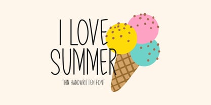 I Love Summer is a sweet and friendly handwritten font. Its natural and unique style makes it incredibly fitting for a large pool of designs. The only limit is your imagination!
 - Habana by Vladislav Ivanov,
$15.00This font opens a new era of typewriting and type design. At first sight, the font seems creepy, but it has a deep connection with some urban motives in its tune. - Harmony by Solotype,
$19.95A handsome German art deco design that fits in well with other types of the 1920s and 1930s. Originally without a lowercase, so we drew one for it, extending its usefulness. - Shaimus by Larin Type Co,
$12.00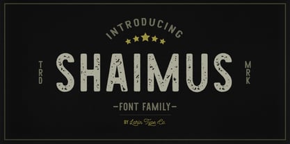 Shaimus is a multi-purpose and very legible font family. It will fit perfectly in a vintage and modern styles. It is great for creating logos, layouts, templates, advertisements and more.
 - Crafty Notes by Illushvara,
$12.00 Crafty Notes is a clean, thin and simple handwritten font. Its natural and unique style makes it incredibly fitting to a large pool of designs. The only limit is your imagination!
 - Svelte by Eko Bimantara,
$19.00 Svelte is condensed serif family. Its consist of upright styles from Regular to ExtraBold. Fit for display, short text, and stacked typesetting. Its contain 394 glyphs with broad latin language coverage.
 - Maron American by Zeenesia Studio,
$12.00 Maron American is a sweet unique and natural handwritten font. Its unique and neat style makes it incredibly versatile, fitting a wide range of designs. The only limit is your imagination!
 - FF Kaytek Sans by FontFont,
$50.99 Kaytek™ Sans is a fresh take on the correspondence typefaces of the 90s - which were originally designed for the demands of office environments. Just like its predecessors, this text typeface is robust and hard-working - meaning it works well in challenging design or printing environments - but it’s not without personality. Look closer at the lowercase g and a, especially in the italic, and you can see some unexpected elements of subversiveness within the design. This blend of sturdiness and quirkiness means it’s just as relevant for information-heavy projects, such as annual reports, as it is in more expressive environments. Although first and foremost designed for text, Kaytek Sans’ details shine through in its heavier weights and larger sizes, meaning it also has display potential. Every style of the typeface takes up exactly the same amount of space, thanks to the way Radek Łukasiewicz created the design. He based the entire typeface on a single, master set of proportions. This means designers can switch between styles without the text being reflowed, making it particularly useful in magazines, where space might be limited, and also on the internet, where hover links appear in a different style. As well as its roots in the office, Kaytek Sans draws on a little bit more 90s nostalgia. It’s named for the first and only Polish walkman, and embodies the same solid, no-nonsense shapes that made the analogue technology of the era so charming. Just like these early personal music devices, Kaytek Sans is practical, but not clinical, able to work hard while still exuding warmth and personality. It pairs effortlessly with Kaytek Slab, which is a sturdier and more expressive take on the design. Kaytek Sans comes in 12 weights, from Thin to Black Italic, and offers multi-language support. Kaytek Slab, Kaytek Headline and Kaytek Rounded are also available.
 - KG One Thing by Kimberly Geswein,
$5.00 This font is super bubbly and round. It is neat enough to be legible but still has personality.
 - St Lorie by Stereotypes,
$29.00 St Lorie is inspired by handmade lettering in logos, but it was drawn completely by the digital method.
 - Wiggles - Unknown license

- Wobbles - Unknown license

- Wibbles - Unknown license

- Tape Back by Adam Ladd,
$5.00 The Tape Back family comes in three weights. Each are monoline in weight and have a modern yet slightly quirky appearance. It is informal but has some stability with its linear forms. The slant backwards makes it unique, and it displays well even for body text.
 - Galleon by AType,
$19.95When you look at it for the first time, it seems to you that letters are inclined to the right. But it is only an illusion. Why Galleon you ask? I do not know. There is in it something both from the sea and from a wind. - Truly Happy by Olivetype,
$18.00 Truly Happy is an ideal font choice for anyone looking to add a bit of fun and playfulness to their projects. This handwritten font has a light and airy feel, making it ideal for any creative project. With its cute and whimsical details, Truly Happy will surely bring a smile to everyone who sees it. So what’s included : Basic Latin Uppercase and Lowercase Numbers, symbols, and punctuations Multilingual Support. PUA Encoded and fully accessible without additional design software Simple Installations Works on PC & Mac Cheers.
 - Contenu EBook by Hackberry Font Foundry,
$19.95 Because ebooks will not normally accept .otf fonts, and they don't support Opentype features, this font family was designed to be used for the ebook conversions of print books. It uses old style figures. The italics are slanted a bit more. And Heavy is a little bolder than the bold in Contenu Book.
 - Gurgle Jock by Bogstav,
$14.00 urgle Jock is actually two fonts in one: The Regular version is a classic handmade sans and the Outline version is…well, an outlined version of the Regular - however, I made it a bit off-grid and hasty scribbled looking. The two versions works well as they are and even greater together!
 - Houndcats PB by Pink Broccoli,
$14.00 A light hearted comic sans-serif typeface inspired by a 1972 cartoon of the same name, Houndcats works with all it’s got to convey a funky, friendly, fantastic persona. A little bit off the chain, yet still easily legible, this typographic nutcase is ready and waiting for you to go wild with it!
 - Dead Mementro by Letterhead Studio-VG,
$20.00 Dead Mementro typeface (ex Dead Metro) has simple and strong shapes. It is a little bit narrow sans serif typeface with brutal constructions of characters. The first edition of typeface — Dead Metro — was realised in 1998 as the part of Garbage Type Foundry project. Now Dead Mementro has more characters and styles.
 - Candy Randy by Lauren Ashpole,
$15.00 Not inspired by any one thing, Candy Randy came about as an attempt to capture the feel of hours spent aimlessly perusing childrens' advertising and packaging from the early 1960s. It always reminds me a bit of Christmas and was named after an imaginary character in tales told to my youngest sister.
 - Confitería by Sudtipos,
$39.00 Confitería is the Spanish word for a shop where sweets and chocolates are made and sold, which sometimes has a tea room. And now Confitería is also a font that brings to mind lettering piped on delicate cakes ... sweet but never sickly. This font captures something of that simple and innocent beauty of traditional confiterías, where good manners will never go out of fashion, menus are elegant and time comes to a standstill to make way for life’s little pleasures. A confitería is a perfect place to share sweet tidbits with a friend or date, eavesdrop on the conversation at the next table, read a book, or just people-watch from the window. I celebrated my last birthday at one. There is one iconic confitería in Buenos Aires that I love more than the rest because, some 60 years ago, it put up its marvellous sign and never took it down. Walking by it is sure to bring a smile to your face. It’s big. Very big. And the lettering in its name is written in a timelessly beautiful vertical script – the most attractive I have ever seen. I joined forces with Sol Matas – who worked with me to update the Montserrat font –to design this geometrical connected font with pleasant, even strokes. It is elegant and saccharine-free. And to top it off, it comes in several flavors. Welcome! What can we get you?
 - Bibliophile Script by Sudtipos,
$79.00 A friend once jokingly told me that what I really do is mine extinct arts for parts to use in modern things, like going to the scrapyard to pick up bumpers, quarter-panels and dashboards off of Datsuns and Ponies to build a shiny new Ferrari. I still kind of grin at that, but I certainly do spend a lot of time looking at old things and imagining ways they would work today. This shiny new Ferrari here is called Bibliophile, and it contains scrap heap parts from various pages by Louis Prang, the Prussian-American printer and publisher who inspired my Prangs fonts. This is my second engagement with the late 19th century man, and it’s quite a bit more intricate than just an italic Didone with a connected lowercase. Bibliophile marries Round Hand calligraphy with Italian capitals, two styles not often relayed in the same alphabet, but work together beautifully when combined well. When you combine them well with a few long-practised tricks of the trade, then mix in a few trusted features from my previous work over the years, you get my usual crazy exuberance, like 17 different shapes for the d, 21 different forms for the y, endings, beginnings, swashes, ornaments, and so on. It’s no secret that I can get carried away when I’m so consumed by an idea. — Bibliophile comes in 2 weights, each of them with over 900 glyphs covering all the latin languages. Bibliophile also comes with a bold weight, something I’m always reluctant to do with something as adventurous and complex as the structure of this historical mashup. But I couldn’t chase away the idea of increasing the contrast while maintaining the hairlines in a lowercase this narrow. Part of it was the curiosity about the outcome, and part was the sheer challenge of it. I think it turned out OK. Words set in either weight will show delicateness and elegance, and the more time you spend inside the font and micro-manage the setting, the more ways you will find to magnify either. Bibliophile can be as muted or luxurious as you want it to be. This is the kind of alphabet that fits well in fashion marketing and high-end packaging, from the very subdued to the super-exquisite. Enjoy the gleaming new vehicle made with freshly polished old parts.
 - Material Boy by PizzaDude.dk,
$15.00 Yes, it is a clear reference to one of my all-time favourite movies: “The Wedding Singer”, but it is also a handmade, rough, organic looking ALL CAPS font. The letters are simple and legible, but vary in roughness and because of the Contextual Alternates, you get 5 different versions of each letter - leaving the text more lively and organic!
 - Avayo by Fontop,
$11.00 Avayo is a modern sans serif typeface. It is perfect for creating alphabet logos, branding, titles, headlines, but also looks great when being used casually, in copies and texts. Avayo looks simple but special and distinct and is defined by its round cut design. Avayo font family comes in five weights to help you choose the best option depending on your purpose.
 - Quelia by Piotr Łapa,
$30.00 Quelia is an experimental, display, all-caps typeface inspired by nature and organic shapes. It has a very expressive character. The letterforms are extraordinary but also elegant at the same time. Quelia is a great choice for fashion projects, branding, headlines, titles, posters, packaging, covers, and logotypes but it can also add a distinct character to your website or app.
 - PAG Auto by Prop-a-ganda,
$19.99Prop-a-ganda offers retro-flavored fonts inspired by lettering on retro propaganda posters, retro advertising posters, retro packages all the world over. This is perfect font for your retrospective project. PAG Auto is an ultra black font, but it is readable. A fat typefaces, but is is boorish. It is recommended for use as all kinds of display typography. - Trisquare by Davide Romito,
$41.00 Trisquare is an Experimental Display Typeface, which is inspired by the strokes of the Fraktur alphabet but developed through the composition of triangular and square shapes. It has a particular ancient soul with a digital taste but is not monospaced. Trisquare is good to use for Branding, Signage, Packaging, Advertising, Headlines, Magazines, Book titles, or everything you want to use it for.
 - Jocham by Hubert Jocham Type,
$39.00 Since I have my new logotype people are asking me about the typeface it is based on. But it did not exist and I did not believe that it would actually work. I still love my logotype and so I went on to try to make it work as a font. After many different versions and some doubts I am glad to present Jocham. It is the first typeface with my name. For an obvious reason. There is only one weight with an italic. I tried different weight, but they were all not as strong as the final.
 - Chocolatte by Hanoded,
$15.00 Chocolatte font is a yummy, creamy script font, made entirely with chocolate.. No, sorry, that’s not true. It was made with a pen, but I thought I’d create a nice urban myth. Chocolatte is a pretty useful font: you can stick it on your X-mas cards, write a little poem with it and surprise the love of your life with an enormous amount of chocolate, decorate your cake with it (preferably a chocolate cake) or use it for your… well, whatever. Just remember that this delicious font cannot be eaten, but it does come with copious amounts of diacritics for all you chocoholics out there!
 - Six Week Holiday by Kitchen Table Type Foundry,
$16.00 In Holland, all kids have a six week long school holiday during the summer months. To prevent chaos, traffic jams and other madness, the government has divided the country in three regions (North, Middle and South) and school holidays start a few days to a week and a half apart. For kids this is the best time of the year, as they can have fun for a month and a half, but for us parents this sometimes is a bit of a logistic nightmare, as we still have to work! Six Week Holiday is an ode to the chaos of summer. It is a cute handmade ‘school’ font that will put some sunshine in your designs! Comes with extensive language support.
 - Tabac Micro by Suitcase Type Foundry,
$39.00 When they say everything’s already been invented, they’re exaggerating a bit. But not much. When we design new typefaces, whether we like it or not, we have in our memories the historical legacy and invention of our predecessors. That’s also true for more detailed work on optical sizes, intended for the largest or the smallest typesetting. Although for display sizes we give room for fantasy and elegance when shaping fine serifs or smooth drawings full of refined details, for styles designed for footnotes and other small texts we do the exact opposite – pragmatically and rationally, with knowledge of the optical properties of small text. And that’s precisely the case for the Tabac Micro subfamily, a sans-serif typeface derived from Tabac Sans.
 - Julie Brious by Cotbada Studio,
$5.00 Julie Brious is a handwritten signature typeface. Its classy energetic look makes it the perfect fit for feminine logos, printed quotes, invitation cards, social media headers, product packaging and a lot more!
 - Gluck by Etewut,
$30.00 Gluck family is based on sans serif font. It fits to product design, any commercial and decorations. Glück family supports european languages. It includes 5 styles: • regular • stroked • bold • bold stroked • stripes
 - Melodi by Diego Berakha,
$20.00 Melodi is the result of years of working with hand made types on my designs. Every time I draw the letters and words that I need for every design piece. One day I decided to go serious and make a real type of it and “Melodi” is the result of this work. It’s a calligraphic font, built using a regular stroke, and carefully crafted to have nice joins between all the letters. It has some playful but stylish capitals that brings lot of personality to the font. It work super nice either in lowercase writing as in all-caps texts. It looks specially good on lists of words or small sentences. Melodi is a playful but very versatile font, it can be used in lots of different scenarios. From creating a logo, writing the tittles of a catalogue or use it in a poster combined with other types (it work really well as counter point of more classical types) to motion graphics animations or advertising work. It can be cute but it also can do hard work!
 - Typewriter DirtY by Matthias Luh,
$32.00 Typewriter DirtY is related to the Typewriter BasiX and Typewriter Revo fonts. While Revo has a very clean and simple outline, BasiX is a bit washed out and looks worn. DirtY goes a step further and has a very dirty, worn, fuzzy, grungy vintage look – even more so than BasiX. Typewriter DirtY is especially suitable for headlines, logos, covers, slogans and much more. BasiX and Revo are recommended for longer texts. Although Typewriter DirtY looks good even in small font size, it is a bit more complex to render because of its detailed outlines. Typewriter Revo, BasiX and Dirty are monospaced typewriter fonts, which are matched to each other. They have the same dimensions and generally somewhat similar contours. Therefore, they can be perfectly mixed and matched with each other.
 - Ruina One by RodrigoTypo,
$25.00 Ruina One is a Rough and distressed font, but at the same time very gestural. It is especially great for youth and child graphics, but can be applied in many other domains too. Ruina One contains various ligatures.
 - Oblivian Grotesque by Jörg Schmitt,
$36.00 Oblivian Grotesque is a sans serif type family of ten weights. The typeface is based on geometric forms with bits and pieces of modern humanistic grotesque fonts. Due to the rounded edges it has a very soft / warm look and feel. It comes along with varius OpenType features such as table and old style figures. Oblivian Grotesque as an extended character set that support Central and Eastern European as well as Western European.


