10,000 search results
(0.153 seconds)
- Magendfret by sugargliderz,
$24.00 Magendfret is a typeface that was designed very mechanically. However, it is also the optimal typeface for expressing soft warmth. Magendfret was designed by constructing a "line." That is: it is based on the concept "it is the combination of a straight line and a curve with a character." I made the character from the act of using and constructing a vector graphics editor, a mouse, and a keyboard. That, I thought when constructing it, should make neither a roman type nor italic type into a novel form, and a very general form. Once those characters were bit-map-ized, they traced again mechanically by the vector graphics editor. It became a soft impression by this work. The very mechanical act of changing the thickness of a line uniformly constitutes the family. The thickness of seven patterns was created first and, finally it results in four patterns. Respectively, styles called Light, Regular, Medium, and Bold are attached as usual. The name Magendfret is meaningless. It is an anagram of a certain words selected very arbitrarily.
 - Diediedie - Unknown license

- Arzachel by CAST,
$45.00 Arzachel is a humanistic sanserif with a big x-height and a specific organic look. Its design is scientifically sharp and efficient in small type sizes as well as rugged and dramatic in headlines. Arzachel’s essential feeling comes from several features: all the letters are slightly sloped, stem terminations are flared at the top, and the terminals in letters a, c, e, f… are widening with the inside parts completely flat. The stroke contrast is low in the regular weight while it increases in the black; finally the capitals have an inscriptional flavor. Despite being a sanserif (thus a product of recent typography) Arzachel’s roots stretch back to the Renaissance tradition: Olocco took inspiration from some of the early and rather weird types cut in Venice in the 15th century. Arzachel was conceived during Olocco’s MA in Reading to provide a companion for his Zenon for use in small type sizes. But instead of expanding the Zenon family with optical sizes, the designer decided on a sans with its own personality rather than a sanserif version of Zenon with chopped-off serifs.
 - Nameh by Naghi Naghachian,
$105.00 Nameh is a single weight sans-serif headline font designed by Naghi Naghashian. It is a condensed big title font. This font is a contribution to modernize the Arabic typography, gives the font design of Arabic letters real typographic arrangement and provides more typographic flexibility. Nameh supports Arabic, Persian (Farsi) and Urdu. It also includes proportional and tabular numerals for the supported languages. Nameh design fulfills the following needs: A Explicitly crafted for use in electronic media fulfills the demands of electronic communication. B Suitability for multiple applications. Gives the widest potential acceptability. C Extreme legibility not only in small sizes, but also when the type is filtered or skewed, e.g., in Photoshop or Illustrator. Nima’s simplified forms may be artificial oblilqued in InDesign or Illustrator, without any loss in quality for the effected text. D An attractive typographic image. Nameh was developed for multiple languages and writing conventions. Nameh supports Arabic, Persian and Urdu. It also includes proportional and tabular numerals for the supported languages. E The highest degree of calligraphic grace and the clarity of geometric typography.
 - Starlight Ballroom NF by Nick's Fonts,
$10.00Cross the irrepressible Samuel Welo with a bit of found matchbook art and voilà! You have this retro charmer, proudly found on the kind of neon signs that offered an invitation to dine and dance. To continue the baseline treatment between words—or to extend it on either side—use the _Underscore character. Both versions of the font include complete Latin 1252, Central European 1250 and Turkish 1524 character sets, with localization for Moldovan, Romanian and Turkish. - Dry Cowboy by Chank,
$99.00 Yee haw! Send me a shot of sarsparilla and let's celebrate a new cowboy font! This time we're pleased to introduce a new, more legible counterpart to Chank's Drunk Cowboy font. The resultant new font has a bit less of a drawl to it and is known as Dry Cowboy. Now you have a choice for smaller text setting when using Drunk Cowboy as the headline font. Wrangle the two together and put a little giddyup in your designs.
 - Cookie Crumble by Hanoded,
$10.00 I like cookies. Especially butter cookies and ginger nuts. The word cookie comes from the Dutch word ‘koekje’ - which means exactly the same. Cookie Crumble is a cute little font that I made on a rainy day. I just needed something that looked and sounded happy and I guess it applies to this font. Cookie Crumble comes with a bunch of alternates, a full set of diacritics and a bit of sunshine to chase away your rainy day.
 - UUeirdie by Ingrimayne Type,
$7.95UUeirdie is weird. The Condensed-Light style was derived from the star-serifed font Asterx by replacing the star serifs with a rounded flare serif. Widening that style resulted in UUeirdie-Regular and the bold was then constructed to complement it. The warped version was a result of play with a font distortion program. Although the glyphs have sharp corners, they do not have straight lines. The UUeirdie faces are rough, irregular, and maybe a bit creepy. - Coin Ding Dong by Inumocca,
$18.00 Coin Ding Dong pixel Font inspired from 8 bit game with beautiful stylized pixelized, game machine really reminds me of my childhood, with coins you can play it, in my country machine games are called "dingdong", inspired me to create this pixel font name. Really Beautiful font to covering your Project, like For Game Names, Poster art, Magazine, Branding, Logos, and more your project design. - Unique glyphs - Multilingual Characters - UPPERCASE - Lowercase - Numeric - Symbol - Punctuation Character - PUA encoded inumoccatype
 - Inverted Squircle by Aurora Borealiz Design,
$- What is an inverted squircle? To answer that we must first identify a squircle, which is a square with rounded edges. An inverted squircle isn't just a regular old square. It is a square with inverted rounded edges. This font is a modular font designed to create inverted rounded square edges. This font was created with using just a few shapes stacked and rotated to make a unique, digital font with a little bit of quirky personality.
 - Barmoor by Barmoor Foundry,
$15.00 Barmoor is a robust, classic roman display face, inspired by the letter designs of the Parisian craftsman Claude Garamond and other 16th century French engravers as well as antique roman letterforms. It works especially well letterspaced and in all caps. Alternate W, R, J, M, Q and K can be used to add a modest bit of flair to letterspaced, all cap treatments. Barmoor is mainly intended to be a display font or a limited text font.
 - Manufactory JNL by Jeff Levine,
$29.00 Manufactory JNL and its oblique counterpart were re-drawn from examples of a now-antique typeface used within many advertisements found throughout the pages of The American Stationer magazine, circa 1879. The term ‘manufactory’ was popular during this era; the word being a more archaic form of ‘factory’. There is a bit of Western flavor to this type design, as the spurred serifs and the top and bottom strokes are heavier than the vertical and mid-point stroke weights.
 - Springwood by Hanoded,
$12.00 Spring is in the air! At least, where I live. My two pear trees are in bloom, bees are buzzing and everything turns a brighter shade of green. Time for a new and fresh font package with a spring-inspired name! Springwood is a handmade set of fonts, ranging from a fat display font to a messy script font. Use it for your freshest ideas, your coolest designs or just anything that needs a bit of springtime.
 - LeKing by Misprinted Type,
$39.00 LeKing is a Frankenstein of vintage ornamental typefaces of the past centuries. Each character is a collage of different bits of different letters. The font has the classic elegant feel of the old ornamental typefaces, combined with a modern and edgy feel. It has 2 uppercase variations, so you can mix letters without repeating them or find the exact type that suits your needs. Le King also comes with an EPS file with 24 vector ornaments! Enjoy!
 - Night Wind Sent by Ana's Fonts,
$12.00 Night Wind Sent is an elegant handwritten script font family inspired by old-fashioned handwritten postcards and letters. It includes ligatures (for a true handwritten feel), stylistic alternates, handwritten small caps, and swashes (for an extra bit of drama). Plus! Extra versions of the font: underline and strikethrough, and an ornaments font, to help decorate your text. Night Wind Sent is perfect for any design that needs a handwritten look, such as signatures, notes and quotes, logos and branding.
 - Foxrights by Maulana Creative,
$15.00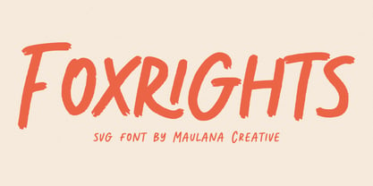 Foxrights is an Handwritten font, with bold stroke, a bit slant and fun character. It has Opentype features ligatures of character, To give you an extra creative work. Foxrights font support multilingual more than 100+ language. This font is good for logo design, Social media, Movie Titles, Books Titles, a short text even a long text letter and good for your secondary text font with sans or serif. Make a stunning work with Foxrights font. Cheers, MaulanaCreative
 - P22 Clementine by IHOF,
$29.95 A bit of Victoriana whimsy from this set of two fonts is heavily inspired by a variety of 19th Century faces without being a direct revival of any one in particular. Undulating curves, swirly terminals and bifurcated semi-serifs give these faces plenty of character. Both fonts include f ligatures and ct/st ligatures. Clementine Curly includes a full set of alternate curly caps as opentype alternates making it essentially a bonus font within a font!
 - Kento by Graphicfresh,
$18.00 This time we present a font with a bit of a classic touch. The font is slightly stretched to the sides. The font is simple and luxurious, so it leaves a deep memory impression when used on a brand. Simple and powerful. This is an overview of the font as a whole. Kento will be perfect for many projects: fashion, magazines, logos, branding, photography, invitations, wedding invitation, quotes, blog headers, posters, advertisements, postcards, books, websites, etc.
 - Raylig by Khaiuns,
$16.00 Raylig is a graceful serif but full of energy, Raylig is an experimental project full of selfishness in it, this project was designed by khaiuns in May 2021, he made it himself so it took about 4 months. Raylig is a desire to present the perfect font for your wide variety of projects so that this type of font can be selected for branding, especially in the UI / UX industry, also suitable for typographic layout for magazines, posters, books, etc. With hard work and spending a lot of time, comes the Raylig Serif font that has interesting things, such as: 10 styles: 5 Original, 5 Alternative 650 glyphs in each style Support for more than 190+ languages: Expanded Latin, and many other languages Each style has 33 really cool alternatives, and find something interesting Raylig also has classic characters, but it is also perfect for your modern design, you can see it on display, such as in thin body size (light), Raylig makes a neutral impression, but when the size is getting bigger (Bold), users are taken on a fun search to find interesting movements, graphic peculiarities, and unusual solutions. All letter patterns are perfectly adjusted. I hope you have a blast using Raylig. Thanks for use this font ~ Khaiuns X zelowtype
 - FF Attribute Mono by FontFont,
$69.00 FF Attribute™ Mono is a monospaced design with an industrial strength, minimalist vibe, making it perfect for attention getting, theme-based headlines, posters, banners and navigational links. And, because it is such a robust family, FF Attribute can also be used for branding of blogs, games, web sites and tech products. FF Attribute comes in two families; Mono and Text. The Mono is a fixed width (monospace) design, while the Text is a proportional design. FF Attribute was, in fact, initially designed for the use in code editor software. Its seven roman and italic monospaced weights and extended character set supporting many languages also make it a powerful communications tool. But this is only the tip of the iceberg. In addition to the monospaced version, where all characters share a fixed width, there is also a proportional, “faux monospaced” version: FF Attribute Text. The Text family keeps the visual character of a monospaced typeface, but wide letters are given more space while narrow characters have been drawn with correct proportions and spacing. FF Attribute Text looks monospaced – but it’s not. Drawn by Viktor Nübel, FF Attribute Mono’s 14 designs, huge character set, including box-drawing characters and user-interface icons, make it the Swiss Army Knife® of monospaced fonts.
 - Grozel by Krakenbox Studio,
$17.00 Grozel is Gaming display font. It has fancy, playful, and Cool. It’s a great font for gaming, product, fashion, apparel projects, signature, album cover, logo, branding, magazine, social media, & advertisements, but also works great for other projects.
 - Niederwald by Scriptorium,
$18.00Niederwald is a hand-drawn font based on samples of turn-of-the-century hand lettered signage. It has a fanciful character, but great readability. Excellent for decorative titles or captions. Includes a number of alternate characters. - Spookyman by Krakenbox Studio,
$12.00 Spookyman is a halloween Font. It has spooky, mysterious, horror, classic. It’s a great font for events, halloween, fashion, apparel projects, signature, album cover, logo, branding, magazine, social media, & advertisements, but also works great for other projects.
 - Chloe by Autographis,
$39.50 Chloe is a very dramatic script with high contrast between the up- and down-strokes. It is not really useful for long copy, but very good at short captions or as a decorative part of your layout.
 - Vergennes by Scriptorium,
$18.00Vergennes is a decorative script font featuring ornate, calligraphic decorative initials based on 19th century metal type. It has a full character set with lower case and numerals, but the upper case initials are the standout feature - Scenders by Juliane Bone,
$9.99 Scenders was inked first then digitized for the masses to use. Strong ascenders and descenders embellish the font, so the lowercase characters are quite compelling. Scenders is versatile, but it works very well in all caps headlines.
 - F2F OCRBczyk by Linotype,
$29.99The original OCR B was designed for optical character recognition systems and was therefore monospaced. Designer Alexander Branczyk made a more typographically tuned and fitted version, with both regular and bold weights, and called it OCRBczyk™. - Today We Escape by PizzaDude.dk,
$20.00 Today We Escape has got rugged edges and a slightly worn surface without overdoing it. The letters are ALL CAPS, but upper and lower case are different. Today we escape comes with substitution characters for double letters!
 - False Widow by OhType!,
$18.00 False Widow is a display typeface, designed for graphic pieces looking for a great visual impact. Aggressive but measured in its proportions is easily adaptable to different uses and formats such as posters, headers; print and digital.
 - Stinky School Book by Nerfect,
$15.00Stinky School Book was created to letter the adventures of a particular Mr. Stinky the Elf, but you can use it for that informal look when used for body copy or as a display face for headlines. - Mural by Solotype,
$19.95Another caps-only font for which we have designed a lowercase. It was originally brought out in smaller sizes for card work, but proved to be so popular that sizes up to 48 point were soon added. - Thirdlone by Letterhend,
$14.00 Thirdlone is a handmade typeface with monoline script and sans. This font is perfect to be used as t-shirt designs, logo/brands, signatures, headlines, lettering quotes, and more. It also comes in uppercase, lowercase, punctuation, symbols, numerals, stylistic set alternate, ligatures, and multi-lingual support. Thirdlone Script includes 3 different styles: Regular, Stamp, and Ink. Thirdlone Sans includes 4 different styles: Regular, Stamp, Ink, and Edge. Regular styles are a regular style that have clean look on it. Stamp styles give you aged texture on the font that will push out the vintage feel. Ink styles will give the font a little bit of an ink feel. The Edge style give this font a rough feel on its edge. You can choose one of the styles mentioned above that match perfectly for your style, or just mix and match it.
 - Porkshop by Chank,
$99.00 Porkshop is a font of retro vintage flavor with a hefty dose of immigrant-influenced naive typography. It's fundamentally inspired by an old-but-still-prominent "Pork Shop" sign in Manhattan. I like to think that this font was made by a signmaker's apprentice who didn't yet have a grasp on the subtleties of elegant letterforms, but put his gusto into perfectly sharp serifs. While pointy little serifs are cool, the real shine of this font comes from the imaginative combination of uppercase and lowercase shapes. This unique mixture in the lowercase reminds me of an indeterminate European accent in the big city. Big and strong and easy to understand. Best rendered in 3-foot tall metal type, Porkshop works well in print and on screens, too. The Bolds and Italics are brand new in 2011.
 - Undulate by Ingrimayne Type,
$10.00 Undulate was designed as an alternating-letter font in which two sets of characters alternate. The alternating is done automatically in applications that support the OpenType feature contextual alternatives (calt). Some individual characters look strange in isolation but they fit into a wave-like pattern in which shapes that bulge up alternate with shapes that bulge down. Undulate has monospaced and monoline letters. The letter spacing is very tight to accentuate the ripple pattern. The family includes an outline style that can be used in a layer above the regular style to add color. Undulate was not designed for any particular use but as a challenge to fit letters into a particular geometric shape. The unusual patterns that a result are eye-catching and may be useful for advertising or signage and in other places where one wants attention-grabbing lettering.
 - Document by Aah Yes,
$11.00Document is an easy-to-read sans serif with large lower-case letters, but with one difference - it is slightly slanted to the right, but a lot less than a conventional italic angle. This is intended to give it a more informal and modern look than a perfectly upright font would be, and which also contributes extra dynamism while reading. It's a sort of in-between font, for situations where a boring old upright typeface is too formal and staid but where the italic version is too slanted and obvious. There are six weights, giving adequate representation for most jobs, from large bodies of text to headlines. The zip package contains both OTF and TTF versions - install either OTF or TTF, not both versions of a font on the same machine. - Saratoga Slim AOE by Astigmatic,
$19.95He's rough around the edges, but he's an outlaw from the Old West, what did you expect? He's Saratoga Slim, a playful shaken up dust devil of a typeface. With a shaken appearance and rough hewn letters, he steps onto the scene, yet is clearly legible to read. He's alot like a one of those ruffigans that is crude around the edges, but when he looks at you and says, "Get what I'm saying partner?", you know exactly what he means. Put some rough and tumble type into your designs with Saratoga Slim. He's been through the ringer a few times but keeps coming back for more. Isn't that what you look for when you create a design...durability...? Here it is, Saratoga Slim, looking at you! Get it today! - Displace Serif by Serebryakov,
$35.00 Displace Serif is a continuation of my Displace fonts. Adding serifs allows you to see the font in a new way. There is a more pronounced charm of Italian monumental fonts, but in an expressive way. The appearance of the serifs allowed the font to move to the antiqua class, but this is purely a formal matter. The proportion of serifs changes markedly from weight to weight, allowing the font to retain its decorative character. In the Light drawing the serifs are barely visible and delicate, while in the Black they are in superposition. The font is catchy, noticeable, which makes it suitable for graphics requiring instantaneous spectator emotions. Displace Serif is suitable for editorial design, as despite the modern image it retains the classic concept.
 - Huxley Alt by HiH,
$8.00 Huxley Alt is just that — an alternative to Huxley Vertical by ATF. It represents one of my earliest efforts. I liked the crispness of Huxley Vertical, but wanted a lowercase and with some modulation of the strokes as in Empire, also by ATF. Huxley Alt is the result. Highly condensed. Set it large or lose it. Huxley Alt is a bargain-priced font with 226 glyphs, covering the usual Western European accents (ref MS Code Page 1252). If you like the style, but would like more glyphs and/or a range of weights, may we suggest our Huxley Amore. Huxley Amore has 379 glyphs and covers the Eastern European, Baltic and Turkish code pages (1250, 1254 and 1257). We also offer Huxley Cyrillic in a single weight.
 - Kalix by Linotype,
$29.99I have a notation that the summer of 1994, when I worked with Kalix, was a warm one. I had no special typeface in mind when drawing the characters of Kalix, but many typefaces contributed to it, e.g. my own Omnibus from which I borrowed the looks of the smal case g. I think it is a lovely typeface whose use is mainly for books and magazines. Kalix is the name of a northern Swedish town situated along a river called Kalixälven. Its name is of sami origin, *káles, meaning cold. There comes the connection to the warm summer of 1994! But even the Latin word for chalice, calix, has something to do with my choice of name. Kalix was released in 1994. - Covergirl by Trine Rask,
$25.00 Warning: works with contextual alternate-feature, which is not showing here. Covergirl is a script typeface that works all by itself. It has a very high contrast, but works also in smaller sizes. It is a display typeface. Covergirl is based on handwriting. The basic shapes are transformed to a very high contrast strict form and the hairline runs through the words in an amusing lively way that simulates the writing by hand. Its scandinavian designed handwriting, decorated, but also very minimalistic. While writing the letters will be substituted by one of the variations of the letter, that will make sure that the letters connect well. When writing in only UPPERCASE a much more simple letter shape will substitute the default.
