10,000 search results
(0.033 seconds)
- Nouveau Crayon by Hanoded,
$15.00 Nouveau Crayon is based on Crayon Crumble, a font I made a long time ago. I changed a lot of glyphs and added a whole bunch of new ones. It has become quite a good looking font to be honest: oodles of crayon goodness, heaps of crumbling bits and a lot of expression. Use it for cafe websites, restaurant menus, children’s books, art fair posters and whatever else you fancy. Nouveau Crayon comes with abundant language support.
 - Hopferian by 2D Typo,
$28.00 This font has been developed based on the engraving by the German artist Daniel Hopfer (1470-1536) listing the Latin ABC. While creating the font I tried to preserve the archaism and certain imperfection characteristic for the prototype to accentuate its charm. Fanciful convolution on the serif make it a bit fairy-tale like and cheerful. The font is also available with decorated dots as in the original version. All the letters in the font are capital.
 - Oilvare by Adam Ladd,
$25.00 Oilvare is a hand-drawn, layered typeface inspired by vintage painted signs and oil cans. While sturdy, it also has a softer side—wide proportions, oval-inspired forms, curled angle strokes, and a medium contrast all help give it a little bit of distinction from the typical sans serif. Mix, match, and layer the styles to your liking. Carefully drawn, when you enlarge the typefaces, the subtle irregularities become more apparent and harken to hand lettering of the past.
 - Ingone by Ingrimayne Type,
$9.95 Ingone is a slightly irregular sans-serif face. It was designed to complement PattyDay and HeyPumpkin, but can be used alone if you need an informal, friendly sans-serif font. It has only one weight, but the family includes a shadowed style. In 2018 the inside of the shadowed version was separated out and made a separate typeface. The letters have the shapes of the regular version but the spacing of the shadowed version and can be layered with the shadowed version to easily produce lettering with two colors.
 - Harmonique by Monotype,
$31.99 Harmonique is an incised serif typeface designed for both text and display purposes. It’s a type family of two styles that work in harmony together to add distinction and personality to your own typographic compositions. Harmonique’s low contrast forms have the appeal of a humanist sans serif typeface. Its subtly flared terminals evoke the craft and skill of a signwriter’s steady hand, creating an authentic and pleasing aesthetic. Harmonique Display is more calligraphic in its structure – as if drawn by a wide-nibbed pen. This style is accentuated by aggressively barbed serifs and chiselled arcs in its counters and bowls. These strong characteristics help to define a flamboyant, confident style that will provide impact and flair to your headlines, titles and identity designs. Practical features include 48 ligatures that will enhance titling possibilities with their all-capital pairings – these are accesssed by turning on Discretionary Ligatures and then selecting either Sylistic Set 1 or 2. There are also a number of alternate caps that will subtly enhance your titles and headlines – access these via Stylistc Sets 3 and 4. Small Caps are included too (along with their matching diacritics) – adding another layer of versatility to this typeface. Proportional Lining figures are available as an option if you prefer them to the default Old Style figures. There are 32 fonts altogether, with 8 weights in roman and italic from Light to Ultra in both text (low contrast) and display (high contrast) styles. Harmonique has an extensive character set (650+ glyphs) that covers every Latin European language. Key features: 8 weights across two styles in both roman and italic 48 Ligatures 11 Alternates Small Caps Full European character set (Latin only) 650+ glyphs per font.
 - Compatil Fact by Linotype,
$50.99Compatil is the first comprehensive type system which enables all typographical elements to be used to full effect in order to reproduce the message conveyed by text information. Four different type styles with a total of 16 weights including italics have been merged into a unique typographical network. There are now no limits to the font user's creativity. The system is a product of technical innovation and constitutes a new design approach which meets the highest aesthetic standards. For almost two years, a team of experts from Linotype has been working with initiator Professor Olaf Leu under the direction of Silja Bilz, Erik Faulhaber and Reinhard Haus to create the Compatil type system. Despite the Internet and TV, it is essential today to be able to absorb information quickly by being able to read it with ease. A fact that is becoming increasingly important both on-screen and on paper. It is the role of the font to increase legibility and to ensure typographically perfect results for text design work. The new Compatil type system meets all these needs. The Compatil is a part of the Platinum Collection. The following four different styles are available: Compatil Exquisit, Compatil Fact, Compatil Letter and Compatil Text. Compatil is available in various font formats: 16 separate OT Pro fonts including the small caps and Adobe Central European character set for OpenType-supporting applications like Adobe InDesign, or as 32 separate OpenType Com fonts for office communication, with the following special features: 1. Optimized display capabilities for computer screens eXcellent Screen Fonts (XSF-quality). 2. An extended, international character set, which supports 48 different languages for Microsoft Office applications like MS Word or as 64 PostScript fonts, which can be used in non-OpenType-supporting applications like Quark XPress. - Compatil Fact Paneuropean by Linotype,
$103.99Compatil is the first comprehensive type system which enables all typographical elements to be used to full effect in order to reproduce the message conveyed by text information. Four different type styles with a total of 16 weights including italics have been merged into a unique typographical network. There are now no limits to the font user's creativity. The system is a product of technical innovation and constitutes a new design approach which meets the highest aesthetic standards. For almost two years, a team of experts from Linotype has been working with initiator Professor Olaf Leu under the direction of Silja Bilz, Erik Faulhaber and Reinhard Haus to create the Compatil type system. Despite the Internet and TV, it is essential today to be able to absorb information quickly by being able to read it with ease. A fact that is becoming increasingly important both on-screen and on paper. It is the role of the font to increase legibility and to ensure typographically perfect results for text design work. The new Compatil type system meets all these needs. The Compatil is a part of the Platinum Collection. The following four different styles are available: Compatil Exquisit, Compatil Fact, Compatil Letter and Compatil Text. Compatil is available in various font formats: 16 separate OT Pro fonts including the small caps and Adobe Central European character set for OpenType-supporting applications like Adobe InDesign, or as 32 separate OpenType Com fonts for office communication, with the following special features: 1. Optimized display capabilities for computer screens eXcellent Screen Fonts (XSF-quality). 2. An extended, international character set, which supports 48 different languages for Microsoft Office applications like MS Word or as 64 PostScript fonts, which can be used in non-OpenType-supporting applications like Quark XPress. - Compatil Letter by Linotype,
$50.99Compatil is the first comprehensive type system which enables all typographical elements to be used to full effect in order to reproduce the message conveyed by text information. Four different type styles with a total of 16 weights including italics have been merged into a unique typographical network. There are now no limits to the font user's creativity. The system is a product of technical innovation and constitutes a new design approach which meets the highest aesthetic standards. For almost two years, a team of experts from Linotype has been working with initiator Professor Olaf Leu under the direction of Silja Bilz, Erik Faulhaber and Reinhard Haus to create the Compatil type system. Despite the Internet and TV, it is essential today to be able to absorb information quickly by being able to read it with ease. A fact that is becoming increasingly important both on-screen and on paper. It is the role of the font to increase legibility and to ensure typographically perfect results for text design work. The new Compatil type system meets all these needs. The Compatil is a part of the Platinum Collection. The following four different styles are available: Compatil Exquisit, Compatil Fact, Compatil Letter and Compatil Text. Compatil is available in various font formats: 16 separate OT Pro fonts including the small caps and Adobe Central European character set for OpenType-supporting applications like Adobe InDesign, or as 32 separate OpenType Com fonts for office communication, with the following special features: 1. Optimized display capabilities for computer screens eXcellent Screen Fonts (XSF-quality). 2. An extended, international character set, which supports 48 different languages for Microsoft Office applications like MS Word or as 64 PostScript fonts, which can be used in non-OpenType-supporting applications like Quark XPress. - Compatil Text by Linotype,
$50.99Compatil is the first comprehensive type system which enables all typographical elements to be used to full effect in order to reproduce the message conveyed by text information. Four different type styles with a total of 16 weights including italics have been merged into a unique typographical network. There are now no limits to the font user's creativity. The system is a product of technical innovation and constitutes a new design approach which meets the highest aesthetic standards. For almost two years, a team of experts from Linotype has been working with initiator Professor Olaf Leu under the direction of Silja Bilz, Erik Faulhaber and Reinhard Haus to create the Compatil type system. Despite the Internet and TV, it is essential today to be able to absorb information quickly by being able to read it with ease. A fact that is becoming increasingly important both on-screen and on paper. It is the role of the font to increase legibility and to ensure typographically perfect results for text design work. The new Compatil type system meets all these needs. The Compatil is a part of the Platinum Collection. The following four different styles are available: Compatil Exquisit, Compatil Fact, Compatil Letter and Compatil Text. Compatil is available in various font formats: 16 separate OT Pro fonts including the small caps and Adobe Central European character set for OpenType-supporting applications like Adobe InDesign, or as 32 separate OpenType Com fonts for office communication, with the following special features: 1. Optimized display capabilities for computer screens eXcellent Screen Fonts (XSF-quality). 2. An extended, international character set, which supports 48 different languages for Microsoft Office applications like MS Word or as 64 PostScript fonts, which can be used in non-OpenType-supporting applications like Quark XPress. - Protipo by TypeTogether,
$35.00 Protipo helps information designers work smarter. Veronika Burian and José Scaglione’s Protipo type family is an information designer’s toolbox: a low-contrast sans of three text widths with a separate headline family, accompanied by an impressive two-weight icon set, and working with the advanced variable (VAR) font format. From annual reports and wayfinding to front page infographics and poster use, designers consistently turn to the simplicity and starkness of grotesque sans fonts to get their point across. Protipo is made for such environments. When designing information you may start with the headline, which in the case of this family is called Protipo Compact and comes in eight weights. From Hairline to Black, set it large, overlap it, or let it run off the page. Protipo Compact was made to hit hard and attract attention with a different character set and different proportions than the three text fonts. It sets the stage for what’s to come. Great information designers are aces at melding form and function, so we’ve stacked the Protipo family with Narrow, Regular, and Wide versions as a way of organising your information and directing the reader. Each width has seven distinct weights (light to bold) and italics, while maintaining the round-rect shapes of its DNA. Subtle details amplify its place in the typographic universe, like an ‘a’ and ‘e’ that go from solid to supple when italicising, an ‘f’ that gains an italic descender, two versions of the lowercase ‘r’ and ‘l’, and clipped corners on diagonals to keep the tight fit inherent to this kind of design work. Protipo is not meant to be loudmouthed, but stakes its claim through refinement, breadth, and impact. Some changes at first don’t seem substantial, but the Protipo family doesn’t handle text like most in its category. Protipo helps readers find and process data in a clear and unequivocal way and accounts for the complexity involved in rendering large amounts of information while still appealing to aesthetics. Protipo is ideal in all informative situations: apps, infographics, UI, wayfinding, transport, posters, display, and even internet memes. Add to all this the icon sets and upcoming variable font capability, and you’re assured a level of creativity, productivity, and impact on a much greater scale.
 - Corner by URW Type Foundry,
$35.99 A unique kind of type by Michael Herold: The 14 cuts of Corner are equally distributed to the two style variants A and B. From Thin to Extra Bold, variant A comes with technical and pure forms while B appears with a soft, more personal character. In combination, the two variants add up to a highly versatile family which is very well suited for branding purposes, thanks to its diverse forms of expression. Eine besondere Schriftfamilie von Michael Herold: Die 14 Schnitte der Corner sind auf die beiden Stilvarianten A und B verteilt. Von Thin bis Extra Bold kommt die Corner im Stil A mit technischen, reinen Formen und im Stil B mit weichem, persönlicherem Charakter. Als Kombination ergibt sich eine sehr vielfältige Familie, die sich mit ihren verschiedenen Ausdrucksformen besonders fürs Branding eignet.
 - Narziss by Hubert Jocham Type,
$39.00 Since Mommie I gradually got more into swirly ornaments. The massive contrast in the neoclassic style is perfect for thin swirly extensions to the characters. Even in an upright typeface. Narziss is very elegant in big headline sizes. Use it only very big.
 - Post Box by Great Scott,
$16.00 Written in a ballpoint pen style POST BOX is a neighborly sans serif is slightly condensed and slanted. Scribbled quickly but readable. Exact but still human. Perfect for print, package and display use. You can also use it in shorter paragraph text.
 - Bajazzo by Schriftlabor,
$39.00 Bajazzo is a multi-weight and multi-width humanist sans-serif typeface. Inspired by old wood-type specimens, its timeless and unapologetic design lends itself for posters just as much as it does for text. Its extensive range of styles, widths, and weights make it fit for use in practically any application.
 - Stina by profonts,
$41.99 profonts Stina is an cursive font based on cross stitch pattern. It can be used in (very) tall letters but it also keeps legible in smaller sizes. Because of its joined letter pairs and ligatures it keeps the flow of a "handwritten" cursive font. So, you ever felt like stitching? - Start today.
 - Bajazzo Rounded by Schriftlabor,
$39.00 Bajazzo is a multi-weight and multi-width humanist sans-serif typeface. Inspired by old wood-type specimens, its timeless and unapologetic design lends itself for posters just as much as it does for text. Its extensive range of styles, widths, and weights make it fit for use in practically any application.
 - Karepe FX by Differentialtype,
$10.00 Karepe FX is a modern sans family, which comes in a variety of styles. Includes 54 styles with regular, rounded, and outline options. They all work perfectly with each other. It can easily fit into any project, so add it to your creative ideas and see how it can make it stand out!
 - Bajazzo Variable by Schriftlabor,
$899.00 Bajazzo is a multi-weight and multi-width humanist sans-serif typeface. Inspired by old wood-type specimens, its timeless and unapologetic design lends itself for posters just as much as it does for text. Its extensive range of styles, widths, and weights make it fit for use in practically any application.
 - Kids Arabic Dashed by Beast Designer,
$47.99 Kids Arabic Dashed Font is an incredibly unique and interesting dashed display font. It was designed especially for letter tracing worksheet for children, but it could be employed to a variety of other designs. Add it to your portfolio of fonts and it will soon become a favorite option, no matter the creation!
 - Discharge Pro by The Type Fetish,
$25.00 Discharge is a bold, heavy, distressed and destroyed sans serif typeface. It was started alongside Universally Corrupt and Insurgent, but it took a couple extra years to finish. It was expanded to include extended Latin, extended Cyrillic and Greek alphabets, so it will work with most languages in Europe and the Americas.
 - Brattleboro Stencil JNL by Jeff Levine,
$29.00 The inspiration for Brattleboro Stencil JNL was found within a reproduction of a sales catalog for stencil punch dies manufactured by S.M. Spencer & Co. (originally of Brattleboro, VT), circa 1868. Basically a sans serif letter, the font's unusual feature is its "split tail" design where the letters take on a bit of a "Western" look in appearance.
 - Ramen Sans by Nina Belikova,
$20.00 Ramen Sans is a friendly grotesque type family with the warmth of serif types and a little bit of the edginess of geometric sans! Designed with body text in mind, it offers 5 weights (and their italics), small caps, tabular figures, fractions, numerators, denominators, and supports the Adobe Latin 3 character set (most western and central European languages).
 - Beachvibes Script by Brainware Graphic,
$12.00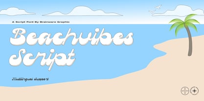 Beachvibes Script is A funky display script font, little bit retro psychedelic and groovy, a funky and modern font featuring playful and whimsical letterforms that will catch the eye. With its unique style and bold personality, it’s perfect for adding a touch of fun and character to any project, from branding to packaging to social media graphics.
 - XLaserTrain by Ingrimayne Type,
$14.95 The first release of XLaserTrain, a toy train font, was constructed by taking bits from the four LetterTrain fonts. Version 2, released in late 2010, added a great many cars with holiday and party themes. The bold version has smoke over the cars and you may have to adjust line spacing (leading) to have it display properly.
 - Fallisanta by Maulana Creative,
$13.00 Fallisanta is a flourish script font with a little bit retro vibes and cursive high contrast stroke. Fallisanta includes opentype features Ligatures and Alternate lowercase flourish. It support multilingual more than 100+ language. This font is suitable for logo design, Movie Titles , Books Titles and any awesome project you create. Make stunning work with Fallisanta flourish font. Cheers, MaulanaCreative
 - Swadi Marker by Sipanji21,
$15.00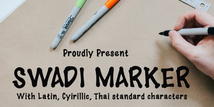 Swadi Marker is a sweet and friendly serif font and features Cyrillic and Thai character. Its natural and unique style makes it incredibly fitting to a large pool of designs. The only limit is your imagination!
 - Head Strung by PizzaDude.dk,
$17.00 The Head Strung font is designed with a simple and basic serif structure, but has its oddities and curly lines. It comes with 4 different versions of each letter, and these automatically cycle as you type.
 - Things To Remember by Orenari,
$14.00 Things To Remember is a chill and friendly display font. Its natural and unique style makes it incredibly fitting to a large pool of designs. Level up your creative project with this thin yet memorable font.
 - Beauchef by Latinotype,
$26.00 Beauchef is a sans serif typeface originally created to meet the needs of Centro de Modelamiento Matemático de la Universidad de Chile (University of Chile Center for Mathematical Modeling). Beauchef is a typeface with rough strokes that features subtle optical compensation and does not strictly follow the laws of perception. This typeface might not be too cheerful, but shows a very particular idiosyncrasy of form. Beauchef is as tough as advanced mathematics; however, it is as legible and exact as numbers themselves. This is an avant-garde typeface that resembles the development of mathematics, but at the same time it is as conservative, calm and respectful as clients who require its services. Beauchef is so astonishing as mathematical formulas that mathematicians work with, but at the same time it is as humble as resulting figures.
 - Abesif by Twinletter,
$12.00 Introducing Abesif sans serif font. This font is stretched from the normal theme, it is boring, while different, it seems strange. from there we design the appearance of this font that is not normal so that it is not boring and we display it differently but not look strange. so if you use this font it will look different from the others but it doesn't look strange because it has a normal design. so that it creates an impression that is easy for each of your audience to remember when they first see your project. This font is very suitable as text with displays for various kinds of branding, advertisements, posters, banners, packaging, news headlines, magazines, websites, logo design, banners, social media design and of course you can use a lot more.
 - Pondicherry by Hanoded,
$15.00 Pondicherry is a nice city in the South-East of India. It has changed colonial hands over time, but after the last colonial power (the French) left in 1954, it reunited with India. I have always liked the name Pondicherry. It evokes something happy and exotic and I guess I had the same feeling when I developed this font. Pondicherry font is an outlined affair with an uneven baseline and an overall 'happy' feel. It is an all caps font, but upper and lower case differ and you can use them together. Pondicherry comes with a treasure chest full of diacritics.
 - MommieBrush by Hubert Jocham Type,
$29.90 MommieBrush is a brush script headline typeface. It is based on the Spencerian Mommie that won the 2008 TDC award. But as a brush script it works in a different area. Like my other brush script typefaces it is made for food packaging and product branding.
 - Toronto Gothic by E-phemera,
$12.00Toronto Gothic was developed from a headline in a 1920s issue of the Toronto Star. In a previous life, it was probably Condensed Titling Gothic #11, but in this form its rounded corners and irregular lines are meant to make it look worn from years of use. - Cobra Hand by Kern Club,
$10.00 Cobra hand is a hand drawn display font. It has a graffiti tattoo style that fits many illustration styles well. It is has a playful cartoony side as well. It comes with upper case, lower case, numbers and punctuation marks. Have fun with this one! -Kern Club
 - Helynovia by Lafitte 58,
$16.00 Helynovia is a modern and dainty handwritten font. Its natural and unique style makes it incredibly fitting to a large pool of designs.No matter the topic, this font will be an incredibly asset to your fonts library, as it has the potential to elevate any creation.
 - Barkley by AdultHumanMale,
$20.00 BARKLEY is a messy pencil drawn display font. It has over 200 glyphs and several variations on the standard alphabet and those extra pesky foreign features. I wanted it to look messy and rough but also with a little heart. Buy it, I know I might.
 - Lanxi Rexas by Lafitte 58,
$18.00 Lanxi Rexas is a modern and dainty handwritten font. Its natural and unique style makes it incredibly fitting to a large pool of designs.No matter the topic, this font will be an incredibly asset to your fonts’ library, as it has the potential to elevate any creation.
 - Oggie Marker by Dear Sue,
$15.00 Oggie Marker is a hand drawn thick marker display font with a textured edge. It has a raw but whimsical feel, which makes it perfect for posters, signage, menus, comics and toys/ product/ packaging for kids. Try it on themes of summer, Halloween, camping/ outdoors, and more!
 - Shabon Dama by Abdulrhman Saeed,
$19.99 Shabon Dama is a cheerful fun Arabic typeface, it bridges the gap between formal and fun, thus keeping it readable. It fits well with video games rated for everyone, kids comics and books, and cheerful marketing. Featuring three weights: Light, Regular, and Bold. ARABIC CHARACTERS ONLY.
 - FG April by YOFF,
$14.95FG April works great with all caps as well emphasized by the double lines. It doesn't connect but feels like a script.