10,000 search results
(0.025 seconds)
- Enzian by Polygraph,
$65.00 Enzian is the fruit of a yearlong German Chancellor Fellowship sponsored by the Alexander von Humboldt Foundation. Our hope was simple: to make something useful and beautiful out of something that most people consider to be neither. We were fascinated by the complex persona of Blackletter in Germany and drawn to its emotive ornament and its sensual, non-geometry. Two areas in particular, the long-standing rivalry and widely-believed inferiority that Blackletter had with Roman type and Blackletter’s relevance in contemporary culture, became the foundation of the project. The result is Enzian: an invigorated, original Blackletter of uncommon depth and hopefully, a bit of charm. It is warm and expressive, feminine and contemporary, while staying true to its hand-written, calligraphic roots. Enzian is a multi-language, workhorse typeface that can create hierarchy (with unconventional italic and small caps), and has numerals that fit the family. It is a display face that isn't afraid of handling longer text; one that is equally comfortable in headlines and in poetry. We are delighted to announce that Enzian has been awarded a Certificate of Excellence in Type Design by the Type Director’s Club.
 - Religiosity by Seemly Fonts,
$12.00 Religiosity is a cute and casual handwritten font. Its friendly feel makes this font incredibly versatile, fitting a wide range of contexts. Add it to your creative ideas and notice how it makes them stand out!
 - Novera by René Bieder,
$29.00 The Novera family is a sharp geometric sans in ten weights plus matching italics, available in two versions – Modern and Classic. It has a contemporary, approachable and multifunctional yet characteristic design, that comes with an extensive glyphs set of 1000+ glyphs per font, meeting all typographic demands. The Design Vertical terminals, circular shapes and angular apexes – Novera truely breathes geometry! But the concept goes beyond the application of rational geometry. The intension was to create a highly legible family suitable for every day usage inspired by the work of Paul Renner, Eric Gill or Jakob Erbar, combining the geometric with the human and the functional with the unconventional. Although Novera is inspired by the past, its appearance is unmistakingly modern. Modern vs Classic Novera is available in two versions - Modern and Classic - born from the same source file but with different characters set as default. This creates subtle but effective distinctions such as the double-storey a (Novera Modern) which is optimized for legibility in longer text paragraphs, as opposed to the single-storey a (Novera Classic) which allows a purely geometric appearance. Another distinguishing feature are the ascenders on Novera Mondern, which extend above the cap height for an elegant presence, compared to the ascenders on Novera Classic, ending at the cap height, for a compact and helvetica-flavored look. Novera Modern was intended for usage in body copy, whereas Novera Classic was planned for headlines, short paragraphs or logos, but both versions can be used vice versa too, of course. Alternate Characters To maintain neutrality and a modern appearance, the standard character set largely dispenses with idiosyncratic forms. This is in contrast to the alternative forms with the gill-like lowercase letters g and t as well as a traditional shape of S and the German ligature t/z, which traces back to old German spellings. Also inspired by German poster designs from the early 20th century are the elongated i-dots and dieresis-dots that can create eye-catchers in headlines or logos. By the way, both versions, Novera Modern and Classic, can be created via stylistic set 1, 17 and 18. Opentype Features and Symbols The family comes with many opentype features to support modern typesetting. This includes ligatures, different number sets or alternative shapes for texts set in all caps. If you like arrows and other shapes, you will love Novera! The family has a built-in extensive symbols-set including 48 different arrows and various geometric shapes or icons. Weights With its 40 styles and 1000+ glyphs per font, the Novera family covers all thinkable design scenarios from branding to web, app or editorial usage. It blends in perfectly in text heavy paragraphs with its mid-weights like Light, Regular, Medium or Bold or stands out like a monument in headlines and posters with its extreme weights like Thin, ExtraLight, Black or Ultra. Testfonts If you like to test the fonts before buying the full version, please follow the link below. Please note, all test fonts are available for evaluation purposes only and contain a limited character set! A commercial license for the full version must be purchased separately. Please send a mail to contact@renebieder.com for more information. Download the test fonts here: https://www.renebieder.com/test-fonts
 - Tenez by Plau,
$30.00 Big News! Tenez has been selected for the Tipos Latinos Biennial 2016 and Typographica’s Favorite Typefaces of 2015! Tenez is a Grand Slam display didone typeface from Plau. We designed it for a branding project, further developing the resulting logotype into a typeface we felt could solve many designers’ needs. Its origins are rooted in pointed nib calligraphy which can be seen in contemporary Didot and Bodoni inspired typefaces. But Tenez’s shapes are organic (these modern typefaces were originally cut by hand after all) – in fact that was the challenge we set from the start: to make a typeface as organic in construction as possible. This echoes some of late 19th century typefaces and advertising, yet we thought of it for contemporary uses. One of the several unique features of Tenez is its unusual Thin weight, in which the contrast between thin strokes and the black area left by the serifs makes for a typewriter-like personality. The italics provide a perfect counterpoint to the roman weights. Tenez was unapologetically conceived as a display typeface meant to be used large as in magazine openings, drop caps or everywhere there’s a need for elegant impact. The family includes support for almost all Latin languages available, figure sets for almost every conceivable occasion (tables, text, you name it), alternates for the quirky beautiful R (sometimes simpler is better, but not always!) and Q (with a nice big tail for that article opener). Tenez pairs really well with our no-frills sans-serif Motiva Sans and our cute vertical connected script Primot.
 - Apresia Script by Asritype,
$42.00 Inspired by various shapes such as leaves, flowers, hearts etc., Apresia Script is harmonically crafted. My first intention is only for standard design, but, later added simpler characters for normal(standard) typings. Apresia Script is rich with capital letter variants and ornaments. There are also lowercase variants in lesser numbers. I assume that many or perhaps most people want to have their name or the other of their important designs to be written with some letters that are in various shapes harmoniously. Apresia Script with more then 4000 glyphs support this aim, also support many latin based languages. However, because of many variations, except the standard characters, the full marked capitals are only set in two variants; in ss01 and ss02, which is also some marked lowercases included here. Swash variants (swsh) consist only one variant of every uppercase and lowercase characters, but no marked characters. All the others capital and lowercase variants are put in stlystic alternatives (salt). There are tens of unmarked caps and fewer for unmarked lowercase in salt (see Apresia Script opentype features(1) poster for some). The ornaments can be accessed via opentype ornaments(ornm), using less() characters for easier access. There are also beginning small letter(lowercase) ornaments, end word(lowercase) ornaments and insertion ornaments to make your typing/design more flourish, using ornm via “[“ (bracketleft), “]” (bracketright) and “\” (backslash), respectively. For marks; marks via combining marks and mkmk was set for many characters variants, however, it seem most applications not yet support this features. Alternatively, you can add non standard unicode combining marks via ornaments for the language supported: asterisk “*” list for uppercase marks above letters; ASCIIcircum “^” list for lowercase marks above letters; underscore “_” for uppercase and lowercase marks below the letters; numbersign “#” for slashing characters, horn, caron alternate and reversed comma for g, (see Apresia Script opentype features(2) poster and save it if you download the font). Thus, it is recommended to have the application which are support these opentype features such as: Adobe in Design, Adobe Illustrator, CorelDRAW or others for easier accessing the glyphs. Still, for non supported applications, you can insert these glyphs via Character maps, insert symbols or other similar tools. Apresia Script will go for most typing/design such as invitation, wedding card, greeting card, banners, logos and many others. Use it for whatever you intended to, Apresia script will give an amazing end design, though you are not a designer. As intended to be able to be used by many, this font is set in an affordable price. Thank you very much for downloading this font.
 - Anultra Slab by Eclectotype,
$40.00 Anultra Slab is, you guessed it... An ultra bold slab serif! Anultra Slab is a hard hitting headliner, designed to be set LARGE. Because it's a single weight typeface, no compromises were necessary to get it interpolatable with other weights, so it is as bold and tight as I intended. Features include automatic fractions, case-sensitive forms, ligatures, stylistic alternates for non-descending J and Q, and a 3D 'xtrude' style, which can be layered behind the regular to create two colour, photo-lettering style text. Very seventies. Very cool. A companion typeface, Alight Slab , is available at the other end of the weight scale, but there are no weights in between. You're no middle-weight designer, so why use middle-weight fonts?!
 - Valverde Rounded by Jehoo Creative,
$20.00 Valverde Rounded is the more playful and gentle variant of Valverde Family. It still remains a super-serif font family with 2 widths condensed and normal, each width consists of 18 fonts and has a complete weight from thin to black combined with beautiful italic cuts to meet the needs of any design in any format. Inspired by the type of vintage rounded look that has recently become a trend, this round letter character has a comfortable and friendly impression. Opentype features such as Stylistic Alternate and Ligature on the Valverde family make it look more aesthetic so that it fits in a classy modern look. Stunningly beautiful and vintage rounded serifs make them an essential addition to any type of tool kit.
 - Barsime by Forberas Club,
$18.00 Barsime is usable for anything. But will be better if you use it for memorable moment.
 - Highboy Ornate by Elemeno,
$18.95Highboy Ornate is an ornamental version of Highboy. It's thinner than Highboy, but compliments it well. - Contra Flare by Wiescher Design,
$16.50 Contra Flare is the organic design of my Contra family of fonts. It has beautiful curved endings – not serifs – that make it look like it was made out of flowers leafs. But still the font has an elegant look to it. Enjoy!
 - Alpha Dance - Unknown license

- Peter by Vibrant Types,
$33.00 Peter started as a sketch in the static sans-serif tradition of Helvetica®. Then slight references to the calligraphic origin of type were added, giving it a more distinct character. This neo-grotesque sans has rational and clear basic letterforms, while in its details it unfolds attributes of humanist type. As a neo-grotesque sans it claims a very modest design, yet being a bit wider than its relatives and offering the warmth of humanist drafts. The early sketch grew to a type family of 18 fonts and now supports 700+ glyphs with pro opentype features.
 - Down The Wall by Hanoded,
$15.00 I have no great love for walls, especially when they are built to keep people out. When I started working on this font, I realized it looked a bit like protest graffiti, found on… yes, walls. Down The Wall is a great little font: it is handwritten, messy and in your face. It has no real baseline and glyphs jump all over the place. Use it for book covers, posters, album covers - anything really. It certainly would look good on a wall too! Comes with a whole bunch of diacritics, so whatever you have to say, the world will understand.
 - Valeson by insigne,
$34.00 Feel the funk with the retro-inspired Valeson. This groovy mix of the ‘70s and ‘80s has an upbeat rhythm of its own that will make your project boogie. It’s loads of fun with its swashy, calligraphic twist. Push it to the max with plenty of weights. Denser weights are brawny and robust, fantastic for headlines, while medium weights are swell for short bits of text. With all its options, this fun, throwback personality is still streamlined and plenty useful for today’s jobs. It’s loads of fun with its swashy, calligraphic twist. Production assistance by Lucas Azevedo and ikern.
 - Material by Rocket Type,
$20.00 Who made this mess! Material is quintessential paint brush font fun. A little bit grunge, little bit 80s chic. Material is rated R for adult content and violence, violence to the american alphabet. This font soars just like KITT in Knight Rider. Part virtuoso part New Kid On The Block. Feels like you’re painting those letters on yr’ own self! Anytime you need to make a little mess and really express yourself choose Material. This font will really give your designs some distressed authenticity. Material is great for billboards, t shirts or video productions. It’s full of smudgy love, it’s loud and is likely to offend but what better way to give your designs that highly sought after ‘edge’.
 - Au Revoir by Hanoded,
$20.00 Au Revoir - saying goodbye is one of the hardest things in life, but in a sense it is also beautiful: there is a promise of seeing each other again, as 'Au revoir' literally means: 'to the next time we see one another'. Au Revoir font is slightly cursive, elegant without being posh, simple and legible. You could write a poem or a farewell letter with it, but I guess its simplicity lets you use it in various other, less dramatic, designs.
 - Cubie by Loaded Fonts,
$-The character set is short but make no mistakes, it is complete. Illegible, unreadable, unusable, this overly-geometric sans adheres to a set of rules just barely allowing an alphabet. But, hey it's free. - Kinn by Stawix,
$30.00 Kinn is an industrial san-serif typeface with an essence of squared structure inspired by a futuristic look. Kinn is robust but portray a friendly touch with a little roundness to its shape, it can also be very formal when it needs to but it is flexible and fun to use at the same time. Its wide proportion makes it ideally suited a wide range of modern applications and variety of usage from heavy display, headlines or even text. Kinn comes in 9 consecutive weights, each weight accompany with italics. Equipped with Alternates, Ligatures and 10 Cryptocurrency signs.
 - Biscuits And Spam by Kitchen Table Type Foundry,
$10.00 I remember that my auntie once made a dish called ‘Macaroni and Smac’. It consisted of little ‘elbow’ macaroni, Spam (which in Holland was called Smac), cheese and ketchup. I am sure it didn’t contain on of your five a day, but it was delicious. As far as I know, I have eaten it only once, but it did make a lasting impression! Biscuits & Spam is a handmade ‘Western’ style font, which I found in my ‘unfinished fonts’ folder. It comes with multilingual support, a full set of alternates for the lower case letters and a really happy vibe.
 - Nicotine by Chank,
$99.00 Need to cram a zillion words on to a single page? Nicotine is your vice. Cram it. Nicotine Jazz is a bit more musical as it trades uppercase and lowercase letters for an interesting unicase effect. Italic can be used for extra emphasis. The condensed nature of the Nicotine fonts allows for impressive use at larger, poster sizes. Another interesting tidbit? The I in Nicotine is a silhouette of a traditional filtered cigarette; that's how the font got its name.
 - Gradl Zierschriften by HiH,
$10.00 Here is another design by jewelry designer Max Joseph Gradl. Zier is a verb, meaning to decorate, adorn or ornament; zierlich means decorative, elegant, fine, neat. Schrift means type. Zierschrift, therefore, means decorative type. Gradl Zierschriften is a decorative type in the Art Nouveau style, rather than the more ornate Victorian style. Very modern, very young, with an elegant simplicity of form. Maria Makela, in her book The Munich Secession (Princeton 1990) suggests that the frequent use of simple, flowing, organic forms that was so characteristic of Art Nouveau was a reaction against the growing complexity and rapid urbanization that resulted from 19th century industrialization. In keeping with that reaction is the hand-drawn quality that intentionally rejects a mechanistic mathematic precision of line rendering. Gradl Zierschriften preserves that hand-drawn quality. Designed with upper case only, this face was obviously intended for short headlines only and is best set at 18 points or larger. However, I don't think you really get to experience the grace of this design until you get to 36 points or more. In the larger sizes, it is simply stunning. Please note that while most of the uppercase letterforms are repeated in the lower case for convenience, the ‘F’,‘L’ and ‘T’ are rendered a little narrower than in the uppercase to provide for visual variety. The font also includes a generous supply of ligatures for just the right fit ... and just for the fun of using them. Three common ways of inserting a ligature, accented letter or other special character are: 1) Key in “ALT”+“0”+[ascii #]; for example ALT+0233 for the e-acute, 2) From within your application program, go to the INSERT menu and look for something like “Insert Symbol,” (this function is NOT available in all application programs) & 3) Cut & Paste from the CHARACTER MAP display that has been supplied by every generation of Windows Operating System that I can recall (All Programs>Accessories>System Tools). Isn't it amazing what you can do? Don't be afraid to experiment. If you back up your work, you have very little to lose and a lot to gain. Not only do you acquire a new tool, but by the very process you have learned how to continually expand your knowledge and skill base.
 - Scratch by ITC,
$29.99Scratch was designed by Andrew Smith in 1995. It looks as thought many fine lines were drawn next to and over each other with a felt-tipped pen. Small bits of white peek out among the strokes and give the font its dynamic character. Flexible and sketchy, the forms are based on those of a classic sans serif cursive typeface. Scratch is meant exclusively as a headline or display font. - Motherblood by Letterafandi Studio,
$10.00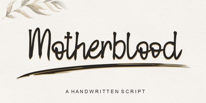 Motherblood is a sweet and friendly handwritten font. Its natural and unique style makes it incredibly fitting to a large pool of designs. The only limit is your imagination!
 - Flintoye by Illushvara,
$10.00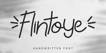 Flintoye is a sweet and friendly handwritten font. Its natural and unique style makes it incredibly fitting to a large pool of designs. The only limit is your imagination!
 - Majestic Valentine by Seemly Fonts,
$12.00 Majestic Valentine is a tall and sweet font. Its natural and unique style makes it incredibly fitting to a large pool of designs. The only limit is your imagination!
 - Georado by Balpirick,
$15.00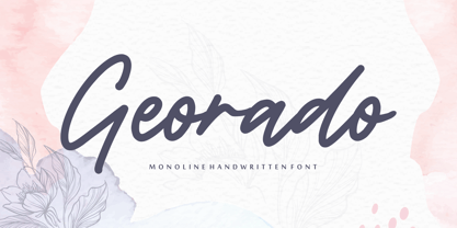 Georado is a sweet and friendly handwritten font. Its natural and unique style makes it incredibly fitting to a large pool of designs. The only limit is your imagination!
 - Love Radiate by Seemly Fonts,
$12.00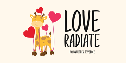 Love Radiate a joyful and casual handwritten font. Its natural and unique style makes it incredibly fitting to a large pool of designs. The only limit is your imagination!
 - Pattaya by Larin Type Co,
$12.00 Modern script font inspired by summer, airy and attractive, Pattaya will fit perfectly into any project and decorate it. Alternates and ligatures will help to make it more natural.
 - Easter Discover by Seemly Fonts,
$14.00 Easter Discover a joyful and casual handwritten font. Its natural and unique style makes it incredibly fitting to a large pool of designs. The only limit is your imagination!
 - Derivation by Seemly Fonts,
$12.00 Derivation is a sweet and friendly handwritten font. Its natural and unique style makes it incredibly fitting to a large pool of designs. The only limit is your imagination!
 - PykesPeakZero - 100% free

- Be Kind by Seemly Fonts,
$12.00 Be Kind is a sweet and simple handwritten font. Its friendly feel makes this font incredibly versatile, fitting a wide range of contexts. Add it to your creative ideas and notice how it makes them stand out!
 - Perfect Day by Hanoded,
$15.00 Perfect Day is a stylish handmade font: it is cute, neat and happy. I can’t guarantee that this font will make your days perfect, but you can give it a go and see where it takes you!
 - Funny munk by Sipanji21,
$15.00 Funny Munk - Cute and Thick display Font, Its friendly for design, kid store, seasonal party or banner, fitting a wide range of contexts. Add it to your creative ideas and notice how it makes them stand out!
 - Cute Lime by Sipanji21,
$10.00 Cute Lime is a bold and colorful display font. Its friendly feel makes this font incredibly versatile, fitting a wide range of contexts. Add it to your creative ideas and notice how it makes them stand out!
 - Super Kids by Stringlabs Creative Studio,
$29.00 Super Kids is a playful, and quirky display font. Its friendly feel makes this font incredibly versatile, fitting a wide range of contexts. Add it to your creative ideas and notice how it makes them stand out!
 - Banyu langits by Stringlabs Creative Studio,
$29.00 Banyu Langits is a cute and quirky display font. Its friendly feel makes this font incredibly versatile, fitting a wide range of contexts. Add it to your creative ideas and notice how it makes them stand out!
 - Avenus Type by Stringlabs Creative Studio,
$29.00 Avenus Type is a cute and quirky display font. Its friendly feel makes this font incredibly versatile, fitting a wide range of contexts. Add it to your creative ideas and notice how it makes them stand out!
 - a Morris line by JOEBOB graphics,
$9.00 Here's a Morris line; a traditional and legible font in small sizes, but almost abstract in big sizes. Named after my son Morris and it's got nothing to do with a certain musical...
 - TT Fellows by TypeType,
$39.00 TT Fellows useful links: Specimen | Graphic presentation | Customization options There can't be too many universal fonts! Meet TT Fellows, a new workhorse whose functionality allows you to comfortably use the font in a variety of projects. Calm and neutral at first glance, the mood of TT Fellows can change. Working with the typeface, you can reveal its soft and friendly nature, or even the brutal one, for example, by typing the text exclusively in capital letters in the bold style. TT Fellows is easy to use and perfect for setting large text arrays. Thanks to the font's uniwidth and versatility, the font is ideal for use on websites or in periodicals. Bold styles will work harmoniously in headlines or as accents in print or on packaging. TT Fellows is a humanist sans serif with a mechanical touch. With its open shapes, the friendly neutral character of thin weights and an even softer character in bold weights, the new typeface differs in character from the classic TT Norms® and TT Commons sans serifs, while still offering the same functionality. Calm regular styles differ from bold, deliberately display and more expressive ones. By the way, TT Fellows is a unwidth typeface. It was important for us that the user could change the styles, knowing that the layout will not suffer. The typeface features equal width proportions, open apertures, and slightly squared ovals, which associatively brings it closer to other popular modern fonts. Since the idea of the typeface was focused on it being a uniwidth typeface, we needed to fit the bold styles into the regular em squares, which led to interesting graphic solutions that are noticeable, for example, in the k and ж characters, in which the branches are cut directly into the stems. TT Fellows consists of 19 styles: 9 upright, 9 italic and 1 variable, each with over 700 glyphs. The font has 26 useful OpenType features. For example, there is a switch to single-part versions of letters a and y, fractions, tabular characters, case versions of punctuation, and localized versions of characters for different languages. There is a ligature for a combination of two characters of a complex design fl. TT Fellows font field guide including best practices, font pairings and alternatives.

