10,000 search results
(0.157 seconds)
- Linotype Feltpen by Linotype,
$29.99Linotype Feltpen is part of the Take Type Library, chosen from the contestants of Linotype’s International Digital Type Design Contests of 1994 and 1997. This fun font was designed by the Swedish artist Lutz Baar with clear, light forms. The spontaneous, even letters seem to have been written with the felt pen from which the font takes its name. Linotype Feltpen is available in two weights, regular and medium, both suitable for short and middle length texts and medium for headlines as well. - Cavello by XdCreative,
$20.00 Cavéllo is a bold and clean slab serif font. This original look will appeal to a wide range of crafty ideas, from letterheads and titles, to stationery. Cavéllo the font family contains 3 basic forms: italics, obliques and uprights, Each of which has 4 different weights: light, regular, semi-bold and bold. Cavéllo slab serif font family ideal for the logos as well, t-shirts, the web as well as for print, for motion graphics, It is also great for headings,
 - Jownsey by Maulana Creative,
$12.00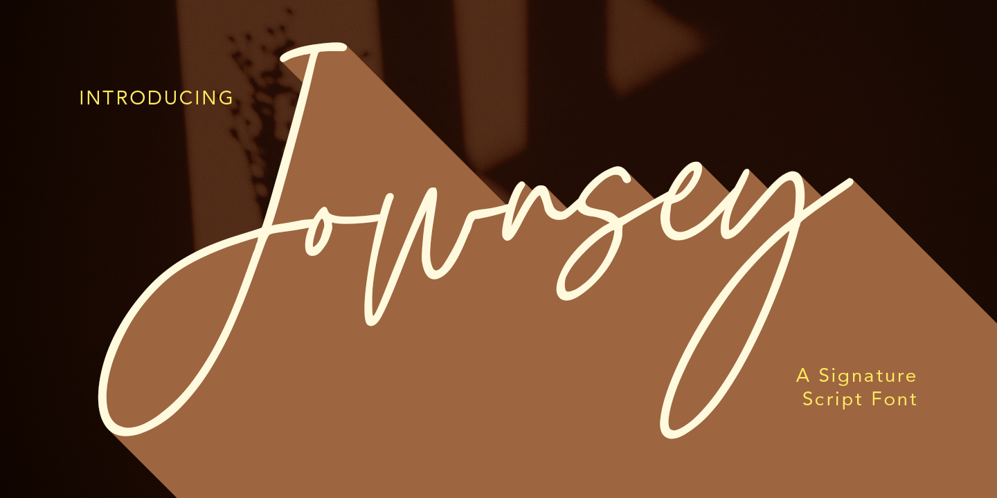 Jownsey is a casual signature cript font, with a light mono-line stroke, slant and fun character. It has Opentype features ligatures of character, To give you an extra creative work. Jownsey signature script font support multilingual more than 100+ language. This font is good for logo design, Social media, Movie Titles, Books Titles, a short text even a long text letter and good for your secondary text font with sans or serif. Make a stunning work with Jownsey font. Cheers, MaulanaCreative
 - Byte 105 by Talbot Type,
$15.00 Byte 105 is a modular font, resulting from experiments in creating a practical, legible font from a minimum set of geometric components on a uniform grid. It has full upper and lower case character sets and includes all accented characters for Western and Central European languages. It's available in three styles – 105, 205 and 305. Each style has different corners, 105 is square, 205 is bevelled and 305 is round. Each style is available in three weights, Light, Medium and Bold.
 - Birdflocks by Maulana Creative,
$11.00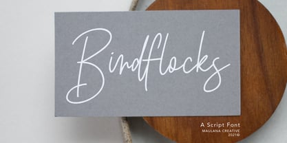 Birdflocks is a handwritten script font, with light mono-line stroke, slant and fun character. It has Opentype features ligatures of character, To give you an extra creative work. Birdflocks handwritten script font support multilingual more than 100+ language. This font is good for logo design, Social media, Movie Titles, Books Titles, a short text even a long text letter and good for your secondary text font with sans or serif. Make a stunning work with Birdflocks font. Cheers, MaulanaCreative
 - Elgraine by Nasir Udin,
$25.00 Elgraine is a serif typeface inspired by the beauty of classic serif and calligraphic style, fused with modern touch. Ranging from thin to black with its matching italics, Elgraine offers many possibilities to be applied in many graphic or editorial projects. The light and regular weights are suitable for long paragraph, and the heavier weights are perfect for striking headlines, perfectly suitable for display purpose such as branding, editorial, and packaging. Elgraine has extended latin character set that supports 200+ latin-based languages.
 - FF Tibere by FontFont,
$41.99 French type designer Albert Boton created this serif FontFont in 2003. The family has 7 weights, ranging from Light to Bold (including italics) and is ideally suited for book text, film and tv, editorial and publishing as well as small text. FF Tibere provides advanced typographical support with features such as swashes, ligatures, small capitals, petite capitals, alternate characters, and case-sensitive forms. It comes with a complete range of figure set options – oldstyle and lining figures, each in tabular and proportional widths.
 - Alternox by Asenbayu,
$12.00 Alternox fonts is a new futuristic multipurpose sans serif font family with sophisticated geometric shapes. You can use it in a modern, clean and professional design. This font is perfect for your various projects such as logos and brand identity, technology, business cards, web, stationery, displays, sports and more. Alternox fonts feature opentype, kerning, ligatures and alternates packed in 6 fonts: ExtraLight, Light, Regular, SemiBold, Bold, and ExtraBold. Alternox fonts include uppercase letters, lowercase letters, numeral, punctuation and multilingual support.
 - Byte 305 by Talbot Type,
$15.00 Byte 305 is a modular font, resulting from experiments in creating a practical, legible font from a minimum set of geometric components on a uniform grid. It has full upper and lower case character sets and includes all accented characters for Western and Central European languages. It's available in three styles – 105, 205 and 305. Each style has different corners, 105 is square, 205 is bevelled and 305 is round. Each style is available in three weights, Light, Medium and Bold.
 - FF Turmino by FontFont,
$41.99 German type designer Ole Schäfer created this sans FontFont in 2002. The family has 6 weights, ranging from Light to Black and is ideally suited for advertising and packaging, editorial and publishing as well as sports. FF Turmino provides advanced typographical support with features such as ligatures, alternate characters, case-sensitive forms, fractions, super- and subscript characters, and stylistic alternates. It comes with a complete range of figure set options – oldstyle and lining figures, each in tabular and proportional widths.
 - Dupla by Tipo Pèpel,
$22.00 When Dupla was designed, its DNA shown the best of the typographic heritage from the XIX century types, the oldest san serif known, also named as “Grotesk”, a soft synonym for bizarre, unnatural weird. XIX century Germans' eyes were surprised, astonished by the formal strangeness that provoked the mutilation of the well known serifed types. But the skeleton and DNA are barely perceptible, an invisible part of the nature of objects. We are interested in the epidermis, the outer, the visible, which directly speak to the eyes, and Dupla tells us with overwhelming presence, that is a formal, traditional type, covered with a childlike sweetness, with slight curves, epidermic, sweetening even ink’s traps up. Frutiger said that Latin alphabet letter’s minimum skeleton is like a lock where you should fit all the letters you see, but that skeleton allows many skins. We use a different skin for every specific use. And Dupla’s skin points to how generous, how friendly it is; the sweetness of the big and good-natured. They do not feel very comfortable in low-cost airplanes company’s seats, but in the proper location with enough room, they'll fill the atmosphere with kindness. Do not ask for narrow columns, or terse captions in squalid sizes; do not ask for ridiculous “small print” in dark contracts where «The party of the first part shall be known in this contract as the party of the first part …» That’s not for Dupla. Large headlines, generous width columns to cover, rude pullquotes half-breaking columns, loud exclamations, great sizes, with black weights. It’s in the insultingly generous, almost obscene use where Dupla is felt. And if you consider this a obscene, gargantuan, typographical feast, Dupla brings you everything to demonstrate that quantity does not mean less quality. Multi-language support, Latin plus full coverage, complete sets of small caps, fractions, old numerals, modern, tabular, bonds and all the “gourmet” paraphernalia that Patau has accustomed us, after many years of work. If you want to be obscene and pass the censorship, use Dupla. Hedonism is just a venial sin.
 - LT Marathon - 100% free

- From Where You Are - Personal use only

- PiS Coffins and Ghosts - Unknown license

- Cone Of Silence - Unknown license

- WC Rhesus A Bta - Unknown license

- Florentine SwashCaps - Unknown license

- Folk Solid - 100% free

- Decade Nouveau JNL by Jeff Levine,
$29.00 Decade Nouveau JNL is based on examples of an Art Nouveau wood type with a bit of Latin/Western typographic flare, and yet it is also reminiscent of the style's revival during the hippie movement of the 1960s.
 - Strata by Just My Type,
$25.00 Big, expansive and flat on top; that’s a land formation called a mesa. “Mesa” was the first name for Strata Bold Rounded Serif, but it turns out it’s someone else’s registered trademark; in any case, if you need a bold, extended mono-height font that’s great for logotype, you could, as we used to say in the Mid-West, do a whole lot worse. SBRS is the final generation of an evolution that started with Mesa begating Mesa Bold which begat Mesa Bold Rounded which culminated in this evolutionary superior product. Use it!
 - Borden by La Boîte Graphique,
$25.00 Borden is a rounded hand-printed caps font ideal for your graphic project. Usage recommendations : Title, short text, children’s book, poster, book cover, brochure, label, magazine. "The friendly hand-drawn charms of the Borden family […] Designed by Ewen Prigent, the Borden family is a hand rendered, all-caps design ideal for all sorts of playful settings. With its narrow condensed letterforms and rough rendering, this family is a good fit when space is limited in your design but you don’t want to compromise its friendly tone." www.fonts.com - newsletter - march 2014
 - Sys 2.0 by FSD,
$60.27Sys is a condensed font designed to work well at small sizes (i.e. phone books, maps, or the like) but it has enough personality to be used at big sizes, too. The TrueType version, thanks to its incredibly accurate hinting, may be used to replace amazingly well TrueType system fonts in every platforms, in web or other screen applications. After the succcess by the first version designed ten years ago, the version 2.0 has numerous improvements in the design of the glyphs, new Unicode ranges, useful OpenType features and enhanced readability. - Partenkirchen NF by Nick's Fonts,
$10.00In Lewis F. Day’s 1910 classic, Alphabets Old and New, the author presented the inspiration for this typeface as an example of German monumental lettering, most likely to suggest not that the typeface was really big, but that it had been found on German monuments. Bold yet charming, the face takes its name from a picturesque village in the Bavarian Alps which was the ancestral home of the Gröbl line of Curtii forebears. Both versions of this font include the complete Latin 1252 and CE 1250 character sets, with localization for Romanian and Moldovan. - Urban Tour by Roland Hüse Design,
$10.00 -This font has been basically designed for poster display in black weight and big size (mostly for capital letters). The rest of the family is a derivative work of it. I can’t guarantee if it works well on small size print. -Future updates may follow in the near future or on request. Please feel free to contact me via rolandhuse@aol.com about the following: -This family does not contain all the language extensions, but I am willing to create any extensions (including Cyrillic) on request; - Discovering kerning problems while using; Or any other question.
 - VanderHand by JOEBOB graphics,
$29.00 The 'VanderHand' font is a friendly and easy to use handwritten font. It is so loaded with ligatures it could easily pass for actual handwriting. The font was created with a felt-tip brush pen and so there are natural thick and thin parts in the characters. All writing was done upright with tightly fit characters. As a result this font has a unique 'instant logo' quality. But you should really try this out for yourself. O, and the font was written by Jeroen van der Ham. It's his handwriting. That's why it's called VanderHand.
 - MN Grissee by Mantra Naga Studio,
$20.00 MN Grissee - a Sans Serif Super Family Font. This typeface has many alternatives with swashes that can make your lettering/logotype more attractive. This font is suitable for logos and various other formal forms, such as invitations, labels, logos, magazines, books, greeting/wedding cards, packaging, fashion, makeup, stationery, novels, labels, or advertising. This font is PUA encoded, which means you can access all of the glyphs and swashes with ease! 436 Glyphs 9 Opentype features 10 Ligatures, Stylistic Set and Swash 3 Widths (Condensed, Normal, Expanded) 8 Weights (Thin, Extra Light, Light, Regular, Medium, Semibold, Bold, Extrabold) 2 Styles (Regular & Italic) Support Multilingual for 89 languages We highly recommend using a program that supports the OpenType feature and the Glyphs pane like many Adobe and Corel Draw applications, so that you can view and access all variations of Glyphs. Thanks for your support of our product and using it in your project.
 - Ver Army - Unknown license

- Khatt by Arabetics,
$39.00 Khatt tries to mimic the concept behind the meaning of the Arabic word Khatt: a straight horizontal line. The word Khatt is also the word for calligraphy in the Arabic language. Even though Khatt is a cursive style font it offers clearly distinguished and visually unified letter shapes in every position of a word. Khatt supports all Arabetic scripts covered by Unicode 6.1, and the latest Arabic Supplement and Extended-A Unicode blocks, including support for Quranic texts. It comes with five weights, regular, medium, bold, light, and ultra-light. Each weight has normal and left-slanted “italic” styles. The script design of this font family follows the Arabetics Mutamathil Taqlidi style and utilizes varying x-heights. The Mutamathil Taqlidi type style uses one glyph per every basic Arabic Unicode character or letter, as defined by the Unicode Standards, and one additional final form glyph, for each freely-connecting letter in an Arabic text. Khatt includes the required Lam-Alif ligatures in addition to all vowel diacritic ligatures. Katts’s soft-vowel diacritic marks (harakat) are positioned with most of them appearing on similar lower or upper positions to emphasize they are not part of letters.
 - Bodrum Style by Bülent Yüksel,
$19.00 "Bodrum Style" is a serif Style family designed by Bülent Yüksel in 20018/19. The font, influenced by serif styles that were popular in the 1920s and 30s, is based on optically corrected geometric forms for a better readability. "Bodrum Style" is not purely geometric; it has vertical strokes that are thicker than the horizontals, an “o” that is not a perfect circle, and shortened ascenders. These nuances help the legibility and give "Bodrum Style" an harmonious and sensible appearance for both texts and headlines. Bodrum Style provides advanced typographical support for Latin-based languages. An extended character set - supporting Central, Western and Eastern European language - rounds up the family. “Bodrum Style 14 Regular” forms the central point. "Bodrum Style" is available in 10 weights (Hair, Thin, Extra-Light, Light, Regular, Medium, Bold, Extra-Bold, Heavy and Black) and 10 matching italics. The family contains a set of 650+ characters. Case-Sensitive Forms, Classes and Features, Small Caps from Letter Cases, Fractions, Superior, Inferior, Denominator, Numerator, Old Style Figures just one touch easy In all graphic programs. Bodrum Style is the perfect font for web use. Enjoy using it.
 - Sangli by insigne,
$- It started in 2007 with Chennai, the first of a three-part series of sans that I envisioned with slab serif counterparts. Each font would differ from the others in how the stem terminals were expressed. The initial font was extremely well received, and a revitalized and remastered Chennai made its appearance two years later, complete with new weights and new, novel OpenType features. Then came Madurai, a variation of Chennai based on the same core, only without the rounded stems. Chennai’s rounded stems made it distinctive and great for headlines but left it lacking appeal as copy--a problem that Madurai easily solved. And now comes Sangli, the final iteration of my original 2007 vision. Sangli is a happy medium. Like Chennai, it’s great for headlines--but not too distinct for copy. Sangli keeps the same core structure as the other two, but new less sharp forms give this latest font a friendlier look that’s more versatile than the original Chennai and less formal than Madurai. The font includes a whole range of six weights from light to black, along with condensed and extended options as well for a total of 54 fonts. There are plenty of OpenType features, including small caps. Alternates include normalized capitals and lowercase letters that include stems for when you want a more traditional look or when you’re writing copy. Sangli also supports over 70 languages that use the extended Latin script. Use Chennai, Madurai, and their slab serif variants interchangeably with Sangli, too, for even more options in your work. All three complement one another well. So when you need a balanced font that stands boldly on the page and commands your reader’s attention, look within and find your Sangli.
 - Scriptina Pro - 100% free

- Amerika Pro - 100% free

- Carrigallen Display by Tony Fahy Font Foundry,
$20.00 The Carrigallen family of fonts has roots in Megalithic and Celtic Ireland. It has six weights—Light, Regular and Bold and their corresponding italics. The distinctiveness of the Carrigallen family, is in it's sculpted, spiral nature, inspired by the graphics at the entrance stones and kerbstones at the Newgrange passage graves in Ireland. This is where it derives it’s decorative nature and suitability, as a very distinct Display font. Exceptionally suited for Logos and Headlines, it can increase the corporate presentation of a company as its main identifying feature—and with high memorability! The three separately designed letterforms—differing in line weight—are held in place by the white space within and without the character giving a distinctive twenty first century flavour! It is this dynamic that makes the font unique! Carrigallen Display is a modern font. It draws from its nomadic influences allowing it to be culturally representative of all languages.
 - PT Spaghetti by Paupe Type,
$10.00 PT Spaghetti is a display font inspired by Spaghetti Western films but with a playful twist given by big serif and high contrast.
 - Scandal by Haiku Monkey,
$10.00Scandal is a handwriting font that is meant to sit big and bold on the page, calling all kinds of attention to itself. - Nutmeg by W Type Foundry,
$25.00 Nutmeg is a geometric typeface with a slight flavored touch. Although its structure is stick to the traditional forms, its details transform this typeface in a boldly project that separates it from other geometric fonts. Nutmeg’s texture can be perceived as a clean typeface that is comfortable to the human eye, furthermore, if you use it in big sizes Nutmeg’s details can be seen as a display font. Under these two ways of perceiving this typefamily, we took the decision of split this type project in two families: a cleaner and more rational Nutmeg versus a Headline version that has more flavored details at the end of the characters. Designed with powerful OpenType features in mind, each weight includes alternate characters, ligatures, fractions, special numbers, arrows, extended language support and many more… Perfectly suited for graphic design and any display/text use. The 36 fonts are the first part of a larger Nutmeg family. We’re proud to introduce: Nutmeg. Learn about upcoming releases, work in progress and get to know us better! On Instagram W Foundry On facebook W Foundry wtypefoundry.com
 - Magnesit Stencil by Rekord,
$22.00 Sporty and brawly, Magnesit Stencil creates impact everywhere it lands. Impressive headlines are its specialty, but it feels right at home used in packaging, branding and poster design. With a very tall x-height, wide language support and minimalistic yet playful appearance, it can take on any serious typographic job. Four distinct styles expand the possibilites even further: the straight to the point Regular, the friendly Soft and the determined Hard styles share metrics across related Magnesit and Magnesit Dark families, so you can mix and match to achieve exactly the effect you need. The SuperSoft style unique to the Magnesit Stencil family carries the concept to the extreme, mixing soft organic curves with rigid modularity inherent to stencil signage. Magnesit Stencil works great with illustrations, the generous shapes can be easily filled with strong imagery to great effect. Based on the best-selling Grim, Magnesit is a vast improvement of the concept with long awaited addition of lowercase, reworked proportions, spacing and kerning, expanded language support and useful icons to satisfy even the most demanding typographers’ needs.
 - FF Kaytek Headline by FontFont,
$50.99 Kaytek™ Headline completes the Kaytek typeface family with seven weights optimized for display purposes. Like the Kaytek Sans it is a fresh take on the correspondence typefaces of the 90s - which were originally designed for the demands of office environments. Just like its predecessors, this text typeface is robust and hard-working - meaning it works well in challenging design or printing environments - but it’s not without personality. Look closer at the lowercase g and a, especially in the italic, and you can see some unexpected elements of subversiveness within the design Every style of the typeface takes up exactly the same amount of space, thanks to the careful creation by Radek Lukasiewicz. This means designers can switch between styles without the text being reflowed, making it particularly useful in magazines, where space might be limited, and also on the internet, where hover links appear in a different style Kaytek Headline comes in seven weights, from Thin to ExtraBlack. Kaytek Sans, Kaytek Slab, and Kaytek Rounded, are also available.
 - Shocka Family by Skinny Type,
$23.00 Shocka Family is a confident serif. Designed to reflect nature, it creates a sense of softness and natural expression. We pushed the concept in a usability-focused direction, to work as a bold tool and a beautiful communicator. Variable Shocka enables fluid design in 9 weights, italics and 2 styles with major latin based languages. The right slant advances aesthetics, brings energy and makes it suitable for modern designs. The type family blends organic curves and soft repetition into strong and harmonious types. At large dot sizes you can appreciate the shape of the letters, while the same control and focus creates an even texture for small dot sizes and long reads. Fonts extend their use by giving weights ranging from light to black. The natural curve, a swollen and sloping stem, grows in character as the font gains weight. While the thinner weight has lowered contrast and optical correction to create a warm and soft look. The Shocka Family character set combines additional symbols, style alternatives, unique binding, and case sensitive punctuation - resulting in a stable, hard-working family ready to tackle projects of any size. I can't wait to see what you do with Shocka Family! Feel free to use the #Skinny_Type and #Shocka Family font tags to show what you've done visit my Instagram : https://www.instagram.com/skinny.type/ Thank you!
 - Bucintoro by Three Islands Press,
$24.00Bucintoro is a modern version of the rotunda blackletter, the Gothic book hand of Italy and Spain in the 14th, 15th, and 16th centuries. As the name implies, it's more "rotund" than the tall, angular Textur blackletter used in Germany that Gutenberg imitated. While the use of blackletter continued far into the 20th century in Germany and Scandinavia, the rotunda gave way to roman (and later also italic) letterforms in Italy, France, and Spain. It's less well known these days. Bucintoro has upper- and lowercase alphabets, numerals, punctuation, diacritics but lacks such modern characters as currency symbols. Has light, medium, and black weights.


