10,000 search results
(0.032 seconds)
- Decorative Arrows JNL by Jeff Levine,
$29.00 Decorative Arrows JNL is a collection of twenty-six decorative arrows provided in right and left facing directions.
 - Handsome by CastleType,
$39.00 A collection of over 30 antique style hands; the typeface includes the hands facing both right and left.
 - I Love Summer by Seemly Fonts,
$12.00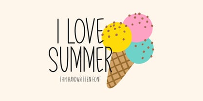 I Love Summer is a sweet and friendly handwritten font. Its natural and unique style makes it incredibly fitting for a large pool of designs. The only limit is your imagination!
 - Harmony by Solotype,
$19.95A handsome German art deco design that fits in well with other types of the 1920s and 1930s. Originally without a lowercase, so we drew one for it, extending its usefulness. - Shaimus by Larin Type Co,
$12.00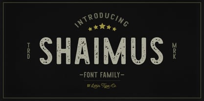 Shaimus is a multi-purpose and very legible font family. It will fit perfectly in a vintage and modern styles. It is great for creating logos, layouts, templates, advertisements and more.
 - Crafty Notes by Illushvara,
$12.00 Crafty Notes is a clean, thin and simple handwritten font. Its natural and unique style makes it incredibly fitting to a large pool of designs. The only limit is your imagination!
 - Svelte by Eko Bimantara,
$19.00 Svelte is condensed serif family. Its consist of upright styles from Regular to ExtraBold. Fit for display, short text, and stacked typesetting. Its contain 394 glyphs with broad latin language coverage.
 - Maron American by Zeenesia Studio,
$12.00 Maron American is a sweet unique and natural handwritten font. Its unique and neat style makes it incredibly versatile, fitting a wide range of designs. The only limit is your imagination!
 - DejaVu Sans Mono - Unknown license

- DejaVu Serif - Unknown license

- DejaVu Serif Condensed - Unknown license

- Roundabout by URW Type Foundry,
$35.99 Roundabout is a typeface that is extracted from an ellipse shape. Each and every character started at the same geometrical figure. By cutting it up in sections, twist and rotate the separate characters could be build. The ellipse provides this typeface with evident and smooth looking features. The name Roundabout is misleading, an ellipse is not round. But the word Roundabout has a nice ring to it and it seems to fit this typeface perfectly. The Roundabout as we know it is a place where the traffic circles. Sometimes in the greater metropoles it jams like clotting veins. Various exits are presented for those who know which way to go, for those who don’t it seems an eternal treadmill. Unlike my typeface, that seems rather careless, light weighted and knows her way around. A roundabout in a child’s mind is a playful carrousel or a merry go round. Merry go round has the sweetest sound and a match is found. My Roundabout is a joyful, optimistic and open typeface, which can be used over and over and over again for many or any purposes. ----- Roundabout ist eine Schrift die aus der Form einer Ellipse entstand. So teilen alle einzelnen Zeichen denselben geometrischen Ursprung. Durch das zerteilen, verdrehen und verflechten der elliptischen Grundform konnten die separaten Zeichen so geformt werden, dass sie einen klaren und weichen Charakter erhielten. Der Name Roundabout scheint auf den ersten Blick etwas irreleitend - ist eine Ellipse ja nicht wirklich rund. Er hat aber einen schönen Klang und doch eine tiefe Verbindung zu dieser Schrift. In unseren Gedanken ist Roundabout ein Kreisverkehr: Manchmal, in großen Städten, kann er blockieren, so wie eine verstopfte Ader. Verschiedenste Auswege zeigen sich denen, die ihr Ziel kennen; für alle anderen erscheint dieser Ort wie eine endlose Schlaufe. Dieses Bild widerspricht dem Auftreten meiner Schrift, welche eher sorglos und leichtfüßig ist; sie kennt ihren Weg. In dem Kopf eines Kindes jedoch ist ein Roundabout ein verspieltes Karussell, ein „merry go round“. ,,Merry go round“ klingt bezaubernd und so fiel die Entscheidung. Meine Roundabout ist eine fröhliche, optimistische und offene Schrift, die immer und immer wieder genutzt werden kann, zu jedem erdenklichen Zweck.
 - Terafile by Sudtipos,
$39.00 Terafile, a sans serif family designed by Raúl Plancarte who was inspired by hi-tech aesthetics. It is made up of eight weight variants with their respective italic versions. Ideally it works to capture in a graphic way the universe related to technology, sci-fi, industry and similar topics. It is a mixed family, because the construction of certain letters (as in "a", "f", "z", "B", "P", among others) is enriched with different finishes in structure to gain differentiation and plasticity. In other words, it moves away from an entirely academic design. Another important line in the creative concept of this typeface is the function of its ink traps, which, in addition to fulfilling their primary function, serve to gain gestuality in its use. This font is capable of covering complex design needs by enabling association with specific themes, which makes it highly competitive in its graphic line.
 - KG One Thing by Kimberly Geswein,
$5.00 This font is super bubbly and round. It is neat enough to be legible but still has personality.
 - St Lorie by Stereotypes,
$29.00 St Lorie is inspired by handmade lettering in logos, but it was drawn completely by the digital method.
 - Able by T-26,
$39.00The history of Able’s connection with the Harry Potter phenomenon is really up in the air. It’s a catch-22 in this business - you either promote your own work and negotiate expensive exclusive licenses, or you work with a promoter and sell your designs to anyone and everyone. It could have been an in-house designer at Rowling’s publisher, Scholastic, or a freelancer who proposed Able for the headings and such. The responsible party licensed it from T26, and JK Rowling’s storytelling made it a star. (I suppose it’s ironic that there’s a whole lot of unwritten history in the typography business.) Able’s rise to fame really is a classic love story between reading and type design. If the books weren’t so popular, Able might still be waiting for some Mexican fast food chain to pick it up for packaging design. The movie deal certainly made the font all the more recognizable, what with its merchandising campaign. Popularity can also cripple a great decorative face. It’s always being recognized as “The Harry Potter Font.” It might just have to wait a few decades for the Potter phenomenon to subside to be freed from the “Chamber of Pigeonholed Fonts.” In the meantime, I’m sure that a lot of fledgling graphic design apprentices are reading their new Potter books, being charmed by the idea of type design when they’re not turning the pages too fast to notice. - Averta by Intelligent Design,
$15.00 Bringing together features from early European grotesques and American gothics, Kostas Bartokas’ Averta (Greek: ‘αβέρτα’ – to act or speak openly, bluntly or without moderation, without hiding) is a new geometric sans serif family with a simple, yet appealing, personality. The purely geometric rounds, open apertures, and its low contrast strokes manage to express an unmoderated, straightforward tone resulting in a modernist, neutral and friendly typeface. Averta is intended for use in a variety of media. The central styles (Light through Bold) are drawn to perform at text sizes, while the extremes are spaced tighter to form more coherent headlines. The dynamism of the true italics adds a complementary touch to the whole family and provides extra versatility, making Averta an EXCELLENT tool for a range of uses, from signage to branding and editorial design. Take advantage of Averta’s extended OpenType features including alternate glyphs, small caps, fractions, case sensitive forms, contextual alternates, oldstyle and lining (proportional and tabular) numerals, small cap numerals, numerators/denominators, superiors/inferiors, and a variety of symbols. Averta comes in eight weights with matching italics and supports over two hundred languages with an extended Latin, Cyrillic (Russian, Bulgarian, and Serbian/Macedonian alternates), Greek and Vietnamese character set. It ships in three different packages offering different script coverage according to your needs: Averta PE (Pan-European: Latin, Cyrillic, Greek), Averta CY (Latin and Cyrillic), and Averta (Latin and Greek). Averta's Cyrillic have received the 3rd Prize in the 2017 Granshan Awards in the Cyrillic Category.
 - Elido by Kontour Type,
$50.00 Elido (Odile in reverse) is the sans counterpart to the Odile type. Together they form a sans/serif superfamily with a wide range of variations for editorial use. Elido follows Odile’s proportions and matches the weight and typographic color of its serif twin. Elido is a sans with classical proportions. A slight geometric hint and open counters convey an airy feel. Elido’s family structure and relations within echo the conceptual approach of Odile. The arched stroke low off the stem reveals a script characteristic most pronounced in the Elido Upright Italic. This particular interpretation is gradually diminished in the Italic and becomes even less emphasized in the Regular. Six balanced weights, from an elegant Light to a pronounced Black, are in tune with three display solutions and a set of beautiful Ornaments. These variants allow for a diverse and multifaceted typography for the discerning type user. Sans serif initials amount to a rare finding. The charming monolinear Elido Initials come in two flavors, elaborate and rational, designed to hold their own in editorial and headline sizes. This type design boasts an extensive character set, many OpenType features including roman and italic Small Caps, five sets of numerals, beautiful ligatures, and many more. OT stylistic variants (with accents) offer a one-story “a” for the roman weights, alternate “g” and “s” designs for the italics, and a variant glyph “s” for the Upright Italic. These distinct qualities with its versatile and sincere traits make Elido an excellent choice for text and display use.
 - Monologous by Comicraft,
$49.00 From A to B, or not to Z: that is the question mark: whether 'tis nobler in the mind to kern with the left and right arrows of outrageous keyboards, or to take arms against a sea of ' thought bubbles,' and by opposing, burst them? To sigh, with those little fireflies: to sleep; No more; and by sleep that is to say we end each line of dialogue with 'zzzzz;' The heart-shapes and the thousand drops of sweat popping off my forehead that sight of flesh is sure to produce, 'tis a consummation devoutly to be letter'd. To die with still at least five balloons of dialogue, to sleep; perchance to flashback to a scene in a previous issue while a picture of my head floats in the corner of each panel: ay, there's the rub; 'Nuff Said.
 - Tim Sale by Comicraft,
$39.00 If you're familiar with the work of Eisner Award winning artist Tim Sale, you'll also be familiar with the soft curves and hard edges of the characters he brings so vividly to life in the pages of GRENDEL, BATMAN and SUPERMAN. Now you can get to know a selection of the characters Tim has been working on his whole life, and Comicraft has been kind enough to arrange them in alphabetical order for you! Based on Tim's own hand lettering work in the lost Dark Horse classic, BILLI 99, the Tim Sale font brings together the class and finesse of Hunter Rose, the elegance and charm of Bruce Wayne and the honesty and trustworthiness of Clark Kent. Don't go into the big city alone at night without it. See the families related to Tim Sale: Tim Sale Lower & Tim Sale Brush.
 - Ark Monogram SG by Spiece Graphics,
$39.00 Ark is a combination monogram set based on the ATF Virkotype design. By combining variously shaped characters, you can produce initials within an oval frame. Just select a left-hand letter, a center letter, and a right-hand letter. Then place all three on an oval frame of your choice. Great for stationery and company logos. The Ark Monogram Set comes with easy-to-read instructions and a useful character map. Additional alternate characters have been provided for better identification and letter fitting within each font. Ark Monogram is now available in the OpenType Std format. Some new stylistic alternates have been added to this OpenType version. Advanced features work in current versions of Adobe Creative Suite InDesign, Creative Suite Illustrator, and Quark XPress. Check for OpenType advanced feature support in other applications as it gradually becomes available with upgrades.
 - Heimat Sans by Atlas Font Foundry,
$50.00 Heimat Sans is the grotesque typeface family within the Heimat Collection, also containing Heimat Didone, Heimat Display, Heimat Mono and Heimat Stencil. Heimat Sans is a legible typeface family designed for contemporary typography, especially for use in headlines and on posters, but also for reading purposes. It combines an idiosyncratic appearance with the feeling of a grid-based letter construction of the late 20s. Since the design might be too extreme for some applications, Heimat Sans character set provides two alphabets, the regular one plus an alternate design that comes across as less suspenseful. Heimat Sans [732 glyphs] comes in six weights and contains an extra set of alternate glyphs, many ligatures, lining [proportionally spaced and monospaced], hanging [proportionally spaced and monospaced], positive and negative circled for upper and lower case, superior and inferior, fractions, extensive language support and many more OpenType features.
 - Heimat Stencil by Atlas Font Foundry,
$50.00 Heimat Stencil is the monospaced typeface family within the Heimat Collection, also containing Heimat Didone, Heimat Display, Heimat Sans and Heimat Mono. Heimat Stencil is a legible typeface family designed for contemporary typography, especially for use in headlines and on posters, but also for reading purposes. It combines an idiosyncratic appearance with the feeling of a grid-based letter construction of the late 20s. Since the design might be too extreme for some applications, Heimat Stencil’s character set provides two alphabets, the regular one plus an alternate design that comes across as less suspenseful. Heimat Stencil [684 glyphs] comes in six weights and contains an extra set of alternate glyphs, many ligatures, lining [proportionally spaced and monospaced], hanging [proportionally spaced and monospaced], positive and negative circled for upper and lower case, superior and inferior, fractions, extensive language support and many more OpenType features.
 - Heimat Mono by Atlas Font Foundry,
$50.00 Heimat Mono is the monospaced typeface family within the Heimat Collection, also containing Heimat Didone, Heimat Display, Heimat Sans and Heimat Stencil. Heimat Mono is a legible typeface family designed for contemporary typography, especially for use in headlines and on posters, but also for reading purposes. It combines an idiosyncratic appearance with the feeling of a grid-based letter construction of the late 20s. Since the design might be too extreme for some applications, Heimat Mono’s character set provides two alphabets, the regular one plus an alternate design that comes across as less suspenseful. Heimat Mono [684 glyphs] comes in six weights and contains an extra set of alternate glyphs, many ligatures, lining [proportionally spaced and monospaced], hanging [proportionally spaced and monospaced], positive and negative circled for upper and lower case, superior and inferior, fractions, extensive language support and many more OpenType features.
 - Enchanted Land DS by Sharkshock,
$125.00 The 2nd installment of the Enchanted Land family takes us on another medieval adventure, opting to completely rebuild instead of refining the legacy script. More emphasis was put into the undulating nature of the Uppercase characters and how they keep your eyes flowing. For this reason, straight lines and right angles are rarely used in favor of flamboyant terminals and wispy swashes. Lowercase characters, by contrast, adhere to a consistent model defined by its straightened edges and sharp corners. This script flirts with several old world styles but seeks only to borrow elements rather than completely emulate them. German Blackletter, Old English, Uncial, Victorian, it’s in there! Enchanted Land DS would work well in a book, video game, or medieval signage. This family is equipped with Basic Latin, Extended Latin, ligatures, punctuation, a few alternates, and kerning.
 - ALS Schlange Sans by Art. Lebedev Studio,
$63.00 Schlange is a rich typeface with rounded terminals. The family includes five sans serifs and five slab serifs in weights from ultra liight to bold. Schlange’s personality is determined by an open aperture and quite large lower case characters in comparison with the upper case set. Schlange’s personality is open and friendly, giving a text it’s used for a soft, warm appeal. Schlange will work well as a display type (think titles, short magazine call-outs, ad banners, and such), but it’s not a good choice for extensive bodies of academic text. Available in numerous weights, the typeface provides rich opportunities for mixing and matching and is great for typographic compositions. These qualities make Schlange a dream type for a packaging designer. It will feel at home in design for cosmetics or sweets, postcards, children’s books and menus.
 - Tape Back by Adam Ladd,
$5.00 The Tape Back family comes in three weights. Each are monoline in weight and have a modern yet slightly quirky appearance. It is informal but has some stability with its linear forms. The slant backwards makes it unique, and it displays well even for body text.
 - Blumenkind by Catharsis Fonts,
$15.00 Blumenkind is a fresh, bright, humanist script font radiating boundless optimism and friendly enthusiasm. Its strokes are based on the rounded triangle, which lends it a dynamic bounce and a confident human touch. It shines in a wide range of display and editorial applications, but excels in particular in the context of art, creativity, food, social events, and spirituality. Blumenkind is inspired by an instance of metal-strip lettering found on the B�rgermeister Kornmesser Siedlung residential building complex in Berlin from the 1960s. The font name, being German for �flower child�, aims to capture the positive zeitgeist of that time evident in the letters. Blumenkind comes with extensive language support, tight kerning, attractive ligatures, and subtly varied alternate shapes for some of the most commonly doubled letters � and all that in three linear weights and one calligraphic weight. Furthermore, a complementary version of the font (Blumenkind Alternate) is available, in which the overlapping tittles and accent marks of the original are replaced with more traditional free-floating marks. This font is dedicated to the miracle of medical science. Thanks to Georg Seifert, Rainer Scheichelbauer, and Michael Wallner for technical aid.
 - Kingdom Ink by Nathatype,
$29.00 Do you want to present an unforgettable design? We have the right display font for you. This is Kingdom Ink, a display font carefully crafted by our professional designers for the highest quality font. Its bold, prominent characters are perfect to add effects and certain characters to your designs. In addition, the professional, outstanding appearances of this font convey that it will leave amazing impressions to your audience. Some of the letters have swinging end wipes to look visually interesting. On the other hand, its aesthetic, low contrast shapes are inapplicable for small text sizes. Furthermore, you can enjoy the available features here. Features: Stylistic Sets Multilingual Supports PUA Encoded Numerals and Punctuations Kingdom Ink fits best for various design projects, such as brandings, posters, banners, headings, magazine covers, quotes, printed products, merchandise, social media, etc. Find out more ways to use this font by taking a look at the font preview. Thanks for purchasing our fonts. Hopefully, you have a great time using our font. Feel free to contact us anytime for further information or when you have trouble with the font. Thanks a lot and happy designing.
 - Trafit by Nathatype,
$29.00 Finding the right fonts for your projects is a challenge because improper fonts will deliver improper messages resulting in unprofessional appearances. Therefore, Trafit is here as your problem solver. This is Trafit, a perfect font to show luxury, class, and eternity. Trafit is an outstandingly designed stylish serif font. Its soft, clean lines and indentations show elegant impressions for your prominent designs. Its letter edges have hooks like the other serif fonts. The simple shapes and even sizes help to make it legible. Due to the great legibility, this font is applicable for any text sizes and length. In addition, you can enjoy the features available here. Features: Ligatures Multilingual Supports PUA Encoded Numerals and Punctuations Trafit fits best for various design projects, such as brandings, posters, banners, greeting cards, magazine covers, quotes, printed products, merchandise, social media, etc. Find out more ways to use this font by taking a look at the font preview. Thanks for purchasing our fonts. Hopefully, you have a great time using our font. Feel free to contact us anytime for further information or when you have trouble with the font. Thanks a lot and happy designing.
 - Moderately by Alex Jacque,
$35.00 Introducing Moderately, a chunky and friendly typeface that makes a bold statement. This high-impact font is specifically crafted for designers seeking a display typeface with presence, perfect for applications where large, expressive type is a must. The defining features of Moderately include a generous x-height, soft curves, and tight spacing, ensuring a punchy and fresh aesthetic. Moderately is a deliberate departure from your contemporary sans with nary a straight line to see, embracing the organic and dynamic qualities reminiscent of blocky Art Nouveau typefaces, notably inspired by the works of Alfred Roller. While drawing influence from psychedelic / Art Nouveau revival typefaces of the 1960s, Moderately strikes a contemporary balance, delivering a design that is both impactful and approachable. Each glyph in Moderately attempts to maximize its space within the em square, incorporating slim carve outs for counters and apertures. The name "Moderately" adds a touch of irony, as this typeface is anything but plain – it exudes affable confidence and subtle flair. Created with versatility in mind, Moderately offers broad support for Latin-based languages, ensuring its adaptability for a wide range of creative projects.
 - Renois by Craft Supply Co,
$20.00 Introducing Renois – Display Sans Serif Powerful Impact, Bold and Condensed Renois – Display Sans Serif is more than just a font; it’s a meticulously designed tool for achieving a commanding presence in a variety of display applications. Command Attention Instantly Furthermore, Renois is purpose-built to command attention instantly. Its bold and condensed design ensures that your message takes center stage and captures the viewer’s gaze right away, making it perfect for headlines and displays that demand immediate attention. Clarity in Boldness Remarkably, despite its boldness, Renois prioritizes clarity. Each character is thoughtfully crafted for optimal readability, guaranteeing that your message is not only impactful but also effectively communicated, even at larger sizes. Versatile for Diverse Displays Moreover, Renois’s versatility shines in various display applications, whether it’s for posters, banners, or promotional materials. This typeface seamlessly adapts to your design needs, making a bold and impactful statement in any context. In Conclusion In summary, Renois – Display Sans Serif is the font of choice when you need to make a powerful and clear statement in your displays. Elevate your designs with Renois, ensuring your message rises above the noise, leaving an indelible and memorable impact on your audience.
 - Nuit by Eurotypo,
$28.00 Nuit, a delightfully handwritten family font with strong character designed by Carine de Wandeleer. Its slight bounce and intentional irregularity, gives your words a wonderful flow. The fatness and thinness of their strokes give an impressive harmony. This new font family includes Regular, Italic, Bold and Bold Italic. It has OpenType features such as Stylistics alternates, Swashes, Ligatures, up to four Stylistic sets by letter, initial and terminal forms in upper and lower, ornaments that allow you to mix and match pairs of letters and a Central European language support to fit your design. This OpenType features may only be accessible via OpenType-aware applications, or the Character Map to view and copy any of the extra characters to paste into your favorite text editor/app. This will help your creativity and make it easier to make expressive and elegant your typographic work. Also with Nuit it is possible to write all in capitals. Nuit looks lovely on wedding invitations, greeting cards, logos, posters, labels, t-shirt design, logos, business-cards and is perfect for using in ink or watercolor based designs, fashion, magazines, food packaging and menus, book covers and whatever your imagination holds! Nuit was made to make your project more beautiful and attractive.
 - Solantra by Stephen Rapp,
$44.00 Solantra is a solidly crafted handwritten script. I’ve long felt that beautiful writing is more pleasing to the eye than the more attention grabbing swashes and flourishes. That being said, both have their role in design and Solantra has a large slice of each. Solantra combines vintage style handwriting with all its quirks and English Roundhand of that same era. The result is a solid setting script filled with charm and personality. With default Adobe Illustrator settings for Ligatures and Contextual Alternates active, the vintage charm is in full display. Want to add more flair? There are loads of more embellished letters inside the full version. Solantro takes into account how scripts are actually written so that connections from letter to letter are more fluid and rhythmic than the average script font. In natural script/handwriting most letters end at the bottom right and move up to connect with the next. Some letters like o, v, and w, however; end at the top right. Rather than force these letters to dip down and go back up they should ideally connect from that upper right point. This is accomplished through a series of alternate letters and ligatures with extensive contextual feature programming. So, for example, you might get one version of a ligature in the middle of a word and a different one at the beginning or end of that word. Solantra also takes into account another often overlooked feature of natural handwriting. When you write you inevitably pick your pen up from the paper at times. This is often just to reposition the hand, but in the days of writing with dip pens this was also needed to attain a fresh supply of ink. Having these occasional breaks in connections makes the writing less static and more rhythmic. While the Basic versions are limited to a standard character set and several ligatures and alternates for better settings of text, the full pro versions contains 1292 glyphs and an abundance of features. Even with numbers there are options like Oldstyle numbers, fractions, and ordinals. Central European language support is included as well as some select ligatures that use accents. To see more on the technical aspects and instructions on using Solantra, please check out the user’s guide in the Gallery section. **Note: The Pro versions of Solantra which do not have the word “Basic” attached to the title, have everything in them. So if you license a Pro version there is no need to get the Basic versions.
 - ITC Garamond Handtooled by ITC,
$34.99Claude Garamond (ca. 1480-1561) cut types for the Parisian scholar-printer Robert Estienne in the first part of the sixteenth century, basing his romans on the types cut by Francesco Griffo for Venetian printer Aldus Manutius in 1495. Garamond refined his romans in later versions, adding his own concepts as he developed his skills as a punchcutter. After his death in 1561, the Garamond punches made their way to the printing office of Christoph Plantin in Antwerp, where they were used by Plantin for many decades, and still exist in the Plantin-Moretus museum. Other Garamond punches went to the Frankfurt foundry of Egenolff-Berner, who issued a specimen in 1592 that became an important source of information about the Garamond types for later scholars and designers. In 1621, sixty years after Garamond's death, the French printer Jean Jannon (1580-1635) issued a specimen of typefaces that had some characteristics similar to the Garamond designs, though his letters were more asymmetrical and irregular in slope and axis. Jannon's types disappeared from use for about two hundred years, but were re-discovered in the French national printing office in 1825, when they were wrongly attributed to Claude Garamond. Their true origin was not to be revealed until the 1927 research of Beatrice Warde. In the early 1900s, Jannon's types were used to print a history of printing in France, which brought new attention to French typography and the Garamond" types. This sparked the beginning of modern revivals; some based on the mistaken model from Jannon's types, and others on the original Garamond types. Italics for Garamond fonts have sometimes been based on those cut by Robert Granjon (1513-1589), who worked for Plantin and whose types are also on the Egenolff-Berner specimen. Linotype has several versions of the Garamond typefaces. Though they vary in design and model of origin, they are all considered to be distinctive representations of French Renaissance style; easily recognizable by their elegance and readability. ITC Garamond? was designed in 1977 by Tony Stan. Loosely based on the forms of the original sixteenth-century Garamond, this version has a taller x-height and tighter letterspacing. These modern characteristics make it very suitable for advertising or packaging, and it also works well for manuals and handbooks. Legible and versatile, ITC Garamond? has eight regular weights from light to ultra, plus eight condensed weights. Ed Benguiat designed the four stylish handtooled weights in 1992." In 1993 Ed Benguiat has designed Handtooled versions. - Contenu EBook by Hackberry Font Foundry,
$19.95 Because ebooks will not normally accept .otf fonts, and they don't support Opentype features, this font family was designed to be used for the ebook conversions of print books. It uses old style figures. The italics are slanted a bit more. And Heavy is a little bolder than the bold in Contenu Book.
 - Gurgle Jock by Bogstav,
$14.00 urgle Jock is actually two fonts in one: The Regular version is a classic handmade sans and the Outline version is…well, an outlined version of the Regular - however, I made it a bit off-grid and hasty scribbled looking. The two versions works well as they are and even greater together!
 - Dead Mementro by Letterhead Studio-VG,
$20.00 Dead Mementro typeface (ex Dead Metro) has simple and strong shapes. It is a little bit narrow sans serif typeface with brutal constructions of characters. The first edition of typeface — Dead Metro — was realised in 1998 as the part of Garbage Type Foundry project. Now Dead Mementro has more characters and styles.
 - Candy Randy by Lauren Ashpole,
$15.00 Not inspired by any one thing, Candy Randy came about as an attempt to capture the feel of hours spent aimlessly perusing childrens' advertising and packaging from the early 1960s. It always reminds me a bit of Christmas and was named after an imaginary character in tales told to my youngest sister.
 - Burin by Monotype,
$29.99The Burin family of typefaces consists of Roman and Sans variations. Burin Roman has very distinct lowercase characters b, c, d, g and y with a quirky use of tapered strokes and hairlines. Burin Sans is a light display face with an extended tail on the lowercase y.


