10,000 search results
(0.046 seconds)
- Neutraface Text by House Industries,
$33.00 Although better known for his residential buildings, Richard Neutra’s commercial projects nevertheless resonate the same holistic ecology—unity with the surrounding landscape and uncompromising functionalism. His attention to detail even extended to the selection of signage for his buildings. It is no wonder that Neutra specified lettering that was open and unobtrusive, the same characteristics which typified his progressive architecture. House Industries brings the same linear geometry to Neutraface without sacrificing an unmistakably warm and human feel. FEATURES AUTOMATIC SMALL CAPS: If you specify “Small Caps”, InDesign and Photoshop will automatically substitute the true small caps charac- ters as well as the corresponding figures and punctuation for any lowercase characters. NEUTRAFACE TEXT ALTERNATES: Neutraface Text contains several stylistic alternate characters. LIGATURES: This feature is on by default. It will substitute a long list of “f” and “t” ligatures. For example, open InDesign or Photoshop and type “ff” or “tt”. Like all good subversives, House Industries hides in plain sight while amplifying the look, feel and style of the world’s most interesting brands, products and people. Based in Delaware, visually influencing the world.
 - Scion by Type Innovations,
$39.00 ‘Scion’ is an original design by Alex Kaczun. The inspiration for the typeface came from the Toyota SCION logo, which bears its name. In Alex’s own words, "I loved the simplicity, proportions and hi-tech look of the logo and decided to create an entire new design series based on its unique look". The fonts come in five flavors: thin, light, regular, bold and black. All the font weights were designed systematically on tabular widths so that the user can make adjustments to overall type color without changing the line length. In addition, Alex Kaczun has provided us with several alternate glyph substitions to further enhance the overall appeal of this contemporary new design. The large Pro font character set, which supports most Central European and many Eastern European languages, makes this typeface series ideally suited for display copy as well as text composition. In the near future, Alex plans to include a narrow, compressed and ultra expanded, along with true-drawn italic variations to further expand the possibilities of this great new display series.
 - Lomo by Linotype,
$29.99Lomo, PLC is a Russian optical manufacturer, whose cameras have built up an international cult following since 1992. Swiss designer Fidel Peugeot recently tapped into this phenomenon, creating an astounding series of pixel fonts for use in a variety of applications-from websites to mobile phone displays. Now available as a single family from Linotype, Lomo's versatility extends itself across 37 various faces. Whether on screen or online, Lomo's different weights deliver great legibility at low resolutions. Additionally, the amazing breadth of this family allows these pixilated faces to crossover into print, bringing a contemporary technology feeling to your more traditional pieces, too. Worth experimenting with is the Lomo Wall series, of which 14 of the Lomo family's 37 fonts belong to. In graphics applications like Adobe's PhotoShop of Illustrator, the Lomo Wall fonts may be layered over top of one another in various combinations. For example, Lomo Wall Chart 50 could be colored red, and layered behind Lomo Wall Pixel 50. The text in Lomo Wall Pixel 50 would then looked like it had been painted over top of a brick wall. With 14 fonts, and millions of colors in your application's color palette to choose from, the combination possibilities for this layering technique are endless! (If you really like this layering feature, check out what Karin Huschka, another Linotype designer, did with her Chineze Dragon family.) Convinced? Give the unlimited possibilities of Lomo a spin today! The entire Lomo family is part of the Take Type 5 collection, from Linotype." - Etrusco Now by Italiantype,
$39.00 Etrusco Now is the revival of a lead typeface originally cast in lead by Italian foundry Nebiolo in the early 1920s. Heavily inspired by the design of the Medium weight of Schelter & Giesecke's Grotesk, Etrusco was, like Cairoli, an early precursor of the modernist grotesque superfamilies: a solid, multi-purpose "work-horse" typeface family that could solve a wide range of design problems with its range of widths and weights. When designing the new incarnation of Nebiolo's Etrusco, the Italiantype team directed by Cosimo Lorenzo Pancini and Mario de Libero decided to extend the original weight and width range to keep this "superfamily" approach. Etrusco Now has twenty-one styles widths in three widths of seven weights each, with matching italics; the original weights for the typeface have been collected in the Etrusco Classic subfamily. Etrusco Now new widths allowed the team to include in the design many nods and homages to other vintage classics of Nebiolo. The lighter weights of the normal width have been heavily influenced by the modernist look of Recta, while the heavy condensed and compressed widths refer to the black vertical texture of Aldo Novarese's Metropol. This infuses the typeface with a slightly vintage mood, making Etrusco at the same time warmly familiar and unexpected to eyes accustomed to the formal and cold look of late modernist grotesques like Helvetica. Contemporary but rich in slight historical quirks, Etrusco Now is perfect for any editorial and branding project that aims to be different in a subtle way. Etrusco Now's deviations from the norm are small enough to give it personality without affecting readability, while its wide range of open type features (alternates, stylistic sets, positional numbers) and language coverage make it a problem solver for any situation. Like its cousin Cairoli, Etrusco is born out of love for lost letterforms and stands like its lead ancestor from a century ago, at the crossroads between artsy craftsmanship and industrial needs.
 - Trinidad Neue by Sudaca Type Design Studio,
$40.00 Trinidad Neue™️ is a geohumanistic typeface developed by the Chilean Type Design Studio Sudaca. The origin of this work lies in an exercise of comparing classic Roman proportions (Trajan Columns) with the capital letter set of Futura by Paul Renner. I wanted to create my own Sans Serif interpretation of classic proportions. I started working with letters A, H, N, O, R and S. When I finished the uppercase set, this exercise transformed itself into a project. I started to develop a set of lowercase letters choosing as direct references Futura and Kabel by Rudolph Koch; always having in mind that the objective was to find a balance between the humanist and the rational or geometric. Here is when this group is formed, giving its name and identity to this family: Paul, Rudolph & Alexis. The result is a typeface with an elegant, modern and versatile aspect. Its seven stylistic sets make Trinidad Neue™️ into a Swiss army knife to compose short and medium texts for editorial design, branding, exhibitions, motion graphics, etc. The family consists of nine weight variants and its corresponding oblique versions. It counts with many OpenType characteristics in each variant, including small caps, seven stylistic sets that can be combined, standard ligatures and discretionals ligatures, proportional numerals, tabular numbers, fractions, superscript, subscript, normal punctuation and also aligned to small caps and capital letters, arrows, emojis and more. With more than 1000 glyphs, this typeface has a wide idiomatic range that includes more than 190 Latin languages. Trinidad Neue™ is the new and alternative version of LC Trinidad™.
 - River Stone by Yumna Type,
$16.00 It may be difficult to find a font with characters and legibility rates when creating impactful visual designs. Amid the abundance of ordinary font options, the branding and marketing processes can remain stagnant because the absence of unique fonts will increase the risk of your visual designs getting blended with other people’s designs and be left forgotten. For that reason, we would be glad to introduce you to River Stone, a font to give you assistance to create prominent visual designs quickly and easily. River Stone is an uppercased display font in textured letter shapes with which it shows firm, eye-catchy impressions. The font’s textures can add dimensions to the letters’ displays and live up the design nuances. With the use of uppercases, this font is capable of protruding the desired messages and make the design displays more attractive. Its unique shapes will affect the legibility rate of the font, therefore, you need to use this font for big text sizes for a better legibility reason. In addition, this font provides you a clipart as a bonus and you can make use of the available features here as well. Features: Multilingual Supports PUA Encoded Numerals and Punctuations River Stone fits best for various design projects, such as brandings, posters, banners, headings, magazine covers, quotes, printed products, merchandise, social media, etc. Find out more ways to use this font by taking a look at the font preview. Thanks for purchasing our fonts. Hopefully, you have a great time using our font. Feel free to contact us anytime for further information or when you have trouble with the font. Thanks a lot and happy designing.
 - Cabrito Inverto by insigne,
$- Life’s always more fun when you reverse the stress. The same goes for the new member of the Cabrito family. Cabrito itself is a recently developed slab serif made for the kid’s book The Clothes Letters Wear. Cabrito proved to be more popular than I thought, and I promised I would create an inverted style for this new addition to the font world--a variant that would pair well with the original or even stand well on its own. And so now, here it is. Cabrito Inverto, which features the reversed stress of the strokes from a font’s “normal” traits. Inverted stress fonts are most often associated with cowboys and the Old West. The inverted stress gives it a happy-go-lucky appearance, not to be taken too seriously. It’s a pleasantly rounded, not-so-strictly geometric typeface with handwriting-inspired forms. Whew, that’s a mouthful! Inverto’s bundle of alternates is accessible in any OpenType-enabled program. It contains a workforce of alternates, swashes, and alternate titling caps to embellish the font. Also bundled are swash alternates, aged design and style figures, and compact caps. Peruse the PDF brochure to examine out these solutions in action. OpenType-enabled purposes such as Adobe suite or Quark will allow ligatures and alternates. This font family also includes the glyphs for 72 different languages. Cabrito Inverto does pair well with Cabrito. There is even an extra font weight, Black, for when you want to punch it up a bit. Jeremy Dooley designed Inverto to be a welcoming, day-to-day font family. Use it to express friendliness on just about anything, from candy to food to children’s toys. Cabrito Inverto’s one-of-a-kind visual appearance brings a bundle of fun to the party. Buy Cabrito Inverto to give a boost to your designs every day of the week.
 - English Monarchs by Celebrity Fontz,
$24.99 English Monarchs is a unique font collection with accurate digital replicas of 84 signatures of English and British monarchs from Richard II through Elizabeth II, including many of the royal consorts. Also included in this font are the Stuart pretenders and Mary Queen of Scots and her consort. A must-have for autograph collectors, desktop publishers, history buffs, fans, or anyone who has ever dreamed of sending a letter, card, or e-mail "signed" as if by one of these famous nobles. This font behaves exactly like any other font. Each signature is mapped to a regular character on your keyboard. Open any Windows application, select the installed font, and type a letter, and the signature will appear at that point on the page. Painstaking craftsmanship and an incredible collection of hard-to-find signatures go into this one-of-a-kind font. Comes with a character map. This font includes signatures from the following noble figures: Richard II, Henry IV, Henry V, Henry VI, Margaret of Anjou, Edward IV, Elizabeth Woodville, Edward V, Richard III, Henry VII, Elizabeth of York, Henry VIII, Catherine of Aragon, Anne Boleyn, Jane Seymour, Anne of Cleves, Catherine Howard, Catherine Parr, Edward VI, Lady Jane Grey, Mary I Tudor, Elizabeth I, James I, Charles I, Henrietta Maria of France, Oliver Cromwell, Richard Cromwell, Charles II, Catherine of Braganza, James II, William III, Mary II, Anne, Prince George of Denmark, George I, George II, George III, George IV, William IV, Victoria, Prince Albert, Edward VII, George V, Edward VIII, Wallis Warfield Simpson, George VI, Elizabeth II, Prince Philip, Prince Charles, Princess Diana, Camilla Duchess of Cornwall, Prince James Edward Stuart, Prince Charles Edward Stuart, Mary Queen of Scots, Henry Stuart Darnley, Francis II of France.
 - Epines by Taznix Creative,
$17.00 Epines is a modern handwritten font, carefully handcrafted to become a true favorite. Its casual charm makes it appear wonderfully down-to-earth, readable and, ultimately, incredibly versatile. Epines will look outstanding in any context, whether it’s being used on busy backgrounds or as a standalone headline! Epines is perfect for branding projects, logo, wedding designs, social media posts, advertisements, product packaging, product designs, label, photography, watermark, invitation, stationery and any projects that need handwriting taste. What's Included : Bonus Swash Ai & Eps Standard glyphs Ligature Works on PC & Mac Simple installations Accessible in the Adobe Illustrator, Adobe Photoshop, Adobe InDesign, even work on Microsoft Word. PUA Encoded Characters - Fully accessible without additional design software. Fonts include multilingual support for; ä ö ü Ä Ö Ü ß ¿ ¡ Hope you enjoy with our font! Taznix
 - By Note by Afkari Studio,
$15.00 By Note - Handwritten Marker Note Font By Note is a handwritten marker note font that's created with a natural and unique style. A Note Handwritten note font is suitable for various design graphics projects and can be used in any size. This Note font is also great for digital notes, quotes design, book cover, logotype, poster, food menu, t-shirt, scrapbooking, comic illustration, magazine titles, kids project and much more! Features; - Uppercase, Lowercase, Number, and Punctuation - Special alternates and ligatures - Works on PC & Mac - Simple installations - Accessible in Adobe Illustrator, Adobe Photoshop, Adobe InDesign, even work on Microsoft Word - Fully accessible without additional design software. - Mültîlíñgúãl Sùppört for; ä ö ü Ä Ö Ü ß ¿ ¡ Hope you enjoy our font and this font is the useful font for your projects!
 - South Central by Loshaj Foundry,
$9.00 "To us it ain't vandalism. It's just letting the people know: We grew up here. This is our neighborhood. And as they pass by they know where we're at." – Los Angeles gang member Graffiti is equivalent to local news, its intended purpose is to inform general populace where gang members are, where they operate, as far as territory lines, and which neighborhoods are at war. Gang Graffiti can be used for: – Marking territory with graffiti. – It's a form of gang advertisement. – Letting people know who's in the gang, living, dead, or in prison. – Which neighborhoods they are at war with. – Who are their allies. Graffiti has along history, specifically Los Angeles gang graffiti, which has has been around since the 1930s. South Central typeface includes uppercase letters, numbers, and select punctuation glyphs.
 - TT Lovelies Script by TypeType,
$29.00 TT Lovelies Script useful links: Specimen | Graphic presentation | Customization options About TT Lovelies Script: Without any false modesty we can say that TT Lovelies Script is one of the most complicated projects we have ever carried out – there are 1115 glyphs, more than 2000 contextual alternates, 10000 kerned pairs and a large number of OT features, including ligatures and Old Style numbers. The most important characteristic of this font is that it is really seamless. We've done the impossible: in TT Lovelies Script, even capital letters are connected to lower-case letters without any breaks. The base for our typeface is original calligraphy by Russian designer Alena Korobanova. The beautiful handwriting was painstakingly crafted into a fully functional font. TT Lovelies Script is a very lively and playful typeface with some unpredictable nuances. Turn on the use of OpenType features CALT & DLIG in your graphic editor and use the font to the full. Every lower-case letter has characteristic pen strokes which begin and end a word. The pen strokes are turned on automatically when you accordingly type two hyphens at the beginning and at the end of a word. For instance, type '- - apricot - -' and you'll see the beautiful pen strokes at the beginning and at the end of the word. TT Lovelies Script uses a great number of contextual alternates and ligatures which help maintain the handwritten impression. For each letter, a separate grapheme is created for the end of a line, and we've also integrated the Case Sensitive OpenType feature to make working with upper-case characters easier. We've enabled onum, sups, sinf, numr, dnom, frac, ordn as well in order to work with figures. To benefit from all of these wonderful options, you need to use software which supports OpenType features. TT Lovelies Script language support: Acehnese, Afar, Albanian, Alsatian, Aragonese, Arumanian, Asu, Aymara, Banjar, Basque, Belarusian (cyr), Bemba, Bena, Betawi, Bislama, Boholano, Bosnian (cyr), Bosnian (lat), Breton, Bulgarian (cyr), Cebuano, Chamorro, Chiga, Colognian, Cornish, Corsican, Cree, Croatian, Czech, Danish, Embu, English, Erzya, Estonian, Faroese, Fijian, Filipino, Finnish, French, Friulian, Gaelic, Gagauz (lat), Galician, German, Gusii, Haitian Creole, Hawaiian, Hiri Motu, Hungarian, Icelandic, Ilocano, Indonesian, Innu-aimun, Interlingua, Irish, Italian, Javanese, Judaeo-Spanish, Judaeo-Spanish, Kalenjin, Karachay-Balkar (lat), Karaim (lat), Karakalpak (lat), Kashubian, Khasi, Khvarshi, Kinyarwanda, Kirundi, Kongo, Kumyk, Kurdish (lat), Ladin, Latvian, Laz, Leonese, Lithuanian, Luganda, Luo, Luxembourgish, Luyia, Macedonian, Machame, Makhuwa-Meetto, Makonde, Malay, Manx, Maori, Mauritian Creole, Minangkabau, Montenegrin (lat), Mordvin-moksha, Morisyen, Nahuatl, Nauruan, Ndebele, Nias, Nogai, Norwegian, Nyankole, Occitan, Oromo, Palauan, Polish, Portuguese, Quechua, Rheto-Romance, Rohingya, Romansh, Rombo, Rundi, Russian, Rusyn, Rwa, Salar, Samburu, Samoan, Sango, Sangu, Scots, Sena, Serbian (cyr), Serbian (lat), Seychellois Creole, Shambala, Shona, Slovak, Slovenian, Soga, Somali, Sorbian, Sotho, Spanish, Sundanese, Swahili, Swazi, Swedish, Swiss German, Swiss German, Tagalog, Tahitian, Taita, Tatar, Tetum, Tok Pisin, Tongan, Tsonga, Tswana , Turkish, Turkmen (lat), Ukrainian, Uyghur, Vepsian, Volapük, Võro, Vunjo, Xhosa, Zaza, Zulu.
 - Helvetica Now by Monotype,
$42.99 Every single glyph of Helvetica has been redrawn and redesigned for this expansive new edition – which preserves the typeface's Swiss mantra of clarity, simplicity and neutrality, while updating it for the demands of contemporary design and branding. Helvetica Now comprises 96 fonts, consisting of three distinct optical sizes: Micro, Text and Display, all in two widths. Each one has been carefully tailored to the demands of its size. The larger Display versions are drawn to show off the subtlety of Helvetica and spaced with headlines in mind, while the Text sizes focus on legibility, using robust strokes and comfortably loose spaces. The Micro sizes address an issue Helvetica has long faced – that of being 'micro type challenged'. In the past, the typeface struggled to be legible at tiny sizes because of its compactness and closed apertures. Helvetica Now's Micro designs are simplified and exaggerated to maintain the impression of Helvetica in tiny type, and their spacing is loose, providing remarkable legibility at microscopic sizes and in low-res environments. There's also an extensive set of alternates, which allow designers the opportunity to experiment with and adapt Helvetica's tone of voice. This includes a hooked version of the lowercase l (addressing a common complaint that the capital I and lowercase l are indistinguishable) as well as a rounded G, and a straight-legged R, a single storey a and a lowercase u without a trailing serif. In the past, designers had to nudge, trim and contort the design to create stylish display-type lockups with Helvetica. Helvetica Now Display was designed and spaced with those modifications in mind—saving effort and providing more consistent (and more stylish) results. “Helvetica is the gold standard,' says Monotype Type Director Charles Nix. “To use it is to claim that you are the ultimate expression of whatever your brand aspires to be. Its blankness is its power.” Helvetica Now User Guide PDF. Featured in: Best Fonts for Resumes, Best Fonts for Websites, Best Fonts for PowerPoints
 - Kageb Bold by Product Type,
$13.00 Introducing Kageb Bold Serif Display Font, a font that exudes boldness and confidence. With its sharp and pointed serifs and thick lines, this display font makes a strong and impactful statement. The font is perfect for creating headings, titles, and logos that demand attention. Kageb Bold Serif Display Font is ideal for designs that require a bold and daring look. The font’s character is unmistakably strong and powerful, making it suitable for branding, advertising, and other marketing materials. It can also be used in editorial design, such as magazine layouts, where the boldness of the font can make a statement. With multilingual support, Kageb Bold Serif Display Font is accessible to a wider audience, enabling designers to reach out to different markets. Whether you’re designing for a fashion brand, a sports team, or an event, this font will give your design a bold and unforgettable presence. What’s Included : - File font - All glyphs Iso Latin 1 - We highly recommend using a program that supports OpenType features and Glyphs panels like many Adobe apps and Corel Draw, so you can see and access all Glyph variations. - PUA Encoded Characters – Fully accessible without additional design software. - Fonts include Multilingual support
 - Roos by Canada Type,
$24.95 The Roos family is a digitization and expansion of the last typeface designed by Sjoerd Hendrik De Roos, called De Roos Romein (and Cursief). It was designed and produced during the years of the second World War, and unveiled in the summer of 1947 to celebrate De Roos's 70th birthday. In 1948, the first fonts produced were used for a special edition of the Dutch Constitution on which Juliana took the oath during her inauguration as the Queen of the Netherlands. To this day this typeface is widely regarded as De Roos's best design, with one of the most beautiful italics ever drawn. In contrast with all his previous roman faces, which were based on the Jenson model, De Roos's last type recalls the letter forms of the Renaissance, specifically those of Claude Garamont from around 1530, but with a much refined and elegant treatment, with stems sloping towards the ascending, slightly cupped serifs, a tall and distinguished lowercase, and an economic width that really shines in the spectacular italic, which harmonizes extremely well with its roman partner. The Roos family contains romans, italics and small caps in regular, semibold and display weights, as well as a magnificent set of initial caps. All the fonts contain extended language support, surpassing the usual Western Latin codepages to include characters for Central and Eastern European languages, as well as Baltic, Celtic/Welsh, Esperanto, Maltese, and Turkish.
 - RAN by URW Type Foundry,
$35.99 RAN Reformed Typeface for Beginners by Georg Salden - a headstrong and courageous approach to an improved handling of handwriting. Diverse and sometimes irreconcilable theories exist about how beginners are supposed to learn writing and reading. This has led to fierce discussions among experts already. We don’t want to pour more oil on the fire, but hope to create a new awareness for this topic, which is important to everyone of us. For beginners the combination of single characters (sounds) to whole words is essential during the acquirement of reading and writing. In this process they develop the skill to recall entire terms from memory. Therefore, after current practice, every word shall be written in a single stroke without lifting the pen in between. Georg Salden contradicts this postulate and warns, that coercively holding the pen down within a word can easily lead to exaggerated loop formations and a general meandering of the written text. The intellectual process in connecting single sounds to words while writing would happen anyway and the prohibition to lift the pen would often lead to tensions. To still support the necessary connections in general and to simplify the connecting, he teaches to write all round letters like a, e, g, o with inclusion of the connecting stroke, so that the spacing and combining with the next character arise by themselves. By settling the stroke at certain points and with a clear and logical writing method, a conscious and careful contact with the various strokes arises. All this automatically leads, together with a certain deceleration, to an increase of beauty and readability in the handwriting. The repeatedly discussed topic »connected or unconnected« appears to be solved in the most comfortable way as, depending on the particular character combination, both solutions are possible.
 - Mantika Book by Linotype,
$50.99 Mantika Book was originally conceived and drawn parallel to the first Agilita drawings. *[images: pencil drawings] It took several years before having a chance looking at these designs again. But then, my first impulse was to turn this alphabet into a new sanserif, which was to become Mantika Sans. This was the starting point to conceive a super family consisting of different design styles and corresponding weights. The initial drawings of Mantika Book were refined and an Italic was developed to go with it. The aim was to create a modern serif typeface which is reminiscent of humanistic Renaissance typefaces, yet without following a particular historic model. Its large x-height for one is far away from original Renaissance models. Mantika Book was designed as a companion serif typeface to Mantika Sans that can be set for lengthy texts as in books, hence its name. It shares the same x-height with Mantika Sans but has longer ascenders and descenders, making for better word shapes in long, continuous reading. The approach of an ›old-style‹ looking typeface with large minuscules makes Mantika Book also a choice for magazine text settings where one often needs smaller point sizes to fit in a multiple columns layout. The unique details of Mantika Book are the asymetric bracketed serifs in the upright font and its higher stroke contrast than usual in a Renaissance style. The stems are slightly curved inwards. Also, the Italics have a low degree of inclination, which makes longer passages of text set in Italic rather pleasing to read. Another feature Mantika Book shares with Mantika Sans is that all four weights take up the same line length. It covers all European languages plus Cyrillic and Greek, is equipped with lots of useful scientific symbols [double square brackets, angle brackets, empty set, arrows] and the regular weight has small caps. There is a kind of an old-style feeling to Mantika Book, yet these citations were turned into a contemporary serif typeface with a soft but sturdy character.
 - Sevigne ST by Reserves,
$39.99 Sevigne [sey-vee-nyey] is a highly refined, contemporary geometric stencil, inspired by the ambience of high-end fashion and luxury combined with the raw, utilitarian nature of the stencil. The inclusion of over 130 unique ligatures expand it’s sensibility of alluring, well-balanced letterforms and distinctive style. The stencil marks are atypically placed and vary throughout, giving it a purposely forward presence. Stylistically, as an all-caps typeface, Sevigne exudes a greater sense of harmony and polish due to it’s unicase form where the interplay of a limited amount of characters is the focus. Subtle, considered details are found within individual letters, contrasted by the complex, intersecting forms that make up the various ligatures. With multiple stylistic sets added to the expanded ligatures, individual letters and ligature pairs can be carefully exchanged to fine-tune text settings for a unique custom type solution. Features include: Precision kerning- Expanded set of over 130 Ligatures, including alternates (ae, oe, fi, fl, ffi, ffl, ffj, ff, fh, fj, ft, tt, th, ct, st, oo, og, go, ogo, gog, la, ea, ev, ew, fy, ez, et, oc, ga, do, uv, vu, yu, uy, nn, mm, xy, yx, ao, oa, ac, da, aq, nt, aa, ll, ss, ut, tu, ka, ca, ag, of, off, co, ne, nr, nl, nd, nk, hn, mn, me, mp, al, an, af, ar, ak, ah, ad, ab, and, gg, all, co, ço, he, the, tl, tn, tf, tr, tk, td, tb, te, am, ame, amb, tm, ap, tp, wu, uw, kt, tz, ra, za, mk, xx, yy, vv, ww, ky, fu, oq, cc, cq) Alternate characters (A, G, R, Q, _, $, ®, •, ¶) Slashed zero Full set of numerators/denominators Automatic fraction feature (supports any fraction combination) Extended language support (Latin-1 and Latin Extended-A) *Requires an application with OpenType and/or Unicode support.
 - Charpentier Renaissance Pro by Ingo,
$42.00 A very legible Renaissance Antiqua This typeface is based on the desire to create an Antiqua like those which might have existed at the beginning of the »printing age« — the basic form oriented on the classical Roman and early Middle Ages models, the ductus defined completely by writing with a wide pen and much individual expression in detail. In the spring of 2005 I had the opportunity to closely examine a few pages in the famous book »Hypnerotomachia Poliphili« from 1499. The script used here from Aldus Manutius is exemplary. Most of the book, however, is not very carefully printed. The characters do not stay on the line; the print is at times too strong and at times much too weak. And on these imperfect pages the true character of the letters is recognizable; that is, that they are cut with lively detail which is a result of the patterns provided by full-time writers. After all, around 1499 script was written as a rule and the printed type was oriented on this pattern. I prefer the typeface on the lightly printed pages. The characters are not placed neatly on the line, but the distinct and emerging lively ductus of the individual characters automatically presents harmonious word formations in the eye of the beholder, with the non-perfect line stepping into the background. Also in Charpentier Renaissance, the strokes of the wide pen are still noticeable. The font has very defined softly bent serifs. The forms are powerful and stand solidly on the baseline. Charpentier Renaissance is very legible and yields a solid and yet still lively line formation. The accompanying italic, like its historical models, has almost no inclination. The lower case characters of Charpentier Renaissance Oblique have such idiosyncratic figures that they can also form a font of their own. Please visit www.ingofonts.com
 - Prociono - 100% free

- Charlie Angela by Almarkha Type,
$35.00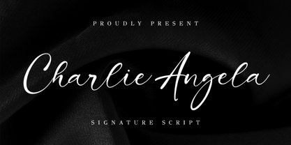 Charlie Angela - Signature Font and classy style, this font is great for your creative projects such as watermark on photography, and perfect for logos & branding, photography, invitation, watermark, advertisements, product designs, stationery, wedding designs, label, product packaging, special events or anything that need handwriting taste. Accessible in the Adobe Illustrator, Adobe Photoshop, Adobe InDesign, even work on Microsoft Word. PUA Encoded Characters - Fully accessible without additional design software. Fonts include multilingual support Cheers!
 - Lust Script by Positype,
$49.00 Boom. You asked for more, um, well just ‘more’—more swashes, more options, more weights, more of everything. I cannot give you more weights. The design just won’t allow it and anything else would be a compromise or a bastardization of the exemplars just to make money that I am unwilling to do. But, I did give you an overly indulgent, 90% cacao bar and espresso, Lust Script Fine. The ending strokes on these glyphs will literally draw blood. Enjoy it as much as I have. The Lust Collection is the culmination of 5 years of exploration and development, and I am very excited to share it with everyone. When the original Lust was first conceived in 2010 and released a year and half later, I had planned for a Script and a Sans to accompany it. The Script was released about a year later, but I paused the Sans. The primary reason was the amount of feedback and requests I was receiving for alternate versions, expansions, and ‘hey, have you considered making?’ and so on. I listen to my customers and what they are needing… and besides, I was stalling with the Sans. Like Optima and other earlier high-contrast sans, they are difficult to deliver responsibly without suffering from ill-conceived excess or timidity. The new Lust Collection aggregates all of that past customer feedback and distills it into 6 separate families, each adhering to the original Lust precept of exercises in indulgence and each based in large part on the original 2010 exemplars produced for Lust. I just hate that it took so long to deliver, but better right, than rushed, I imagine.
 - Besley Clarendon by HiH,
$12.00 Besley Clarendon ML is our version of the Clarendon registered by Robert Besley and the Fann Street Foundry in 1845. Besley Clarendon ML represents a significant change from the slab-serif Antiques & Egyptians that had become so popular in the prior three decades. Like Caslon’s Ionic of 1844, it brackets the serifs and strongly differentiates between the thick and thin strokes. Besley Clarendon is also what today is considered a condensed face, as a comparison to the various contemporary Clarendons will show. Robert Besley’s Clarendon was so popular that many foundries quickly copied it, a fact that caused him to complain vigorously. The reason it was so widely copied is simple ó it was extremely useful. It provided the attention-getting boldness to highlight a word or phrase, yet at the same time was compact and easier to read than the fat faces and antiques of the period. It wasn't until sixty years later that the concept of a typeface family of different weights was developed with DeVinne and Cheltenham. Until then, Clarendon served as everyone’s all-purpose bold face. It can be used for ads, flyers, headers or even short text. Don't leave home without it. Besley Clarendon ML includes the following features: 1. Glyphs for the 1250 Central Europe, the 1252 Turkish and the 1257 Baltic Code Pages. Added glyphs to complete standard 1252 Western Europe Code Page. Special glyphs relocated and assigned Unicode codepoints, some in Private Use area. Total of 353 glyphs. 158 kerning pairs. 2. OpenType GSUB layout features: pnum, salt, liga, dlig, hist and ornm. 3. Inclusion of tabular (std) and proportional (opt) numbers. 4. Kreska-accented letters.
 - Lunar Pop by Prioritype,
$19.00 Lunar Pop - Display Font. Bold and fun fonts are here to accompany your design projects. Consists of 2 styles, namely Regular & Outline which further adds to the creative value of this font. Perfect for poster design, branding, crafting, merchandise and more. Features: Uppercase, Lowercase, Numeral, Punctuation & Multilingual. Multilingual contained: Afrikaans, Albanian, Asu, Basque, Bemba, Bena, Breton, Catalan, Chiga, Cornish, Danish, Dutch, English, Estonian, Filipino, Finnish, French, Friulian, Galician, German, Gusii, Indonesian, Irish, Italian, Kabuverdianu, Kalenjin, Kinyarwanda, Luo, Luxembourgish, Luyia, Machame, Makhuwa-Meetto, Makonde, Malagasy, Manx, Morisyen, North Ndebele, Norwegian Bokmål, Norwegian Nynorsk, Nyankole, Oromo, Portuguese, Quechua, Romansh, Rombo, Rundi, Rwa, Samburu, Sango, Sangu, Scottish Gaelic, Sena, Shambala, Shona, Soga, Somali, Spanish, Swahili, Swedish, Swiss German, Taita, Teso, Uzbek (Latin), Volapük, Vunjo, Zulu. Thanks!
 - Francisco by Homelessfonts,
$49.00 Homelessfonts is an initiative by the Arrels foundation to support, raise awareness and bring some dignity to the life of homeless people in Barcelona Spain. Each of the fonts was carefully digitized from the handwriting of different homeless people who agreed to participate in this initiative. Please Note: these fonts include only the latin alphabet; no accented characters, no numbers or punctuation. MyFonts is pleased to donate all revenue from the sales of Homelessfonts to the Arrels foundation in support of their mission to provide the homeless people in Barcelona with a path to independence with accommodations, food, social and health care. The world is a very big place, the world is for travelling. And that’s what Francisco did, travel. Though born in Spain, he was raised in Brazil, where he worked as a graphic designer. He spent years hitchhiking round South America, his eagerness to see and learn new things preventing him from settling in one place. He returned to Spain an old man, to find his roots. Francisco never dreamed he’d end up in the street: “The experience of the street has taken away my vanity,” or that he would grow as a person there. “The only thing I’ve learnt in life is that in life you have to learn, because if you spend your life without learning you haven’t lived.” In Barcelona, the street changed his life and taught him just how tough it can be. Tough, but full of good people. He says that’s the best thing about the street.
 - Bianca Kamelo by Ivan Rosenberg,
$16.00 Bianca Kamelo is a modern hand-lettered font with 67 standard ligatures and unique 676 "love ligatures" which connect names with style. Font includes multilingual support for Western and Central Europe. It is ideal for weddings invitations, baby showers, blogs and websites, instagram, branding, invitations, business cards, and many more. This font also include complete set of alternates for uppercase and lowercase characters and stylistic ends for lowercase characters. To activate the "love ligatures" you just need to enable "standard ligatures" and type name without separator (space). For example BiancaKamelo. If the name ending with standard ligature, you need to disable that ligature, enable ligature for last name character and first surname character. For example: ChristianKate - disable ligature for ChristianKate and enable for ChristianKate. For access to Stylistic Alternates is required software with glyphs panel like Photoshop, Illustrator etc. Ligatures shows up automatically.
 - Uniser by Almarkha Type,
$29.00 Hello Everyone, Introduce our new collection, Uniser Font is inspired by famous logos of shoes and brands that have very strong characteristics, Uniser has 4 styles that allow you to get a job with satisfying results. very suitable for posters, tshirt, packaging, branding, logotype and more. Uniser font with strong and challenging nuances. very suitable for the title, typography, clothes, Poster, magazines, brochures, packaging,Websites and much more for your design needs, making your designs more modern and professional What’s Included : Standard glyphs Web Font Works on PC & Mac Simple installations Accessible in the Adobe Illustrator, Adobe Photoshop, Adobe InDesign, even work on Microsoft Word. PUA Encoded Characters – Fully accessible without additional design software. Fonts include multilingual support Image used : All photographs/pictures/vector used in the preview are not included, they are intended for illustration purpose only. Cheers! Thank You
 - Single Ladies by Scoothtype,
$9.00 Single Ladies are sexy handwritten fonts with varied basic lines, designed to convey elegance and style, clean and lightweight. Perfect for logos, magazines, menus, books, invitations, wedding / greeting cards, packaging, labels, t-shirts, etc. All of your designs will have an amazing homemade touch with Single Ladies. Single Ladies are coded with Unicode PUA, which allows full access to all additional characters without having special design software. Mac users can use Font Book, and Windows to attach your favorite text editor / application. To activate the OpenType Stylistic alternative, you need a program that supports OpenType features such as Adobe Illustrator CS, Adobe Indesign & CorelDraw X6-X7, Microsoft Word 2010 or newer versions. and there are additional ways to access alternatives / swashes, using Character Maps (Windows), Nexus Fonts (Windows), Font Books (Mac) or software programs such as PopChar (for Windows and Mac).
 - Technovier by Almarkha Type,
$29.00 Hello Everyone, Introduce our new collection, Technovier – Techno Sans Family famous logos of Technology and brands that have very strong characteristics, Technovier has 5 Fonts that allow you to get a job with satisfying results. very suitable for posters, t-shirt, packaging, branding, logotype and more. Technovier font with strong and challenging nuances. very suitable for the title, typography, clothes, Poster, magazines, brochures, packaging,Websites and much more for your design needs, making your designs more modern and professional What’s Included : Standard glyphs Web Font Works on PC & Mac Accessible in the Adobe Illustrator, Adobe Photoshop, Adobe InDesign, even work on Microsoft Word. PUA Encoded Characters – Fully accessible without additional design software. Fonts include multilingual support Image used : All photographs/pictures/vector used in the preview are not included, they are intended for illustration purpose only. Cheers! Thank You
 - Avestrage by Mokatype Studio,
$24.00Avestrage is a bold stencil serif, build with stylish look, and includes bunch of alternates and ligatures, to make your presentation look satisfying. This font can used for clean design and if you want make it retro look this font is suitable too because this font is very versatile for any design. This font is one weight only, you can create designs such as posters, headlines, merch, web or app interfaces, etc. What's you get : Standard glyphs Ligatures (Opentype features) Web Font International Accent Works on PC & Mac Simple installations Accessible in Adobe Illustrator, Adobe Photoshop, Adobe InDesign, and even works on Microsoft Word. PUA Encoded Characters - Fully accessible without additional design software. Fonts include multilingual support Image used: All photographs/pictures/vectors used in the preview are not included, they are intended for illustration only. Thank You - Ganesha Script by Lettersams,
$16.00 Ganesha Script is modern calligraphy design, including Regular. This font is casual and pretty with swashes. Can used for various purposes. such as logo, product packaging, wedding invitations, branding, headlines, signage, labels, signature, book covers, posters, quotes and more. Ganesha Script features OpenType stylistic alternates, ligatures and International support for most Western Languages is included. To enable the OpenType Stylistic alternates, you need a program that supports OpenType features such as Adobe Illustrator CS, Adobe Indesign & CorelDraw X6-X7, Microsoft Word 2010 or later versions. Ganesha Script is coded with PUA Unicode, which allows full access to all the extra characters without having special designing software. Mac users can use Font Book , and Windows users can use Character Map to view and copy any of the extra characters to paste into your favourite text editor/app.
 - Family Holiday by IRF Lab Studio,
$12.00 Family Holiday are sexy handwritten fonts with varied basic lines, designed to convey elegance and style, clean and lightweight. Perfect for logos, magazines, menus, books, invitations, wedding / greeting cards, packaging, labels, t-shirts, etc. All of your designs will have an amazing homemade touch with Family Holiday. Family Holiday are coded with Unicode PUA, which allows full access to all additional characters without having special design software. Mac users can use Font Book, and Windows to attach your favorite text editor / application. To activate the OpenType Stylistic alternative, you need a program that supports OpenType features such as Adobe Illustrator CS, Adobe Indesign & CorelDraw X6-X7, Microsoft Word 2010 or newer versions. and there are additional ways to access alternatives / swashes, using Character Maps (Windows), Nexus Fonts (Windows), Font Books (Mac) or software programs such as PopChar (for Windows and Mac).
 - Going Clap by Ahmad Jamaludin,
$17.00 Introducing Going Clap, the font that's all about bold and nostalgic vibes! This chunky slab serif typeface is your secret weapon for making text pop with artistic and vintage flair. With 8 unique font families, including Condensed, Normal, Semi Expanded, Expanded, and their cool shadow versions, you'll find the perfect style for any project. But that's not all! When you choose Going Clap, you'll also get a fantastic bonus—56 retro mascot illustrations for that extra touch of character and nostalgia. What's included? Going Clap Main File Has 8 fonts: Condensed, Normal, Semi Expanded, Expanded, Condensed Shadow, Normal Shadow, Semi Expanded Shadow, Expanded Shadow Instructions (Access special characters, even in Cricut Design) Unique Letterforms Works on PC & Mac Simple Installations Accessible in Adobe Illustrator, Adobe Photoshop, Microsoft Word even Canva! PUA Encoded Characters. Fully accessible without additional design software. Thank you, Dharmas Studio
 - Gabyan by Gatype,
$12.00 Gabyan is elegant calligraphy font. This font is casual and pretty with swashes. Can used for various purposes. such as logo, product packaging, wedding invitations, branding, headlines, signage, labels, signature, book covers, posters, quotes and more. Gabyan features OpenType stylistic alternates, ligatures and International support for most Western Languages is included. To enable the OpenType Stylistic alternates, you need a program that supports OpenType features such as Adobe Illustrator CS, Adobe Indesign & CorelDraw X6-X7, Microsoft Word 2010 or later versions. Gabyan is coded with PUA Unicode, which allows full access to all the extra characters without having special designing software. Mac users can use Font Book , and Windows users can use Character Map to view and copy any of the extra characters to paste into your favourite text editor/app. Thanks so much for looking and Enjoy it.
 - Radditya Signature by Figuree Studio,
$18.00 Experience elegance and sophistication with Radditya Signature - the must-have signature font for any design project. Crafted with meticulous attention to detail, Radditya Signature features sleek, flowing lines and unique flourishes that bring a touch of class to any design. With unique ligatures and swash characters, you have complete creative control to make your designs truly unique. Whether you're designing a logo, crafting invitations, or creating social media posts, Radditya Signature adds a modern, elegant touch that will make your designs stand out from the crowd. Plus, with support for multiple languages, you can easily reach a global audience. What You Get Radditya Signature Features Uppercase and Lowercase Number and Punctuation Ligatures and swash Multilingual Support To enable the OpenType Stylistic alternates, you need a program that supports OpenType features such as Adobe Illustrator CS, Adobe Indesign & CorelDraw X6-X7. tutorial here There are additional ways to access alternates, using Character Map (Windows), Nexus Font (Windows), Font Book (Mac), or a software program such as PopChar (for Windows and Mac). If you have any questions, don't hesitate to contact me
 - Sticky Written by Yumna Type,
$16.00 Sticky Written is a round, soft display font expressing funny, cute, fun nuances in every design. The letters look like soap bubbles flying around in the air in flowing shapes and balanced proportions. The Sticky Written font will live up and charm your designs in order to suggest positive and cute vibes to your target audience. You can apply this font, which provides a clipart as a bonus, for big text sizes to make it more legible and attractive. In addition, you can make use of some available features here. Features: Multilingual Supports PUA Encoded Numerals and Punctuations Sticky Written fits best for various design projects, such as brandings, headings, magazine covers, quotes, printed products, merchandise, social media, etc. Find out more ways to use this font by taking a look at the font preview. Thanks for purchasing our fonts. Hopefully, you have a great time using our font. Feel free to contact us anytime for further information or when you have trouble with the font. Thanks a lot and happy designing.
 - Lovely Unicorn by Gilar Studio,
$16.00 Introducing " Lovely Unicorn" Lovely Unicorn Is a Handwritten Font With 3 Style (Regular,Outline and Shadow) You Can Mix And Match for Your Awesome Project This fonts is ideal for crafting, branding and decorate your any project. This fonts are perfect for wedding invitation or your blog. Also with their help, you can create a logo or beautiful frame for your home. Or just use for your business, book covers, stationery, marketing, magazines and more. FEATURES : Uppercase & Lowercase Number & Punctuation More than 265 of glyphs Multilingual Language PUA Encode 28 Ligatures Alternate The alternative characters were divided into several Open Type features can be accessed by using Open Type savvy programs such as Adobe Illustrator, Adobe InDesign, Adobe Photoshop Corel Draw X version, And Microsoft Word. And this Font has given PUA unicode (specially coded fonts). so that all the alternate characters can easily be accessed in full by a craftsman or designer. Check my other Font here https://gilarstudio.com/
 - Anak Sultan by Gilar Studio,
$16.00 Introducing "Anak Sultan" Anak Sultan Is a Handwritten Display Font With 3 Style (Regular,Outline and Shadow) You Can Mix And Match for Your Awesome Project This fonts is ideal for crafting, branding and decorate your any project. This fonts are perfect for wedding invitation or your blog. Also with their help, you can create a logo or beautiful frame for your home. Or just use for your business, book covers, stationery, marketing, magazines and more. FEATURES : Uppercase & Lowercase Number & Punctuation More than 256 of glyphs Multilingual Language PUA Encode 24 Ligatures Alternate The alternative characters were divided into several Open Type features can be accessed by using Open Type savvy programs such as Adobe Illustrator, Adobe InDesign, Adobe Photoshop Corel Draw X version, And Microsoft Word. And this Font has given PUA unicode (specially coded fonts). so that all the alternate characters can easily be accessed in full by a craftsman or designer. Check my other fonts here : gilarstudio.com
 - The Funy Times by Gilar Studio,
$16.00 The Funy Time's Is a Joyful Display Font With 3 Style (Regular,Outline and Shadow) You Can Mix And Match for Your Awesome Project This fonts is ideal for crafting, branding and decorate your any project. This fonts are perfect for wedding invitation or your blog. Also with their help, you can create a logo or beautiful frame for your home. Or just use for your business, book covers, stationery, marketing, magazines and more. FEATURES : Uppercase & Lowercase Number & Punctuation More than 256 of glyphs Multilingual Language PUA Encode 24 Ligatures Alternate The alternative characters were divided into several Open Type features can be accessed by using Open Type savvy programs such as Adobe Illustrator, Adobe InDesign, Adobe Photoshop Corel Draw X version, And Microsoft Word. And this Font has given PUA unicode (specially coded fonts). so that all the alternate characters can easily be accessed in full by a craftsman or designer. Check Out my other fonts here : gilarstudio.com
 - Luar Galaxy by Gilar Studio,
$16.00 Luar Galaxy a Handwritten Display Font With 3 Style (Regular,Outline and Shadow) You Can Mix And Match for Your Awesome Project This fonts is ideal for crafting, branding and decorate your any project. This fonts are perfect for wedding invitation or your blog. Also with their help, you can create a logo or beautiful frame for your home. Or just use for your business, book covers, stationery, marketing, magazines and more. FEATURES : Uppercase & Lowercase Number & Punctuation More than 219 of glyphs Multilingual Language PUA Encode Ligatures Alternate The alternative characters were divided into several Open Type features can be accessed by using Open Type savvy programs such as Adobe Illustrator, Adobe InDesign, Adobe Photoshop Corel Draw X version, And Microsoft Word. And this Font has given PUA unicode (specially coded fonts). so that all the alternate characters can easily be accessed in full by a craftsman or designer. Check Out my other fonts here : gilarstudio.com
