10,000 search results
(0.875 seconds)
- Everleigh Script by Hrz Studio,
$17.00 Everleigh Script including alternative characters, ligatures and various language support. With the OpenType feature with an alternative style and elegant binder. The OpenType feature does not function automatically, but you can access it manually and for the best results needed for your creativity in combining these Glyph variations. and also a touch of ornament makes this font look elegant. Files include: To enable the OpenType Stylistic alternates, you need a program that supports OpenType features such as Adobe Illustrator CS, Adobe Indesign & CorelDraw X6-X7, Microsoft Word 2010 or later versions. (Windows), Font Book (Mac) or a software program such as PopChar (for Windows and Mac). If you need help or advice, please contact me Thank you for watching!
 - Singolare by Latinotype,
$29.00 Singolare is a contemporary geometric Sans Serif with angular terminals and a great x height. Its main feature is the style difference between the lighter and heavier weights. The more weight it gains, the higher its singularity. With its weights, styles and layers variety, it's perfect for display use and short texts that require a visual impact. Singolare is composed by five weights, from Ultralight to Black. Every weight has its own stencil variation with expressive cuts and four decorative versions: three outline and one inline version, that can work on it’s own or overlapped to the black normal version (changing the colors of each layer) in order to amplify its usage possibilities.
 - Megalito Slab ExtCond - Personal use only

- Amfibia by ROHH,
$40.00 Amfibia™ is a soft, flat-sided geometric grotesk family with a lot of character, equipped with tons of ligatures and swashes. Its main function is display use of all kinds, however it is prepared to serve as paragraph text typeface thanks to its 5 widths, giving total amount of 100 fonts. It is crafted for a broad variety design situations - from posters, magazine editorial use, logo design & branding, to web design, user interfaces and mobile applications. Main features: - 5 widths (Narrow, Condensed, Normal, Expanded, Wide), each consisting 20 fonts - 10 weights for each width (from Hairline to Black) - handdrawn, carefully crafted obliques - over 900 glyphs, full of swashes, initial forms, terminals and ligatures - pronounced ink traps and large x-height improving legibility in small sizes as well as adding strong personality to display sizes - flat-sided letter shapes adding vertical rhythm and elegance to narrow widths - extended latin language support - OpenType features (swashes, initials, terminals, standard and discretionary ligatures, stylistic sets, contextual alternates, case sensitive forms, lining, oldstyle and tabular figures, slashed zero, fractions, superscript and subscript, ordinals, currencies and symbols)
 - LiebeErika by LiebeFonts,
$29.00 Ever since we started publishing on MyFonts in 2009, we've received requests for a typeface to complement our popular dingbat fonts. So here it is: LiebeErika. Friendly and polite, rather thin, extra narrow, and of course‚ carefully hand-crafted. LiebeErika’s casual and warm style is perfectly suited for invitations and personal correspondence. It’s even in the name: German phrase, Liebe Erika‚ translates to, Dear Erika, the beginning of a personal letter. But LiebeErika is not limited to English or to the German character set. It supports many other languages, too! LiebeErika comes with a stunning variety of ligatures and alternative forms available through OpenType features. (Please make sure your software supports OpenType if you wish to use the advanced features.) The font contains over 500 glyphs, so it’s actually two or three fonts in one. If you like this font, you may want to look at LiebeOrnaments, our perfectly matching set of swashes and curls to complement LiebeErika. By the way: LiebeErika gets along great with our wide range of illustrative fonts such as LiebeCook, LiebeFish, and LiebeTweet.
 - TG Minagi Sans by Tegami Type,
$30.00TG Minagi Sans is a neo-humanist sans serif that takes inspiration from some calligraphy and blackletter letterforms providing sharp details and a little stiffness in some parts of the typeface. By combining these things with the modern form of the sans serif letter, TG Minagi Sans has a forceful and distinct character. Super terrific when used at massive sizes for display purposes and headlines, but reliable enough for small text sizes. TG Minagi Sans comes with 7 weights, 2 axes & 14 Styles, including a variable font file. Has several OpenType features such as various ligatures, lining figures (proportional, old styles, superior, inferior, denominator, numerator & fraction), stylistic styles 01-04 & covered more than 100 languages Latin based. - Mirtha Display by Nois,
$24.00 Mirtha Display is a modern display font with distinct Art Nouveau details. Its lighter weights are condensed and sophisticated, while the heavier weights have a more powerful effect, making it perfect for headlines, posters, branding, logos, packaging and more. With a set of over 450 glyphs, this font supports a wide range of languages. Key OpenType Features include numerators and denominators, Old Style and Lining numbers, standard ligatures and localized characters such as Uppercase and Lowercase Sharp S. Mirtha Display covers 5 weights, 10 styles and 2 Variable cuts (regular and italic) to give you more design flexibility. Any suggestion to continue improving Mirtha Display will be welcome, do not hesitate to contact us!
 - Zulia Pro by Sudtipos,
$59.00 Zulia is located in the west of Venezuela and it is the state in where Joluvian grew up. It is a region of sunshine, high temperatures, oil and cheerful people, although we choose the name to honor his mother who is from there (zuliana) and who is proud of her land and everything that it represents the area. Zulia is also his first typographic project. It is based on two of his favourite calligraphic styles: italic and brush pen. He started with simple and contrasted strokes on paper with brush and marker. After that he developed the full alphabet and its various options for each letter, starting from a set of handmade forms that could be connected in different ways according to the user needs. What motivates him to involve this style was to create a differentiation with his daily work by generating a heavier type, contrasted and low rise. Zulia finally got life of its own with the participation of Alejandro Paul and a feedback of techniques and skills that were generated with the duo work. Zulia is not just a typeface, Zulia is his love of letters.
 - Karita by Nathatype,
$29.00 Your design project is your brand’s introduction to the public, so it is crucial to do it in the right way. An inappropriate font can totally change your messages and damage your work. For that reason, Karita is here to assist you with your needs. Karita is a classic, elegant, professional display serif font to increase the product and brand values promoted. This font looks more prominent than the others and shows strong, yet elegant impressions to attract customers. Continuity elements on every little scratch of the letters’ edges lead your eyes to follow one letter to another in line with serif font characters. Besides, this font type has thick lines and strong contrasts to attract customers and to show firm impressions. For a legibility reason, you can use this font for big text sizes. You can enjoy the available features here as well. Features: Stylistic Sets Ligatures Multilingual Supports PUA Encoded Numerals and Punctuations Karita fits best for various design projects, such as brandings, posters, banners, headings, magazine covers, quotes, invitations, name cards, printed products, merchandise, social media, etc. Find out more ways to use this font by taking a look at the font preview. Thanks for purchasing our fonts. Hopefully, you have a great time using our font. Feel free to contact us anytime for further information or when you have trouble with the font. Thanks a lot and happy designing.
 - Pot roaster - Unknown license

- Aviano Sans Layers by insigne,
$19.00 With this charismatic new type system, the possibilities are as large as your vision behind them. Achieve the impact you're looking for by layering the different fonts and colorations for a custom, hand-drawn look that likes to be noticed. Play around with the potential. Create effects such as realistic 3D looks by adding centerlines, dotted centerlines, and shadow variations. Inspired by the affable look of vintage handmade signage, the Aviano Sans Layers spacing accommodates these shadows and other features well with its generous width and helps you hit your message home. Try mixing it with the other members of the Aviano Hyperfamily, too. There are lots of funky options for you to explore. See what you can create with Aviano Sans Layers!
 - Supria Sans Condensed by HVD Fonts,
$50.00 Beside Supria Sans™ , the condensed version is the second component of the Supria type system. Encompassing the same six weights and three styles as Supria Sans, and characterised by the same approach to the modernist source material, this condensed set of fonts is 20% narrower than the normal version, allowing for significant space saving economies. Used together, Supria Sans and Supria Sans Condensed become much more than just a versatile and functional workhorse – ideal for resolving complex design issues with elegance and sophistication. Supria Sans Condensed™ is equipped for complex, professional typography. As an exclusively OpenType release, these fonts feature small caps, five variations of numerals, arrows and an extended character set to support Central and Eastern European as well as Western European languages.
 - Ariestha Script by Arterfak Project,
$18.00 Ariestha is a fancy script font, inspired by modern and retro typography. Carefully designed with bold strokes on the bottom of the letters and some playful touches of letter layout that allows you to make neat and flexible designs. Ariesta scripts comes with many variations of OpenType features which gives you the possible to explore more alternative looks in your design process. The OpenType features are accessible in Adobe Illustrator, Photoshop, InDesign and others. Very recommended for your headline in logotypes, sign painting, posters, die-cut craft, branding, storefront, and merchandise design! Ariestha Script has over 500+ Glyphs with 26 multi-lingual accents. Also with standard punctuation, uppercase and lowercase. There are stylistic alternates, contextual alternates, ligatures, stylistic set 01 - 04. Great design asset for your projects.
 - Berpatu by Majestype,
$25.00 Berpatu Brush Lettering Font: A Unique and Timeless Design Solution Are you searching for a font that adds a touch of vintage charm to your designs? Look no further than Berpatu Brush Lettering Font! Inspired by classic retro and vintage designs seen in shop windows and street billboards, this font is created with passion using a brush pen. Berpatu features over 300 glyphs and supports OpenType features such as ligatures, contextual alternates, and swash variants, providing endless possibilities for your designs. It is ideal for use in signage, displays, titles, posters, t-shirts, logos, advertisements, billboards, packaging and more. This font is available in Catalan, Danish, German, English, Spanish, Estonian, Finnish, French, Irish, Icelandic, Italian, Norwegian, Portuguese, Slovenian, Albanian, and Swedish. For a unique and timeless design solution, try Berpatu Brush Lettering Font today! We hope you enjoy this font as much as we made it. Cheers and thank you so much!
 - Newspoint by Elsner+Flake,
$35.00 The design of the Newspoint typeface is based on the tradition of the American sans serif faces of the last century. This form expression was greatly influenced by the News Gothic type which was created by Morris Fuller Benton in 1908, and has, once again, become very popular. When the development of sans serif types such as Futura and Kabel by Renner and Koch began in 1925, the design of American sans serif types receded somewhat into the background. In the 1950’s, however, they experienced a renaissance which continues to this day. Thanks to its clean design and the relatively large x-height, the Newspoint is well suited for informative texts in newspapers, magazines, and brochures. In packaging design, as well, the Newspoint can display its strength in small print. Newspoint was developed as a customer-specific variation of the News Gothic. In contrast to the News Gothic, however, the face appears to be softer and more appealing thanks to the changed interpunctions. If so desired, the alternative characters give the typeface expanded individuality and a richness of design options.
 - Makro by Tokotype,
$50.00 Makro is a family of extended display sans fonts with an imposing profile with six weights, ranging from Light to Black. This series is distinguished by the excessively contrasting shapes and tones of the shapes on each opening joint and adjusted open counter. This font was designed primarily for large display text that demands more space, such as on out-of-home graphics, headings, titles, or another similar application. The most recent version of Makro supports variable weight and italic axes, as well as OpenType features such as alternatives, circled numbers, etc. In addition, the family has enlarged its linguistic repertoire to incorporate Cyrillic in addition to Latin.
 - Redwinger by Ditatype,
$29.00 Redwinger is a captivating display font designed with a games theme, featuring different proportions of letters and sharp, uneven borders. This font showcases different proportions in its letterforms, adding a sense of variety and excitement to the font. Each uppercase letter has its own distinct width and height, creating a visually engaging composition. This design choice adds a playful and dynamic element to the font, reflecting the diversity and unpredictability of the gaming world. The sharp and uneven borders of Redwinger enhance its edgy and adventurous aesthetic. The jagged edges and irregular shapes give the font a distinctive and daring look, evoking a sense of action and intensity. This unique feature adds a touch of excitement and captures the spirit of gaming. For the best legibility you can use it in the bigger text. Enjoy the available features here. Features: Stylistic Sets Multilingual Supports PUA Encoded Numerals and Punctuations Redwinger fits in headlines, logos, posters, titles, branding materials, print media, editorial layouts, website headers, and any other projects that aim to transport players into thrilling virtual worlds. Find out more ways to use this font by taking a look at the font preview. Thanks for purchasing our fonts. Hopefully, you have a great time using our font. Feel free to contact us anytime for further information or when you have trouble with the font. Thanks a lot and happy designing.
 - Letterpress Studio by Fenotype,
$15.00 Letterpress Studio -Crafted Vintage Goods Letterpress Studio includes following • 7 fonts - a textured and clean version of each • Ornaments • Catchwords • 25 Logo Templates Letterpress Studios core is seven fonts - textured and clean version of each. Fonts are designed in same proportions and work great together. Here’s a short introduction to the fonts: • Letterpress Script -A connected script with lot’s of OpenType features • Letterpress Script Bold -Bold version of Letterpress Script • Letterpress Condensed -A condensed sans-serif typeface with swash uppercase characters on • Letterpress Gothic -A sans-serif typeface with swash uppercase characters • Letterpress Sans -An extended sans-serif typeface with swash uppercase characters • Letterpress Wood -A woodcut style serif typeface with swash uppercase characters • Letterpress Black -A black woodcut style serif typeface with swash uppercase characters • Letterpress Ornaments -A set of pictograms, ornaments, borders and badges (OTF, AI & PDF) • Letterpress Catchwords -A set of over 100 woodcut-style catchwords (OTF, AI & PDF) All fonts have West European, Central European, Baltic, Turkish and Romanian character sets. Fonts come in OTF format. TTF are also available but OpenType features won’t work with them. Letterpress Templates -25 templates (AI) Letterpress Templates is a set of 25 ready made compositions with font pairings, shapes, ornaments and ready made 2-4 color schemes for each. Templates can be used as such or as a starting point for your own project. Download Letterpress Templates here.
 - Cabrito Serif by insigne,
$33.00 The Cabrito family is making a statement again. Launched as a supplement to the children's book, The Clothes Letters Wear, the original Cabrito is carefree, fun and easy on the eyes. Now, by balancing this friendly connection with new elegance, Cabrito Serif arrives: attractive copy text with an extra sophisticated sensibility incorporated into the design. Still bright and playful, this new Cabrito is cleaner and leaner, ensuring that its polished appearance retains legibility. 54 fonts include upright alternates, ligatures, and old figures. The range includes extended and condensed variants. To see any of these interactive features, see the PDF manual. The family also includes language support for 72 Latin-based languages, and there are more than 600 glyphs. Cabrito Serif can be used for logos and packaging, as well as for brochures and web pages. It’s readability makes it an excellent choice for a wide range of jobs. Take a walk with Cabrito Serif and see how much fun it is. By the way, look at some other Cabrito members and see how much you love the original, Inverto, Contrast or Didone.
 - Bank Sans EF by Elsner+Flake,
$35.00 With its extended complement, this comprehensive redesign of Bank Gothic by Elsner+Flake offers a wide spectrum for usage. After 80 years, the typeface Bank Gothic, designed by Morris Fuller Benton in 1930, is still as desirable for all areas of graphic design as it has ever been. Its usage spans the design of headlines to exterior design. Game manufacturers adopt this spry typeface, so reminiscent of the Bauhaus and its geometric forms, as often as do architects and web designers. The creative path of the Bank Gothic from hot metal type via phototypesetting to digital variations created by desktop designers has by now taken on great breadth. The number of cuts has increased. The original Roman weight has been augmented by Oblique and Italic variants. The original versions came with just a complement of Small Caps. Now, they are, however, enlarged by often quite individualized lower case letters. In order to do justice to the form changes and in order to differentiate between the various versions, the Bank Gothic, since 2007 a US trademark of the Grosse Pointe Group (Trademark FontHaus, USA), is nowadays available under a variety of different names. Some of these variations remain close to the original concept, others strive for greater individualism in their designs. The typeface family which was cut by the American typefoundry ATF (American Type Founders) in the early 1930’s consisted of a normal and a narrow type family, each one in the weights Light, Medium and Bold. In addition to its basic ornamental structure which has its origin in square or rectangular geometric forms, there is another unique feature of the Bank Gothic: the normally round upper case letters such as B, C, G, O, P, Q, R and U are also rectangular. The one exception is the upper case letter D, which remains round, most likely for legibility reasons (there is the danger of mistaking it for the letter O.) Because of the huge success of this type design, which follows the design principles of the more square and the more contemporary adaption of the already existing Copperplate, it was soon adopted by all of the major type and typesetting manufacturers. Thus, the Bank Gothic appeared at Linotype; as Commerce Gothic it was brought out by Ludlow; and as Deluxe Gothic on Intertype typesetters. Among others, it was also available from Monotype and sold under the name Stationer’s Gothic. In 1936, Linotype introduced 6pt and 12pt weights of the condensed version as Card Gothic. Lateron, Linotype came out with Bank Gothic Medium Condensed in larger sizes and a more narrow set width and named it Poster Gothic. With the advent of photoypesetters and CRT technologies, the Bank Gothic experienced an even wider acceptance. The first digital versions, designed according to present computing technologies, was created by Bitstream whose PostScript fonts in Regular and Medium weights have been available through FontShop since 1991. These were followed by digital redesigns by FontHaus, USA, and, in 1996, by Elsner+Flake who were also the first company to add cursive cuts. In 2009, they extended the family to 16 weights in both Roman and Oblique designs. In addition, they created the long-awaited Cyrillic complement. In 2010, Elsner+Flake completed the set with lowercase letters and small caps. Since its redesign the type family has been available from Elsner+Flake under the name Bank Sans®. The character set of the Bank Sans® Caps and the Bank Sans® covers almost all latin-based languages (Europe Plus) as well as the Cyrillic character set MAC OS Cyrillic and MS Windows 1251. Both families are available in Normal, Condensed and Compressed weights in 4 stroke widths each (Light, Regular, Medium and Bold). The basic stroke widths of the different weights have been kept even which allows the mixing of, for instance, normal upper case letters and the more narrow small caps. This gives the family an even wider and more interactive range of use. There are, furthermore, extensive sets of numerals which can be accessed via OpenType-Features. The Bank Sans® type family, as opposed to the Bank Sans® Caps family, contains, instead of the optically reduced upper case letters, newly designed lower case letters and the matching small caps. Bank Sans® fonts are available in the formats OpenType and TrueType.
 - PGF Qualta by PeGGO Fonts,
$24.00 "Qualta" was initially designed in 2017 as a submission for a type design assignment while at typography school, originally launched under Alt-A Foundry, "PGF Qualta" was developed specially for Publishing Agency under the supervision of Peggo Fonts Foundry, now with a complete Small Caps set, classic and old style numeric figures, lining and tabular forms, scientific and fractional notation set, arrows set, light parenthesis set. Set on producing a geometric sans, it started with the circular form drawn from a 50s television screen. The bloated shape gave an illusion of protrusion and so much open space to the rounded letters. A broken stem was then added to the lowercase to provide a notch that allowed the typeface legibility in smaller sizes. The typeface was then developed into eight cuts with their corresponding italics. The lower case g includes a variation with a transitional link derived from the upper case Q’s tangent tail. Qualta’s original concept was designed by Isabel Gatuslao and was developed by Pedro Gonzalez.
 - Aougtron by Twinletter,
$17.00 Aougtron is a modern font that combines a dynamic slope with sporting event-inspired lettering and cutouts. Designed to apply to all professional sporting events, it can also be used to create modern logos and screen prints in text fields. Aougtron’s bold and powerful appearance is created by the strong horizontal strokes on each letter which contrasts sharply with the elegant strokes on the corners of each letter. Combine these fonts to create a maximum display effect on each of your projects. What’s Included : - File font - All glyphs Iso Latin 1 - Alternate, Ligature - Simple installations - We highly recommend using a program that supports OpenType features and Glyphs panels like many Adobe apps and Corel Draw so that you can see and access all Glyph variations. - PUA Encoded Characters – Fully accessible without additional design software. - Fonts include Multilingual support
 - Calmine Font Duo by Letterhend,
$17.00 Calmine is a font duo package contain a hand drawn bold script and sans serif which looks great to be paired especially for vintage and adventure theme! This font duo is purposely made for headline, display or logotype, and signature which need a standout appearing. This font is also suitable to be applied especially in logo, and the other various formal forms such as invitations, labels, logos, magazines, books, greeting / wedding cards, packaging, fashion, make up, stationery, novels, labels or any type of advertising purpose. Features : Calmine Script Regular and Rough Calmine Sans Regular and Rough uppercase & lowercase numbers and punctuation multilingual alternates & ligatures PUA encoded We highly recommend using a program that supports OpenType features and Glyphs panels like many of Adobe apps and Corel Draw, so you can see and access all Glyph variations.
 - Lady Dodo by Sudtipos,
$49.00 And the day in which I introduce my second typographic family has arrived. In order to do this, I borrowed several passages from this beautiful book by Maurice Maeterlinck, “Life and Flowers”. His poetic observation of Nature made me reflect about the small discoveries behind the flow of my pen on paper. About that quick, spontaneous, overwhelmed stroke, with some awkwardness as well as certainty in it. About the writing that looms line after line. About the mischievous stains of ink flooding my writing tool. Lady Dodó was born as a product of these drawings, pieces of writing and reflections. Following the steps of its ancestor and friend, Lady René, it takes advantage of the goodness of the Open Type technology to propose a systematized as well as a personalized writing font. Both friendly and challenging. Due to the large number of alternate characters (both for lower and upper case as well as for numbers) and to its precise programming, it proposes to design diverse and rich typographical sets with multiple strokes in a simple way. However, Lady Dodó is not just made of typographical signs; it also proposes a set of modules to make patterns and another one to design frames. From the combination of these modular signs, an infinite universe of possibilities for decoration arises. Here is Lady Dodó, ready to get started and write its destiny. July 2015.
 - Warzone by Arterfak Project,
$23.00 Warzone is a minimalist techno font. Based on sans serif design, developed to techno style with the minimalist stencil concept and sharp edges. Quipped with extra alternate characters that give you more variations on your design. This font has geometric shapes that are perfect for a futuristic theme, techno, digital, sci-fi, and hipster style. Warzone is an all-caps font that has a solid version in the lowercase. A great choice to apply for many purposes. Thank you and happy designing!
 - Selfie by Lián Types,
$37.00 ATTENTION CUSTOMERS :) There's a new Selfie available, have a look here; Selfie Neue is better done and more complete in every aspect. However, you can stay here if you still prefer the classic version. -But first, let me take a Selfie!- said that girl of the song and almost all of you at least once this year. While some terms and actions get trendy, some font styles do it too. It wouldn't be crazy to combine these worlds, in fact it happens often. Selfie is a connected sans serif based in vintage signage scripts seen in Galerías of Buenos Aires. These places are, in general, very small shopping centres which pedestrians sometimes use as shortcuts to get to other parts of the city. Their dark corridors take you back in time, and all of a sudden you are surrounded by cassettes, piercings, and old fashioned cloth. For some reason, all these shops use monolined geometric scripts. Surely, neon strings are easier to manipulate when letterforms have simple shapes. My very first aim with Selfie was to make a font that would serve as a company to those self-shot pictures that have become so popular nowadays. However, the font turned into something more interesting: I realised it had enough potential to stand-alone. Selfie proves that geometry itself can be really attractive. In this font, elegance is not achieved with the already-known contrast between thicks and thins of calligraphy, but with the purity of form. Its curves were based in perfectly shaped circles which made the font easy to be used at different angles (some posters show it at a 24.7º angle) without having problems/deformities. In addition to its nice performance when used over photographs, the font can be a good option for packaging and wedding invitations. TIPS Adding some lights/shadows between letters will for sure catch the eye of the viewer: Words will look as if they were made with tape/strings; so trendy nowadays. Try using Selfie at a 24.7º angle so that the slanted strokes become perfectly vertical. Having the decorative ligatures feature (dlig) activated is a good option to see letters dance. TECHNICAL It is absolutely recommended to use this font with the standard ligatures feature (liga) activated. It makes letters ligate perfectly and also improves the space between words.
 - Feel Good by Gassstype,
$25.00 Here comes a New font, Feel Good is Brush Sans Font that is written casually and quickly. Letters are made with brushes on Procreate. Then crafted carefully drawn into vector format. That is why Feel Good has Stylish and strong characteristic more natural look to your text with a more modern look to your text. Feel Good is perfect for homeware designs,branding projects, Logo design, Quotes product packagingprinted quotes, invitations, cards, product packaging, headers, Logotype, Letterhead, PosterLabel, cartoon, and comic etc.
 - Decima Nova Pro by TipografiaRamis,
$39.00 Decima Nova Pro is a geometric sans serif typeface family, built in eight styles. The typeface is ideal for use in display sizes, but also is quite legible in text and is well suited for editorial and brand design. Features include extended language support, small caps, multiple numeral styles, slashed zero, ligatures... Decima Nova Pro is released as font family in OpenType format with a Latin Western 1252, Eastern European 1250, Baltic 1257, Turkish 1254 and Cyrillic 1251 character set.
 - Cortese by Hanoded,
$15.00 As usual, I stumbled upon a great 1971 Italian movie poster when looking for something else. The poster for “La Morte Cammina Con I Tacchi Alti” (directed by Luciano Ercoli), was made by an unknown artist and comes with a great font. Cortese was based on this movie poster font, but as I started working on the glyphs, I figured they would even look better in ligatures. So here it is: Cortese font - complete with 135 ligatures, accents and even Greek and Cyrillic!
 - Keks by Hubert Jocham Type,
$29.90 And now something completely different. Keks has broken elements like a blackletter typeface, but the actual forms are roman. That keeps it very legible although there is no curve at all. What was the inspiration for designing the font? Blackletter has an interesting history here in Germany. We need to find contemporary interpretations for this tradition. What are its main characteristics and features? Legible roman blackletter Usage recommendations: any usage that needs a black letter athmosphere where legibility is important.
 - Hampala by TSA Creative,
$14.00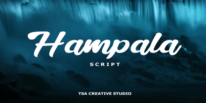 Hampala is a handwritten script font with a simple and classy style, such as branding, watermark on photography, signature, logo design, quotes, album cover, business card, and many other design project. From business cards to photo watermarks, Hampala is here to elevate your work. Hampala comes with uppercase letters, lowercase letters, lowercase, numbers, punctuation, ligature and multi lingual support If you have any queries, questions or issues please don't hesitate to contact us direct. Thank you very much Tiko Creative
 - Claiborne by madeDeduk,
$15.00 Hello I'm really excited to introduce Claiborne script, with a solid & a rough style. Claiborne script is perfect for poster design, book covers, merchandising, fashion campaigns, newsletters, branding, advertising, magazines, greeting cards, album covers, and quote designs and more. What's included? - Claiborne Solid.otf - Claiborne Rough.otf Feature - UPPERCASE - lowercase - Number & Symbol - International Glyphs - Alternative lowercase - Ligature - Swash If you need anything else just shoot me an email at: dedukvic@gmail.com Find more previews on my Instagram here : https://www.instagram.com/acekelgondolayu/?hl=en
 - Interval Next by Mostardesign,
$25.00 Interval Next is a modern sans serif font family that is the successor of the successful Interval Sans Pro. Designed by Olivier Gourvat, Interval Next typeface consists of 16 fonts in 8 weights — Ultra Light, Light, Book, Regular, Medium, Semi Bold, Bold, Black— and has 4 styles. This super family combines a humanist mind with its contrasted shapes and a modern look with its open counters. With its four versatile styles (Condensed, Narrow, Roman and Wide) Interval Next has a creative palette able to meet the modern typographic demands. Its OpenType features will provide you almost unlimited multilingual support as well as small caps, case sensitive forms, proportional and tabular figures, slashed zero, numerators, superscripts, denominators, scientific inferiors, circled figures, subscript, ordinals, fractions, arrows and f-ligatures. Also extremely functional for professional editorial design, Interval Next has a pro kerning and would be extremely suitable for mobile applications, e-books, web sites, headlines, posters, signage and many more. Interval Next covers a large spectrum of languages such as West European, East European and the Cyrillic.
 - Nextir by Ditatype,
$25.00 Nextir is an extraordinary brush sans serif font that commands attention and redefines modern typography. Designed with large letters and a thick weight, its distinctive square letter shapes are the epitome of strength and contemporary style. What sets Nextir apart from the ordinary is its brush detailing. This unique blend of brush strokes and sans serif elements adds a layer of organic texture to the font. The combination of large letters, thick weight, square shapes, and brush detailing creates a font that makes a striking statement with a contemporary edge. When you need a typeface that combines strength with artistic expression, Nextir is the perfect choice to infuse your designs with boldness, modernity, and a touch of handcrafted elegance. You can also enjoy the features here. Features: Multilingual Supports PUA Encoded Numerals and Punctuations Nextir fits in headlines, logos, posters, flyers, branding materials, print media, editorial layouts, and many more designs. Find out more ways to use this font by taking a look at the font preview. Thanks for purchasing our fonts. Hopefully, you have a great time using our font. Feel free to contact us anytime for further information or when you have trouble with the font. Thanks a lot and happy designing.
 - A10 STAR Black by Mogtahid,
$90.00 As a former typographer / lino and calligrapher, Abdallah NASRI had recourse to the nature of the idea of an "INTERCHANGEABLE" collection for types who in reality offer a police collar parallel to the complex typeface of the variable. Our fashion is outlined by a simple calculation defined by superimposed geometric circles where we used only its ¼ to fill the need for the angles of each of our letters. Always with the idea of having in the same allocated space, the same letter nested as many times as fat example from Hairline to Ultrabold. It was in this way that I was able to obtain a large number of styles, with a very interesting kerning which prompted me to extend the font to other languages with +1000 characters and +600 glyphs. I have always been treasured by the all in "1". I assure you that I sought to obtain the maximum of Visibility for a use S / Titling TV, WEB Pages and Typography Typo; once the difficult thing was done, I was rewarded by a font that has countless typographic openings for the world of graphics with 10 styles of weights in hand, and again I am happy to have personalized the charm of each letter by new details; I do not regret the time spent on thinking about it so that it is useful and at the same time pleasant as a working tool, finally profitable in all sectors and more multilingual, without forgetting that it is a family of inter change c ' is to say: All the types occupy the same height of the body and it is their fats which differs in the same space width of each of the letters, therefore no interference in spacing. Here, an additional alternative, a participation of a septuagenarian in the service of the love of modern digital typography. • TEST: At 50% screen in a body of 12 pixels, the A10 STAR Alphabet subjected to a test, has a clear Readability / Visibility. • P.S: A10 STAR integrates Diacriticism in all its forms. Texte d'origine : Abdallah NASRI a eu recours en étant ancien typographe/lino et calligraphe à la nature de l'idée d'une collection "INTERCHANGEABLE" pour les types qui en réalité offre un collier de police parallèle à la fonte complexe du variable. Notre mode est esquissé par un calcul simple défini par des ronds géométrique superposés où on a utilisé seulement son ¼ pour garnir le besoin des angles de chacune de nos lettres. Toujours dans l’idée à avoir dans le même espacement alloué, la même lettre imbriquée autant de fois de graisse exemple du Hairline à Ultrabold. C’est de cette manière que j’ai pu obtenir un grand nombre de styles, avec un crénage très intéressant ce qui m’a incité à étendre la police à d’autres langues avec +1000 caractères et +600 glyphes. J’ai toujours été prisé par le tout en « 1 ». Je vous assure que j’ai cherché à obtenir le maximum de Visibilité pour une utilisation S/Titrage TV, Pages WEB et Maquette typo ; une fois le difficile fait, j’ai été récompensé par une police qui possède d’innombrable ouverture typographique pour le monde du Graphisme avec comme atout en main 10 styles de graisses, et encore je suis content pour avoir personnalisé le charme de chaque lettre par des détails nouveaux ; je ne regrette pas le temps passé dessus à réfléchir pour qu’il soit utile et à la fois agréable comme outil de travail, enfin profitable tous secteurs confondus et en plus multilingue, sans oublié que c’est une famille d’inter change c’est-à-dire : Tous les types occupent la même hauteur du corps et c'est leurs graisses qui diffère dans un même espace largeur de chacune des lettres, donc aucune interférence dans l’espacement. Voilà, une alternative supplémentaire, une participation d’un septuagénaire au service de l’amour de la typographie numérique moderne. • TEST : A 50% d'écran dans un corps de 12 pixels, l'Alphabet A10 STAR soumise a un test, présente une nette Lisibilité / Visibilité. • P.S : A10 STAR intégre la Diacritique dans toutes ses formes.
 - Naxmos by Twinletter,
$17.00 Naxmos is a futuristic font with upper- and lowercase letters, a set of numbers, and a galaxy alternative and cyberpunk theme. It has a distinctive futuristic design. Use it to create time-traveling movie posters for futuristic or extraterrestrial productions. Fantastic for creating unique cards and artwork for science fiction fans. This font was created to be used for universal events like game competitions, wall advertisements, and poster designs. Your design can look better with a simple combination. Purchase it right away to enjoy using it ahead of the competition. What’s Included : - File font - All glyphs Iso Latin 1 - Alternate, Ligature - Simple installations - We highly recommend using a program that supports OpenType features and Glyphs panels like many Adobe apps and Corel Draw so that you can see and access all Glyph variations. - PUA Encoded Characters – Fully accessible without additional design software. - Fonts include Multilingual support
 - Naive Sans by S&C Type,
$8.00 Naïve Sans is a sans serif handwritten font designed by Fanny Coulez and Julien Saurin in Paris. Our goal was to draw a font with finely irregular lines that give a human and whimsical feeling. We drew five finely balanced weights to assure a good readability whatever the size, with contrasting upstrokes and downstrokes to add an unusual, fancy touch. We also designed five shaked versions with different lowercases and uppercases, to improve your designs and bring a more organic and playful feeling. Mixed or not, both styles can be used for various purposes, such as headings, logos, posters, wedding invitations... This font is part of our Naïve superfamily that contains lot of variations: Line, Inline, Serif, Sans Serif, and a special Art Deco one. Just click on our foundry name to see them all! We hope you will enjoy our work. Merci beaucoup!
 - Abodin by Twinletter,
$17.00 Abodin is a modern and fresh futuristic font. This font gives off a clean, minimalist, and futuristic feel. This font is equipped with upper and lower case. This font also contains Alternate and is equipped with 4 different styles, so it can give the impression of unlimited designs and is perfect for all kinds of your projects. Use this modern san serif font to have a high impact on your design, giving it a futuristic feel. This font is the right choice for websites or designs that need to be presented with a futuristic character. What’s Included : - File font - All glyphs Iso Latin 1 - Alternate, Ligature - Simple installations - We highly recommend using a program that supports OpenType features and Glyphs panels like many Adobe apps and Corel Draw so that you can see and access all Glyph variations. - PUA Encoded Characters – Fully accessible without additional design software. - Fonts include Multilingual support
 - Christmas Reign by Mans Greback,
$59.00 Christmas Reign is a very decorative festive typeface. It is a professional typeface, containing advanced but easy-to-use. OpenType functions, such as contextual alternates and ligatures. Try it and see how each letter pair behaves differently, magically creating new ways to connect as the text goes on. Use it for a stand-alone logotype, or for a longer text which requires that extra touch of magic and mystery. Each letter has more than 10 alternate variations, making it truly adaptable with hundreds of possible ways to write any word. Very easy to use functions! Use characters + < > * # to create Christmas symbols. Example: +Merry Christmas+ Use ( ) [ ] to make a decorative border around any word. Underline _ makes a space with borders. Example: (Santa_Claus) The typeface has very extensive lingual support, and works for all European languages, including Cyrillic and Greek. It also contains numbers and all characters you will ever need.
 - Beatnik by Type Innovations,
$39.00 I was working at Bozell Worldwide, an advertising agency, on their yearly promotional pitch. An art director was looking for a condensed informal headline treatment to be used on one of the new ad campaigns. I took several different font designs and started to condense and scale the proportions in the hopes of finding several good solutions. They finally settled on a version of Times Roman, scaled horizontally to about 50 percent proportions. I liked the look so much that I later went back to the drawing board and refined the concept by adding slanted serifs and a varying alignment on all the letter forms giving the typeface a very casual and informal appearance. At about that time, I was reading a book by Jack Kerouac, and was so inspired by his writings on the ‘beat generation’ that I decided to name the font ‘Beatnik’. Afterwards, I added a set of true small capitals and old style figures. I'm currently working on additional weights and variations to expand this ‘hip’ new font series. Groovin' baby.

