10,000 search results
(0.04 seconds)
- Itoxina by FSdesign-Salmina,
$39.00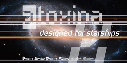 Itoxina is designed especially for the burgeoning market of starships and other space cruisers. Itoxina has been developed with the contribution of experts in navigation through space and time. The fonts are ideal for internal and external use (including zero-g and occasional bursts of cosmic rays), and with their simplified forms are expected to survive well in non-linear galaxies. With their unusual diagonal half-pixels the fonts are striking as abstract designs at astronomical sizes, where small text may be placed within the black holes formed inside the letters. On explicit suggestion of Mr. Spock true capital letters have been added.
 - Farfa by Eurotypo,
$44.00 The Farfa fonts were designed for institutional use, commissioned by the City of Fara in Sabina, Italy. This project started from the study of the manuscripts found in the Abbey of Farfa, penned in a variant of the lower case of “Carolingian” typical style of that area. The Capital, ligatures and Small Caps, however, are based on the uncial writing that often appears in those codes and manuscripts. Farfa Abbey is a territorial abbey in northern Lazio, central Italy. It is one of the most famous abbeys of Europe. It belongs to the Benedictine Order and is located about 60 km from Rome, in the commune of Fara Sabina The origin of the Abbey is still unknown. Archaeological discoveries seem to prove that the first monastic establishment was built on the ruins of a pagan temple. The Vandals destroyed the first monastery in the fifth century. Only a few documents from the sixth-century prove the early presence of the monastic community. It had the heritage of Charlemagne (S VIII), the Lombard chiefs, and later the Carolingians, succeeded in withdrawing Farfa from obedience to the Bishops of Rieti, and in securing many immunities and privileges for the monastery. Farfa was at this period the most important monastery in Italy both from the point of view of worldly possession and ecclesiastical dignity.
 - Doovy Groovy Party by Mofr24,
$11.00 Introducing the Doovy Groovy Party font! This stylized, psychedelic, and round Groove Display Font takes you back to the 90's and 00's era. With its multilingual support, it's perfect for creating a pop, funky, and bold vibe. What sets the Doovy Groovy Party font apart is its unique ability to capture the essence of the vibrant and energetic 90's and 00's era. Its stylized, psychedelic design evokes a sense of nostalgia while still offering a fresh and contemporary look. This font is a true standout, allowing your designs to stand out as well. For designers looking to create harmonious compositions, the Doovy Groovy Party font has a few relatives and typefaces that complement it beautifully. Consider pairing it with "Retro Sans Serif" for a bold and cohesive look, or experiment with "Funky Display" to amplify the funky vibes. These combinations will add an extra layer of creativity and versatility to your design projects. The Doovy Groovy Party font comes in three variations - Regular, Outline, and Shadow - making it a versatile tool for various design needs. The Regular version provides a solid foundation, ideal for headlines and titles that demand attention. The Outline variation adds an element of sophistication and can be used for modern designs, while the Shadow option creates depth and dimension for a more dynamic appearance. Additionally, this font boasts extensive multilingual support, ensuring that it can be used effectively across different languages and cultures. The Doovy Groovy Party font draws inspiration from the bold and expressive typography prevalent in the 90's and 00's. It captures the vibrant and carefree spirit of that era, where music, art, and pop culture collided to create an explosion of creativity. The psychedelic elements incorporated into the font pay homage to the colorful and trippy visuals that defined the time. This font encapsulates the nostalgia and excitement of those years, allowing designers to infuse their projects with a sense of fun and playfulness. We created the Doovy Groovy Party font with a passion for celebrating the bold and expressive designs of the past. We wanted to provide designers with a versatile tool that brings the nostalgic charm of the 90's and 00's to their modern projects. By using this font, you can effortlessly transport your audience to a time when colors were brighter, music was groovier, and creativity knew no bounds. Let your imagination run wild with the Doovy Groovy Party font and infuse your designs with a vibrant touch that will captivate and inspire! Unlock the power of nostalgia and creativity with the Doovy Groovy Party font. Its unique design, versatile variations, and multilingual support make it the perfect choice for posters, marketing materials, T-shirt designs, headlines, and much more. Get ready to groove and let this font elevate your creative projects to a whole new level!
 - Decrypt H1 by Type Innovations,
$39.00 Say hello to Decrypt H1—a geometric typeface that features highly stylized capitals with sharp corners, circular forms and generous proportions. Specifically created for visual impact—use Decrypt H1 when you want your words to stand out from the rest of the crowd. The concept is modern, futuristic and non-traditional. Perfect for display text, logos and headings. The development of Decrypt H1 started in 1997, inspired by Alex Kaczun’s best selling grotesque font family called Contax Pro. Decrypt H1 is specifically introduced here as a bold weight, but Alex plans to expand the design to include many weights, styles and alternative design treatments. Stay tuned! If you like Decrypt H1—check out it’s alternate twins Decrypt 01, Decrypt 02 and all of Type Innovations fonts at: http://www.myfonts.com/person/Alex_Kaczun/
 - Halloween Notes by PhoenixXWay,
$12.00 Every character in this font is meticulously crafted from eerie, yet beautifully haunting music notes. Here are some ways you can use this font to your benefit: Party Invitations: Create spine-chilling invitations for your Halloween party that resonates with the theme, setting the mood for a night of hauntingly good fun. Posters and Flyers: Craft attention-grabbing posters and flyers for haunted houses, Halloween events, or horror movie screenings that evoke the perfect blend of fear and fascination. Merchandise: Design eerie merchandise like t-shirts, mugs, or stickers that cater to Halloween enthusiasts and music lovers alike. Digital Media: Elevate your digital content, including social media graphics, banners, and web elements, to capture the essence of Halloween in a truly unique way. (This font only includes the 26 characters based on the English alphabet)
 - Fimfarum by Juraj Chrastina,
$39.00 Fimfarum is a word that the Czech actor and writer Jan Werich created for one of his magical fairy tales for children and adults. Fimfarum is also the name of this playful typeface equipped with various styles simulating the randomness of handwriting. You can choose to select and combine different styles either using an all-in-one pro font in an OpenType-savvy application, or with a 10 fonts family pack. Fimfarum Pro also offers an automatic random effect. The OpenType contextual alternates feature can randomly mix narrow, wide and bold characters. You can specify how through various stylistic sets. For more details, check the Fimfarum Typeface Manual. With this versatile tool your designing possibilities are immense. Well, this is Fimfarum. You can download the instruction PDF here.
 - Decrypt 02 by Type Innovations,
$39.00 Say hello to Decrypt 02—a geometric typeface that features highly stylized capitals with sharp corners, circular forms and generous proportions. Specifically created for visual impact—use Decrypt 02 when you want your words to stand out from the rest of the crowd. The concept is modern, futuristic and non-traditional. Perfect for display text, logos and headings. The development of Decrypt 02 started in 1997, inspired by Alex Kaczun’s best selling grotesque font family called Contax Pro. Decrypt 02 is specifically introduced here as a bold weight, but Alex plans to expand the design to include many weights, styles and alternative design treatments. Stay tuned! If you like Decrypt 02—check out it’s alternate twin Decrypt 01 and all of Type Innovations fonts at: http://www.myfonts.com/person/Alex_Kaczun/
 - Decrypt He2 by Type Innovations,
$39.00 Say hello to Decrypt He2—a geometric typeface that features highly stylized capitals with sharp corners, circular forms and generous proportions. Specifically created for visual impact—use Decrypt He2 when you want your words to stand out from the rest of the crowd. The concept is modern, futuristic and non-traditional. Perfect for display text, logos and headings. The development of Decrypt He2 started in 1997, inspired by Alex Kaczun’s best selling grotesque font family called Contax Pro. Decrypt He2 is specifically introduced here as a bold weight, but Alex plans to expand the design to include many weights, styles and alternative design treatments. Stay tuned! If you like Decrypt He2—check out it’s alternate twins Decrypt H1, Decrypt 01, Decrypt 02 and all of Type Innovations fonts at: http://www.myfonts.com/person/Alex_Kaczun/.
 - Hells Kittchen Devil God by TypoGraphicDesign,
$19.00 CHARACTERISTICS The font name is a pun on the German word "Kittchen" (English prison/jail) and the English "Hell’s Kitchen". The character of the font looks as though the scum here — the guilty and innocent prisoners carved/scratched their signs and messages at the prison walls of their jail cell. The cold, creepy and scratchy character of the handwritten typeface is a very unique gloomy atmosphere. APPLICATION AREA The scary, dark, horror, trash, handwritten script font "Hells Kittchen Devil God" with many symbols/dingbats would look creepy good at rusty display size for headlines. Magazines or websites, movie posters, music covers or webbanner. TECHNICAL SPECIFICATIONS Headline Font / Display Font / Trash Script "Hells Kittchen Devil God" OpenType Font with 375 glyphs — many symbols/dingbats, alternative letters and ligatures (with accents &€) & 2 style (regular, bold)
 - Raqmi Monoshape by Arabetics,
$39.00 Raqmi Monoshape is a simplified version of the Raqmi font family with unified (non-varying) shapes. This font family supports all Arabetic scripts covered by Unicode 6.1, and the latest Arabic Supplement and Extended-A Unicode blocks, including support for Quranic texts. It includes two weights: regular and light, each of which has normal and left-slanted Italic versions. The script design of this font family follows the Arabetics Mutamathil style utilizing varying x-heights. The Mutamathil type style utilizes only one glyph per Arabic Unicode character or letter, as defined by the Unicode Standards. Raqmi Monoshape includes the required Lam-Alif ligatures in addition to all vowel diacritic ligatures. Soft-vowel diacritic marks (harakat) are selectively positioned with most of them appearing on similar high and low levels—top left corner—, to clearly distinguish them from the letters. Tatweel is a zero-width glyph.
 - Ganges Slab by ROHH,
$40.00 Ganges Slab is a condensed slab serif typeface inspired by Central European advertising typography from late XIX century. It is a perfect match for Ganges Sans. The font has condensed proportions and original letter shapes. Ganges is designed mainly for editorial design, especially for display use, as well as short paragraphs of text. Its narrow proportion makes it very practical to use for posters and magazine covers. Characteristic letter forms fit great for branding, logo and packaging design. It is also a very interesting choice for websites and e-book headlines. Ganges Slab family consist of 27 fonts - 9 weight, 9 italics and 9 obliques. It supports extended set of latin languages, as well as broad number of OpenType features, such as case sensitive forms, standard and dicretionary ligatures, stylistic alternates, contextual alternates, lining, oldstyle and tabular figures, slashed zero, fractions, superscript and subscript, ordinals, currencies and symbols.
 - Hand Stamp Slab Serif Rough by TypoGraphicDesign,
$25.00 The typeface “Hand Stamp Slab Serif Rough” was designed for the Typo Graphic Design font foundry in 2017 by Manuel Viergutz. It is a display font with a classic slab serifs based on real rubber stamp letters for a authentic, rough & dirty, stamped-by-hand appearance. It provides a vintage look through state-of-the-art Open Type features such as contextual alternates that cycle automatically through 5 different letter variants for each character to create a varied look, just as if the letters were stamped by hand. The font is intended for use in logos, magazines, posters, advertisements, and as a webfont for decorative headlines. The font works best for display sizes. There are 1031 glyphs with 5× A–Z, 0–9 & a–z and 70+ decorative extras like arrows, dingbats, symbols, geometric shapes, catchwords, and many alternative letters. A range of figure set options including oldstyle figures and additional decorative ligatures (type the word “love” for ❤ … ), Versal Eszett (German Capital Sharp S), symbols, and emojis. Have fun with this font & use the DEMO-FONT (with a reduced glyph-set) FREE!
 - Chutz by Michael Rafailyk,
$9.00 Chutz is an audacious slanted typeface with horizontal contrast and horizontally oriented strokes developed for Jewish brand Chutzpah of the Feisty Foods company based in Brooklyn, New York. Scripts: Latin, Greek, Cyrillic, Hebrew Languages: 480+ Hinting: TrueType autohint for static fonts. Variable font is unhinted. The promo images used photos of Ola Rafailyk, and photos of Marta Dzedyshko, Josh Sorenson from Pexels.
 - Rofato by Papermode Co,
$22.00 Rofato is a beautiful and light handwritten font with a unique feel and a stunning impact. It will add a luxury spark to any design project that you wish to create! This font is PUA encoded which means you can access all of the amazing glyphs and ligatures with ease! Try Rofato, enjoy the richness of OpenType features and let her fun and elegant excitement make you happy and enhance your creativity! You can use this font very easily. Included multiligual support and special ligatures If you do not have programs that support OpenType features like Adobe Illustrator and CorelDraw X Versions, you can access all alternates using Font Book (Mac) or Character Map (Windows). Thank you!
 - Tendria by Linotype,
$29.99Patricia Pothin-Roesch's Tendria typeface bases its letterforms on the logo for the French “Tendriade” mark. Clearly inspired by writing and hand lettering, Patricia Pothin-Roesch began her work on Tendria in Adobe Illustrator. After a few letters, she went back to designing the old-fashioned way: drawing by hand on layers of tracing paper. Tendria is a sturdy upright script face with a warm, childlike feeling. Its letters are like the typefaces often used in primary schools; the counterforms are large and open. The name Tendria is reminiscent of the French word for tender, “tendre.” Designers who set Tendria lovingly will reap rewards; this is an excellent addition to a display heading toolkit. - Deliscript by Alphabet Soup,
$29.00 Although initially inspired by the neon sign in front of Canter’s Delicatessen in Los Angeles, the design of Deliscript Upright and Deliscript Slant soon took on a life of its own–and its own distinctive look. Like its sibling Metroscript, Deliscript has many features that expand its usability such as the the variable length tails which can be accessed in 6 different styles, and the never before seen crossbars which can be extended outward in either direction from the lower case “t”. Throw in the special “WordLogos”, tons of ligatures and foreign accented characters, and you have a recipe for typesetting that approaches the look of hand-lettering. For a better understanding of its unique features please download The Deliscript User Manual—available in the Gallery section.
 - Bellagia Display by Attract Studio,
$22.00 Bellagia Display is a blend of two hand calligraphy typefaces and vintage serifs with a natural bond consisting of 7 weights from Thin to Black. All the wildcards and binders are specially designed to bring out the letters that are unique, and interesting. This makes it a very versatile font that works in both large and small sizes. Perfectly supports your creativity in making various design projects such as logo designs, branding, posters, magazines, labels, merchandise, invitations, long and short texts, and many of your other needs. Bellagia Display Features: - 7 Weights (from Thin to Black) - 1 Variable font - Alternates & Ligatures - OpenType support - Multilingual - PUA Encoded.
 - Daytona by Monotype,
$50.99 The Daytona™ typeface family grew out of a desire to provide improved fonts for use in televised sporting events. Jim Wasco drew the design as sturdy squared letters based on humanist shapes and proportions. Letters were kept narrow for economy of space, and inter-character spacing was established for easy reading. While televised sporting events may have initially been his target, the design considerations he incorporated into the Daytona family also enabled it to perform well in a variety of other video and on screen environments. Daytona Variables are font files which are featuring two width axes and have a preset instance from Thin to Fat.
 - Legquinne by Jolicia Type,
$19.00 We introduce our product called Legquinne. We designed this serif type font to reflect elegance and modernity to create an aesthetic feeling in every word issued by Legquinne. With 8 weights and variables it is possible to present the flavors of our font. The total number of glyphs is 429 support for 93 Languages
 - Gazzetta by TipoType,
$24.00 Gazzetta is a condensed font family with a display character and neo-grotesque nature, friendly and energetic. It exhibits softened features and curves, very sharp joins between some strokes, and a slight reverse contrast in its thicker weight. Characteristics that give it a lot of personality and display capacity.The family is made up of 8 weight variables and their respective slanted versions, with substitutions in some glyphs that seek to maintain an italic flavor. It has a repertoire of OpenType features, including Stylistic Alternates, Case Sensitive Forms and Old Style Figures. In addition to decorative resources such as circled numbers, arrows and quotation marks. Its aesthetic and technical attributes can be used in the design of book covers, newspapers, magazines, posters, large format materials, websites and apps.
 - Silent Noise Font Duo by Dora Typefoundry,
$19.00 Silent Noise has two font types, namely serif and handwritten script with a thin size, adding to the impression of elegance and class, both of these fonts have a subtle touch Silent Noise is versatile enough to add an elegant element to almost any project that requires a special touch of class.,perfect for casual type on greeting cards, illustrations, quotes, old branding, cover books, social media posts, packaging and many others :) Features : Uppercase & lowercase Numbers and punctuation Alternates & Ligatures Multilingual PUA encoded WHAT'S INCLUDED Silent Noise Serif Silent Noise Script Once you download this romantic, handwritten font duo you will be able to start creating straight away. Enjoy! We highly recommend using a program that supports OpenType features and Glyphs panels like many of Adobe apps and Corel Draw, so you can see and access all Glyph variations. This type of family has become the work of true love, making it as easy and fun as possible. I really hope you enjoy it! Thak you.
 - Le Havre Layers by insigne,
$19.00 With this charming new layered typeface, the possibilities are endless with your vision behind it. Accomplish the effect you've been searching for by layering these exceptional fonts and altering opacity and color, for a unique custom appearance that yells “hello there!” Play around a bit with the potential of Le Havre Layers. Build effects which include realistic 3D appearances reminiscent of the storefronts of old and adding centerlines, dotted centerlines, and shadow variations. Inspired by the affable appearance of vintage signage from the 1930s to the 1960s, Le Havre Layers spacing is altered from Le Havre Titling’s to accommodate shadows and other options properly. With its generous width it sends a message of refinement and grace. The geometric and art deco curves are a beautiful addition to your work. Mix and match with the other members of the Le Havre Hyperfamily. There are many amazing design solutions for you to discover. See what you could build with Le Havre Layers!
 - Hunky Chunk by Just My Type,
$25.00 Way back in the 1990s, the fatter the fast food generation got, the more condensed letters became. I figured when the taste in fonts started to mirror the contemporary bodily norm, Hunky Chunk should be there. Here it is.
 - Odisean by deFharo,
$24.00 Odisean Fonts and its 3 styles (One, Tech & Small Caps) are ideal for graphic design, editorial, logos and posters. Its rounded finish and marked contrast between antlers evoke the charm of bygone eras. In addition, it has a collection of retro icons accessible through OpenType: Small Caps. Letter proportions are multiples of 8, ensuring exceptional visual harmony, while metrics and kerning use values multiples of 8 for impeccable legibility and aesthetics. Discover Odisean and revive retro nostalgia in your designs. Each Odisean variant comes loaded with a set of alternative letters that allow you to customize and adapt each project to your liking. In addition, you will be able to access an exclusive collection of retro icons through the OpenType feature: Small Caps, adding even more versatility and charm to your creations. - Odisean One will transport you to a bygone era with its retro charm, offering you alternative lyrics that evoke the aesthetic of the golden and happy years. - Odisean Tech for those who love technology and innovation, the font is full of graphic elements and retro transportation icons, which will immerse you in a futuristic world of the past. - Odisean Small Caps bring elegance and versatility to your designs with their small capital letters.
 - Mule Cargo by Menagerie Type,
$20.00 The Mule is a very special mix – it has a donkey father and horse mother, and they often inherit the best qualities of both. "The mule is an example of hybrid vigor, Charles Darwin wrote: The mule always appears to me a most surprising animal. That a hybrid should possess more reason, memory, obstinacy, social affection, powers of muscular endurance, and length of life, than either of its parents, seems to indicate that art has here outdone nature." They are typically very strong for their size compared to horses and are able to cope with bad weather better than donkeys. Mules rarely become ill and their behavior is Intelligent and sensitive. In the right home, they can make great companions for other equines, and wonderful pets. However, if they are unhandled or not correctly trained, mules have the potential to be dangerous. The inner shapes of Mule Cargo are almost identical between the Regular and the Heavy weight. This shared genom make them very powerful pair and a useful design tool for display purposes.
 - Risotto Script by Estudio Calderon,
$69.00 Risotto Script is a sexy font designed by Felipe Calderón, it represents the texture, sound, smell and flavor of food that come in those interesting packages with different concepts. This font makes you want to eat it because it is designed with a unique texture like a lot of vegetables, it has flourishes that suggest herbs and country roots. Calligraphy with folded pen and food packaging were two of the inspirations to develop this project that will work well wherever it is applied. Risotto Script Pro has 672 glyphs that have the purpose of covering a lot of writing options with different results, by applying OpenType programming as: - Standard ligatures - Stylistics alternatives - Contextual alternates - Discretionary ligatures - Swashes - Terminal forms - Stylistic Set 1, 2, 3 and 4 - Initials (it includes leaves in some endings) NOTE: The X height is generous, in order to design signs to 8 and low size. You`d better get the “extras” for a more complete experience. Most of the Standard ligatures include Stylistics alternatives with detailed endings Multiple language options.
 - Limoncello Recipe by PeachCreme,
$19.00 Savor the perfectly imperfect strokes of "Limoncello Recipe," a handwritten font that embraces the charm of human touch in every line. Just like the handwritten notes of a well-used family cookbook, this font features delightfully uneven lines and a casual, unrefined style that brings an approachable, personal feel to any project. With 84 standard ligatures, "Limoncello Recipe" reflects the natural variations of handwriting, creating connections that are as authentic as they are unique. These connections celebrate the beauty of imperfection, making your text resonate with the warmth and originality of a handwritten letter. The font's assortment of beginning and ending swashes provides a variety of expressive flourishes, giving your words a laid-back elegance. These alternates allow for a playful freedom in your designs, echoing the spontaneous and joyful scribbles found in the margins of a secret family recipe. Ideal for designs that call for a touch of rustic charm and a dash of whimsy, "Limoncello Recipe" is a reminder that beauty often lies in the flaws. Whether you're designing a quirky brand identity, a charming event invitation, or packaging for artisanal products, this font proves that sometimes the best approach is a little bit carefree and wonderfully imperfect.
 - Grit Gothic by Baseline Fonts,
$39.00 You can hear the wheels of imagination turning within this font - Grit Gothic, from Grit History™ B Series, by Baseline Fonts. Both highly stylized and very legible, the extreme height of this font can give even a goblin vertigo. Extended X heights create lowercase that adventurously reach up through extended shoulders and spines while persistent grunge warns of skinned knees that may result along the climb. It’s easy to envision children’s rallying cries in Grit Gothic, perfect for book titles, film titles, poster headlines, and any other epic that needs a strong font with a dark edge of mystery and wonder. This font is rife with personality, including large and daunting punctuation, whittled wood-look vertical bars that berate and argue with beveled bowls, ascenders that attempt to intimidate one another with their height variances, and tittles that bully one another, as they're a variety of context dependent sizes. Grit Gothic is available in Regular and Bold with full Greek-lettered foreign language support.
 - Klint by Linotype,
$40.99 Type designer Hannes von Döhren created Klint. A sans serif typeface with a technical appearance and humanistic streak. The family includes five weights; each weight ships in three widths: condensed, regular, and extended. All of the 15 Klint variants have a companion Italic, rounding out family at 30 fonts. Klint's large x-height makes the design especially legible at small point sizes. In today's day and age, appliance manufacturers and/or companies in the mobile phone, computer hardware and software or Internet sectors are becoming ever more important. Klint fills the rising need for superfamilies with a technical feeling that are also legible in both text and display settings. Through conspicuous letters like R, K, k, or g, as well as the independent nature of its Italic, Klint exudes an ethos that separates it from the competition. Longer text passages in brochures, catalogs, or magazines would be well served by Klint's Light, Regular, and Medium weights. The heavier cuts are optimized for poster settings and headlines."
 - Petras Script EF by Elsner+Flake,
$35.00 Petras Script, the first digital script font created by the calligrapher Petra Beiße, has, for many years, met with worldwide success. Now the font is complemented with an alternate character set, which gives designers more flexibility and adds a personal touch to the font. Petra Beiße has resided for a long time in Wiesbaden, Germany, where she is working as a renowned calligrapher. It is rare that any of her scripts are transferred into digital format and sold worldwide as fonts. Because Petras Script became such a huge success, she decided to release Casanova Script Pro.
 - Dubrove by Dima Pole,
$36.00 Dubrove is a wedge serif typeface inspired by Moravian (Czech) type designs of the 1930-50s. The character font is expressive: free, daring and graceful, delicious and attractive. Here are more than 1100 glyphs, all 102 European languages, all Ancient Slavic Alphabet (49 characters), Latin and Slavic small capitals and OpenType features with many solutions. Dubrove has several stylistic sets, historical forms, localized forms of several languages, interest contextual ligatures and many other delicacies. In the Dubrove typeface several stylistic sets of Slavonic lowercase letters are made. In addition to font basic style (in fact it is close to the natural lowercase character) is a traditional [ss02] set (postpreliminary, the Soviet Union, when most copy lowercase letters are uppercase) and lowercase the natural character [ss03], the style of which, in particular, is often used in the Bulgarian script.
 - Ganges by ROHH,
$40.00 Ganges is a condensed sans serif typeface inspired by Central European advertising typography from late XIX century. The font has condensed proportions and original letter shapes. Ganges is designed mainly for editorial design, especially for display use, as well as short paragraphs of text. Its narrow proportion makes it very practical to use for posters and magazine covers. Characteristic letter forms fit great for branding, logo and packaging design. It is also a very interesting choice for websites and e-book headlines. Ganges family consist of 27 fonts - 9 weights, 9 italics and 9 obliques. It supports extended set of latin languages, as well as broad number of OpenType features, such as case sensitive forms, standard and dicretionary ligatures, stylistic alternates, contextual alternates, lining, oldstyle and tabular figures, slashed zero, fractions, superscript and subscript, ordinals, currencies and symbols.
 - XXII CoolScript by Doubletwo Studios,
$25.99 XXII CoolScript - The vibrant typeface with a ton of alternates MAJOR UPDATE This is a big update of XXII CoolScript. First of all, from now it’s a whole family with 7 new weights from ExtraThin to Black. It comes with more than hundred additional glyphs, some more alternates, ligatures, numerals and fitting opentype features for fractions and two extra ampersands. This lovely script font by Lecter Johnson is another, more soft and round one in the series of Doubletwo Studios’ script fonts (XXII YeahScript, XXII AwesomeScript). Its wonderfully designed letters, ligatures and alternates may bring a charming and individual handwritten look to your creation. This fonts are designed to easily create logos, headlines and text phrases within a blink of an eye. Just open your glyphs-palette* and simply chose, from up to 27 different alternates and variations per glyph, the one that fits best for your needs. *For further information visit the Behance Project.
 - Omega Pixel by João Henrique Lopes,
$- OmegaPixel Font Description I created this font for the game Hyper Ninja Blast (but made it useful to all kinds of games!). While creating the game, I searched for pixel fonts, but could not find a suitable one. The fonts were generally ugly and lacking the basic variations (italic and bold). So I decided to create my own pixel font. Just as pixel art can be better than a high-resolution painting, so pixel fonts don’t need to be always worse than traditional fonts. In OmegaPixel I tried to achieve elegance, readability and flexibility within the limitations of a 6 pixel x-height. With 4 versions (regular, italic, bold and bold italic), and a neutral feel, OmegaPixel can be used in any genre of games. Considering the general lack of money among indie game devs, I’m giving the regular version for free! For inspiration, I often remebered Minion’s lowercase ‘a’, Galliard italic lowercase ‘g’, and the calligraphy of Chinese emperor Huizong.
 - Arista Pro by Zetafonts,
$39.00 Arista Pro is the definitive version of the successful Arista typeface, designed by Francesco Canovaro, first released in 2007 as Arista Z and then reissued as Arista 2.0 in 2010. The pro version of Arista features the geometric and soft approach of the original typeface but comes in a full range of weights and two alternate versions (Arista Pro Regular and Arista Pro alternate version). The typeface has been expanded with the inclusion of Greek and Cyrillic alphabets as well as an extended range of latin characters. A companion icon typeface, Arista Pro Icon, has been developed, allowing for variable-width monoline icons that can be used to faultlessly match the typeface line width, up to semibold weight.
 - VLNL Bleek by VetteLetters,
$35.00 Bleek started its life as a logo for a rock band with the same name. This makes sense as it has distinct roots in classic rock logo design. Any rock band name set in VLNL Bleek looks instantly cool – profi logo quality! Of coarse Bleek will serve an awesome purpose as a headline font as well. Or gig flyers and posters. Or band backdrops. Just turn it up to 11! DBXL expanded the original logo into the full Heavy weight and added Light and Medium cuts. VLNL Bleek is an all caps font with uppercase and lowercase variations for maximum effect. It has a number of Open type features, like and alternate F, mirrored A and O and a TT ligature to spice up your designs. VetteLetters says: Rock on!
 - Naive Deco Sans by S&C Type,
$8.00 Naïve Deco Sans is a layered sans serif handwritten font designed by Fanny Coulez and Julien Saurin in Paris. Our goal was to draw a font with finely irregular lines that give a human and whimsical feeling. It is available in two versions: double or triple lines. The font is also decomposed in three different parts that you can use to improve your designs with multiple colors, giving to the font a deco touch. To do so, you can simply superimpose the parts with a compatible software like Photoshop and choose a color for each. This font is part of our Naïve superfamily that contains lot of variations: Line, Inline, Serif, Sans Serif... Just click on our foundry name to see them all! We hope you will enjoy our work. Merci beaucoup!
 - Purgatorie by Putracetol,
$16.00 Purgatorie - Quirky Halloween Font is an enigmatic display typeface tailor-made for the spooktacular season of Halloween. With its sharp, angular letterforms, it effortlessly embraces the eerie and horror-themed design aesthetic. This font offers a whopping ten alternative variations, each inspired by different Halloween motifs like skeletons, bats, tombstones, blood, pumpkins, bats, witches' hats, and ghosts. Ideal for crafters and designers who enjoy creating products with a variety of themes, Purgatorie is a fantastic choice for logos, packaging, product branding, stickers, crafting, greeting cards, and invitations. Its ability to bring a playful and whimsical Halloween spirit to your creative projects makes it a must-have for the season. With its quirky Halloween style, Purgatorie allows you to create a bewitching atmosphere in your designs and celebrate the spooky holiday.
 - Fakir Pro by Underware,
$50.00 Fakir | A Hindu ascetic or religious mendicant, especially one who performs feats of magic or endurance. The well known feats performed by them include sitting steadily on a bed of nails and walking on burning coals. Blackletter | A script used throughout Western Europe from approximately 1150 to 1500. It continued to be used for the German language until the 20th century. Fakir, a blackletter with a holy kiss is a contemporary interpretation of gone letterforms with origin in blackletters. More precisely, we based the construction on broadnip textura, with lots of broken, edgy, interrupted strokes – try to sit on a nail bed and you’ll know why fakirs like to read just these kind of fonts! After being abandoned for some time (not accepted, nearly forbidden), we would like to give our generation a blackletter from here and now. So Fakir is not a revival, but an all new 21st-century blackletter. Fakir is a set of edgy text and display fonts, ranging from tight and heavy to light and wide. It has 11 fonts, all supporting Underware Latin Plus character set, that covers 219 languages.
 - Rouge Gorge by Par Défaut,
$15.00 Rouge Gorge is a Serif Font (Regular, Italic, Semi-Condensed, Condensed and Variable) The font also has 7 OpenType features : (All access Alternative (aalt) - Fraction (frac) - Numerator (numr) - Denominator (dnom) - Old Style (onum) - Kerning (kern)