10,000 search results
(0.028 seconds)
- OCR A Extended by Monotype,
$40.99OCR A and OCR B are standardized, monospaced fonts designed for Optical Character Recognition" on electronic devices. OCR A was developed to meet the standards set by the American National Standards Institute in 1966 for the processing of documents by banks, credit card companies and similar businesses. This font was intended to be "read" by scanning devices, and not necessarily by humans. However, because of its "techno" look, it has been re-discovered for advertising and display graphics. OCR B was designed in 1968 by Adrian Frutiger to meet the standards of the European Computer Manufacturer's Association. It was intended for use on products that were to be scanned by electronic devices as well as read by humans. OCR B was made a world standard in 1973, and is more legible to human eyes than most other OCR fonts. Though less appealingly geeky than OCR A, the OCR B version also has a distinctive technical appearance that makes it a hit with graphic designers. - A Likely Story by Comicraft,
$39.00 Finally an animated alphabet with a tall tale to tell -- perfectly suited to putting words in the mouths of mutts, talking tigers and anthropomorphic animal characters of all kinds. The precise thick and thin pen strokes of these eight versatile weights are well suited to gag strips, classic cartoons and maybe even that internet meme you've been thinking about for weeks!
 - AF Generation A by ACME Collection,
$44.00 - Ariana Script by Zane Studio,
$20.00 Introducing a new, elegant Ariana Script Font! If you need a casual chic calligraphic touch to your designs, this font is made for you! Ariana Script is built with OpenType features and includes start and end swashes, alternative characters for lowercase and uppercase letters, lots of different swash alternatives for lowercase, numbers, punctuation, alternatives, ligatures and also supports other languages :) More than 400 engines fly! If you don't have opentype capable software, you can still access all ligatures, alternatives and swash alternatives by installing all the supporting fonts included in the download. From there, you can switch between the two as you type for a handwritten, professional look. Take a look at the character map to help you along the way! Thank you very much for visiting my shop! All the best,
 - Marian Churchland by Comicraft,
$39.00 Tall, thin and elegant, Marian Churchland’s fonts are very much like her.. and now available from those awfully nice chaps at Comicraft to allow you to pretend that you are too! Marian Churchland was born in Canada in 1982, and was raised on a strict diet of fine literature and epic fantasy video games. She has a BA in Interdisciplinary Studies (English Literature and Visual Arts) from the University of British Columbia, and has been doing professional illustration work, including book covers and magazine articles, since she was 17. Last year, she became the first woman to solo-illustrate a CONAN story, and this year she’s illustrating three issues of ELEPHANTMEN for Image Comics. See the families related to Marian Churchland: Marian Churchland Journal.
 - Ariana Pro by Mostardesign,
$25.00 Ariana Pro is a geometric font family. It provides advanced typographical support with features such as case sensitive forms, small caps, ligatures, alternate characters, fractions, circled gures, pro kerning…This typeface comes with a complete range of ligature set options. It comes in 9 weights with corresponding italics and it’s suited for multiple purposes including editorial use, web font, apps, digital ads and also for advertising, long text and branding. As a modern sans serif font family, Ariana Pro has also an extended character set to support Central and Eastern European as well as Western European languages.
 - Varial Rounded by Cloud9 Type Dept,
$35.00 Varial typefaces are extra-condensed Opentype™ sans-serifs with small caps, extended character set (european languages support) and extra features (fractions, ligatures and alternatives).
 - Varial Two by Paavola Type Studio,
$21.00 Varial Two typefaces are new and updated versions of Varial family created 2014: Extra-condensed Opentype™ sans-serifs with small caps, extended character set (european languages support) and extra features (fractions, ligatures and alternatives). Varial Two is versatile in all design applications, for example all headlines, display use, infographics and more!
 - Varien SS by Sensatype Studio,
$15.00 A Modern Strong Display Font that perfect for technology, sport, racing, action design project. A new Display Font that we created special for Headline, Title and more stand out typography needs, with extra outline that will add your variations. It's so perfect to add your style and headline overview. And specially for Headline font, we crafted for futuristic style and modern feels so enjoy to create any project that will show your main idea out. Varien Modern Strong Display Font ready with: Any options to get creative variations (combination of Outline Characters) Preview as a inspirations that you can do with Varien font Ready with All Uppercase characters Wish you enjoy our font. :)
 - Ongunkan Carian by Runic World Tamgacı,
$50.00 Caria (/ˈkɛəriə/; from Greek: Καρία, Karia, Turkish: Karya) was a region of western Anatolia extending along the coast from mid-Ionia (Mycale) south to Lycia and east to Phrygia. The Ionian and Dorian Greeks colonized the west of it and joined the Carian population in forming Greek-dominated states there. Carians were described by Herodotus as being of Minoan descent, while he reports that the Carians themselves maintained that they were Anatolian mainlanders intensely engaged in seafaring and were akin to the Mysians and the Lydians
 - Varial Medium by Cloud9 Type Dept,
$35.00
- Varent Grotesk by Identitype Co,
$25.00 Identitype is very pleased to present Varent Grotesk, a sans serif family designed by Hendra Maulia and Aulia Rahman who was inspired by modern sans serif. The weights of the family itself contain 18 styles plus italic, ranging from Thin to Black. Ideally, it works to capture in a graphic way the universe related to technology, sci-fi, industry, and similar topics. It is a mixed family because of the construction of certain letters (as in “a”, “e”, “h”, “k”, “A”, “B”, and more). Another important line in the creative concept of this typeface is the function of its ink traps, which, in addition to fulfilling their primary function, serve to gain gestuality in its use. This font is capable of covering complex design needs by enabling association with specific themes, which makes it highly competitive in its graphic line.
 - Saved By Zero - Unknown license

- Electric Hermes AOE - Unknown license

- SF Zero Gravity - Unknown license

- SF Zero Gravity - Unknown license

- Zero Velocity (BRK) - Unknown license

- SF Zero Gravity - Unknown license

- Electric Hermes AOE - Unknown license

- SF Zero Gravity - Unknown license

- Kilroy Was Here - Unknown license

- JLR Lookee Here! - Unknown license

- Monkey Was Here by Intellecta Design,
$22.90 A collection of fonts by the type foundry Intellecta Design. Distressed and antique, use these fonts in display purposes for a stylized type design. Contains a limited amount of letter designs.
 - Chinese Herbs JNL by Jeff Levine,
$29.00Chinese Herbs JNL gives an outline and cast shadow treatment to the lettering found in Chinese Menu JNL. Based on some old signage. - BF Sub Zero by BrassFonts,
$30.00 - MC Sero Aromad by Maulana Creative,
$14.00 Sero Aromad brush script font. This font is good for logo design, Social media, Movie Titles, Books Titles, a short text even a long text letter and good for your secondary text font with signature or script typeface. Make a stunning work with Sero Aromad brush script font. Cheers, Maulana Creative
 - Ovoid Two Zero by No Bodoni,
$35.00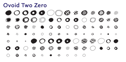
- Lookey Here JNL by Jeff Levine,
$29.00Lookey Here JNL is an "Alphading" - a term coined by Jeffrey N. Levine to describe dingbat fonts containing both images and letters and/or numbers. This one - partially based on the classic "Kilroy" icon from the World War II era is a newer, cleaner reworking of one of Jeff's early freeware fonts. The typeface used inside the images is Casual Lunch JNL, so you can match this text for a particular project. Limited character set. - Varia Display by Tomtype,
$6.00 Introducing Varia Display, a font that emerged from the renowned challenge of 36 Days of Type. In the 2023's edition, I embarked on a journey to explore a wide variety of styles, leading to infinite possibilities for crafting unique letterforms. The result is a meticulously crafted variable font with a single weight axis, designed to push the boundaries of typographic aesthetics across all characters. With each letter and number embodying a distinct and innovative approach, this font offers a captivating typographic experience. With its distinctive and varied letterforms, this font is ideally suited for eye-catching main headlines and complementary typography. Whether you seek diversity or a touch of uniqueness, this font is sure to meet your creative needs. Embrace the world of possibilities it presents and elevate your designs to new heights. Key features: Meticulously designed Variable Font Single Weight Axis Multilingual support 374 glyphs Contact: If you have any doubts or questions please ask me via mail or Instagram hello@tomascastiglioni.com @tomtype
 - Ariane Coachella by UICreative,
$23.00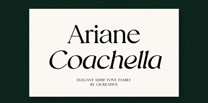 Introducing our new product the name Ariane Coachella Elegant Serif Font Family comes with 9 different weights. Modern Serif font that feels beautiful classy, elegant, and modern. This font is perfectly suited for a wide variety of projects, such as signature, stationery, logo, wedding, typography quotes, magazine or book covers, website headers, clothing, branding, packaging design, and more. Also for fashion-related branding or editorial design and displays both masculine and feminine qualities.
 - Polias Varia by Esintype,
$140.00 Polias Varia is an all-caps uniwidth variable weight typeface inspired by an ancient inscription carved on a monoblock stone in hybrid characters — between no-contrast linear sans to low-contrast flared serif. The inspiring inscription is the dedication by Alexander the Great, discovered in the Temple of Athena Polias in the ancient Ionian city of Priene. Stanley Morison mentioned this inscription in one of his lectures: “The distinctive feature of this inscription consists of a consistent thickening towards the ends of perpendiculars and horizontals.” … “We have not the right to say that the serif was invented for Alexander the Great’s inscription, only that this is its first datable appearance.” In Polias Varia, the letter proportions are almost identical to the original, but the stroke features have been reinterpreted and characterized. Serif-like nodes at the end of the strokes are subtle extensions that serve to accentuate rather than break its monoline elegance. With an analogy, they are not flowers, but like blooming buds. Polias Varia is a flared sans typeface which is closer to sans-serif forms on the spectrum between sans and serif. It’s especially light looking by design to convey rather thin and white typographic color of its original monumental look. It comes in eight weights and a variable font, scaled from Thin to Bold. It is multiplexed, so the weights do not affect text lengths. Light weights are closely based on the actual carving of the inscription. Thicker weights can be used on smaller typesettings to compensate for the weight difference of larger letters’ strokes, and to keeping the monoline appearance of the entire text block intact. This method can be used for any purpose, such as setting a hierarchy between the lines or to justify their lengths. Some of the original letterforms have been preserved and stylistic alternatives such as Ionic four-bar Sigma, dotted Theta, palm Y are provided as open type feature. Some of the other ancient forms, such as the three-bar Sigma (S), the pointed U, were also added for both the Greek and Latin scripts. Polias Varia is preferable for big type settings such as logos and headlines as a modern representation of perennial classical forms. Its a fine fit for product branding, movie posters, book covers, packaging materials, and more, which require an epic look to attracting attention with a distinctive elegance. Polias Varia can be considered for distinctiveness wherever Roman Capitals work. As a noun, Polias is one of the epithets of Athena / Minerva, and in this case referring to her role as the protector of the city of Priene. Polias (family) is one of the seven typeface designs in Esintype’s ancient scripts of Anatolia project, Tituli Anatolian series.
 - PG Grotesque Variable by Paulo Goode,
$300.00 IMPORTANT: This is the VARIABLE VERSION of PG GROTESQUE This is my interpretation of Edel Grotesk – a “lost typeface” from circa 1914 produced by Johannes Wagner GmbH of Ingolstadt, Germany. PG Grotesque is definitely not a revival, or even a faithful reproduction of that typeface as I was unable to source enough accurate references. What I have done is take the essence and unique characteristics of that typeface and brought this forgotten gem right into the 21st century. This variable version includes 99 instances spread across 9 weights and 6 widths with the ability fine tune the width, weight, and italic angle to your exact preference. Distinctive features include high-waisted capitals, a straight-legged capital ‘R’, and flattened arches in the ‘a’ and ‘g’ glyphs. Using PG Grotesque will give your typography a distinctly retro feel with its vintage heritage inherent in every character. You will find this is an incredibly versatile typeface with added value from its extensive language coverage along with small caps availability at the click of a button. PG Grotesque will prove to be a valuable asset in your type arsenal. See full details and hi-res images at https://paulogoode.com/pg-grotesque
 - Tazugane Info Variable by Monotype,
$1,049.99 Tazugane Info is a Japanese typeface family developed by the Monotype Studio, an alternative set of kana designed to match the kanji and Latin alphabet which retains the original form of the Tazugane Gothic. In contrast to the Tazugane Gothic, the kana of Info family is more systematically designed in order to give the text a calm, restraint look.
 - Xanas Wedding Variable by Pedro Teixeira,
$30.00 This font family has derived from a lettering creation for my wedding stationery. One of the most significant momentos for me and my wife Xana (hence the font name - Xanas Wedding). I hope this typography can give a touch of informal elegance and discreet beauty to your projects. There can be multiple applications, since this font is flexible enough to appear as a custom text or a variable, organic, handwritten work. Initial and final swashes: you select a letter (like "a" of xanas wedding inicial swash) and then you type the other letters, but with another font (like xanas wedding bride, for example). In the final of the phrase/name, you type "a" or "d" and select this final letter and switch the font for xanas wedding final swash.
 - Dexa Pro Variable by Artegra,
$79.00 Dexa Pro is now available on variable version. The family was designed by Ceyhun Birinci in 2020 with an inspiration to create a contemporary super family with inspiration from classic sans serif families. It's a workhorse family consisting of condensed, narrow, normal and expanded widths. Each width has a wide weight range from thin to black, along with their true italic counterparts. With more than 770 glyphs per font, It offers a ton of language support from all the Latin languages to Cyrillic.
 - Shorai Sans Variable by Monotype,
$1,049.99 Shorai™ Sans balances the subtlety of traditional hand-drawn brushstrokes with clean, geometric outlines. An intellectual-looking sans serif, Shorai’s simplified letterforms and vast weight ranges provide creatives with a holistic branding solution. Shorai Sans was designed as a companion typeface to Avenir® Next, built to work harmoniously in modern global designs, while preserving the essence of Japanese handwriting. Shorai goes beyond existing Japanese sans serifs to provide a wide spectrum of expression and personality for designers to play with. Shorai Sans is opening new horizons in Japanese typography.
 - Vintage Genial Variables by Typeskets,
$25.00 Introducing Vintage Genial, a captivating vintage script font that brings depth and dimension to your designs with its extrude version. This font family and variable package offers a timeless charm and retro-inspired style, perfect for creating visually striking and nostalgic designs. Vintage Genial's extrude version adds a three-dimensional effect to the classic script font, creating a visually stunning illusion of depth. This variant enhances the elegance and character of the original script styles, giving your design a distinctive and captivating aesthetic. Customize each variant of Vintage Genial using the variable font feature to align with your brand identity. Adjust the thickness or width of the letters to create a unique look that sets your design visual Elevate your visual design with Vintage Genial's vintage script font and its extrude version. Experience the captivating allure of this font and give your designs a mesmerizing vintage aesthetic.
 - Gridlite PE Variable by Rosetta,
$290.00 The two great technical constraints a type designer can tackle are low resolution, which limits detail and dictates proportions between negative and positive shapes, and uniform width, which restricts each letter to a fixed horizontal space. Wrestle with both at once, and each letter becomes a black-and-white chessboard that challenges every design decision. Sometimes battling these constraints gets in the way of a good idea, but other times, tinkering with fewer options can make the job irresistibly easy and lead straight to a grid addiction. Gridlite, an experiment with a modular negative space, is the side effect of such an addiction. It’s simplified, monospaced, and variable: foreground and background alike are ready to be animated, typed, scaled up, scaled down, rounded, or otherwise deformed. Gridlite is primarily a variable font with axes that control the size of the elements, their shape, and the background (one for the rectangular field and one for the compact envelope around the letters). The fonts cover Cyrillic, Greek, and Latin scripts. Small caps are included, for no apparent reason ... and there is a monospaced elephant, too.
 - Extra C Variable by Tipastype,
$56.00 It is an Extra Condensed, Extra Light, Extra experimental and Extra display font. Extra C is a fun font that doesn't take itself too seriously. Ideal for those who need a font with great character and personality but at the same time a delicate touch in their graphic pieces.
 - FS Koopman Variable by Fontsmith,
$299.99New York to London via Europe The hardworking FS Koopman is a crossbred workhorse which draws inspiration from Swiss and Germanic grotesks, American gothics and early British grotesques, but refuses to fit neatly into any of these categories. Its neither one nor the other, but all of the above. Fontsmith designers Andy Lethbridge and Stuart de Rozario decided to take the characteristics they admired from each category and distill them down into one functional family. Neo meets Neue FS Koopman aims to swim against the tide of Helvetica-ish derivatives by bringing some personality and soul to a genre that all too often ends up feeling bland and sterile. FS Koopman subtly embraces the quirkiness and charm often seen in early twentieth century designs but pairs this with the functionality of later pioneers of the genre. It’s a grotesque isn’t it? The term grotesque surfaced around the early 1800s and refers to the early sans serif designs that many initially believed were strange or ‘grotesque’ due to their lack of elegant serifs. Later variations became known as neo-grotesques and this moniker stuck around even after they gained mass popularity. Some American variants became known as gothics. FS Koopman takes cues from all three categories and blends them into one cohesive design.


