10,000 search results
(0.028 seconds)
- Turquoise by Resistenza,
$59.00 Many calligraphers agree that Roman Capitals is one of the most beautiful yet difficult hands to master. Its beauty lies in its simplicity of form and structure, yet understanding and applying these skillfully can take years of mindful practice. My goal was to design Roman Capitals that were smoothly designed with a brush, not carved. The main concept was based on the fundamental strokes that are commonly studied when you practice Roman letters. That’s why many Serifs have these unfinished terminal serifs. I created the Turquoise typeface based on my Capitalis Romana practice with a flexible broad edged brush and gouache. During the lowercase process I was still following Foundational calligraphy with a flat brush. My Turquoise Capitals were then adjusted and redesigned at the Tipobrda calligraphy workshop in Slovenia. Turquoise contains small caps, many discretionary ligatures, ornaments, swashes as well as several brushy nature-inspired ornaments, accessible via OpenType. Ideally suited for headlines or body text in advertising, packaging and visual identities, its delicate shapes, curves and endings give projects a harmonious elegance and stylistic feel in unique Turquoise style. My inspiration for this font showcase is one of the richest islands in the Mediterranean, the place where my parents are from, Sicily. This southern Italian region has so many unique spots: Stromboli, part of the Aeolian Islands, and the Pelagie Islands is one of my favorite places in Sicily. The pictures I used were taken there this year. So enjoy the sun, the serifs, the water and its Turquoise colors. The brush is mightier than the sword. Opentype Features: https://www.rsztype.com/article/how-to-use-opentype-features-adobe-microsoft-pages Turquoise works very well with Nautica Check also Turquoise Inline
 - MVB Solitaire Pro by MVB,
$39.00 A typeface is a tool. Sure, there are frilly fonts that are more art than craft, showy faces that exist merely to call attention to themselves. But, in the end, any functional typeface worth its salt lives to serve one thing first: the text, the content. Everything else—the fashion of the moment, the allure of individual words and letters—is secondary. MVB Solitaire™ epitomizes this universal typographic mandate. As a tempered sans serif somewhere between a humanist and a gothic, MVB Solitaire captures a 21st-century neutrality. But practical doesn’t have to mean banal. MVB Solitaire has a soul. While some “neutral” type is dead the moment the ink hits the page, MVB Solitaire delivers text that feels lively, contemporary, relevant. Readers will not tire of this type. Behind the useful exterior is an arsenal of thoughtful technical features. It’s no surprise that this family’s creator, Mark van Bronkhorst, was first a graphic designer before becoming a type designer. Mark built all the goodies into MVB Solitaire that he would appreciate as a user: case-sensitive punctuation; alternate forms that can be invoked individually or together; oldstyle and lining figures in both tabular and proportional widths; slightly shorter lining figures that don’t stand out in running text, but also cap-height figures for all-cap settings; and the ability to speak nearly any Latin-based language. MVB Solitaire aspires to be the sort of workhorse that a designer keeps installed on their system at all times. It is a family bound to have a permanent spot in the font menu, always at the ready for projects (those most common of all) where the typography mustn’t mask the message. It has that quality that all truly useful typefaces have: the capacity to get the job done without getting in the way.
 - Optima Cyrillic by Linotype,
$65.00Many typefaces are distinctive or attractive at the expense of legibility and versatility. Not so the Optima® family. Simultaneously standing out and fitting in, there are few projects or imaging environments outside of its range. Although Optima is almost always grouped with sans serif typefaces, it should be considered a serifless roman. True to its Roman heritage, Optima has wide, full-bodied characters – especially in the capitals. Only the E, F and L deviate with narrow forms. Consistent with other Zapf designs, the cap S in Optima appears slightly top-heavy with a slight tilt to the right. The M is splayed, and the N, like a serif design, has light vertical strokes. The lowercase a and g in Optima are high-legibility two-storied designs. Optima can be set within a wide choice of line spacing values – from very tight to very open. In fact, there are few limits to the amount of white space that can be added between lines of text. Optima also benefits from a wide range of letter spacing capability. It can be set quite tight, or even slightly open – especially the capitals. If there are any guidelines, Optima should be set more open than tight. It’s not that readability is affected that much when Optima is set on the snug side; it’s just that the unhurried elegance and light gray typographic color created by the face are disrupted when letters are set too tight. Optima is also about as gregarious as a typeface can be. It mixes well with virtually any serif design and a surprisingly large number of sans serif faces. The Optima family is available in six weights, from roman to extra black, each with an italic counterpart. In addition, the family is available as a suite of OpenType® Pro fonts, providing for the automatic insertion of small caps, ligatures and alternate characters, in addition to offering an extended character set supporting most Central European and many Eastern European languages. When you’re ready to find its perfect pairing, browse these fantastic matches: Monotype Century Old Style™, Dante®, Frutiger® Serif, Joanna® Nova, Malabar™, and Soho®. - Dupla by Tipo Pèpel,
$22.00 When Dupla was designed, its DNA shown the best of the typographic heritage from the XIX century types, the oldest san serif known, also named as “Grotesk”, a soft synonym for bizarre, unnatural weird. XIX century Germans' eyes were surprised, astonished by the formal strangeness that provoked the mutilation of the well known serifed types. But the skeleton and DNA are barely perceptible, an invisible part of the nature of objects. We are interested in the epidermis, the outer, the visible, which directly speak to the eyes, and Dupla tells us with overwhelming presence, that is a formal, traditional type, covered with a childlike sweetness, with slight curves, epidermic, sweetening even ink’s traps up. Frutiger said that Latin alphabet letter’s minimum skeleton is like a lock where you should fit all the letters you see, but that skeleton allows many skins. We use a different skin for every specific use. And Dupla’s skin points to how generous, how friendly it is; the sweetness of the big and good-natured. They do not feel very comfortable in low-cost airplanes company’s seats, but in the proper location with enough room, they'll fill the atmosphere with kindness. Do not ask for narrow columns, or terse captions in squalid sizes; do not ask for ridiculous “small print” in dark contracts where «The party of the first part shall be known in this contract as the party of the first part …» That’s not for Dupla. Large headlines, generous width columns to cover, rude pullquotes half-breaking columns, loud exclamations, great sizes, with black weights. It’s in the insultingly generous, almost obscene use where Dupla is felt. And if you consider this a obscene, gargantuan, typographical feast, Dupla brings you everything to demonstrate that quantity does not mean less quality. Multi-language support, Latin plus full coverage, complete sets of small caps, fractions, old numerals, modern, tabular, bonds and all the “gourmet” paraphernalia that Patau has accustomed us, after many years of work. If you want to be obscene and pass the censorship, use Dupla. Hedonism is just a venial sin.
 - Optima by Linotype,
$45.99 Many typefaces are distinctive or attractive at the expense of legibility and versatility. Not so the Optima® family. Simultaneously standing out and fitting in, there are few projects or imaging environments outside of its range. Although Optima is almost always grouped with sans serif typefaces, it should be considered a serifless roman. True to its Roman heritage, Optima has wide, full-bodied characters – especially in the capitals. Only the E, F and L deviate with narrow forms. Consistent with other Zapf designs, the cap S in Optima appears slightly top-heavy with a slight tilt to the right. The M is splayed, and the N, like a serif design, has light vertical strokes. The lowercase a and g in Optima are high-legibility two-storied designs. Optima can be set within a wide choice of line spacing values – from very tight to very open. In fact, there are few limits to the amount of white space that can be added between lines of text. Optima also benefits from a wide range of letter spacing capability. It can be set quite tight, or even slightly open – especially the capitals. If there are any guidelines, Optima should be set more open than tight. It’s not that readability is affected that much when Optima is set on the snug side; it’s just that the unhurried elegance and light gray typographic color created by the face are disrupted when letters are set too tight. Optima is also about as gregarious as a typeface can be. It mixes well with virtually any serif design and a surprisingly large number of sans serif faces. The Optima family is available in six weights, from roman to extra black, each with an italic counterpart. In addition, the family is available as a suite of OpenType® Pro fonts, providing for the automatic insertion of small caps, ligatures and alternate characters, in addition to offering an extended character set supporting most Central European and many Eastern European languages. When you’re ready to find its perfect pairing, browse these fantastic matches: Monotype Century Old Style™, Dante®, Frutiger® Serif, Joanna® Nova, Malabar™ and Soho®.
 - Hiyagh Ahey by Viaction Type.Co,
$16.00 Hiyagh Ahey Script & Sans font with original handwriting style, looks very natural and beautiful. It is suitable for boutique brand, photography, magazine, quote, business card, logo, poster and many more. There are two types of fonts: script and sans, script is equipped with opentype features such as ligature, contextual alternates and multilingual support. Opentype Feature : Standard Ligature. Contextual Alternates. Multilingual & Punctuation. PUA Encoded. I hope you enjoy and thank you.
 - Telenovela NF by Nick's Fonts,
$10.00Here's a retooling of the Art Deco classic Novel Gothic, designed by Morris Fuller Benton and Charles H. Becker for American Type Founders in 1929. We've added a little sparkle to this classic with a reflected-highlight treatment, to help create attractive and commanding headlines. Both versions include the complete Latin 1252, Central European 1250 and Turkish 1254 character sets, as well as localization for Moldovan and Romanian. - Quite Something by Hanoded,
$15.00 I have always liked the word ‘quite’ - you can stick it in a sentence and all of a sudden that sentence looks quite sophisticated! Quite Something may not be all that sophisticated; in fact, it is a rather messy font. But that’s where the fun begins! Use it for your children’s book covers, toy packaging and posters. I am sure people will say that your designs are Quite Something!
 - Joe Mad by Comicraft,
$39.00 When Joe Madureira saw the custom font we'd created for Jim Lee, he called us up immediately and uttered the immortal words... "I Want One!" We were, of course, only too happy to oblige. Now, this very font, based upon Joe's own handwriting, is available. Think about it, where else can you get a World Famous Comic Book Artist like Joe Madureira to work for you for under a hundred bucks?
 - Hamerald by Typehand Studio,
$16.00 Hamerald inspiration from seasonal Halloween Themes, Hamerald Decorative style inspired from bones illustration. Hamerald font is perfect for use as a poster design, branding, logos, apparel design, tattooo or other design needs. Hamerald font containing uppercase and lowercase, plus numerals and a full range of punctuation. There are alternate stylystic version and ligature. To access these, simply turn on 'Stylistic Alternates' or access them via a Glyphs panel.
 - Magnetica by Galaxa,
$10.00 Magnetica font family combines design simplicity of modern sans serifs with a futuristic feel based on semi-rounded concept. Its fluent lines can bring unusual spark to logo designs, headlines, magazine designs, quotes, documentaries, advertisements or similar projects. This font, especially its Italic variation, will find its use also in larger text blocks where simplicity, clean lines and well applied kerning is a must. Create something spectacular with Magnetica.
 - Bandbox by Sean Thorenson,
$22.00 Inspired by classic sport logo lock-ups, Bandbox delivers with its heavy, streaming cursive letterforms. Bandbox's wide, gently-sloped script comes bundled with a collection of ligatures and 18 athletic swash banners, perfect for logotype, posters and t-shirt designs. Here's what's included in the single-weight typeface Bandbox: Upper (A-Z) and lower case (a-z) characters Numbers (0-9) Standard punctuation and glyphs Alternates, Ligatures and Swashes Multilingual support
 - Bambina by Ivan Rosenberg,
$16.00 Bambina is a stylish retro font inspired by 19th century architecture and decoration. It looks amazing at display sizes and is easily readable in text size. There are two versions of this font : REGULAR and OUTLINE. Bambina Font is a display font made mainly for headlines, titles, and other short texts and is well-suited for advertising, vintage mood board, branding, logotypes, packaging, titles, editorial design and modern and vintage design.
 - Buntisland by Greater Albion Typefounders,
$20.00 Buntisland (we wonder where we came up with that name from... another subconscious whim), is Greater Albion Typefounders blackletter release for Christmas 2016. The family consists of four typefaces- regular, weathered, shaded and shadowed, and has it's origin in a design challenge which came up in conversation, as all the best ones do. In this case it was 'design a legible all capitals black letter...' Challenge accepted and completed!
 - Santini by Canada Type,
$25.00Santini began as an experiment in mixing historical art deco, art nouveau, arts and crafts, and to a lesser extent Bauhaus sources. Surprised at the pleasant outcome of the experiment, we expanded it to become three weights, and included some alternates within the fonts themselves. Santini is an excellent choice for art- and architecture-related design, where the message needs to be conveyed in a clear yet sturdy and modern fashion. - Ralsteda Script by Ajibatype,
$14.00 Ralsteda is a vintage script font family. Classic and elegant touch. Ralsteda script family consist of 14 fonts with 7 weigths. There are so many variations on each character. Include Opentype stylistic alternates, standard ligatures, discretionary ligatures and multilingual support. You are able to create so many different typographical layouts easily and quickly. This font is suitable for badges, lable, posters, wedding invitation, t-shirts, signage, logos, branding, packaging, etc.
 - ReTyper by Green Type,
$19.00 ReTyper is a typewriter font. ReTyper is a family of decorative fonts designed aspecially to make your texts look like authentic typewritten text. Designed for use in advertising, branding, packaging. It is also suitable for use in online activities. ReTyper is also great for your personal purposes, like romantic letters, poetry writing, and making vintage vibes. ReTyper contains Latin, Cyrillic and Greek glyphs. There is also a crossed out stylistic set.
 - Prime Style by Hatftype,
$15.00 Prime Style - Graffiti Display Font is a free style font that has the characteristics of street art that shows freedom and is filled with unique characters. Features : • Character Set A-Z • Numerals & Punctuations (OpenType Standard) • Accents (Multilingual characters) • Ligature • Alternate There it is. I really hope you enjoy it. Comments & likes are always welcome and accepted. More importantly, don't hesitate to send a message if you have a problem or question.
 - Pimpus by 066.FONT,
$9.99 Pimpus is a display font in which each letter has been handwritten, giving it an authentic and original character. It exudes a varied and extravagant style, and with its daring and sophisticated letterforms, Pimpus attracts attention and gives projects a touch of nonchalance. It is ideal for creative projects such as posters, invitations or branding materials, where a striking and distinctive text finish is sought that stands out. Remastered in 2023.
 - Downtown Tessie NF by Nick's Fonts,
$10.00Here's another mosaic marvel from the New York subway system, to complement Midtown Tessie. This style is based on signage at the 34th Street station, with connections to Brooklyn. A full tile background is available at the bar position, and a marvelous meander can be found at the German double-s spot. Both versions of the font include 1252 Latin, 1250 CE (with localization for Romanian and Moldovan). - Earmark NF by Nick's Fonts,
$10.00This extra stout slab serif derives its inspiration from two Vincent Pacella designs: Pacella Barrel and Pacella Colossus. Essentially it’s an all-caps font, but there are biform variants of a, e, m, n and u, so you can mix things up to create more interesting headlines. This font contains the complete Latin language character set (Unicode 1252) plus support for Central European (Unicode 1250) languages as well. - Bambino by Mindburger Studio,
$29.00 Bambino Font Family is a typography project by Milos Mitrovic and affiliates. Bambino has an influence of 1920s Futura-like fonts and art deco look and feel. Combining its vintage character with clean geometric form and organic flow, Bambino is shaped to fit modern aesthetics. There are 12 fonts (six weights with italics) included in the family. Bambino weight range spreads from almost hairline lightness to extreme bold style.
 - Smart Cookie by PizzaDude.dk,
$15.00 Smart Cookie is a happy and handmade font, ideal for packaging, posters or books (especially children's books!) It's highly legible and comes int 3 versions: Regular, Shine and Layer. Mix the Regular and Shine layer (using different colours) to make a cool shiny effect, or use the Shine version where the colours rely on the fore- and background colours...also a nice way of making your text stand out!
 - Hoicky by Putracetol,
$24.00 Introducing Hoicky, a quirky irregular font. Each character in this font has a different tilt angle, plus there is a ligature that makes this font even more unique. Hoicky also perfect for branding design, posters, apparel, logotype, header, quote, invitation, greeting card, cover, poster, fashion design and any more. Come with lot of ligatures character, its help you to make great lettering. This font is also support multi language.
 - Gillies Gothic by ITC,
$40.99Gillies Gothic font was originally designed by William S. Gillies for Bauer'sche Schriftgiesserei. The Extra Bold Weight was designed by Freda Sack at Letraset Design Studio and later the Extra Bold Shaded was designed by Phillip Kelly at Letraset. The extravagant capitals should be used as initials with the more reserved lowercase, and the lowercase should be set closely, overlapping where possible, to reproduce the look of true handwriting. - Caseopia by Letteralle,
$29.00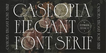 Caseopia is a modern font that takes a classic style. Designed to give the impression of elegance and luxury with a classic feel. Contains uppercase-only characters, all punctuation & numerals. There are also ligatures that will bring a unique style. Perfect for editorial projects, Logo design, Wedding, Clothing Branding, product packaging, magazine headers, or simply as a stylish text overlay to any background image. Enjoy the font, Thank You!
 - Donnager by Harvester Type,
$15.00 Donnager is a rough, hard and futuristic typeface. It is inspired by square shapes, dystopia and futurism. The name is inspired, like the font itself, by the Dead Space universe. I can just see this font on the cover of some dystopian comic book! The font has alternate glyphs. The uses are unlimited, as there are different styles, weights, and even a variant version. Logos, posters, headers, branding, prints and more!
 - Zlatoust Chaos by Arendxstudio,
$13.00 latoust Chaos is a free style font that has the characteristics of street art that shows freedom and is filled with unique characters Features : • Character Set A-Z • Numerals & Punctuations (OpenType Standard) • Accents (Multilingual characters) • Ligature • Alternate There it is! I really hope you enjoy it - comments & likes are always welcome and accepted. More importantly, don't hesitate to send a message if you have a problem or question.
 - Mantra Rimba by Four Lines Std,
$15.00 Introducing Mantra Rimba Font: Where Nature's Magic Meets Readability, inspired by the beauty that surrounds us. While it's inspired by nature's whimsy, we haven't forgotten the basics. This font ensures your message is clear, making it perfect for a wide range of creative projects. Whether you're designing invitations, logos, social media graphics, posters, or stickers, let "Mantra Rimba Font" be your creative muse. It adapts flawlessly to any canvas.
 - Aint Baroque NF by Nick's Fonts,
$10.00Here’s a not-often-seen variation of Milton Glaser’s 1968 creation Baby Teeth, distributed by Photo-Lettering Inc. as Baby Teeth Baroque. Actually, the sinuous swirls suggest, rather, an Art Nouveau influence, which is why this version has its name. Well, that, and the original design didn’t need any fixing. This font contains the complete Latin language character set (Unicode 1252) plus support for Central European (Unicode 1250) languages as well. - PR Hydra by PR Fonts,
$15.00 A sequel to my own Herakles font, with multiple faces, and more to come, so the name refers to his second labor, slaying the Hydra. The straight lines and sharp angles make it suitable for evoking the feel of many ancient civilizations where writing was cut into stone. Whether your heroic deeds include slaying mythical monsters, or making the best spanakopita in the city, this font is for you.
 - Jacques & Gilles by Emily Lime,
$34.00 There are two “personalities” in this font. Jacques’ persona comes to life when typing in all lowercase letters. And Gilles’: when using all uppercase. And the best part is Jacques and Gilles were made for each other. J&G features 300+ glyphs including terminal letters, alternates, ordinals, roman numerals (I,V,X) and 2 sets of ornaments - 1 outline & 1 solid so you can create a cool, modern painted effect.
 - Conference by ITC,
$29.99Conference is a bold, playful sans serif, which was designed in 1978 by Martin Wait. Conference's letters are very curvaceous; many of them bulge lovingly outward from their centers. This typeface offers a different feeling than is available from most contemporary sans serif display faces; Conference is lively, without sacrificing readability. The type should be set in large, display sizes, where the eye can better appreciate its loving forms. - Kneebls by Ingrimayne Type,
$9.95 Kneebls was inspired by Art Deco lettering. It is monoline and all caps, with most of the letters on the lower-case keys different from those on the upper-case keys. It comes in three weights: thin, regular, and bold. There is also a distorted, wavy version, KneeblsRuffled, and a shadowed version. The shadowed-inside style is designed to be used in a layer with the shadowed style.
 - With Lovely by Yoga Letter,
$15.00 "With Lovely" is a very pretty handwritten font. This font has beautiful decorations in the form of love, birds, and butterflies. This font features uppercase, lowercase, alternative, swashes, titling, binders, numbers, punctuation, and multilingual support as well. The font decoration is very easy to apply, and there are also instructions for use in the preview. Great for weddings, Valentine's Day, invitations, stickers, birthdays, Christmas, winter, Easter, and so on.
 - Aysiano by Bean & Morris,
$42.00 Aysiano Regular and Italic is a casual sans serif typeface with its influence originating from Eastern broad brush style calligraphy. It includes selected swash caps to vary the settings where required. With a slick, fresh feel, capturing the spontaneity of brushed hand lettering, it will be suited to many applications especially as a display font although it can also be used in larger text sizes with great legibility.
 - Oh Honey by Diana Kohne,
$16.00 Oh Honey is a handmade, feminine, new retro serif font made in 2021 by an artist who wanted to create an organic font to stand out in a world of rigid letterforms. Use Oh Honey for logos, headings, packaging, weddings, self help and fiction book covers and anywhere where you want to stand out with artsy sophistication. According to one font enthusiast, "This font is the typographic zeitgeist!"
 - Romagna by AlienValley,
$5.00 Romagna is a modern and highly versatile sans-serif typeface designed for readability without sacrificing aesthetics. There are 8 included styles to pick from including regular + bold weights plus italics and 2 different uppercase styles so you can either go with a classic look or a modern futuristic theme. Features Modern design Easy to read characters Great for both headlines & large chunks of text Multilingual support Great versatility 8 Included styles
 - Nature Stencils JNL by Jeff Levine,
$29.00 Nature Stencils JNL brings together a number of vintage decorator stencils with bird and flower motifs (along with individualized elements from the original designs). These home decor stencils were manufactured by the Huntington Oil Cured Stencil Company somewhere around the early 1950s. Originally located in Huntington, New York, the company later relocated to the South Florida area, but there is no additional information found about the company's background.
 - Island Time JNL by Jeff Levine,
$29.00 Island Time JNL is based on the hand-lettered title from a piece of 1940s sheet music called "An Island Melody". This Art Deco typeface is perfect for projects where a clean, yet attractive headline font is needed. The font's name is based on the euphamism popular amongst Caribbean Islanders that when someone is excessively late for an appointment, date or event they are running on "island time".