10,000 search results
(0.026 seconds)
- Movie Star Deco JNL by Jeff Levine,
$29.00 Here’s a jaunty little Art Deco sans serif type design inspired by the headline of a feature article on Carole Lombard found in the August, 1937 issue of Hollywood magazine. This served as the inspirational model for Movie Star Deco JNL, and is available in both regular and oblique versions.
 - Lance Corporal NF by Nick's Fonts,
$10.00This font was inspired by Arts and Crafts lettering found on the cover of the Austrian journal Ver Sacrum (Sacred Spring), 1898. Primarily an uppercase-only font, there are several variants in lowercase positions. Both versions of the font include 1252 Latin, 1250 CE (with localization for Romanian and Moldovan). - Alt Gotisch by HiH,
$12.00 Alt-Gotisch Verzierte is a typeface of decorative initials that is Victorian in style and bears a close family resemblance to the many ornamental tuscans cut throughout the nineteenth century by British foundries. Instead of the bifurcated terminals of the archetypical tuscan (see Figgins Tuscan by HiH or Stereopticon by Dan X. Solo), these letters display what Nicolete Gray might call a “wedge and bite” design -- as if they started with the wedge serif of a latin form and someone came along and took a perfectly round bite out of the wedge. We need not dwell on the lack of teeth marks. The calligraphic curls and flourishes are often graceful, sometimes a bit contrived, but always complex. There is a busyness that marks the style of the period. If you ever see an old photograph of a well-appointed Victorian parlor, you will recognize that same quality of busyness. Overdone is a word that frequently comes to mind. Alt-Gotisch Verzierte means “adorned or decorated old gothic.” The typeface is attributed by Alexander Nesbitt to an unidentified German foundry of the nineteenth century (Decorative Alphabets and Initials, Dover, New York 1987, plate 92). The designer is unknown. Our font is supplied with a lower case that is similar to the upper case, but is 15% shorter and is simplified by the omission of the decorative vines. For the lower case, alternate letters A, E, & T; and ligatures LE, OT & LY have been supplied. In addition, a few small decorative vines were planted here and there for optional use. An accented upper case is not part of the original design and is not here supplied. This design is also seen under the name “Sentinel” -- as always, it is worthwhile to compare the completeness of the character set and the faithfulness of the rendering. We believe you will agree that we provide a balance of quality and value that is unmatched in the contemporary marketplace. Alt-Gotisch Einfach is a simplified version of Alt-Gotisch Verzierte. The vine-less lower case of the Verzierte font is the upper case in Einfach. For a lower case for Einfach, the letters were further simplified by stripping away the three-dimensional outline, down to the bare bones and bites, as it were. Einfach, in fact, means “simple” or “plain.” It is interesting to note that this bare bones & bite lower case bears (I have a special license to use two homonyms in the same sentence) a striking resemblance to the 15th & 16th century ornamental letters from Westminster Abbey shown in Plate 47 of Alexander Nesbitt’s Decorative Alphabets and Initials (Dover, New York 1987).
 - Aeris by Linotype,
$29.99 Aeris™ typeface is a contemporary book face created by the American designer Tom Grace. It combines the proportions and rhythm of a sans serif font with the high contrasts and flexed strokes of script faces, while the open counters also ensure optimal legibility. Tom Grace focuses on providing subtle differentiations in his cuts and, as a consequence, this font family has its own individual structure: there are A and B variants of the basic forms regular, italic, bold and bold italic, and a display version for use in titles that also comes in A and B variants. It is advisable to use the A variant for larger font sizes, while the slightly more emphasized B variant can be recommended for smaller font sizes. Where the basic forms are to be mixed together in a work, it is important to use the corresponding A/B variants throughout as their designs have been carefully coordinated. Aeris is available in the OpenType Pro format and thus includes a wide range of different glyphs. The font family can be used in various environments, such as books, magazines, advertisements and promotional materials, but it is also the perfect choice for printed corporate documentation.
 - Cal Uncial Rough by Posterizer KG,
$19.00 Cal Uncial Rough is a calligraphic font based on sketches written with cane calligraphy pen and ink on coarse-textured paper. Because of the fact that the Uncial don't have lowercase letters, there are small capitals instead of the lowercase. As the Latin version of the Uncial was created from the Greek Uncial script (translating the Bible from Greek into Latin), in addition to the standard Latin graphemes, the font contains the Greek alphabet (and also the Cyrillic letters (Ustav), derived from the Greek Uncial too). Regardless of the stylistic connection, there is a difference between the morphology of related Greek, Latin and Cyrillic letters. Most of the graphemes are based on traditional roman and insular uncial calligraphy. Cal Uncial Rough is suitable for the preparation of calligraphic sketches as well as an application in typography that should bring us closer to historical topics (European literature, quotes, history, film ...).
 - Malden Sans by Monotype,
$49.00 Malden Sans is a mischievous grotesque sans serif with charming details that gives designers a solid typographic voice. It was created by Michele Patanè with regular and condensed widths, as a utilitarian typeface family for print and digital environments. It was originally designed as part of a type system for cinema magazines, and embodies the devil-may care attitude of the silver screen. Designer Michele Patanè looked back to an earlier era of typography to create the typeface, embracing unusual details, rather than ironing them out. “There is a very naive way of using typography in the 30s and 40s, something not as clean as how it’s used in the late 50s and 60s when everything passed through a rationalisation of the typographic palette,” he explains. “In film magazines you can still see a bit of roughness, and I like that.” This is a design that’s desperate to be used in editorial environments, and has been created to stand up to lower quality paper. It would be equally at home on posters, packaging, and even in digital environments where designers are looking for something more expressive than another geometric sans serif. Malden Sans includes a Normal and Condensed range, with 7 weights in the normal and 6 in the Condensed, both including italics.
 - Bex Script by The Ampersand Forest,
$35.00 Bex Script is a riff on traditional French script forms: the Bâtarde, the Ronde, and the Coulée. It has two versions: First, there’s La Belle, a straightforward, lovely interpretation of the script form, suitable for things like invitations, poetry and branding. La Belle’s evil twin is La Bête, a more whimsical (and considerably more hairy) version, great for anything that requires an elegant-but-beastly feel. Bex is surprisingly versatile! With three optional capital forms (Swash, Caps, and Small Caps) all taller than the x-height, Bex has a variety of voices. A full small cap set and a full set of Swash Caps, plus a large complement of alternates, initial forms, terminal forms, and ligatures makes it customizable and… well, FANCY! Additionally, both versions of Bex Script have a set of ten ornament glyphs. La Belle has a combination of fleurons on a culinary theme and symbols of France. La Bête has ten pseudoheraldic beasts that would feel at home at the top center of any whimsical letterhead. NOTE: A few years ago in Paris, I was lucky enough to stop at the Librairie Paul Jammes in St Germain-des-Prés, where I bought a turn-of-the-19th-century signature from a Type Specimen of the printer Joseph Gaspard Gillé. The irregularity of his script types — particularly the ones at smaller sizes, like the Cicéro — was very intriguing. They seemed to blend the Ronde with some elements of the Bâtarde and Coulée. And they, along with the work of French master penman Louis Rossignol, gave Bex Script its initial form.
 - FS Kitty by Fontsmith,
$50.00 Cute FS Kitty is the type equivalent of Bagpuss: plump, cute, cuddly and not fond of exercise. So don’t go giving it a run-out on body copy; FS Kitty is an all-caps font made for showing off in posters and headlines, and on products, point-of sale and especially sweets. Blubber Kitty had been quietly curled up in Phil Garnham’s sketchbook for a year before he brought it out to be brushed up. “It was in the mix as a basic form when I started thinking about FS Lola. It was a twisted, bubbly beauty – quite squishable and huggable. The working file was called Blubber. “At that time it was a basic construction of strokes. I created the ‘A’ first, purely as a shape to play with, not as type. I flipped it for ‘V’, and copied that for a ‘W’. I flipped the ‘W’ for an ‘M’... I thought, ‘This looks a bit wacky, but I like it,’ and just carried on. The most tricky characters were the ‘B’ ‘P’ and ‘R’. I must have drawn about 20 kinds of B for this, just to get it to fit.” Variety “When the regular weight of Kitty had been designed,” says Jason Smith, “it just felt like a natural progression to go on and explore how far we could go with it: Light, Solid, Headline, Shadow.” Phil Garnham thinks there’s still more to come. “There are some really individual characters in this font that I think have yet to be exploited: the Greek Omega symbol, the strange face in the ampersand. Like Bagpuss, Kitty has kept a low profile so far. “We know people are using Kitty. In fact, it was the first of any of our fonts that we sold on the day it was released. But I still haven’t seen it out there in the wild. It’s going to be a exciting moment.”
 - FS Kitty Variable by Fontsmith,
$199.99Cute FS Kitty is the type equivalent of Bagpuss: plump, cute, cuddly and not fond of exercise. So don’t go giving it a run-out on body copy; FS Kitty is an all-caps font made for showing off in posters and headlines, and on products, point-of sale and especially sweets. Blubber Kitty had been quietly curled up in Phil Garnham’s sketchbook for a year before he brought it out to be brushed up. “It was in the mix as a basic form when I started thinking about FS Lola. It was a twisted, bubbly beauty – quite squishable and huggable. The working file was called Blubber. “At that time it was a basic construction of strokes. I created the ‘A’ first, purely as a shape to play with, not as type. I flipped it for ‘V’, and copied that for a ‘W’. I flipped the ‘W’ for an ‘M’... I thought, ‘This looks a bit wacky, but I like it,’ and just carried on. The most tricky characters were the ‘B’ ‘P’ and ‘R’. I must have drawn about 20 kinds of B for this, just to get it to fit.” Variety “When the regular weight of Kitty had been designed,” says Jason Smith, “it just felt like a natural progression to go on and explore how far we could go with it: Light, Solid, Headline, Shadow.” Phil Garnham thinks there’s still more to come. “There are some really individual characters in this font that I think have yet to be exploited: the Greek Omega symbol, the strange face in the ampersand. Like Bagpuss, Kitty has kept a low profile so far. “We know people are using Kitty. In fact, it was the first of any of our fonts that we sold on the day it was released. But I still haven’t seen it out there in the wild. It’s going to be a exciting moment.” - JAF Lapture by Just Another Foundry,
$59.00 Lapture is based on the Leipziger Antiqua by Albert Kapr, released in 1971 by the East German foundry Typoart. It has been extended and carefully redesigned by Tim Ahrens in 2002-05. The strong calligraphic characteristics are a result of the design process: "The size of the counters and the width of individual characters at small optical sizes were analysed with a steel pen while the letter shapes were designed in larger size with a specially trimmed reed pen. Sometimes the hand is more innovative than the head alone," says Kapr. A unique feature of this font is the introduction of gothic shapes into a latin typeface. "The basic concept is to string together narrow white hexagons as counters and inter-letter spaces, defined by vertical stems and triangular serifs. The interior spaces are at least as important as the strokes that make up the characters." Lapture is an ideal choice if a reference to gothic style is desired, as true black letter types are often too eye-catching and not as legible as latin fonts for unfamiliar readers. "The last few years have seen a number of very elegant typefaces based on the mellow and feminine renaissance model. However, sometimes we require a font that is strong and robust, harmonic yet rigid," says designer Tim Ahrens. JAF Lapture is provided in OpenType format. Each font contains more than 600 glyphs, including true small caps, nine sorts of figures, contextual and stylistic alternates and accented characters. This means that you only need to purchase one font whereas in other families you would have to buy two or three fonts in order to get the same. Technically, they follow the Adobe Pro fonts and provide the same glyph set and OpenType functionality. JAF Lapture Basic is provided in OpenType format. Each font contains the standard sets of both MacOS and Windows. In contrast to JAF Lapture they do not provide any advanced OpenType features and no extended glyph set.
 - Misdirection JNL by Jeff Levine,
$29.00Fonts can be both functional and attractive, but there's no rule against them being fun. Misdirection JNL is an assortment of 52 outrageous road signs - perfect for protests against government inefficiency or used on novelty note pads... as attention-getting spot art for ads or for whatever your imagination can deliver... - Gothic Initials One by Gerald Gallo,
$20.00 Gothic Initials One was inspired by the beautifully-written gothic scripts of medieval scribes. The font contains the upper case letters A through Z under both the character set and shift+character set. This font is intended for use as initials, monograms, drop caps or wherever fancy letters are desirable.
 - Gothic Initials Three by Gerald Gallo,
$20.00 Gothic Initials Three was inspired by the beautifully-written gothic scripts of medieval scribes. The font contains the upper case letters A through Z under both the character set and shift+character set. This font is intended for use as initials, monograms, drop caps or wherever fancy letters are desirable.
 - Gothic Initials Seven by Gerald Gallo,
$20.00 Gothic Initials Seven was inspired by the beautifully-written gothic scripts of medieval scribes. The font contains the upper case letters A through Z under both the character set and shift+character set. This font is intended for use as initials, monograms, drop caps or wherever fancy letters are desirable.
 - Gothic Initials Four by Gerald Gallo,
$20.00 Gothic Initials Four was inspired by the beautifully-written gothic scripts of medieval scribes. The font contains the upper case letters A through Z under both the character set and shift+character set. This font is intended for use as initials, monograms, drop caps or wherever fancy letters are desirable.
 - Daybird Script by Letterhend,
$14.00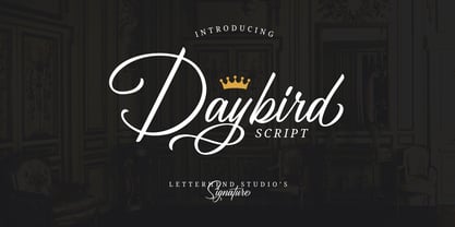 Daybird is an elegant signature that contain lowercase, uppercase, symbol, and also support multi-language. There's a lot of alternates in this font. You can use this font to make a logo for branding, beautiful fashion designs, it's suitable for wedding invitations and authentic signatures. Daybird is also PUA Encoded.
 - Quiron by Pedroglifos,
$12.00 A modern square sans serif that dares to be different. There's a tech-spacey air to Quiron, it will suit all modern display needs. It's low contrast and minimalist nature grants its design an avant-garde look & feel, ready to be part of sophisticated packaging or galactic exploration video game title.
 - Gothic Initials Six by Gerald Gallo,
$20.00 Gothic Initials Six was inspired by the beautifully-written gothic scripts of medieval scribes. The font contains the upper case letters A through Z under both the character set and shift+character set. This font is intended for use as initials, monograms, drop caps or wherever fancy letters are desirable.
 - Gothic Initials Two by Gerald Gallo,
$20.00 Gothic Initials Two was inspired by the beautifully-written gothic scripts of medieval scribes. The font contains the upper case letters A through Z under both the character set and shift+character set. This font is intended for use as initials, monograms, drop caps or wherever fancy letters are desirable.
 - Gothic Initials Five by Gerald Gallo,
$20.00 Gothic Initials Five was inspired by the beautifully-written gothic scripts of medieval scribes. The font contains the upper case letters A through Z under both the character set and shift+character set. This font is intended for use as initials, monograms, drop caps or wherever fancy letters are desirable.
 - Heart Strings by Seemly Fonts,
$12.00 Heart Strings, a charming and warm handwritten font, brings a delightful touch to designs centered around Valentine's Day. Its simplicity and distinctive style make it a perfect match for a wide range of creative projects. Let your imagination run wild—there's no limit to the sweetness this font can add! Uppercase
 - Gothic Initials Nine by Gerald Gallo,
$20.00 Gothic Initials Nine was inspired by the beautifully-written gothic scripts of medieval scribes. The font contains the upper case letters A through Z under both the character set and shift+character set. This font is intended for use as initials, monograms, drop caps or wherever fancy letters are desirable.
 - Gothic Initials Eight by Gerald Gallo,
$20.00 Gothic Initials Eight was inspired by the beautifully-written gothic scripts of medieval scribes. The font contains the upper case letters A through Z under both the character set and shift+character set. This font is intended for use as initials, monograms, drop caps or wherever fancy letters are desirable.
 - Shooma MF by Masterfont,
$59.00 Ever wondered how your great text will look like as if it just came out of an ATM machine? Here it is!
 - Churchward Tua by BluHead Studio,
$25.00 Churchward Tua and Churchward Tua Italic are two more OpenType font releases by Bluhead Studio from the exciting and unique library of Joseph Churchward type designs. The Tua fonts sport an Old West, cattle drive sort of look. One can imagine Tua being used on the swinging front doors of the local saloon or jailhouse. These fonts are perfect for headlines, posters or wherever you want to express your inner cowboy. Giddy-up!
 - Beauty Script by Corradine Fonts,
$19.95 Beauty Script is a modern interpretation of the classic formal script style. You could notice in it a special feeling due its subtle wavy rhythm to mimic the natural movement of handwritten calligraphy. Because its strong contrast and the fluidity of its traces Beauty Script is ideal to be used as headline in any media related to fashion, beauty, nature, food, pleasure, travel, luxury or wherever you required to express formality and elegance.
 - Nothing by Dharma Type,
$19.99 The real handwriting script. Very powerful impression because of its heavy, wide and speedy shape. Award Winning No. 1 font 2007 at MyFonts and Rising Star. There is one more script designed by in the same concept. -Banana -Nothing
 - Bardi by URW Type Foundry,
$39.99 Tilp Barde is a striking, moderately dynamic design suitable for many different typographic tasks. Its individual ductus is inspired by handwriting, however without calligraphic embellishment. There are no serifs but tiny endings which lead to think of wood-carving.
 - Write by Aah Yes,
$12.00Write is a handwriting font, more like neat print than a flowing cursive script, which renders it highly readable and almost like a formal font, but still retaining the informality of handwriting. Also there are some "special effects" varieties. - Niemi by Blank Is The New Black,
$10.00 Niemi is a continuation of the work started with Versteeg. Where Versteeg was separated into individual circles, Huet connects these circles and adds a sharp geometric style. This creates a nice juxtaposition between the rounded ends, and sharp corners.
 - Hi Ho Steverino NF by Nick's Fonts,
$10.00 Here's a hipster face that evokes the Beat era, taking its name from Louis Nye's catchphrase on "The Steve Allen Show." Both versions of this font support the Latin 1252, Central European 1250, Turkish 1254 and Baltic 1257 codepages.
 - Raleigh by Bitstream,
$29.99Following the death of Carl Dair, David Anderson redrew Dair’s design, Cartier, for Typsettra, where it was renamed Raleigh. Adrian Williams at Fonts added three weights as a display series for Conways, while Robert Norton drew the text series. - Miscellany JNL by Jeff Levine,
$29.00 Miscellany JNL collects numerous images of various genres into one dingbat font. There are vintage stencil patterns, old-time ad cuts and decorations, line spacers [number keys 1 through 7], conversation balloons, parking lot symbols and other assorted goodies.
 - Aspire SmallCaps by Grype,
$18.00 Geometric/Technical style logotypes have been developed for car chrome labels since the early 1980's. Many of these sleek logotypes are lacking an expansive family to enhance and express their brand in a richer sense, becoming true brand workhorses. The Aspire SmallCaps family finds its origin of inspiration in the ACURA automotive company logo, and from there expands to an 6 font family of weights & oblique styles, striving to become a workhorse. Aspire SmallCaps is perhaps the most true to form tribute to the original all capitals inspiration logotype. It maintains all capital forms (whether standard or smallcaps) and yet is still strikingly powerful in its presence and readability including numerals, and a comprehensive range of weights, creating a straightforward, uncompromising collection of typefaces that lend a solid foundation and a broad range of expression for designers. Here's what's included with the Aspire SmallCaps Family bundle: - 438 glyphs per style - including Capitals, Small Caps, Numerals, Punctuation and an extensive character set that covers multilingual support of latin based languages. (see the 6th graphic for a preview of the characters included) - Stylistic Alternates - alternate characters that remove the angled stencil cuts for a more standardized text look. - 3 weights in the family: Light, Regular, & Black. - 3 obliques in the family, one for each weight: Light, Regular, & Black. - Fonts are provided in TTF & OTF formats. The TTF format is the standard go to for most users, although the OTF and TTF function exactly the same. Here's why the Aspire SmallCaps Family is for you: - You're in need of automotive sans font family with a range of weights and obliques - You're love that ACURA letter styling, and want to design anything within that genre - You're looking for an alternative to Eurostile with more stylized letterforms. - You're looking for a battle-tech typeface for your futuristic war chest labelling. - You just like to collect quality fonts to add to your design arsenal
 - Flink Neue by Identity Letters,
$45.00 Geometric typefaces are a staple in every typographer’s toolbox since the 1920s. It was a time when iconic faces such as Futura, Erbar, and Kabel appeared on the scene and turned the world of type upside-down. Inspired by those early giants as well as later epigones with a legacy of their own (such as 1970’s Avant Garde Gothic), Flink Neue is the Identity Letters take on this genre, characterized by a clean and focused appearance. With neat shapes and the look of pure geometry, Flink Neue adapts to a vast range of applications and topics, from the fine print in contract to website body copy to logo design to billboard-size slogans. Its x-height is considerably larger than in classic geometric sans-serif fonts; its proportions are harmonized as opposed to strictly constructed. This makes for a more contemporary look, setting it apart from the classics. With three different widths, Flink is a true all-rounder. Geometric fonts are usually quite wide, which often leads to text-settings problems with headlines or small print. The Condensed and Compressed variants of Flink Neue solve this problem easily. This font family comes along in 18 weights from Thin to Black with matching Italics. There are almost 1400 characters per style, including nine stylistic sets that offer variations to the look and feel of Flink Neue, making it even more versatile. Besides the default mood of Flink Neue, there is also a Text and Bauhaus variant, where different letters have been changed to create a new mood. In theory, you just need one single font file to change between all three moods, but to make it easier for you, we also exported each mood within a separate file. Plenty of additional Open Type Features like ligatures, small caps, case sensitive forms, old-style figures, tabular figures and symbols make Flink Neue a valuable tool for the discerning typographer. Flink Neue is the reimagination of a classic genre, designed to suit the needs of our time.
 - Picturama Founder by Mans Greback,
$59.00 Picturama Founder is a beautiful script font that elegantly bridges the gap between time-honored formality and contemporary innovation. Every curve and connection in this formal calligraphy type speaks of finesse, flowing with an unmatched grace reminiscent of vintage labels or classic vinyl covers. Yet, there's a modern twist that sets it apart: its bold stance and innovative touches redefine what we expect from formal script.
 - Micro Manager NF by Nick's Fonts,
$10.00This font features a complete uppercase alphabet, including accented characters, as well as numbers and standard punctation. Lowercase characters are an assortment of useful dings and things. To create very low-load GIFs, compose your type in Photoshop (or equivalent) at 8 point (or multiples thereof), with anti-aliasing turned off. Both versions of the font include 1252 Latin, 1250 CE (with localization for Romanian and Moldovan). - Film Crew JNL by Jeff Levine,
$29.00It's not a new idea, but it's always a fun one... a typeface comprised of 35mm film frames. Film Crew JNL is Jeff Levine's version, utilizing his Koehler Sans JNL as the lettering inside the frames. The lesser and greater keys have solid black frames for end caps or word spacing, and there's an alternate pair of frames with clear centers on the brace keys. - Monique Sans BF by Bomparte's Fonts,
$40.00 Monique Sans features an unconventional thick/thin stroke weight pattern, that creates a fresh, unique appearance throughout. Aside from being a superb choice for a diverse variety of applications in headline and display, Monique Sans is remarkably legible and distinctive in short passages of mid-range text (10 pt to 14 pt). Wherever your design project requires a stylish, sophisticated look, Monique Sans is sure to shine!
 - Intrinseca by AVP,
$29.00 With only a suggestion of the serifs remaining, Intrinseca is modelled on traditional serif letterforms but with low-contrast stroke widths and a generous x-height. The family has a clean appearance and excellent readability. Six weights plus italics, small caps and extended language support make Intrinseca ideal for magazines, books and web – wherever distinctive headings and a variety of text options are required.