10,000 search results
(0.074 seconds)
- Delusoid by Flawlessandco,
$9.00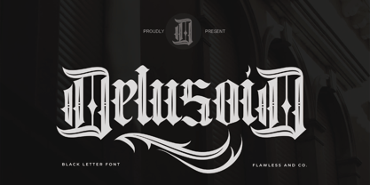 Delusoid, a Blackletter font with an authentic and unique style on each character that gives a bold touch to any design you create. There's some connected letters and some alternates that suitable for any graphic designs such as branding materials, t-shirt, print, business cards, logo, poster, t-shirt, photography, quotes .etc This font support for some multilingual. Also contains uppercase A-Z and lowercase a-z, alternate character, numbers 0-9, and some punctuation. If you need help, just write me! Thanks so much for checking out my shop!
 - Golden Cosmic by Flawlessandco,
$9.00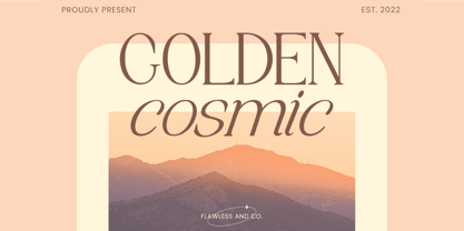 Golden Cosmic is a Serif Italic Font with a classy and elegant style in each character, so it's fitted for some wedding invitation display. There's some connected letters and some alternates that suitable for any graphic designs such as branding materials, t-shirt, print, business cards, logo, poster, t-shirt, photography, quotes .etc This font support for some multilingual. Also contains uppercase A-Z and lowercase a-z, alternate character, numbers 0-9, and some punctuation. If you need help, just write me! Thanks so much for checking out my shop!
 - Mondrake by Flawlessandco,
$9.00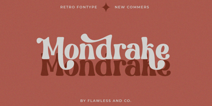 Mondrake is a modern retro with a fun and bold style that perfect for your retro-themed projects. Try out some alternate characters for another visual result! There's some connected letters and some alternates that suitable for any graphic designs such as branding materials, t-shirt, print, business cards, logo, poster, t-shirt, photography, quotes .etc This font support for some multilingual. Also contains uppercase A-Z and lowercase a-z, alternate character, numbers 0-9, and some punctuation. If you need help, just write me! Thanks so much for checking out my shop!
 - Mondice by Flawlessandco,
$9.00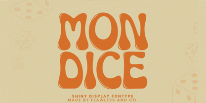 Mondice is a Groovy Retro Font that made with an additional shiny mode in each character, so it's fitted for some retro project. There's some connected letters and some alternates that suitable for any graphic designs such as branding materials, t-shirt, print, business cards, logo, poster, t-shirt, photography, quotes .etc This font support for some multilingual. Also contains uppercase A-Z and lowercase a-z, alternate character, numbers 0-9, and some punctuation. If you need help, just write me! Thanks so much for checking out my shop!
 - Dominic by Flawlessandco,
$9.00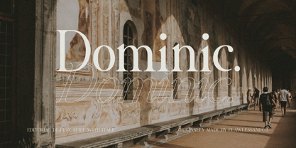 Dominic is a Serif Italic Font with a classy and elegant style in each character, so it's fitted for some wedding invitation display. There's some connected letters and some alternates that suitable for any graphic designs such as branding materials, t-shirt, print, business cards, logo, poster, t-shirt, photography, quotes .etc This font support for some multilingual. Also contains uppercase A-Z and lowercase a-z, alternate character, numbers 0-9, and some punctuation. If you need help, just write me! Thanks so much for checking out my shop!
 - Mothern by Flawlessandco,
$9.00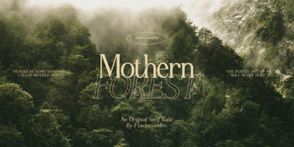 Mothern is a Serif Italic Font with a classy and elegant style in each character, so it's fitted for some wedding invitation display. There's some connected letters and some alternates that suitable for any graphic designs such as branding materials, t-shirt, print, business cards, logo, poster, t-shirt, photography, quotes .etc This font support for some multilingual. Also contains uppercase A-Z and lowercase a-z, alternate character, numbers 0-9, and some punctuation. If you need help, just write me! Thanks so much for checking out my shop!
 - Benogi by Flawlessandco,
$9.00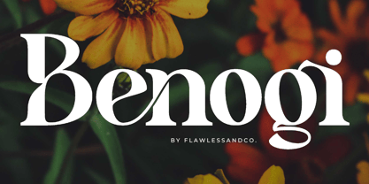 Benogi is a Modern Retro Font with a classy and unique style in each character, so it's fitted for some wedding invitation display. There's some connected letters and some alternates that suitable for any graphic designs such as branding materials, t-shirt, print, business cards, logo, poster, t-shirt, photography, quotes .etc This font support for some multilingual. Also contains uppercase A-Z and lowercase a-z, alternate character, numbers 0-9, and some punctuation. If you need help, just write me! Thanks so much for checking out my shop!
 - Croist by Flawlessandco,
$9.00 Croist is a modern retro with a fun and bold style that perfect for your retro-themed projects. Try out some alternate characters for another visual result! There's some connected letters and some alternates that suitable for any graphic designs such as branding materials, t-shirt, print, business cards, logo, poster, t-shirt, photography, quotes .etc This font support for some multilingual. Also contains uppercase A-Z and lowercase a-z, alternate character, numbers 0-9, and some punctuation. If you need help, just write me! Thanks so much for checking out my shop!
 - Helios Retro by Flawlessandco,
$9.00 Helios Retro is a modern retro with a fun and bold style that perfect for your boho-themed projects. Try out some alternate characters for another visual result! There's some connected letters and some alternates that suitable for any graphic designs such as branding materials, t-shirt, print, business cards, logo, poster, t-shirt, photography, quotes .etc This font support for some multilingual. Also contains uppercase A-Z and lowercase a-z, alternate character, numbers 0-9, and some punctuation. If you need help, just write me! Thanks so much for checking out my shop!
 - Brahmasta by Flawlessandco,
$9.00 Brahmasta is a modern serif with a classic retro style that perfect for your retro-themed projects. Try out some alternate characters for another visual result! There's some connected letters and some alternates that suitable for any graphic designs such as branding materials, t-shirt, print, business cards, logo, poster, t-shirt, photography, quotes .etc This font support for some multilingual. Also contains uppercase A-Z and lowercase a-z, alternate character, numbers 0-9, and some punctuation. If you need help, just write me! Thanks so much for checking out my shop!
 - Nadier by Flawlessandco,
$9.00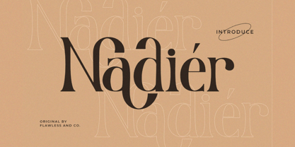 Nadier is a Modern Serif Font that made with a classic style in each character, so it's fitted for some wedding invitation display. There's some connected letters and some alternates that suitable for any graphic designs such as branding materials, t-shirt, print, business cards, logo, poster, t-shirt, photography, quotes .etc This font support for some multilingual. Also contains uppercase A-Z and lowercase a-z, alternate character, numbers 0-9, and some punctuation. If you need help, just write me! Thanks so much for checking out my shop!
 - Renaf by Flawlessandco,
$9.00 Renaf is a Groovy Retro Font that made with an additional shiny mode in each character, so it's fitted for some retro project. There's some connected letters and some alternates that suitable for any graphic designs such as branding materials, t-shirt, print, business cards, logo, poster, t-shirt, photography, quotes .etc This font support for some multilingual. Also contains uppercase A-Z and lowercase a-z, alternate character, numbers 0-9, and some punctuation. If you need help, just write me! Thanks so much for checking out my shop!
 - Baveuse - Unknown license

- Arcade King by Ditatype,
$29.00 Arcade King is an exciting display font inspired by classic arcade games. Designed in uppercase, this typeface captures the nostalgic essence of retro gaming with its playful style. With consistent letter proportions and high contrast, this font ensures easy readability while immersing you in a world of gaming fun. The consistent letter proportions of Arcade King create a sense of harmony and balance throughout the font. Each uppercase letter is carefully crafted to maintain visual cohesion, ensuring a smooth and enjoyable reading experience. This design choice guarantees that every character complements the others, resulting in a visually appealing and cohesive typographic composition. The stark difference between thick and thin strokes enhances the visibility of each letter, making them easily distinguishable even at smaller sizes. The high contrast design adds a touch of boldness and excitement to the font, capturing the essence of the arcade gaming experience. Enjoy the available features here. Features: Stylistic Sets Multilingual Supports PUA Encoded Numerals and Punctuations Arcade King fits in headlines, logos, posters, product packaging, branding materials, print media, editorial layouts, website headers, and any projects that aim to evoke a sense of fun and adventure. Find out more ways to use this font by taking a look at the font preview. Thanks for purchasing our fonts. Hopefully, you have a great time using our font. Feel free to contact us anytime for further information or when you have trouble with the font. Thanks a lot and happy designing.
 - Hamburger Heaven NF Pro by CheapProFonts,
$10.00 A stylish retro script where I have completely redone the spacing to make the text look more even. All of the diacritics have been redone, too - and the character set expanded in our usual fashion. So now this little gem from Nick Curtis is ready for the big time! Nick Curtis says: “This font is basically a design exercise, influenced by a number of contemporary fonts, but unique in its own way. The gentle, fluid motion reminded me of diner lettering from the 30s and 40s, hence the name.” ALL fonts from CheapProFonts have very extensive language support: They contain some unusual diacritic letters (some of which are contained in the Latin Extended-B Unicode block) supporting: Cornish, Filipino (Tagalog), Guarani, Luxembourgian, Malagasy, Romanian, Ulithian and Welsh. They also contain all glyphs in the Latin Extended-A Unicode block (which among others cover the Central European and Baltic areas) supporting: Afrikaans, Belarusian (Lacinka), Bosnian, Catalan, Chichewa, Croatian, Czech, Dutch, Esperanto, Greenlandic, Hungarian, Kashubian, Kurdish (Kurmanji), Latvian, Lithuanian, Maltese, Maori, Polish, Saami (Inari), Saami (North), Serbian (latin), Slovak(ian), Slovene, Sorbian (Lower), Sorbian (Upper), Turkish and Turkmen. And they of course contain all the usual “western” glyphs supporting: Albanian, Basque, Breton, Chamorro, Danish, Estonian, Faroese, Finnish, French, Frisian, Galican, German, Icelandic, Indonesian, Irish (Gaelic), Italian, Northern Sotho, Norwegian, Occitan, Portuguese, Rhaeto-Romance, Sami (Lule), Sami (South), Scots (Gaelic), Spanish, Swedish, Tswana, Walloon and Yapese.
 - Kolbano by Jehoo Creative,
$19.00 Kolbano is a visually captivating typeface that is renowned for its distinctive and expressive letterforms. Designed with meticulous attention to detail, each character in Kolbano Font possesses a unique shape, making it an exceptional choice for creative and artistic projects. The font's design philosophy centers around providing a harmonious balance between elegance and personality. The letters in Kolbano are meticulously crafted with fluid curves, sharp angles, resulting in an eye-catching and memorable visual experience. Every character stands out on its own, showcasing its own individuality and artistic flair. Whether used in headlines, logos, or other design applications, Kolbano is sure to make a lasting impression. In addition to its regular upright variant, Kolbano also offers a captivating italic style. The italics add a dynamic touch to the typeface, imbuing the text with a sense of movement and energy. The slanted letterforms maintain the unique shape of each character, preserving the font's distinctiveness while introducing a sense of flow and elegance. The italics are perfect for emphasizing words, creating emphasis, or adding a touch of sophistication to any design. Kolbano s versatile and adaptable, suitable for a wide range of creative projects. Its aesthetic appeal makes it ideal for editorial design, branding, packaging, posters, and any application where typography plays a central role. The font's versatility allows it to effortlessly adapt to various design themes and concepts, whether it be modern and sleek or vintage and nostalgic.
 - Rotis Sans Serif by Monotype,
$45.99 Rotis is a comprehensive family group with Sans Serif, Semi Sans, Serif, and Semi Serif styles, for a total of 17 weights including italics. The four families have similar weights, heights and proportions; though the Sans is primarily monotone, the Semi Sans has swelling strokes, the Semi Serif has just a few serifs, and the Serif has serifs and strokes with mostly vertical axes. Designed by Otl Aicher for Agfa in 1989, Rotis has become something of a European zeitgeist. This highly rationalized yet intriguing type is seen everywhere, from book text to billboards. The blending of sans with serif was almost revolutionary when Aicher first started working on the idea. Traditionalists felt that discarding serifs from some forms and giving unusual curves and edges to others might be something new, but not something better. But Rotis was based on those principles, and has proven itself not only highly legible, but also remarkably successful on a wide scale. Rotis is easily identifiable in all its styles by the cap C and lowercase c and e: note the hooked tops, serifless bottoms, and underslung body curves. Aicher is a long-time teacher of design and has many years of practical experience as a graphic designer. He named Rotis after the small village in southern German where he lives. Rotis is suitable for just about any use: book text, documentation, business reports, business correspondence, magazines, newspapers, posters, advertisements, multimedia, and corporate design.
 - Quorthon by Monotype,
$18.99 Quorthon is a collection of blackletter style fonts in 3 distinct voices – Black, Dark, and Grey. Each style has a more contemporary feel than the centuries-old blackletter standard, the capitals in particular were drawn to aid legibility in today’s world rather than to follow tradition. All the fonts contain a number of alternates that will help you embellish your typography – when used subtly, they can add flair to your titles and logo designs. BLACK is the most severe of the three styles, its lowercase forms were inspired by text I discovered on a marble tomb in a remote countryside church in England. The aggressive barbs and spurs give these fonts an imposing stature, ideal for branding, advertising and logotype, where a forceful message is required. DARK is a little more subtle, while retaining a barbed style, more contemporary serifs are present. The highly-contrasted, calligraphic glyphs are full of character and subtle nuances that give these fonts a unique personality. Again, these fonts are perfect for branding, advertising and logotype designs... and maybe even a tattoo? GREY is the softest of all the Quorthon styles, its minimal design and clean, straight lines make it ideal for creating stunning titles and headlines. It evokes the past with its blackletter pedigree, yet is imbued with a modern architectural influence. Key Features: • 15 font family – 5 weights across 3 styles • 17 Alternates in each font • Western European Language Support (Latin only) • 250+ glyphs per font.
 - LunchBox Slab by Kimmy Design,
$25.00 LunchBox Slab is the pair of LunchBox, a uniquely hand-drawn typeface that gives numerous customizable options and a fully authentic look. The serifs in LunchBox Slab are simple blocks, with bulbous terminals on curved letters, which creates a unique effect. Identical to its pair behind the scenes, LunchBox Slab’s OpenType features allow access to over 1,500 different characters. Contextual alternatives give each letter 4 different character styles, all cycling through each other to ensure that no two letters ever show up together. There is also a custom set of small caps, each with 4 style variations as well. Stylistic alternatives give an extra hand-drawn flourish, loop and slight variation, also with 4 different styles per letter. Discretionary ligatures pertain to both regular all caps LunchBox as well as stylistic alternatives. It gives special letter combinations a unique interaction, giving your design a unique and personalized look without spending hours creating it and outlining your text. Included are also a set of swashes that also have four style variations to both the regular and stylistic alternatives, as well as lowercase letters with ascenders and descenders. All of these options are available in Light, Regular and Bold. LunchBox Slab Ornaments includes nearly 200 different graphics, flourishes, frames, catchwords, text breaks and arrows. If you do not use OpenType but are using a program that includes a full glyph panel, you will be able to manually access each of the style variations you want. Enjoy!
 - Breathe Neue by Lián Types,
$37.00 Breathe Neue is not just an update of my renowned Breathe of 2010, this is something else... Many times I find myself looking for inspiration in my previous creations. The original Breathe has something on its essence: Something that almost 10 years later still caught my attention. Like its name suggests, letters seem to be breathing, moving, alive. Many years passed so I asked myself if there was still something I could do for it, something to get the most of that beautiful essence... Suddenly, I was already working on its curves: Many new loops, more polished, more refined. Also the proportion and spacing were altered to embellish the font. Breathe Neue’s swashes are addictive. I couldn't find another word. Irresistible? Maybe. Once you see some of its loops you want to see more. I believe this might be due to its very geometrical feel, which match well with the bodonian curves of the font. See also how well it works with Breathe Caps. And what if you combine them with Breathe Special? wow. I'm still young (yeah, sure) and I believe there're still many years ahead to enjoy this great profession, and to make many new (and astonishing, I hope) fonts. But I also think, it’s time to pamper my first creations. They deserve the best treatment, after all, they were once a success! This is what I did with my lovely Breathe. I hope you like it.
 - AZN Knuckles Varsity by AthayaDZN,
$10.00 Introducing "AZN Knuckles Varsity" font by AthayaDZN. Revolutionizing a varsity slab serif, combining sharp and rounded edges, angled serif, and a variety of weights, fitting it into the modern scene. Equipped with 3 styles ( Defined, Regular, Stencil ) Use the Defined version if you are aiming for that slab serif look, just like the name suggested, it defines the modernized slab serif on each letter, giving it that retro look yet still in the modern scene. Especially on the light weight of this version, the slab serif is really prominent. Use the Regular Version if you are aiming for any type of design that you see this font fits especially the modern scene, just like how it's advertised. Use the Stencil version if you are aiming to make a statement, my favorite one is the Bold and Italic version of the Stencil if I was to make a statement, just like the preview where it says "Anarchy", the separated shapes of the letter combined with it's bold and slanted shape is perfect to make a strong statement. Language Support : Afrikaans, Albanian, Danish, Dutch, English, Estonian, Filipino, Finnish, French, Galician, Indonesian, Irish, Italian, Luxembourgish, Norwegian, Portuguese, Romansh, Scottish Gaelic, Spanish, Swedish, Swiss German, Uzbek (Latin). And that's it for this font, thank you for purchasing the product, I wish you success on your projects. Please enjoy the font and let me know if you needed any help or if you have any questions -Athaya twitter.com/Athaya_DZN behance.net/athayadzn
 - Nicolas Jenson SG by Spiece Graphics,
$39.00 It was the original work of fifteenth century designer Nicolas Jenson that formed the basis for this roman serif style developed by Ernst Detterer in 1923. Similar in spirit to other early twentieth century revivals such as Centaur, Cloister Old Style, and Italian Old Style, Nicolas Jenson is distinguished by its pristine and delicate nature. A gifted young apprentice to Detterer, Robert Hunter Middleton, greatly expanded the family. And by 1929, bold, italic, and open were part of the Ludlow Foundry’s beautiful Nicolas Jenson Series. It was reintroduced under a new name, Eusebius, in 1941. This digital version includes a new medium and extrabold weight with intermediate small caps and swash alternates throughout the family. There is also a regular expert version with a variety of currency symbols plus a regular petite caps (regular x-height small caps) and old style figures version. Nicolas Jenson is now available in the OpenType Std format. Small caps, old style figures, and swash alternates have all been combined into one style for ease of use. You will also find an additional regular petite caps version included with the regular style. Some new characters have been added as stylistic alternates and historical forms. These advanced features work in current versions of Adobe Creative Suite InDesign, Creative Suite Illustrator, and Quark XPress. Check for OpenType advanced feature support in other applications as it gradually becomes available with upgrades.
 - 1510 Nancy by GLC,
$20.00 This set of decorated initial letters was inspired by those used in 1510 in Nancy (France, Lorraine) for printing of "Recueil ou croniques des hystoires des royaulmes d'Austrasie ou France orientale[...]" Author Symphorien Champion, unknown printer. There were three sorts of initials family, but only one complete and clear, except a very few characters. The printer used some letters to represent others, as V, turned over to make a A, D to make a Q, M for E, So, the reconstruction was a little less difficult. Thorn, Eth, L slash and O slash were also added. The original font's letters was only drawn in white on a black background only, but it was tempting to propose a negative version in black on white. A few letters have multiple appearance, but only the A was clear enough to be reproduced. It can be used as variously as web-site titles, posters and flyer design, publishing texts looking like ancient ones, or greeting cards, all various sorts of presentations, as a very decorative, elegant and luxurious additional font... This font supports strong enlargements revealing its fine details and remaining very smart. Its original medieval height is about one inch equivalent to about three to four lines of characters. This font may be used with all our blackletter fonts, but as well with "1543 Humane Jenson", "1557 Italic" and "1742 Civilite", without any fear about anachronism.
 - Lux by URW Type Foundry,
$35.99 Many times, when a new creative process is starting, it is triggered by an everyday action or item. In this case, the looks of a lady’s watch inspired Michael Herold to create his new typeface LUX. The sight of the chronograph sparked associations of the 1950s in Mr. Herold: While this decade was predominantly dominated by brush and feather scripts, there was also a bloom of strict and modern architecture. This special mix of strength and retro style is exactly what Michael Herold is trying to capture in his LUX. The result is a typeface which is perfectly suitable for use on book covers, posters and claims – thanks to its striking impression. The name LUX, Latin for light, is inspired by the high bright-dark contrast within the individual characters. Oft sind es alltägliche Gegenstände, die das Bestreben eines neuen kreativen Prozesses auslösen. So entspringt auch die Inspiration zur Erschaffung der LUX von Michael Herold dem Anblick einer Damenuhr. Der Chronograph löste bei Herrn Herold Assoziationen zu den 1950er Jahren aus: Während diese Zeit hauptsächlich von Schreibschriften aus Federn und Pinseln beherrscht wurde, nahm auch die streng und modern anmutende Architektur starken Einfluss auf die Epoche. Diese Mischung aus Strenge und 50er Jahre Retro-Stil soll in der LUX zum Ausdruck kommen. Das Ergebnis ist eine Schrift, die sich mit ihrer plakativen Wirkung perfekt für Buchumschläge, Poster und Claims eignet. Namensgebend war der starke hell-dunkel Kontrast innerhalb der Schrift – festgehalten in dem lateinischen Wort für Licht.
 - Shameless by Positype,
$79.00 I will spare you the long-winded description this time and all of the motivations and witty innuendoes. Quite frankly, I forgot about creating this typeface and it sat on my hard drive for almost a year. Luckily, my daughter Isobel saw the initial drawings one day and ask me about those pretty letters and I remembered… yep, that happened. That said, time made this a better typeface… with fresh eyes and time, much was redrawn, retooled and expanded to something I truly enjoy playing with. Shameless makes extensive use of Contextual alternates to create a proper ebb and flow from letter to letter. Interestingly, there are only a handful of ligatures… instead many special combinations are accounted for solely by relying on Contextual Alts. Mix in Stylistic Alts, Swashes, responsive Titling Alts, numerous Style Sets, etc and you can have a lot of fun. I created 2 versions. A ‘Standard’ version that has 2200+ characters and a ‘Deluxe’ version that has 2400+ characters and an interesting caveat… I plan on expanding the Deluxe version any time I have an idea to add to the typeface… and as such, buyers will receive all of those updates at no charge (with updates going directly to the distributors). You get what you pay for… no insane discounts. Oh, and if you are wondering… Shameless is based on my handwriting using Kuretake Zig CocoIro pens. I love these pens.
 - Vernacular Sans by jpFonts,
$19.95 The Vernacular trilogy was designed by Swiss designer Hans-Jürg Hunziker, who had worked for Adrian Frutiger in Paris for many years. Based on the concept of a transitional Linear Antiqua, he has developed a colorful bouquet of typefaces that contain the entire spectrum of typefaces for book design and corporate identity. Thanks to his "Swiss school" and his outstanding skills, he has succeeded in giving the typefaces a particularly noble and sympathetic expression. In addition to the Sans family, there is a Serif family and a Clarendon family, each of which, including the separately drawn italics, is equipped with 12 font weights that are finely tuned to one another. Each of the 3 font styles develops its own character, but thanks to a concept that brings the different font styles closer together, they also work well together and complement each other perfectly. Sans and Clarendon have a vertical axis and similar endings in contrast to the Serif, which has a traditional diagonal axis and horizontal endings. The straight stems and the proportions are used as an element to stress the closeness of the typeface-trilogy. They thus share a comon feature. All fonts contain tabular and proportional figures as well as old style figures. Small caps and small cap figures are also available in all fonts. In addition, some fonts have alternative characters available via style set, such as «g», which can be used to further vary the typeface. Vernacular offers all the options for well-kept typesetting for print and web - for small and large orders.
 - Rizado Script by Kostic,
$40.00 Rizado Script is a classy one-weight script typeface, made with “dolce vita” in mind. Its high contrast and pointy tone are recalling the fine nib handwriting of a meticulous and decisive person that hasn’t got free time to spare but surely knows how to enjoy his life. No quick and dry strokes, but rather wide, elegant and strong-minded temper that will bring a long-lasting touch to your packaging layouts. Sure, if you are looking for a good fit for some more ephemeral design such as a weekend high-class cocktail promotion, or a wedding invitation – this handy display typeface won’t let you down for a second. If you happen to go to Venice and enjoy their popular Aperitivo, you’ll be asked to choose between three types of bitter-reddish base drink. Rizado will bring you the same amount of pleasure, authority and uniqueness while you pick out one of the three ampersands or other alternate characters. According to the concept of Fellini’s lifestyle, “la dolce vita” is a luxury lifestyle full of cheerful worldly pleasure. But don’t let yourself be fooled by this moto, because Italians are famous for their modesty and sagacity as well. That’s why you’re always supposed to turn on the Contextual Alternates (to activate extra positional forms — isolated, initial and final) and keep your voice down and never set this typeface in all Capital letters. There are 391 total glyphs made to support West European, Central European and South East European languages.
 - Megre by JAB,
$16.00The courageous Russian author of the best seller Anastasia, Vladimir Megre, once said that this remarkable woman would inspire creative people around the world to produce their best work. Since I consider myself a creative person who has been deeply touched by her story, I sincerely hope that this will be true for me also. Anastasia talks a lot about God, the wonders of the natural world and how all things have been created so perfectly. This belief in universal perfection, however, is not confined to mystics alone. Many great mathematicians and scientists, including Albert Einstein, were of the same opinion. Having read Dan Brown’s The Da Vinci Code, I became quite fascinated with the so-called Fibonacci series; "a sequence of integers in which each integer (Fibonacci number) after the second is the sum of the two preceding integers; specif., the series 1, 1, 2, 3, 5, 8, 13, . . ." (Webster’s Dictionary). These mysterious numbers, which are said to give divine proportions, are found throughout nature in everything from a rose to a spiral galaxy. Many believe that this reinforces the argument that there is a divine intelligence back of creation. With that in mind, I thought it would be interesting to see if I could somehow create a font using these numbers in the design process. If I have succeeded - even partially - in attaining these mystical proportions, it will definitely have been worth all the hard work. And, I sincerely hope that many will enjoy using this font in producing their own best work. - Grafical by Halbfett,
$30.00 Grafical is a contemporary take on 19th-century sans serifs. In this family, the amount of geometry inherent within the letterforms has been amped up. Many shapes have received further streamlining, too. All the geometric forms you see have been optically corrected, ensuring their delivery of better legibility. Grafical ships in two different formats: depending on your preference, you can install the typeface as two Variable Fonts or use the family’s 16 static OpenType font files instead. The static fonts offer eight weights, running from Extralight through Black. Each weight has an upright and an italic font available. While the static-format fonts offer a good intermediary-step selection, users who install the Variable Fonts have vastly greater control over their text’s stroke width. The Grafical Variable and Grafical Variable Italic font’s weight axes allow users to differentiate between almost 1,000 possible font weights. That enables you to fine-tune your text’s exact appearance on-screen or in print. Grafical is the perfect tool for a range of design uses, including text on the web, text in print, and text in motion graphics. Its fonts are typographic workhorses – not just from their legibility perspective but also because of the amount of OpenType features they include. There are ligatures, for instance, as well as proportional and tabular lining and oldstyle figures, fractions, numbers placed inside circles, and even Roman numerals. Users can also substitute alternate versions of the “a”, “g”, “i”, “j”, “y”, “G”, and “Q” into their work.
 - Symply by TripleHely,
$16.00 Hi there! Let me introduce Symply – a handwritten signature-style font. Symply is perfect for logos, branding, quotes, blog headlines, magazine and book design, product packaging, web design – or for any text on postcards and your favorite photos. Symply contains: a standard set of characters with wide multilingual support: Western-, Central- and Eastern-European, Baltic, Turkish, Latin-type Africans, and Asian (94 languages in total) 2 additional sets of alternative characters for lowercase letters 8 alternative characters for some initial letters 28 ligatures for double letters and frequent combinations a bonus font with 62 swashes and doodles Symply has two types of embedded auto-replacements: lowercase letters without connecting strokes (for a case of the last character of the word), and ligatures (for a case of two letters that do not pair well together). These features work well in many apps (even simple ones like Notepad/TextEdit), and if you need to customize their application – you could use programs that support OpenType features (for example, Adobe apps or CorelDraw). All these additional glyphs are PUA-encoded, so if your software does not support OpenType — you could access them through Character Map (Windows) or Font Book (Mac) Swashes and doodles come in a bonus font, Symply Swashes. To type them, please press keys with letters A – X, a – x, and numbers 0 – 9 I hope you will like Symply and create great designs with it! And if you have any questions, feel free to contact me via e-mail: triple.hely@gmail.com
 - Vernacular Serif by jpFonts,
$19.95 The Vernacular trilogy was designed by Swiss designer Hans-Jürg Hunziker, who had worked for Adrian Frutiger in Paris for many years. Based on the concept of a transitional Linear Antiqua, he has developed a colorful bouquet of typefaces that contain the entire spectrum of typefaces for book design and corporate identity. Thanks to his "Swiss school" and his outstanding skills, he has succeeded in giving the typefaces a particularly noble and sympathetic expression. In addition to the Sans family, there is a Serif family and a Clarendon family, each of which, including the separately drawn italics, is equipped with 12 font weights that are finely tuned to one another. Each of the 3 font styles develops its own character, but thanks to a concept that brings the different font styles closer together, they also work well together and complement each other perfectly. Sans and Clarendon have a vertical axis and similar endings in contrast to the Serif, which has a traditional diagonal axis and horizontal endings. The straight stems and the proportions are used as an element to stress the closeness of the typeface-trilogy. They thus share a comon feature. All fonts contain tabular and proportional figures as well as old style figures. Small caps and small cap figures are also available in all fonts. In addition, some fonts have alternative characters available via style set, such as «g», which can be used to further vary the typeface. Vernacular offers all the options for well-kept typesetting for print and web - for small and large orders.
 - Vernacular Clarendon by jpFonts,
$19.95 The Vernacular trilogy was designed by Swiss designer Hans-Jürg Hunziker, who had worked for Adrian Frutiger in Paris for many years. Based on the concept of a transitional Linear Antiqua, he has developed a colorful bouquet of typefaces that contain the entire spectrum of typefaces for book design and corporate identity. Thanks to his "Swiss school" and his outstanding skills, he has succeeded in giving the typefaces a particularly noble and sympathetic expression. In addition to the Sans family, there is a Serif family and a Clarendon family, each of which, including the separately drawn italics, is equipped with 12 font weights that are finely tuned to one another. Each of the 3 font styles develops its own character, but thanks to a concept that brings the different font styles closer together, they also work well together and complement each other perfectly. Sans and Clarendon have a vertical axis and similar endings in contrast to the Serif, which has a traditional diagonal axis and horizontal endings. The straight stems and the proportions are used as an element to stress the closeness of the typeface-trilogy. They thus share a comon feature. All fonts contain tabular and proportional figures as well as old style figures. Small caps and small cap figures are also available in all fonts. In addition, some fonts have alternative characters available via style set, such as «g», which can be used to further vary the typeface. Vernacular offers all the options for well-kept typesetting for print and web - for small and large orders.
 - Klainy by Identity Letters,
$29.00 An unadorned Grotesque with a refreshingly personal touch. If “Grotesque” mainly means “industrial, mechanical, anonymous typeface” to you, Klainy might redefine your image of the genre. Yes, it’s a Grotesque—but with a contemporary look and a lot of personality. Klainy’s apertures are more closed at the top and more open at the bottom, creating an informal rhythm that sets Klainy apart: a confident, optimistic voice with a clean appearance. Terminals are subtly back-bent: these quaint “hooks” make Klainy a bit more personal, a bit friendlier. (You can find them in the a, c, f, and r.) Just like its old-style Grotesque ancestors, Klainy is optimized for display sizes and short texts. There, its unobtrusive quirks can be wholly appreciated. However, the familiar Grotesque appearance makes sure that the typeface is comfortable to read in smaller sizes, as well. Use Klainy whenever a basically classic sans-serif typeface with a modern and individual twist is called for. This font family comes in eight weights ranging from Thin to Black, each with a matching italic style. More than 500 glyphs and a bunch of Open Type Features make it a reliable companion for all of your projects. You can fine-tune the flavor of Klainy with Stylistic Alternates such as a one-story a and a two-story g. Their simple construction blends perfectly with the design concept of this typeface. Klainy is a seasoned blue-collar worker that surprises you with wit and team spirit. It’ll be a great addition to your font library.
 - Samantha by Laura Worthington,
$75.00Samantha is a bright and cheerful font based on pointed-pen lettering and featuring slightly condensed characters and a measured rhythm. Samantha is available in upright or italic variants, each with regular and bold weights and features over 1,100 alternates and swash characters that vary in size and complexity. Samantha includes 60 ornaments and 45 catchwords, lining numerals and oldstyle and swash numerals. See what’s included! Upright, Upright Bold • Italic, Italic Bold *NOTE* Basic versions DO NOT include swashes, alternates or ornaments These fonts have been specially coded for access of all the swashes, alternates and ornaments without the need for professional design software! Info and instructions here: http://lauraworthingtontype.com/faqs/ - Hamble by YonTypeStudio Co,
$5.00 Hamble was inspired by typographic designs in the 70s, and includes 3 styles for making logos, signboards, simple word signs. It is complete with hundreds of alternatives and with Unicode PUA. Alternative characters will help you create bold, strong, artistic and diverse graphic designs for flyers, posters, Advertising banners, T-Shirts, book covers, titles or classic typography. This font also contains multi-language support. To access the alternate glyphs, you need a program that supports OpenType features such as Adobe Illustrator CS, Adobe Photoshop CC, Adobe Indesign and Corel Draw. how to access alternate characters and pair the basic script font with the drive style here.==>https://youtu.be/1m8AzjnHrf8
 - Donaparte script by Slex Studio,
$15.00 new modern calligraphy font - Donaparte. This beautiful script is for those who need elegance and style for their designs and is perfect for wedding invitations, saving date cards and feminine branding. Donaparte has includes a full set of Basic Uppercase and Lowercase Characters, Numbers and Punctuation. Also contains ligatures and many alternative styles to perfectly recreate natural calligraphy (check the preview to see them all). What will you get? Laquittea (OTF, TTF) Laquittea Bold (OTF, TTF) If you have any questions about my products, feel free to write me a message or contact me by message here on FontBundles. Thank you so much for checking out my shop!
 - Bodicx by Gatra Std,
$15.00 Introducing a cute handwriting "Bodicx" Simple Fun Display Font! If you are needing a touch of casual modern San-Serif for your designs, this font was created for you! What's Included: Uppercase and Lowercase Number and Punctuation Support Language This font works best in a program that supports OpenType features such as Adobe Indesign, Adobe Illustrator CC and CS, or Adobe Photoshop CC and CS also CorelDraw More Questions? Here are some (potential) answers! Do not to resell this font in any way. Multilingual Support is included for Western European Languages If You interest this font for commercial use please contact me at : wahyuputrabangsa127@gmail.com Have a Wonderful Day, Gatra Std
 - Andalia by Arterfak Project,
$30.00 Introducing Andalia, the romantic script typeface, that is modern, casual, and elegant. Created with slanted strokes, and a clean ornament that visualizes the more dramatic typographic looks. Andalia is ready to play with you. It comes with hundreds of alternates characters and some ligatures that you can mix and match. This font was created especially for food branding or advertising, and fashion. Consists with 500+ glyphs, Andalia is PUA Encoded, which means you can access the special characters from Font Book (Mac) or Character Map (Win). No special software is needed. Here is what you'll get : Uppercase Lowercase Numbers, symbols, & punctuation. Accented characters (Multilingual) Stylistic alternates Stylistic Set 01-11 Ligatures
 - Fast Lane by Gassstype,
$22.00 Here comes a New font,Introducing Fast Lane - Dynamic Handwritten Font with a natural style and dramatic movement. Crafted manually with love and passion, This font is great for your next creative project such as logos, printed quotes, invitations, cards, product packaging, headers, Logotype, Letterhead, Poster, Label, and etc. This handmade font will make your design has a beautiful natural touch for each details. It is perfect for any design project as Invitation,logo, book cover, craft or any design purposes,photos, photography overlays, signs, window art, scrapbooking, tags and so much more! This font is PUA encoded which means you can access all of ligatures glypsh.
 - Winsome by Laura Worthington,
$39.00 Winsome is a friendly script face that offers virtually endless variation. This charming font balances the casual with the calligraphic, and Winsome’s generous letter spacing and unfussy letterforms are always a pleasure to read. Customizable with over 59 alternates, 466 swash characters, and 89 ligatures, Winsome even includes a disconnected version using the titling feature for even more design versatility. See what’s included! http://bit.ly/1Q11B1U *NOTE* Basic versions DO NOT include swashes, alternates or ornaments This font has been specially coded for access of all the swashes, alternates and ornaments without the need for professional design software! Info and instructions here: http://lauraworthingtontype.com/faqs/
