10,000 search results
(0.034 seconds)
- Riviera by Solotype,
$19.95This is derived from the Marder, Luce foundry's face called Rivet. A nip and a tuck here and there plus the addition of a lowercase make this into a potentially useful font. - Senegal by BA Graphics,
$45.00A Large and Small cap design great for Headlines Sub heads and even works great in text. A unique look. Allows you to fit a lot of copy in a small space. - Westwood by ITC,
$29.99Westwood is the work of American West Coast designer David Westwood, a bold display typeface featuring a fine linocut effect. Westwood exhibits a dramatic, eye-catching style with a rough-hewn look. - AZ Rough Fart by Artist of Design,
$20.00 AZ Rough Fart font was created out of a need for a typeface that would compliment a rough outlined Tee-Shirt design. For use as a headline or subhead in your design.
 - Dilectus by TeGeType,
$29.00 Inspired by Paleochristian engravings and writings, this font has a timeless aspect while keeping a real monumentality. It was originally designed to serve as a visual identity for a group of museums.
 - Volatile Serif by Mans Greback,
$59.00 Volatile Serif, designed by Mans Greback, is a luxurious and romantic typeface that exudes an air of softness and delicate beauty. Its flowing, liquified forms, and delicate swirls evoke feelings of empathy, creating a sense of connection and warmth. This font is perfect for high-end projects that demand a touch of fine elegance. Inspired by the gentle movements of water, the designer sought to capture the essence of fluidity in Volatile Serif. The result is a typeface that feels alive, as if its character is organically creating the word, making it a perfect choice for luxury brands, romantic designs, and storytelling. The font is built with advanced OpenType functionality and has a guaranteed top-notch quality, containing stylistic and contextual alternates, ligatures, and more features; all to give you full control and customizability. It has extensive lingual support, covering all Latin-based languages, from Northern Europe to South Africa, from America to South-East Asia. It contains all characters and symbols you'll ever need, including all punctuation and numbers. Mans Greback is a Swedish typeface designer with a passion for creating unique and versatile fonts. With an extensive background in design and typography, Mans has built a reputation for his meticulous attention to detail and prolific craftsmanship. His many fonts are widely used by designers around the world, making his work synonymous with creativity and innovation.
 - Revista by Latinotype,
$29.00 Revista is a typographic system that brings together all the features to undertake any fashion magazine-oriented project. The font harmoniously blends different styles into a single big family, which consists of a Didone uppercase and small caps family—including 4 variants ranging from a monolinear Thin to Black with matching italics—and an Inline Black variant that works as a decorative alternative to the Didone fonts. Revista Stencil, one of its versions, comes with the same number of variants. Revista also comes with a Script Family that includes 5 weights, ranging from Thin (monolinear) to Black, contrasting in a tidily untidy way with many ligatures and alternates. You can choose between using stylistic alternates—if you want to give your designs a different untidy look, in the style of the modern calligraphy—or switching between different options if you are looking for a hand-written style. We highly recommend using the default contextual alternates and discretionary ligatures in order to take more advantage of this great font family. Revista includes 2 sets of dingbats, varying from zodiac signs symbols to technology symbols, and complementary ornaments in 3 different weights: Thin (monolinear), Regular and Black. All these features make Revista an ideal typeface for users to design to their liking! Photo by Fervent-adepte-de-la-mode
 - Metro Office by Linotype,
$50.99The Metro Office family is designed after the model of the original sans serif family – Metro No.1 – produced by W.A. Dwiggins and Mergenthaler Linotype’s design studio during the late 1920s and 1930s. A distinctly new interpretation of the sans serif idea, Metro was a thoroughly “American” sans serif when it was released. However, over the ensuing decades, it became a favorite the world over. Moreover, it is one of the first “humanist” sans serif typefaces designed. While redesigning Metro in 2006, Linotype’s Type Director Akira Kobayashi drew from his own knowledge of humanistic letterforms. The result is a redefined Metro; a typeface that is finally ready for heavy text setting. The original Linotype Metro No.1 never had italic variants. Kobayashi has created oblique variants, extending its use in document setting. A double-storey a and g, as well as a wider w were features of Dwiggins’ original Metro design that were filtered out by Mergenthaler Linotype in the 1930s. Kobayashi remedied this historical slight, retooling Dwiggins’ original forms and optimizing their legibility. Kobayashi has additionally retooled some of Metro’s more troublesome letters, which has black elements that became too dense. By opening up the troublesome joins (like that on the Q), Kobayashi has given his new Metro a more even color in text, improving its legibility while retaining its original spirit. - Limes by Piñata,
$9.90 The idea of Limes emerged at the seashore last year in late summer. Getting ready in advance for a dark winter, we've decided to design a special fontfamily which would bring a bit of vitamins and summer sun into the rough everyday routine and help us survive the cold winter. Limes is both a dream of the sun while it’s gone and a refreshing breeze for the time when it finally gets warm! Limes is a completely handwritten fontfamily and consists of 23 typefaces. To create Limes Sans and Limes Slab families, we've used regular watercolor brushes, and to create monolinear Limes Script, as well as for Catchwords and Dingbats, we've used a felt-tip pen with circular section. Limes Sans and Limes Slabs fonts work perfectly together with Limes Script due to the general handwritten idea, as well as due to the widths contrast – despite its width, Limes Script mixes well with narrower opponents and adds a bit of human spontaneity into the general handwritten concept. The Limes collection includes: Limes Sans (Thin, Light, Regular, Bold, Black & italics), Limes Slab (Thin, Light, Regular, Bold, Black & italics), Limes Script, Catchwords and Dingbats. Limes Sans and Limes Slab widely support OT features: tnum, ordn, frac, case, numr, dnom, subs, sups, and Limes Script uses a large number of context alternatives.
 - FHA Broken Gothic by Fontry West,
$15.00 More than a century ago, Frank H. Atkinson presented this hand lettered style as Broken Poster. It was one of a hundred styles he demonstrated in his manual on sign painting. Even before his book was published (and certainly after), Broken Poster was a favorite with sign painters and letterers. It has graced show cards and movie posters, signs and windows displays, and advertisements of all varieties. We presented the our first digital revival of this classic in 2000. It is long overdue for an upgrade. Broken Gothic expands the basic Broken Poster to four weights, two specialty formats and some cool layed effects. The language base includes Greek, Cyrillic, Latin A, and some of Latin B and Latin Extended. There are also some nice alternates and ligatures. All weights are quite suited to posters, headlines, display copy, web headers, etc. At first glance, Broken Gothic may seem to have limited uses. Give it a chance and it will surprise you. Broken shouts out that there is a sale, a giant monster or the end of the world. Broken Gothic is comfortable in a wide range of themes and applications from zombie movie titles to salsa jar labels. While I can't recommend it for text, Broken is great for headers, banners, signs, titles, product presentation and other display applications. When you need a rough customer, Broken Gothic fills the bill.
 - Neo Sans Cyrillic by Monotype,
$103.99The branding agency's client wanted an ultra modern"" typeface that was ""futuristic without being gimmicky or ephemeral,"" according to the design brief. Designer Sebastian Lester took on this intriguing custom font assignment, but soon, a bureaucratic decision cancelled the project. ""I was left with a sketchbook full of ideas and thought it would be a shame not to see what came of them,"" says Lester. He decided to finish the design on his own. Lester's research confirmed that the principal ingredient of an ""ultra modern"" typeface was simplicity of character structure: a carefully drawn, monoline form, open letter shapes and smooth, strong curves. To conceive a typeface that crossed the line from modern to futuristic, Lester decided to amplify these qualities. About a year after Lester's initial conceptual work, two highly functional and versatile typefaces emerged. These are Neo Sans and Neo Tech, designs Lester describes as ""legible without being neutral, nuanced without being fussy, and expressive without being distracting."" Both the Neo Sans and the more-minimalist Neo Tech families are available in six weights, ranging from Light to Ultra. Each has a companion italic, and Neo Tech offers a suite of alternate characters. While engineered to look modern as tomorrow, Neo Sans and Neo Tech display the functional and aesthetic excellence that earns them a place in the list of classic designs from the Monotype typeface library. - Neo Sans Paneuropean by Monotype,
$114.99The branding agency's client wanted an ultra modern"" typeface that was ""futuristic without being gimmicky or ephemeral,"" according to the design brief. Designer Sebastian Lester took on this intriguing custom font assignment, but soon, a bureaucratic decision cancelled the project. ""I was left with a sketchbook full of ideas and thought it would be a shame not to see what came of them,"" says Lester. He decided to finish the design on his own. Lester's research confirmed that the principal ingredient of an ""ultra modern"" typeface was simplicity of character structure: a carefully drawn, monoline form, open letter shapes and smooth, strong curves. To conceive a typeface that crossed the line from modern to futuristic, Lester decided to amplify these qualities. About a year after Lester's initial conceptual work, two highly functional and versatile typefaces emerged. These are Neo Sans and Neo Tech, designs Lester describes as ""legible without being neutral, nuanced without being fussy, and expressive without being distracting."" Both the Neo Sans and the more-minimalist Neo Tech families are available in six weights, ranging from Light to Ultra. Each has a companion italic, and Neo Tech offers a suite of alternate characters. While engineered to look modern as tomorrow, Neo Sans and Neo Tech display the functional and aesthetic excellence that earns them a place in the list of classic designs from the Monotype typeface library. - Monarque by The Paper Town,
$27.00 Monarque is an elegant typeface. It is crafted with fine details that would make your typography stand out. Large x-height, high stroke contrast, rounded curves & long sharp serifs create together a dramatic look that would succeed in delivering a strong message with elegance. The true italic’s are designed to work harmoniously with the roman for a striking contrast within a line. Originally created to be an all-caps only, the font includes a lot of uppercase ligatures that are thought to flow in naturally and achieve a legible composition. OpenType features include a stylistic set of alternates, contextual alternates, discretionary and standard ligatures, old style figures, small caps and case-sensitive forms. The type family is available in 5 weights for a total of 10 fonts and supports over 200 Latin-based languages, making Monarque a solid powerful typeface ready for any kind of project from editorial design, branding, magazines, logos and more. As Monarque is only available as a display (for now) its full potential operates at its best with headlines or short to medium-length texts.
 - Poeta by Tarallo Design,
$18.99 Poeta is an ornamental font for making patterns and text decoration. It contains floral and nature motifs. The symbols are versatile enough for simple decoration or festive holiday moods. Designers can use Poeta to make unique lines, fields, borders, or ornamentation within or around text. Try replacing a simple straight line with repeated symbols. Make a background to add visual interest to a design. Use the forms to decorate a chapter title or to mark the end of a magazine article. Replace a letter in a word with a symbol to create a memorable statement. Poeta will add visual poetry to any design project. This font began with sketches of patterns seen in ceramic tiles around Sicily. It is named Poeta because Sicily is an island rich in poetry traditions. Using this font is simple. Install it and type. Symbols will appear instead of letters. Choose the precise symbols through a software’s glyph palette. Use the type/character menu controls to vary the spacing and density of patterns.
 - Maximillian CT by CastleType,
$19.00 Another one of those faces that caught my eye in one of my art deco type books, and I wanted it. After I finished the face, I noticed that there is a more clean-cut version of this face in digital format, but my version retains more of the funkiness of the original drawings.
 - Hamilton by Scriptorium,
$12.00Hamilton is a tall, bold display font developed from hand lettering by Samuel Welo. It embodies elements of art nouveau poster lettering and turn-of-the-century advertising design. The result is handsome and versatile, well suited to many uses. The full version includes lots of nice alternate versions of many of the letters. - Ambassador by Juraj Chrastina,
$39.00 Hairline display fonts are elegant and subtle with touch of luxury. They are the Champagne of type. Ambassador represents a classy typeface best suitable for magazines, cosmetics packaging, advertising or any kind of fine and sensitive design. The quality of the display-oriented spacing and kerning of this font is ensured by Igino Marini.
 - Credit Crunch by Comicraft,
$29.00 Here in the heart of Santa Monica, in the disused 1940s aircraft hangar we like to call the Comicraft Studios, we know that times are tough. As we were driving to “work” in the back of our chauffeur driven Humvee limo, sipping martinis out of the navels of Playboy bunnies and wondering what font we should release next, we decided it was time to reach out to the poor people. Yes, we felt it was time to create a font for the huddled masses yearning to breathe free, for the wretched refuse of our teeming shores. A font, if you will, for the tempest-tossed. It’s a little skinny and might be described as pinched and starved, but it’s guaranteed to see you through this current economic crisis as only the 26 letters of the alphabet can. It was a tall order, but Jazzy JG Roshell created this one while he was in line at the bank, waiting for his personal bailout. Meticulously crafted using one of those ballpoint pens attached to the cashier’s station by elastic, Credit Crunch is the Hamburger Helper of comic book fonts. It’s kind of a hybrid -- just like the Priuses our trophy wives drive to their personal plastic surgeons -- and it’s solar powered and also comes with a tank full of good old fashioned Biro ink. The Recession, Climate Change AND Global Hunger will probably end mere minutes after you crack open your life’s savings to buy this font. How can you afford NOT to...? See the families related to Credit Crunch: Credit Extension.
 - Arsapia by URW Type Foundry,
$49.99 Michael Hoffmann manufactures digital fonts for 30 years. At URW++ he contributed to the technological progress. Over the years, he also specialized in the ideal representation of fonts on screen and the complex assembly of international fonts with scripts of all countries. In his latest project he put the emphasis on developing a highly readable typeface. Less interested in the design as in the functionality of this typeface, he designed Arsapia which he has now installed as a system font on all his computers. Michael Hoffmann studied Japanology at the University of Hamburg and traveled in the early years of his professional activity frequently to Japan, there to train the IKARUS font production tools to Japanese customers. In his spare time he plays guitar or golf depending on the weather. The typeface Arsapia has been designed in such a way that all three font styles Light, Regular and Bold have the same width. When a user therefore opts for the use of Arsapia Light, even though he has already written his text in Regular, nothing changes with respect to the letter tracking. When choosing the Bold for emphasis: Nothing changes except the blackness of the letters. A font change does not engender unwanted line and page breaks of itself. All letters can be clearly distinguished from each other. 1 l I O 0 are all different. For programmers and lovers of monospaced fonts Michael Hoffmann has developed a fourth typeface: Arsapia Mono. This is the perfect terminal font.
 - Merchandiser JNL by Jeff Levine,
$29.00Merchandiser JNL is a serif treatment of Sign and Design JNL. - KG Miss Kindergarten by Kimberly Geswein,
$5.00 This neat handwritten font is the handwriting of a kindergarten teacher.
 - 20th Century ExtraBold Extended by Wooden Type Fonts,
$20.00 A version of Futura, but very bold, ideal for modern advertising.
 - Troubadour Pro by RMU,
$35.00 A script font of broad nib style, both plain and engraved.
 - Tame by Suomi,
$25.00 This a headline font with three degrees of liveliness. Choose appropriately.
 - Talbot by Suomi,
$25.00 Talbot is a connecting script with influence of car logo design.
 - Espada by Jonahfonts,
$25.00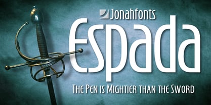 Legible, dynamic and modern. Very suitable for a variety of applications.
 - Altemus Security by Altemus Creative,
$11.00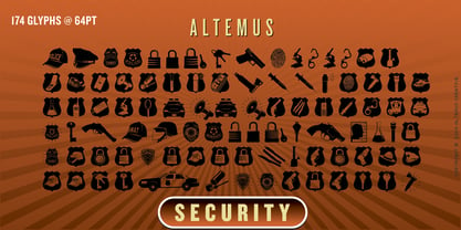 A collection of 174 law enforcemet and security icons and designs.
 - DB Artsy by Illustration Ink,
$3.00DoodleBat Artsy is a collection of decorative doodles and fancy scribbles. - KG Summer Sunshine by Kimberly Geswein,
$5.00 A trio of 3 playful fonts perfect for summery, whimsical projects.
 - Empty Streets by PizzaDude.dk,
$15.00 Empty Streets is a brush made font with loads of attitude!
 - Spectra New Style by Martin Wait Type,
$26.00Spectra is a more modern cut of the original New Spectra. - Speedball Metropolitan Caps by Intellecta Design,
$6.00 a decorative caps font based in designs of old Speedball booklets
 - Altemus Kitchen by Altemus Creative,
$11.00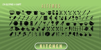 A collection of 174 kitchen and serving equipment icons and designs.
 - Arcadia by Kraken,
$15.00A typeface inspired by the old computer games of the 1980s. - Fenotype Dingbats by Fenotype,
$19.00 A set of urban images for flyers, posters and LP-covers.
 - Luco Sans by artill,
$19.00 A headline typeface with an impression of standardisation and stylish touches.
 - Untitled Wood Type by Intellecta Design,
$13.90a classic wood type font, in an attractive set of variations - Altemus Roughcuts by Altemus Creative,
$11.00 A collection of 174 rough, hand-made and rough-looking designs.
 - Alabaster Micro by Jesse Tilley,
$5.00 A micro version of the font Alabaster. Font actual size 32pt.
 - Posterama by Monotype,
$40.99 The Posterama™ typeface family contains 63 fonts and is a true journey through space and time. Designed by Jim Ford, each Posterama family contains 7 weights from Thin to Ultra Black, in 9 distinct families. What makes Posterama so unique and versatile are the eight alternative display families. By making use of a collection of alternative glyphs, Posterama sets an evocative flavor to visualize an entire century of futuristic reference points from art, architecture, poster design and science fiction into one family. Posterama Text is the base family. It has the most robust character set including upper and lowercase glyphs and pan-European language support (including Greek and Cyrillic). Note: all the other Posterama variants described below do not have lowercase letters or Greek and Cyrillic support. Posterama 1901 recalls the decoratively geometric style of Art Nouveau from the turn of the 20th century. Letterforms such as the slender, snaking ‘S’, the high-waisted ‘E’ and the underlined ‘O’ revive the spirit of Charles Rennie Mackintosh and the designers of the Viennese Secession. Posterama 1913 pays homage to the Armory Show, or 1913 Exhibition of Modern Art, which brought the revolutionary work of European artists such as Picasso, Duchamp and Kandinsky to the US for the first time to the shock and astonishment of press and public. Near-abstract, angular characters such as the ‘A’, ‘E’ and ‘N’ hint at cubism’s jagged and clashing planes. Posterama 1919 uses a small, but important, variation to set a tone when the Bauhaus was founded, and the surge in radical European typography that followed. The straight-sided, roundheaded ‘A’ adds a flavor of 1919 – this style of ‘A’ can still be seen in the Braun logo, designed in 1934. Posterama 1927 captures the year of Metropolis, The Jazz Singer and Paul Renner’s pioneering, geometric Futura typeface from 1927, which had a profound influence on design in the US and Europe. Posterama 1933 – With its low-waisted, sinuous designs, the Posterama 1933 typeface family echoes lettering of the Art Deco period, which in turn had its roots in Art Nouveau, the key influence on Posterama 1901. The two fonts make a great team and can be used interchangeably. Posterama 1945 features a few Cyrillic characters to conjure up an era when Russian art and political posters made their mark in cold war propaganda, espionage and also giant aliens and monsters. Posterama 1984 takes its typographic influences from George Orwell’s classic novel, publicity for the dystopian action and sci-fi movies (Blade Runner, Videodrome and Terminator) and games like Space Invaders and Pac-Man that made an impact at that time. Posterama 2001 was inspired by Stanley Kubrick’s science fiction masterpiece, which made extensive use of the Futura typeface. Posterama 2001 finds its cosmic orbit with its nosecone-style ‘A’ from NASA’s much-missed ‘worm’ logotype. There’s an echo, too, in Bauhaus designs from as early as 1920, whose minimalist, geometric lettering also featured a crossbar-less ‘A’.