10,000 search results
(0.032 seconds)
- Slavica by Green Type,
$28.00 Slavica is a modern pixel version of old Slavonic fonts.
 - Blobbing by Wooden Type Fonts,
$15.00 One of a few quirky display types by this designer.
 - Bernhard Gothic Medium by Wooden Type Fonts,
$15.00 A version of Bernhard Gothic Medium. Quite useful for advertising.
 - Altemus Rays by Altemus Creative,
$11.00 A collection of 174 ray sunray and corner ray designs.
 - Homer by Autographis,
$39.50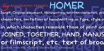 Homer is a very useful handwritten set of comic characters.
 - Technik Mono by CarnokyType,
$20.00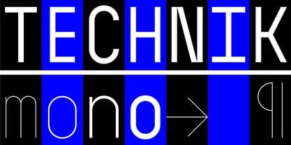 Technik Mono is a complementary monospaced version of Technik typeface.
 - Munster Gotische by Intellecta Design,
$24.90a gothic font with variations of style ready to use - Mencken Std by Typofonderie,
$59.00 An American Scotch remixed in 27 fonts Mencken has twenty seven styles, divided into three widths, three optical sizes, romans and italics. Generally, optical size typeface families belong to a same common construction. It falls into the same category of type classification, while presenting different x-heights or contrasts. Mencken is unique because it is designed according to different axis and optical sizes. Firstly, Mencken Text is a low-contrast transitional typeface, designed on an oblique axis, asserting horizontal with featuring open counters. Its capitals follow Didots to better harmonize the rest of the family. On the other side of the spectrum, Mencken Head (and narrow variations) is designed on a vertical axis, high contrast, in a contemporary Didot style. The Mencken is therefore a typeface answering to different sorts of uses, whose design is different according to its uses: from oblique axis in small size to vertical axis in large sizes. Vertical proportions (x-height, capitals height, etc.) were calibrated to be compatible with many Typofonderie typeface families. Lucie Lacava and I followed the idea launched by Matthew Carter few years ago for some of his typefaces intended for publications. From Baltimore Sun’s project to Typofonderie’s Mencken It is a bespoke typeface for American newspaper The Baltimore Sun started at the end of 2004 which marks the beginning of this project. The story started with a simple email exchange with Lucie Lacava then in charge of redesigning the American East Coast newspaper. As usual, she was looking for new typeface options in order to distinguish the redesign that she had started. At the time of its implementation, a survey of the newspaper’s readers has revealed that its previous typeface, drawn in the mid-1990s, was unsatisfactory. The Mencken was well received, some reader responses was particularly enjoyable: “It’s easier to read with the new type even though the type is designed by a French.” Why it is called Mencken? The name Mencken is a tribute to H. L. Mencken’s journalistic contributions to The Sun. According to the London Daily Mail, Mencken ventured beyond the typewriter into the world of typography. Because he felt Americans did not recognize irony when they read it, he proposed the creation of a special typeface to be called Ironics, with the text slanting in the opposite direction from italic types, to indicate the author’s humour. Affirming his irreverence, the Mencken typeface does not offer these typographic gadgets. Henry Louis Mencken (1880 — 1956) was an American journalist, satirist, cultural critic and scholar of American English. Known as the “Sage of Baltimore”, he is regarded as one of the most influential American writers and prose stylists of the first half of the twentieth century. He commented widely on the social scene, literature, music, prominent politicians and contemporary movements. Creative Review Type Annual 2006 Tokyo TDC 2018
 - Koorkin by Monotype,
$29.99 “I originally drew the primary characters with a felt tip marker, scanned them and then proceeded to noodle on the computer,” says George Ryan of his new typeface, Koorkin. “Over the years, I’ve designed many original typefaces, but Koorkin has become one of my favorites. I’ve worked on hundreds of highly structured text faces. For the most part, the roots of all of them can be found in the handwritten letterforms we learn as children. I enjoy going back to these shapes whenever the opportunity presents itself. ”The happy result of Ryan‘s felt tip marker sketches and his love of simple letterforms is a new family of upright and italic scripts in medium and bold weights.
 - Sultania by URW Type Foundry,
$39.99 Sultania is a harmonic synthesis of the old characters’ suppleness and the resolute, clean design of modern typography. The rich in contrast calligraphic approach with thick and thin strokes is still visible and you can almost feel traces of ink on paper while it’s shapes in general, without serifs and any embellishments, proclaim its up-to-dateness swinging between roundness and rigor. Elegant, noble, yet still affected by traces of the handwritten script, Sultania is reminiscent of power, wealth, mind and culture. Sultania’s historical roots and it’s originality remind of oriental colors. A close Orient, at the gates of Europe, in which Latin characters are mixed with distant sounds. The Byzantium of the Sultans.
 - Ongunkan Brahmi by Runic World Tamgacı,
$60.00 The Brāhmī alphabet is the ancestor of most of the 40 or so modern Indian alphabets, and of a number of other alphabets, such as Khmer and Tibetan. It is thought to have been modelled on the Aramaic or Phoenician alphabets, and appeared in India sometime before 500 BC. Another theory is that Brāhmī developed from the Indus or Harappa script, which was used in the Indus valley until about 2,000 BC. The earliest known inscriptions in the Brāhmī alphabet are those of King Asoka (c.270-232 BC), third monarch of the Mauryan dynasty. Brāhmī was used to write a variety of languages, including Sanskrit and Prakrit.
 - Herculanum by Linotype,
$36.99Herculanum is a part of the 1990 program “Type before Gutenberg”, which included the work of twelve contemporary font designers and represented styles from across the ages. Herculanum is a work of Swiss typeface designer Adrian Frutiger. It takes its name from the city of Herculaneum, an ancient Roman resort town destroyed by volcanic pyroclastic flows from Mt Vesuvius in 79 AD (the same eruption that destroyed the nearby city of Pompeii). Herculaneum's ruins are located today in the commune of Ercolano, Campania, Italy. Ancient Roman writings of the 1st century influenced the font's design. Herculanum is distinguished by its broad characters with narrow strokes and its willful character. - Morris Sans by Linotype,
$40.99 Morris Sans is a newly revised and extended version of a small geometric family of typefaces originally produced by Morris Fuller Benton in 1930 for ATF. His initial design consisted of an alphabet of squared capital letters with a unique twist that characterized its appearance: corners with rounded exteriors and right-angle interiors. The types were intended for use in the fine print found on business cards, banking or financial forms, and contracts. But over the ensuing decades, this design became a popular element in all sorts of design environments, and several foundries revived the typeface in digital form. Since digital fonts are bicameral, with slots for both upper and lowercase letters, new cuts of the type opted filled the lowercase slots with small caps. In 2006, Linotype commissioned its own version of the typeface-an extension for 21st century use. Under the advisement of Linotype's type director Akira Kobayashi, Dan Reynolds redrew the uppercase and added an original lowercase for the first time. Additionally, a number of extras were brought into the fonts, including six figure styles (tabular and proportional lining figures, tabular and proportional oldstyle figures, and special tabular and proportional small cap" figures). Small caps, which have become an iconic element over time, are accessible in each font as an OpenType feature. To differentiate this version from the original, Linotype's new family is named Morris Sans, in honor of Morris Fuller Benton. All fonts in the Morris Sans family are OpenType Com fonts; they include a character set capable of setting 48 European languages that employ the Roman alphabet, including all Central and Eastern Europe languages, those from the Baltics, and Turkish. This glyph coverage extends to the small caps as well. Morris Sans is a wide typeface, especially in its regular widths; the condensed faces set a more conventional line of text. The new lowercase letters are less geometric than the uppercase, except for those that share the same basic forms (e.g., c, o, and s). Instead of following this geometric trend, the new lowercase tends to strengthen the humanist elements that were present in several characters from the original type, including the uppercase D and the figures 5, 6, and 9. Morris Sans also sports a number of glyphic flares, like the stroke found on the original uppercase Q. Morris Sans is a clean, modern design best suited for headlines, advertising, posters, expressive signage (especially on storefronts), and corporate identity work."
 - AT Move Powerplay by André Toet Design,
$39.95 POWERPLAY a monospace lowercase alphabet with a 3D twist. Designed by André Toet in 1976 (during his study at Central School of Art & Design, London, UK) and he redesigned this in 2011. The name Powerplay is based on the Battersea Power Station, London. The remarkable architecture of the building is also used as a decor for films and for one of the covers by Pink Floyd (Animals, the flying pig). Concept/Art Direction/ Design: André Toet © 2017
 - Palio by Eurotypo,
$34.00 Palio is a family of fonts derived from the classic Didone, its capitals are slightly condensed and the lower case definitively abandon the reminiscent of the baroque endings strokes, which are still endure in many typefaces. It is an elegant font especially the slant version that actually is a truly italic. This version very readable and is enriched with a series of alternative variables and swashes that make it more expressive for certain projects that need some flowering.
 - Automatic Typewriter by Ana's Fonts,
$16.00 Automatic Typewriter is a monospaced typewriter font in two styles: Upright and Oblique, and two weights: Regular and Bold, plus an Automatic Underline version of each font, for a total of 8 fonts. This makes it versatile and ready to use in modern and vintage designs alike. This font is also very legible at a wide range of sizes and looks great in both long or short texts, in digital collages, branding and packaging, social media posts, logotypes, etc.
 - Pinatas Cottons by Piñata,
$12.00 Original Foundry: TypeType Original typeface name: TT Cottons Pinatas Cottons is a friendly hand-drawn typeface with condensed proportions. Each separate style of Pinatas Cottons was drawn by using different instruments. For instance, the black style was painted with a real brush, and the thin one was created with a pen. We tried to keep this analog feeling of hand drawing while we digitalized each style of the typeface. Pinatas Cottons is your ideal design helper.
 - Olap Metric by S6 Foundry,
$20.00 Olap Metric is a modern, one-of-a kind font that will make your designs stand out against the competition. With 9styles and Multi-languages support, this stylistic display type has what you need for all sorts of projects! The family has been developed as a modern playing system allowing the mixing of infinite combinations. Perfectly suited for headlines, large-format prints, brand identities, social media, advertising, editorial design, posters, magazines, logos, headings, digital and more.
 - Quavo by Quatype,
$10.00 Quavo is a round sans font family, including regular and oblique font styles. Round corner of letters show the soft and friendly vibe and some letters for instance: letter a, b and d, they all have a tail at the end. It's sort of personal preference, for I want to add some ornamental elements in this font. Quavo can be applied in lots of areas. Including but not limited in titles, posters, book pages and big display canvas.
 - Merry Brook by Letterhend,
$19.00 Merry Brook is a beautiful signature script based on manual hand writing. The stylistic alternate, ligatures and the tick and thin stroke kk make this font looks a real hand writing instead of typing a font. This type of font perfectly made to be applied especially in logo, and the other various formal forms such as invitations, labels, logos, magazines, books, greeting / wedding cards, packaging, fashion, make up, stationery, novels, labels or any type of advertising purpose.
 - Original Quality by Hanoded,
$15.00 Original Quality: I often see these words on various objects - from T-shirts to sprinkles and cookies. In fact, I see this term so often that I decided to name a font after it. Original Quality font is an adaptation of an older font of mine called Butterfly Ball. It is a totally different typeface, but I hope it hasn’t lost its original quality… ;-) Comes with all the diacritics you want, plus a handful of cute stylistic alternates.
 - Physe by Typotheticals,
$5.00 Physe. Physe is a basic set of fonts, designed for scrapbooking and general use. It comes in a variety of versions, with a light version, expanding up to bold. Many hurdles were taken to finalize this version, both physical and electronic. Like all of us, as I grow older, my glaucoma keeps pace with my arthritis, while I look on in amusement, hedging my bets on which will be the one to finally complete my retirement.
 - Tabac Sans by Suitcase Type Foundry,
$75.00 Tabac Sans is a linear, dynamic sans serif type that blurs the lines between text and title typefaces. Drawing on the rich tradition of European lettering, the humanist basis supports excellent readability even at the smallest letter sizes, while unique details and a wide array of alternative glyphs prove highly effectual in titles and headlines. The broad variety of types and weights make this font family a versatile aid when composing complex magazine and newspaper layouts.
 - Burra by Creativemedialab,
$18.00 Introducing Burra, a Variable display font. All capital alphabet with a wavy psychedelic look. Inspired by liquify and water strokes. Burra Consists of 3 widths and 5 weights on each, a total of 15 fonts. It is Variable font, officially known as Open-Type Font Variations. You can generate lots of width and weights with the two available slider axis. Burra will add fresh fun vibes to your designs. This font is perfect for clothing, book covers, titles, etc.
 - Hot Grinches by Beast Designer,
$15.99 Hot Grinches Font exudes playful charm and whimsy, making it an ideal choice for vibrant and lively designs. With its lively characters and distinctive style, this font adds a touch of fun and character to any project. Perfect for conveying a sense of joy, Grinched Font is particularly well-suited for children’s themes and pairs seamlessly with lively color palettes. Elevate your designs with this cheerful and spirited font that brings a dash of personality to any creative endeavor.
 - Decondor by Alit Design,
$12.00 Introducing DECONDOR Typeface DECONDOR font family consists of 14 families, from Thin to Heavy style fonts. The elegant modern font creates a unique design and is sure to steal the eye of the design target audience. Besides being unique, the DECONDOR font also has a luxury simple character that makes the design charming and classic luxurious. These a fonts are perfect for designs with the concept of elegant, luxury, romance, fashion, classic royal and so on.
 - Kachelofen by Proportional Lime,
$9.99 Konrad Kachelhofen was a printer in the city of Leipzig beginning around 1483. He printed many works by contemporary authors and also many of the classics. He acquired an unusually large amount of typefaces for his shop, a place that included a wine bar and book store. This particular face is based on the Typ.8:170G GfT101 Gesamtkatalog der Wiegendrucke. He probably died in 1529 after passing his business on to his son-in-law Melchior Lotter.
 - Romanica by K-Type,
$20.00 ROMANICA is a relaxed humanist sans with subtly curved corners and slightly flared glyphic terminals that are expressively angled where appropriate. Romanica has the authority of the ages without the harshness of many classically inspired typefaces. All eight fonts include a full complement of Latin Extended-A characters, Welsh diacritics, Irish dotted consonants, and additional oldstyle numerals. ROMANICA is available in three packages - • Basic Family (Regular, Italic, Bold & Bold Italic) • Light (Light & Light Italic) • Medium (Medium & Medium Italic)
 - Chalfont by Alan Meeks,
$45.00 The typeface was designed after seeing a photocopy of some News Gothic text where the ink had faded on the bottom of each character. As character recognition is generally based on the top half of a character, readability was never compromised. Rather like Antique Olive the characters have a top heavy look when viewed straight on, however, as most type is read at an angle with the top further away than the bottom this top heavy look is diminished.
 - Crazy David No 1 by 066.FONT,
$9.99 Crazy David No 1 is a display font that draws inspiration from the distinctive aesthetic of 90s zines, and exudes a varied and extravagant style that lends a certain nonchalance to projects. Its expressive and daring letters are perfect for creative projects such as posters, invitations or branding materials. Crazy David No 1 perfectly captures the striking look and distinctive character of the text, which is associated with the unique spirit of that decade. Remastered in 2022.
 - Arbotek by Type-Ø-Tones,
$60.00 Arbotek has the original skeleton that the author used for the development of his typeface Arboria, a real 'architect typography', with a basic and radical approach to pure geometric forms. The three basic styles - Thin, Light and Light Rounded - try to approach the cartographic technique annotations and their output on plotters. The voluptuous style, Ultra, keeps the same structure of the Light versions, but develops as a historic Art Decó variant of this 20s and 30s graphic style.
 - Neue Power by Power Type,
$15.00 Neue Power is a contemporary sans serif display font family in 6 weights plus 12-degree of obliques. It supports 75+ Languages (Latin Based) followed by the Grotesk typefaces, perfect for various design needs, including Branding (Identity), Logotype, Printing to On-Screen/Digital Reading, Posters, Caption, Headline, Body Text, or Captions. Neue Power Typeface will give you a nice way of aesthetic communication for your design project. Available from Light — Ultra plus obliques in a total of 12 Fonts.
 - Mauritania Script by Get Studio,
$16.00 Introducing, Mauritania Script. This hand-made font is well crafted with a dancing baseline that makes this font perfect for delivering an extremely fearless message in your design without losing the natural impression. Mauritania Script is very suitable for various types of design needs such as branding materials, t-shirt, food-packaging, business cards, logos, posters, and more. This font comes with a complete set of lowercase alternates, numerals, a large range of punctuation ligatures, and Special European Characters.
 - Aesop by Fine Fonts,
$29.00 Aesop was developed from some book jacket lettering drawn by Michael Harvey for an edition of Aesop’s Fables by a master Japanese Artist. It is based upon a pen-drawn script, and is characterised by a lively sense of movement and grace. Aesop Plus, being an OpenType font, contains many alternative characters and additional ligatures which can be automatically substituted to enhance the liveliness of set text, where the application in which it is used, permits.
 - Mariné by TipoType,
$19.90 Mariné is a geometric sans but with the softness of humanistic strokes. It’s mild contrast and multiple different styles allow Mariné to work well as both a text and display font. It also includes an Up version and calligraphic features that add a touch of informality. Mariné is available in an extended family and is the close cousin of Amelia (available at MyFonts.com). All differences between Mariné and Amelia appear in the italic and Up versions.
 - Keep Humble by Struggle Studio,
$16.00 Keep Humble is a retro styled font with a stunning style that can make the most of your design projects. This font gives a touch of retro style that was famous in the 60-70s. Keep Humble font has an alternative style for Uppercase and Lowercase, Ligature, which can be adapted to your design needs so you don't waste time creating extrusion effects. Keep Humble also has 25 Swash options, of course this really helps to beautify this font.
 - Tacit by Fontar,
$25.00 Tacit is the first typeface to be the creative outcome of a PhD thesis in graphic design. The work's main study had the aim of documenting design processes in an effort to externalise the tacit (experiential) knowledge of graphic designers. Initially the task was only to design several glyphs but the work resulted in a full typeface. Tacit is an elegant sans serif with a distinctive character and is legible at small and large point sizes.
 - Archipelago International by Aldedesign,
$25.00 Archipelago International // Modern Calligraphy is a stylish script font that features a varying baseline, smooth line, modern, and depth of love. For those of you who need a touch of love and modernity for your designs or branding, it can be used for various purposes such as headings, weddings, invitations, signatures, logos, branding, letterhead, signage, labels, news, posters, badges, etc. Each Font Has: Stylish modern handwritten script Beautiful Swash (Ending tail) Beautiful Titling (Beginning tail) Special Ligatures Multilingual Support
 - Gambero by Typoforge Studio,
$29.00 Say hi to new member of Typoforge zoo! Gambero family consists of 18 styles (including italics) with a subtle rounded finished details. Gambero is a stable, slab cousin of Kapra, Kapra Neue adn Kapra Neue Pro. It is ideally suited for advertising, editorial and publishing, offering new design potential. Font Gambero is inspired by a "You And Me Monthly" published by National Magazines Publisher RSW "Prasa" that appeared from May 1960 till December 1973 in Poland.
 - Xalapa by insigne,
$14.99Xalapa is a wavy and rugged script. The font comes packed with OpenType alternates and ligatures. Included are fifteen titling alternates, small caps, oldstyle figures and a full set of stylistic alternates to ensure that your designs are unique every time. Sixty-four contextual ligatures are available to extend the organic nature of the lettering and make certain that no two letters in a word are alike. Choose Xalapa when you need to evoke the spicy flavors of Mexico.