10,000 search results
(0.047 seconds)
- Andaluz by Storm Type Foundry,
$38.00 The land of beauteous angels, Andalucia, connects different cultures with a curved arch. Almond trees bloom there in February, and orange trees grow in the heavenly courtyards of Gothic churches. A Catholic cathedral stands in a mosque, Moorish fountains gush with water, and ornate arcades are reflected in the mirrors of the Alhambra pools. Fishing villages have long been busy with tourism, but there are remote pubs where only locals go for fresh fish. Beer is served in wine glasses, and with each one you get a piece of cheese, shrimp, or a few slices of specially smoked ham, sitting on the bar counter. Here, in the off-season, it is possible to gaze into the distance towards the African shores and sketch watercolors for the diary completely undisturbed.
 - Omnibus by Linotype,
$29.99Omnibus is one of my absolute favourites. My intention was to design a typeface as easy to read as Baskerville, without being a copy of it. It is easy to see that I was influenced by Baskerville, e.g. in the open lowercase g. I had in mind to design a Baskerville with the looks of the Baskervilles used in earlier typesetting. I put aside those plans for a while (but fulfilled them later on) and dedicated myself to Omnibus. In both cases my aim was to achieve a typeface with darker looks than the most used Baskerville. The name has nothing to do with buses, it is Latin with the meaning of for all". It is also in the name of Omnibus Typografi. Omnibus was released in 1993. - Nolan by Kastelov,
$55.00 The idea behind Nolan is to create emotional response due to its inviting character and legibility. It is ideal for headlines, presentations, product signage and bespoke logotypes. Due to the structure of the letters, Nolan can also stand its ground in body text, although this is not its primary purpose. Nolan is created slightly wider than what is to be expected from a typical sans font, yet not to the point of being considered a wide typeface. This uniqueness lends the family an air of originality while adhering to already established standards in the creation of contemporary sans typefaces. Nolan has a large x-height, so as to deliver a better punch and be legible at a glance . Its clean and modern lines are reminiscent of architectural aesthetic.
 - Stevie Sans by Typefolio,
$29.00 Some years ago I had my first contact with a grotesque typeface, when handling a sample catalog of typographic specimens from the age of phototypesetting. The style eventually settled in my memory waiting for the work of time. Behind its apparent neutrality, there is a complex balance game, that almost leads to the basic principles of design which deliver such power to the grotesque style. Stevie Sans is the answer to the action of time. A bridge that allows the designer to go into the past, while being in the present and looking towards the future. It is what it’s expected from a grotesque designed in the 21st century. With 7 roman styles ranging from thin to black, support to many languages and essential opentype features, Stevie Sans is the ideal choice for your project.
 - Rigoletto by Sabrcreative,
$15.00 Introducing Rigoletto Font Duo, a stunning combination of a monoline script and Sans Serif fonts. This font duo offers a neat and clean monoline style, complemented by the versatility of the Sans Serif fonts, resulting in designs that are sophisticated, expensive, and elegant. With 70 alternates included, Rigoletto allows you to add decorative elements to your designs effortlessly. It supports a wide range of languages, including English, Danish, Dutch, Estonian, Faroese, Filipino, Finnish, French, German, Hungarian, Icelandic, Irish, Italian, Norwegian, Polish, Portuguese, Spanish, Swedish, and more. Unleash your creativity with Rigoletto Font Duo! It is perfect for various applications such as logotypes, wedding invitations, vintage labels, romantic cards, and much more. Its unique combination of monoline script and Sans Serif fonts adds a touch of elegance to any project.
 - Mellony by Alit Design,
$12.00 Introducing Mellony brush script font which has a elegant hand lettering brush style. So it looks naturally handmade, the Mellony family is unique because it has more choice of characters, like a swash, end characters and many more. This font is best used for your design project that has the concept of fun, girly, romantic and elegant. Can also be applied to the design of a logotype, header website, wedding logo, romantic design, make some lettering a quote, t-shirt design etc. Mellony family font has two font styles that are similar but a different character, namely Mellony regular and Mellony dry brush. The Mellony family deserve to be one of your fonts collections, because it is unique, elegant and has many options of alternative glyphs for your fresh designs. Thank you and enjoy :)
 - Expectation by Linotype,
$29.99Making a Christmas card takes a lot of work! Finding the right typeface can be tough, too. Have you ever spent hours searching for the right one? Well, in 2003, instead of spending hours searching, German designer Guido Bittner made his own. Expectation was first used on the Christmas card for Bittner's Wiesbaden design studio. This delicate series of letters maintains a handwritten feel, in part because it began as a digitalization of Bittner’s own handwriting. Expectation Swash includes additional swash letters, which can be paired with regular version of Expectation to create superior effects. Perhaps it is already time for you to begin working on next year’s holiday cards. Let these fonts be the starting port for your inspiration! Expectation was a winner in the 2003 International Type Design Contest, sponsored by Linotype GmbH. - Carpenter Script by GroupType,
$19.95 Carpenter® is a beautiful script perfectly suited for invitations and announcements. Created by James West, the design was a facsimile of the penmanship of Mr. Carpenter of R. Hoe & Co. and released by the Cleveland Type Foundry as one weight in 1882. It is now also available in SemiBold and Bold. The style of this script is very reminiscent of formal handwriting popular in the late 19 and early 20th centuries. It is graceful with formal structure. Its x-height is very small, with unusually long ascenders and descenders. Although there are many script fonts available, Carpenter is a historical design with a truly unique personality that will add a truly unique look and feel to your design. From GroupType™, Carpenter is available in TrueType and OpenType.
 - AJSHA by Fontex,
$49.00 AJSHA font, even though being our newest font, is inspired by ancient Japanese and Chinese culture, eastern style of life of about 5000 years before present day, when honor and a good sword were respected. Japanese special sword Katana is known to be handcrafted to be extremely sharp and deadly. Therefore, the shapes of the AJSHA font accompanies the moves of a Katana master when he uses the power of his sword. The font comes in two styles, light and medium. Medium is a bit bolder style while the exact bold or strong version lacks due to the fact that the font's lines needed to be sharp as a swordsman's cuts. We expect this font to be a great asset tool for top-notch designer companies that put quality before everything else.
 - MV Bombay by ManVsType,
$40.00 Bombay is serif type family by ManVsType. It is ideal to use at larger sizes as a display font. The family comes in 5 weights in 2 styles (normal stem height and low stem height). This font is variable in its weight and "connection" heights in the letters a, b, d, h, m, n, p, q, r and u. The typeface has a number of ligature including an R+s ligature that automatically turns into the ₹ (rupee symbol) to solve a major problem in the Indian subcontinent where people don't know how to type it. Bombay is inspired by the colonial version of the city. The city being a melting pot of all kinds of people. Poets, writers, filmmakers enjoyed the city and it quickly became the cultural hub of the entire country.
 - VLNL Wasabi Turbo by VetteLetters,
$35.00 Wasabi is one of the key ingredients in the Japanese kitchen. Also known as japanese horseradish, it is an extremely spicy condiment made out of the graded root of the Wasabi plant. Its spiciness is different than that of a chili pepper though, more like a hot mustard. The spicy taste shoots right through your nose, but does not last for long. Wasabi is traditionally used in sushi and sashimi dishes, soba noodles, and in a number of Japanese snack foods. Equally sharp and stingy, VLNL Wasabi Turbo was designed by Donald Roos. Despite its japanese outward appearance, the font has its origin in lettering found on a German book. It is hot, and edgy like a samurai sword. Wasabi Turbo will stand out as headline and logo!
 - Moments by DearType,
$35.00 Moments is a charming font family inspired by all those moments in life that make us smile. As usual, it is a combo of an informal script, two handmade sans variations and some extras to spice up your designs. The script has 1300+ lovely glyphs with lots of stylistic variations, ligatures and swashes, which you can mix and match for a more interesting effect. The dancing baseline makes it very casual and full of personality, thus a great addition to every design project. Moments is versatile and can be used on cards, posters, merchandise, book covers, websites, packaging, and basically anywhere you like. The overall feel of the font is warm, elegant and informal and it is perfect if you want to convey a sense of friendliness and style.
 - Magical Journey by Letterhanna Studio,
$19.00 "Magical Journey" is a captivating handwritten script font that invites you to embark on a whimsical adventure through its enchanting curves and graceful strokes. This font encapsulates the essence of imagination and wonder, as if each letter carries the secrets of a fantastical realm waiting to be explored.
 - Octagone Monogram by MonogramBros,
$8.00 Octagon Monogram is a perfect Octagon shaped monogram font consisting of 52 letters and 1 frame. Octagon Monogram Font comes with font files in OTF format. With just a single font file you will be able to create beautiful monograms in just a matter of minutes after the purchase!
 - RMU Herkules by RMU,
$25.00 At the end of the 19th century, the fin de siècle, both Bauer and Berthold released ‚Herkules‘, a heavy Art Nouveau font for ads and posters. This font was carefully redesigned and makes it a great font in Jugendstil surroundings and a splendid partner of the Carlsbad font family.
 - Giddelham by wearecolt,
$29.00 Giddelham is classy curvy and italic. A bold set of characters which flow in to an elegant, simple flourish. Giddelham offers several ligatures to help the flow and shape of your words. Giddelham is ideal for titles, subheadings and makes for a great start point for a sexy logo.
 - Hugedelia by Invasi Studio,
$19.00 This modern handwritten brush script is stylish and fresh. Featuring a touch of class and a fabulous brush style. It has a huge and sophisticated look, so we named it Hugedelia. The font offers tons of ligatures and multi-language support, which adds more naturalness to the application.
 - Oak Ridge JNL by Jeff Levine,
$29.00Oak Ridge JNL gives a Westernized treatment to Flivver JNL; which in turn is a serif derivative of Two Reeler JNL. Although all three fonts come from the same root source—inter-title cards from an old Charlie Chaplin movie, they each take on a personality of their own. - Rinat by Samtype,
$34.00 This hebrew typeface is inspired in prayer books from the beginning of the XX century. You can apply modern hebrew marks like Kamats Katan, Sheva Na, Dagesh Chazak and Cholam Chaser. It's a classic style with the most modern of a digital font technology and a easy lecture.
 - MD Pen by Margarita Dyakovich,
$12.00 MD pen is a unique handwritten sans serif font family ( based on MD Grotesque) with a feel of elegance and with high readability. It’s versatile and can be used for a big variety of design projects. Perfect for any simple text. Each style includes Latin and Cyrillic character set.
 - Round Branch Monogram by MonogramBros,
$12.00 Round Branch Monogram Font is a perfect shaped monogram font consisting of 52 letters. With just a single font file you will be able to create beautiful monograms in just a matter of minutes after the purchase! Round Branch Monogram Font comes with font file in OTF format.
 - Andovai by Eurotypo,
$39.00 Andovai, a modern Roman cursive family, fast and slightly aggressive as today's Rome, deriving its name in Roman dialect of the phrase "Ma 'ndo vai...", the meaning of which in Italian is "Dove vai?" (Where are you going?) ... in a game to define a current and irreverent gestural typography.
 - Keswah by Twinletter,
$15.00 Keswah is a calligraphic display font inspired by the heritage of Middle Eastern typography. Each letter is carefully drawn by hand and then digitized to add subtle stroke variations. This font is suitable for a variety of your design needs, especially for designs that require a middle eastern theme
 - MNRagnala by Mantra Naga Studio,
$20.00 MNRagnala is a display serif typeface that boasts a versatile collection of 18 font families, encompassing 9 weight weights and 2 unique styles. With an inherent blend of elegance and boldness, this font exudes a commanding presence, making it an ideal choice for branding endeavors and diverse design requirements.
 - Resolution by Emil Kozole,
$29.99 Resolution is a modern monospaced typeface with 4 weights. The typeface is a satire of rendering of early screens and inherited its name through this sentiment. Since screen resolution is getting higher, this font is a memorial to low resolution screens. Resolution is also an excellent programmer’s choice.
 - Chilia by Craft Supply Co,
$15.00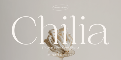 Chilia is a stylish serif font where contemporary upper serifs meet a feminine allure, making it ideal for beauty and display purposes. With its unique blend of modern and elegant features, Chilia adds a touch of sophistication with eye-catching presence that perfect for captivating displays that demand attention.
 - Bajt Rounded by Fontsphere,
$12.00 BAJT Rounded is a futuristic all-caps display font. It was created as a rounded version of the BAJT Font. Use for awesome display, illustrations, posters, logos, t-shirts, titles, and much more.. The font includes multilingual support (Latin-1), uppercase letters, numerals and a large range of punctuation.
 - Joanne Script BH by BluHead Studio,
$25.00 Joanne Script BH is based on the handwriting of a BluHead friend. This fun design has a sharp, angular feel which lends itself to casual messages, greeting cards, post its, journals, you name it! Plus, a large complement of characters allows you to send your thoughts in multiple languages.
 - India Echo by Vic Fieger,
$6.99India Echo was simply derived from doodling on a whiteboard with a dry erase marker. The aim of the exercise was to create a string of writing that looked foreign enough to be an alien script, angular enough to appear to be futuristic, and familiar enough to be legible. - Catshape by RodrigoTypo,
$45.00 Catshape is a font of dingbats, which in combinations with uppercase and lowercase you can generate multiple characters with different textures. In addition to a set of ornaments and a font called Alquitran Stencil, it was designed for different graphics. I hope you can have fun with this font!
 - Pleasure by ITC,
$29.99Pleasure is the work of German designer Holger Seeling, a condensed open sans serif typeface featuring a shadow behind each character. Its geometric forms are flexible and best used closely spaced. Pleasure reflects no particular time or setting and is therefore ideal for a wide variety of headline applications. - Sign Stencil JNL by Jeff Levine,
$29.00 Sign Stencil JNL was modeled from some vintage lettering stencils spotted in an online auction that were part of a store sign making kit. A variety of styles, sizes and designs were contained within a carrying case along with paints, brushes and instructions on how to paint attractive signs.
 - Algarabia Display by Macizo.com.mx,
$55.00 Algarabía Display was created for titles or to highlight a particular text. It includes a set of accented capitals and accented lowercases, almost one hundred ligatures, entry and exit capitals, symbols, punctuation and numerals, and almost 50 different kinds of dingbats. It is a typeface to have fun.
 - Hondo by Fontasmic,
$16.99 The Hondo fonts are a collection of ultrabold slab serif typefaces with a dynamic look. Accented with decorative and functional inktraps and complete with Slant and Backslant styles, this heavyweight has a high performance racey feel to it. Ideal for titling, poster work, logos, and small bits of copy.
 - Vuvuzela NF by Nick's Fonts,
$10.00A signpainter's chapbook called this style Show Card Casual, although "casual" might be understating the case a bit. Guaranteed to put some fun, and a wee bit of mischief, into your headlines. Both versions of this font include the complete Latin 1252 and Central European 1250 character sets. - Old Wood JNL by Jeff Levine,
$29.00 One of the charming features of vintage wood type is the unusual interplay of stroke widths or letter shapes that can vary from character to character. In today's world of digital perfection, a set of letters, numbers and punctuation marks must conform to rigid standards of uniform lines, balanced curves and other form-and-function rules that has often removed the human feel from the overall type design. While this is fine when applied to most text fonts and some modern display faces, Old Wood JNL is a simple throwback to an earlier time when type design was an artistic, not engineering endeavor. Modeled in part from vintage source material, this wood type design retains that charming imperfection of a time long passed.
 - F2F Styletti by Linotype,
$29.99The Face2Face (F2F) series was inspired by the techno sound of the mid-1990s, personal computers and new font creation software. For years, Sibylle Schlaich and her friends formed a unique type design collective, which churned out a substantial amount of fresh, new fonts, none of which complied with the traditional rules of typography. Many of these typefaces were used to create layouts for the leading German techno magazine of the 1990s, Frontpage. Schlaich and her fellows would even set in type at 6 points, in order to make it nearly unreadable. It was a pleasure for the kids to read and decrypt these messages! F2F Styletti Medium is one of 41 Face2Face fonts included in the Take Type 5 collection from Linotype GmbH." - Morris by HiH,
$10.00 Morris is a four-font family produced by HiH Retrofonts and based on the work of the very English William Morris. William Morris wanted a gothic type drawn from the 14th century blackletter tradition that he admired both stylistically and philosophically. He drew from several sources. His principal inspiration for his lower case was the 1462 Bible by Peter Schoeffer of Mainz; particularly notable for the first appearance of the ‘ear’ on the g. The upper case was Morris’s amalgam of the Italian cursive closed caps popular throughout the 12th through 15th centuries, a modern example of which is Goudy’s Lombardic Capitals. The gothic that Morris designed was first used by his Kelmscott Press for the publication of the Historyes Of Troye in 1892. It was called “Troy Type” and was cut at 18 points by Edward Prince. It was also used for The Tale of Beowulf. The typeface was re-cut in at 12 points and called “Chaucer Type” for use in The Order of Chivalry and The Works of Geoffrey Chaucer. Morris' objective is designing his gothic was not only to preserve the color and presence of his sources, but to create letters that were more readable to the English eye. ATF copied Troy and called it Satanick. Not only was the ATF version popular in the United States; but, interestingly, sold very well in Germany. There was great interest in that country in finding a middle ground between blackletter and roman styles -- one that was comfortable for a wider readership. The Morris design was considered one of the more successful solutions. Our interpretation, which we call Morris Gothic, substantially follows the Petzendorfer model used by other versions we have seen, with the following exceptions: 1) a larger fillet radius on the upper arm of the H, 2) a more typically broadpen stroke in place of the foxtail on the Q, which I do not like, 3) inclusion of the aforementioned ear on the g and 4) a slightly shorter descender on the y. We have included five ornaments, at positions 0135, 0137, 0167, 0172 and 0177. The German ligatures ‘ch’ & ‘ck’ can be accessed using the left and right brace keys (0123 & 0125). Morris Initials One and Morris Initials Two are two of several different styles of decorative initial letters that Morris designed for use with his type. He drew from a variety of 15th century sources, among which were Peter Schoeffer’s 1462 Mainz Bible and the lily-of-the-valley alphabet by Gunther Zainer of Augsburg. Each of the two initial fonts is paired with the Morris Gothic lower case. Morris Ornaments is a collection of both text ornaments and forms from the surrounding page-border decorations.
 - Glance Sans by Identity Letters,
$29.00 Geometric, stylish, and not quite a stencil face: Glance Sans is the urban alter ego of Glance Slab—a strong-willed sans-serif with no frills but a few unique character traits. Glance Sans follows the design principle of nonjoining parts that made Glance Slab successful. Some strokes may not connect to their stems, creating visible gaps and thus, a dynamic impression of balance and movement. However, Glance Sans has a calmer appearance due to the lack of detached serifs. If Glance Slab’s home territory are large, crowded stadiums and massive sports events, Glance Sans prefers streetball courts, well-used skate parks, and underground clubs. It also adapts to urban work environments from finance to high-tech. Whenever a more toned-down look is called for while retaining the elegance of an athlete, Glance Sans is ready to roll. In the city environment, versatility is key. That’s why Glance Sans sports 7 weights as well as a complete set of italics. These are not just sloped romans but individually drawn letterforms, subtly referencing classic italic construction for more effective emphasis. Among the 600+ glyphs of Glance Sans, you’ll find goodies such as six sets of figures, circled numbers, circled arrows, and all kinds of currency symbols in two stylistic versions. Glance Sans is a great tool for industrial and high-tech branding, for wayfinding systems in contemporary or modernist architecture, for corporate identities in arts, crafts, medicine, culture, and education, and for all kinds of sports-themed design. Both members of the Glance superfamily are easily and effectively combinable; both are able to stand on their own feet. With its powerful italics, you might opt for Glance Sans as your text typeface and use Glance Slab for headlines. Or you set large, clean, display-sized lines in Glance Sans and spice them up with a bit of sportive Glance Slab. It’s up to you to decide how to bring out the best in both of them.
 - Laughing Gull by Atlantic Fonts,
$26.00 Distinctive with a sense of humor, Laughing Gull is a fun interlocking font that will fill your project with swirling energy, but won’t snatch your lunch. Handsome straight up, or switch on discretionary ligatures to find a fresh array of interlocks. Most of the ligatures are for lower case, some for upper/lower, and a few are for all-caps. Play around by turning some on and others off and feel free to mix up upper/lower whenever you need a laugh. Laughing Gull posters also feature Atlantic Fonts' Digby and Atlantic Doodles.