10,000 search results
(0.232 seconds)
- Baroniene ML by HiH,
$12.00 Genovaite Baroniene is former school teacher and a native of Lithuania who loves fancy letters. When she writes, she likes to add extra flourishes to her handwriting and printing. It simply appeals to her to do so. While living in the United States a few years ago and working in the health care field, she put pen to paper to provide a specimen of her writing from which a font could be developed. The process has taken longer than either of us expected. Now we are finally able to present Baroniene ML, a stylishly unique example of what we call Lithuanian Folk Baroque. Baroniene ML has a total of 362 glyphs, including the Unicode Latin Extended-A glyphs (0100 to 017F), covering the more widely-used Central European languages. To resolve the cedilla/undercomma conundrum, we have chosen to design a hybrid disconnected accent for use with C, G, K, L, N, R, S & T. We hope this solution is acceptable to users of Albanian, Catalan, French, Latvian, Portuguese, Romanian and Turkish. Baroniene ML also comes with four ligatures: gh, Th, th and Ch (167, 172, 177 and 181). Baroniene ML is certainly not the polished script of a professional calligrapher. It is very personal. The human source is still visible in its form. The letter spacing is uneven. Some of the curves are not quite perfect. In sum, the individuality has not been refined out of it. That is why it is so charming. If you want for a font that has a very different look, perhaps Baroniene ML is what you need.
 - Be Cool by Ana's Fonts,
$12.00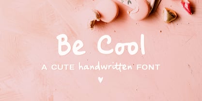 Be Cool is a cute handwritten font with an alternate character set (A-Z, a-z) and an extra set of swashes and ornaments to help decorate your text. This font includes: - A-Z, a-z, numbers and punctuation - Multilingual support - Dozens of ligatures that give it a true handwritten feel Use Be Cool in any design that needs a handwritten feel, such as signatures, notes and quotes, logos and branding.
 - Whistleberry by 10four,
$25.00 Originally given life as a wordmark for the Alt-Country band Woodshed Supply Company, the Whistleberry typeface evolved from a few simple letterforms inspired by early 20th Century signage, into a surprisingly functional typeface. With plenty of rustic charm, a robust glyph set, and a variety of alternate characters, Whistleberry will add flare and appeal to your work. Whistleberry comes in two weights; a modest Regular and a beefy Bold
 - Arthur Cabinet by SIAS,
$49.90 The Arthur Cabinet font family offers a most particular range of seven fancy ornamental fonts in the spirit of the Art Deco era. These fonts celebrate the age of elegance, stylishness and refinement to its very best. They give you a unique tool for exquisite designs. The fonts of this family are derivatives from the Arthur Sans series, which you may also want to have a look at. Use this unique typefaces for distinctive personal stationary, outstanding headlines, captivating brochures and invitations; for marvellous logotypes, wonderful menus, hotel leaflets, exciting ads … for brillant designs. Each Arthur Cabinet font features the same comprehensive Euro-Latin encoding for full language support. Additionally, every font includes a small supplementary set of fine ornaments. – For an even more comprehensive range of Arthur embellishments check out the font Arthur Sans Regular or Arthur Ornaments! Have also a look at the sister fonts of the gorgeous Arthur Sans Family, which will offer you yet another wonderful scope of fascinating typographic possibilities. ________________________________________________________________________________ Tip: Set Sample text (see below) manually to [ABCDE…] to view effectively the fonts most relevant parts! ________________________________________________________________________________
 - Relato Sans by Emtype Foundry,
$69.00 Relato Sans is the other face of Relato Serif (a typeface with much idiosyncrasy) nevertheless, the sans version of this typeface is more austere and aseptic. A humanistic type, with a contemporary cut, created for general use in texts and holders and with a great variety of weights, which allow enough flexibility for projects of great magnitude. Although leading with an independent family it maintains many of the characteristics of its homologous such as proportions, the “x” height, the construction based on air lines of the italic, ornaments and so on. These details show coherence with the serif version, and at the same time reinforce its personality. Being a multifunctional type, the “kerning” has been worked to function in small sizes as well as in larger ones such as holders. The contrast between weights, was optimized to be used in pairs (Light with Semibold, Regular with Bold and Medium with Black). Relato Sans is presented in 6 different weights, in Roman, Italic, Small Caps and Small Caps Italic with three different styles of numerals, Old style figures, Lining figures and Small Caps figures.
 - Klimaks by Kereatype,
$10.00 Klimaks is a modern serif font family whose design refers to the style of transitional serifs. In the process of working on Klimaks font, we have significantly revised the initial idea and expanded the areas of possible font application, while maintaining the original spirit of the project. Despite a large number of display details, the typeface looks great in small point sizes, and also when it is used in large text arrays. Klimaks - Luxury Serif Font has been crafted from scratch with a structural logic of its own: a fusion of pure geometry and optical balance. By combining a variety of styles Klimaks Font is suitable for Logo, greeting cards, quotes, posters, branding, name card, stationary, design title, blog header, art quote, typography Klimaks - Luxury Serif Font also suitable for art, modern envelope lettering or book design, happening style like the hand-drawn design or watercolor design theme, craft design, any DIY project, book title, wedding font, pop vintage design, or any purpose to make our art/design project look pretty and trendy.
 - Linotype Dropink by Linotype,
$29.99Linotype Dropink, from German designer Christine Voigts, is part of the TakeType Library, chosen from the entries of the Linotype-sponsored International Digital Type Design Contest 1999 for inclusion on the TakeType 3 CD. A spirited font, Linotype Dropink may remind you of your first attempts with a broad-tipped pen or of schoolwork in days of yore. However, the blots of ink are in this case done on purpose, are indeed the highlight of the font, large and small, round and irregularly sheped. Linotype Dropink is intended exclusively for headlines/display and should be used in point sizes of 18 or larger. - Mocombo JNL by Jeff Levine,
$29.00Mocombo JNL is a slightly modified version of one of the numerous alphabets created by the late Alf R. Becker for Signs of the Times Magazine during the period of the 1930s through the 1950s. Tod Swormstedt of ST Media—who is also the curator of the American Sign Museum in Cincinnati, Ohio—supplied Jeff Levine a wealth of source material from which this font is derived. The angular style of this typeface was originally referred to as “German Poster Lettering” by Becker, but it can represent many styles from 1940s night clubs to African safaris and just about anything in-between. - Yekuana Pro by Neo Type Foundry,
$28.50 Yekuana Pro is a typeface whose design is based primarily on the study of certain geometric ethnic ancestral Venezuelan signs, visually rich and originally used in the enrichment of various utilitarian objects with high symbolic and cultural content. It’s a family that is composed of 330 glyphs y of two weights, including Inline and Outline versions, Stylistic Alternates, Fractions, Ordinals and Ligatures. The combination of their styles through the use of layers by contrasting colors application of allows to obtain new interesting results. Its use is recommended for titles or short phrases and elements of oversized visual communication.
 - FS Matthew by Fontsmith,
$80.00 Developed for screen For not the first time, Fontsmith was commissioned to develop a font for one of the UK’s terrestrial TV channels. The product was a clearly-defined three-weight family. When italics were added, it became FS Matthew, a clean, stylish, structured sans serif with swooping, open curves and a bright, lively personality. Southbank Inspiration for many of the forms of FS Matthew came from details found within the modernist buildings and architecture of London’s Southbank, such as the Royal Festival Hall. During the font’s gestation, Jason had found himself at London Studios, a TV studio on Southbank, and a wander around the neighbouring arts buildings proved thought-provoking. The result was a font with a very British character: solid forms that provide the platform for innovation and distinctiveness. Feelgood efficiency FS Matthew’s trademark is efficiency with a feelgood factor: disciplined enough for corporate identities, websites and signing systems, and colourful enough for logotypes and advertising. Its versatility and excellent legibility are achieved via some unexpected details: the reaching curves of the “g” and “y”; the simple shape of the “u”; an off-kilter “k”; generous counters; and a slightly condensed aspect that makes FS Matthew a space-saver in text or title sizes.
 - Adero by Eko Bimantara,
$22.00 Adero is a futuristic and versatile display font family designed to meet the needs of modern design projects. With its wide and minimalist style, Adero offers designers a unique blend of futuristic and functional design elements that make it a perfect choice for a wide range of applications. Featuring nine weights, from Thin to Black, and matching obliques, Adero provides designers with a wide range of options to choose from when creating designs. The font’s letterforms are carefully crafted with attention to detail, resulting in a modern, clean look that is both attractive and easy to read. Adero’s minimalist design makes it ideal for a variety of design applications, including branding and logo design, product design, advertising, web and various digital design. The font’s wide proportions and large x-height make it a great choice for bold and attention-grabbing designs, while its sleek and functional style makes it perfect for more understated design applications. Whether you’re creating a futuristic poster or a sleek website design, Adero is a versatile and powerful tool that can help you achieve your design goals. With its unique blend of wide proportions, minimalist design, and futuristic style, Adero is an excellent choice for any modern design project.
 - Sablon by Roman Cernohous Typotime,
$29.00 Solid all caps display font with a hint of retro expression. Wide language support including complete set of Cyrillic characters.
 - Bruce 1065 by Intellecta Design,
$28.90Bruce 1065 is a digitization of the Bruce's Typefoundry font n. 1065 in your classical catalogue of types from 1886 - Merry Mob by Typephases,
$5.99 A gestual drawing of little people that will produce an instant crowd, gang or any combination of folks you need.
 - Frivolous by Typadelic,
$19.00The informal style of Frivolous feature lots of flourishes and swirls that give it a charming and spontaneous handwritten quality. - Wald by Volcano Type,
$19.00A font completely made of nature elements. Pieces of wood, branches and leaves. Do not go limp, use Wald instead! - Rolling Ball Cursive by Gerald Gallo,
$20.00 Rolling Ball Cursive simulates a handwritten style executed with one of the many types of rolling ball pens now available.
 - Deriva by BRtype,
$21.90 Deriva was created taking as inspiration the manuscripts of a homeless person live in the city of São Paulo, Brazil.
 - TB Matrix by TrueBlue,
$10.00A creative dot matrix font with more likeable and funny types of dots. Also contains an extended set of characters. - Mondawmin JNL by Jeff Levine,
$29.00Here's yet another stencil font based on a vintage source, and part of Jeff Levine's extensive library of stencil typefaces. - FF Pastoral by FontFont,
$50.99 A sturdy workhorse with the grace of a gazelle, the FF Pastoral typeface family marries pure craftsmanship with rapturous excesses of form. With his fifteenth release under the FontFont brand, prolific French designer Xavier Dupré has filled a typographic toolbox with plentiful options ranging from a tender, feathery Thin to a robust, healthy Black. At a glance, FF Pastoral appears deceptively simple, particularly in the middle weights. That surface serenity is intentional and allows for easy reading and quick comprehension of short blocks of copy. Upon closer inspection, FF Pastoral is complex and nuanced, carrying a balanced tension in its forms. This plays particularly well in magazine spreads and corporate logos, where uniqueness is a virtue. In creating his latest design, Dupré drew inspiration from a tasteful mix of references, combining diverse elements with a deft hand. While its letter shapes were informed by humanist-geometric hybrid Gill Sans, FF Pastoral’s proportions have been optimized for contemporary typography. Slightly condensed but generously spaced, FF Pastoral features a tall x-height, open counters, and subtle, sprightly italics slanted at just 5°. Proportional oldstyle figures are the default in the family, with tabular and lining numbers and fractions accessible through OpenType features. Elegant details evocative of calligraphy judiciously pepper the FF Pastoral glyph set. The ‘e’ bears an oblique crossbar, while the right leg of the ‘K’ and the ‘R’ are insouciantly curved in both the upright and italic variants. Further flourishes appear throughout the italics, notably in the ‘T’ and the ‘Z’, the gloriously looped tail of the ‘G’, and an extraordinary ampersand. Sharp-eyed fans of Dupré’s work may feel like they’re in familiar territory, and they would be right. An early version of FF Pastoral sprang to life in 2017 as Malis, a family in four weights on the heavier side of the spectrum. Over time, Dupré refined his original design, expanding it with four lighter styles and including true italics for all. The lightest weights are ethereal, with exquisitely delicate strokes drawing the eye in and across a line of type. The most substantial styles are tremendous in their power, allowing text to make a deep impression in print or on screen. Fully fleshed out, FF Pastoral works sublimely in a vast array of text and display settings. Dupré sees his latest FontFont offering as a ‘cultural’ typeface, perfect for the pages of an oversized coffee-table book or business communications where warmth and informality will win the day. Born in Aubenas, France (1977), Xavier Dupré is a gifted user of type as well as an award-winning type designer and lettering artist. After training in graphic design in Paris, Dupré studied calligraphy and typography at the Scriptorium de Toulouse. Since releasing FF Parango in 2001, Dupré has published such FontFont classics as the FF Absara and FF Sanuk superfamilies, FF Megano, FF Tartine, and FF Yoga. A designer of Khmer fonts as well as Latin typefaces, Dupré splits his time between Europe and Asia.
 - Belma by Adam Fathony,
$16.00 Introducing Belma, designed with a stylish serif that exudes elegance, modernity, and minimalism. Belma are crafted to elevate your design and bring a touch of sophistication to your creations. Belma is perfect for display, poster, logo, and any design that requires a bold, larger text. With its clean lines and minimalist aesthetic, the font is both timeless and contemporary, making it suitable for a wide range of applications. The elegant serifs and modern design combine seamlessly to create a truly breathtaking font collection that will enhance any design project. Whether you're designing a poster for a music festival or creating a logo for a luxury brand, these fonts will add a touch of class and refinement to your work.
 - Huron by Solotype,
$19.95A Barnhart Bros. & Spindler type from the late victorian period. We have been faithful to the spirit of the original buy "calmed down" a few of the lowercase letters to make the lines read more smoothly. - Nokian11 by GRIN3 (Nowak),
$16.00Nokian11 is a font inspired by an old Nokia phone display. It was created in 2001 and named Nokian. Nokian11 is a new, improved version with full set of glyphs and covers most of European languages. - Spooky Strikes by Aldedesign,
$45.00 Spooky Strikes Halloween is a crafty and distinctive display font. With a combination of pixel-art and scary horror themes, this font has the potential to bring each of your creative ideas to the highest level!
 - Caleuche by RodrigoTypo,
$25.00 Caleuche is a typeface family of 18 styles, from its standard version Light to UltraBold such as Rough and Inline, it is a display typeface that plays with the style of action, mythology, terror and suspense.
 - Term Paper JNL by Jeff Levine,
$29.00Jeff Levine's collection of stencil fonts based on original source material has grown by one with the addition of Term Paper JNL, a bold sans serif based on a stencil lettering guide from the 1950's. - Sign Trade JNL by Jeff Levine,
$29.00Sign Trade JNL is a reworking of Sign Crafter JNL. With a traditional M,N and W replacing the stylized versions of these letters in the previous font, Sign Trade JNL also offers an oblique version. - Sveva by astype,
$58.00 Sveva Versal is a light swinging art nouveau caps only headliner, with swash like alternates and lots of special combinations. It's well suited to set a short and fancy block or line of text. PDF Specimen
 - Daily Planet by Balpirick,
$15.00 Daily Planet results out of a stunning pairing of a brush pen and pencil that makes it look incredibly endearing and authentic. Use this gorgeous and unique handwritten font to bring any DIY project to life!
 - Spidertoes PB by Pink Broccoli,
$19.00 Are you ticklish? Spidertoes is a petite and whimsical tapering latin serif font that is full of life, capable of looking playfully spooky as well as cute & dainty. Its a font that inspires smiles and laughter.
 - Too Much Information JNL by Jeff Levine,
$29.00Too Much Information JNL is a dingbat font consisting of old-fashioned wall and door plates that can be used as part of a larger illustration or actually scaled up to print out helpful informational signs. - Fashion Wacks by Nirmana Visual,
$22.00 Fashion Wacks , contemporary of serif font, Inspired by all the retro aesthetics making a comeback, Fashion Wacks offers beautiful typographic harmony for a diversity of design projects, including logos & branding, social media posts, advertisements & product designs.
 - Mortal Wave by Stringlabs Creative Studio,
$29.00 Mortal Wave results out of a stunning pairing of a brush pen and pencil that makes it look incredibly endearing and authentic. Use this gorgeous and unique display font to bring any DIY project to life!
 - Flamenco Inline by ITC,
$29.99Flamenco is the work of British artist Tony Geddes. Its versatile display style has an inline contour decoration and a controlled yet casual appearance. Flamenco will guarantee visual excitement across a vast range of advertising applications. - Aperture Display by Mi Chen,
$5.99 Aperture Display is a san-serif typeface which combines the “standard” forms of grotesks and the modern takes on the use of ink traps. It is a display typeface designed mainly for branding and printed matter.
 - Frutiger Capitalis by Linotype,
$29.00Frutiger Capitalis Regular and Outline belong to the group of typefaces for the Linotype’s Type Before Gutenberg project. However, they are not based on direct historical sources. At first glance, they may seem related to the roman type Capitalis Monumentalis, but upon closer examination, the fonts reveal a vitality unknown to the characters the Romans etched in stone. Frutiger confesses that creating Capitalis was “a liberation”. After working on so many sophisticated and meticulously designed typefaces, Frutiger Capitalis was a breath of fresh air. Stylistically, Frutiger Capitalis Outline forms a bridge to Frutiger Capitalis Signs, a whole universe of its own. Frutiger Capitalis Signs is a personal cosmos of symbols, many are immediately “legible”, others leave room for interpretation. Some of the symbols are the product of Frutiger’s imagination, such as his “Life Signs” — soft, hand drawn figures whose lines have no apparent beginning or end, creating both interior and exterior spaces, new forms emerging at each glance. These contoured drawings have accompanied Frutiger throughout his professional life, a fantasy garden which has provided an important balance to his many years of disciplined typeface design. Yet he does not consider himself an artist. Frutiger says he simply “wants to tell stories, to draw thin lines, create contours of signs; that is my style”. - Spaza by Scholtz Fonts,
$15.00In parts of Africa, in the poorer, rural and peri-urban areas there are many small shops or convenience stores which are called "Spaza" shops. The owners of these shops often don't have access to commercial signwriting and write their signs themselves. The font "Spaza" is based on these hand-lettered signs. This lettering has a refreshing simplicity and spontaneity, yet retains great legibility. In the font "Spaza", there are three styles: - Spaza Regular - with normal upper and lower case; - Spaza Small Caps - in which the lower case is a true "small caps" and not a shrunken version of the upper case (generated by the operating system); - Spaza Double Caps - in which the lower case characters have been replaced by an alternate set of capital letters. The font thus contains two sets of differing upper case characters. You can use characters from both these sets to give a true feeling of randomness because if the same character occurs twice in a word, different versions of the character can be used. Spaza can be used with great effect in a great variety of applications such as advertisements, flyers, posters and in magazine pages. Spaza contains a full character set and has been carefully spaced and kerned. - Litza by Marianna Orsho,
$35.00 Litza is a layered, condensed, all-caps cross stitch display type family. It is made up of 10 layers that show different stages of stitching and can be stacked, moved around, and coloured separately in order to create interesting effects. The ten layers come in 3 weights; Light, Medium, and Bold. The 3 weights can also be mixed with one another to create a vast range of combinations when stacking the layers. Litza has multilingual support and includes glyphs for a wide range of Latin and Cyrillic languages. The family also contains a set of ornamental borders and over 80 decorative symbols in the shape of various animals and objects. Combining the various Litza layers allows you to create eye-popping, intricate, experimental typographic compositions that are rich in detail - with ease. The condensed, geometrics sans-serif letterforms and playful nature of the Litza layering system give a contemporary feel - while at the same time retaining a nostalgic and tactile quality due to its reference to traditional needlework techniques and patterns. Ideal for use at larger point sizes where the unique, stylish effects can be best expressed - Litza will add a touch of intrigue and work best in headings and emphasised text for poster design, editorial design, packaging design, and motion design.
 - Lilla Letter Lover by Letterground Foundry,
$11.99 "Lilla Letter Lover" is a captivating font designed specifically for children's books. This delightful typeface brings an element of playfulness to reading, while also enhancing phonemic awareness. The font's remarkable strength lies in bridging the gap between handwritten and printed letters. For early readers, this transition can be challenging, but "Lilla Letter Lover" simplifies the process. It merges the familiar aspects of handwritten letterforms with the clarity of printed text, providing a seamless reading experience. This feature ensures that children can comfortably navigate both forms of writing, enhancing their overall literacy skills. The whimsical charm of "Lilla Letter Lover" instantly captures young readers' imaginations. Each letter is thoughtfully designed with basic shapes and simplicity in mind, for an experience where letters come to life, fostering a love for reading and storytelling. Additionally, "Lilla Letter Lover" offers a unique opportunity for sight-based spelling learning. The visually distinctive presentation of words helps young readers to develop a strong visual memory of spelling patterns. This visual association enables them to recognize and recall words with ease, strengthening their reading and writing proficiency. In summary, "Lilla Letter Lover" is not just a font; it is an enchanting gateway to make reading a joyous adventure for children of all ages.