10,000 search results
(0.038 seconds)
- Oz Handicraft BT WGL by Bitstream,
$50.99Oswald Cooper is best known for his emblematic Cooper Black™ typeface. Although he was responsible for several other fonts of roman design, Cooper never drew a sans serif typeface. But that didn’t stop George Ryan from creating one. Ryan saw a sans serif example of Cooper’s lettering in an old book and decided that it deserved to be made into a typeface. Ryan’s initial plan was to make a single-weight typeface that closely matched the slender and condensed proportions of the original lettering. While the resulting Oz Handicraft™ typeface proved to be very popular, Ryan was not satisfied with the limited offering. So, between other projects – and over many years – Ryan worked on expanding the design’s range. The completed family includes light, semi bold and bold weights to complement the original design, plus a matching suite of four “wide” designs, which are closer to normal proportions. Fonts of Oz Handicraft include a Pan-European character set that supports most Central European and many Eastern European languages. - Mangerica by Ndiscover,
$25.00This design incorporates different styles into a consistent look. A pinch of script, a little of geometric and some humanistic shapes as well create a very distinguishable sans-serif. It has an overall good feeling specially on the heavier weights that have intended contrast irregularities to create a 'cartoonish' look. On the intermediate weights the design will preform well on small font sizes because of its large counters, low contrast and large x-height, but as you go to the extremes you will see shapes full of personality that will pop out in large font sizes. The font is loaded with opentype features such as small caps, ligatures, alternates, old style figures, and much more. The italic version is deeply rooted in the calligraphic heritage of the Italics. This way the brush inspired strokes are emphasized as well as an overall calligraphic look. Far from being a mere slant, Mangerica Italic had every lowercase glyph redesigned as well as some uppercase, besides that, every glyph was optically adjusted to ensure not only aesthetics but functionality too. - Mono To Go by buero bauer,
$20.00 Mono To Go is a monospace typeface with a constructed, grid-based body and a playful and quirky spirit. Built from circles and other simple geometric shapes, it sees itself as a contemporary interpretation of the early, consistently reduced typefaces of modernism. With its modular concept, the typeface invites you to "build" individually combined word pictures. Depending on your preference for the type of composition, stylistic alternatives and open typeface features offer you a wide range of possibilities. The rhythm of the glyphs and their distinctive ascenders and descenders give the typeface a confident character for bold designs. The typeface works best in larger sizes, e.g. for brands, poster and cover designs, film titles, exhibition displays or generally for striking headlines. The character set contains 600 glyphs, including full language support for Western, Central and Eastern Europe, digits and oldstyle figures, punctuation, currency and mathematical symbols, and the entire set as small caps. mono to go was designed by buero bauer (2019–2021). Special thanks to Franziska Weitgruber for her support.
 - Ongunkan Lycian by Runic World Tamgacı,
$50.00 Lycia (Lycian: 𐊗𐊕𐊐𐊎𐊆𐊖 Trm̃mis; Greek: Λυκία, Lykia; Turkish: Likya) was a geopolitical region in Anatolia in what are now the provinces of Antalya and Muğla on the southern coast of Turkey, bordering the Mediterranean Sea, and Burdur Province inland. Known to history since the records of ancient Egypt and the Hittite Empire in the Late Bronze Age, it was populated by speakers of the Luwian language group. Written records began to be inscribed in stone in the Lycian language (a later form of Luwian) after Lycia's involuntary incorporation into the Achaemenid Empire in the Iron Age. At that time (546 BC) the Luwian speakers were decimated, and Lycia received an influx of Persian speakers. Ancient sources seem to indicate that an older name of the region was Alope (Ancient Greek: Ἀλόπη, Alópē). Lycia fought for the Persians in the Persian Wars, but on the defeat of the Achaemenid Empire by the Greeks, it became intermittently a free agent. After a brief membership in the Athenian Empire, it seceded and became independent (its treaty with Athens had omitted the usual non-secession clause), was under the Persians again, revolted again, was conquered by Mausolus of Caria, returned to the Persians, and finally fell under Macedonian hegemony upon the defeat of the Persians by Alexander the Great. Due to the influx of Greek speakers and the sparsity of the remaining Lycian speakers, Lycia was rapidly Hellenized under the Macedonians, and the Lycian language disappeared from inscriptions and coinage.
 - Golden Decades by Dharma Type,
$19.99 Back to the basics. In the last ten years, type design has been confronting chaotic scene. The font market is flooded with a mixture of wheat and chaff and typography becomes increasingly complex. But one golden straight path exists. The path began from the industrial revolution, passing through swiss style, now we walk along the path as a matter of course. It is sans-serif. The decades from the Swiss style, namely "less is more age" to the contemporary basic style "Less, but better age", we call it golden decades. In those decades, type design met modernism. Go back to a theory in the golden decades, we redesigned new geometric, minimal sans-serif. Less is more and better. We added cool and calm spices to the modernism in the golden decades. As a result, letterform has a contemporary, sharp, and neutral atmosphere, and geometric rounded bowls and counters create a nice rhythm. Golden Decades consists of 8 weights and their matching Italics for a wide range of usages. Farther, Golden Decades is supporting international Latin languages and basic Cyrillic languages including Basic Latin, Western Europe, Central and South-Eastern Europe. Also, Golden Decades covers Mac Roman, Windows1252, Adobe1 to 3. This wide range of international characters expands the capability of your works. Lowercase "a" has OpenType stylistic alternate for advanced typography.
 - Second Reign by Mans Greback,
$59.00 Second Reign is a decorative medieval typeface. With borders and diamonds, this magic typeface of extreme variability brings us to glorious worlds in the golden times of epic sagas. Second Reign is the typeface of a viking king or a knight order. Use it for a Middle Ages game, a fantasy headline, or as a logotype for anything of historical theme. With usage in any modern software, the letters will automatically overlap and embrace in an elegant way. To make heraldic symbols, copy these icons: 🐉 🐎 👑 🗡 🦁 🦅 🦌 + ♖ × ✝ ⚓ * ⚔ † ‡ Alternatively write %A %B %C ... etc to create the heraldry. (Download required.) Dragon, Horse, Crown, Sword, Eagle, Deer, Cross, Anchor are some of the logos. Use [ ] for side borders. Example: [Royal⚔Thrones] The Second Reign family consists of four variations: The weight styles Thin, Medium and Bold, plus the decorated Border style. The font is built with advanced OpenType functionality and has a guaranteed top-notch quality, containing stylistic and contextual alternates, ligatures and more features; all to give you full control and customizability. It has extensive lingual support, covering Greek and Cyrillic, as well as all Latin-based languages, from North Europe to South Africa, from America to South-East Asia. It contains all characters and symbols you'll ever need, including all punctuation and numbers.
 - Leftfield by Fenotype,
$35.00 Leftfield - stylish vintage font collection. Leftfield collection includes following: •Leftfield Brush -a bold baseball style script with Clean and Rough version •Leftfield Swoosh -a set of swooshes designed to go with Leftfield Brush. Clean and Rough version. •Leftfield Sans -a sturdy all caps sans serif with Regular and Bold weight and Clean and Rough version of both •Leftfield Serif -a sturdy all caps serif with Regular and Bold weight and Clean and Rough version of both Leftfield Brush is a bold and strong sports team style vintage connected script. It’s great for any kind of display use from impressive logos to packaging and headlines. Brush is equipped with automatic Contextual Alternates that keep the connections smooth. In addition there is Swash, Titling and Stylistic alternates for standard characters. Try combining Leftfield Swoosh to make stunning compositions. Leftfield Sans and Serif work great as themselves, they make striking word blocks and they are designed to go with the Brush. Try Leftfield Serif in large sizes to make the best out of the subtle serif’s. Leftfield Rough versions simulate a printed version of the font for authentic vintage look. They’re otherwise the same font but with a rugged outline and print texture inside the characters. Leftfield has a wide language support including West European, Central European, Baltic, Turkish and Romanian character sets.
 - Dienstag by insigne,
$24.99 With its extended sans-serif style, Dienstag boasts a sleek and sophisticated look that's perfect for a wide range of projects. Whether you're designing a website, creating branding materials, or producing print publications, Dienstag's refined elegance is sure to make a lasting impression. Compared to Montag, Dienstag has a slightly more formal feel, thanks to its lack of rounded terminators. But that doesn't mean it's any less versatile – in fact, Dienstag's four original weights have now been expanded to ten, giving you even more flexibility in your designs. With OpenType features that include simplified versions of many characters, you can easily create unique and eye-catching titles that stand out from the crowd. But Dienstag is just one part of the larger Montag superfamily, which also includes Mittwoch, and Donnerstag. Each font in this collection offers its own unique style and flair, giving you a wealth of options to choose from when it comes to your next project. Whether you're looking for a bold and dynamic font or a more refined and understated style, you're sure to find the perfect fit in the Montag family. So why wait? Check out Dienstag and the rest of the Montag superfamily today, and start creating designs that are sure to captivate and inspire! With its elegant style and versatile functionality, Dienstag is the perfect choice for designers who demand the best.
 - Eclectic Two by Altered Ego,
$45.00STF Eclectic Two contains more of the useful and the sublime. Alarm clock time icons and many characters which connect add extra usefulness to this dingbat font. Stuff you'll need someday for a graphic element, bullet or dingbat application. Perfect for website icons! The Eclectic family is legendary, with a cult-like following among the inititated. With over 100 characters in the complete set, you'll find yourself using Eclectic Two almost daily to add spice to your otherwise san-serif typographic existence. This font is essentially a soap opera of typographic image elements, created for projects when I couldn't find the "thingbat" I needed. Almost more of a collection of illustrations, there are many characters which connect to form patterns, and of course it's like a "small neutral European country" army knife for the creative community. EcTwo features an complete architecturally-inspired alphabet, more of those smiley face variations, the eight ball, alarm clocks for the hours, the bouncing ball (with connecting dotted lines!), the paper airplane (flying and crashed!), the work dog, the chainsaw, Dorothy's slippers, the sideways arrows again, a handicapped symbol, chicken feet tracks, male/female symbols, gears, polynesian-inspired ornaments for patterns, a lighthouse, a torch, and more. Sounds twisted, eh? Make your own juxtapositionsof characters for funky borders. Available in Mac and PC formats. License it today! - Third Reign by Mans Greback,
$59.00 Third Reign is a decorative medieval typeface. With braids and pearls, this swirly typeface of extreme variability brings us to the golden times of epic knight sagas. Third Reign is the typeface of a Middle Age queen or a viking ruler. Use it for a Middle Ages game, a fantasy headline, or as a logotype for anything of historical theme. With usage in any modern software, the letters will automatically overlap and embrace in an elegant way. To make heraldic symbols, copy these icons: 🐉 🐎 👑 🗡 🦁 🦅 🦌 + ♖ × ✝ ⚓ * ⚔ † ‡ Alternatively write %A %B %C ... etc to create the heraldry. (Download required.) Dragon, Horse, Crown, Sword, Eagle, Deer, Cross, Anchor are some of the logos. Use [ ] for side borders. Example: [Magic⚔Thrones] The Third Reign font family consists of two styles: The decorative Border style, and the plain Regular style. The font is built with advanced OpenType functionality and has a guaranteed top-notch quality, containing stylistic and contextual alternates, ligatures and more features; all to give you full control and customizability. It has extensive lingual support, covering Greek and Cyrillic, as well as all Latin-based languages, from North Europe to South Africa, from America to South-East Asia. It contains all characters and symbols you'll ever need, including all punctuation and numbers.
 - Kadigan by Missy Meyer,
$12.00 Kadigan: (noun) A placeholder word. A kadigan can be used to substitute for any other noun: persons (John Doe, Acme Company), places (Anytown, 123 Main Street) or things (whatchamacallit, thingamajig). Just like kadigans can be used in nearly any situation, the members of the Kadigan font family can be used in nearly any design! These sans-serif beauties are clear and easy to use, but they also have a little bit of wiggle in their strokes and weights, for a fun hand-lettered look! The three members of the family: - Kadigan Light: An all-purpose lightweight stroke, with sharp corners. - Kadigan: A nice mid-weight stroke, with slightly rounded corners. - Kadigan Heavy: A thick, chonky stroke with pillowy rounded corners. And each member of the family is packed with features, including: - All of the basic stuff you expect from every font; - 340+ extended Latin characters; - Cyrillic character set; - Greek character set; - Those character sets? Support over 110 languages! - 52 double-letter ligatures for variety (That's right, EVERY letter. I'm looking at you, savvy revved trekkers!); - A full set of small caps (including Cyrillic & Greek); - And more! (Seriously, it was hard to stop.) So whether your work is in English, Español, български, ελληνικά, Türkçe, or over a hundred other languages, this cute and fun sans-serif may be just what you've been looking for!
 - Night Scream by Ditatype,
$29.00 Night Scream is a spine-chilling display font that brings a horrifying twist to your designs. With its big letters and bold weight, this font commands attention and instills fear. The details of the letters are carefully crafted to resemble menacing plant roots, adding a nightmarish and eerie touch to the font. Each letter in this font is bold and impactful, demanding to be noticed. The large size of the letters adds to the font's imposing presence. The root-like details in Night Scream give the font an organic and otherworldly appearance, reminiscent of sinister, twisted plant life. These details add an element of the unknown and create an atmosphere of dread, immersing the viewer into a world of dark and chilling horrors. For the best legibility you can use this font in the bigger text sizes. Enjoy the available features here. Features: Multilingual Supports PUA Encoded Numerals and Punctuations Night Scream fits in headlines, logos, movie posters, flyers, invitations, branding materials, print media, editorial layouts, headers, and any project that requires a terrifying touch. Find out more ways to use this font by taking a look at the font preview. Thanks for purchasing our fonts. Hopefully, you have a great time using our font. Feel free to contact us anytime for further information or when you have trouble with the font. Thanks a lot and happy designing.
 - Touvlo by Monotype,
$49.99 New from the Monotype Studio’s Creative Type Director, Emilios Theofanous, Touvlo – meaning brick in Greek – is an homage to London and the view from his studio window. A zestful, modern interpretation of a classic genre, Touvlo skillfully captures the spirit of early British grotesque typefaces through playful terminals and lively curves. Touvlo offers an array of styles, from clean uprights to characterful Italics, and exuberant Backslants. Its regular upright weights are optimized for long text, with prominent and visible vertical contrast, creating rhythm and texture for comfortable reading. The Italics are designed to be visibly distinct, with narrower proportions and calligraphic shapes, offering brightness and emphasis wherever needed. The Backslants are an unexpected and energetic addition, providing an element of surprise while following similar design choices as the Italics, packing a particular punch. With a total of 24 weights in 3 styles across 3 variable fonts, Touvlo’s variety adds flavor in any use case, and can withstand complex typographic layouts or unexpected and peculiar settings. Touvlo’s weights range from Thin to Black, giving it an expressive edge for headlines. Its lyrical Drop caps are the finishing touch, featuring exquisite birds and creatures inspired from ornaments found in type specimen books. Touvlo’s spirit is radiant; becoming more than a voice; a reimagining of a classic genre and a must have for every designer's typographic palette.
 - Touvlo Variable by Monotype,
$229.99 New from the Monotype Studio’s Creative Type Director, Emilios Theofanous, Touvlo – meaning brick in Greek – is an homage to London and the view from his studio window. A zestful, modern interpretation of a classic genre, Touvlo skillfully captures the spirit of early British grotesque typefaces through playful terminals and lively curves. Touvlo offers an array of styles, from clean uprights to characterful Italics, and exuberant Backslants. Its regular upright weights are optimized for long text, with prominent and visible vertical contrast, creating rhythm and texture for comfortable reading. The Italics are designed to be visibly distinct, with narrower proportions and calligraphic shapes, offering brightness and emphasis wherever needed. The Backslants are an unexpected and energetic addition, providing an element of surprise while following similar design choices as the Italics, packing a particular punch. With a total of 24 weights in 3 styles across 3 variable fonts, Touvlo’s variety adds flavor in any use case, and can withstand complex typographic layouts or unexpected and peculiar settings. Touvlo’s weights range from Thin to Black, giving it an expressive edge for headlines. Its lyrical Drop caps are the finishing touch, featuring exquisite birds and creatures inspired from ornaments found in type specimen books. Touvlo’s spirit is radiant; becoming more than a voice; a reimagining of a classic genre and a must have for every designer's typographic palette.
 - Decipher by Mans Greback,
$69.00 Decipher, designed by Mans Greback, is an edgy graffiti-inspired font that captures the essence of street art and hip-hop culture. With its cool, calligraphic and marker-style handwriting, Decipher brings the energy and speed of urban life into your designs. Perfect for projects that require a touch of street-smart attitude, this font will take your creations to the next level. The typeface comes in four styles: the Regular style and the Symbols style, both provided in Bold. The Symbols style is a unique addition, offering a variety of tag elements such as swashes, arrows, stars, and crowns to enhance your designs further and unleash your creativity. The font is built with advanced OpenType functionality and has a guaranteed top-notch quality, containing stylistic and contextual alternates, ligatures, and more features; all to give you full control and customizability. It has extensive lingual support, covering all Latin-based languages, from Northern Europe to South Africa, from America to South-East Asia. It contains all characters and symbols you'll ever need, including all punctuation and numbers. Mans Greback is a Swedish typeface designer dedicated to crafting diverse and versatile fonts. With a passion for a wide range of typographic styles, he has developed a range of fonts that are appreciated and utilized by designers around the world.
 - TessieMiscellaneous by Ingrimayne Type,
$13.95 A tessellation is a shape that can be used to completely fill the plane—simple examples are isosceles triangles, squares, and hexagons. Tessellation patterns are eye-catching and visually appealing, which is the reason that they have long been popular in a variety of decorative situations. These Tessie fonts have two family members, a solid style that must have different colors when used and an outline style. They can be used separately or they can be used in layers with the outline style on top of the solid style. For rows to align properly, leading must be the same as point size. To see how patterns can be constructed, see the “Samples” file here. Shapes that tessellate and also resemble real-world objects are often called Escher-like tessellations. Most of the shapes contained in TessieMiscellaneous are Escher-like tessellations. Most or all of these shapes were discovered/created by the font designer during the past twenty years in the process of designing maze books, colorings books, and a book about tessellations. (Earlier tessellation fonts from IngrimayneType, the TessieDingies fonts, lack a black or filled version so cannot do colored patterns. The addition of a solid style that must be colored makes these new fonts a bit more difficult to use but offers far greater possibilities in getting visually interesting results.)
 - Tagalog Doctrina 1593 - Unknown license

- Jackdaws by Bogstav,
$17.00 A rough, yet legible version of my handwriting. Comes with contextual alternates that makes your text look even more cool! Also with loads of international letters! Viva multilingual support!
 - Chisel by Linotype,
$29.99An inline version of the Latin bold condensed, and designed on the suggestion of Robert Harling. There is a double white line, which was originally engraved in Latin type. - Capstone by Rivet Designworks,
$10.00 Capstone is a display typeface influenced by the bold angular features of stone architecture, especially that of cathedrals and archways. It works well for short bold titles or brands.
 - Fifty Famous Fairy Tales by Funk King,
$20.00 Fifty Famous Fairy Tales was inspired by lettering on the cover of a children’s book of the same name published by Whitman Publishers back in the 50s or 60s.
 - Direkta JNL by Jeff Levine,
$29.00Direkta JNL take the classic Art Deco influenced lettering of the 30s and 40s and adds a diagonal triangular cut into the letters, creating an air of forward movement. - Surface Stencil JNL by Jeff Levine,
$29.00 A hand-cut antique brass stencil for marking barrel tops of dill pickles was the source of inspiration for Surface Stencil JNL, available in both regular and oblique versions.
 - Borough Park JNL by Jeff Levine,
$29.00 Borough Park JNL is named for a neighborhood in the southwestern part of the borough of Brooklyn, NY and was modeled from hand lettering found on vintage sheet music.
 - Loretta Display by Nova Type Foundry,
$44.99 Loretta Display is a version of Loretta designed to bring it to bigger sizes. Loretta Display is elegant and sharp. Expand your universe of editorial typefaces with Loretta Display.
 - Sense by Shinntype,
$29.00 Modernist sans serif with a "big" look and lots of weights. Compact, elegant and strong, Sense commands any kind of page -- from the largest headline to the smallest text.
 - KG Say Something by Kimberly Geswein,
$5.00 This quirky font features tons of personality in curls and swirls. Use it for titles & small snippets of text. (Don't try turning a term paper written in this font!)
 - SF Buttacup - Unknown license

- West Avenue by KA Designs,
$12.00 West Avenue is a chic font that combines the look of both a traditional and modern serif. Use opentype features to take full advantage of the sleek alternates and glyphs - making each project luxurious and unique! This font is perfect for logos, branding, packaging, advertisements, social media and more!
 - Ka Callista by Karandash,
$28.00 Callista (from the Greek for "most beautiful") is a fat cursive typeface, inspired by the works of Francois Boltana in the early 1970s and those of Milka Peykova in late 1970s. With its Full Latin and Cyrillic support, Callista is a perfect choice for short headlines and logotype design.
 - Seanor by Typebae,
$15.00 Seanor is a modern and versatile logo font that features 26 elegant ligatures. It offers a modern aesthetic, making it suitable for various branding and design projects. The font's ligatures provide unique and stylish combinations of letterforms, enhancing the overall visual appeal of any logo or typographic design.
 - Mandarin Duck by Yasemin Varlik,
$10.00 Mandarin Duck is a very playful typeface where its design was inspired by the rare duck seen in New York once every year. The delicate tail of this duck creates the edges of the characters. It is bold and fun, a perfect typeface for children books and larger texts.
 - Lil Milton AEF by Altered Ego,
$45.00Lil Milton is full of energy and excitement, like the blues legend that inspired its name. Irregular counters (and irregular outlines!) creates a dissonant harmony of form and function. Stretch it, but don't condense it for a righteous look. Lil Milton is the perfect companion to Adobe Myriad Tilt. - Beuys by Jan Eloy Gabriel,
$9.99 Beuys is a sans serif typeface based on geometrical shapes. The horizontal sroke contrast gives Beuys its distinct look. This unique appearance makes it an interesting display typeface. The six weights of Beuys come with OpenType-Features and a character set of 323 glyphs including symbols, ligatures and alternates.
 - Rutin Tutin NF by Nick's Fonts,
$10.00Schrifti Alphabeti, a delightful collection of Cyrillic typefaces for posters from the former Soviet Union, strikes again, this time with a way-out West (Vladivostok?) theme. Extrabold, extra wide and delightfully different! Both versions of the font include 1252 Latin, 1250 CE (with localization for Romanian and Moldovan). - Baleny by Craft Supply Co,
$15.00 Baleny Elegant Font Duo is a combination of a serif font & beauty handwritten script font based on the expression of real handwriting. Baleny Elegant Font Duo will work perfectly for fashion, e-commerce brands, trend blogs, wedding boutiques or any business that wants to appear upscale and chic.
 - Christmas Angely by Letterara,
$21.00 Step into the world of enchantment with Christmas Angely, a captivating formal calligraphy font that adds a touch of glamour to your designs. Embrace the holiday spirit with sophistication and elegance, making every Christmas moment truly extraordinary. With PUA encoding, unlock its endless possibilities and effortlessly enhance your creations.
 - Gabara Sans by Arodora Type,
$50.00 Gabara is a modern, fun and dynamic sans serif family. Thanks to its flexible appearance, it is suitable for paragraphs and headings of any length. Also includes Gabara, multilingual support, ligatures, and more. In this way, you can handle many of your needs with a single font family.
 - Berries by Letterara,
$12.00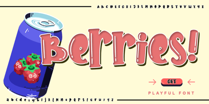 Berries is a cute and sweet handwritten font with an incredibly friendly feel. Get inspired by its playful feel! This font is PUA encoded which means you can access all of the cute glyphs with ease! It also features a wealth of special features including alternate glyphs and ligatures.
 - Palmilla by RodrigoTypo,
$25.00 Palmilla is a very gestural Sans font that contains 7 fonts (Thin, Light, Regular, Medium, Bold, Black as well as a set of dingbats, it is perfect for informal or children's titles, it contains many Alternatives such as Ligatures, to have more options at the time of writing.

