10,000 search results
(0.028 seconds)
- Entitled JNL by Jeff Levine,
$29.00Way back before digital imaging, video tape and computer editing, the home movie enthusiast had to shoot on film his own titles using any one of a variety of movie titling kits on the market. One common approach was to arrange white ceramic letters on a colored background and film them. A set of such letters provided the inspiration for Entitled JNL from Jeff Levine. The classic, sleek Art Deco lines of this font makes it an all-purpose design for any headline needs. - Canciller by Corradine Fonts,
$29.95 Canciller is an elegant typeface designed by Manuel Corradine and Sergio RamÌrez that will give your projects a very exclusive and fresh appearance. Its style is a mix between the grace of calligraphy and the legibility of typography so Canciller can be used in a wide range of purposes. It’s available in six weights that go from light and delicate to black and powerful to give the designer the possibility of creating hierarchies and great contrasts. Its character set supports Western and Central European languages.
 - Remontoire by MAC Rhino Fonts,
$36.00 The original sketches who formed the base for Remontoire is known as one of the first typefaces drawn by Karl-Erik Forsberg . It was a result of a competition set up by various typographic organizations in the early 1930. The typeface was never completed and sketches are only to be found on paper. Made only as a single font but some the character can later on be found in other of examples of his work; Carolus and Ericus. MRF developed and expanded the family into 5 weights.
 - Kia Ora by Something and Nothing,
$15.00 Kia ora is a M?ori-language greeting which is used as an informal greeting, equivalent to "hi" or "hello", or an expression of thanks. The koru (M?ori for loop or coil) is a spiral shape based on the appearance of a new unfurling frond. It is an integral symbol in M?ori art, carving and tattooing, where it symbolises new life, growth, strength and peace. Its shape conveys the idea of perpetual movement, while the inner coil suggests returning to the point of origin.
 - Kwersity by Ingrimayne Type,
$12.95 Kwersity is a boxy, geometric, slab-serifed typeface with strokes of uniform weight. Its circular elements are almost rectangular. The narrower style has a high x-height. Both the narrower and wider variants come in three weights, regular, semi-bold, and bold. (In its original, pre-2020 form, what is now semi-bold was bold. What is now bold is new as of 2020.) There is also a shadow version; Kwersity-semibold can be layered on top of it to color the interior of the letters.
 - Spooky Season by Ake,
$18.00 Spooky Season is a bewitching and delightful Halloween Display font that brings a playful and cute twist to the spookiest time of the year. With its charming and quirky design, this font captures the essence of Halloween with friendly ghosts, adorable pumpkins, and mischievous bats. Whether youre creating party invitations, spooky decorations, or fun social media graphics, Spooky Season will add a touch of enchantment to your designs. Embrace the magic of Halloween with this cute and versatile font thats perfect for all your ghoulishly delightful projects.
 - ITC Bolthole by ITC,
$29.99I fell in love at the age of twelve in Wales, recalls Bernard Philpot. "My father brought me to a small graveyard in the Welsh hills to show me two headstones carved by the great Eric Gill. I instantly fell in love with the beauty of the carving and the perfection of the letterforms. I still go back to marvel at these works of art." However, the ITC Bolthole™ design, Philpot's first commercial typographic endeavor, is quite unlike the works of Eric Gill that first captured his heart. Bolthole is a craggy sans serif with a definite grumpy attitude. It's not terribly legible, and, if more than a few words are set in the design, it's not very readable. To round out its cranky personality, Bolthole does not like to be set in small sizes. Like Cheez Whiz® and bullfights, you either love or hate this typeface. But whichever emotion dominates, there is no denying that Bolthole has a personality to be reckoned with - one with ample magnetism to ensure reader attraction. If used to set brief blocks of display copy, the typeface makes a powerful statement. Bolthole was originally designed to complement a whimsical ad for the Royal Society for the Prevention of Cruelty to Animals. As Philpot recalls, "although the ad didn't win any awards, the type attracted some very positive comments for its original look and feel." Philpot studied graphic design and typography at the London School of Printing, and soon after graduation found himself working in a large advertising agency in London. According to Philpot, "After designing type for everything from packaging to ads, I thought it time to convert one of my designs into a complete font - and Bolthole was born." ITC Bolthole could very well be the Shrek™ of typeface design - which might not be such a bad thing." - Onick by Wordshape,
$- While researching the history of Onitsuka Tiger's branding and graphic design, I came across an odd, yet highly appealing piece of custom lettering on the company's ONICK ski boots from the 1970s. Reminiscent of aspects of the typeface Black-Out by Eli Carrico (released by my type foundry Wordshape), yet vertically compressed with razor-sliced counters and odd stencil element that makes up one of the legs of the "K", the ONICK lettering is a potential source for an intriguing modular font. I immediately thought of Ryoichi Tsunekawa as a potential collaborator to bring this piece of lettering to full-fledged life in the contemporary context. Based in Nagoya, Tsunekawa runs an independent type foundry called Dharma Type, including three specialized foundry sub-labels: Flat-It, devoted to display lettering; Prop-A-Ganda, a series of fonts inspired by and based on retro propaganda posters, movie posters, retail sign lettering & advertisements in the early 20th century; and Holiday Type, a series of decorative and retro scripts for holiday use. The past year has seen a flurry of notice of his work abroad, having been featured in both MyFonts' "Creative Characters" and YouWorkForThem's newsletter. As the work of most Japanese type designers is almost wholly unnoticed abroad, for Tsunekawa to be interviewed by two of the most popular type distribution companies in the world is definitely something beyond the norm. Perhaps it is because he works independently, or perhaps it is due to the charm and friendliness with which his typefaces are infused. Either way, this attention is both welcome and appreciated. Beyond mere charm, Tsunekawa's work is nuanced, detailed, and accessible due to its high level of finish. His fonts stand apart from his contemporaries in Latin typeface design in Japan due to his fascination with pop, vernacular and historical lettering from "non-pure" sources- whereas type designers like Kunihiko Okano and Akira Kobayashi have spent years analyzing the essence of Western letterform construction and unlocking the essence of Latin forms, Tsunekawa views surface and the awkward nature of his sources as being of value, as well. His irreverence for the formal doctrines of history imbue his typeface designs with a rugged inventiveness that would be missed by most- glyphs without source designs are guessed at and approximated, often in a manner wildly divergent from what Western eyes would assume. It is in these moments that I find sheer delight in Tsunekawa’s work and what make me most pleased to invite him aboard Neojaponisme and Onitsuka Tiger’s type development project. His assorted typefaces show an eclecticism in finish and as holistic systems- Tsunekawa's return email to me about the proposed type project showed a digital sketch of how a completed typeface family from the source lettering might look, rendered with an effortlessness and dedication to detail that belies a skilled craftsperson. Further development showed Tsunekawa’s rigor- the typeface in development rapidly featured glyphs ignored by many: a full set of fractions, Eastern European diacritics and accents, superior and inferior numerals, alternate characters, and custom ligatures - all designed with regulated, detailed spacing. ONICK is a typeface Tsunekawa should be proud of- an homage to a moment in history rendered in the absolute best fashion. We are proud to present it to the world! --Ian Lynam
 - TT Norms Std Condensed by TypeType,
$35.00 TT Norms® Std Condensed useful links: Specimen | Graphic presentation | Customization options TT Norms® Std Condensed is the logical development of our bestselling TT Norms®. Since the release of TT Norms®, we received a bunch of requests to create its narrow version and even managed to make several custom projects of the narrow TT Norms® before we decided to start creating a full-fledged commercial version of the typeface. At the very beginning of the project, we did some research and tested several options for the possible width of the typeface. Despite the fact that TT Norms® Std Condensed has narrower proportions than the original family, it inherited the classic proportions of characters, attention to detail and meticulous elaboration of each character in the typeface. The TT Norms® Std Condensed font family consists of 18 faces (9 upright and 9 italics). Each style includes a sufficient set of characters that allow you to solve most of the problems that arise in the field of graphic design, branding, packaging design or website design.
 - Serid by Samuel Vicente Types,
$22.00 SERID is a display font condensed and regular designed for editorial applications. Inverted contrast, features a serif hybrid that gives a decorative character and personality to the font. Being a display type, intended for use in titles or in small blocks of text, from 24pt. The name SERID comes from the combination of words “SERif” and “hybrID”, resulting SERID.
 - Sansational by Type Innovations,
$39.00 Sansational is an original design by Alex Kaczun. The inspiration started with the shape of a "paper clip". Simple and elegant. A condensed sans serif that's, well... just sansational! It's a delight to use and view. Great for advertising, large headlines, web applications, and well... just about anything. Works equally well in a broad range of text point sizes.
 - Bunbury by Monotype,
$15.99 For playfulness and something a little less ordinary, Bunbury is a wonderful script that’s packed with personality. Created using a felt marker and available as an all capitals display font, SC Bunbury’s style is sort of awkward and a lot of fun, with defined outlines and uneven line thicknesses that make for letters packed with hand drawn quirks.
 - Average Joe by Typadelic,
$14.95 Based on a mid 20th century retro typestyle, Average Joe is anything but average! You might even find that it breaks the rules and is somewhat of a rebel. Because this font has such a bouncy style, I've created extra characters for ease of flow when you type. Try combining upper and lowercase letters for a really fun look!
 - Plakat by Scriptorium,
$18.00Plakat is based on lettering by 1920s advertising calligrapher Samuel Welo. It is a complete upper and lower case set with a number of alternate characters, all with a rough, decorative look accented by curls and hooks. If you like the look of our popular Scurlock font, Plakat has a similar aesthetic, though it is even bolder. - Space Majestic by ahweproject,
$10.00 Space Majestic is a retro display font that is a perfect blend of boldness and uniqueness. Its bulky letters are slightly unbalanced, adding an extra layer of charm and personality. It’s perfect for designs that require a vintage touch with a modern twist. This font is PUA encoded which means you can access all glyphs and swashes effortlessly!
 - Woolwich by Hanoded,
$15.00 Woolwich is a jolly fine display font, named after a district in south-east London. Woolwich, somewhat inspired by Futura condensed, was completely made by hand and comes in a clean and an eroded version. It is highly legible and will certainly make your designs stand out. Woolwich speaks a lot of languages, including the language of doodles.
 - Quethy by Zamjump,
$10.00 Quethy is a playful font that can be applied to many of your precious designs. It's very simple handwritten and has an elegant style that makes this font a lot of fun. Quethy has a characteristic that is handwriting with a simple pen. You can use it for posters, titles, greeting cards, packaging, invitations and more.Included : - Multi-language
 - Sorvettero by Just in Type,
$30.00 Sorvettero is a sans, layered and unicase typeface inspired by some wood signs at Descansópolis, a neighborhood on Campos do Jordão, a city of Brazil. A fun and cute display project with different use purposes, like packaging, logos, signs, and whatever your creativity brings on. Designed by Diego Maldonado, with contribution of Tony de Marco on the Diamond style.
 - Mikhaella by Stefani Letter,
$12.00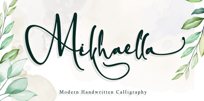 Mikhaella is a beautiful light handwritten font with a unique feel and looks stunning. It will add a luxury spark to any design project! This font is PUA encoded which means you can access all of the amazing glyphs and swashes with ease! It also features a wealth of special features including alternate glyphs and ligatures.
 - Dupont Serif by Hexagon Foundry,
$20.00 Dupont Serif, a graceful and modern serif font. Embodying clean lines, well-proportioned letterforms, and a unique charm, Dupont Serif stands as a versatile typeface suitable for various applications. The unpretentious nature of Dupont Serif allows it to be employed in a multitude of design scenarios. Offered in 10 weights alongside corresponding oblique characters and 2 style sets.
 - Chunk Plump by Viswell,
$19.00 Introducing "Chunk Plump," a retro display font that combines chunky and rounded shapes. Bold and playful, it captures the nostalgic charm of the past with a contemporary twist. Perfect for headlines and titles, it adds authenticity and character to any design, infusing a sense of warmth and inviting energy. Get ready to make a lasting impression with "Chunk Plump."
 - Easter West by Sipanji21,
$17.00 "Easter West" is a display font with straight and sharp character shapes. Fonts like this are often chosen for designs that require a clean, modern, and bold appearance. This type of font can work well in a variety of design projects, including logos, headlines, posters, and other creative applications where a sharp and straightforward typography style is desired.
 - Antartida by Latinotype,
$26.00 Antartida is a sans serif typeface, while it is monolinear simple structure give it a kind of neutral feeling, is functional, clean and minimal. Is a family of 8 fonts, 4 weights and italics. This typeface contains alternate glyphs that help to emphasize text or headlines. You can also see AntartidaEssential, a simpler and less expensive version.
 - Drop Dead Gorgeous by Hanoded,
$22.00 Drop Dead Gorgeous is a slightly slanted all caps Brush font. I made it with the last of my Chinese ink (I ordered a new batch, it should arrive tomorrow). Drop Dead Gorgeous is a very legible font, ideal for headlines, posters and book covers. Comes with alternates for lower case letters and a truly breathtaking amount of diacritics.
 - SandraOh by Chank,
$59.00Sandra Oh is a quirky modern take on the classic serif fonts of the 20th century, updated here with a wiggle in her walk and a giggle in her talk. A Chankstore classic from the earlier days of the internet, this font is now available in OpenType format for the first time. Perfect for indie films or youtube videos. - ITC Symbol by ITC,
$29.99ITC Symbol font was designed by Aldo Novarese, a simple, straightforward design of understated elegance. It has just the hint of a serif to aid legibility. Book and medium weights have a light, even color and are perfectly complemented by the bold and black weights. The italics are clear and simple, a comfortable companion to the roman. - Aprex Mono by S6 Foundry,
$10.00 Aprex Mono is a Mono spaced stylized industrial version of the Aprex Sans typeface, with multilingual support. The font is inspired by a basic sans serif glyphs structure, concerning the balance and optimization that bring a clean typeface, versatile for both display and body text use ideal for adding a touch of style to your creations and layouts!
 - Natube by Dhan Studio,
$14.99 Natube is a font that is scratched with a brush pen, to get a natural texture, so this font will display the characteristics of the hand. This font is very suitable for a variety of places such as clothing, poster, tittle books, stationery designs, quotes, branding, logos, invitations, greeting cards, t-shirts, packaging designs and more.
 - Beaumont by Studio Buchanan,
$12.00 Beaumont is a modern take on classic 1920's type, playing with stroke contrast and art deco forms. The result is a 10 font family, providing options for setting readable body copy or high impact display headings. With full multilingual character support, stylistic alternates and a range of open type features, Beaumont is perfect for a variety of situations.
 - Peach Chery by Look Minus Today,
$14.00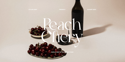 Introducing Peach Chery - A Display Serif Font With Alternates by Look minus today Peach Chery - Is a display and elegant serif font that is perfect for adding a touch of sophistication to your designs. Its sleek and stylish look makes it suitable for a variety of applications, including branding, advertising, and editorial design. Thanks &Happy Designing!
 - Moki by FaceType,
$25.00 The seven ways of Moki. Moki comes in seven different styles: Base, Cut, Dust, Lean, Mono, Soft and Uni. Moki is a display expert – with a wide range of languages covered, the family offers a style for every purpose. You are a SciFi movie director and are looking for an alternative to the inevitable Eurostile? Now you have!
 - Hullabaloo by Solotype,
$19.95We saw a few letters of this in a catalog, and liked it so well we drew it up and made it as a film font for photolettering. Due to a surplus of interesting types in our shop this one never made it into our catalog, so we can¹t tell you anything about its popularity. - Favorite Hangout JNL by Jeff Levine,
$29.00A "thick and thin" line weight treatment is given to Jeff Levine's Hash and Beans JNL, providing a whole new take on the design - first inspired by a sign in an old photograph of a diner. Favorite Hangout JNL conjures up memories of summer nights, drive-ins, your best guy or gal and sharing some tasty burgers and fries. - Fenggasta by Gatype,
$9.00 Fenggasta is a font that is scratched with a brush pen, to get a natural texture, so this font will display the characteristics of the hand. This font is very suitable for a variety of places such as clothing, poster, tittle books, stationery designs, quotes, branding, logos, invitations, greeting cards, t-shirts, packaging designs and more.
 - Pabean Market by Nasir Udin,
$24.00 Pabean Market is an interpretation of the incription on the oldest market in Surabaya, Indonesia, which was established on 1849. The unique character inspired me to make a complete set of typeface. It’s a retro typeface but has a futuristic aura yet a festive vibes. This font comes in single style and has several Discretional Ligatures. -- Uppercase
 - Waiting For My Girl by Hanoded,
$15.00 Waiting For My Girl comes from a System of a Down song (Hypnotize). I was listening to it when I created this font and I liked the name! Waiting For My Girl is a script font - it’s quite loose and uneven, just like proper hand writing. It comes with double letter ligatures and a lot of character!
 - CA Fourty Open by Cape Arcona Type Foundry,
$29.00 CA Fourty Open is another take on the idea of a double-line font. It reminds us of neon-sings, but lifts the 50s aesthetics to a contemporary level. Although it’s an all-caps font, upper and lower cases differ a little bit. The upper cases are more open. CA Forty Open has a full Central European letterset.
 - Roxon by Fo Da,
$7.00 Roxon is a sans serif typeface of 4 weights from Extra Light to Bold and can be used as both a headline and text face. Roxon is recommended for using in long-form writing and articles, since a serif is far more readable for longer passages of text. The typeface has a carefully crafted weight range, with ligatures.
 - Arlequin by TipografiaRamis,
$29.00 Arlequin is a high-contrast sans serif decorative font. The most distinguished characteristic of this typeface is its lowercase letters. Their shapes, a high-contrast clash of bold angular fragments with arched thin counterparts, make for a dramatic impact on entire font visual impression. Arlequin is recommended for use as a headline or short-text font.
 - Arakne by Scriptorium,
$12.00While working on a font based on Spencerian Script (a popular late 19th century handwriting style) we did some experimenting with original designs which created the general feel of Spencerian and brought to mind the spidery handwriting of old ladies and Dickensian clerks. The result was Arakne, a spidery script font with a really striking look.