10,000 search results
(0.186 seconds)
- LudwigHohlwein - 100% free
- Gladiate by Solotype,
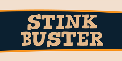
$19.95This was a favorite of job printers in late Victorian times. They used it on cards and stationery, as well as small handbills. It was made in a range of sizes from 10 point to 36 point. Good for places where you really don't want to shout. - Stink Buster by Bogstav,
$16.00There’s nothing stinky about this font, don’t worry! But what’s is up with Stink Buster is a whole lot of serifs gone bad! Each letter is loosely based upon the classic slab serif style, but influence by grafitti and comics just made them crooked and off the grid. But despite that, the font works great if you have a message that you want shouted out loud! - Bloxen by Schaub Design,
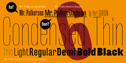
$12.00Hand-hewn along the banks of the mighty River Raisin in Southeast Michigan, this heavy block typeface is the perfect addition to any design project in need of a stout, yet fun typographical treatment. Before this font made its journey into the outside world, it began its life as a 4B pencil sketch on cheap inkjet printer paper, as many of my projects do. This typeface, not unlike me, doesn't waste its time with finesse, or convention, and truly doesn't mind being a little bit on the thick side. There is a time for refinement and propriety, but this ain't it. - Mr Palker Dadson by Letterhead Studio-YG,
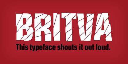
$35.00Mr Palker Dadson — has appeared in a natural evolution of the Palker-Palkerson family. Its closest relative - burly slab serif Mr Palker Dad. This generation is more stout than the previous one. One may even be brave enough to use them for composing small texts. Notably Mr Parker Dad has become one of the frequently sold typefaces on the «Peterburg. The city speaks» map as it is highly readable while remaining extremely tight. Mr Parker Dadson has all the features of P&P’s family. - Britva by Juraj Chrastina,
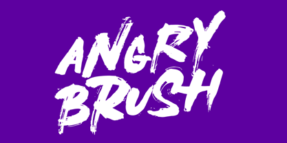
$39.00Derived from Valibuk, Britva is designed like from broken glass for eye-catching headlines. It's a heavy, condensed face with a high x-height and tight spacing. While Valibuk can write it loud, Britva literally shouts it out even louder. The unbroken glyphs are accessible through OpenType contextual alternates. - Angry Brush by Joy Studio,
$13.00Introducing ANGRY BRUSH - a very bitter display brush font made for all your resentful ramblings. Available only in upper case (shout mode) and with 17 different unique variations of every single character so it always looks fresh, with no duplicated letters in sight. You can either manually choose your preferred character, or let the contextual alternates rotate through each stylistic set whilst you type. - Ehrhardt MT by Monotype,
$29.99The Ehrhardt name indicates that this typeface is derived from the roman and italic typefaces of stout Dutch character that the Ehrhardt foundry in Leipzig showed in a late-seventeenth-century specimen book. The designer is unknown, although some historians believe it was the Hungarian Nicholas Kis. Monotype recut the typeface for modern publishers in 1937 to 1938. Ehrhardt has a clean regularity and smooth finish that promote readability, as well as a slight degree of condensation, especially in the italic, that conserves space. Ehrhardt is a fine text face, especially for books. - Ramenson by Larin Type Co,
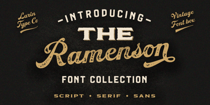
$15.00Ramenson is a vintage collection of fonts that includes serif, script, and sans serif, each of them has five styles - Clean, Rough, Pressed, Shadow, Rough Shadow. Also for the script includes Alternates and Swashes. This collection was inspired by vintage signage, beer labels, logos, scout patch. These fonts are perfectly suitable for any vintage project and will make it at a high level. This font is easy to use has OpenType features. - SpideRaY - Personal use only
- Kairos Variable by Monotype,
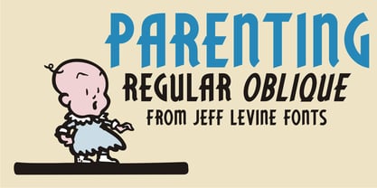
$314.99Kairos is equal parts traditional and digital. Inspired by 19th century wood type fonts called Grecians, it’s an octagonal slab serif at its core. The serif detailing makes it radiate in headlines, with the square serifs driving its performance in text. The 51 weights and widths—all with small caps—offer a flexible and usable contemporary palette of styles perfect for branding, advertising and packaging. Kairos is stout, but has energy. It often looks athletic, industrial, and stern, while the subtle rounded features can also give it a gentlemanly and gracious demeanor. Kairos Variables are font files which are featuring two axis and have a preset instance from Thin to Black and Condensed to Extended. - Parenting JNL by Jeff Levine,
$29.00 - Deco Triline JNL by Jeff Levine,
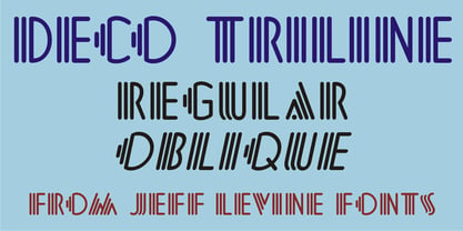
$29.00From the title on the sheet music for the 1935 composition "Along Tobacco Road" comes Deco Triline JNL in both regular and oblique versions. Reminiscent of Broadway if done as a neon sign, this typeface virtually shouts about the Manhattan nightlife of the 1930s. For maximum readability, space the letters a bit wider than normal. - Sangkuriang - Unknown license
- Suffiya NF by Nick's Fonts,
$10.00The Boston Type Foundry called the pattern for this elegant typeface "Moslem," suggesting the exotic appeal of faraway lands. The face succeeds in fulfilling its promise, with remarkably little extraneous fussiness. The font's name suggests that it's a wise choice for headlines which tout the lure of distant charms. Both versions of the font include complete Latin 1252, Central European 1250 and Turkish 1524 character sets, with localization for Moldovan, Romanian and Turkish. - Xanakee by Chank,
$39.00Xanakee is a curvacious bubbly fun font, with equal parts pleasant approachableness and a swaggerish strut. Xanakee features large, leisurely curves controlled by the consistency of the monoline stroke. All with a friendly, human voice and confident gait. OpenType versions have a few special features, like some smallcaps and some fanciful swash figures. Purchase it from MyFonts and you'll get TrueType format in your download as well. Also available as web type, too, of course. - Poster Casual JNL by Jeff Levine,
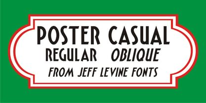
$29.00Poster Casual JNL is based on the hand lettered title on the cover of the 1929 sheet music for the song "Give Yourself a Pat on the Back"; touted at the time as being "the cheer-up song of England". Available in both regular and oblique versions, the font is perfect for applications where a less-formal look is desired in headlines or brief text. - Oskal by Pesotsky Victor,
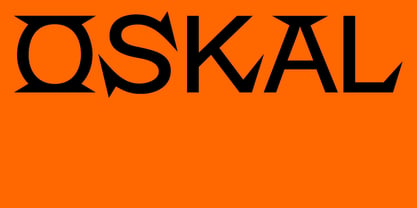
$15.00"OSKAL" is a font that appeared as an experiment to cross the neutral grotesque and antique. The idea is to make a strange hybrid out of a simple grotesque. The serifs are added in non-standard places and make this font unusual for perception. It's a sharp and active font that you can shout at or break down walls with. OSKAL supports Basic Latin and Extended Latin, Cyrillic — in total about 90 languages are supported. The font has one Regular weight, uppercase and lowercase, punctuation. OSKAL font was designed by Viktor Pesotsky. - Poster Paint by Canada Type,
$24.95Poster Paint is a fun shocard alphabet which came about from Jim Rimmer’s admiration of Goudy Stout, a design he liked in spite of the fact that Goudy himself claimed to detest it. Extremely eye-catching and humourous to a fault, Poster Paint is an ideal fit for fun environments like theme parks, concession stands, cofee and juice bars, and in print design for children books and fun food packaging. Poster Paint was updated and remastered for the latest technologies in 2012. It comes with a glyphset of over 375 characters, and supports the majority of Latin-based languges. 20% of this font’s revenues will be donated to a GDC scholarship fund, supporting higher typography education in Canada. - TX Manifesto by Typebox,
$39.00Manifesto was designed for an article written in response to opinions that philosophy and personal expression have been wiped clean from today's design profession. Contemporary design is sterile and sublime. Enter Ken Garland's revision of the original 1964 Manifesto. The publishing of the "First Things First" manifesto 2000 is exhibit A that a trend for social belief systems is growing. Or is it? Many comfortably accept that designers are indeed "engaged in nothing less than the manufacture of contemporary reality". The four 'voices' of the TX Manifesto Family (Regular, Slant, Stout and Stencil) is intended for your typographical response, and push for conscientious design. - Splash by TypeSETit,
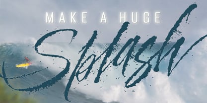
$24.00Inspired by the splatters that come from a heavily inked architectural ruling pen gliding along the surface of a highly textured watercolor page—Splash. Just as droplets of water splash the ocean’s shore, little control can be predicted and no two splashes are exactly alike. The result is wonderfully organic and natural surprises. This display font touts flowing design potential. All glyphs are PUA encoded for ease of use. - Blunt by Miller Type Foundry,
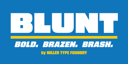
$16.99Blunt is a refreshing new bold headline typeface, designed to be an alternative to overused headline typefaces such as Impact. Blunt is more than just a one-trick-pony though, but includes 4 weights (Condensed - Wide) each with matching italics. This gives Blunt a lot more versatility when it comes to headline use. Try Blunt today and shout your most important messages with boldness! - Dez Squeeze by Dezcom,
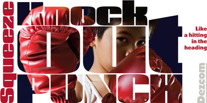
$29.00When you don't want to speak softly, Squeeze can shout above the crowd. Say it loudly and proudly, this face does not have a weight problem. The Dez Squeeze Pro Family is also now available from Dezcom in seven widths. http://www.myfonts.com/fonts/dezcom/dez-squeeze-pro/ Dez Squeeze has 483 glyphs with uppercase, lowercase, proportional lining figures, unicase, stylistic sets, alternates, ordinals, and case specific punctuation. It has a full range of diacritics and covers all European languages using the Latin script. - Red Top by Studio K,
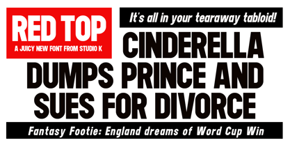
$45.00Red Top is the UK name for the tabloid press, the scandal sheets of journalism, scourge of royalty, errant politicians and public figures, and celebrants of sex, celebrity and astrology: all human life is there as they used to say in the now defunct News of the World. For the budding media moguls amongst you – or for designers who want to make their headlines shout a little louder – here at last is Red Top the font. Splash it all over! - Floyal Rush by PizzaDude.dk,
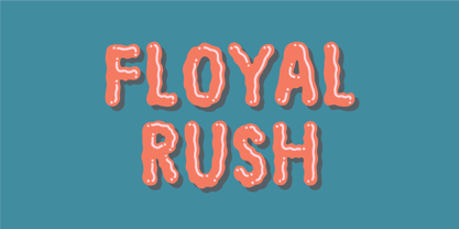
$18.00Floyal Rush is 100% handmade, it’s organic looking and super friendly in a funky wobbly way! Although inspired by grafitti, Floyal Rush has got this cartoon and whimsical vibe to it. I don’t know about using Flyal Rush for massive text, but I would suggest short words and shout-outs - but I dare you! Go ahead and challenge me! I have added 3 versions, which fit together: Solid, Shine and Regular. - Jaunty Gent NF by Nick's Fonts,
$10.00In 1936, Erich Mollowitz designed a typeface named »Rheingold Kräftig« for the German type foundry J. D. Trennert & Sohn (Hamburg-Altona). The original letterforms have been extended and beefed up a bit, and the result is a rollicking, righteously retro romp…a perfect choice when you want to strut your stuff. The PC Postscript, Truetype and Opentype versions contain the complete Latin language character set (Unicode 1252) plus Central European (Unicode 1250) languages as well. - Resistance Is Lowered by Comicraft,
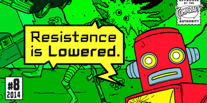
$19.00Lower your shields and surrender your ships. You will talk to your central world authority in upper AND lower case, and order global surrender. Your culture will adapt to serve us in sentence case. You will not shout in UPPER CASE as before. You will be upgraded. You will become like us. Upgrading RESISTANCE IS FUTILE to RESISTANCE IS LOWERED is compulsory. There is no escape. Artwork from Monster Truck by Shaky Kane - Vow by Thinkdust,
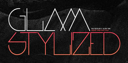
$15.00Vow is an incredibly stylised font, strutting its stuff on the typography catwalk. Vow does everything to excess, even when cutting down: where it’s curvy, it’s very curvy, but where it’s thin, it’s thin. Vow’s regular weight has a certain boldness at text size, but its ultra-thin alternative is much better used at larger sizes, managing to take up very little space even when scaled up. Using a mix of the two creates a subtle emphasis, especially when coloured, which helps to create stunning messages in elegant ways. - Beatle by Lián Types,
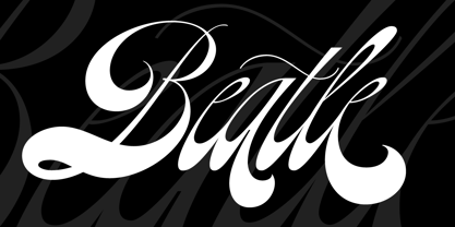
$30.00What if Platt R. Spencer and Charles P. Zaner were born in mid-20th Century? What if they were fans of The Beatles or The Mamas & Papas? Beatle is what those masters would have made. Letters shouting for peace, like a true hippie does, with a lot of elegance. With Beatle I wanted to mix the delicacy of engrossers script with the exuberance of flower power. The result is a font designed with freedom, full of provocative alternates and fat tails. Enjoy it and of course, let it be. - Pieches by PintassilgoPrints,
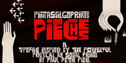
$29.00This typeface is inspired by the powerful political and social posters by Paul Peter Piech, a tireless artist and printer. Questioned about his endless energy and focus on work, he said "I don't want to sit around and be silent". Pieches is a linocut-looking font heavily loaded with interlocks, including vertical pairs of letters. There are alternates also, and not quite a few: four glyphs for each letter so countless expressive possibilities are open. Graphical elements are also included, for added wilderness. This is a loud-speaking font for those who don't want to be silent. Come on, let’s shout! - Godger by Craft Supply Co,
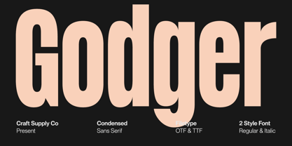
$20.00Godger Condensed Sans Serif: Boldness Redefined Step into the bold world of Godger, where strength and simplicity converge. This bold, masculine font is a powerhouse, built for strong, memorable branding. Its condensed form is not only space-efficient but also packs a punch, perfect for headlines that demand attention. Masculine and Commanding Godger’s bold, condensed letters exude a sense of command, making it a go-to for titles needing a masculine touch. Each letter is crafted for high impact, ensuring your words aren’t just read, but felt. This font doesn’t whisper; it shouts with a clear, authoritative voice. - Nonchalant by PizzaDude.dk,
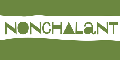
$20.00Nonchalant was inspired by an old Peter Sellers poster from the around 1970 (the year that I was born!) I wanted to keep the funky look of the 70's but update with a more modern 21st century look. That's how Nonchalant ended up looking like a hybrid between funk, grafitti and sans serif! Use Nonchalant for your posters, commercials, postcards, invitations, shout-outs or whatever needs something funky! Comes with an extensive amount of international letters! - Jellyka Castle's Queen - Personal use only
- Jellyka - Estrya's Handwriting - Personal use only
- Flamingo Plush by PizzaDude.dk,
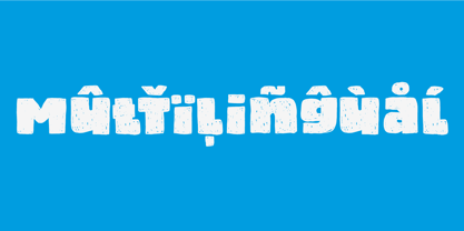
$20.00Flamingo Plush is something you want to use when you need your statement shouted out! The large, rough and worn letters will do the job for you - all you need to do is write your message! There is a slight difference in upper- and lowercase in a kind of unicase way. Some of the lowercase letters looks a bit more worn, when mixed with uppercase makes the handmade look really stand out! Go for something big, go for Flamingo Plush! - Jellyka, End_less Voyage - Personal use only
- Big Welly by Inclusive Fonts,
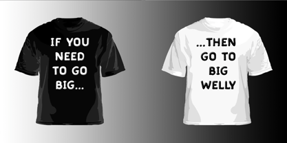
$19.95Big Welly …in the United Kingdom we have a very British phrase which is ‘Give it some Welly (Wellie)’ this is often shouted to a person as encouragement or criticism, it asks for more effort to be put into whatever he or she is doing. The saying comes from an informal name for Wellington Boots; Wellies - named after The Duke of Wellington. Hence, ‘Big Welly’ the font, this font is bold and big on the one hand and handwritten on the other. These two attributes make this font ideal as a poster font or t-shirt font for instance to make your message really stand out. So, if you need a bit of added oomph in your design – look no further than ‘Big Welly’. - P22 Slogan by IHOF,
$24.95P22 Slogan is a non-connecting script font that captures the essence of the lettering used in 1950s European advertising. Bold strokes of this brush-drawn face make this design a great choice for both retro design and contemporary work. The font is based on the 1957 design Slogan by Aldo Novarese for the Italian Nebiolo Type Foundry. At the time of its original release, it was touted for "striking publicity work". This new digitization accurately reproduces the outlines of the original not found in previous digital versions of this design. P22 Slogan is a non-Pro Opentype font that includes Central European characters. - Salas by AdultHumanMale,
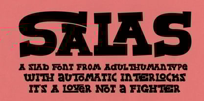
$20.00Salas is a fun, chunky, slab serif omnicase display font. It's blocky and loud, so it can scream from Posters and Headlines. Think of a clown with poor hearing making a Skype call, he's shouting, but you like it. Anyway: it has over 300 glyphs, several variations on the standard alphabet and lots of those extra foreign features for sending international ransom notes. OpenType coded, it has various letter pairings that interlock automatically to create a more randomized, bespoke feel to your copy. It also has some extra characters available directly through your glyphs palette. Play around with it, I hope you like it. - Madden by Typogama,
$19.00Madden is a bold, single weight typeface designed for use in titles, editorial design, branding or any other setting that requires capturing attention. With a bold, rugged stroke, inspired by the wide brush used in hand made protest signs, this typeface exploits Opentype features to randomly replace letters set in a line of text, thereby simulating the erratic and irregular letterforms that could be create by a manual writing. Madden is designed to give you an expressive and impactful typeface that will grab attention and shout your message.

