10,000 search results
(0.021 seconds)
- Dementor by Balpirick,
$15.00 Dementor is a flowing and elegant handwritten font, created with the help of a brush pen. Fall in love with its incredibly versatile style and use it to create gorgeous wedding invitations, beautiful stationary art, eye-catching social media posts, and much more!
 - One Good Urn NF by Nick's Fonts,
$10.00J. M. Bergling, in his 1914 masterwork Art Alphabets and Lettering, offered this face as suitable for all occasions Greek, and we couldn't agree more. Both versions of this font include the complete Unicode 1252 Latin and Unicode 1250 Central European character sets. - Asrafel by Scriptorium,
$18.00Asrafel is an original font by Dave Nalle. It is a strong, stylish titling font based on hand lettering influenced by Celtic uncial styles and Art Nouveau titling fonts. It includes a variety of alternate character forms to create interesting visual relationships. - Simple Note by Linecreative,
$16.00 The Simple Note font is perfect for your upcoming project. Such as logo branding, editorial design, fashion, adventure stories, stationery design, sports design, blog design, modern advertising design, invitation cards, badges, art quotes, home decor, book titles/covers, special events and many more.
 - Sheol Einsocal by Warisand,
$17.00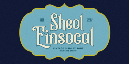 Sheol Einsocal is a Vintage Font inspired by beautiful vintage sign art and lettering. The font comes with unique alternate design characters to give your designs an elegant and artistic look. It is perfect for logo and packaging design, short phrases or headlines.
 - Iris by ITC,
$39.00Iris font was designed in the late 1930s for American Typefounders. It is an all capital sans serif typeface whose slender geometric letter forms suggest the Art Deco period without limiting its application potential. Iris font creates a look of refined elegance. - Voneryc by Warisand,
$17.00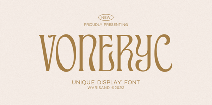 Voneryc is a Vintage Font inspired by beautiful vintage sign art and lettering. The font comes with unique alternate design characters to give your designs an elegant and artistic look. It is perfect for logo and packaging design, short phrases or headlines.
 - Timeless Nature by Gassstype,
$25.00 Timeless Nature - Authentic Natural Handwritten Typeface Font that will make your designs look modern, unique and fun. It’s perfect for labels, quotes, posters, DIY projects, branding, packaging, greeting cards, websites, photos, photography overlays, signs, window art, scrapbooking, tags and so much more!
 - River Terrace JNL by Jeff Levine,
$29.00 “Corbitt” is one of the many designs found within the pages of the 1907 Inland Type Foundry specimen book. A bold spurred serif with Art Nouveau influences, it is now available digitally as River Terrace JNL in both regular and oblique versions.
 - Wonc Honesok by Warisand,
$17.00 Wonc Honesok is a Vintage Font inspired by beautiful vintage sign art and lettering. The font comes with unique alternate design characters to give your designs an elegant and artistic look. It is perfect for logo and packaging design, short phrases or headlines.
 - Andielly by Warisand,
$17.00 Andielly is a Vintage Font inspired by beautiful vintage sign art and lettering. The font comes with unique alternate design characters to give your designs an elegant and artistic look. It is perfect for logo and packaging design, short phrases or headlines.
 - Momotako by Almarkha Type,
$22.00 Momotako is a Cute Playful Display font that will make your designs look modern, unique and fun. It’s perfect for labels, quotes, posters, DIY projects, branding, packaging, greeting cards, websites, photos, photography overlays, signs, window art, scrapbooking, tags and so much more!
 - Kopi Arabica by Gassstype,
$22.00 Kopi Arabica is Unique Playful Display Font that will make your designs look modern, unique and fun. It’s perfect for labels, quotes, posters, DIY projects, branding, packaging, greeting cards, websites, photos, photography overlays, signs, window art, scrapbooking, tags and so much more!
 - HV Constantine by Harmonais Visual,
$10.00 Constantine - an exquisite display modern serif, inspired by classic roman arts and vintage cars aesthetics. Specially designed for luxury, clean, high-end projects, perfectly suitable for creating elegant, classy design such as magazine, social media, and more. The font features standard ligatures.
 - Poultry And Fish JNL by Jeff Levine,
$29.00 The image of an old enamel sign advertising poultry inspired Poultry and Fish JNL, which is available in both regular and oblique versions. Horizontal cut-through lines within the Art Deco-era hand lettering adds to the uniqueness of this type design.
 - Dash Grid by Gleb Guralnyk,
$13.00 Hi there, introducing an abstract font named Dash Grid. At's a geometric display typeface made of square dashed blocks. Dash Grid font supports most of the european latin languages and includes ukrainian cyrillic alphabet (check out all available characters on the last screenshot).
 - Dance Routine by Jeff Levine,
$29.00 The hand lettered title on the cover of the 1932 sheet music for “I Wish We Could Dance Forever” was the inspiration for Dance Routine JNL. This bold Art Deco sans serif design is now available in both regular and oblique versions.
 - Phaley by Typebae,
$15.00 Phaley is a soft and charming handwritten signature script font that effortlessly exudes elegance and grace. With its delicate curves and timeless beauty, it adds a touch of allure and personality to any design or document, transforming words into works of art.
 - Vallisa by Letterara,
$12.00 Vallisa is a cute and sweet handwritten font with an incredibly friendly feel. This font will turn any creative idea into a true piece of art! This font is PUA encoded which means you can access all of the cute glyphs with ease!
 - Vandal Zoy Graffiti by Sipanji21,
$18.00 Vandal Zoy is a Thick font with a graffiti style and bubble looks. It will elevate a wide range of design projects to the highest level, be it branding, headings, wedding designs, invitations, signatures, logotype, wall art illustration, apparel, labels, and much more!
 - JAF Lapture by Just Another Foundry,
$59.00 Lapture is based on the Leipziger Antiqua by Albert Kapr, released in 1971 by the East German foundry Typoart. It has been extended and carefully redesigned by Tim Ahrens in 2002-05. The strong calligraphic characteristics are a result of the design process: "The size of the counters and the width of individual characters at small optical sizes were analysed with a steel pen while the letter shapes were designed in larger size with a specially trimmed reed pen. Sometimes the hand is more innovative than the head alone," says Kapr. A unique feature of this font is the introduction of gothic shapes into a latin typeface. "The basic concept is to string together narrow white hexagons as counters and inter-letter spaces, defined by vertical stems and triangular serifs. The interior spaces are at least as important as the strokes that make up the characters." Lapture is an ideal choice if a reference to gothic style is desired, as true black letter types are often too eye-catching and not as legible as latin fonts for unfamiliar readers. "The last few years have seen a number of very elegant typefaces based on the mellow and feminine renaissance model. However, sometimes we require a font that is strong and robust, harmonic yet rigid," says designer Tim Ahrens. JAF Lapture is provided in OpenType format. Each font contains more than 600 glyphs, including true small caps, nine sorts of figures, contextual and stylistic alternates and accented characters. This means that you only need to purchase one font whereas in other families you would have to buy two or three fonts in order to get the same. Technically, they follow the Adobe Pro fonts and provide the same glyph set and OpenType functionality. JAF Lapture Basic is provided in OpenType format. Each font contains the standard sets of both MacOS and Windows. In contrast to JAF Lapture they do not provide any advanced OpenType features and no extended glyph set.
 - Madison Street by Studioways,
$40.00 Madison Street is a font family with 8 fabulously fun typefaces! Eliza Gwendalyn & Jim Lyles of Studioways have teamed up with Spencerian calligrapher Elaina DeBoard to create a classic pointed pen calligraphy font. From its ornamental monograms, to its variety of complimentary text styles, and to its Madison Street Pro, with its elegant stylistic swashes and OpenType goodies, there is a font for every designer. Enjoy the sleek Madison Street Sans, Serif or Script, paired with the Ornaments font, complete with ornate monograms, or use each typeface on its own! Madison Street Pro has all the OpenType bells and whistles. The Ligature feature automatically substitutes beginning and ending letterforms, as well as 100 ligatures. Turn on the Swash feature for elegantly sweeping swash lowercase forms. Enable Stylistic Alternates for even more variations. There are also 10 Style Sets to chose from. And many more OT features! Madison Street is a basic version of the Pro font, intended for users who do not have OpenType savvy applications. Madison Street Stylistic is also a basic version of the Pro font, intended for users who do not have OpenType savvy applications. It has stylistically different ascenders and descenders. Madison Street Swash is intended to be used with the basic fonts, Madison Street and Madison Street Stylistic. It has lowercase beginning and ending swash glyphs and cannot be used to set text by itself. Madison Street Sans, Serif, and Script are text fonts modeled after the handwriting of Elaina. They are intended to be complimentary to any of the script fonts. However, you'll need to set them at a smaller point size (about 1/3 the size) in order to get the preferred scale and weight. Finally, the hairline weight of the Madison Street script fonts is very thin, and at small sizes up to 40 pt, you may notice some breaking up when printing to desktop printers. To remedy this, we recommend outline stroking the text a small amount (.1 -.3 value). this should improve the output without adding to much weight overall.
 - Ingeborg by Typejockeys,
$70.00 The Ingeborg family was designed with the intent of producing a readable modern face. Its roots might well be historic, but its approach is very contemporary. Ingeborg’s Text Weights are functional and discreet. This was achieved without losing the classic characteristics of a Didone typeface, which are the vertical stress and the high contrast. The Display Weights on the other hand are designed to fulfil their job and catch the reader’s eye by individual form language and a whole lot of ink on the paper. Nevertheless both are of one origin and work together in harmony.
 - Pricing Labels JNL by Jeff Levine,
$29.00Pricing Labels JNL gives you a set of digital price gun labels in fifty-one of the most common store departments, plus an untitled title label on the lower case ‘z’ key. Additionally, numbers for creating prices are on the standard keystrokes (for dollar amounts), and smaller numbers/underscores (for cents amounts) are on the shift key groupings for the number keys. The dollar and cents sign are on the left and right brackets, the decimal point is on the period key and the words “each” and “for” [set sideways] are on the greater and lesser keys. - Square Bite by PizzaDude.dk,
$9.00 Here's a fun collection of cute, weird, crazy and goofy drawings. They are all drawn within a box, which makes it easy for you to align them in a grid, or perhaps make your own colouring book or picture lottery. The shapes of the drawings are typically simple: triangles, circles, squares etc. I use drawings like these in my work as a kindergarten teacher. These simple, but yet appealing drawings, are a great inspiration for kids (especially the ones who never draws or are insecure on how to draw) to start drawing themselves, or as a kickstarter for their imagination!
 - Malmo Sans Pro by Martin Lexelius Core,
$33.00 Malmö Sans was born from the preconception that geometry is neutral, and neutral fonts have a wide application window. No ornaments, no quirks – just clean. Design process: establishing the main proportions, grids and library of geometric shapes. However, people are not math, people are not built from grids. We are irregular, not always logical, and, foremost, we are human. So: humanisation – define parts and areas, and make the needed adjustments to shapes and forms, although being mathematically correct. Basically, changing it into something that pleases the eye. Much effort has been made to achieve equal parts minimalism, aesthetics and legibility.
 - Ongunkan Iberian Script by Runic World Tamgacı,
$50.00 The Iberian scripts are the Paleohispanic scripts that were used to represent the extinct Iberian language. Most of them are typologically unusual in that they are semi-syllabic rather than purely alphabetic.[1] The oldest Iberian inscriptions date to the 4th or possibly the 5th century BCE, and the latest from end of the 1st century BCE or possibly the beginning of the 1st century CE. The characters in this font do not contain all the characters of the Iberian script. If there are friends who need all the characters, contact me so that I can install the font on the system.
 - Vintage Monograms by Intellecta Design,
$16.00 A Monogram is a lettering character made up of the main letters of a name and sometimes all of them. It is a kind of design which dates from the earliest times of our history. It is a distinctive mark that everyone could have themselves, to apply to documents and many purposes. The signatures of ancient Kings were Monograms. Today this brand, for the people of taste, must have the cachet of this era or the evocative feelings of ancient times. Our predecessors knew how to create it by using the capital that preceded Gothic and the other characters. The Vintage Monograms collection contain hundreds of ready to use in alarge of shape of the letters, with styles from Victorian, to Art Nouveau and to mediaeval like in the old manuscripts. Ready to use fonts, Vintage Monograms collection is a classic that features elegant and intricate monograms perfect for branding and personalization. Its ornate designs evoke the timeless style of vintage logos and can be used to add a touch of sophistication to invitations, stationery, and packaging. Monogram brings an air of refinement and exclusivity to any project.
 - Nestine by Craft Supply Co,
$20.00 Introducing Nestine – Elegant Sans Serif High Contrast Elegance Nestine – Elegant Sans Serif is more than just a font; it’s a visual masterpiece with high contrast that effortlessly exudes an air of elegance and luxury. The Epitome of Elegance Moreover, Nestine epitomizes elegance. Its striking contrast between thick and thin lines creates a visual appeal that is both refined and sophisticated, making it the perfect choice for luxury designs that demand attention. A Minimalist Marvel Nestine’s high contrast design is a minimalist marvel. It relies on the purity of its design to convey sophistication and elegance, proving that simplicity can be the essence of opulence. Ideal for Luxury Design Additionally, Nestine is tailor-made for luxury design projects. From high-end branding to upscale packaging, it adds a touch of opulence and refinement that leaves a lasting impression of sophistication. In Conclusion In summary, Nestine – Elegant Sans Serif is the epitome of high-contrast elegance. It’s the font that effortlessly combines the art of sophistication and luxury. With Nestine, your designs achieve a minimalist yet opulent quality that captivates the viewer, leaving an indelible mark of refined taste and aesthetic beauty.
 - Malabar by Linotype,
$29.99 Malabar is a type family for extensive text. Its design was developed with a nod toward newspapers. Malabar's characters are seriffed and of the Old Style genre. A strong diagonal axis is apparent within the curves. Sturdy serifs help strengthen the line of text in small point sizes, as well as define the overall feeling of the face. Malabar's x-height is very high, a deliberate choice that makes the most important parts of lowercase letters visibly larger in tiny settings. The height of the capital letters is also rather diminutive, allowing for better character fit, as well as eliminating a bit of clumsiness in German, which often includes quite a few uppercase letters. Diacritical marks and additional alphabetic forms required by many Western, Central, and Eastern European languages are naturally a part of the character set, including those needed in the Baltic states, for Romanian, and for Turkish. Malabar's accents are bold and direct, sitting well with their base glyphs. The family includes three weights, each with a companion Italic. Malabar Regular is equipped with small caps, and both it and Malabar Italic include oldstyle figures. All members of the family have both proportional and tabular-width lining figures, as well as special variants of certain punctuation marks vertically adjusted for all-caps text setting. Malabar is informed both by contemporary ideas of typeface design (sheared terminals, the wider-drawn s) as well as by 16th-century masters. Malabar Heavy and Heavy Italic are very loud; their blackness almost shouts out from the page. The Regular's wedge serifs become more slab-ish in nature as the letters' weight increases. Malabar Heavy and Heavy Italic are best relegated to headline use only. Malabar Bold and Bold Italic may be used for text emphasis, a job for which the Heavy is to dark. Malabar received a Certificate of Excellence in Type Design at the Type Directors Club of New York TDC2 competition in 2009.
 - Open Book ING by Ingrimayne Type,
$9.00 OpenBookING is a gimmick or novelty font that has letters on pages of a book. It is caps only and monospaced. The letters on the upper-case keys are on the left-handed pages of an open book and the letters on the lower-case keys are the same letters but on the right-handed pages of an open book. One could alternate upper and lower case keys to get letters on complete books, but the Opentype feature of contextual alternatives (calt) does this automatically. Several previous typefaces from IngrimayneType used the calt feature to alternate shapes that fit together in an interlocking pattern, such as alternating concave and convex shapes. OpenBookING uses the calt feature in a different way, to alternate two halves of a symmetrical shape. To provide two copies of numbers and common symbols, some non-alphabetical characters are unavailable because their slots were taken by the second form of the number or common symbol. If stylistic set one (ss01) is turned on, spaces are replaced with empty pages. This may leave you with unwanted spaces at the end of lines, and to eliminate them, turn off the feature (or change the font) for these spaces. The empty pages can be used in a layer to add color to the text. There is also a second set of empty pages with a filled page that can also be used in layers. (See poster for examples.) These pages are on the (logicalnot multiply) and (register divide) characters for the first set and on the (ordmasculine ellipsis) and (macron trademark) keys for the second set. Finally, OpenBookING has a large set of accented characters if anyone should need them. The letters used on the books were derived from the font Myhota-Bold. For a related typeface of letters on book covers, see NewLibrary. OpenBookING has limited uses and is priced accordingly.
 - TT Bluescreens by TypeType,
$35.00 TT Bluescreens useful links: Specimen PDF | Customization options Please note! If you need OTF versions of the fonts, just email us at commercial@typetype.org Meet the upgraded TT Bluescreens! TT Bluescreens is a geometric sans serif with narrow proportions. The font has a memorable character, while remaining neutral, so it can be used in various design projects. The range of possibilities of the updated TT Bluescreens has become much wider! Condensed styles with narrowed proportions have been added. The classic styles of TT Bluescreens are universal and suitable for setting both in headings and in text arrays. Condensed styles are intended for non-standard design solutions. In small sizes, they are perceived as if having a texture, thanks to which they can become part of packaging or poster design. In large size they look extraordinary, but they are highly readable and convey information well. Variable font now changes along 3 axes: weight, width and slant. Even more options for those who love variety. The character set of TT Bluescreens was expanded, and additional extended Cyrillic and Latin characters were added. Expanded character set. Each style has 874 characters. This is 253 characters more than it there were in the previous version. New currency signs, arrows, punctuation and fractions were added. Number of OpenType features increased from 18 to 31! The font has become even more functional and convenient thanks to a large number of ligatures, stylistic alternatives and localizations. The quality of the contours has become even higher, diacritics were improved. The updated TT Bluescreens is suitable for the design of covers and posters, it will look aesthetically pleasing in packaging design. It can be used in the design of titles and disclaimers. Condensed styles are preferably used in large size. The TT Bluescreens font has 37 styles: 9 upright and 9 italics of standard width, 9 upright and 9 italics in Condensed, 1 variable style. Each style contains 874 characters. The font has 31 OpenType features, including ligatures, stylistic sets, and localizations.
 - Houndtime - Unknown license

- Scrawny Kids - Unknown license

- Today We Escape by PizzaDude.dk,
$20.00 Today We Escape has got rugged edges and a slightly worn surface without overdoing it. The letters are ALL CAPS, but upper and lower case are different. Today we escape comes with substitution characters for double letters!
 - Hand Stamp Gothic Rough by TypoGraphicDesign,
$25.00 “Hand Stamp Gothic Rough” is based on real vintage rubber stamp letters from Germany. A classic american gothic face mixed with a modern condensed sans serif type. Rough & dirty with a authentic hand stamped look for a warm analogue vintage charm. It started analogous with only a few rubber stamps and finally it was digital 776 glyphs. With 4 × A–Z, 4 × 0–9, 4 × a–z and many other alternative glyphs like @. Plus modern OpenType Features like contextual alternates (automatic generated loop for letter variation). The different variations from the dynamic pressure by hand intended to show the hand-made nature and creates a liveliness in the display font. The font has 80 decorative extras in the form of symbols & dingbats like arrows, hearts, smileys, stars, further numbers, lines & shapes. A range of figure set options like oldstyle figures, lining figures, superiors & inferiors. Additionally standard ligatures, decorative ligatures (type the word “show” for ☛ and “love” for ❤ … ), Versal Eszett (German Capital Sharp S) and many emojis & symbols. Example of use It’s your turn … for example everywhere where it makes sense. The hand stamped font would look good at headlines. Advertising (big headlines), Corporate Design (type for logos & branding), Editorial Design (magazine or fanzine headlines), Product Design (typographical packaging) or Webdesign (headline webfont for your website), flyer, poster, music covers or web banner … How To Use – awesome magic OpenType-Features in your layout application: ■ In Adobe Photoshop and Adobe InDesign, font feature controls are within the Character panel sub-menu → OpenType → Discretionary Ligatures … Checked features are applied/on. Unchecked features are off. ■ In Adobe Illustrator, font feature controls are within the OpenType panel. Icons at the bottom of the panel are button controls. Darker ‘pressed’ buttons are applied/on. ■ Additionally in Adobe InDesign and Adobe Illustrator, alternate glyphs can manually be inserted into a text frame by using the Glyph panel. The panel can be opened by selecting Window from the menu bar → Type → Glyphs. Or use sign-overview of your operating system. For a overview of OpenType-Feature compatibility for common applications, follow the myfonts-help http://www.myfonts.com/help/#looks-different ■ It may process a little bit slowly in some applications, because the font has a lot of lovely rough details (anchor points). Technical Specifications ■ Font Name Hand Stamp Gothic Rough ■ Font Weights Regular & Dirty (Bold) ■ Font Category Display for headline size ■ Font Format.otf (OpenType Font for Mac + Win) ■ Glyph Set 776 glyphs ■ Language Support Basic Latin/English letters, Central Europe, West European diacritics, Turkish, Baltic, Romanian, OpenType Features, Dingbats & Symbols ■ Specials Alternative letters, stylistic sets, automatic contextual alternates via OpenType Feature (4× different versions of A–Z & 0–9 + a–z), Euro, kerning pairs, standard & decorative ligatures, Versal Eszett (German Capital Sharp S), 80 extras like Dingbats & Symbols, arrows, hearts, emojis/smileys, stars, further numbers, lines & shapes. ■ Design Date 2016 ■ Type Designer Manuel Viergutz ■ License Desktop license, Web license, App license, eBook license, Server license
 - Delectables by ITC,
$29.99A former lettering artist at Hallmark Cards, Rob Leuschke now has his own thriving design businesses, Alphabytes and the new TypeSETit. Growing up in St Charles, Missouri, where he still lives, Rob showed great artistic promise at an early age. He earned a BFA in graphic design at the University of Missouri at Columbia. After graduation, his stint at Hallmark Cards gave him the opportunity to learn from and work with some of the best lettering artists in the industry. Rob struck out on his own in 1987 and now boasts a long list of clients from all over the world. Rob has created over 250 custom typefaces, and his work has been exhibited in New York. Ambiance BT is Rob’s first typeface published by Bitstream, with more to follow. - NERMOLA Scripcy Font by Alit Design,
$12.00 Introducing NERMOLA Scripcy Font from alitdesign. The rise of typeface duos in the marketplace made us not want to be left behind so we created a pairing of our own. This font duo launch contains both a sans serif and signature script. NERMOLA Scripcy sans serif has characters that are unique, elegant, formal and assertive. It is suitable for the heading or subheading of any text. The uppercase of the sans looks very unique and elegant. The script letters are also unique and natural in character. Additionally, it has several alternatives that can be replaced using OpenType features. NERMOLA Scripcy fonts are the perfect addition to your font collection library. The designs are elegant and romantic and are equally suitable for logotype design and for any phrase, poem, or quote.
 - Speech Bubbles by Harald Geisler,
$68.00 The font Speech Bubbles offers a convenient way to integrate text and image. While the font can be used to design comics, it also gives the typographer a tool to make text speak – to give words conversational dynamics and to emphasize visually the sound of the message. The font includes a total of seventy outlines and seventy bubble backgrounds selected from a survey of historic forms. What follows is a discussion of my process researching and developing the font, as well as a few user suggestions. My work on the Speech Bubbles font began with historic research. My first resource was a close friend who is a successful German comic artist. I had previously worked with him to transform his lettering art into an OpenType font. This allowed his publishing house to easily translate cartoons from German to other languages without the need to use another font, like Helvetica rounded. My friend showed me the most exciting, outstanding and graphically appealing speech bubbles from his library. I looked at early strips from Schulz (Peanuts), Bill Waterson (Calvin & Hobes), Hergé (TinTin), Franquin, as well as Walt Disney. The most inspiring was the early Krazy Kat and Ignatz (around 1915) from George Herriman. I also studied 1980’s classics Dave Gibbon’s Watchmen, Frank Miller’s Ronin and Alan Moore and David Lloyd’s V for Vandetta. Contemporary work was also a part of my research—like Liniers from Macanudo and work of Ralf König. With this overview in mind I began to work from scratch. I tried to distill the typical essence of each author’s or era’s speech bubbles style into my font. In the end I limited my work down to the seventy strongest images. An important aspect of the design process was examining each artist’s speech bubble outlines. In some cases they are carefully inked, as in most of the 80’s work. In others, such as with Herriman, they are fast drawn with a rough impetus. The form can be dynamic and round (Schultz) with a variable stroke width, or straight inked with no form contrast (Hergé). Since most outlines also carry the character of the tool that they are made with, I chose to separate the outline from the speech bubble fill-in or background. This technical decision offers interesting creative possibilities. For example, the font user can apply a slight offset from fill-in to outline, as it is typical to early comic strips, in which there are often print misalignments. Also, rather than work in the classic white background with black outline, one can work with colors. Many tonal outcomes are possible by contrasting the fill-in and outline color. The Speech Bubbles font offers a dynamic and quick way to flavor information while conveying a message. How is something said? Loudly? With a tint of shyness? Does a rather small message take up a lot of space? The font’s extensive survey of historic comic designs in an assembly that is useful for both pure comic purposes or more complex typographic projects. Use Speech Bubbles to give your message the right impact in your poster, ad or composition.
 - KG Fractions by Kimberly Geswein,
$5.00 This font was created with math teachers in mind. It is hard to represent fractions in a way that can print easily in black and white on worksheets or tests. The extra outlines on these shapes are created just for that purpose- so your student can easily identify how many parts are shaded in the image. Blanks are also included so students can color in parts of a whole.

